The Australian Bureau of Statistics (ABS) released the latest labour force data today (APRIL 16,…
Australian Labour Force data – all bad and getting worse
Today’s release by the Australian Bureau of Statistics (ABS) of the – Labour Force data – for March 2013 reveals a very weak and deteriorating labour market. All the main indicators were bad – employment fell, full-time employment fell, unemployment rose, participation fell and aggregate monthly hours worked fell. The unemployment rate would have risen to 5.9 per cent rather than the 0.2 point rise to 5.6 per cent had the participation rate not fallen by 0.2 points. There are now 686 thousand workers unemployed. The youth labour market remains in an appalling state. Overall, the data is consistent with the steady flow of information pointing to a contraction in the Australian economy, which is being deliberately exacerbated by the Federal Government’s insistence that it pursues a budget surplus. Private spending growth is insufficient to drive growth at present and the Government should be increasing the deficit and targetting job creation programs. Instead, it marches on to electoral oblivion and watches the labour market deteriorate and unemployment rise.
The summary ABS Labour Force (seasonally adjusted) estimates for March 2013 are:
- Employment decreased 36,100 (0.3 per cent) with full-time employment falling by 7,400 and part-time employment falling by a substantial 28,700.
- Unemployment increased by 25,900 (3.9 per cent) to 686,900.
- The official unemployment rate increased by 0.2 points to 5.6 cent.
- The participation rate decreased 0.2 points to 65.1 per cent, which reduced the rise in unemployment given the falling employment growth. Hidden unemployment will have risen.
- Aggregate monthly hours worked decreased by 5 million hours (0.3 per cent).
- The quarterly ABS broad labour underutilisation estimates (the sum of unemployment and underemployment) will come out next in the May release. In February, the total labour underutilisation rate was 12.5 per cent. Underemployment was estimated to be 7.1 per cent or 869 thousand persons. The broad rate will be higher now by at least 0.2 points but probably 0.3 points (given I expect a small rise in underemployment to accompany the 0.2 point rise in unemployment).
There is no other way of looking at these numbers today other than to conclude that the trends that have been developing over the last several months are bad.
The ABC National News Report – Unemployment jumps to 5.6 per cent – noted that:
Unemployment jumped from 5.4 to 5.6 per cent in March, hitting its highest level since November 2009 after more than half the jobs created in February disappeared
The Sydney Morning Herald report – Jobless rate jumps as economy sheds jobs – also emphasised the sharp rise in unemployment.
This sort of sudden rise may signal the point that the contraction is starting to accelerate. But as usual – I caution against reading anything into a month’s figures. As we note below, the swings from month-to-month can be substantial.
The SMH quoted a bank economist who said:
… the underlying rate of jobs growth was not keeping pace with the big surge in population growth.
There has been no “big” surge in the population growth. As my analysis shows below, the rate of population growth and the addition to the Working Age Population is relatively stable from month-to-month.
Another bank economist, quoted by the SMH was more accurate:
There is a clear upward trend in the unemployment rate now, and that suggests the economy is growing below its average pace … There doesn’t seem to be a circuit breaker to turn this around any time soon.
The economy has been growing below trend for some quarters now.
The only circuit breaker that is available is a renewed fiscal stimulus given that the monetary policy easing has not worked (and was never going to offer much by way of aggregate demand stimulus).
The refusal of the Government to reverse its obsessive pursuit of a budget surplus amounts to economic vandalism as thousands of workers lose their jobs as a result of their mindless obstinacy.
Employment growth – negative and trend is down
The February data shows a welcome strengthening of employment growth and for the first time in many months it has outstripped the underlying population growth.
Total employment rose by 71.4 thousand (0.6 per cent). Full-time employment rose by 17,800, after three consecutive months of decline. Part-time employment rose by 53,700. Part-time employment growth has been strengthening over the last 3 months.
Over the last 6 months, 70.7 per cent of the net employment opportunities created have been part-time.
Today’s data reasserts the message that the labour market data is switching back and forth regularly between negative employment growth and positive growth spikes. This monthly behaviour is producing a weak positive trend, although not too much should be read into one month’s results.
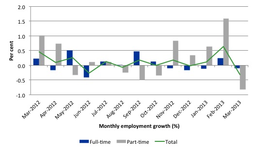
There have been considerable fluctuations in the full-time/part-time growth over the last year with regular crossings of the zero growth line.
The following graph shows the month by month growth in full-time (blue columns), part-time (grey columns) and total employment (green line) for the 12 months to March 2013 using seasonally adjusted data.
Today’s results just repeat the topsy-turvy nature of the data over the period shown.
While full-time and part-time employment growth are fluctuating around the zero line, total employment growth is still well below the growth that was boosted by the fiscal-stimulus in the middle of 2010.
The following table provides an accounting summary of the labour market performance over the last six months. The monthly data is highly variable so this Table provides a longer view which allows for a better assessment of the trends. WAP is working age population (above 15 year olds). The first three columns show the number of jobs gained or lost (net) in the last six months.
The conclusion – overall only 68.8 thousand jobs (net) have been created in Australia over the last six months (heavily influenced by the February 2013 result). Over the last six months, full-time employment has fallen by 7.3 thousand jobs (net) while part-time work has grown by 76.1 thousand jobs (111 per cent of the total).
The Working Age Population has risen by 186 thousand in the same period while the labour force rose by 88.4 thousand. The weak employment growth has thus not been able to keep pace with the underlying population growth and unemployment has risen as a result (by 20 thousand).
The rise in unemployment has been much higher had not the participation rate fallen by 0.175 percentage points (see detailed analysis below).
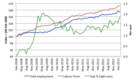
To put the recent data in perspective, the following graph shows the movement in the labour force and total employment since the low-point unemployment rate month in the last cycle (February 2008) to March 2013. The two series are indexed to 100 at that month. The green line (right-axis) is the gap (plotted against the right-axis) between the two aggregates and measures the change in the unemployment rate since the low-point of the last cycle (when it stood at 4 per cent).
You can see that the labour force index has largely levelled off and now falling and the divergence between it and employment growth has been relatively steady over the last several months with this month showing some improvement.
The Gap series gives you a good impression of the asymmetry in unemployment rate responses even when the economy experiences a mild downturn (such as the case in Australia). The unemployment rate jumps quickly but declines slowly.
It also highlights the fact that the recovery is still not strong enough to bring the unemployment rate back down to its pre-crisis low. You can see clearly that the unemployment rate fell in late 2009 and then has hovered at the same level for some months before rising again over the last several months.
The gap shows that the labour market is still a long way from recovering from the financial crisis that hit in early 2008. There hasn’t been much progress since January 2010, when the fiscal stimulus started to run out.
Teenage labour market – remains in a parlous state
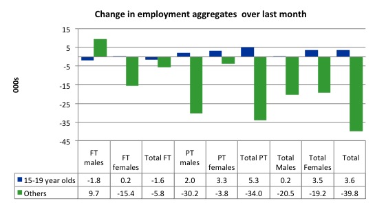
Full-time employment for teenagers fell by 1.6 thousand in March 2013 and part-time employment grew by 5.6 thousand, resisting the economy-wide decline in part-time employment. Overall, teenage employment increased by 3.6 thousand, which reverses the trends in recent month, although the continuing decline in full-time work is a major worry.
The following graph shows the distribution of net employment creation in the last month by full-time/part-time status and age/gender category (15-19 year olds and the rest)
Over the last month, teenagers gained 3.6 thousand jobs while the rest of the workforce lost 39.8 thousand jobs.
If you take a longer view you see how poor the situation is.
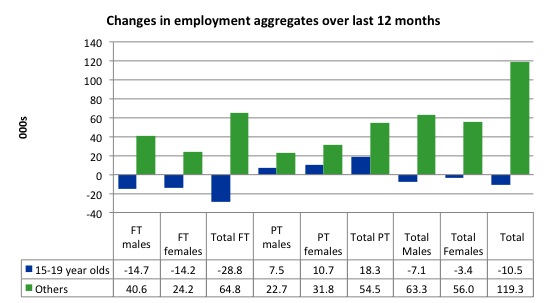
Over the last 12 months, teenagers have lost 10.5 thousand net jobs overall which the rest of the labour force have gained 119.3 thousand net jobs. This is a very poor annual growth in employment overall.
Teenagers have lost a massive 28.8 thousand full-time opportunities and gained 18.3 thousand part-time opportunities in net terms.
So the Australian labour market continues to undermine the opportunities for this cohort over the last year.
The teenage segment of the labour market is being particularly dragged down by the sluggish employment growth, which is hardly surprising given that the least experienced and/or most disadvantaged (those with disabilities etc) are rationed to the back of the queue by the employers.
The following graph shows the change in aggregates over the last 12 months. Australian teenagers are going backwards which is a trend common around the world at present.
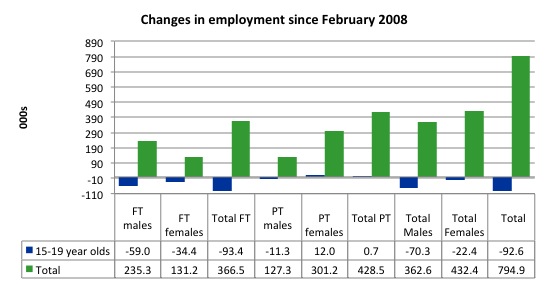
To further emphasise the plight of our teenagers I compiled the following graph that extends the time period from the February 2008, which was the month when the unemployment rate was at its low point in the last cycle, to the present month (March 2013). So it includes the period of downturn and then the “recovery” period. Note the change in vertical scale compared to the previous two graphs.
The results are stunning and represent a major policy failure.
Since February 2008, there have been 794.9 thousand (net) jobs added to the Australian economy but teenagers have lost a staggering 92.6 thousand over the same period. It is even more stark when you consider that 93.4 thousand full-time teenager jobs have been lost in net terms. Even in the traditionally, concentrated teenage segment – part-time employment – there have been only 700 jobs (net) gained even though overall some 428.5 thousand part-time jobs have been added.
Overall, the total employment increase is modest. Further, around 54 per cent of the total (net) jobs added since February 2008 have been part-time, which raises questions about the quality of work that is being generated overall.
Overall, the performance over the last 12 months is poor and should receive a much higher priority in the policy debate than it does.
The longer-run consequences of this teenage “lock out” will be very damaging.
The Australian government has no coherent strategy to resolve this appalling state. Ensuring teenagers are included in paid work, if they do not desire to remain in school, should be a number one policy priority.
The Government’s response is to push this cohort into endless training initiatives (supply-side approach) without significant benefits. The research shows overwhelmingly that job-specific skills development should be done within a paid-work environment.
I would recommend that the Australian government announce a major public sector job creation program aimed at employing, in the first instance, all the unemployed 15-19 year olds.
It is clear that the Australian labour market continues to fail our 15-19 year olds. At a time when we keep emphasising the future challenges facing the nation in terms of an ageing population and rising dependency ratios the economy still fails to provide enough work (and on-the-job experience) for our teenagers who are our future workforce.
Unemployment
The unemployment rate rose by 0.2 percentage points to 5.6 per cent in March 2013 and official unemployment rose by 25,900 – a sharp 3.9 per cent rise. The rise in unemployment would have been larger (see analysis next section) had not the participation rate fallen by 0.2 percentage points.
Employment growth is slowing and failing to keep pace with the underlying population growth. The sharp rise in unemployment is disturbing and could be revealing an acceleration in the economic contraction that has been emerging over the last 12 months.
Overall, the labour market still has significant excess capacity available in most areas and what growth there is is not making any major inroads into the idle pools of labour. However, it is probably reasonable to conclude that hidden unemployment fell a little in March 2013.
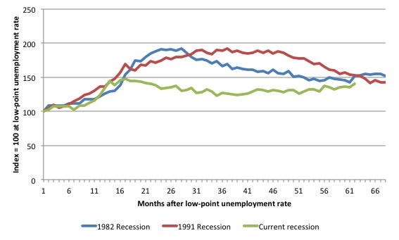
The following graph updates my 3-recessions graph which depicts how quickly the unemployment rose in Australia during each of the three major recessions in recent history: 1982, 1991 and 2009 (the latter to capture the 2008-2010 episode). The unemployment rate was indexed at 100 at its lowest rate before the recession in each case (January 1981; January 1989; April 2008, respectively) and then indexed to that base for each of the months as the recession unfolded.
I have plotted the 3 episodes for 68 months after the low-point unemployment rate was reached with the current episode now in its 61st month. For 1991, the end-point shown is the peak unemployment which was achieved some 38 months after the downturn began although the recovery was painfully slow. While the 1982 recession was severe the economy and the labour market was recovering by the 26th month. The pace of recovery for the 1982 once it began was faster than the recovery in the current period.
It is significant that the current situation while significantly less severe than the previous recessions is dragging on which is a reflection of the lack of private spending growth and declining public spending growth.
The graph provides a graphical depiction of the speed at which the recession unfolded (which tells you something about each episode) and the length of time that the labour market deteriorated (expressed in terms of the unemployment rate).
From the start of the downturn to the 62-month point (to March 2013), the official unemployment rate has risen from a base index value of 100 to a value 141 – peaking at 148 after 17 months. After falling steadily as the fiscal stimulus pushed growth along (it reached 122.8 after 35 months – in January 2010), it has been slowly trending up for some months now. Unlike the other episodes, the current trend, at this stage of the cycle, is upwards.
The gains that emerged in the recovery as a result of the fiscal stimulus in 2009-10 are now being lost.
At 61 months, 1982 index stood at 151.9 and was falling, while the 1991 index was at 153.2 and was also falling. It is clear that at an equivalent point in the “recovery cycle” the current period is more sluggish than our recent two major downturns.
It now appears that the recoveries are converging, which tells us that the current policy has failed to take advantage of the fact that the latest economic downturn was much more mild than the previous recessions. In other words, the policy failure is locking the economy into a higher unemployment rate than is desirable and otherwise attainable.
Note that these are index numbers and only tell us about the speed of decay rather than levels of unemployment. Clearly the 5.4 per cent at this stage of the downturn is lower that the unemployment rate was in the previous recessions at a comparable point in the cycle although we have to consider the broader measures of labour underutilisation (which include underemployment) before we draw any clear conclusions.
The notable aspect of the current situation is that the recovery is very slow.
Aggregate participation rate fell in March 2013
The participation rate fell by 0.2 percentage points in March continuing the decline which was punctuated by an improvement in February. It is now at 65.1 per cent. The rise in participation meant that unemployment would have been 34.7 thousand persons higher than the official level had the labour force remained static and given the actual employment growth.
We can assume that hidden unemployment has risen by something close to 34.7 thousand persons in March 2013 as the employment prospects for workers continue to diminish. The participation rate is still substantially down on the most recent peak of 66 per cent (January 2010) when the labour market was gathering pace courtesy of the fiscal stimulus.
In the current month, the unemployment rate rose to 5.6 per cent. What would have the unemployment rate been had the participation rate not risen?
The labour force is a subset of the working-age population (those above 15 years old). The proportion of the working-age population that constitutes the labour force is called the labour force participation rate. So changes in the labour force can impact on the official unemployment rate and so movements in the latter need to be interpreted carefully. A rising unemployment rate may not indicate a recessing economy.
The labour force can expand as a result of general population growth and/or increases in the labour force participation rates.
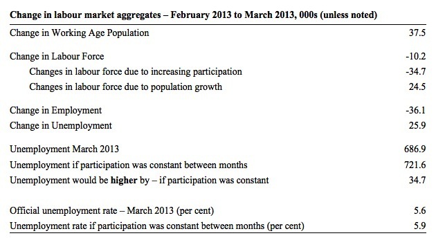
The following Table shows the breakdown in the changes to the main aggregates (Labour Force, Employment and Unemployment) and the impact of the rise in the participation rate.
In March 2013, employment fell by 36.1 thousand while the labour force contracted by 10.1 thousand persons. As a result, unemployment rose by 25.9 thousand.
The labour force rise in February was the outcome of two separate factors:
- The underlying population growth added 24.5 thousand persons to the labour force. The population growth impact on the labour force aggregate is relatively steady from month to month; and
- The fall in the participation rate meant that 34.7 thousand workers left the labour force (relative to what would have occurred had the participation rate remained unchanged).
So while employment growth failed to keep pace with the underlying population growth, the falling participation took the pressure off somewhat (by 34.7 thousand) as workers exited the labour force and were taken out of the official unemployment count.
If the participation rate had not have risen, total unemployment, at the current employment level, would have been 721.6 thousand rather than 686.9 thousand as recorded by the ABS.
Thus, without the rise in the participation rate, the unemployment rate would have actually risen to 5.9 per cent rather than 5.6 per cent. At the start of this year, I forecast that by year’s end Australia would see a 6 per cent unemployment rate. That is still looking like a reality.
The conclusion is that hidden unemployment rose and this attenuated the rise in the official unemployment rise. In functional terms this signals an much worse deterioration in the conditions than signalled by the 0.2 point rise in the official unemployment rate.
Hours worked fell in March 2013
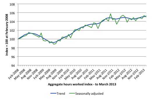
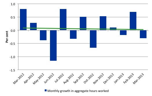
Aggregate monthly hours worked decreased by 5 million hours (0.31 per cent) in seasonally adjusted terms although the trend over the last 12 months is pointing down. The fall in hours worked this month continues the trends over several months of growth being interspersed with contraction with a slightly downward trend apparent.
The small swings up and down in monthly hours worked each month since the beginning of 2011 is being driven by similar fluctuations in full-time employment.
The following graph shows the trend and seasonally adjusted aggregate hours worked indexed to 100 at the peak in February 2008 (which was the low-point unemployment rate in the previous cycle). The rising trend which marked the early recovery courtesy of the fiscal stimulus is now clearly gone.
The next graph shows the monthly growth (in per cent) over the last 12 months. The green linear line is a simple regression trend – basically flat – that is if you can find it running along the horizontal axis. You can see the pattern in working hours that is also portrayed in the employment graph – zig-zagging across the zero growth line. The economy is now starting to slow down as private spending growth is slowing and being exacerbated by the fiscal contraction.
Once again the data doesn’t support the notion of a fully employed labour market that is bursting against the inflation barrier.
Conclusion
Overall, today’s data was very poor on all fronts – employment fell, full-time employment fell, unemployment rose, participation fell and aggregate monthly hours worked fell.
There is nothing good that can be said about those movements. The labour market remains weak and the employment gap is substantial.
Despite the respite last month, Australia is continuing to experience a sluggish pattern of employment growth, fluctuating participation rates and rising unemployment, which has defined the last 18-24 months or so.
We always have to be careful interpreting month to month movements given the way the Labour Force Survey is constructed and implemented.
The most striking aspect of a sad picture remains the appalling performance of the teenage labour market. Employment has collapsed for that cohort and things became worse in March 2013. Even with the overall surge in part-time work, teenagers still went backwards. The trend has been clear since 2008. and I consider it a matter of policy urgency for the Government to introduce an employment guarantee to ensure we do not continue undermining our potential workforce.
The data certainly doesn’t support the Federal Government’s current macroeconomic settings, which are biased towards contraction. More fiscal stimulus is definitely needed and now.
That is enough for today!
(c) Copyright 2013 Bill Mitchell. All Rights Reserved.

More stimulus is certainly needed now, but it doesnt have to be fiscal. I think a monetary stimulus would actually be better for australia right now, as it would help return our dollar to the level that the balance of trade would justify, and it would reduce our net debt.
It’s so volatile month to month that I don’t even bother with the s.a. numbers – I focus on the trend. And the trend isn’t great!
Aidan either knows something about the import elasticity of demand we don’t or he’s downshifted into neo-liberal mode.
Bill I’m interested to see an hours worked per head graph, wouldn’t this show declining work opportunities?
Off topic.
Listening to the wireless this morning.
The IMFs mission chief to Ireland Ajai Chopra was on state radio this morning.
He said the austerity policy was a bit of a mistake………..
Sorry about that lads.
The interviewer asked him does he accept responsibility ?
He said yes “but he was in good company” and he just reports to the top (Geithner I imagine or some hidden deep actors)
I will try to publish this when /if RTE radio puts this online
This is a problem I have with MMT going back to World War 1 and indeed the 19th century
Modern treasuries via the IMF become global banking lobbyists.
Banks should have nothing I repeat NOTHING to do with state fiat.
PS
He must also read this blog
If I remember correctly he said Ireland is dependent on global trade growth.
He said global trade growth has dived this past year………..
We are dead men walking me thinks – this man is clearing his throat to cover his ass.
Ireland does not have a rational domestic economy.
Its domestic economy is solely a offshoot of gross international trade flows and thus very input heavy / labour light in its structure.
Indeed It had no semi- rational domestic economy since we left the sterling peg in 1979 ! so as to get in the Eurotrash club.
What is to become of us ?
http://www.rte.ie/radio/utils/radioplayer/rteradioweb.html#!rii=0%3A20186732%3A0%3A%3A
What exactly are we dealing with here ?
Me thinks a post 1648 aristocracy which needs a fiat king to take the bastards on.
Aidan / Alan Dunn
In terms of the monetary response, me thinks interest rates are already low enough. It seems to me that money demand is improving so need to be careful here. Part the AUD’s overvaluation is other central banks using it as a safe haven currency. They’re more interested in the AAA rating than they are the yield differential. [Analysts are putting this as about 10 to 15 cents worth of the overvaluation.] This safe haven status for a resources economy will turn out be a temporary phenomena. The terms of trade decline will utltimately come to dominate.
Let’s slash taxes for everyone who earn less than $250k and pay large subsidies to those with very low incomes (as during the GFC) and watch this place rebound.
Sorry the speaker was the IMF economist Ashoka Mody’s
http://www.neurope.eu/blog/rolling-dice-cyprus
When I am not seeing red I just see the US , UK &French banks changing tack so as to redirect real resources towards their base of operations.
Now the story is one of deserving little deposits vs not so deserving large deposits.
Its so obvious now – its almost painful to watch
Sorry, the interview
http://www.rte.ie/news/morningireland/player.html?20130411,20187082,20187082,flash,232
Alan Dunn, do you really not know what I do about import elasticity of demand? (That seems to be a rather confusingly worded phrase BTW.) Are you unaware that the high dollar is making manufacturers uncompetitive? Did you miss the fact that isn’t because our other industries are supercompetitive at thie moment, but rather because banks have chosen to park their money in Australia? Did you overlook the implication that because of this we’re payinng huge interest bills to overseas instead of financing things ourselves?
Alan Dunn, surely by now a lot of them have cottoned on to the fact that a AAA credit rating for a sovereign currency issuer in its own currency means almost nothing? Not completely nothing, of course, because some haven’t, but it’s far less significant than yield differential.
Money demand may be improving, but today’s figures prove its not improving enough.
(Sorry, I wrote the above when very tired. The second paragraph shd be directed to Esp Ghia.)
Aidan, not sure if you are still tired but it reads like you agree with me on the AUD. Or are you saying that central banks would pile into Aussie securities regardless of the S&P et al. (phony) ratings? Either way, there’s nothing to stop them from taking flight.
As for the jobs numbers, if you believe yesterday’s bad numbers then you must also believe last month’s even better numbers. I pay more attention to the trend data, though the market trades off the headline seasonally adjusted figures.
fwiw, I think the AUD will be below parity by year’s end.
Esp Ghia, I’m saying the ratings play only a minor role in its attractiveness. Central banks would pile in regardless, commercial banks would pile in regardless, and Australian commercial banks would source plenty of money from overseas regardless – the rate differential is the main driver.
If the Libs get in at the next election and implement a program of cuts, Australia’s at risk of falling into recession – in which case the Aussie dollar is likely to fall below parity. Otherwise I don’t expect it to fall quite that much (Australia’s long term outlook is good) but there’s no good reason for keeping it as high as it is.
Since deficit spending by the monetary sovereign is akin to gold-mining under a gold-standard, it is odd and even sinister that a country with as much mining history as Australia does not recognize the need for it.