The Australian Bureau of Statistics (ABS) released the latest labour force data today (APRIL 16,…
Australian labour force data – some respite
After several months of very poor labour market news, today’s release by the Australian Bureau of Statistics (ABS) of the Labour Force data for February 2013 provides some respite. In fact, all the main indicators moved in a virtuous direction, which is a welcome outcome. Caution is required in interpreting monthly data movements as the standard errors are larger than most would imagine. But there was a sharp rise in total employment reported by the ABS, the participation rate rose and monthly hours of work improved. Most of the rise in employment was in part-time jobs. This is the first month in several that employment growth has outstripped the underlying population growth rate. The unemployment rate remained unchanged at 5.4 per cent but would have been 0.3 points lower had the participation rate not risen. So unemployment rose a little and hidden unemployment fell more. However, the continuing negative feature that should warrant immediate policy concern is the appalling state of the youth labour market. The 15-19 year old segment of the labour market continued to deteriorate even though part-time job opportunities surged. That is a deeply disturbing sign. Overall there are still at least 12.5 per cent of the willing work force without work (either unemployed or underemployed). So there is still a massive job shortage and today’s data shows that in February only a tiny fraction of that shortage was reduced. We will also await revisions!
The summary ABS Labour Force (seasonally adjusted) estimates for February 2013 are:
- Employment increased 71,500 (0.6 per cent) with full-time employment rising by 17,800 and part-time employment rising by a substantial 53,700.
- Unemployment increased 400 (0.1 per cent) to 660,000.
- The official unemployment rate remained unchanged at 5.4 cent.
- The participation rate rose by 0.3 points to 65.5 per cent, which is the reason there were more unemployed. This probably signals a decline in hidden unemployment.
- Aggregate monthly hours worked increased 11.3 million hours (0.7 per cent).
- The quarterly ABS broad labour underutilisation estimates (the sum of unemployment and underemployment) came out in this release. The total labour underutilisation rate was rising and stood at 12.5 per cent. Underemployment was estimated to be 7.1 per cent or 869 thousand persons.
The ABC National News Report – Positive jobs surprise to ‘sideline’ Reserve Bank – noted that:
A shock addition of 71,500 jobs in February has confounded economists and left unemployment steady at 5.4 per cent.
I will put my hand up as one of the confounded economists! The data is stronger than could reasonably be expected given the other indicators that have been coming out.
Most of my colleagues would agree that monthly shifts like this are suspicious and likely to be revised. But that shouldn’t be taken to mean that I think there has been no improvement.
The ABS publishes standard errors of its estimates in its – Labour Force, February 2013 – publication. The estimates provided by the ABS are “based on a sample survey” and are “subject to sampling variability”.
Standard errors are a statistical measure of that variability. Statisticians construct what are called confidence intervals to provide a range over which they are confident that the true estimate from the population would lie. A standard level of confidence is the 95 per cent interval.
The ABS tell us that:
There is a 95% chance that the true value of the estimate lies within that interval.
The following Table shows the confidence intervals for the seasonally adjusted data for the changes in the Labour Force aggregates between January 2013 and February 2013. For example, we can be equally confident that total employment rose by 71,500 (the point estimate published by the ABS) as we could be that it rose by 16,500 or 126,500.
In the case of unemployment, we would have equal confidence that it rose to 5.6 per cent or fell to 5.2 per cent as we have that it remained static at 5.4 per cent. The uncertainty over the shifts in the participation rate are even larger.
This is one reason why we have to be somewhat cautious when interpreting the monthly data published by the ABS. The best bet is that there has been some improvement in the labour market in February. How much? Take your pick within the confidence intervals.
Employment growth – improves this month but still weak on trend
The February data shows a welcome strengthening of employment growth and for the first time in many months it has outstripped the underlying population growth.
Total employment rose by 71.4 thousand (0.6 per cent). Full-time employment rose by 17,800, after three consecutive months of decline. Part-time employment rose by 53,700. Part-time employment growth has been strengthening over the last 3 months.
Over the last 6 months, 70.7 per cent of the net employment opportunities created have been part-time.
Today’s data reasserts the message that the labour market data is switching back and forth regularly between negative employment growth and positive growth spikes. This monthly behaviour is producing a weak positive trend, although not too much should be read into one month’s results.
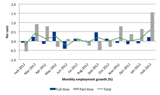
There have been considerable fluctuations in the full-time/part-time growth over the last year with regular crossings of the zero growth line.
The following graph shows the month by month growth in full-time (blue columns), part-time (grey columns) and total employment (green line) for the 12 months to February 2013 using seasonally adjusted data.
Today’s results just repeat the topsy-turvy nature of the data over the period shown.
While full-time and part-time employment growth are fluctuating around the zero line, total employment growth is still well below the growth that was boosted by the fiscal-stimulus in the middle of 2010.
The following table provides an accounting summary of the labour market performance over the last six months. The monthly data is highly variable so this Table provides a longer view which allows for a better assessment of the trends. WAP is working age population (above 15 year olds). The first three columns show the number of jobs gained or lost (net) in the last six months.
The conclusion – overall only 125.5 thousand jobs (net) have been created in Australia over the last six months (heavily influenced by the February 2013 result). Only 36.8 thousand full-time have been created (overall) and 88.7 thousand part-time jobs (70.7 per cent of the total).
The Working Age Population has risen by 174 thousand in the same period while the labour force rose by 161 thousand. The weak employment growth has thus not been able to keep pace with the underlying population growth and unemployment has risen as a result (by 36 thousand).
The rise in unemployment has been lower had not the participation rate risen (by 0.255 percentage points) – most of that in the last month (see detailed analysis below).
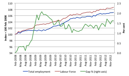
To put the recent data in perspective, the following graph shows the movement in the labour force and total employment since the low-point unemployment rate month in the last cycle (February 2008) to February 2013. The two series are indexed to 100 at that month. The green line (right-axis) is the gap (plotted against the right-axis) between the two aggregates and measures the change in the unemployment rate since the low-point of the last cycle (when it stood at 4 per cent).
You can see that the labour force index has largely levelled off and now falling and the divergence between it and employment growth has been relatively steady over the last several months with this month showing some improvement.
The Gap series gives you a good impression of the asymmetry in unemployment rate responses even when the economy experiences a mild downturn (such as the case in Australia). The unemployment rate jumps quickly but declines slowly.
It also highlights the fact that the recovery is still not strong enough to bring the unemployment rate back down to its pre-crisis low. You can see clearly that the unemployment rate fell in late 2009 and then has hovered at the same level for some months before rising again over the last several months.
The gap shows that the labour market is still a long way from recovering from the financial crisis that hit in early 2008. There hasn’t been much progress since January 2010, when the fiscal stimulus started to run out.
Teenage labour market – remains in a parlous state
The teenage labour market deteriorated further in February 2013 despite the general improvement in the overall labour market and the significant growth in overall part-time work.
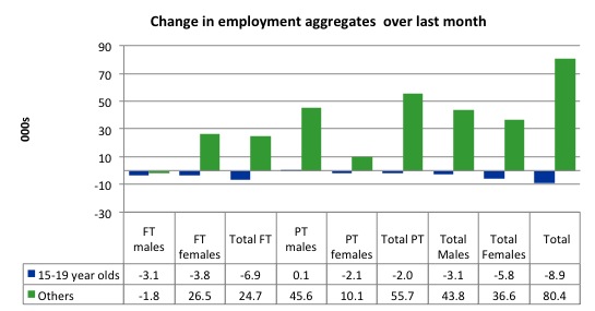
The following graph shows the distribution of net employment creation in the last month by full-time/part-time status and age/gender category (15-19 year olds and the rest)
Over the last month, teenagers lost 8.9 thousand jobs while the rest of the workforce gained 80.4 thousand jobs. Even though there was a surge in part-time work overall, teenagers still lost 2.1 thousand part-time jobs. They also lost 6.9 thousand full-time jobs (net) despite the rest of the labour force gaining 24.7 thousand full-time jobs
Taken together, this is a deeply disturbing result.
If you take a longer view you see how poor the situation is.
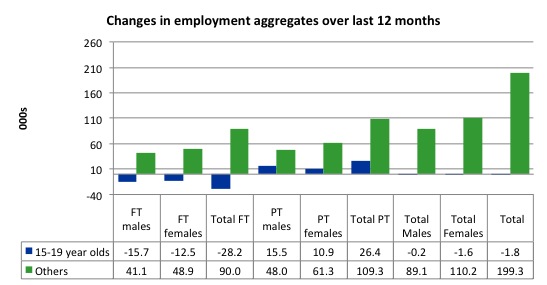
Over the last 12 months, teenagers have lost 1.8 thousand net jobs overall which the rest of the labour force have gained 199.3 thousand net jobs. Teenagers have lost a massive 28.2 thousand full-time opportunities and gained 26.4 thousand part-time opportunities in net terms.
So the Australian labour market has further undermined the opportunities for this cohort over the last year.
The teenage segment of the labour market is being particularly dragged down by the sluggish employment growth, which is hardly surprising given that the least experienced and/or most disadvantaged (those with disabilities etc) are rationed to the back of the queue by the employers.
The following graph shows the change in aggregates over the last 12 months. Australian teenagers are going backwards which is a trend common around the world at present.
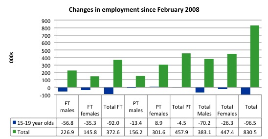
To further emphasise the plight of our teenagers I compiled the following graph that extends the time period from the February 2008, which was the month when the unemployment rate was at its low point in the last cycle, to the present month (February 2013). So it includes the period of downturn and then the “recovery” period. Note the change in vertical scale compared to the previous two graphs. That tells you something!
The results are stunning and represent a major policy failure.
Since February 2008, there have been 830.5 thousand (net) jobs added to the Australian economy but teenagers have lost a staggering 96.5 thousand over the same period. It is even more stark when you consider that 92 thousand full-time teenager jobs have been lost in net terms. Even in the traditionally, concentrated teenage segment – part-time employment – there have been 4.5 thousand jobs (net) lost.
Further, around 55 per cent of the total (net) jobs added since February 2008 have been part-time, which raises questions about the quality of work that is being generated overall.
Overall, the performance over the last 12 months is poor and should receive a much higher priority in the policy debate than it does.
The longer-run consequences of this teenage “lock out” will be very damaging.
The Australian government has no coherent strategy to resolve this appalling state. Ensuring teenagers are included in paid work, if they do not desire to remain in school, should be a number one policy priority.
The Government’s response is to push this cohort into endless training initiatives (supply-side approach) without significant benefits. The research shows overwhelmingly that job-specific skills development should be done within a paid-work environment.
I would recommend that the Australian government announce a major public sector job creation program aimed at employing, in the first instance, all the unemployed 15-19 year olds.
It is clear that the Australian labour market continues to fail our 15-19 year olds. At a time when we keep emphasising the future challenges facing the nation in terms of an ageing population and rising dependency ratios the economy still fails to provide enough work (and on-the-job experience) for our teenagers who are our future workforce.
Unemployment
The unemployment rate remained unchanged at 5.4 in February 2013 and official unemployment rose by 400. Given that employment growth outstripped the underlying population growth for the first time in many months, the rise in unemployment was all due to the rise in the participation rate. That sort of conjunction of events is a good sign.
Overall, the labour market still has significant excess capacity available in most areas and what growth there is is not making any major inroads into the idle pools of labour. However, it is probably reasonable to conclude that hidden unemployment fell a little in February 2013.
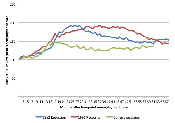
The following graph updates my 3-recessions graph which depicts how quickly the unemployment rose in Australia during each of the three major recessions in recent history: 1982, 1991 and 2009 (the latter to capture the 2008-2010 episode). The unemployment rate was indexed at 100 at its lowest rate before the recession in each case (January 1981; January 1989; April 2008, respectively) and then indexed to that base for each of the months as the recession unfolded.
I have plotted the 3 episodes for 68 months after the low-point unemployment rate was reached with the current episode now in its 61st month. For 1991, the end-point shown is the peak unemployment which was achieved some 38 months after the downturn began although the recovery was painfully slow. While the 1982 recession was severe the economy and the labour market was recovering by the 26th month. The pace of recovery for the 1982 once it began was faster than the recovery in the current period.
It is significant that the current situation while significantly less severe than the previous recessions is dragging on which is a reflection of the lack of private spending growth and declining public spending growth.
The graph provides a graphical depiction of the speed at which the recession unfolded (which tells you something about each episode) and the length of time that the labour market deteriorated (expressed in terms of the unemployment rate).
From the start of the downturn to the 61-month point (to February 2013), the official unemployment rate has risen from a base index value of 100 to a value 136 – peaking at 148 after 17 months. After falling steadily as the fiscal stimulus pushed growth along (it reached 122.8 after 35 months – in January 2010), it has been slowly trending up for some months now. Unlike the other episodes, the current trend, at this stage of the cycle, is upwards.
At 61 months, 1982 index stood at 142.4 and was falling, while the 1991 index was at 154.5 and was also falling. It is clear that at an equivalent point in the “recovery cycle” the current period is more sluggish than our recent two major downturns.
It now appears that the recoveries are converging, which tells us that the current policy has failed to take advantage of the fact that the latest economic downturn was much more mild than the previous recessions. In other words, the policy failure is locking the economy into a higher unemployment rate than is desirable and otherwise attainable.
Note that these are index numbers and only tell us about the speed of decay rather than levels of unemployment. Clearly the 5.4 per cent at this stage of the downturn is lower that the unemployment rate was in the previous recessions at a comparable point in the cycle although we have to consider the broader measures of labour underutilisation (which include underemployment) before we draw any clear conclusions.
The notable aspect of the current situation is that the recovery is very slow.
Broader labour underutilisation
The ABS published its quarterly broad labour underutilisation measures in this data release.
Total underemployment remained at 7.1 per cent and the ABS broad labour underutilisation rate was at 12.5 per cent (the sum of unemployment and underemployment). Earlier this week we estimated that if hidden unemployment is added to this figure the best-case scenario would see a 13.4 per cent underutilisation rate. This was likely to be a very conservative estimate.
Please read my blog – Australian labour underutilisation rate is at least 13.4 per cent – for more discussion on this point.
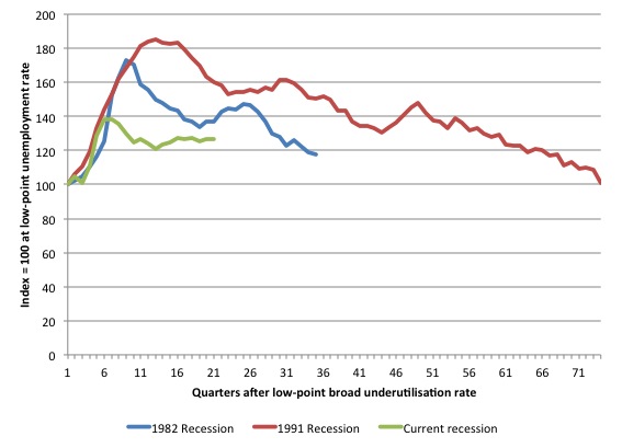
The following graph shows the same type of indexes as the previous graph except it uses the ABS broad labour underutilisation rate (unemployment plus underemployment). It also is in terms of quarters rather than months.
We also show the full evolution of the the 1982 and 1991 episodes from the low-point (= 100) through the peak and back to the next low-point. In the case of the 1982 recession the index had risen to a peak of 172.8 in May 1983 (a broad underutilisation rate of 14.4 per cent) and then fell back to 9.8 per cent by November 1989 (index value 117.4).
At that point, the cycle turned down again signalling the beginning of the 1991 recession. That cycle reached a peak of 185 (or 18.1 per cent in November 1992) and it took until February 2008 for it to reach the low-point of 9.9 percent (an index value of 100.9). That point marked the beginning of the next cycle.
That should tell you how severe the 1991 recession was and how asymmetric the labour market response is on either side of the cycle. From its start in November 1989 it took 74 quarters (18.5 years) to return to more or less that level.
In terms of the three recession comparison, at the same period in the recovery (using quarterly data), the broad labour underutilisation rate (unemployment plus underemployment) had an index value of 137.2 in the 1982 recession (absolute value of 11.4 per cent); an index value of 159.9 in the 1991 recession (absolute value of 15.7 per cent); and an index value of 126.6 in the current period (absolute value of 12.5 per cent).
So while the level of unemployment is much lower now than in the 1982 recession (at a comparable stage), underemployment is now much higher and so the total labour underutilisation rates is higher. But the 1982 recovery in broad underutilisation terms was more robust than the current stagnating situation.
Commentators who think of the 1982 recession as severe, rarely see it in these terms. Joblessness is probably worse than underemployment but both mean that labour is wasted and income earning opportunities are being foregone. For a worker with extensive nominal commitments, the loss of income when hours are rationed may be no less severe than the loss of hours involved in unemployment, if the threshold of solvency is breached.
Aggregate participation rate rose in February
The participation rate rose by 0.3 percentage points in February after two months of decline. It is now at 65.3 per cent. The rise in participation meant that unemployment was 36.8 thousand persons higher than it would have been had the labour force remained static and given the actual employment growth. The other way of saying that is that unemployment would have fallen by 36.8 thousand instead of rising by 400 had not the extra workers come into the labour force.
While the rise in participation signals a drop in hidden unemployment (and perhaps improving employment prospects for some workers), the participation rate is still substantially down on the most recent peak of 66 per cent (January 2010) when the labour market was gathering pace courtesy of the fiscal stimulus.
In the current month, the unemployment rate remained unchanged at 5.4 per cent. What would have the unemployment rate been had the participation rate not risen?
The labour force is a subset of the working-age population (those above 15 years old). The proportion of the working-age population that constitutes the labour force is called the labour force participation rate. So changes in the labour force can impact on the official unemployment rate and so movements in the latter need to be interpreted carefully. A rising unemployment rate may not indicate a recessing economy.
The labour force can expand as a result of general population growth and/or increases in the labour force participation rates.
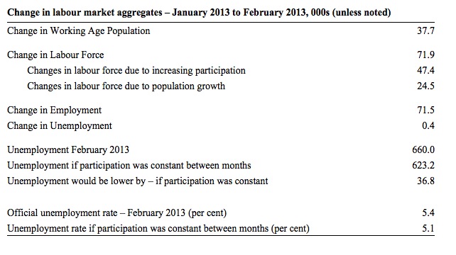
The following Table shows the breakdown in the changes to the main aggregates (Labour Force, Employment and Unemployment) and the impact of the rise in the participation rate.
In February 2013, employment rose by 71,500 while the labour force grew by 719 thousand persons. As a result, unemployment rose by 400.
The labour force rise in February was the outcome of two separate factors:
- The underlying population growth added 24.5 thousand persons to the labour force. The population growth impact on the labour force aggregate is relatively steady from month to month; and
- The rise in the participation rate meant that 47.4 thousand workers entered the labour force (relative to what would have occurred had the participation rate remained unchanged).
So while employment growth was able to more than match the underlying population growth, the rising participation soaked up the remainder (47.4 thousand) and unemployment rose.
If the participation rate had not have risen, total unemployment, at the current employment level, would have been 623.2 thousand rather than 660 thousand as recorded by the ABS.
Thus, without the rise in the participation rate, the unemployment rate would have been 5.1 per cent rather than 5.4 per cent as officially published.
The conclusion is that hidden unemployment fell and this added pressure to the official unemployment rise. In functional terms this signals an overall improvement in the labour market.
Hours worked rose in February 2013
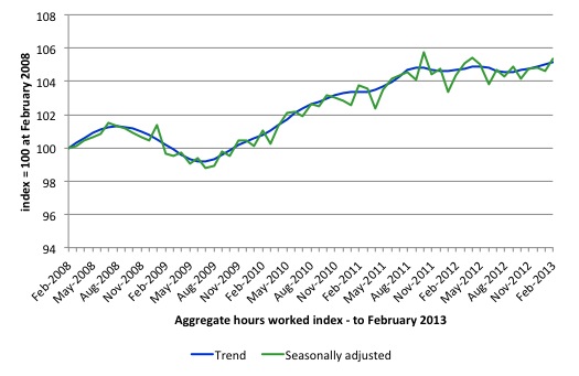
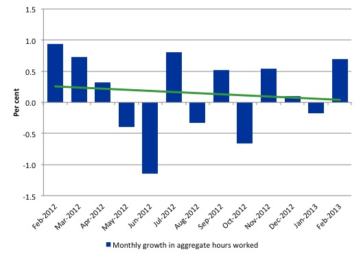
Aggregate monthly hours worked increased 11.3 million hours (0.7 per cent) in seasonally adjusted terms although the trend over the last 12 months is pointing down. The rise in hours worked this month has to be seen in terms of several months of falling hours (interspersed with growth).
The small swings up and down in monthly hours worked each month since the beginning of 2011 is being driven by similar fluctuations in full-time employment.
The following graph shows the trend and seasonally adjusted aggregate hours worked indexed to 100 at the peak in February 2008 (which was the low-point unemployment rate in the previous cycle). The rising trend which marked the early recovery courtesy of the fiscal stimulus is now clearly gone.
The next graph shows the monthly growth (in per cent) over the last 12 months. The green linear line is a simple regression trend – basically flat – that is if you can find it running along the horizontal axis. You can see the pattern in working hours that is also portrayed in the employment graph – zig-zagging across the zero growth line. The economy cannot get any head of steam up as any growth in private spending is being offset by the fiscal contraction.
Once again the data doesn’t support the notion of a fully employed labour market that is bursting against the inflation barrier.
Conclusion
Overall, today’s data was a welcome respite from the sluggish news that has come out over the last year or more. The labour market remains weak and the employment gap is substantial.
But for once month at least employment growth was stronger than the underlying population growth. The only reason that unemployment didn’t fall (but rose modestly) is because there was a rise in the participation rate. That suggests that there might have been a slight reduction in hidden unemployment.
One month of respite, however, does not alter the fact that we have seen a sluggish pattern of employment growth and fluctuating participation rates over the 18-24 months or so. We will need several months of this sort of performance before we might conclude the labour market is on the improve.
We always have to be careful interpreting month to month movements given the way the Labour Force Survey is constructed and implemented.
The most striking aspect of a sad picture remains the appalling performance of the teenage labour market. Employment has collapsed for that cohort and things became worse in February 2013. Even with the overall surge in part-time work, teenagers still went backwards. The trend has been clear since 2008. and I consider it a matter of policy urgency for the Government to introduce an employment guarantee to ensure we do not continue undermining our potential workforce.
The data certainly doesn’t support the Federal Government’s current macroeconomic settings, which are biased towards contraction. More fiscal stimulus is definitely needed.
Taxes and the dole
On a related topic, I was driving to Melbourne Airport early yesterday and heard a segment on the early ABC current affairs program AM (March 13, 2013) – Cameron calls for new tax to boost dole – where a government senator was rightfully implicating his own party in government in despicable behaviour towards to the poor in Australia.
He suggested that “forcing people into poverty” was against traditional Labor values and the Government should introduce a new tax “to pay for an increase in Newstart” (Newstart is the unemployment benefit paid by the Federal government to the unemployed).
Senator Cameron told AM:
Australian children are being forced into poverty because of the Government’s decision to move single parents from the single parent payment to Newstart at the start of this year.
I last wrote about the appalling policy position taken by the Federal Labor government in this blog – Australia’s own little fiscal cliff – and explicitly analysed the changes in policy that the senator was referring to.
When asked whether he thought that Government “policy is driving children into poverty” he replied:
There’s no doubt about it.
The interview then went like this:
SAMANTHA HAWLEY: Acknowledging the pressures on the budget, Senator Cameron says revenue could be raised via a Medicare style tax so the Newstart payment can be increased by $50 a week.
DOUG CAMERON: We should have a look at this whole rorting of trusts that, you know, skims, multi-millions if not billions out of the tax system. We should widen and deepen the MRRT. And we should look at some hypothecated taxes.
Which tells you that the senator has his heart in the right place but his head hasn’t followed suit.
Australia has a massive pool of underutilised labour and our national growth rate is well below trend. Doug Cameron should be better read and understand the principles of functional finance.
A government should levy a tax to “raise revenue” not to pay for its spending program but to prevent the non-government sector from spending. Taxes (other than those designed for specific purposes such as tobacco taxes to reduce smoking) undermine spending (private) rather than facilitate spending (public).
The only reason that the Australian government should consider raising taxes now would be if they thought the non-government sector had too much spending capacity. The reality is that there is not enough private spending occurring and the manifestation of that is the below trend growth and the huge pool of underutilised labour.
The government might usefully increase the unemployment benefits to provide an income support regime that doesn’t drive people into poverty just because they cannot find a job and cut taxes to encourage more private spending (or saving to reduce excessive private debt levels).
It can do both of those things given the room for expansion that currently exists in the economy.
That is enough for today!
(c) Copyright 2013 Bill Mitchell. All Rights Reserved.


How does a state that is supposed be not far above or perhaps even in recession contribute about half of a very good monthly result?
The revision might be interesting.
Lefty, are you talking about Victoria?
Yes that’s the one Esp. Though I do see that job agencies such as SEEK recorded a significant rise in vacancies in Victoria around Dec/Jan (and a correspondingly sharp fall in Feb) and DEEWR recorded a bit of an uptick. But the size of the move is supposedly the biggest monthly gain in over a decade, beating any of the monthly gains that were made during the roaring, pre-GFC economic boom days, which seems a tad unusual.
I tend to suspect that there was a real improvement in January but that the size of it has been significantly exaggerated by some combination of statistical factors. What do you think?
At the national level the market was expecting 10k…and got 71.5k! I think Bill’s analysis is spot on other than to say that the limited data data we have so far for Jan and Feb has been very positive. A quick glance at share price rises for JB, Myer and the much-hated Harvey-Norman suggest that discretionary spending is clearly higher and this bodes well for employment.
As for Vic, the bigger (louder) companies are still cutting jobs but there is anecdotal evidence that small and medium sized businesses (the real drivers of growth in the pvt sector) are hiring big time. Why? Money demand is strengthening and so the accommodative monetary policy stance is finally having an impact. House prices are rising again (though construction’s lagging) and with equity markets higher, the wealth effect is also starting to come through.
My view is that the economy (as well as the US for that matter) bottomed in the December quarter. In my view interest rates are unlikely to be cut again this year – unless Europe returns to the front pages for all the wrong reasons. Thankfully the govt abandoned the surplus stupidity. Maybe in a couple of years from now will be the right time to pursue a surplus, but like Bill, I am worried about youth unemployment and the overall level of underemployment. With the huge increase in part-time jobs I definitely would have expected to see a decrease in youth unemployment. It might just be the case that a JG is a way to get these people into the workforce and start them on the career ladder. It’s definitely a BIG problem with no ‘easy’ solution.
Cheerio.
Peter Martin from The Age adds further clues to yesterday’s outlier:
“The Bureau of Statistics had confirmed earlier in the day that the figures it published for February showing the unusual jump in employment of 71,500 overstated the increase, most likely by a factor of two.
To understand why, it is necessary to examine the way the figures are created.
Each month the bureau surveys about 29,000 homes. One-eighth of the group, about 3600 homes, leave the survey each month and a new 3600 are “rotated” in.
Rarely, usually only once every one or two years, employment conditions in the new homes are quite different to those in the old. When that happens, the official employment numbers jump (or fall) even if employment itself hasn’t changed.
The houses rotated in in February were extremely different to the houses rotated out. So different that the bureau believes the rotation itself was responsible for half of the reported 71,500 surge in employment, the “best monthly job creation result in 13 years”.
Bureau staff explained this to government officials in a briefing on Wednesday morning.
Another unusual occurrence “amplified” the error.
To convert its survey into answers for the entire population, the bureau multiplies the result by a number based on its guess of the population. Its best guess is that Australia’s working age population rose by more than usual at the start of this year as a greater than usual number of foreign students arrived.
It reckons this further exaggerated the already-exaggerated employment growth, perhaps by another 13 per cent.
It would prefer people to look at its estimate of what it calls the trend. This shows employment climbed at a sedate pace of 11,600 in February, much less than 71,500, and just enough to keep pace with population. The unemployment rate remained steady at 5.4 per cent.”
Just FYI, that report by Peter Martin was in the Sydney Morning Herald rather than The Age.
Cheers Esp.
One thing I do note though – this was apparently the biggest monthly gain in over a decade, bigger than any gain made during the roaring pre-GFC boom years. That would seem noteworthy enough in itself but all the more so because there doesn’t appear to be much reflection of it in DEEWR job vacancies. The internet job vacancy index for January declined 0.7% in trend terms after having declined 23.2% over the year, to stand at the lowest level ever recored by the series since it was launched in 2006. True, there was a seasonally-adjusted rise of 2% in January but it still seems a tad unusual. SEEK wasn’t fantastic either, recording a 2.3% fall in February after the same sized rise in January, with Victoria and Western Australia leading the falls. So go figure I guess.
Also, though I have no formal training in economics I do have a strong laypersons interest (Bill taught me some of the fundamentals on this blog in it’s early days) and follow the situation reasonabley closely – while it certainly isn’t terrible overall, I’m not sure that I see as much strength as you seem to.
Lefty, if you read each chapter of Bill’s text you will know more than most ‘economists’ anyway. You don’t have to agree with it, but if you can understand the concepts it will help you think about different issues. This blog has undoubtedly improved my knowledge of monetary theory and labour market economics in a very practical way. It’s a shame politicians have such a poor grasp of these two fields – the world would be a better place if they applied this stuff.
Yes, it is a shame and it’s made worse by the fact that our policy makers enact economic policy based not on economics but on politics which can be problematical to say the least – at this point in time I think that a great majority of the electorate still believe that the delivery of ever-larger government budget surpluses are the hallmark of competent economic governance. Until the public can grasp the basic notions of sectoral balances and the concept of fiat currencies, I think we will just keep voting to sabotage ourselves.
As to the issue of the current trajectory of the Australian economy, I tend to think that the signals are mixed – it may have bottomed in the December quarter of last year and be now improving or it may not be. More time I think is needed to form a more conclusive opinion. House prices have reversed their direction from last year and are growing strongly – but the market seems to be heavily powered by investors, with January housing finance slumping for the fourth consecutive month as first-time buyers stay sidelined. Credit card usage climbed 4.5% year on year – but monthly balances continued trending down and the middle of last year is looking like the peak of a hill. And the NAB business survey for February is not particularly flattering – a small improvement in employment but forward orders basically collapsed in nearly everything, which doesn’t bode well for domestic demand in the short term. On the other hand, Westpac’s consumer confidence index continued to rise strongly and retail wasn’t too bad either (though growth remains lower than history). Too many conflicting signals.
Yes, the federal government is running a deficit but it’s not discretionary – they are pretty much just letting the automatic stabalisers do their thing. The states are also politically committed to returning surplus budgets and the clueless buffoons that are the Newman government (currently in charge of my home state of Queensland) are actively dismantling the public sector and selling every public asset not nailed down.
I would probably wait another few months at least before declaring a turnaround.
I don’t understand the need for such uncertainty about employment numbers. With modern technology, databases and cross-matching of these databases (e.g. the tax database, Centrelink Database, DVA database, Medibank database and so on, it should be possible to build a national employment database which will record and update all data on a fortnighlty basis.
Clearly it wouldn’t be perfect. Clearly it would have teething problems. Clearly some people would fall through the net. And clearly it would have to be cross-checked with other estimates for some time. However, over time, as it was refined, this database would become a good record of citizen numbers (not names) in every category e.g. under 16, student, employed, unemployed, retired etc. It seems eminently do-able to me.
As it would not record citizen personal data it would (a) not be duplicating data from elsewhere and (b) not be a civil liberties issue.