The Australian Bureau of Statistics (ABS) released the latest labour force data today (APRIL 16,…
Australian labour market – fluctuating around a weak trend
Today’s release by the Australian Bureau of Statistics (ABS) of the – Labour Force data – for April 2013 shows reasonably strong employment growth. The data looks good – employment up, full-time employment up, participation up, monthly hours worked up. But the message you need to get is that the data is very volatile at present and hard to interpret. We have to go to the underlying trends to get a better impression. The fluctuating monthly fortunes are over what remains a fairly weak labour market. It is not collapsing but it is not growing strongly enough to really bring down the substantial stock of underutilised labour.
The summary ABS Labour Force (seasonally adjusted) estimates for April 2013 are:
- Employment increased 50,100 (0.4 per cent) with full-time employment rising by 34,500 and part-time employment rising by 15,600.
- Unemployment decreased by 2,700 (0.4 per cent) to 685,300.
- The official unemployment rate remained steady at 5.5 cent after being revised down 0.1 points from last month’s estimates.
- The participation rate rose by 0.2 points to 65.3 per cent.
- Aggregate monthly hours worked increased by 10.9 million hours (0.6 per cent).
- The quarterly ABS broad labour underutilisation estimates (the sum of unemployment and underemployment) will come out next in the May release. In February, the total labour underutilisation rate was 12.5 per cent. Underemployment was estimated to be 7.1 per cent or 869 thousand persons.
The data looks good – employment up, full-time employment up, participation up, monthly hours worked up. But the message you need to get is that the data is very volatile at present and hard to interpret. We have to go to the underlying trends to get a better impression.
The ABS told us today that:
Labour force estimates for the period January 2011 to March 2013 have been revised to reflect the latest available information on population benchmarks.
In the explanatory note – Rebenching of Labour Force Estimates – we learn that the revisions were made because the ABS has revised the estimated resident population and received updated its estimates of Net Overseas Migration from the Department of Immigration and Citizenship.
The variations – once they scale up their survey sample to the population level – are not that large – for example, employment was 12.9 thousand higher in March 2013 than they told us when the data was originally released but the February estimate is now 13.6 thousand higher. The net result is that the contraction between the two months estimated to be 36,100 jobs is now 36,900.
There will be some discussion in the press about the impacts of “sample rotation bias” on the employment estimates.
The ABS explain what is going on with their collection methods for the Labour Force survey in this article – Transition to Online Collection of the Labour Force Survey.
One rotation group (about 1/8 of the sample used) has been trialling an optional on-line entry system since December 2012. The ABS will extend that option to all respondents from May 2013.
This is nothing out of the ordinary.
But overall, today’s data is stronger than could reasonably be expected given the other indicators that have been coming out.
Most of my colleagues would agree that monthly shifts like this are suspicious and likely to be revised downwards.
The ABS publishes standard errors of its estimates in its – Labour Force, April2013 – publication. The estimates provided by the ABS are “based on a sample survey” and are “subject to sampling variability”.
Standard errors are a statistical measure of that variability. Statisticians construct what are called confidence intervals to provide a range over which they are confident that the true estimate from the population would lie. A standard level of confidence is the 95 per cent interval.
The ABS tell us that:
There is a 95% chance that the true value of the estimate lies within that interval.
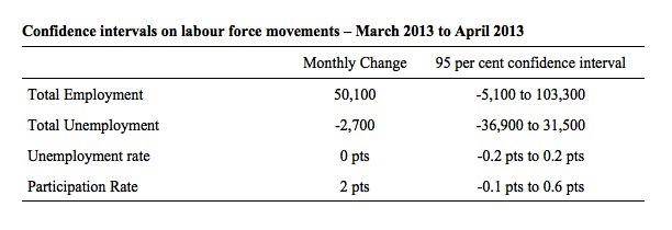
The following Table shows the confidence intervals for the seasonally adjusted data for the changes in the Labour Force aggregates between March 2013 and April 2013.
As a guide to interpretation, we would be able to say with equal confidence that total employment rose by 50,100 (the point estimate published by the ABS) as we could be that it fell by 5,100 or rose by 103,300. Similar interpretations apply to the other aggregates.
The unemployment might be 5.3 per cent but then it could be 5.7 per cent.
This is one reason why we have to be somewhat cautious when interpreting the monthly data published by the ABS.
Employment growth – positive
The April data shows a welcome strengthening of employment growth and for the first time in many months it has outstripped the underlying population growth.
Total employment rose by 50,100 (0.4 per cent) to 11,663,200. Full-time employment rose by 34,500 making up last month’s substantial fall. Part-time employment rose by 15,600.
Over the last 6 months, a staggering 84.9 per cent of the net employment opportunities created have been part-time.
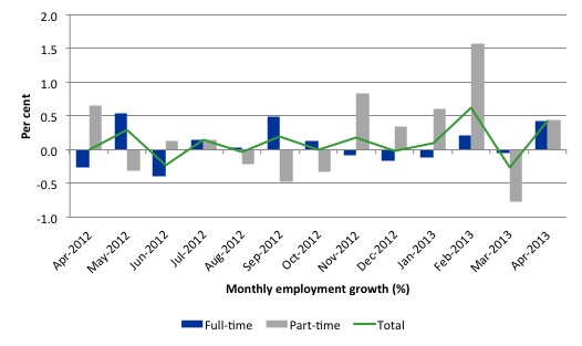
Today’s data reasserts the message that the labour market data is switching back and forth regularly between negative employment growth and positive growth spikes. This monthly behaviour is producing a weak positive trend, although not too much should be read into one month’s results.
There have been considerable fluctuations in the full-time/part-time growth over the last year with regular crossings of the zero growth line.
The following graph shows the month by month growth in full-time (blue columns), part-time (grey columns) and total employment (green line) for the 12 months to April 2013 using seasonally adjusted data.
Today’s results just repeat the topsy-turvy nature of the data over the period shown.
While full-time and part-time employment growth are fluctuating around the zero line, total employment growth is still well below the growth that was boosted by the fiscal-stimulus in the middle of 2010.
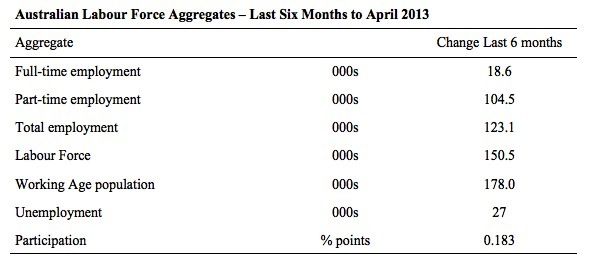
The following table provides an accounting summary of the labour market performance over the last six months. The monthly data is highly variable so this Table provides a longer view which allows for a better assessment of the trends. WAP is working age population (above 15 year olds). The first three columns show the number of jobs gained or lost (net) in the last six months.
The conclusion – overall 123.18 thousand jobs (net) have been created in Australia over the last six months (heavily influenced by the February 2013 result). Over the last six months, full-time employment has risen by only 18.6 thousand jobs (net) while part-time work has grown by 104.5 thousand jobs.
The Working Age Population has risen by 178 thousand in the same period while the labour force rose by 150.5 thousand. The weak employment growth has thus not been able to keep pace with the underlying population growth and unemployment has risen as a result (by 27 thousand).
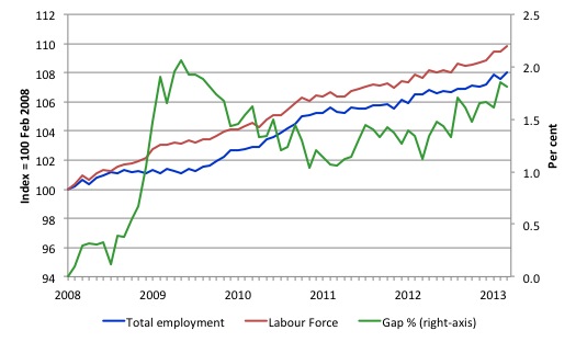
To put the recent data in perspective, the following graph shows the movement in the labour force and total employment since the low-point unemployment rate month in the last cycle (February 2008) to April 2013. The two series are indexed to 100 at that month. The green line (right-axis) is the gap (plotted against the right-axis) between the two aggregates and measures the change in the unemployment rate since the low-point of the last cycle (when it stood at 4 per cent).
You can see that the labour force index has largely levelled off and now falling and the divergence between it and employment growth has been relatively steady over the last several months with this month showing some improvement.
The Gap series gives you a good impression of the asymmetry in unemployment rate responses even when the economy experiences a mild downturn (such as the case in Australia). The unemployment rate jumps quickly but declines slowly.
It also highlights the fact that the recovery is still not strong enough to bring the unemployment rate back down to its pre-crisis low. You can see clearly that the unemployment rate fell in late 2009 and then has hovered at the same level for some months before rising again over the last several months.
The gap shows that the labour market is still a long way from recovering from the financial crisis that hit in early 2008. There hasn’t been much progress since January 2010, when the fiscal stimulus started to run out.
Teenage labour market – remains weak
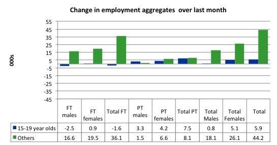
Full-time employment for teenagers fell by 1.6 thousand in April 2013 and part-time employment grew by 7.5 thousand on the back of an overall rise in part-time jobs in the economy. Overall, teenage employment increased by 5.9 thousand although the continuing decline in full-time work is a major worry.
The following graph shows the distribution of net employment creation in the last month by full-time/part-time status and age/gender category (15-19 year olds and the rest)
If you take a longer view you see how poor the situation is.
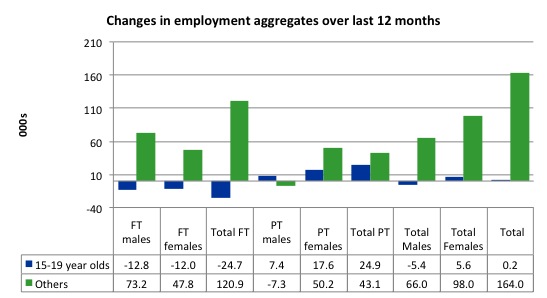
Over the last 12 months, teenagers have stood still in terms of overall jobs while the rest of the labour force have gained 164 thousand net jobs. This is a very poor annual growth in employment overall.
The worrying trend though is the attrition of full-time jobs among teenagers – losing 24.7 thousand over the last year.
The teenage segment of the labour market is being particularly dragged down by the sluggish employment growth, which is hardly surprising given that the least experienced and/or most disadvantaged (those with disabilities etc) are rationed to the back of the queue by the employers.
The following graph shows the change in aggregates over the last 12 months. Australian teenagers are going backwards which is a trend common around the world at present.
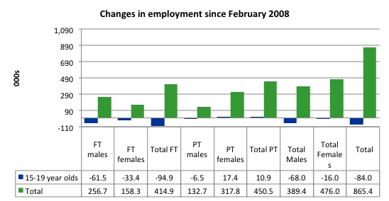
To further emphasise the plight of our teenagers I compiled the following graph that extends the time period from the February 2008, which was the month when the unemployment rate was at its low point in the last cycle, to the present month (April 2013). So it includes the period of downturn and then the “recovery” period. Note the change in vertical scale compared to the previous two graphs.
Since February 2008, there have been 865.4 thousand (net) jobs added to the Australian economy but teenagers have lost a staggering 84 thousand over the same period. It is even more stark when you consider that 94.9 thousand full-time teenager jobs have been lost in net terms. Even in the traditionally, concentrated teenage segment – part-time employment – there have been only 10,900 jobs (net) gained even though overall some 450.5 thousand part-time jobs have been added.
Overall, the total employment increase is modest. Further, around 52 per cent of the total (net) jobs added since February 2008 have been part-time, which raises questions about the quality of work that is being generated overall.
Overall, the performance of the teenage labour market remains poor. It doesn’t rate much priority in the policy debate, which is surprising given that this is our future workforce in an ageing population. Future productivity growth will determine whether the ageing population enjoys a higher standard of living than now or goes backwards.
The longer-run consequences of this teenage “lock out” will be very damaging.
The Government’s response is to push this cohort into endless training initiatives (supply-side approach) without significant benefits. The research shows overwhelmingly that job-specific skills development should be done within a paid-work environment.
I would recommend that the Australian government announce a major public sector job creation program aimed at employing, in the first instance, all the unemployed 15-19 year olds.
It is clear that the Australian labour market continues to fail our 15-19 year olds. At a time when we keep emphasising the future challenges facing the nation in terms of an ageing population and rising dependency ratios the economy still fails to provide enough work (and on-the-job experience) for our teenagers who are our future workforce.
Unemployment
The unemployment rate fell from 5.6 per cent to 5.6 per cent but when rounded there was no change for April 2013. Official unemployment rose by 2,700. If the participation rate had not risen, then given the employment growth this month, unemployment would have declined slightly.
Overall, the labour market still has significant excess capacity available in most areas and what growth there is is not making any major inroads into the idle pools of labour. However, it is probably reasonable to conclude that hidden unemployment fell a little in April 2013 given the rise in participation.
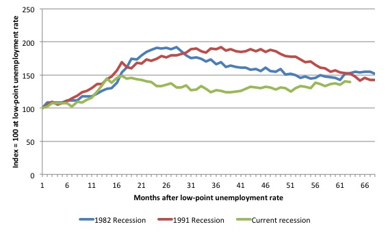
The following graph updates my 3-recessions graph which depicts how quickly the unemployment rose in Australia during each of the three major recessions in recent history: 1982, 1991 and 2009 (the latter to capture the 2008-2010 episode). The unemployment rate was indexed at 100 at its lowest rate before the recession in each case (January 1981; January 1989; April 2008, respectively) and then indexed to that base for each of the months as the recession unfolded.
I have plotted the 3 episodes for 68 months after the low-point unemployment rate was reached with the current episode now in its 63st month. For 1991, the end-point shown is the peak unemployment which was achieved some 38 months after the downturn began although the recovery was painfully slow. While the 1982 recession was severe the economy and the labour market was recovering by the 26th month. The pace of recovery for the 1982 once it began was faster than the recovery in the current period.
It is significant that the current situation while significantly less severe than the previous recessions is dragging on which is a reflection of the lack of private spending growth and declining public spending growth.
The graph provides a graphical depiction of the speed at which the recession unfolded (which tells you something about each episode) and the length of time that the labour market deteriorated (expressed in terms of the unemployment rate).
From the start of the downturn to the 63-month point (to April 2013), the official unemployment rate has risen from a base index value of 100 to a value 139.9 – peaking at 148 after 17 months. After falling steadily as the fiscal stimulus pushed growth along (it reached 122.8 after 35 months – in January 2010), it has been slowly trending up for some months now. Unlike the other episodes, the current trend, at this stage of the cycle, is upwards.
The gains that emerged in the recovery as a result of the fiscal stimulus in 2009-10 are now being lost.
At 62 months, 1982 index stood at 153.1 and was wavering while the 1991 index was at 151.5 and was also falling. It is clear that at an equivalent point in the “recovery cycle” the current period is more sluggish than our recent two major downturns.
It now appears that the recoveries are converging, which tells us that the current policy has failed to take advantage of the fact that the latest economic downturn was much more mild than the previous recessions. In other words, the policy failure is locking the economy into a higher unemployment rate than is desirable and otherwise attainable.
Note that these are index numbers and only tell us about the speed of decay rather than levels of unemployment. Clearly the 5.4 per cent at this stage of the downturn is lower that the unemployment rate was in the previous recessions at a comparable point in the cycle although we have to consider the broader measures of labour underutilisation (which include underemployment) before we draw any clear conclusions.
The notable aspect of the current situation is that the recovery is very slow.
Aggregate participation rate effects
The participation rate rose by 0.2 percentage points in April reversing the fall in March. The participation rate is fluctuating from month to month too much for it to be a behavioural response – that is, it is definitely to do with sample variability.
But the longer-term perspective is that at 65.3 per cent, the participation rate is a long way from its most recent peak in November 2010 of 65.9 per cent.
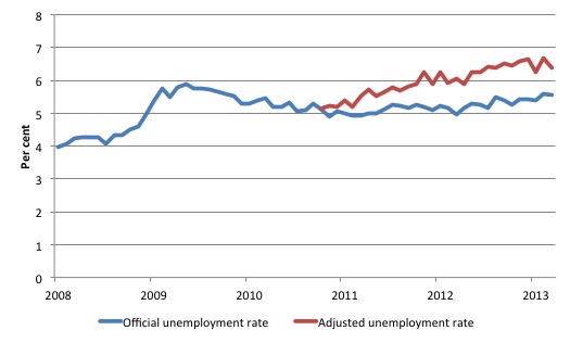
The following graph tells us what that means in terms of the unemployment rate. The blue line is the official unemployment since its most recent low-point of 4 per cent in February 2008. It is currently at 5.5 per cent.
The red line starts at November 2010 (the peak participation month). It is computed by adding the workers that left the labour force as employment growth faltered (and the participation rate fell) back into the labour force and assuming they would have been unemployed. At present, this cohort is likely to comprise a component of the hidden unemployed (or discouraged workers).
These workers would take a job immediately if offered one but have given up looking because there are not enough jobs and as a consequence the ABS classifies them as being Not in the Labour Force.
Note, the gap between the blue and red lines doesn’t sum to total hidden unemployment, unless November 2010 was a full employment peak, which it clearly was not. The interpretation of the gap is that it shows the extra hidden unemployed since that time.
As the participation rate dropped over the period, the gap rose. The adjusted unemployment rate would now be 6.4 per cent instead of the official rate of 5.5 per cent.
Hours worked rose in April 2013
Aggregate monthly hours worked increased by 10.9 million hours (0.6 per cent) in seasonally adjusted terms. The rise in hours worked this month continues the trends over several months of growth being interspersed with contraction with the trend switching back and forth between positive and negative.
The small swings up and down in monthly hours worked each month since the beginning of 2011 is being driven by similar fluctuations in full-time employment.
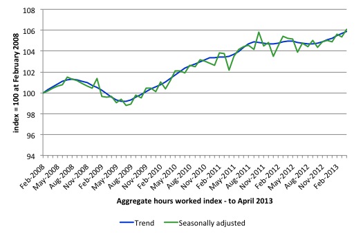
The following graph shows the trend and seasonally adjusted aggregate hours worked indexed to 100 at the peak in February 2008 (which was the low-point unemployment rate in the previous cycle). The rising trend which marked the early recovery courtesy of the fiscal stimulus is now clearly gone.
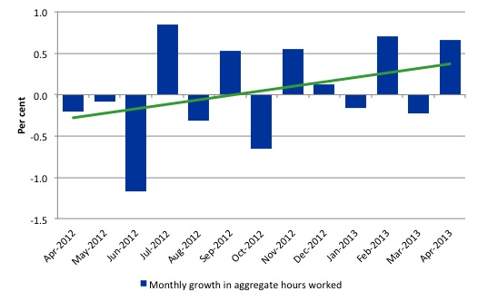
The next graph shows the monthly growth (in per cent) over the last 12 months. The green linear line is a simple regression trend – slightly positive after this month’s gains. You can see the pattern in working hours that is also portrayed in the employment graph – zig-zagging across the zero growth line. The economy is now starting to slow down as private spending growth is slowing and being exacerbated by the fiscal contraction.
Once again the data doesn’t support the notion of a fully employed labour market that is bursting against the inflation barrier.
Conclusion
Overall, today’s data was good but we need to keep a healthy dose of skepticism about it. At present as the ABS meddles with its sample and survey methods it appears the rotations are driving these fluctuations. In general, we always have to be careful interpreting month to month movements given the way the Labour Force Survey is constructed and implemented.
I am in the camp that still considers the labour market to be weak and the employment gap to be substantial.
Certainly, it is not collapsing and in the face of significant terms of trade adjustments (down) and the fiscal contraction that is continuing, the performance is reasonable. But reasonable is not good nor acceptable.
Despite this month’s respite, Australia is continuing to experience a sluggish pattern of employment growth, fluctuating participation rates and, generally rising unemployment, which has defined the last 18-24 months or so.
The most striking aspect of a sad picture remains the appalling performance of the teenage labour market. Employment has collapsed for that cohort and things were only marginally better in April 2013. The trend has been clear since 2008. I consider it a matter of policy urgency for the Government to introduce an employment guarantee to ensure we do not continue undermining our potential workforce.
The data certainly doesn’t support the Federal Government’s current macroeconomic settings, which are biased towards contraction. More fiscal stimulus is definitely needed but will not be forthcoming given the government’s neo-liberal biases.
That is enough for today!
(c) Copyright 2013 Bill Mitchell. All Rights Reserved.
“But reasonable is not good nor acceptable”
Unfortunately it’s very likely to be ‘good enough’ to ensure that policy remains exactly as it is for many years to come.
I doubt the situation will remain much the same for years to come Neil. We are about to go over the mining investment cliff – time will tell if it’s a cliff or an easy stroll down a gentle slope but I tend to feel the downward gradient will likely be steep.
The last decade and the last few years in particular have seen an absolutely staggering sum of money invested in expanding Australia’s mining/resource infrastructure – I see it every day because I live in the thick of it. The industry took the bet that commoddity prices and raw material demand would go on booming for decades or at least had reached a permanently high plateau. That bet has turned out wrong – the miners have over-invested. A huge onshore LNG processing plant has recently been axed in Western Australia. Here on the other side of the country, the fourth LNG plant on Curtis island here at Gladstone is now looking doubtful. Everywhere, mining companies are under pressure to cut costs.
Mining itself may only be a small employer in Australia (approx 3% of the workforce) but a massive investment boom is something else again. The next 18-24 months may be interesting.
“Hours worked rose in April 2013
Aggregate monthly hours worked ‘decreased’ by 10.9 million hours (0.6 per cent) in seasonally adjusted terms.”
Should that say ‘increased’?
When I try to argue a little MMT type thinking on other economic blog sites, the general tenor of replies from (orthodox) “economists”, professional and lay alike, is that MMT is over-simplistic. This is when they don’t say, “It’s just wrong.”
These same critics who say MMT is over-simplistic then intone. “The budget must be in surplus or balanced or maybe when things are really bad it can be maybe just a teensy bit in deficit.” Or words to that effect. The message never varies.
When one asks, “Why?” the answer essentially is Dothraki-like in nature, “It is known.”
(Those who know George R. R. Martin’s overblown epic even a little will know the Dothraki. Neocons remind me of the Dothraki.)
Greek unemployment for youths aged 15-24 is now at 64.2%.
May I have permission to repost that please, Ikonoclast?
Ikonoclast
When someone asks, Why?
It invokes a memory dump.
Far better to ask : What are the reasons.
Interesting how the neophiles can call MMT simplified and yet they think the dynamics of inflation can be explained using MV=PQ.
The fact that none of this nonsense stands up to empirical testing still doesn’t deter them though because the data “must be wrong”.
What is their reaction when confronted with the derivation of the sectoral balances?
Perhaps in their economics they think they’ve found a way to intermit the operational rules of algebra when the results of the application of those rules cause them discomfort.