The Australian Bureau of Statistics (ABS) released the latest labour force data today (APRIL 16,…
Australia – a deteriorating labour market with all the indicators in decline
Today’s release by the Australian Bureau of Statistics (ABS) of the Labour Force data for August 2012 reveals a deteriorating labour market with all the indicators of merit in decline. Total employment fell, labour force participation fell and hours worked fell. Unemployment fell but only because the decline in the labour force outstripped the decline in employment – which means that the decline in unemployment was due to an increase in hidden unemployment. A decline in unemployment driven by a rise in hidden unemployment is not virtuous. Certainly this data is not consistent with any notions that the Australian labour market is booming or close to full employment. The most continuing feature that should warrant immediate policy concern is the appalling state of the youth labour market. My assessment of today’s results – worrying with further weakness to come. The government has no case to make for its pursuit of a budget surplus in the next fiscal year.
The summary ABS Labour Force (seasonally adjusted) estimates for August 2012 are:
- Employment decreased 8,800 (0.1 per cent) with full-time employment rising by 600 and part-time employment falling by 9,300.
- Unemployment fell by 10,600 (1.7 per cent) to 622,600.
- The official unemployment rate fell to 5.1 per cent from the revised July figure of 5.2 per cent.
- The participation rate decreased by 0.2 pts to 65 per cent meaning hidden unemployment has risen significantly due to poor employment growth.
- Aggregate monthly hours worked fell by 5.7 million hours (0.35 per cent).
- The ABS broad labour underutilisation estimates (the sum of unemployment and underemployment) which are published on a quarterly basis (latest data published in this release) showed that the total labour underutilisation rate was 12.4 per cent in the third-quarter 2012 down from 12.6 per cent (largely because hidden unemployment has risen).
The ABC National News Report – Unemployment falls despite job losses – said that:
A fall in the participation rate is often a sign that discouraged jobseekers have given up the search for work because they cannot find a job, even though they might still like to work.
The Report quoted one bank economist as saying “On balance it’s a pretty weak report, but not as weak as if the unemployment rate had gone up. It’s a bit of a mixed bag.” Which misses the point of the initial observation in the ABC Report.
It is every bit as weak – but the weakness is just disguised from the public because most of us do not understand that hidden unemployment (as people drop out of the labour force due to a lack of jobs) is just as bad as official unemployment.
Further, the data release does not portray a “mixed bag”. The data today is all bad. Every indicator that tells us about the true state of the labour market deteriorated.
The Sydney Morning Herald report (by Chris Zappone) – Jobless rate posts fall as job seekers give up – decided to confuse its readers by saying that:
A day after the Australian economy celebrated its 21st consecutive year of growth, there’s more solid news with the jobless rate dipping in August.
The fall in joblessness, which was driven by fewer people hunting for work, took the national unemployment rate to 5.1 per cent, bucking expectations of a rise to 5.3 per cent from 5.2 per cent in July.
Which is about as wrong as it gets (sorry Chris!).
Yesterday’s national accounts data told us about the economy in the months from April to June 2012. We are now in September and today’s labour force data tells us about the last 4 weeks.
Further, yesterday’s growth data indicated the economy was slowing and the prospects are deteriorating. Moreoever, today’s data does not provide “solid news” – as noted above. Every relevant indicator was poor once we understand that the decline in unemployment was due to the participation rate declining.
At least the SMH article quoted a bank economist who clarified the situation:
The unemployment number is totally misleading. It only fell because the participation rate fell, and that’s been the story for much of the last year.
Chris – please edit the article to tell your readers that today’s data was a very poor result for the Australian economy.
Employment growth – negative and trend is pointing down
The August data shows that employment growth was negative with total employment rose by 8,800 (0.1 per cent) – full-time employment rose by 600 but part-time employment decreased by 9,300.
Today’s data reasserts the message that the labour market data is switching back and forth each month with an sluggish underlying trend being fairly stable for some months now.
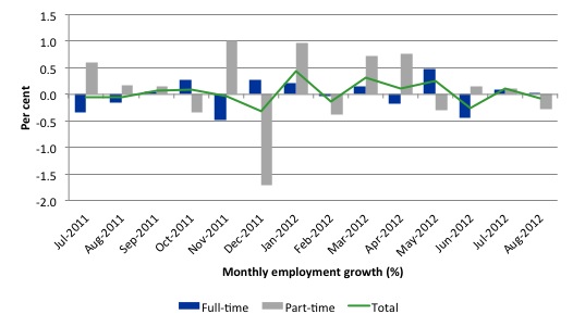
There have been considerable fluctuations in the full-time/part-time growth over the last year with regular crossings of the zero growth line.
Over the last 12 months, full-time employment has risen by on 33.2 thousand while part-time employment has risen by 29 thousand.
Over the last 12 months, the labour force has grown marginally stronger than employment, which means that unemployment has risen (by 16 thousand) over the same period.
Labour force growth is also subdued by the state of the economy (with participation rates still well down on previous peaks and flat over the last 12 months), which means that the sluggish supply growth is keeping unemployment much lower than it otherwise would be given how poor the employment growth has been.
The following graph shows the month by month growth in full-time (blue columns), part-time (grey columns) and total employment (green line) for the 12 months to August 2012 using seasonally adjusted data.
Today’s results just repeat the topsy-turvy nature of the data over the period shown. The Australian labour market is struggling with the low GDP growth creating a near jobless growth environment.
While full-time and part-time employment growth are fluctuating around the zero line, total employment growth is still well below the growth that was boosted by the fiscal-stimulus in the middle of 2010.
The following table provides an accounting summary of the labour market performance over the last six months. The monthly data is highly variable so this Table provides a longer view (over the last 6 months) which allows for a better assessment of the trends. WAP is working age population (above 15 year olds). The first three columns show the number of jobs gained or lost (net) in the last six months.
The conclusion – overall only 50.1 thousand jobs (net) have been created in Australia over the last six months with only 9.5 thousand full-time jobs. Job creation in Australia over the first half of this year has been dominated by part-time employment – which suggests underemployment will also be rising.
The WAP has risen by 118 thousand in the same period while the labour force has risen by 39.6 thousand.
The upshot is that relatively weak employment growth has only been able to outstrip the even weaker labour force growth (so unemployment is down by 11 thousand) because the participation rate has fallen by 0.2 percentage points.
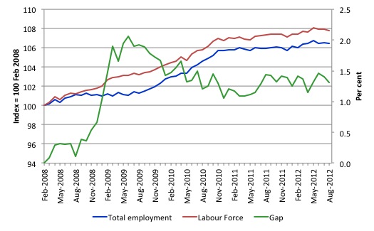
To put the recent data in perspective, the following graph shows the movement in the labour force and total employment since the low-point unemployment rate month in the last cycle (February 2008) to August 2012. The two series are indexed to 100 at that month. The green line (right-axis) is the gap (plotted against the right-axis) between the two aggregates and measures the change in the unemployment rate since the low-point of the last cycle (when it stood at 4 per cent).
You can see that the labour force index has largely levelled off and now falling and the divergence between it and employment growth has been relatively steady over the last several months with this month showing some improvement.
The Gap series gives you a good impression of the asymmetry in unemployment rate responses even when the economy experiences a mild downturn (such as the case in Australia). The unemployment rate jumps quickly but declines slowly.
It also highlights the fact that the recovery is still not strong enough to bring the unemployment rate back down to its pre-crisis low. You can see clearly that the unemployment rate fell in late 2009 and then has hovered at the same level for some months before rising again over the last two months.
The gap shows that the labour market is still a long way from recovering from the financial crisis that hit in early 2008. There hasn’t been much progress since November 2010, when the fiscal stimulus started to run out.
Teenage labour market – remains in a parlous state
Regular readers will know that I always try to highlight the plight of our teenagers in the labour market.
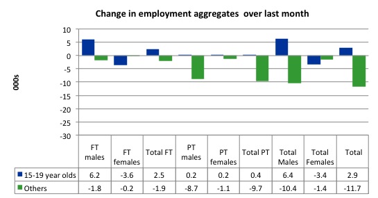
The following graph shows the distribution of net employment creation in the last month by full-time/part-time status and age/gender category (15-19 year olds and the rest)
Over the last month, teenagers gained 2.9 thousand jobs while the rest of the workforce lost 11.7 thousand jobs.
If you take a longer view you see how poor the situation is.
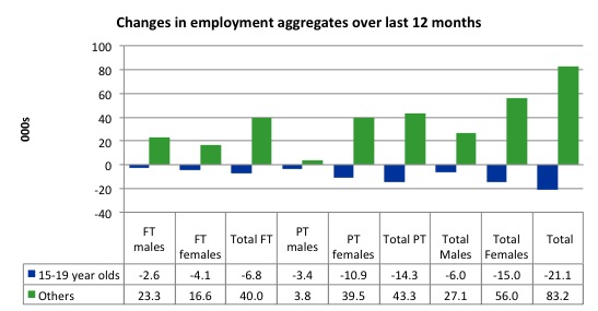
Over the last 12 months, teenagers have lost 21.1 thousand net jobs overall which the rest of the labour force have gained 83.2 thousand net jobs. Teenagers have lost 6.8 thousand full-time opportunities and 14.3 part-time opportunities in net terms.
So the Australian labour market has further undermined the opportunities for this cohort over the last year.
The teenage segment of the labour market is being particularly dragged down by the sluggish employment growth, which is hardly surprising given that the least experienced and/or most disadvantaged (those with disabilities etc) are rationed to the back of the queue by the employers.
The following graph shows the change in aggregates over the last 12 months. Australian teenagers are going backwards which is a trend common around the world at present.
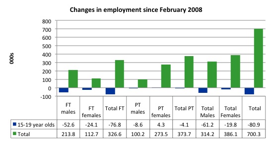
To further emphasise the plight of our teenagers I compiled the following graph that extends the time period from the February 2008, which was the month when the unemployment rate was at its low point in the last cycle, to the present month (August 2012). So it includes the period of downturn and then the “recovery” period. Note the change in vertical scale compared to the previous two graphs. That tells you something!
The results are stunning and represent a major policy failure.
Since February 2008, there have been 700.3 thousand (net) jobs added to the Australian economy but teenagers have lost a staggering 80.9 thousand over the same period. It is even more stark when you consider that 76.8 thousand full-time teenager jobs have been lost in net terms. Even in the traditionally, concentrated teenage segment – part-time employment – there have been 4.6 thousand jobs (net) lost.
Further, around 53 per cent of the total (net) jobs added since February 2008 have been part-time.
Overall, the performance over the last 12 months is poor and should receive a much higher priority in the policy debate than it does.
The longer-run consequences of this teenage “lock out” will be very damaging.
The Australian government has no coherent strategy to resolve this appalling state. Ensuring teenagers are included in paid work, if they do not desire to remain in school, should be a number one policy priority.
The Government’s response is to push this cohort into endless training initiatives (supply-side approach) without significant benefits. The research shows overwhelmingly that job-specific skills development should be done within a paid-work environment.
I would recommend that the Australian government announce a major public sector job creation program aimed at employing, in the first instance, all the unemployed 15-19 year olds.
It is clear that the Australian labour market continues to fail our 15-19 year olds. At a time when we keep emphasising the future challenges facing the nation in terms of an ageing population and rising dependency ratios the economy still fails to provide enough work (and on-the-job experience) for our teenagers who are our future workforce.
Unemployment
The unemployment rate fell by 0.1 percentage points in August 2012 to 5.1 per cent. The fall in unemployment was due entirely to a fall in the participation rate – that is, the labour force declined by more than employment fell. That means the Australian labour market merely substituted official unemployment for hidden unemployment.
Overall, the labour market still has significant excess capacity available in most areas and what growth there is is not making any major inroads into the idle pools of labour.
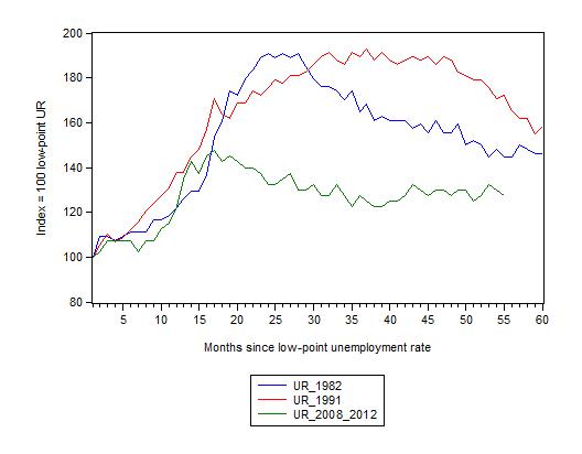
The following graph updates my 3-recessions graph which depicts how quickly the unemployment rose in Australia during each of the three major recessions in recent history: 1982, 1991 and 2009 (the latter to capture the 2008-2010 episode). The unemployment rate was indexed at 100 at its lowest rate before the recession in each case (August 1981; December 1989; April 2008, respectively) and then indexed to that base for each of the months as the recession unfolded.
I have plotted the 3 episodes for 55 months after the low-point unemployment rate was reached. For 1991, the end-point shown is the peak unemployment which was achieved some 38 months after the downturn began although the recovery was painfully slow. While the 1982 recession was severe the economy and the labour market was recovering by the 26th month. The pace of recovery for the 1982 once it began was faster than the recovery in the current period.
It is significant that the current situation while significantly less severe than the previous recessions is dragging on which is a reflection of the lack of private spending growth and declining public spending growth.
The graph provides a graphical depiction of the speed at which the recession unfolded (which tells you something about each episode) and the length of time that the labour market deteriorated (expressed in terms of the unemployment rate).
From the start of the downturn to the 55-month point (to August 2012), the official unemployment rate has risen from a base index value of 100 to a value 130 – peaking at 145 after 21 months. It has been hovering at the current level for some months now. Unlike the other episode, the current trend, at this stage of the cycle, is unclear.
At 55 months, 1982 index stood at 144 and falling steadily, while the 1991 index was around 172, also falling steadily. It is clear that at an equivalent point in the “recovery cycle” the current period is more sluggish than our recent two major downturns.
But remember that the small decline in the current index was all down to the shrinking labour force as workers gave up looking for jobs as the poor employment situation undermined their capacity to find jobs.
Note that these are index numbers and only tell us about the speed of decay rather than levels of unemployment. Clearly the 5.1 per cent at this stage of the downturn is lower that the unemployment rate was in the previous recessions at a comparable point in the cycle although we have to consider the broader measures of labour underutilisation (which include underemployment) before we draw any clear conclusions.
The notable aspect of the current situation is that the recovery is very slow.
Broader labour underutilisation
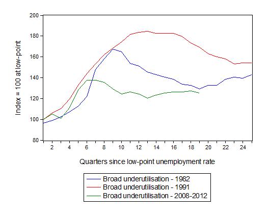
The following graph replicates the previous graph except it uses the ABS broad labour underutilisation rate (unemployment plus underemployment).
At the same period in the recovery (using quarterly data), the broad labour underutilisation rate (unemployment plus underemployment) had an index value of 129 in the 1982 recession (absolute value of 11.1 per cent); an index value of 169 in the 1991 recession (absolute value of 16.6 per cent); and an index value of 125.3 in the current period (absolute value of 12.4 per cent).
So while the level of unemployment is much lower now than in the 1982 recession (at a comparable stage), underemployment is now much higher and so the total labour underutilisation rates is higher. But the 1982 recovery in broad underutilisation terms was more robust than the current stagnating sitution.
Commentators who think of the 1982 recession as severe, rarely see it in these terms. Joblessness is probably worse than underemployment but both mean that labour is wasted and income earning opportunities are being foregone. For a worker with extensive nominal commitments, the loss of income when hours are rationed may be no less severe than the loss of hours involved in unemployment, if the threshold of solvency is breached.
And it is important to keep in mind that the 0.2 per cent drop in the current quarter in broad labour underutilisation is due to the fall in participation. If participation had not have fallen so much the broad index would have risen by 0.2 percentage points in the August quarter. That is, things are getting worse.
Aggregate participation rate falls sharply in August
The participation rate fell by 0.2 percentage points in August 2012 to 65 per cent. It is also 0.5 percentage points lower than 12 months ago.
It is still substantially down on the most recent peak of 66 per cent (November 2010) when the labour market was gathering pace courtesy of the fiscal stimulus.
This drop in participation in the last year or more has meant the labour force growth has been relatively subdued with the additional result being that the unemployment rate is considerably lower than would otherwise been the case.
What would have the unemployment rate been if the participation rate was constant (that is, had have remained at its previous month’s level)?
The labour force is a subset of the working-age population (those above 15 years old). The proportion of the working-age population that constitutes the labour force is called the labour force participation rate. So changes in the labour force can impact on the official unemployment rate and so movements in the latter need to be interpreted carefully. A rising unemployment rate may not indicate a recessing economy.
The labour force can expand as a result of general population growth and/or increases in the labour force participation rates.
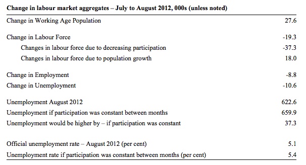
The following Table shows the breakdown in the changes to the main aggregates (Labour Force, Employment and Unemployment) and the impact of the fall in the participation rate.
In August 2012, employment fell by 8,800 while the labour force fell by 19,300 (as a consequence of the falling participation rate) which meant that unemployment fell by 10,600.
The labour force fell in August for two (opposing) reasons: (a) The underlying population growth added 18 thousand to the labour force. The population growth impact on the labour force aggregate is relatively steady from month to month; and (b) the participation rate fall led to a decline in the labour force of 37.3 thousand (relative to what would have occurred had the participation rate remained unchanged).
Given the current employment level, unemployment would have been 659.9 thousand instead of 622.6 thousand as recorded by the ABS.
So if the participation rate had have remained unchanged, the unemployment rate would have risen to 5.4 per cent rather than 5.1 per cent as officially published. The difference, of-course, is that the “hidden unemployment rate” most probably rose. Trends such as changes in retiremet plans etc do not happen as starkly as these month-to-month changes in participation.
The conclusion is that the rise in unemployment would have been much higher had not the fall in labour force participation (equivalent to 37.3 thousand persons) led to a rise in hidden unemployment.
Hours worked fell in August 2012
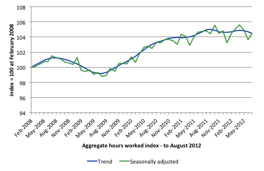
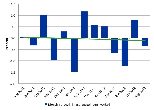
Aggregate monthly hours worked fell by 5.7 million hours (0.35) per cent) in seasonally adjusted terms and the trend is now firmly down and signalling a labour market that is deteriorating.
The small swings up and down in monthly hours worked each month since the beginning of 2011 is being driven by similar fluctuations in full-time employment.
The following graph shows the trend and seasonally adjusted aggregate hours worked indexed to 100 at the peak in February 2008 (which was the low-point unemployment rate in the previous cycle). The rising trend which marked the early recovery courtesy of the fiscal stimulus is now clearly gone.
The next graph shows the monthly growth (in per cent) over the last 12 months. The green linear line is a simple regression trend – firmly down.
Once again the data doesn’t support the notion of a fully employed labour market that is bursting against the inflation barrier.
Conclusion
Overall, today’s data is consistent with the message being delivered by a range of recent indicators that the Australian economy is slowing down and the recovery is stalling. Employment growth is clearly not strong enough to eat into the huge pool of unemployment and underemployment and the poor condition of the labour market is being masked by a declining participation rate.
So as has been the case for some months now, the outlook remains uncertain with positive and negative swings in employment growth continuing and repeating the behaviour over the last 18 or so months.
The best assessment is that the labour market is weak – trending towards increased weakness.
We always have to be careful interpreting month to month movements given the way the Labour Force Survey is constructed and implemented. But the underlying trend is weak as a result of the withdrawal of the fiscal stimulus undermining employment growth.
The most striking aspect of a sad picture remains the appalling performance of the teenage labour market. Employment has collapsed for that cohort and I consider it a matter of policy urgency for the Government to introduce an employment guarantee to ensure we do not continue undermining our potential workforce.
This labour force update is brought to you from Brussels courtesy of that well-known force – jet lag.
Camp Greece takes shape
To give a European flavour to the labour force report this month, consider the leaked document that the Glorious Troika sent to the Greek Labour Ministry last week. You will find the full text in various places if you wish to read the whole thing.
If the austerity measures already imposed on this nation are not sick enough, the latest set of demands from the commandants are beyond anything imaginable in a sophisticated and civilised world.
Camp Greece is being told by the Euro elite with its Washington hangers-on (IMF) that:
1. “The framework for setting the minimum wage needs to be overhauled to help ensure that wage dynamics support full employment” – aka cutting minimum wages which will only undermine employment further by cutting the spending power of low-wage workers.
2. “Concrete measures should be proposed to reduce social contribution rates by 5 percentage points in a fiscally-neutral manner” – that is, firms provide less welfare support to their workers and public spending elsewhere has to fall to compensate for the lost revenue.
3. A range of so-called “flexibility measures” – aka as destroy family life and ensure surplus value extraction is maximised:
– Increase the number of maximum workdays to 6 days per week for all sectors.
– Set the minimum daily rest to 11 hours.
– Delink the working hours of employees from the opening hours of the establishment.
– Eliminate restrictions on minimum/maximum time between morning and afternoon shifts.
– Allow the consecutive two week leave to be taken anytime during the year in seasonal sectors.
4. “The ESF can provide resources which can be used to help integrate the unemployed into those economic sectors with higher growth potential. The procedures related to ESF schemes (i.e. those combining work and training together with the social work programmes) should be completed as soon as possible, with a view to begin implementing the schemes by end-September”.
And I support this last proposal – which I know they mean but just couldn’t say it – the implementation of a Job Guarantee which will be federally funded (by the European Social Fund) – available to all workers who cannot find a job elsewhere with structured training built-in to the jobs. (-:
I am sure that is what Point 4 is about – which means Point 1 should be revised to read “the implementation of a socially adequate minimum wage for all workers”. Further Point 2 would be redundant and Point 3 could be abandoned because there would be full employment anyway.
Which is what my talk at the EC conference on jobs in Brussels today will be all about. They will have to hurry if they want the Job Guarantee in place and operational by the end of September. But ambition is virtuous. If only!
To see if any Greeks were obeying the dictates I did some personal research last night. It just happens that the Greek Delegation in Brussels is just near where I am staying (in the European Quarter). I went to check up whether they were working – I saw no-one. Perhaps today was their one day off a week! But then again it was late at night so the Troika will let them have 13 hours a day for sleep, eating, recreation, family time, maintenance of houses, cars etc and all the other things they will be able to squeeze into that time span. They will definitely re-define productivity!
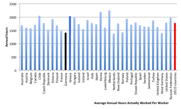
And excuse me wondering – but doesn’t the data show that the Greeks are among the hardest workers in the OECD (Source).
The following graph was constructed using the – OECD Average Annual Hours Actually Worked Per Worker – data. The data is for 2011 although for Korea and Switzerland the observations are at 2010.
I was trying to find Germany amongst the highest bars! I failed. To help you I made Germany black. The OECD average is out there on the right (red). Greece is just to the right of Germany. But then adding another day and making the minimum legal day longer will just make the Greek bar higher.
I repeat what I said when the Eurozone was formed – break it up. Greece should give the Troika the bird and take control of its own affairs.
That is enough for today or should I say – this early morning in Brussels!
(c) Copyright 2012 Bill Mitchell. All Rights Reserved.


I wonder how long it is going to take for a majority of the Greeks to realize that they have everything to lose and nothing to gain by staying in the EMU.
Podargus,
My understanding is that the Greek people are only interested in staying in the euro because the current treatise mean that departure from the euro means departure from the EU and common market as well – it is this they do not want perhaps.
the greeks work 600 hrs a year more than the germans!!! thats 15 weeks at 40 hrs per week extra per year!!!!! surely their must be some mistake? do years get longer the closer you get to the equator? are the germans all driving greek cars?
i actually saw that chart a while back and thought they could do with working a little less hours and spreading the work about but actually working more is crazy. are the germans activily lowering hours worked to encourage them to go to bed and create the next generation of workers? or do they think the greeks, spaniards, portugese and italians will eventually get desparate enough to move there so they can extend their demographic dividend? god knows they need it!! i believe the germans and others knew what they were signing up to when they gave monatary policy over to the ecb and would say they have a cheek in not allowing it to do its job. if not the ecb paying taxes (buying bonds) then the germans need a massive pay rise or at least a minimum wage of 8/9/10 eur/hr to solve this crisis. brussels should put a minimum wage across the whole block and let the currency do the work.
on the ozzy employment……have you included net immigration? university students(that time of year for in/out of uni)? the ozzys also travel well and the aud is strong….all on holiday? not trying to complicate things but is their a trend with seniors working later in life? rise of ebayers who just make a living on the net buying and selling which is massive in the uk( i know 3 and i ain’t that popular)?
just thoughts and i enjoy your blog
[“The research shows overwhelmingly that job-specific skills development should be done within a paid-work environment.
I would recommend that the Australian government announce a major public sector job creation program aimed at employing, in the first instance, all the unemployed 15-19 year olds.”]
Yes, repeat, yes.