The Australian Bureau of Statistics (ABS) released the latest labour force data today (APRIL 16,…
Australian labour market – just creeping along
Today’s release by the Australian Bureau of Statistics (ABS) of the Labour Force data for July 2012 reveals a fairly flat labour market with modest gains in employment and hours worked which were sufficient to outstrip the underlying labour force growth and so unemployment fell by 2,500. That decline in unemployment was aided by a declining participation rate. In other words, some of the decline in unemployment was due to a modest increase in hidden unemployment. Certainly this data is not consistent with any notions that the Australian labour market is booming or close to full employment. The most continuing feature that should warrant immediate policy concern is the appalling state of the youth labour market. My assessment of today’s results – positive outcome but very weak (mostly flat) trend. The economy is just creeping along when it comes to creating jobs.
The summary ABS Labour Force (seasonally adjusted) estimates for July 2012 are:
- Employment increased 14,000 (0.1 per cent) with full-time employment rising by 9,200 and part-time employment increased by 4,800.
- Unemployment fell by 2,500 (0.4 per cent) to 635,100.
- The official unemployment rate fell to 5.2 per cent from the revised June figure of 5.3 per cent.
- The participation rate decreased by 0.1 pts to 65.2 per cent.
- Aggregate monthly hours worked rose by 13.4 million hours (0.8 per cent).
- The ABS broad labour underutilisation estimates (the sum of unemployment and underemployment) which are published on a quarterly basis (next update will be August) showed that the total labour underutilisation rate was 12.6 per cent in the second-quarter 2012.
The ABC National News – Stable jobs data likely to leave rates on hold – quoted one bank economist as saying:
The labour market has ticked the box on the side that says the glass is half full It is obviously generating just enough jobs, despite losses in some areas, to keep unemployment constant. In the current environment, that’s not a bad outcome.
The comment suggests that the situation is sub-optimal (meaning below full employment) but we should be thankful given the conditions that are found in other nations.
It implies that the national government cannot target a lower unemployment rate. That sort of acceptance is characteristic of the neo-liberal era – that the market generates the outcome and governments should set conditions such that the market generates a good outcome.
But Modern Monetary Theory (MMT) tells us that the national government that issues its own currency (as in the Australian case) can set whatever national unemployment it chooses and ultimately does so. It always has the capacity to absorb the workers that want to work but cannot, given current aggregate demand conditions in the private sector, find work in the non-government sector.
So if the unemployment rate is persistently high (as it is in the Australian case and has been for 35 years now) then, ultimately this reflects a deliberate policy choice.
All the arguments about there not being enough productive work or that government jobs erode incentives etc are smokescreens to divert our attention from the failure of our national governments to fulfill their responsibilities to maximise the potential of all citizens.
Employment growth – positive but trend remains weak
The July data shows that employment growth was modest and failed to offset the sharp decline last month. Total employment rose by 14,000 (0.1 per cent) with full-time employment rising by 9,200 and part-time employment increased by 4,800.
Today’s data reasserts the message that the labour market data is switching back and forth each month with an sluggish underlying trend being fairly stable for some months now.
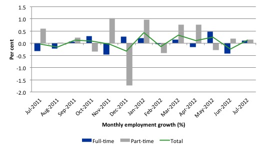
There have been considerable fluctuations in the full-time/part-time growth over the last year with regular crossings of the zero growth line.
Over the last 12 months, full-time employment has risen by on 20 thousand while part-time employment has risen by 45.2 thousand.
Over the last 12 months, the labour force has grown marginally stronger than employment, which means that unemployment has risen (by 16 thousand) over the same period.
Labour force growth is also subdued by the state of the economy (with participation rates still well down on previous peaks and flat over the last 12 months), which means that the sluggish supply growth is keeping unemployment much lower than it otherwise would be given how poor the employment growth has been.
The following graph shows the month by month growth in full-time (blue columns), part-time (grey columns) and total employment (green line) for the 12 months to July 2012 using seasonally adjusted data.
Today’s results just repeat the topsy-turvy nature of the data over the period shown. The Australian labour market is struggling with the low GDP growth creating a near jobless growth environment.
While full-time and part-time employment growth are fluctuating around the zero line, total employment growth is still well below the growth that was boosted by the fiscal-stimulus in the middle of 2010.
The following table provides an accounting summary of the labour market performance over the last six months. The monthly data is highly variable so this Table provides a longer view (over the last 6 months) which allows for a better assessment of the trends. WAP is working age population (above 15 year olds). The first three columns show the number of jobs gained or lost (net) in the last six months.
The conclusion – overall only 49.5 thousand jobs (net) have been created in Australia over the last six months with only 8.9 thousand full-time jobs. Job creation in Australia over the first half of this year has been dominated by part-time employment – which suggests underemployment will also be rising.
The WAP has risen by 18 thousand in the same period while the labour force has risen by 69.6 thousand.
The upshot is that relatively weak employment growth has failed to keep pace with the underlying population growth and so unemployment has risen (by 20 thousand). The rise in unemployment has been attenuated by the slight fall in participation.
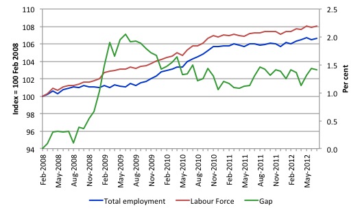
To put the recent data in perspective, the following graph shows the movement in the labour force and total employment since the low-point unemployment rate month in the last cycle (February 2008) to July 2012. The two series are indexed to 100 at that month. The green line (right-axis) is the gap (plotted against the right-axis) between the two aggregates and measures the change in the unemployment rate since the low-point of the last cycle (when it stood at 4 per cent).
You can see that the labour force index has largely levelled off and now falling and the divergence between it and employment growth has been relatively steady over the last several months with this month showing some improvement.
The Gap series gives you a good impression of the asymmetry in unemployment rate responses even when the economy experiences a mild downturn (such as the case in Australia). The unemployment rate jumps quickly but declines slowly.
It also highlights the fact that the recovery is still not strong enough to bring the unemployment rate back down to its pre-crisis low. You can see clearly that the unemployment rate fell in late 2009 and then has hovered at the same level for some months before rising again over the last two months.
The gap shows that the labour market is still a long way from recovering from the financial crisis that hit in early 2008. There hasn’t been much progress since November 2010, when the fiscal stimulus started to run out.
Teenage labour market – remains in a parlous state
Regular readers will know that I always try to highlight the plight of our teenagers in the labour market.
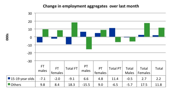
The following graph shows the distribution of net employment creation in the last month by full-time/part-time status and age/gender category (15-19 year olds and the rest)
Over the last month, teenagers gained 2.2 thousand jobs while the rest of the workforce gained 11.8 thousand jobs.
However, all the gains for teenagers have been in part-time employment (11.4 thousand) with 9.1 thousand full-time jobs vanishing (net) over the last month. So teenage underemployment is certain to have risen.
If you take a longer view you see how poor the situation is.
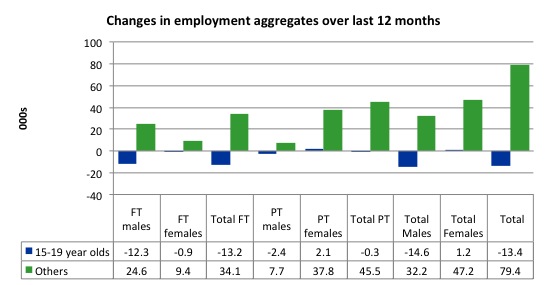
Over the last 12 months, teenagers have lost 13.4 thousand net jobs overall which the rest of the labour force have gained 79/4 thousand net jobs. Teenagers have lost 13.2 thousand full-time opportunities and 300 part-time opportunities in net terms.
So the Australian labour market has delivered nothing to this cohort over the last year.
The teenage segment of the labour market is being particularly dragged down by the sluggish employment growth, which is hardly surprising given that the least experienced and/or most disadvantaged (those with disabilities etc) are rationed to the back of the queue by the employers.
The following graph shows the change in aggregates over the last 12 months. Australian teenagers are going backwards which is a trend common around the world at present.
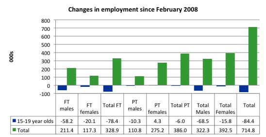
To further emphasise the plight of our teenagers I compiled the following graph that extends the time period from the February 2008, which was the month when the unemployment rate was at its low point in the last cycle, to the present month (July 2012). So it includes the period of downturn and then the “recovery” period. Note the change in vertical scale compared to the previous two graphs. That tells you something!
The results are stunning and represent a major policy failure.
Since February 2008, there have been 714.8 thousand (net) jobs added to the Australian economy but teenagers have lost a staggering 84.4 thousand over the same period. It is even more stark when you consider that78.4 thousand full-time teenager jobs have been lost in net terms. Even in the traditionally, concentrated teenage segment – part-time employment – there have been 6 thousand jobs (net) lost.
Further, around 54 per cent of the total (net) jobs added since February 2008 have been part-time.
Overall, the performance over the last 12 months is poor and should receive a much higher priority in the policy debate than it does.
The longer-run consequences of this teenage “lock out” will be very damaging.
The Australian government has no coherent strategy to resolve this appalling state. Ensuring teenagers are included in paid work, if they do not desire to remain in school, should be a number one policy priority.
The Government’s response is to push this cohort into endless training initiatives (supply-side approach) without significant benefits. The research shows overwhelmingly that job-specific skills development should be done within a paid-work environment.
I would recommend that the Australian government announce a major public sector job creation program aimed at employing, in the first instance, all the unemployed 15-19 year olds.
It is clear that the Australian labour market continues to fail our 15-19 year olds. At a time when we keep emphasising the future challenges facing the nation in terms of an ageing population and rising dependency ratios the economy still fails to provide enough work (and on-the-job experience) for our teenagers who are our future workforce.
Unemployment
The unemployment rate fell by 0.1 percentage points in July 2012 to 5.2 per cent. The fall in unemployment was due to a combination of the modest employment growth and the declining participation rate, although the latter impact was the smaller one.
Overall, the labour market still has significant excess capacity available in most areas and what growth there is is not making any major inroads into the idle pools of labour.
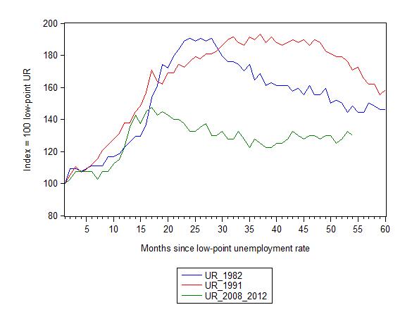
The following graph updates my 3-recessions graph which depicts how quickly the unemployment rose in Australia during each of the three major recessions in recent history: 1982, 1991 and 2009 (the latter to capture the 2008-2010 episode). The unemployment rate was indexed at 100 at its lowest rate before the recession in each case (August 1981; December 1989; April 2008, respectively) and then indexed to that base for each of the months as the recession unfolded.
I have plotted the 3 episodes for 54 months after the low-point unemployment rate was reached. For 1991, the end-point shown is the peak unemployment which was achieved some 38 months after the downturn began although the recovery was painfully slow. While the 1982 recession was severe the economy and the labour market was recovering by the 26th month. The pace of recovery for the 1982 once it began was faster than the recovery in the current period.
It is significant that the current situation while significantly less severe than the previous recessions is dragging on which is a reflection of the lack of private spending growth and declining public spending growth.
The graph provides a graphical depiction of the speed at which the recession unfolded (which tells you something about each episode) and the length of time that the labour market deteriorated (expressed in terms of the unemployment rate).
From the start of the downturn to the 54-month point (to July 2012), the official unemployment rate has risen from a base index value of 100 to a value 130 – peaking at 145 after 21 months. It has been hovering at the current level for some months now. Unlike the other episode, the current trend, at this stage of the cycle, is unclear.
At 54 months, 1982 index stood at 148 and falling steadily, while the 1991 index was around 170, also falling steadily. It is clear that at an equivalent point in the “recovery cycle” the current period is more sluggish than our recent two major downturns.
Note that these are index numbers and only tell us about the speed of decay rather than levels of unemployment. Clearly the 5.1 per cent at this stage of the downturn is lower that the unemployment rate was in the previous recessions at a comparable point in the cycle although we have to consider the broader measures of labour underutilisation (which include underemployment) before we draw any clear conclusions.
The notable aspect of the current situation is that the recovery is very slow.
Aggregate participation rate falls in July
The participation rate fell by 0.1 percentage points in July 2012 to 65.2 per cent. The previous month’s estimate of 65.2 per cent was revised upwards to 65.3 per cent.
The fact is that the current participation rate remains 0.4 percentage points lower than 12 months ago.
It is still substantially down on the most recent peak of 66 per cent (November 2010) when the labour market was gathering pace courtesy of the fiscal stimulus.
This drop in participation in the last year or more has meant the labour force growth has been relatively subdued with the additional result being that the unemployment rate is considerably lower than would otherwise been the case.
The current decline means that the unemployment rate is only partially lower than it would have been if the participation rate had not changed.
In general, it is the modest employment growth in July that accounts for the decline in the unemployment rate from 5.3 per cent to 5.2 per cent. That is a good outcome.
Hours worked rose slightly July 2012
Aggregate monthly hours worked rose modestly by 13.4 million hours (0.8) per cent) in seasonally adjusted terms and the trend is flat.
The small swings up and down in monthly hours worked each month since the beginning of 2011 is being driven by similar fluctuations in full-time employment.
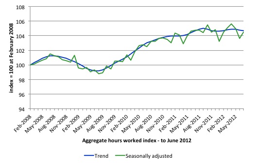
The following graph shows the trend and seasonally adjusted aggregate hours worked indexed to 100 at the peak in February 2008 (which was the low-point unemployment rate in the previous cycle). The rising trend which marked the early recovery courtesy of the fiscal stimulus is now clearly gone.
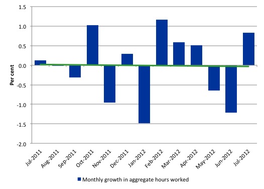
The next graph shows the monthly growth (in per cent) over the last 12 months. The green linear line is a simple regression trend – flat, tending down.
Once again the data doesn’t support the notion of a fully employed labour market that is bursting against the inflation barrier.
Conclusion
Overall, today’s data continues the weak trend in the Australian labour market with one bad month (as in June) being followed by a modest growth month and so on, with the trend fairly flat and employment growth clearly not being strong enough to eat into the huge pool of unemployment and underemployment.
So as has been the case for some months now, the outlook remains uncertain with positive and negative swings in employment growth continuing and repeating the behaviour over the last 18 or so months.
The best assessment is that the labour market is weak – especially when you consider that full-time employment has barely moved over the last six months.
We always have to be careful interpreting month to month movements given the way the Labour Force Survey is constructed and implemented. But the underlying trend is weak as a result of the withdrawal of the fiscal stimulus undermining employment growth.
The most striking aspect of a sad picture remains the appalling performance of the teenage labour market. Employment has collapsed for that cohort and I consider it a matter of policy urgency for the Government to introduce an employment guarantee to ensure we do not continue undermining our potential workforce.
Alternative Olympic Games Medal Tally
My Alternative Olympic Games Medal Tally is now active.
I update it early in the day and again around lunchtime when all the sports are concluded for the day.
That is enough for today!
(c) Copyright 2012 Bill Mitchell. All Rights Reserved.

How is the Aus participation rate calculated?
I struggle to see how AUS participation is 65% whereas the UK ’employment rate’ is quoted as 70.7% when the unemployment rate is supposedly higher.
UK is simply working age (16-64) employment divided by working age population.
UNDERSTANDING THE AUSTRALIAN LABOUR FORCE USING ABS STATISTICS
Neil Wilson
In the UK Labour Market Survey they don’t talk aout “participation rate”, instead they have the inverse of this which is the “economic inactivity rate” which currently stands at 22.9% of WAP, meaning the participation rate is 77.1% see the link below:
http://www.ons.gov.uk/ons/rel/lms/labour-market-statistics/july-2012/statistical-bulletin.html#tab-Economic-inactivity
I think I’ve got this right(?)
Neil, the numbers published are for the population aged 15 or over. The publication on the website that Bill linked to has a very handy glossary with definitions.
The OECD.org statistics portal shows Australia’s e:pop as three percentage points higher than the UK’s in 2011, for the age range 15 to 64.
Sadly, most Americans would define 5% unemployment as full employment.
“meaning the participation rate is 77.1% see the link below:”
Nice to see the unemployed participating 🙂
The employment rate is on the main ONS stats page and is currently 70.7% on their calculation method.
I think its to do with the differing way that the total labour force is defined.
Using the ABS definition I think the UK ‘participation rate’ would be 63.3% ( (MGSC + MGRZ) / MGSL )
Amazing what you can do with a change of denominator.
Apparently, Leeds (in the UK) has a higher medal tally than Australia!
Australia needs to up its game for the next Olympics – I’m sure they will though!
Bill,
Keep hammering away because Ne0-liberali$m is looking more and more vulnerable every day.
I have noticed in the past week or two that the ABC media are now starting to acknowledge that youth unemployment is at a rate which is unacceptable. Best of all, the ABC media are beginning to view the problem as a case of governments not doing enough rather than the youths themselves being responsible.
http://www.abc.net.au/7.30/content/2012/s3564552.htm
Also of interest is that Registered Training Organisations are under investigation due to allegations of them being little more than scams to dip into government funds.
http://www.abc.net.au/7.30/content/2012/s3563622.htm
Given how heavily the ne0-liberal$ have weighed in on the benefits of such organisations it’s most pleasing to see them with egg on their faces.
Work for the dole next ? We can only hope.
Tyler Healey:Sadly, most Americans would define 5% unemployment as full employment.
Yeah. Wish you could use the same definition of “full” for debts to be called “paid in full”. Surely creditors know that being paid 100% rather than 95% would cause hyperinflation!
Governments owe the governed true full employment just as, even more, surely, and the arguments against it are equally absurd and innumerate.