The Australian Bureau of Statistics (ABS) released the latest labour force data today (APRIL 16,…
A surprise every day … employment rises!
Everyday brings surprises as a social science researcher. Today I was gearing myself up for the lunchtime current affairs radio onslaught from the budget nazis – “see unemployment is still rising and stimulus doesn’t work” – that sort of thing. But then at 11.30 (or just after) I looked up today’s Labour Force data released by the Australian Bureau of Statistics and was … to say the least … surprised. Here is what I was expecting – the labour participation rate would fall a little and unemployment to continue rising. I expected full-time employment to fall and perhaps part-time employment to rise a little but for total employment overall to fall. However, given three other pieces of information, two of which were released yesterday, I was thinking that all these “bad movements” would be fairly moderate in size. So a surprise indeed but … we should be careful before we get too carried away.
Data summary
The following table shows the movements in thousands for employment (by category) for the period since February 2008 (when the lowest unemployment rate in this cycle was recorded); for the four months on 2009; and for the last month (April). They show that, remarkably, full-time employment in April rose and part-time employment fell.
Given the data overall is going to be explained, in part, by yesterday’s retail sales figures, the full-time growth is fishy! More about this later.
While the downturn, so far, has impacted more harshly on males, in April, male employment rebounded somewhat with 35 thousand new (net) male full-time jobs. Overall, males and females enjoyed similar net employment gains. However, when you take it over the downturn so far (since February 2008), males have lost 25.7 thousand jobs overall while females have gained 87.9 thousand jobs. Quite a difference. The only gains that males have made over that longer period have been in part-time jobs. But the April figures clearly offset some of the losses that have occured to date in this downturn.
Unemployment now stands at 614.6 thousand, down in April by 35 thousand on the back of the stronger than expected employment growth. Female unemployment fell by 22.7 thousand while male unemployment fell by 12.5 thousand. Some of the female easing is due to the slight drop in participation rates (so less females were looking for work in April). The male participation rate was unchanged.
The reason that the unemployment rate has risen since February 2008 from 3.9 per cent to its current 5.4 per cent is because employment growth (which has been positive over that period) has been outstripped by labour force growth driven largely by population growth given that the participation rates have not shifted much at all.
Since February 2008, an extra 239.2 thousand persons (99 thousand males and 140 thousand females) have sought work. Given that total employment has increased by only 62 thousand over the same period, the extra labour force growth has gone into unemployment which has risen by 177 thousand (125 thousand males and 52 thousand females).
So, what gives?
The explanations for this rather surprising labour force data are varied. First, the stimulus packages in December and now seem to have bolstered retail sales which could only be good for employment growth. However, as noted above this would predict that part-time work should benefit, which is certainly not the case in April.
Second, some people think that with large fiscal stimulus in place and expectations of more coming in the May budget, firms have decided to “hoard” their skilled labour in the expectation that the expansionary policy will deliver the goods. It is extremely expensive to replace skilled staff and at the height of the boom as labour shortages in some areas (definitely not overall!) became apparent competition for labour increased. Firms may be trying to avoid losing this staff. But that would only explain why employment didn’t decrease in April – it doesn’t explain the growth in full-time work and would be inconsistent with the drop in employment over the first 4 months of this year.
Third, net exports were stronger than expected yesterday and showed that our exports to China had grown strongly over the first 4 months of this year. The seasonal wheat sales were also strong. However, our major trading partners Japan (export to down 36 per cent since the boom peak in 2008) and the US (exports to down 33 per cent since their highest value) – provided us with very weak markets. More ominous is the expected fall in the major commodity prices which will reduce net export income considerably over the next 18 months or so. We will have to wait until next week’s employment data by industry to trace where the jobs were generated in April.
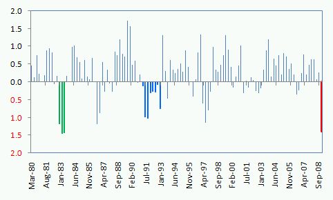
Fourth, the last National Accounts data showed that inventory were being dramatically run-down in the December quarter after rising through the earlier part of 2008 as demand slowed. The following graph shows the inventory changes as a percentage of GDP with the red bar denoting the December quarter. There are two ways of thinking about these changes. Notice in the 1982 recession (green bars) and the 1991 (royal blue bars) there was also a lot of inventory shedding as firms met the weak demand by running down their stocks rather than producing new goods. So we might be heading in that way now. But in the 1982 and 1991 recessions we didn’t see retail sales spiking up nor employment growing. We also didn’t have the same response from the Federal government by way of fairly rapid and sizeable (but not sizeable enough!) stimulus.
So it might be that firms have run down their stocks signficantly and in the face of continued spending and the prospect of more in the months ahead as the stimulus packages deliver further disposable income – they have started producing more. This would explain the employment growth and the concentration on full-time employment growth. But this speculation will have to wait now until the National Account figures come out on Wednesday, June 3, 2009. Then we will have an idea of how production levels are faring.
How is the downturn tracking?
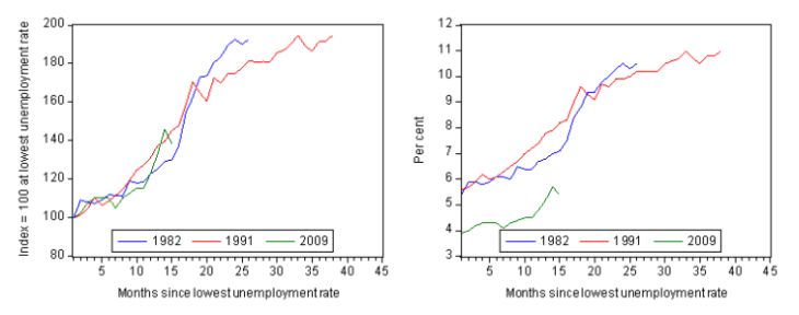
In past blogs – for example, USA and Australian unemployment trends – I have compared the evolution of this downturn to the 1982 and 1991 recessions. The following graph updates that analysis for the month of April. The graph depicts how quickly the unemployment rose in Australia during each of the three major recessions in recent history: 1982, 1991 and 2009. The unemployment rate was indexed at 100 at its lowest rate before the recession in each case (see previous blogs for details) and then indexed to that base for each of the months until it peaked. So you get a graphical illustration of the speed at which the recession unfolded (which tells you something about each economy) and the length of time that the labour market deteriorated (expressed only in terms of the unemployment rate). The right panel shows you the same analysis in actual levels given that we started this recession with a lower level of official unemployment than in 1982 and 1991.
The pace of contraction in the early months of this year was very fast and the April results still places the deterioration somewhere between the 1982 and 1991 recessions at an equivalent temporal phase. It will all depend on whether the data is to be trusted or not as to what happens next.
Can we trust the data?
As I noted at the outset, we should be very careful in taking this data as a sign that happy days are here again – here is the song actually from 1930.
But there are so many other indicators suggesting that these results could not be correct at all. For example, if you merely tote up the job losses that have been announced recently, you would be considerably skeptical that the labour market is growing. Also, the most recent data from the ANZ job advertisements survey was grim. So there is some reason to expect this data is simply wrong.
In recent months there has been some controversy about the budget cutbacks endured by the ABS which have manifested as reductions in the sample sizes of some of its survey publications. The Labour Force survey has been particularly affected and researchers such as myself have been worried that the accuracy and reliability of the estimates produced will suffer as a consequence. To get decent statistical properties a survey needs to be rather large (this reduces so-called sampling variability). So cutting the size of the survey to suit the whims of the mandarins is not a very sensible thing to do if you are wanting to base policy on the best available information. You might like to read an earlier blog – Labour Force data surprises … for more on this issue.
The ABS also publish standard errors which reflect the fact that the estimates are derived from a sample survey. The standard errors provide an indication of the sampling variability involved in trying to draw population estimates from a sample. Statisticians use these standard errors to construct what are called 95% confidence intervals which can be interpreted as showing the range that the true value will lie within 95 times out of a 100. So we can be fairly confident that the true value lies within the 95% confidence interval, which is expressed as an upper and lower value of the survey estimate.
The following table is taken from the ABS Labour Force publication and shows the estimate for April 2009 (middle column) and the 95% confidence interval for each of the labour force aggregates (right column). You can see that we could be equally certain that total employment rose by 87,900 as we could be that employment fell by 33,300 in April 2009. The estimated change was 27,300. So you have quite large standard errors associated with the estimate.
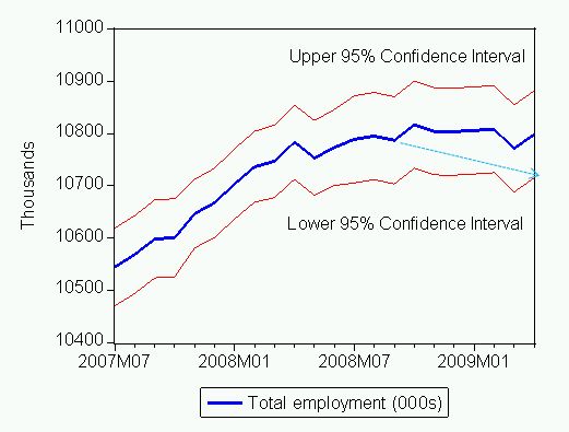
The following graph shows employment from July 2007 (six months before the lowest unemployment rate of the last cycle was recorded) to April 2009 (the thick blue line). The red lines above and below the blue line are the upper and lower define the 95% confidence interval around employment. So the true value will lie between these upper and lower limits. What would have happened if the true value was more represented by the lower limit? The standard errrors increased in July 2008 (once the survey was reduced in size).
The dotted line with the arrowhead pointing down to the low point in April 2009 might have shown the trajectory of employment which would have accorded more with expectation. But then on statistical grounds, saying that employment may be better described by the upper limit is just as valid.
Conclusion
I am keeping my fingers crossed that when the Government announces the Job Guarantee in the May Budget they will have around 600,000 people to employ rather than a considerably larger number. That is, I am keeping my fingers crossed that the April data is providing an accurate picture of what is going on.
However, my experience tells me that this is an odd result and the data could jump the other way next month and get us back into the gloom.


Another bunch of men just lost their jobs from the alumina plant today in Gladstone and a large number were “temporarily stood down” from one of the mines in the area. And a crane and rigging firm shed local staff.
If employment is growing, it doesn’t seem to be growing here.
Dear Lefty
It is definitely not growing in Gladstone. We have been looking at the Centrelink New Start and Youth Allowance data and your area is very bad. By next week when the detailed labour force data is out we will have a better idea of where these jobs have been created (estimated to have been, that is!).
When dealing with monthly data you have to take a longer moving average to see the trend movements. The trend is definitely down and that will dominate in the months to come despite the likelihood of monthly blips like we saw last month and again this month.
best wishes
bill
Are you able to give me the current unemployment stats for Gladstone, Qld?
Do you live in Gladstone as well Andre?
Dear Andre
The most recent data at that level is for December 2008. The March 2009 data will be available in early June. So the 2008 data is not showing the decline yet.
According to that data, the Statistical Local Area of Gladstone had an estimated labour force of 17,259 in December 2008. The unemployment and unemployment rate (%) estimates are as follows:
Quarter Unemployed Unemployment Rate (%)
December 2007 520 3.1
March 2008 581 3.4
June 2008 701 4.1
September 2008 743 4.3
December 2008 722 4.2
Hope that helps.
best wishes
bill