The Australian Bureau of Statistics (ABS) released the latest labour force data today (March 19,…
Australian labour force data – mixed news with little to be happy about
Today’s release by the Australian Bureau of Statistics (ABS) of the Labour Force data for January 2012 shows that the deterioration in the Australian economy towards the end of the year has temporarily ceased although working hours have fallen sharply. The data shows that employment has recovered a little and unemployment fell as a response – both good signs. The employment growth, however, is dominated by part-time jobs growth and underemployment is almost certain to have risen in January. The fall in hours worked is consistent with that conclusion. So the news is mixed this month. I still consider the Federal government to be undermining our prosperity by pursuing its obsession to get the budget back into surplus in the coming year. The most disturbing aspect of the labour market data over the last year or more has been the appalling state of the youth labour market. Teenage females did gain some modest relief this month from the relentless loss of jobs, but teenage males continued to go backwards. This should be a policy priority for the government. But they have gone missing in action – lost in their surplus mania. My assessment of today’s results – mixed news with little to be happy about.
The summary ABS Labour Force (seasonally adjusted) estimates for January 2011 are:
- Employment increased 46,300 (0.4 per cent) with full-time employment increasing by 12,300 persons and part-time employment increasing by 34,000. Even though the employment increase is welcome, we also have to remember that over the last year, employment has grown by only 0.3 per cent – that is, virtually not at all.
- Unemployment decreased 15,300 (2.4 per cent) and is now at 614,200.
- The official unemployment rate declined to 5.1 per cent down from 5.2 per cent.
- The participation rate increased by 0.1 pts to 65.3 after falling sharply last month by 0.3 points.
- Aggregate monthly hours worked decreased by 23.1 million hours (0.35 per cent).
- The ABS broad labour underutilisation estimates (the sum of unemployment and underemployment) are published quarterly (next data will be in March 2012) but the overall labour underutilisation estimate was 12.6 per cent.
The results thus indicate that the deterioration in the labour market in recent months may be slowing but it is still too early to make a definitive conclusion.
What we now see is employment and participation rising a little after some months of poor results but overall hours worked declining.
That suggests to me that underemployment is on the rise and the labour market slack is being moved from the jobless to the part-time workers forced to work at below their optimal hours as a result of a lack of overall working hours.
So I wouldn’t say the results are bad – but I will, in due course, probably conclude that they are not good either.
The Sydney Morning Herald report – Jobless rate in surprise drop – said that:
Australia’s unemployment rate unexpectedly dropped in January, sending the dollar jumping as the chances of another interest rate cut receded further
The article also contrasts the gain in jobs (although the majority were part-time) with the flurry of news reports in recent days detailing the jobs cuts across a range of firms.
While these high-profile layoffs (and today Qantas joined the throng in announcing it would lay off 500 workers) attract immediate and enduring media attention, they are small in scale relative to the monthly movements in the labour market.
It is the latter that drive the aggregates not the former.
I also note that the SMH and other media reactions this morning haven’t mentioned the European debt crisis given the data is showing a labour market that is struggling overall but probably adding jobs and arresting the recent stagnation.
In the past few months as the slowdown in the labour market was gathering pace the reaction was being increasingly pitched in terms of the “cloud” that was being “cast … over hiring and spending decisions in the Australian economy” (a quote from last month’s SMH labour force reaction).
The ABC News response – Unemployment rate posts surprise fall – also focused on how the data has once again tricked the bank economists.
The ABC said that:
Australia’s unemployment rate has dropped to 5.1 per cent in January, beating economists’ expectations.
It also said that the “participation rate ticked 0.1 per cent higher to 65.3 per cent, suggesting a modest return of job seekers to the market” but if you read my follow-up to last month’s data release you will know that this comment is only relevant to the seasonally adjusted data rather than what actually happened.
Please read my blog – Employment fell in December, no it didn’t employment rose – and other apparent inconsistencies – for more discussion on this point.
Employment growth – rebounds but still very weak when considered over a longer time-horizon
The January data shows that employment increased by 46,300 (net) (0.4 per cent) with both full-time employment and part-time employment growing, the latter outstripping the former by a factor of nearly 3. Given that aggregate monthly hours worked decreased I suspect underemployment probably rose in the last month.
There have been considerable fluctuations in the full-time/part-time growth over the last year with regular crossings of the zero growth line. Over the last 12 months, full-time employment has risen by a paltry 17.5 thousand while part-time employment has risen by less than half that – 7.1 thousand.
The upshot is that total employment has barely grown (24.7 thousand). So today’s data is good relative to what has gone before it in the last 6 months or so.
Since January 2011, employment has grown by a miserly 0.3 per cent while the labour force has grown by 0.4 per cent, which means that unemployment has risen (by 6.4 thousand) over the same period.
Labour force growth is also subdued by the state of the economy (with participation rates down), which means that the sluggish supply growth is keeping unemployment much lower than it otherwise would be given how poor the employment growth has been.
So while 2011 was a jobless year – the first results for 2012 demonstrate and improvement although it is too early to determine whether a more favourable trend has begun.
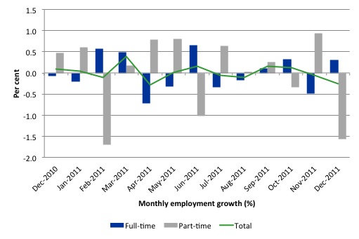
The following graph shows the month by month growth in full-time (blue columns), part-time (grey columns) and total employment (green line) for the 12 months to December 2011 using seasonally adjusted data.
Today’s results just repeat the topsy-turvy nature of the data over the period shown and thus it is better to be cautious in our assessments of what is going on.
While full-time and part-time employment growth are fluctuating around the zero line, total employment growth is still well below the growth that was boosted by the fiscal-stimulus in the middle of 2010.
The following table provides an accounting summary of the labour market performance over the last six months. The monthly data is highly variable so this Table provides a longer view (over the last 6 months) which allows for a better assessment of the trends. WAP is working age population (above 15 year olds). The first three columns show the number of jobs gained or lost (net) in the last six months.
The conclusion – overall only 24.7 thousand jobs (net) have been gained in Australia since July 2011. In that context, today’s data is good.
The WAP has risen by 113 thousand in the same period while the labour force has risen by 18.4 thousand.
The upshot is that weak employment growth has still allowed the unemployment to fall (by 6 thousand) because the sharp decline in the participation rate (0.3 points) has led to a subdued labour force growth rate relative to the underlying population growth.
If participation had not have fallen so sharply (that is, the labour force had have grown more in line with the underlying population growth) there would have been a rise in unemployment.
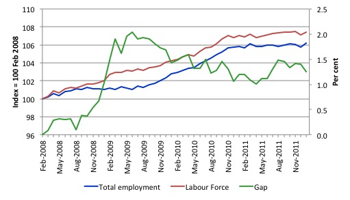
To put the recent data in perspective, the following graph shows the movement in the labour force and total employment since the low-point unemployment rate month in the last cycle (February 2008) to January 2012. The two series are indexed to 100 at that month. The green line (right-axis) is the gap (plotted against the right-axis) between the two aggregates and measures the change in the unemployment rate since the low-point of the last cycle (when it stood at 4 per cent).
You can see that the labour force index has largely levelled off and now falling and the divergence between it and employment growth has been relatively steady over the last several months with this month showing some improvement.
The Gap series gives you a good impression of the asymmetry in unemployment rate responses even when the economy experiences a mild downturn (such as the case in Australia). The unemployment rate jumps quickly but declines slowly.
It also highlights the fact that the recovery is still not strong enough to bring the unemployment rate back down to its pre-crisis low. You can see clearly that the unemployment rate fell in late 2009 and then has hovered at the same level for some months before rising again over the last two months.
The question that won’t be answered for a few months (given the variability of the monthly data) is whether the downturn in the gap is the start of a sustained labour market improvement.
The gap shows that the labour market is still a long way from recovering from the financial crisis that hit in early 2008.
Teenage labour market – remains in a parlous state
The teenage labour market saw a welcome reprieve in January 2012 from the almost continuous deterioration each month over the last few years (see below).
There was a very modest gain in overall employment but this was dominated by females with teenage males continuing to miss out.
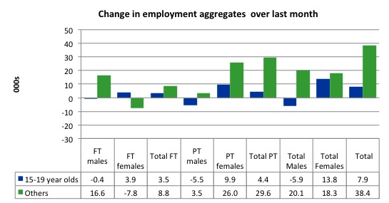
Of the last month, teenagers gained a modest 7.9 thousand jobs. However, young males lost both full-time and part-time jobs.
The following graph shows the distribution of net employment creation in the last month by full-time/part-time status and age/gender category (15-19 year olds and the rest).
If you take a longer view you see how poor the situation is.
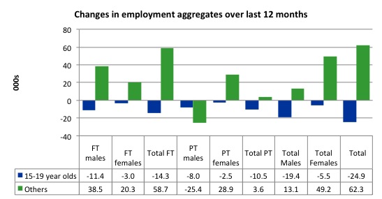
Over the last twelve months teenagers have lost 24.9 thousand (net) jobs while the rest of the labour force has gained 62.3 thousand jobs (net). So it is the teenage segment of the labour market that is being dragged down by the sluggish growth, which is hardly surprising given that the least experienced and/or most disadvantaged (those with disabilities etc) are rationed to the back of the queue.
The 15-19 year olds lost 14.3 thousand full time jobs and 10.5 thousand part-time jobs over the last 12 months.
The following graph shows the change in aggregates over the last 12 months. Australian teenagers are going backwards which is a trend common around the world at present.
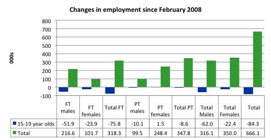
To further emphasise the plight of our teenagers I compiled the following graph that extends the time period from the February 2008, which was the month when the unemployment rate was at its low point in the last cycle, to the present month (January 2012). So it includes the period of downturn and then the “recovery” period. Note the change in vertical scale compared to the previous two graphs. That tells you something!
The results are stunning and represent a major policy failure. Since 2008, there have been 666 thousand (net) jobs added to the Australian economy but teenagers have lost 84.3 thousand over the same period. It is even more stark when you consider that 75 thousand full-time teenager jobs have been lost in net terms.
So today’s results, at least for teenage females showed a slight sign of improvement. Teenage males continue to languish.
Overall, the performance over the last 12 months is poor and should receive a much higher priority in the policy debate than it does.
The longer-run consequences of this teenage “lock out” will be very damaging.
In the December 2011 quarter broad labour underutilisation data released today by the ABS, the underemployment rate for 15-24 year olds was 13.2 per cent. Total labour underutilisation for 15-24 year olds was 24.7 per cent.
While the Treasurer is always reminding us how responsible he is being in the pursuit of budget surpluses he fails to mention that this pursuit is one of the reasons that Australian teenagers are being locked out of the labour market.
The Australian government has no coherent strategy to resolve this appalling state. Ensuring teenagers are included in paid work, if they do not desire to remain in school, should be number one policy priority.
I would recommend that the Australian government announce a major public sector job creation program aimed at employing, in the first instance, all the unemployed 15-19 year olds.
It is clear that the Australian labour market continues to fail our 15-19 year olds. At a time when we keep emphasising the future challenges facing the nation in terms of an ageing population and rising dependency ratios the economy still fails to provide enough work (and on-the-job experience) for our teenagers who are our future workforce.
Unemployment
The unemployment rate fell by 0.1 per cent in January to 5.1 per cent.
Overall, the labour market still has significant excess capacity available in most areas and what growth there is is not making any major inroads into the idle pools of labour.
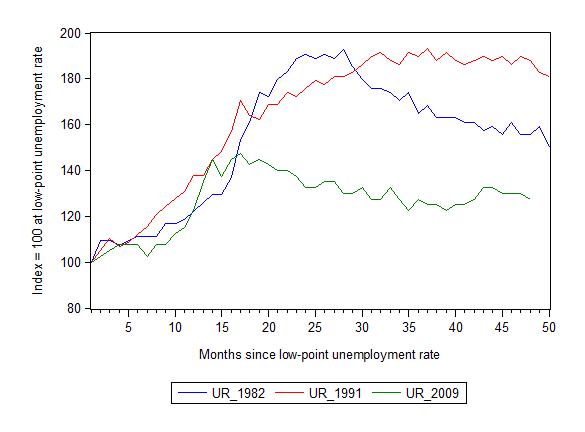
The following graph updates my 3-recessions graph which depicts how quickly the unemployment rose in Australia during each of the three major recessions in recent history: 1982, 1991 and 2009 (the latter to capture the 2008-2010 episode). The unemployment rate was indexed at 100 at its lowest rate before the recession in each case (August 1981; December 1989; February 2008, respectively) and then indexed to that base for each of the months as the recession unfolded.
I have plotted the 3 episodes for 48 months after the low-point unemployment rate was reached. For 1991, the end-point shown is the peak unemployment which was achieved some 38 months after the downturn began although the recovery was painfully slow. While the 1982 recession was severe the economy and the labour market was recovering by the 26th month. The pace of recovery for the 1982 once it began was faster than the recovery in the current period.
It is significant that the current situation while significantly less severe than the previous recessions is dragging on which is a reflection of the lack of private spending growth and declining public spending growth.
The graph provides a graphical depiction of the speed at which the recession unfolded (which tells you something about each episode) and the length of time that the labour market deteriorated (expressed in terms of the unemployment rate).
From the start of the downturn to the 48-month point (to January 2012), the official unemployment rate has risen from a base index value of 100 to a value 127.5 – peaking at 145 after 21 months. However, it reached a low point 8 months ago (122.5) and has been hovering at the higher level since then. Unlike the other episode, the current trend, at this stage of the cycle, is unclear.
At 48 months, 1982 index stood at 155.5 and declining relatively quickly, the 1991 index was around 187 and falling slowly
Note that these are index numbers and only tell us about the speed of decay rather than levels of unemployment. Clearly the 5.3 per cent at this stage of the downturn is lower that the unemployment rate was in the previous recessions at a comparable point in the cycle although we have to consider the broader measures of labour underutilisation (which include underemployment) before we draw any clear conclusions
Aggregate participation rate rose slightly
The participation rate fell by 0.3 percentage points in December 2011 from 65.5 to 65.2 per cent. This sharp drop in the labour force meant that the unemployment rate did not rise in the face of the declining employment growth. In January 2012, there was a favourable movement – up by 0.1 percentage points. This is a good sign.
Hours worked fell in January 2012
While the rise in employment and fall in unemployment was a good outcome, even though the jobs growth was dominated by part-time work, the bad news is that aggregate monthly hours worked decreased by significant 23.1 million hours (1.3 per cent).
This will almost certainly mean that underemployment rose in January 2012.
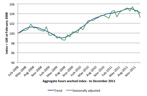
The following graph shows the trend and seasonally adjusted aggregate hours worked indexed to 100 at the peak in February 2008 (which was the low-point unemployment rate in the previous cycle). The rising trend which marked the early recovery courtesy of the fiscal stimulus has now turned negative.
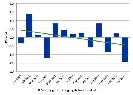
The next graph shows the monthly growth (in per cent) over the last 12 months. The green linear line is a simple regression trend and it is suggesting monthly growth rates is very weak negative trended..
Once again the data doesn’t support the notion of a fully employed labour market that is bursting against the inflation barrier.
The trend in hours growth is now firmly down with several large losses over the last 6 months.
Related aside
I did an interview for a Sydney daily yesterday which drove this article – Reserve Bank has job on hands.
The story opened in this way:
AUSTRALIA’S recently unemployed should take a class action against the Reserve Bank because it has failed to deliver on one of its core missions, one of the nation’s top economists said yesterday.
Professor William Mitchell, a leading voice on the jobless from the University of Newcastle, has said the proof was plain to see that the Reserve Bank wasn’t living up to its duty of “maintaining full employment in Australia
I have had a lot of calls today from journalists and even an industrial lawyer – while I am over here in the US working – enquiring about the story.
The article actually misquotes me but I am on the public record as saying that I think an “unemployed union” should be formed and force the RBA into court to explain why they now use unemployment as a policy tool rather than a policy target.
I know that they would argue that the full employment unemployment rate (the NAIRU) has risen over time and that the economy is close to full employment.
But it would be a good opportunity for a sharp lawyer to get the Governor into the witness box and explain what the NAIRU is, how they measure it, and to have to answer questions relating to how poor a measure it is.
Conclusion
Last month, we discovered that 2011 was a jobless year and that over the last 6 months employment growth contracted sharply. The national economy clearly had failed in 2011 to grow fast to absorb the underlying population growth.
In the first month of the new year, the data was better but I wouldn’t get carried away with the results just yet given the sharp decline in working hours.
The trend in working hours has been down. So if employment continues to grow and the hours trend persists then all that will happen is that unemployment will be replaced by underemployment.
I still believe that the private sector is deleveraging after a period of unsustainable credit-driven consumption and that mining boom aside, net exports are not strong enough to offset the spending moderation.
In the coming year, the obsessive push towards surplus by the Federal government will also put a significant brake on aggregate spending growth.
We always have to be careful interpreting month to month movements given the way the Labour Force Survey is constructed and implemented but there has now been enough data over the last several months to tell us that my assessment in the previous paragraphs is probably sound.
The withdrawal of the fiscal stimulus is definitely undermining employment and hours growth.
The most striking aspect of a sad picture remains the appalling performance of the teenage labour market. Employment has collapsed for that cohort and I consider it a matter of policy urgency for the Government to introduce an employment guarantee to ensure we do not continue undermining our potential workforce.
Its time for bed for me!
That is enough for today!

Fear the old for they have wealth, power and they vote. But fear more the youth, they revolt.
I view the JG as the Unemployed Union.
Sennex, does that mean MMR is anti-union?
On an either/or basis yes. And on that basis I would compare them to the Business Council of Australia (BCA) – I don’t know the US equivalent.
And for MMRists, please note the qualification of my comments.