The Australian Bureau of Statistics (ABS) released the latest labour force data today (APRIL 16,…
Australian labour force data – things are getting worse
The January release of the Labour Force data is always a week later than the releases in other months as we enjoy the summer holidays. But the wait hasn’t improved the news. In December 2011, my headline was “everything is bad” meaning that the evil three – falling employment, rising unemployment and falling participation – had appeared. Today’s release by the Australian Bureau of Statistics (ABS) of the Labour Force data for December 2011 shows that the deterioration in the Australian economy towards the end of the year gathered pace. The data shows that employment has fallen and the participation rate has fallen sharply. This is the worst combination that can occur indicating that job creation is declining, workers are leaving the workforce because of the lack of job opportunities and labour underutilisation is rising. So while the Government continues to pursue its obsession to get the budget back into surplus in the next year, it is actually only succeeding in undermining employment growth and prolonging unemployment. The most striking expression of how poor the Australian labour market is performing is the continued deterioration of the youth labour market. That should be a policy priority but unfortunately the government is largely silent on that issue. My assessment of today’s results are that – everything is bad and getting worse.
The summary ABS Labour Force (seasonally adjusted) estimates for December 2011 are:
- Employment decreased 29,300 (0.3 per cent) with full-time employment increasing by 24,500 persons and part-time employment decreasing by 53,700. Over the last year, employment has grown by only 0.2 per cent – that is, virtually not at all.
- Unemployment decreased 3,800 (0.6 per cent) and is now at 629,900.
- The official unemployment rate remained unchanged at 5.2 per cent.
- The participation rate decreased by a sharp 0.3 points to 65.2 per cent.
- Aggregate monthly hours worked increased by 5.6 millions hours (0.35 per cent).
- The ABS broad labour underutilisation estimates (the sum of unemployment and underemployment) are published quarterly (next data will be in March 2012) but the overall labour underutilisation estimate was 12.6 per cent.
The results thus indicate that the deterioration in the labour market is continuing and now influencing participation. Unemployed workers are giving up looking for work and moving from official unemployment into hidden unemployment (outside the official labour force estimate). This is because there is a serious deficiency in vacancies.
A labour market that is failing to meet the needs of the available workforce on all fronts.
The ABC News response – Unemployment steady as job seekers drop out – acknowledged that the reason the unemployment rate was unchanged “was driven by a drop in the number of people looking for work”.
The ABC said that:
The job participation rate fell to 65.2 per cent – the lowest rate since May 2010 – suggesting people were dropping out of the jobs market.
So while the rising unemployment, given the falling employment, was modest, the rise in hidden unemployment was substantial.
The Sydney Morning Herald report – Economy shed jobs at year’s end – emphasised the fact that the “economy shed nearly 30,000 jobs in December” in its coverage of today’s data release.
The SMH article notes that the predictions of the bank economists once again failed to match the reality. It says that “Analysts expected 10,000 jobs to be created in December but total employment fell 29,300”.
The SMH reminds us that the fall in employment is:
… only the second time in almost nine years that the economy has lost more than 29,200 jobs in a single month.
The article quoted one bank economist as acknowledging that the labour market is now a weak state:
The overall outcome suggests the labour market is soft … It shows there has been a bit of ‘discouraged worker’ effect because we’ve seen the participation rate fall as well as the unemployment rate …
This assessment from the “markets” is quite different from the line the bank economists have been pushing for months now as the decline continued. Most of them have sought fit to perpetuate the official government mantra that the economy is close to full employment with inflation the main risk.
Finally the message seems to be getting through. Economic growth in Australia is clearly not strong enough to generate employment growth sufficient to keep pace with the population growth.
While some, including the SMH, are trying to say that the European debt crisis “has cast a cloud over hiring and spending decisions in the Australian economy”, the reality is that the premature withdrawal of the fiscal stimulus, while private demand remains weak and households and firms were deleveraging, has undermined economic growth.
This trend was evident well before the latest shenanigans in Europe. To use a European expression, the Australian government is “kicking own goals”.
Employment growth – zero over the year and declining over the last 6 months
The December data shows that employment decreased by 29,300 (net) (0.3 per cent) with full-time employment rising but part-time employment collapsing.
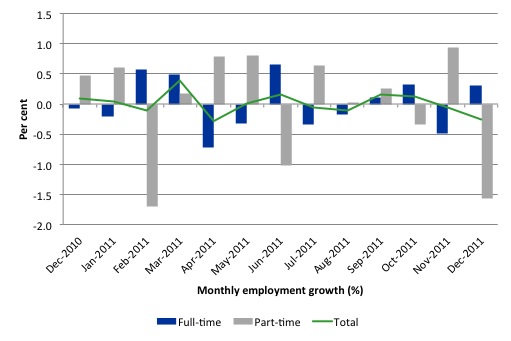
There have been considerable fluctuations in the full-time/part-time growth over the last year with regular crossings of the zero growth line. Over the last 12 months, full-time employment has risen by a paltry 15.6 thousand while part-time employment has fallen by the same amount.
The upshot is that total employment has not grown at all – the Australian economy is not generating any new net employment.
Since December 2010, with employment growth at zero, the labour force has grown by 0.3 per cent, which means that unemployment has risen over the same period.
Labour force growth is also subdued by the state of the economy (with participation rates down), which means that the sluggish supply growth is keeping unemployment much lower than it otherwise would be given how poor the employment growth has been.
So 2011 was a jobless year – which tells us that government policy is failing and should be changed.
The following graph shows the month by month growth in full-time (blue columns), part-time (grey columns) and total employment (green line) for the 12 months to December 2011 using seasonally adjusted data. The ABS trend growth rate of employment is now zero.
While full-time and part-time employment growth are fluctuating around the zero line, total employment growth is still well below the growth that was boosted by the fiscal-stimulus in the middle of 2010.
While the last 12 months has seen jobless growth, the situation has been much worse over the last six months.
The following table provides an accounting summary of the labour market performance over the last six months. The monthly data is highly variable so this Table provides a longer view (over the last 6 months) which allows for a better assessment of the trends. WAP is working age population (above 15 year olds). The first three columns show the number of jobs gained or lost (net) in the last six months.
The conclusion – overall 23.4 thousand jobs (net) have been lost in Australia since June 2011 with the overwhelming majority being full-time employment losses.
The WAP has risen by 110 thousand in the same period but the labour force has only risen by 8.1 thousand. The sharp decline in the participation rate (0.35 points) explains why the labour force growth has been so modest relative to the underlying population growth.
Unemployment has risen by 31.5 thousand since June 2011 because employment growth is unable to keep pace with even the labour force growth rate. If participation had not have fallen so sharply (that is, the labour force had have grown more in line with the underlying population growth) the rise in unemployment would have been much worse.
What we’re seeing now, is the second stage of a deteriorating labour market. The first stage is marked by declining employment growth and rising unemployment with participation more or less constant.
The second stage is when workers give up looking for jobs due the lack of vacancies and participation falls. In this stage, unemployment may even fall, but typically rises more slowly than in the first stage. But hidden unemployment rises quickly in this stage.
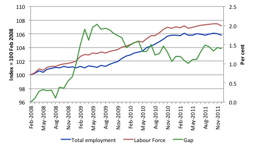
To put the recent data in perspective, the following graph shows the movement in the labour force and total employment since the low-point unemployment rate month in the last cycle (February 2008) to December 2011. The two series are indexed to 100 at that month. The green line (right-axis) is the gap (plotted against the right-axis) between the two aggregates and measures the change in the unemployment rate since the low-point of the last cycle (when it stood at 4 per cent).
You can see that even though the labour force is now falling (due to the sharp plunge in the participation rate), the divergence between it and employment growth has been widening over the last several months. The overall result is that the Gap (unemployment) has risen significantly in recent months.
The Gap series gives you a good impression of the asymmetry in unemployment rate responses even when the economy experiences a mild downturn (such as the case in Australia). The unemployment rate jumps quickly but declines slowly.
It also highlights the fact that the recovery is still not strong enough to bring the unemployment rate back down to its pre-crisis low. You can see clearly that the unemployment rate fell in late 2009 and then has hovered at the same level for some months before rising again over the last two months.
Teenage labour market – appalling and getting worse
The teenage labour market has continued to deteriorate in December from an already parlous starting point. The appears to be no policy awareness with the government and the media continually trying to convince us that the economy is close to full employment.
The following data shows that the teenage labour market is in an appalling state. In December 2011, teenagers endured further losses in total employment.
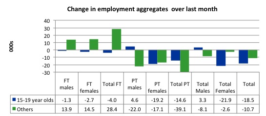
Of the last month, teenagers lost 18.5 thousand jobs, that is, 63% of the total job losses. Further while it was some full-time growth overall, teenagers lost both full-time and part-time jobs.
The following graph shows the distribution of net employment creation in the last month by full-time/part-time status and age/gender category (15-19 year olds and the rest).
If you take a longer view you see how poor the situation is.
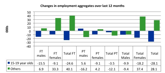
Over the last twelve months teenagers have lost 28.1 thousand (net) jobs while the rest of the labour force has gained 28.1 thousand jobs (net). So the jobless growth for 2011 is because of the failure to provide work for our teenagers. The 15-19 year olds lost 24.6 thousand full time jobs and 3.5 thousand part-time jobs over the last 12 months.
The following graph shows the change in aggregates over the last 12 months. Australian teenagers are going backwards which is a trend common around the world at present.
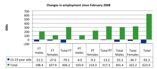
To further emphasise the plight of our teenagers I compiled the following graph that extends the time period from the February 2008, which was the month when the unemployment rate was at its low point in the last cycle, to the present month (December 2011). So it includes the period of downturn and then the “recovery” period. Note the change in vertical scale compared to the previous two graphs. That tells you something!
The results are stunning and represent a major policy failure. Since 2008, there have been 623.6 thousand (net) jobs added to the Australian economy but teenagers have lost a staggering 92.2 thousand (net) jobs over the same period. It is even more stark when you consider that 79.1 thousand full-time teenager jobs have been lost in net terms and 9.2 thousand part-time jobs have been lost.
There is nothing good that you can say about any of that. It makes a mockery of those (like the bank economists and our politicians) who claim we are close to full employment. An economy that excludes its active teenagers from any employment growth at all is not one that is using its existing capacity to its potential.
The longer-run consequences of this teenage “lock out” will be very damaging.
In the December 2011 quarter broad labour underutilisation data released today by the ABS, the underemployment rate for 15-24 year olds was 13.2 per cent. Total labour underutilisation for 15-24 year olds was 24.7 per cent.
While the Treasurer is always reminding us how responsible he is being in the pursuit of budget surpluses he fails to mention that this pursuit is one of the reasons that Australian teenagers are being locked out of the labour market.
The Australian government has no coherent strategy to resolve this appalling state. Ensuring teenagers are included in paid work, if they do not desire to remain in school, should be number one policy priority.
I would recommend that the Australian government announce a major public sector job creation program aimed at employing, in the first instance, all the unemployed 15-19 year olds.
It is clear that the Australian labour market continues to fail our 15-19 year olds. At a time when we keep emphasising the future challenges facing the nation in terms of an ageing population and rising dependency ratios the economy still fails to provide enough work (and on-the-job experience) for our teenagers who are our future workforce.
Unemployment
The unemployment rate remained unchanged in December at 5.2 per cent. As noted above, the unemployment rate would have risen in December given a negative employment growth at not the participation rate fallen so sharply.
In the next section, I will compute the participation effect. The point is that some of the weakening in the labour market has now moved outside the official labour force in the form of rising hidden unemployment.
Overall, the labour market still has significant excess capacity available in most areas and what growth there is is not making any major inroads into the idle pools of labour.
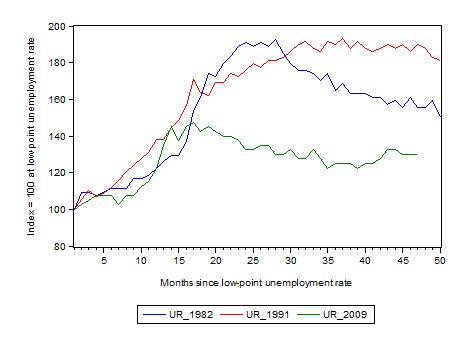
The following graph updates my 3-recessions graph which depicts how quickly the unemployment rose in Australia during each of the three major recessions in recent history: 1982, 1991 and 2009 (the latter to capture the 2008-2010 episode). The unemployment rate was indexed at 100 at its lowest rate before the recession in each case (August 1981; December 1989; February 2008, respectively) and then indexed to that base for each of the months as the recession unfolded.
I have plotted the 3 episodes for 47 months after the low-point unemployment rate was reached. For 1991, the end-point shown is the peak unemployment which was achieved some 38 months after the downturn began although the recovery was painfully slow. While the 1982 recession was severe the economy and the labour market was recovering by the 26th month. The pace of recovery for the 1982 once it began was faster than the recovery in the current period.
It is significant that the current situation while significantly less severe than the previous recessions is dragging on which is a reflection of the lack of private spending growth and declining public spending growth.
The graph provides a graphical depiction of the speed at which the recession unfolded (which tells you something about each episode) and the length of time that the labour market deteriorated (expressed in terms of the unemployment rate).
From the start of the downturn to the 47-month point (to December 2011), the official unemployment rate has risen from a base index value of 100 to a value 130 – peaking at 145 after 21 months. However, it reached a low point 8 months ago (122.5) and has been rising since then. Unlike the other episode, the current trend, at this stage of the cycle, is upward.
At 47 months, 1982 index stood at 155.5 and declining relatively quickly, the 1991 index was around hundred and 89 and falling slowly
Note that these are index numbers and only tell us about the speed of decay rather than levels of unemployment. Clearly the 5.3 per cent at this stage of the downturn is lower that the unemployment rate was in the previous recessions at a comparable point in the cycle although we have to consider the broader measures of labour underutilisation (which include underemployment) before we draw any clear conclusions.
The notable aspect of the current situation is that the recovery has stalled.
Aggregate participation rate drops sharply
The participation rate fell by 0.3 percentage points in December 2011 from 65.5 to 65.2 per centl. This sharp drop in the labour force meant that the unemployment rate did not rise in the face of the declining employment growth.
What would have the unemployment rate been if the participation rate was constant?
The labour force is a subset of the working-age population (those above 15 years old). The proportion of the working-age population that constitutes the labour force is called the labour force participation rate. So changes in the labour force can impact on the official unemployment rate and so movements in the latter need to be interpreted carefully. A rising unemployment rate may not indicate a recessing economy.
The labour force can expand as a result of general population growth and/or increases in the labour force participation rates.
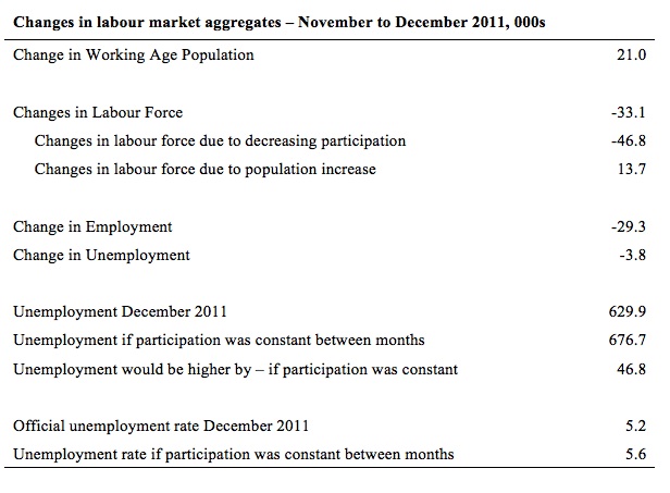
The following Table shows the breakdown in the changes to the main aggregates (Labour Force, Employment and Unemployment) and the impact of the fall in the participation rate.
In December 2011, employment fell by 29.3 thousand but the labour force fell by 33.1 thousand which meant that unemployment actually fell by 3.8 thousand.
The impact of the fall in the participation rate was to take 46.8 workers out of the labour force while growth in the working age population added an extra 13.7 thousand to the labour force. The population impact is steady from month to month.
If the participation rate had have been unchanged then the labour force would have been 12,098.1 thousand instead of 12,051.3. Given the current employment level, unemployment would have been 676.7 instead of 629.9 thousand.
So if the participation rate had have remained unchanged, the unemployment rate would have been 5.6 per cent rather than 5.2 per cent as officially published. The difference, of-course, is the that the “hidden unemployment rate” rose.
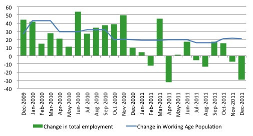
Another way of thinking about the strength of employment growth is to compare the change in employment each month with the change in the working age population (WAP). The change in the WAP is the underlying number of workers that enter the labour force month to month. The labour force fluctuates also due to participation rate changes but they tend to be volatile and cyclical.
So is the Australian economy adding jobs faster than the growth of its population? The answer is no.
The following graph plots the two series over the last two years. Over that period, the WAP has expanded on average by 25thousand per month while employment has only grown on average by 16 thousand. That is why unemployment has risen. But then further fluctuations in unemployment are driven by the participation rate volatility over this period.
If you consider the last 12 months, it is very clear that employment growth is lagging well behind the growth in the working age population.
Hours worked rise marginally in December
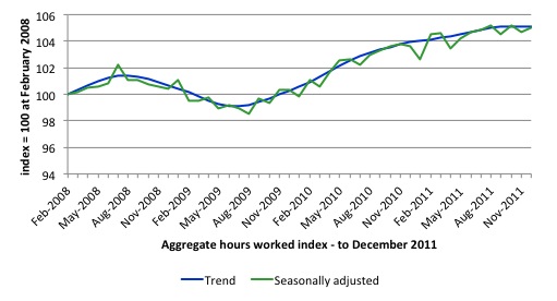
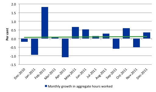
The only good piece of news from this data release is that aggregate monthly hours worked increased by 5.6 millions hours (0.4 per cent). This is because despite the overall loss of employment, full-time employment rose during the month adding hours of work to the economy.
The following graph shows the trend and seasonally adjusted aggregate hours worked indexed to 100 at the peak in February 2008 (which was the low-point unemployment rate in the previous cycle). The rising trend which marked the early recovery courtesy of the fiscal stimulus has now flattened.
The next graph shows the monthly growth (in per cent) over the last 12 months. The green linear line is a simple regression trend and it is suggesting monthly growth rates is very weak negative trended..
Once again the data doesn’t support the notion of a fully employed labour market that is bursting against the inflation barrier.
Conclusion
I just did on ABC radio interview for their nightly news bulletin and was asked what I thought of today’s figures. I said that the data told me that the state of the labour market is bad and getting worse.
While 2011 was a jobless year, the last 6 months has seen employment growth plummet. The national economy is currently not growing fast to absorb the underlying population growth.
I was asked by the ABC whether I thought this situation will change in coming year. I said that with the private sector deleveraging after a period of unsustainable credit-driven consumption and net exports not being strong enough to replace the lost growth, continued growth relied on stronger fiscal support.
However this would not be forthcoming because for political reasons the government is intent on cutting net public spending because it thinks the achievement of a budget surplus in the coming financial year will restore its ailing political stocks.
My assessment is that by undermining capacity of the Australian economy to grow at present the electorate will punish the Australian government severely in next year’s election.
The December Labour Force data shows that the Australian economic recovery has now stalled.
We always have to be careful interpreting month to month movements given the way the Labour Force Survey is constructed and implemented but there has now been enough data over the last several months to tell us that my assessment in the previous paragraph is sound.
The withdrawal of the fiscal stimulus has definitely undermined employment growth.
The most striking aspect of a sad picture is the appalling performance of the teenage labour market. Employment has collapsed for that cohort and I consider it a matter of policy urgency for the Government to introduce an employment guarantee to ensure we do not continue undermining our potential workforce.
However, the Government has become obsessed with pursuing its budget surplus and has lot track of what the real priorities that it should attend to are.
That is enough for today!

Dear Bill, please level with us.
Your blogs are really written by a group of some 10 or more researchers and writers. This cannot be the daily work of one person, I dare say. Are you at least overseeing their stuff?.. 🙂
Best regards,
Vassilis Serafimakis
“My assessment is that by undermining capacity of the Australian economy to grow at present the electorate will punish the Australian government severely in next year’s election.”
Probably. And they will instead elect the conservative opposition, who will be worse.
Dear Vassilis Serafimakis (at 2012/01/19 at 23:33)
Sorry to disappoint. I just type fast and work long hours.
best wishes
bill
Yes,Lefty,that is probably on the cards and that,in a nutshell,is the tragedy of having a political system and a substantial part of the population captured by a greedy and reactionary oligarchy.
Personally,I haven’t voted for Liberal or Labor for years as Tweedle Dee or Dum are just dumber than dumb.I always vote for one of the minor parties even though I don’t always agree with some of their policies.
Have you seen this?
LSE lecture on need to reduce working hours in UK & USA and redistribute hours of work
http://www.youtube.com/watch?feature=player_embedded&v=nqI951u9emQ