The Australian Bureau of Statistics (ABS) released the latest labour force data today (March 19,…
Australian labour market – in reverse gear and accelerating
Yesterday, the June quarter National Accounts came out showing a real GDP growth spurt. As I noted yesterday, the results should be treated with caution because they apply to the period April to June, the strong growth was largely driven by inventory accumulation, and the household consumption behaviour runs counter to more recent retail sales data. Moreover, national accounting data is typically revised when the next quarter results are known. The other cause for caution in thinking that the Australian economy is really growing above trend is that more recent data is not good at all and it is difficult rationalising the poor data results with the vision of a booming Australian economy. Today, there was more bad news when the Australian Bureau of Statistics (ABS) published the Labour Force data for August 2011. It shows that the labour market has gone backwards for the second consecutive month with total employment declining and full-time employment falling again. It shows unemployment rising further and the unemployment rate at 5.3 per cent. More worrying is that the BS broad labour underutilisation rate (underemployment plus unemployment) rose to 12.3 per cent over the last quarter. This is not an economy that is “bursting at the seams”. The labour market is in reverse gear and accelerating.
The summary ABS Labour Force (seasonally adjusted) estimates for August 2011 are:
- Employment decreased 9,700 (-0.1 per cent) with full-time employment falling by 12,600 and part-time employment increasing by 2,900. This is the second consecutive month that full-time employment has decreased significantly.
- Unemployment rose by 18,400 (3.0 per cent) to 636,800 the second month in a row that it has risen by 3 per cent.
- The official unemployment rate remained rose to 5.3 per cent up from 5.2 (revised upwards from 5.1 per cent last month).
- The participation rate remained constant at 65.6 per cent so that all the labour force growth was due underlying growth in the working age population.
- Aggregate monthly hours worked increased 4.6 million hours (0.2 per cent) – that is, hardly at all.
- The quarterly labour underutilisation estimates published this month show that the ABS broad labour underutilisation rate hase risen over the last three months to 12.3 per cent (up from 12.2 per cent). This is due to the continued collapse in full-time work over the last few months.
The ABC News response – Jobless rate up in August – said that:
Australia’s unemployment rate jumped unexpectedly in August, with almost 10,000 jobs lost.
The “surprise” was because the only people they talk to on a daily basis are bank economists who think the economy is surging ahead into an inflationary oblivion. The ABC noted that “Economists had predicted that 10,000 jobs were likely to have been created and had expected the jobless rate to stay steady at 5.1 per cent”.
Once again use the rule – put a negative sign on anything the bank economists say. In this case, you would have been dead right.
The Sydney Morning Herald report carried the headline – Jobless rate jumps in August – and quoted some bank economists who variously said the rise in unemployment was:
… certainly was a surprise” and occurring more quickly than anticipated.
It was much weaker, losing the full time jobs, and quite a substantial rise in the unemployment rate again after a similar outcome in the previous month …
It definitely doesn’t appear to be working to the RBA’s script … With the unemployment rate rising, it suggest growth is below trend …
So with confidence falling back, it’s not surpising firms have wound back their hiring intentions and we’re likely to see more of that over the next few months
The same cohort have been leading the charge claiming that the Australian economy is strong as a result of our alleged “once-in-a-hundred-years” mining boom. There have been constant assertions that Australia is back to full employment and so a budget surplus has to be pursued with vigour and at all costs to prevent an inflation break-out.
I have been almost a sole voice arguing that the labour market has been struggling since the downturn began.
The best thing a government can learn from today’s data is that it is the state of the real economy and its labour market that matters and the budget outcome should be whatever it takes to ensure there is full employment and price stability.
Targetting a surplus at a time of high and rising unemployment and underemployment is fiscal vandalism.
Employment continues to contract
The August data shows that employment decreased by 9,700 (net) (-0.1 per cent). There have been considerable fluctuations in the full-time/part-time performance and regular crossings of the zero growth line over the last several months. Since December 2010, employment has declined 4 out of the 9 months, didn’t grow at all for 2 of the months, and average growth has been 0.1 per cent. So for the year to date we are effectively in a jobless growth environment.
Full-time employment contracted for the second consecutive month (a loss of 12,600 net jobs) with growth at -0.2 per cent. Full-time employment has contracted in 4 of the last 5 months. In the last two months, it has failed to keep pace with underlying population growth and unemployment has risen.
Trend employment growth which has been subdued since dropping sharply around November 2010 as the fiscal stimulus was withdrawn is now negative.
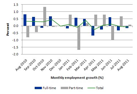
The following graph shows the month by month growth in full-time (blue columns), part-time (grey columns) and total employment (green line) for the 12 months to August 2011 using seasonally adjusted data. It is clear that the picture has been mixed over the last 12 months with employment growth averaging 0.1 per cent per month (full-time 0.2 per cent; part-time 0.0 per cent).
While full-time and part-time employment growth are fluctuating around the zero line, total employment growth is still well below the growth that was boosted by the fiscal-stimulus in the middle of 2010.
Accounting Table – February 2011 to August 2011
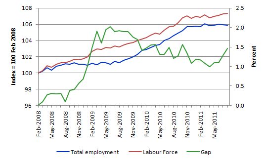
To put the recent data in perspective, the following graph shows the movement in the labour force and total employment since the low-point unemployment rate month in the last cycle (February 2008) to August 2011. The two series are indexed to 100 at that month. The green line (right-axis) is the gap (plotted against the right-axis) between the two aggregates and measures the change in the unemployment rate since the low-point of the last cycle (when it stood at 4 per cent).
You can see that even though the labour force is slowing (mainly due to a fall in working age population due to lower in-migration rates), the divergence between it and employment growth is growing. The result is that the Gap (unemployment) has risen significantly in recent months.
The Gap series gives you a good impression of the asymmetry in unemployment rate responses even when the economy experiences a mild downturn (such as the case in Australia). The unemployment rate jumps quickly but declines slowly.
It also highlights the fact that the recovery is still not strong enough to bring the unemployment rate back down to its pre-crisis low. You can see clearly that the unemployment rate fell in late 2009 and then has hovered at the same level for some months before rising again over the last two months.
The Australian labour market continues to be stuck in a period of sluggish growth and fluctuating participation rates.
Teenage labour market – remains in an appalling state
The teenage labour market has remains in a parlous state, which is a fact that is being ignored by the government and the media who continually try to convince us that the economy is close to full employment.
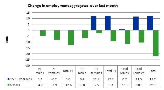
The following data shows that the teenage labour market is in an appalling state. In August 2011, the losses in full-time employment were endured by non-teenagers. There was no change in full-time employment for teenagers. The gains in the part-time employment overall (2,900) were concentrated in the teenage female labour market.
The following graph shows the distribution of net employment creation in the last month by full-time/part-time status and age/gender category (15-19 year olds and the rest).
However, while that result is better than that experienced in the non-teenager segment of the labour market, if you take a longer view you see how poor the situation is.
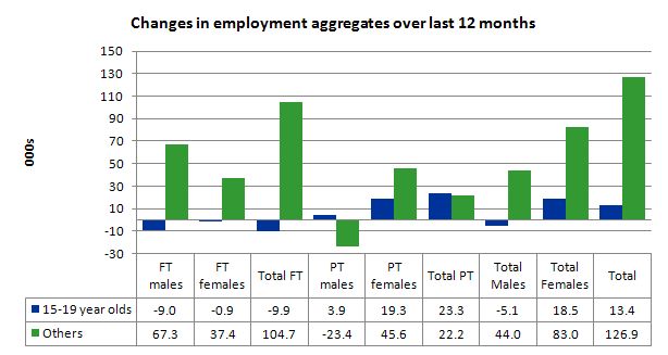
Over the last twelve months teenagers have gained only 12.4 (net) jobs while the rest of the labour force has gained 140.3 thousand jobs (net) – the latter figure being insufficient to prevent unemployment from rising. However, the 15-19 year olds lost 9.9 thousand full time jobs in the same period. In other words, the sparse job opportunities available to them are in the form of casualised, low-paid, insecure jobs that will not develop skills.
To put this month’s figures in perspective though, the following graph shows the change in aggregates over the last 12 months. In this so-called period of recovery, teenagers are going backwards.
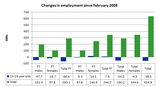
To further emphasise the plight of our teenagers I compiled the following graph that extends the time period from the February 2008, which was the month when the unemployment rate was at its low point in the last cycle, to the present month (August 2011). So it includes the period of downturn and then the “recovery” period. Note the change in vertical scale compared to the previous two graphs. That tells you something!
The results are stunning and shameful. Since February 2008, there have been 634 thousand (net) jobs added to the Australian economy but teenagers have lost 58.5 thousand over the same period. It is even more stark when you consider that 66.4 thousand full-time teenager jobs have been lost in net terms while only 7.9 thousand (net) part-time jobs have been added.
Further, around 40 per cent of the total (net) jobs added since February 2008 have been part-time.
There is nothing good that you can say about any of that. It makes a mockery of those (like the bank economists and our politicians) who claim we are close to full employment. An economy that excludes its active teenagers from any employment growth at all is not one that is using its existing capacity to its potential.
The longer-run consequences of this teenage “lock out” will be very damaging.
In the May 2011 quarter broad labour underutilisation data released last month by the ABS, the underemployment rate for 15-24 year olds was 13.1 per cent (up from 12.9 per cent in the February quarter). Total labour underutilisation for 15-24 year olds was 24.2 per cent (only marginally below the 24.6 per cent in February).
In the August 2011 quarter (published today), the underemployment rate for 15-24 year olds was 13.5 per cent. Total labour underutilisation for 15-24 year olds was 24.9 per cent.
This is an economy that the Treasurer says is booming and in need of fiscal austerity but in which 25 per cent of our 15-24 year olds (who are seeking work) are idle (sum of unemployment and underemployment).
It is clear that the Australian labour market continues to fail our 15-19 year olds. At a time when we keep emphasising the future challenges facing the nation in terms of an ageing population and rising dependency ratios the economy still fails to provide enough work (and on-the-job experience) for our teenagers who are our future workforce.
Unemployment
The unemployment rate rose sharply by 0.2 percentage points in August to 5.3 per cent. The reason is simple. With participation rates constant all the labour force growth is being driven by underlying growth in the working age population (above 15 year olds) even though that growth is slowing (due to a decline in in-migration rates). The rising unemployment has resulted from the failure of the demand side of the economy (employment growth) to match that labour force growth which is a sign of a weakening economy.
Overall, the labour market still has significant excess capacity available in most areas and it is rising.
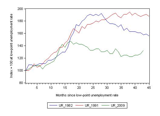
The following graph updates my 3-recessions graph which depicts how quickly the unemployment rose in Australia during each of the three major recessions in recent history: 1982, 1991 and 2009 (the latter to capture the 2008-2010 episode). The unemployment rate was indexed at 100 at its lowest rate before the recession in each case (August 1981; November 1989; February 2008, respectively) and then indexed to that base for each of the months as the recession unfolded.
I have plotted the 3 episodes for 46 months after the low-point unemployment rate was reached (although the current episode has only endured for 43 months). For 1991, the end-point shown is the peak unemployment which was achieved some 38 months after the downturn began although the recovery was painfully slow. While the 1982 recession was severe the economy and the labour market was recovering by the 26th month. The pace of recovery for the 1982 once it began was faster than the recovery in the current period.
It is significant that the current situation while significantly less severe than the previous recessions is dragging on which is a reflection of the lack of private spending growth and declining public spending growth.
The graph provides a graphical depiction of the speed at which the recession unfolded (which tells you something about each episode) and the length of time that the labour market deteriorated (expressed in terms of the unemployment rate).
From the start of the downturn to the 43-month point (to August 2011), the official unemployment rate has risen from a base index value of 100 to a value 132.5 – peaking at 145 after 21 months. At the same stage in 1991 the rise was 1879 (and falling) and in 1982 – 157 (and falling).
The trend in unemployment at present is rising as employment growth fails to keeps pace with the (declining) labour force growth. So unlike the previous recovery periods, the current recovery has stalled and going into reverse.
Note that these are index numbers and only tell us about the speed of decay rather than levels of unemployment. Clearly the 5.3 per cent at this stage of the downturn is lower that the unemployment rate was in the previous recessions at a comparable point in the cycle although we have to consider the broader measures of labour underutilisation (which include underemployment) before we draw any clear conclusions.
The notable aspect of the current situation is that the recovery has stalled.
Each quarter the ABS publish their broader measures of labour underutilisation. Today, we received the data for the August 2011 quarter.
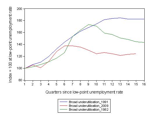
The following graph replicates the previous graph except it uses the ABS broad labour underutilisation rate (unemployment plus underemployment) as a better means of comparing the three recessions.
At the same period in the recovery (using quarterly data), the broad labour underutilisation rate (unemployment plus underemployment) had an index value of 144 in the 1982 recession (absolute value of 12.1 per cent and falling); an index value of 182 in the 1991 recession (absolute value of 17.9 per cent and steady); and an index value of 124 in the current period (absolute value of 12.2 per cent and rising).
So while the level of unemployment is much lower now than in the 1982 recession (at a comparable stage), underemployment is now much higher and so the total labour underutilisation rates are similar.
Commentators who think of the 1982 recession as severe, rarely see it in these terms. Joblessness is probably worse than underemployment but both mean that labour is wasted and income earning opportunities are being foregone. For a worker with extensive nominal commitments, the loss of income when hours are rationed may be no less severe than the loss of hours involved in unemployment, if the threshold of solvency is breached.
Aggregate participation rate remains constant
The participation rate remained unchanged in August which means that the rise in unemployment is purely down to employment growth failing to keep pace with the underlying population growth.
Hours worked basically static in August
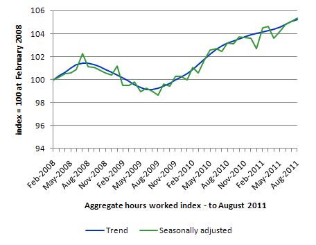
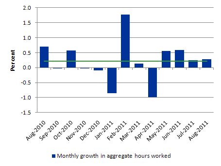
Total monthly hours worked rose in August by 4.6 million hours or 0.3 per cent – that is, very subdued. After the initial fiscal-driven recovery from the recession, the trend is now flat.
The following graph shows the trend and seasonally adjusted aggregate hours worked indexed to 100 at the peak in February 2008 (which was the low-point unemployment rate in the previous cycle). The rising trend which marked the early recovery courtesy of the fiscal stimulus has now flattened.
The next graph shows the monthly growth (in per cent) over the last 12 months. The green linear line is a simple regression trend and it is suggesting monthly growth rates are struggling.
Once again the data doesn’t support the notion of a fully employed labour market that is bursting against the inflation barrier.
Regional trends
While the detailed regional labour market data doesn’t come out until next Thursday, today’s release does provide state-by-state breakdowns and the results were very interesting.
So it is worth commenting on what is happening at this level because it runs counter to the mainstream “once-in-a-hundred-years” mining boom rhetoric that we are being bombarded with by the politicians (and the mining industry) and which is being used to impose fiscal austerity on the nation at a time when it badly needs more jobs being created.
In a previous blog I considered the claim that is being driven in the media that the recovery phase is being driven by the mining sector and a two-speed economy is emerging. So the “mining” states (Western Australia, Queensland and Northern Territory) are leaving the old manufacturing areas (NSW and Victoria) behind. The evidence is not yet convincing although in the last month the mining states of Queensland and WA have revealed increasingly better outcomes.
This has been a popular narrative for some time now.
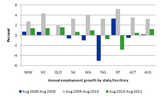
The following graph shows the percentage employment growth for the states and territories for each of the last three annual periods (August to August). There is nothing special about the periods chosen – just to correspond with the latest observation.
The data shows that employment in the mining states is now slowing quite sharply.
Remember not to get tricked by scale. The ACT is a much smaller labour market in absolute terms than NSW and Victoria.
In the most populous states (NSW, VIC and QLD). NSW and Victoria are the manufacturing strongholds and have very little exposure to the mining industry. Queensland has some exposure to the mining industry clearly but is probably suffering from the a fall in tourism as our exchange rate appreciation makes holidaying abroad less expensive.
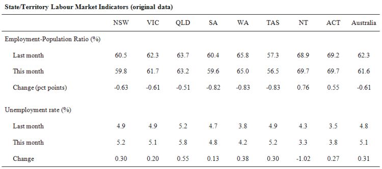
The data in the Table is based on original (rather than seasonally adjusted data). The Employment-population ratio is considered to be a cyclically-clean measure because its variation is due to changes in employment with the underlying population growth being mostly non-cyclical.
The data compares the results from July 2011 with those published today for August 2011. You can see that the mining states (Queensland, Western Australia) are going backwards in terms of employment.
When you consider the movement in the unemployment rate both Queensland and Western Australia experienced sharp rises well above the national trend.
Conclusion
The August Labour Force data shows that the Australian economic recovery is probably faltering despite the National Accounts data published yesterday which told us that some 3 months ago the economy was growing. The labour market has been subdued for some months now and has contracted for the last two months.
We always have to be careful interpreting month to month movements given the way the Labour Force Survey is constructed and implemented but there has now been enough data over the last several months to tell us that the trend is down.
The labour market is now failing to generate sufficient employment growth to even keep pace with underlying population growth and as a consequence unemployment is rising again as it did last month. We are now not that far from the peak of the downturn in 2008.
Today’s data is consistent with a range of indicators that are pointing to weakness in the economy.
Total labour underutilisation rate (the broad measure – the sum of unemployment and underemployment) rose again to 12.3 per cent and that was all because unemployment edged up.
It is insulting the workers that the government is deliberately allowing to remain idle to claim we are close to full employment.
There is still a lot of slack left to be mopped up and the teenage employment problem is manifest and should be a policy priority.
The fact that the Treasurer continues to argue that they will deliver a budget surplus in the next 2 years shows how far removed from reality he has become. He has been trapped by the political process into this one line response to everything without realising that the slow growth will prevent him from delivering a surplus irrespective of what he does by way of fiscal cuts. He is getting very poor advice.
It would be better for the Government to admit that they need to reintroduce fiscal stimulus to underpin job creation which would require them to abandon their budget surplus ambitions and show some leadership. Their current surplus mantra is totally at odds with the direction of the labour market at present.
For those in Australia – I did an interview for ABC PM program today on the labour force data.
That is enough for today!
This paragraph sums up the major problem with the World economy today.
“The best thing a government can learn…………it is the state of the real economy and its labour market that matters and the budget outcome should be whatever it takes to ensure there is full employment and price stability.”
Adding “price stability” makes a huge difference to impact of the sentence. These words should be permanently tattooed onto their foreheads….. Backwards so they can read it in the mirror every morning.