The Australian Bureau of Statistics (ABS) released the latest labour force data today (APRIL 16,…
Labour force data – no boom yet!
Australia’s economy is apparently booming. At least that is what all the current public rhetoric is suggesting. Wage breakouts are apparently looming and the Mining boom (is) too hot for Canberra to handle. Today the ABS released the Labour Force data for April 2010 and the data reveals that while there are positive developments in the labour market, employment growth remains sluggish and is barely keeping pace with the growth in the population. Unemployment rose a tad as a result. While the bank economists have hailed today’s figures as “stellar” and indicative of an economy “near full capacity”, I consider their judgement to be seriously impaired and biased. Conditions in the Australian labour market are, in fact, fairly subdued. As I said last month – with the declining fiscal stimulus and private spending remaining subdued – today’s data doesn’t represent a place we would want to be in for very long.
The summary ABS Labour Force results for April 2010 are (seasonally adjusted):
- Employment increased 33,700 (+0.3 per cent) with full-time employment increasing by 37,500 and being partially offset by a reduction of 3,900 in part-time employment.
- Unemployment increased 6,500 (+1.0 per cent) to 628,100.
- The official unemployment rate was stable at 5.4 per cent. The ABS revised last month’s rate up from 5.3 per cent by the way.
- The participation rate remained at 65.2 per cent and is still well down from its most recent peak (April 2008) of 65.6 per cent. So the approximate number of workers that have dropped out of the labour force because of diminishing job prospects (that is, the rise in hidden unemployed) is 68 thousand persons. These workers were ignored in Tuesday’s Budget which claimed that if the unemployment rate drops to 4.75 with a participation rate equal to what it is now, Australia will have full employment. Clearly, the government is denying that hidden unemployment exists.
- Aggregate monthly hours worked decreased 8.3 million hours (-0.5 per cent) and is still well below the July 2008 peak.
- Total labour underutilisation (the sum of underemployment and unemployment) remains at around 12.8 per cent – which is significant evidence of labour market slack despite the rhetoric that we are approaching full capacity.
News Limited reported that there was “strong jobs growth” and that the “strength of the Australian economy has fuelled worries about inflationary risks”.
The RBA however said after today’s labour force data release that they are watching the “sovereign debt turmoil in Europe” (Read: A.K.A. nonsensical voluntary flagellation by mindless bureaucrats, central bankers and politicians). They are likely not to put rates up next month.
News Limited also claimed that:
A key reason for a robust labour market has been the demand for Australia’s minerals and agriculture from fast-growing China, as well as well as other key trading partners. Buoyant consumer and business confidence, despite rising interest rates, has also enabled more employers to covert part-time staff back into full-time workers.
I think you will see later in this blog that it is hard to make this conclusion from today’s data. Most of the improvement is coming from non-mining states.
The usual crop of bank economists were wheeled out by the press and among the more stupid comments I heard were as follows.
It’s a pretty stellar jobs report …
What? Employment growth is barely keeping up with population growth (given the participation rate is constant). That is what we call stellar these days?
(a) good result … It shows employers are still willing to put on more labour
Sure, but at very modest rates of growth – given we are meant to be booming.
It continues to show the resilience of the domestic economy compared to what we’re seeing overseas in Europe
Definitely – but then why compare us with Europe? We have a sovereign currency and actually used aggressive fiscal policy early in the downturn. The Europeans are falling over themselves to keep fiscal policy as muted and preferably as pro-cyclical as possible. No comparison.
Then you read this comment which made me laugh:
The tightening of the labour market will be a growing concern for the RBA, particularly after the government announced this week that it expects that the economy will approach full employment by mid-2012 … Indeed, this highlights the risk of a wages breakout … In this week’s budget, the government forecast wage inflation of 3.75 per cent in the year to June 2011, although the risks are skewed to an even higher rate given that the economy already is growing around trend and doing so with little spare capacity.
A ridiculous assessment that defies the facts.
How is the labour market tightening when the unemployment rate is constant and employment growth is just barely keeping pace with the labour force growth?
How is the labour market tightening when aggregate hours worked is falling?
The labour market did add full-time employment this month but in the early part of the downturn it shed these jobs at a very rapid pace. Some adjustment had to come as growth returned. But this is not a tightening labour market.
There is no danger of a wages breakout. The unions are under control and the industrial relations climate benign.
And total labour underutilisation remains at least at 12.8 per cent (not counting the 2 per cent or so of hidden unemployed). Since when has that level of labour wastage coincided with “little spare capacity”. I would sack this commentator for bring my organisation into disrepute if I was their boss. Let them go out into the “wages boom” and see how much spare capacity there actually is!
I continue to consider the “bank economist” commentary to represent such a dismal standard of public discourse.
Employment growth strengthening – just
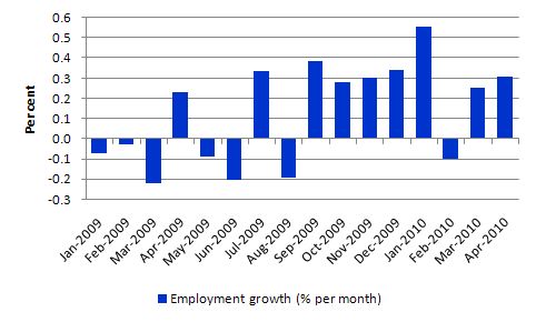
The following graph shows the month by month growth in total employment since January 2009. The overall picture is mildly positive. Employment growth has strengthened in the last month and the trend is up but it is just keeping pace with the labour force which is why the unemployment rate is unmoved. This is a tepid recovery at present.
It does not support the rhetoric that we heard from the bank economists noted above. It is clear that the spending stimulus from the fiscal intervention has waned and that private sector spending growth is not yet very strong. So the boost from the stimulus is giving way to a pale labour market recovery. There is positive employment growth but it is just keeping up with the labour force growth (which means population growth given the participation rate is constant).
The other signal that the economy is not booming lies in the static behaviour of the labour force participation rate.
Unemployment rate
The official unemployment rate is now stuck on 5.4 per cent and employment growth is not strong enough to offset labour force growth.
Tightening aggregate policy under these circumstances amounts to vandalism or worse.
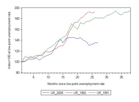
The following graph updates my 3-recessions graph which I produce each month. It depicts how quickly the unemployment rose in Australia during each of the three major recessions in recent history: 1982, 1991 and now 2009 (the latter to capture the 2008-2010 episode). The unemployment rate was indexed at 100 at its lowest rate before the recession in each case (June 1981; November 1989; February 2008, respectively) and then indexed to that base for each of the months until it peaked. It provides a graphical depiction of the speed at which the recession unfolded (which tells you something about each episode) and the length of time that the labour market deteriorated (expressed in terms of the unemployment rate).
From the start of the downturn to the 27-month point (to April 2010 – the length of the current deterioration since February 2008), the official unemployment rate has risen from a base index value of 100 to a value 135 – a 35 percent rise. At the same stage in 1991 the rise was 81.6 per cent (and growing) and in 1982 92.7. The 1982 recession which was fairly severe ended at the 26-month point and the economy began a painful recovery after that month.
While the unemployment rate was tracking the severity of the 1991 recession up until month 16, it is now clear that the current downturn has parted company with the previous experiences. But the fact remains that the promising employment growth from early 2009 (see graph above) which lasted while the fiscal stimulus was impacting significantly on employment growth is not gone and the retrenchment of the unemployment rate is temporarily stalled. That is bad news.
Note that these are index numbers and only tell us about the speed of decay rather than levels of unemployment. Clearly the 5.4 per cent at this stage of the downturn is lower that the unemployment rate was in the previous recessions at a comparable point in the cycle although we have to consider the broader measures of labour underutilisation (which include underemployment) before we draw any clear conclusions.
The underemployment data is quarterly and will come out again next month so we will see what has been happening to the overall slack in the labour market then.
While many local commentators have been claiming the superior relative outcomes in the most recent downturn compared to the 1991 and 1982 recession are the result of increased labour market flexibility after the decades of deregulation, the argument doesn’t hold water. The US, for example, is a much freer labour market than Australia’s and their situation is still very grim.
The more robust explanation – especially when you examine the profile of the employment growth in the first graph, is that the Australian government implemented the fiscal stimulus very early in the cycle and targetted it to consumers followed by infrastructure. While there have been some problems with a couple of the programs the overall result has been positive for the economy.
The risk now is that with aggregate policy tightening as the RBA hikes interest rates and the fiscal stimulus is withdrawn is that we will get stuck at this level of unemployment.
Most commentators are claiming this will not happen and the mining boom will take care of the demand lost via the fiscal withdrawal and the tightening monetary policy. The next section has a look at evidence that today’s data might provide in support or otherwise of that claim.
Tale of two economies?
There is once again talk of the two-speed economy and the danger of an inflationary surge as the mining boom pushed growth beyond capacity. Part of this rhetoric has led the federal government to introduce its now controversial resource super profits tax. The only thing coming out of the current debate on that tax, which has seen the press (News Limited) beat up untruthful stories about mining projects being scrapped in recent days and the big miners like Rio Tinto claiming they will reduce their investment because of the tax, is that special pleading is alive and well in Australia and is accompanied by an extraordinary propensity of leading businessmen to lie through their greedy teeth. My advice to the government – remember – the wealth is in the ground and they cannot take it with them!
Anyway, the two-speed economy was a reality in the end-years of the last boom. I wrote several articles about it at the time which were published in various places. The reality was that some sectors (such as manufacturing) and regions (such as Sydney) were struggling while other sectors (such as mining) and regions (such as Western Australia) were booming. These trends – popularised the term “two-speed economy” – whereby serious sectoral and regional imbalances accompany overall economic growth.
The trends challenged the fundamental patterns of our economic and social settlements and threaten the financial viability of many Australian households.
While the term “two-speed economy” has taken on a number of meanings in different countries the imbalance of most interest in the policy debate was the precariousness of the NSW economy (particularly, Sydney) relative to the prosperousness of the mining regions of Western Australia, Queensland and the Northern Territory.
Several coincident factors were seen to be driving the “two-speed” economy some of which did not received much public attention.
First, our terms of trade for non-rural, particularly base metal commodities boomed but delivered uneven benefits to Australian regions. Further, Australian manufacturing has been declining steadily for many years with regionally concentrated costs. Consequently, unemployment fell in some areas but rose elsewhere.
Second, record fuel prices at the time started to impinge on household spending power and industry cost levels, the latter, in turn, affecting the inflation rate. Rising inflation provoked the one-trick pony that is our central bank to increase interest rates rises which exacerbated the financial stress for many households. It is poor policy to attack a supply-side cost impulse with a demand-side restraining measure. But the neo-liberals will never learn that lesson.
Third, the major city property booms in the early part of this century have abated with households left holding record debt levels. In some areas, household finances became so vulnerable to minor interest rate variations and increasing unemployment that the Reserve Bank of Australia (RBA) had to slow down its normal pattern of tightening. But still household viability was impinged by the poor conduct of monetary policy.
Fourth, there was unprecedented fiscal drag as a result of Federal Government’s obsession with running increasing budget surpluses. The resulting squeeze on household disposable income combined with rising interest rates, increased the bankruptcy rate in some areas (like Sydney) which were not enjoying the growth benefits of the commodity prices boom.
So what do we see now?
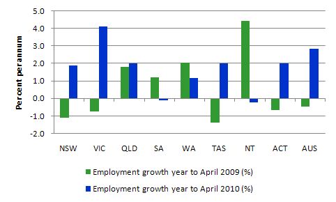
The graph shows the percentage employment growth for the states and territories for each of the last two years (to April). There is nothing special about the periods chosen – just to correspond with the latest observation. The choice doesn’t really change the message.
You can see that the strongest employment growth is in the most populous states (NSW, VIC and QLD). NSW and Victoria are the manufacturing strongholds and have very little exposure to the mining industry. Queensland has some exposure to the mining industry clearly but also is probably benefiting from domestic-sourced tourism as our exchange rate appreciation makes holidaying abroad more expensive.
The strong employment growth in the ACT, given it is a public sector economy (seat of government and main government departments are there) reflects the benefits of the fiscal stimulus and the modest expansion of government. Remember not to get tricked by scale. The ACT is a much smaller labour market in absolute terms than NSW and Victoria.
Importantly, states with significant exposure to mining are not recording as strong employment growth and South Australia and the Northern Territory have actually gone backwards in the last year.
Overall, the labour market is not yet showing signs of a two-speed economy opening up as it did in the end-years of the previous cycle.
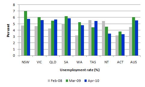
The next graph shows the evolution of the unemployment rates (%) by states and territories since the onset of the downturn. The low-point national unemployment rate of the last cycle was achieved in February 2008 (grey bars). The national peak was realised in March 2009 (green bars) and the blue bars are the current observation (April 2010).
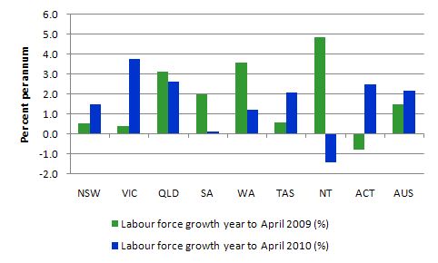
You should study this graph in relation to the previous graph (employment growth) and the next graph (labour force growth).
You can see that the most populous state, NSW suffered the worst rise in its unemployment rate as the downturn worsened (mostly due to the loss of manufacturing and some service sector jobs) but is recovering relatively better than the other states.
The relatively low unemployment rate in February 2008 for Western Australia, reflected the mining gains in the end-years of the last cycle. But the current recovery period has not reduced its unemployment rate very quickly.
Same story for Queensland and if you examine the labour force growth graph below you will see that Queensland is experiencing slower labour force growth in the last year than the previous.
Overall, no mining boom spilling over into the labour market yet!
The next graph completes the picture and shows labour force growth rates by states and territories for the same annual periods as depicted in the employment growth graph. Draw your own conclusions which I help you with in the next discussion.
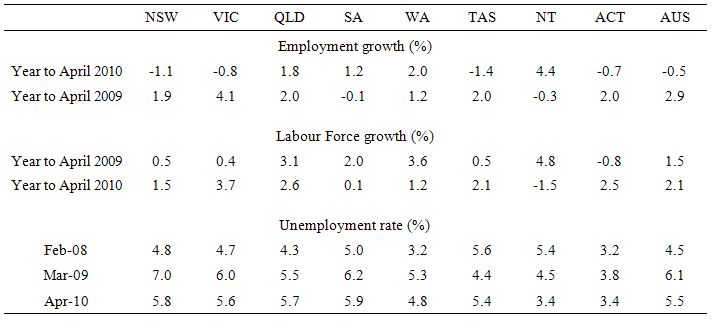
The following table provides the actual data for the graphs to help you make the necessary interpretations more accurately. I would have expected employment and labour force growth to be strengthening and well above the national average in the mining states (WA, QLD, SA, NT) if the “mother of all mining booms” (as one News Limited journalist keeps telling us is upon us) was running out of control. That is clearly not the case.
You see stronger aggregates on both the supply and demand side in the non-mining states (the manufacturing strongholds). We will get detailed industry data next Thursday whereupon we will be able to see what sectors are driving these patterns.
But at the agggregate level I suspect we are talking a bit to early about a runaway mining boom.
Hours worked
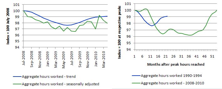
Total hours worked in April fell by 8.3 million hours (-0.5 per cent) which was on top of a fall in March of 10 million hours (-0.6 per cent). While last month’s fall could have been a blip, given the strong growth in February, the successive weakening is something to think about. Most commentators saw the strong February growth as a sign of a developing trend – the “boom claims” but as I pointed out then – you have to be wary of making anything out of the monthly movements given the sampling errors. There is no strong positive hours trend yet – it remains a fairly weak and weakening positive trend at present. Another month of working hours losses and that weak positive trend will start reversing.
The following graph is taken from the the ABS data and shows the trend and seasonally adjusted aggregate hours worked indexed to 100 at the peak in July 2008 (left-panel) and the trend series indexed to 100 at the peaks coinciding to the 1991 recession (peak at November 1989) and the 2009 recession (peak at July 2008) (right-panel).
From the left-panel, you can see a very flat V-shaped recovery is emerging but the trend is now very weak as the recent monthly falls in aggregate hours worked takes it effect.
The comparison with the 1991 recession is interesting. You can see how prolonged that event was in our economic history. Although hours collapsed more quickly in the early months of the current downturn than they did in 1991, the trough has been much shallower and recovery has come sooner. The reason? In 1991, the then Labor Government under Keating refused to admit that the recession was going to be anything other than a “soft landing” and eschewed the use of fiscal policy. He was still extolling the virtues of his obscene budget surpluses. He found out the hard way.
The lessons were learned this time around and the government introduced and early and large fiscal stimulus. It was not large enough and it is being withdrawn too early but it was light years ahead of the policy awareness that was demonstrated in the 1991 recession.
But the national economy overall is still not close to the peak of July 2008.
The following graph shows the month-by-month changes (in 000s of hours) for aggregate working hours for full-time, part-time and total employment by sex. T
We see that the surge in aggregate working hours in January, which started to fuel the “boom hysteria” has now given way to successive declines in total hours worked. While females were the winners in the initial months of the downturn, mainly because the economy kept adding part-time work as full-time employment collapsed, the tables seem to be turning now. However, in the last two months, the loss of hours is only slight greater for females.
All the hours data tell me that the impact of the fiscal intervention is now leaving the expenditure system and aggregate demand is weakening in the face of households trying to increase saving and exports not being strong enough to make up the difference. Business investment is still weak except for some activity in mining.
Conclusion
While the business economists are claiming that the labour market is strong the facts belie that assessment. There is some growth especially in full-time employment and that is always a good sign. But the employment growth is barely keeping pace with population growth and the usual signs of a strong recovery (rising participation) are absent. So the modest rise in official unemployment published today indicates a subdued picture.
My conclusion is that things are looking positive still very tentative.
I don’t consider the data is consistent with an economy that is close to a boom as the banking economists are now consistently claiming. It looks very much like a labour market with a lot of slack and the recovery is not gathering much pace.
I expect the labour underutilisation to remain high for some years yet.
You cannot escape the conclusion that the boost provided by the fiscal stimulus is waning. We will have to wait until June for the National Accounts data for the first quarter but the retail sales data released last week and various housing indicators suggest that private spending remains fairly passive.
Given today’s data and related data releases over the last few weeks, I am still of the view that a further fiscal expansion is required – and should be directly targeted at public sector job creation and the provision of skills development within a paid-work context. That would be a great boost to low inflation growth.
That is enough for today!

Call me a sceptic but I honestly believe we will look back on this period and ask ourselves how did we get it so wrong?
It is refreshing to read and see a commentator who does not subscribe to the herd mentality!
Ten years ago I had the pleasure of meeting Senator Graham Richardson and asked him why did Bob had to go? He replied he lost touch. As soon as a politician loses touch and he cannot tell you what the price of milk is it’s time to go.
Unfortunately when it comes to policy it is the same people , spinning the same lines again and again. They never seem to have lost touch!
Even my four year old son would be able to tell you our economy is precariously balanced. Why:
Growth is predominately being driven by the mining boom
We have the Euro crisis which is looming if not here and have we really recovered from GFC?
The lessons of 1991 as outlined above are lost on people – we seem to have no long term memory these days
Statements about full employment are like the Great Moderation speech….and if you believe in that its time you left some milk and cookies out for santa this year…
I have a (hopefully not too off-topic question) for bill, maybe one that deserves a blog post.
You often say that a JG will not be inflationary for the simple reason that the resource being bought (unemployed workers) has no price. This seems true enough, but obviously those wages will then be used to buy other things (food, housing, fuel) which may well be resource constrained.
It is not obvious to me that the additional work produced by the JG will – in the short term – lead to more production of those resources, so it is reasonable to imagine that a JG will generate a rise in prices.
In the longer term one would hope that domestic production would generate those resources, so the rise in prices would not be permanent. But it still seems to me that, as long as a JG is adding to aggregate demand you would expect a continuing upward pressure on prices.
So my question is : what sort of ongoing price rises would MMT expect while a JG was repairing the underutilisation of labor? 5% ? 10% ? I get that this is a very technical question about the exact structure of the economy and quite separate from the basic argument, but can you give me some idea? It is a question that often gets put when I try to explain MMT to people who don’t follow economics beyond the papers.
Bill,
I’ve just heard that Wynne Godley has passed away. He was probably sick of the place. RIP
begruntled: From my understanding, inflation will not result because of price stickiness. To balance the old supply-demand-price equation most companies prefer to hire more people and produce more of their goods, thus adding to supply rather than just mindlessly raising the price. If they do raise prices then they will lose market share, unless they have a monopoly or cartel.
Dear Spiro Kolokithas at 7:14 pm
You said:
We are showing how stupid a race of animals we are at present.
And thanks for the nice comment.
best wishes
bill
Dear begruntled at 1:42 am
You said:
First, the unemployed are already in the public sector usually on income support. The minimum wage that I would pay them would be above this but not that far above to represent a huge boost to aggregate demand.
Second, if there were inflationary pressures then we would need to reduce private demand somewhat by increasing taxes or cutting government spending elsewhere (for example, we could start with military expenditure).
You then said:
As you question went on to say, this is a technical issue relating economic structure, income support levels, where you set the minimum wage etc.
I would not expect very much inflation if any. You might like to read this very detailed report we put out in 2008 on all these questions – Creating effective local labour markets: a new framework for regional employment policy. I think it answers most questions about the JG.
best wishes
bill
Dear BFG at 10:20 am
You said:
He was definitely sick. Some great work over a long career. He was a very interesting fellow.
best wishes
bill
@grigory
I get that prices are sticky, but I think ‘monopoly’ power is more widespread and important than you imply. I just cannot see how production of all sorts of basic goods can be expanded easily just by putting on more workers – if only due to capital requirements
@bill
Thanks for the pdf, looks like a good read.
I get your point about many of the JG candidates already being on the government payroll through income support, but as you always say the reported unemployment level is hopelessly understated, by a good 6-7%. Surely a JG would see many of those people signing up, and 6-7% of the population gaining an income seems a pretty substantial increase in aggregate demand to me.
However, your point about getting the resources from somewhere else – like defense – is well taken. In essence, inflation is always an optional government policy, never required, so my question of ‘what inflation would result’ is misguided. Whatever inflation the government was comfortable with would result.
Bill,
Wynne Godley
He was definitely sick. Some great work over a long career. He was a very interesting fellow.
Yea,
I watched an interview of Wynne Godley on youtube last year. He has an interesting background coming from nobility. They have a large 5000 acre estate here in Co. Leitrim, Killegar House, well large by Irish standards. And his views always seemed to go against the grain. I’ll have to buy that book he wrote with Marc Lavoie, Ramanan gives it high praise.
“To balance the old supply-demand-price equation most companies prefer to hire more people and produce more of their goods, thus adding to supply rather than just mindlessly raising the price. If they do raise prices then they will lose market share, unless they have a monopoly or cartel.”
That is opinion stated as fact. Companies do not like hiring more people or buying more plant. If they are well advised by good accountants then they will produce as much as they can with what they’ve got and increase their prices as much as they can get away with. It is an accounting fact that if you can increase your prices and top slice your turnover you’ll almost certainly make more money. (See http://www.accountancyextra.co.uk/blog/index.php/2010/02/24/boost-your-profits-instantly for an example). It will also get rid of your most troublesome customers – who are always the ones on the margins.
Only once they have pushed these envelopes as far as they can will a sensible business consider expansion.
Neil,
why is that Apple so often running low on inventories? I wish you luck moving your price up and down depending on stochastic demand behaviour. Your company will be gone after a couple of your price cycles.