I finally arrived back home late last night, so I am catching up today. Part…
The Australian economy loses to the snail
Three months ago, I wrote that Australia continues to grow but the signs are not all good in response to the moderating National Accounts data for the June quarter and associated data releases. My position in the national debate was lambasted as heretical and my competence was questioned because as all the bank economists, politicians, and related officials know Australia is close to full capacity and full employment and is about to burst at the seams courtesy of the “once-in-a-hundred” years commodities prices boom. My response, if only that was true! Sure enough, unemployment rose last month and there have been many signs that my judgement that the fiscal withdrawal and rising interest rates were cruelling growth was sound. Today’s Australian Bureau of Statistics release of the National Accounts data for the September quarter should shut those who are talking things up continually up. The Australian Bureau Statistics shows the Australian economy is growing barely faster than the zero line of no growth. And our so-called mining boom is not sufficient to generate a positive net exports contribution. The reality does not match the direction of policy or the rhetoric that is being used to justify the withdrawal of fiscal support. Bad luck if you are unemployed, underemployed or one of those that will certainly lose their jobs as employment growth stalls, again!
This country needs some policy vision and the courage to implement it. But our so-called progressive Labor government cannot even support the current test case in the wage tribunals seeking equal pay for equal work. Why? Because they claim it might prevent them from achieving their cherished (misguided) budget surplus by 2012. Well today’s growth figures will certainly do their part in slowing down their capacity to achieve that surplus. If only they could see beyond the neo-liberal budget mania!
The main features of today’s National Accounts release were (seasonally adjusted):
- Real GDP increased by 0.2 per cent in the September quarter.
- The main positive contributors to expenditure on GDP were Household final consumption expenditure (0.3 percentage points), Private gross fixed capital formation (0.1 percentage points) and Public gross fixed capital formation (0.1 percentage points). The largest negative contributor was Net exports (-0.4 percentage points).
- Agriculture (up 21.5%) contributed 0.4 percentage points to GDP growth driven largely by strong forecasts for grain crops.
- GDP per capita fell by -0.27 per cent.
- Real gross national income fell by 0.1 per cent.
- Real net national disposable income per capita fell by 0.9 per cent.
- GDP per hour worked fell by 0.9 per cent.
So the growth in production was barely above the zero line; our famed external sector reduced growth; we became poorer overall; and labour productivity fell. I wouldn’t use terms like “the results are fine” – “it just goes to show how resilient the economy is” – “cutting public spending has been appropriate” – in reference to these figures. But that hasn’t stopped others.
The ABC news report said that Economic growth softer than expected – which just tells me that the bank economists were wrong again. They had predicted growth would be twice as strong. Further, the mining boom rhetoric is a little pale given that the only thing saving the economy from a negative growth quarter was the agricultural sector (adding 0.4 per cent to the quarter’s growth rate).
As I will explain below net exports was the “main drag on the economy, detracting 0.4 per cent from the quarterly figure”. Please read my blog – When you haven’t got a Plan B – for more discussion on this point.
I loved the comment from one senior bank economist:
We think these numbers are fine. They’re exactly where the Reserve Bank wants them and it means that interest rates are exactly where they should be …
He thinks the numbers are fine because his job is safe. Tell that to the rising stock of unemployed and those part-time workers who cannot access enough hours of work. I find the view that the policy makers would be perfectly satisfied with this outcome which entrenches and worsens the labour market slack to be an appalling statement.
Since when should the failure of policy to advance public purpose and broaden the access to the prosperity that the economy is capable of producing be applauded as “fine”? Since when do we consider a deliberate strategy to undermine the chances of workers to gain jobs and enjoy real wage gains to be “fine”?
Answer: since it is someone else’s job that is at risk.
The Sydney Morning Herald reported that the Federal Treasurer (Wayne Swan) was happy with the stagnating growth. Remaining true to his ideologically-stunted theme he said:
Today’s GDP figures are another solid result for our economy in the context of a world economy which is fragile … The Australian economy remains resilient … the timing and pace of withdrawal of fiscal stimulus remained appropriate … But we are not complacent … We are determined to continue our plans to build a stronger, broader, more competitive economy so we can stay ahead of the pack and tackle the challenges that come with mining boom mark II.
You might ask what planet Swan is living on – it is called Planet Canberra – where the streets are plated with public-spending that the government denies to the rest of us. Where the buildings and parks are publicly supported at levels denied to the rest of us. Where the government’s advisers – fresh from some economics degree taught from Mankiw – wax lyrical about their capacity over latte and do nuts in some urban cafe or another.
The problem is that there is no capacity at all to understand that the timing and pace of withdrawal of fiscal stimulus has been totally inappropriate and the real GDP growth figures are telling us that. Since when is a slowing economy – barely out of recession – been something to be proud of?
And where is the so-called near trend growth performance that Swan has been touting for months and which justified (in his erroneously twisted logic) the timing and pace of withdrawal of the fiscal stimulus? We are yet to see it.
Swan also told the media that the government was “determined not to spend like drunken sailors” and “had to lift government savings”. In those two statements you realise he hasn’t any understanding of the way the economy works. Swan is just a political mouthpiece for the mainstream neo-liberal sabotagers who consider that having rising unemployment and more than 12.5 percent of available labour resources lying idle to be and essential part of their desire to ensure the wage share keeps falling and that capital keeps getting a greater share of real output.
As a matter of logic, it is a meaningless statement to say that a sovereign government which issues its own currency can “save” in that currency. Running budget surpluses does not increase national savings. Other things equal, it reduces national savings because of the fiscal drag it imparts to the spending side of the economy.
A government issuing its own currency doesn’t save when it runs a budget surplus. All it does is rip purchasing power of the non-government sector and reduces the wealth holdings of the same (by reducing the pace at which it issues debt). Budget surpluses undermine private income and wealth creation. I have never been able to understand why those who applaud private income and wealth generation think that budget surpluses are a good thing.
I thought the Sydney Morning Herald report today (December 1, 2010) – Economic growth slows – was fairly close to the mark.
The Report said:
Australia’s economy grew in the September quarter by 0.2 per cent, but the pace of economic growth has slumped to its slowest since the depths of the global financial crisis at the end of 2008 … The September quarter growth rate was half the 0.4 per cent expected by economists, and compared with a revised 1.1 per cent growth in the June quarter.
You can see how far the actual outcomes have deviated from the hyped up expectations that have been driving policy in recent months. Actual annual growth (September-to-September) is 2.7 per cent and that is 0.7 per cent below the bank economists’ forecasts and falling.
The reality is that the spending room being left by the withdrawal of the fiscal stimulus is not being filled by private sector demand.
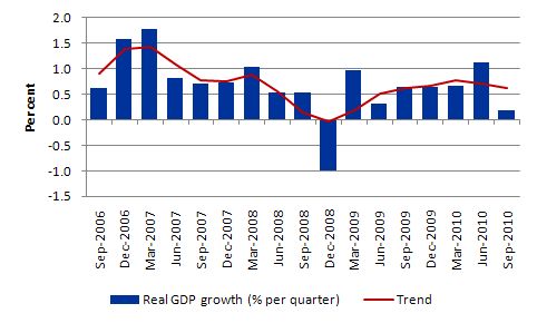
The following graph shows the quarterly percentage growth in real GDP from September 2006 to September 2010 (blue columns) and the ABS trend series (red line) superimposed. Not only is quarterly growth faltering but now the trend growth rate is pointing downwards – as it has been for 6 months now. The trend rate is now barely above 2 per cent per annum which is not enough to sustain employment growth. The only thing saving employment growth at the moment is the plunging productivity growth (see below).
Ever heard of the Race-to-the-Bottom? Australia is trying hard to stay in it!
So what is saving the economy from negative growth?
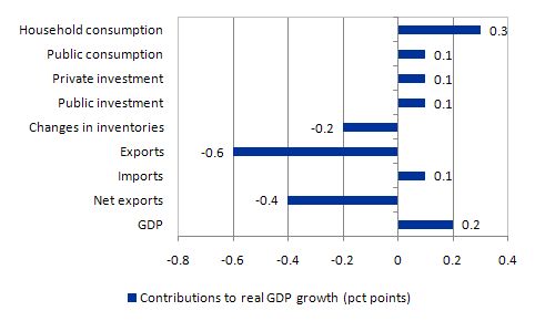
The following graph shows the percentage contributions to real GDP growth in the September 2010 quarter by aggregate spending type. While GDP growth was 0.2 per cent in the September quarter, private consumption added 0.3 percentage points (down from 0.9 percentage points in June quarter). Retail trade is now waning.
Private investment contributed only 0.1 percentage points (down from 0.2 percentage points in June quarter) which does not signal an investment boom. Only non-dwelling construction exhibited positive growth with the rest of the investment components negative in the September quarter. There is very little productive capacity being added to the Australian economy at present.
Once again the public sector contributed 0.2 percentage points (consumption and investment) but that contribution is falling as the government pursues its mindless strategy to get the budget into surplus (and increase the fiscal drag on the economy).
The shocking result comes from the external sector with net exports reducing growth by 0.4 percentage points. While the June quarter contribution was positive, the current result mirrors the poor trade performance from the March quarter. Exports pulled 0.6 percentage points out of the real GDP bottom line. Imports added to growth only because they fell – that is, even with an appreciating currency, households and firms taken together reduced their demand for imports.
With real disposable incomes falling in this quarter that is no surprise and suggests income effects dominate substitution effects which is contrary to the mainstream logic. But then what would they know about anything?
Overall, I am not looking at an economy on the cusp of an inflationary explosion. Rather, I am looking at an economy that is weakening not because the world economies are in poor shape but because our national government has withdrawn its fiscal support and allowed the central bank to attack spending via successive interest rate hikes even though inflation has been falling.
I see policy failure writ large in these figures.
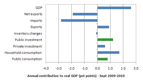
The following graph shows the contribution to real GDP growth over the last year (four-quarters to September 2010) by expenditure components.
The contribution of government consumption and investment (2 per cent) and the additional multiplier effects on private consumption clearly played a major role in maintaining real economic growth over the 12 months to September 2010. The external sector subtracted 1.9 percentage points from the growth which says a lot for our so-called export-led recovery. It is a nonsense.
Wage share continues to fall
The wage share in factor income is tells us about the direction of real unit labour costs – that is, what each unit of output is costing per real unit of labour input.
The wage share can fall because the real wage is falling as a result of discretionary policies to deregulate the labour market and attack unions. But, equally, it can fall because the economy is booming and productivity growth is strong.
The estimates for the September quarter 2010, show the wage share in seasonally adjusted terms was 52.6 per cent which was the same as the (downwardly-revised) estimate for June. In trend terms, the wage share fell by 0.2 percentage points.
In the last year, the wage share has fallen by 1.1 percentage points alone which means that real unit labour costs are falling. Why have commentators been claiming that labour costs overall are rising? They are not and haven’t been for some time.
And remember that labour productivity is going backwards so for the wage share to remain more or less constant real wages have to be going backwards too.
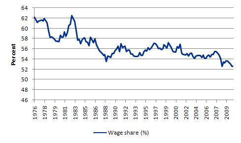
The following graph shows the evolution of the wage share in national income since March 1974. It shows the continuous redistribution of income from wages to profits which I document as one of the characteristics of the neo-liberal period that led to the current crisis. Please read the blog – The origins of the economic crisis – for more detail on this point.
In historical terms, this redistribution is very large and unprecedented – another atypical behaviour – which the neo-liberals have tried to condition us is just normal. This trend along with the rapid increase in household indebtedness and the obsessive pursuit of budget surpluses are all historically atypical behaviours – which have to be reversed if we are to avoid further crises of the type that has recently crippled the World economy.
Household saving ratio
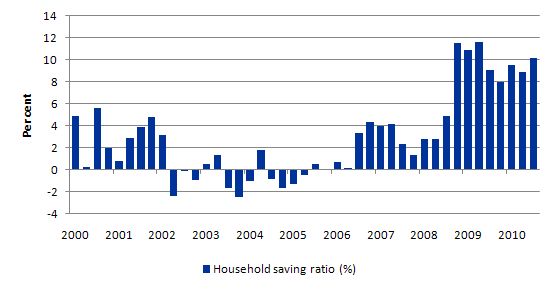
The following graph shows the household saving ratio (% of disposable income) which has risen again and is now at 10.2 per cent (September quarter). For the economy to grow strongly with this ratio rising public spending, private investment and/or net exports has to increase. The problem is that the contribution from net exports is negative and private investment is struggling to return a positive growth rate. Thus a rise in public net spending is indicated but absent in the Australian context.
A rising budget deficit would provide the nominal aggregate demand growth necessary to “ratify” the household saving intentions and support stronger real growth. The private sector has to reduce the overhang of debt left from the last credit binge. That process has to be supported by a growth in net exports or public spending. Neither expenditure component is helping right now.
With real wages growth continuing to lag behind productivity growth (and the gap is increasing), it is clear that households cannot continue to absorb the real output that is being produced by the economy under these distributional trends without having to continually increase their debt levels.
Real wages growth has to come back into line with productivity growth to ensure sustainable growth is achieved and this means one thing – there has to be a rather significant shift in the wage share upwards.
The reality is that this can only be accomplished if real wages growth is allowed to track labour productivity growth. That will require a paradigm shift away from labour market deregulation, anti-labour legislation and trade union bashing.
Trade contribution
Many people have asked me to explain how one measures the net exports contribution and whether it is the same as the Current Account outcome. So here is a brief explanation drawn from the Australian National Accounts: Concepts, Sources and Methods.
The following ABS Glossary is also very informative.
A non-resident is defined as:
Any economic entity (individual, enterprise or other organisation) ordinarily domiciled in a country other than Australia. Note that foreign branches and foreign subsidiaries of Australian enterprises and other external territories are regarded as non-residents.
Primary income represents
* compensation of employees;
* dividends;
* reinvested earnings;
* interest;
* investment income attributable to policy holders in insurance, standardized guarantees, and pension funds;
* rent;
* and taxes and subsidies on products and production.
Secondary income:
… include current transfers that offsets to the provision of resources that are normally consumed within a short period (less than twelve months) after the transfer is made. Examples include food aid, remittances from residents temporarily abroad, and remuneration received by international students undertaking university studies.
The Current Account is “the sum (net) of credit and debit entries for goods, services, primary income, and secondary income”.
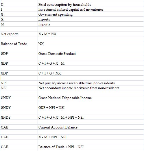
I constructed the following Table to show the sequence of transactions that help us understand how net exports and the primary and secondary income flows are accounted for.
So the first rows describe the components of aggregate demand which drive output – C + I + G + (X – M).
So the contribution to real GDP growth from the external sector is measured by (X – M) which is also the Balance of Trade. That is, the sum (net) of the credit and debt entries fro goods and services.
In addition, to this flows of primary and secondary income are recorded between Australia and the rest of the world. They are shown in net terms (NPI and NSI) in the Table. These flows are sometimes called “invisibles” meaning they are not goods and services. They are added to the Balance of Trade to give the Current Account Balance (CAB).
So when the ABS reported that for the September quarter the contribution of net exports was -0.4 percentage points, they were looking at the combined effect of the drop in exports (X) (-0.6 subtracting from growth) and the fall in imports (M) (-0.1 adding to growth). You might wonder why a fall in imports adds to growth. Answer: a fall in imports reduces the leakage from the expenditure system and so more income is being spent locally in relative terms.
Conclusion
Today’s result is very disappointing for those who were hoping to find a job. It was also disappointing for the prospects of real wages growth given the fall in labour productivity.
Overall, we became poorer as real disposable income fell.
Real GDP growth is now trending down and it is hardly the time to be tightening monetary or fiscal policy.
While our terms of trade are strong this has not translated into an improved or even positive contribution from the external sector (despite imports falling).
With the fiscal stimulus steadily being withdrawn, unless private investment really starts to pick up and add to productive capacity and drive production using existing capacity, real GDP growth will continue to wallow at levels which will not see any material reduction in the idle labour that the economy is carrying.
The indications are that the terms of trade will come off their current levels by the end of this year and into next year.
The household sector is clearly trying to reduce its indebtedness (rising household saving ratio) and that is also deflationary.
It is clear that the fiscal stimulus packages were still driving economic growth in the September 2010 quarter. Without the public contribution, real GDP growth would be zero.
But it is also clear that the contribution of government is falling. The outlook is uncertain despite the political hype that we are close to full capacity. That is certainly not true and certainly doesn’t describe the direction we are currently heading in and have been trending towards over the last few quarters.
Today’s GDP results indicate to me – a failure of government to support growth strong enough to reduce the huge pool of idle labour. It is not surprising that they would act in this way given that both sides of politics abandoned full employment as a policy goal years ago. I just wish they would stop lying about it.
Advertising segment: Annual CofFEE Conference – December 2-3, 2010
Tomorrow, the The Centre of Full Employment and Equity (CofFEE) hosts the annual Path to Full Employment Conference. For many years the conference has also been combined with the National Conference on Unemployment (which began in the aftermath of the 1991 recession as a venue to discuss ideas about the persistently high unemployment that remained for some years after that downturn.
This year we are hosting the 12th Path to Full Employment/17th National Unemployment Conference at the University of Newcastle (NSW, Australia) from Thursday, December 2 to Friday, December 3, 2010.
It is a chance to meet a lot of the Modern Monetary Theory (MMT) developers and to participate in debates. The conference is accessible for all interested parties and is not overly academic. A lot of government officials and workers from relevant sector organisations attend as well as academic researchers.
So register and come along if you would like a nice few days in Newcastle.
I will be giving a talk about why I still host an unemployment conference.
My blog tomorrow will feature the conference unless Ireland does the right thing by its people and exits the Eurozone.
That is enough for today!
Oh well ….. look on the bright side. If the current trend continues. In about 150 years the wage share will 0%. Something for the grandchildren to look forward to.
Bill mate, you’re suffering from an acute case of “too far ahead of the curve….itus”. It’s never a popular position when you figure out something really unpleasant before the madding crowd has a clue. History is littered with sacked heroes who tried to warn the management team of impending disaster.
“I’m telling you Honorius, those Goths are up to no good”
I’m fully expecting somone to try justifying the crowding out theory by claiming excess Government spending forced the rate hikes. Neo classical economists are never shy of finding the facts to fit a theory.
I’m going to take a walk, I think I hear the sound of a crashing Australian housing market.
Should all Australian streets be paved in public spending?
If I understand correctly, the sectoral balances treat the government as a single entity (i.e. Treasury and Central Bank combined). I thought I would try and work out what “G” was in the table you provided but found it difficult to work out what figures to use. I was thinking of using the annual reports published on the Treasury and RBA websites:
http://www.treasury.gov.au/contentlist.asp?ContentID=519&classification=10&titl=Annual%20Reports
http://www.rba.gov.au/publications/annual-reports/rba/
Can you please advise how one would go about combining the financial statements of both the RBA and Treasury to come up with “G”? Alternatively, is there a better way to go about this??
Take into consideration our commodities competitor Canada has experienced 2 out of 3 months of negative growth, this could be more than coincidental.
Hmmm… Maybe I should be using figures from the final budget outcomes from the Budget website:
http://www.budget.gov.au/2009-10/past_budgets.htm
Yet the greatest Australian economist ( just ask him ) is telling us that we are all suddenly getting much richer.
http://christopherjoye.blogspot.com/2010/12/abs-makes-huge-upward-revisions-to.html
Something seems to be wrong here ??
Steven Shaw says:
Wednesday, December 1, 2010 at 18:52
Should all Australian streets be paved in public spending?
Depends what they use, deep pile $10 notes or $1 coins. I think the coins will look nicer and should be more durable.
We should privatise the pavement building program. I’m fairly sure we don’t need many pavements, except for those besides the cash machines. There’s not much profit in pavement operations. I’m hoping to pass legislation for a pavement toll concession.
I think one of the great misunderstandings currently circulating in the political arena is the fixation with producing a Surplus. Everyone knows that surpluses are good and deficits are bad, right?
Well this is exactly the thinking of the Australian public because our poll-watching political leaders also think this way and both sides ran an election campaign on how quickly and to what extent they could produce a Surplus regardless of the economic environment at the time.
Mainstream economists deserve a crack on the knuckles for not setting things straight with a little education program.
At least the RBA has demonstrated it will respond quickly with monetary policy settings when they see the economy floundering but I must admit I consider the use of unemployment as a popular policy indicator much more distasteful than perhaps I did a couple years ago.
Why the RBA needs to implicitly seek a higher unemployment rate and take comfort when this occurs while inflation is moderating is somewhat disturbing.
I wish Warren, Winterspeak, or one of the contributors to the New Economic Perspectives website would take the time to go into the kind of detail analyzing U.S. national accounts data as Professor Mitchell does here analyzing Australian national accounts data. I suppose I could go to the U.S. Department of Commerce’s Bureau of Economic Analysis website and construct this kind of in depth analysis myself, but I’m too lazy and I probably don’t have the requisite graph and table making skill =)
Seriously though, I wonder Professor Mitchell if you would be willing to sacrifice one or two blog entries every month to perform the kind of analysis you do here on the U.S. national accounts data. Maybe you think this would be kind of a slippery slope though as regular readers from all over the world request similar analysis for their own countries. I know “billy blog,” is international in scope and consequently gets quite a bit of traffic from even non-English speaking countries. I don’t want to come across as too American-centric so what do other regular commentators here on billy blog think? If Professor Mitchell is willing, would you be willing to give up a blog entry or two in order to see the kind of analysis Professor Mitchell performs every month on the Australian national accounts data done on the U.S. national accounts data?
Alternatively, does anyone know of any other web sites, MMT or otherwise, that goes into the kind of analysis on U.S. national accounts data Professor Mitchell goes into here for Australian national accounts data? Thank you for your input.
NKlein,
You may know but the St Louis Fed has theirFRED system which has most of this data available and in some series it allows comparison graphical analysis, of course minus the professor’s valuable insight. Resp,
The RBA did offer commiserations to the farmers before it started its cascade of midyear consecutive interest rate rises. Something about a two speed economy, sacrifices, best interests of the nation, belt tightening, high interest rate impacts, sorry its the only tool we’ve got to control inflation even if it is a blunt tool and people lose their homes, jobs and farms….kind of stuff.
I second NKlein1553’s request.
There seems to be a bit of government tinkering with inflation rates (via rate rises, electricity and water price hikes and other government bills) that obscure the real picture. The deflationary/inflationary situation is real, and in contrast to optimistic RBA reports, and non-housing-bubble bank denials of the past few months. Building that has halted on shopping centre expansions seem to tell a tale of their own.
Much thanks for your analysis.
I share your wishes for Ireland.
NKlein1553,
My vote would be for Calculated Risk – as the top blog for objective analysis of incoming US economic data of all types – although the data scope is more sporadic than the aggregative national accounts level per se. The analysis is piecemeal for the most part, as new data arrives – as opposed to the holistic overview that Bill gives here. That said, CR analysis is very good if you stick with it, and want to get familiar with the US economic data overall from somebody who follows it consistently and reliably and understands it.
CR also does great graphs.
http:
//www.calculatedriskblog.com/
Econbrowser is another site that is heavily US data analysis oriented:
http:
//www.econbrowser.com/
Unfortunately, one of the guys there does Fed watch stuff, and he is most assuredly not MMT schooled. But that’s a small part of what they do.
“Should all Australian streets be paved in public spending?”
Yes – until aggregate demand recovers.
NKlein1553,
My vote doesn’t count – I’m an American. Hmmm, that’s even more true than I first thought.
Anyway. I don’t know if they are exactly what you’re looking for, but Warren’s company, Valance, produces a LOT of graphs, tables and commentary on the U.S. and Europe, and you can access them freely from his MoslerEconomics site. Just scroll down the right-hand column to Links and click on Valence Co.
Yeah, I check out calculated risk at least once a week. I agree the analysis there is very good, but it’s short and in pieces. What Bill does here is complete, comprehensive, and all in one place. I’ve heard of the Econbrowser, but haven’t checked it out before. I’ll do so shortly.
Dear Steven Shaw (at 2010/12/01 at 18:52)
You asked (somewhat acerbically)
No, I would prefer them to be paved with an environmentally sustainable material and laid by workers (public or private) who have secure, well-paid jobs. I also want them to have nice bike paths which encourage users to ride to work. Finally, I would like them to be lined with beautiful trees which suit the locale and provide an ambience that allows us to appreciate the beauty of nature.
That will be sufficient.
Any other questions?
best wishes
bill
Dear Andrew:
I think the lower bound for the wage share is above 0%, maybe 5%. Even slaves must get “paid” in food and shelter.
NKlein1553: I cast another vote to request analyses of the US economy. Next year we (the US) will jump wholeheartedly into the race to the bottom, as always, aiming to be first. It should provide great fodder for commentary. We will soon have several lab rat experiments on-going.
bill says:
Thursday, December 2, 2010 at 8:32
“No, I would prefer them to be paved with an environmentally sustainable material and laid by workers (public or private) who have secure, well-paid jobs. I also want them to have nice bike paths which encourage users to ride to work. Finally, I would like them to be lined with beautiful trees which suit the locale and provide an ambience that allows us to appreciate the beauty of nature.”
Exactly what the stimulus should have been spent on rather than pink insulation batts and school halls in the middle of playgrounds where there was no room to put them.
I wonder if there are now committees (bi-partisan preferrably), which actually have a plan for the next time such stimulus is needed rather than deciding on the spot with little consultation as to how best make the public dollar travel.
Typo in the para under the Household saving ratio barchart Bill ?
“it is clear that households can …”
Dear John Armour (at 2010/12/02 at 10:15)
Thanks very much. Fixed now.
best wishes
bill
@simonh I’d be more concerned about this blog post http://christopherjoye.blogspot.com/2010/12/adam-carr-gdp-was-actually-strong-no.html – in many ways it is more or less a rebuttal to what Prof. Mitchell has written above.
I don’t think you will find too many retailers who share Christopher Joye’s argument that there is surging demand out there but retailers are just too stupid to have prepared for it Senexx. The falling retail sales and high – or rather, historically normal – savings rate, would seem to go toward the opposite conclusion.
Joye is of course one of the most bullish of all the property bulls in Australia, and a seriously weakening economy would spell bad news for “infinitely” rising property prices.
Bill, yes I was being critical. I’m not sure it’s the right thing for the government to ensure that everyone’s employed. I suppose if we did that, we’d be sure to prop up the housing market. I don’t like that idea because I’ve been waiting for a decade or so for it to get back to normal!
Q. What should we (i.e. government policy) do about the house prices in Australia?
If government starts employing people to pave the streets (and the bikeways etc) then won’t private employment struggle to compensate equally? Since the recession the USA seems to have a problem that workers in private industry have struggled to keep their wages and many have taken pay cuts and less hours etc. Government jobs in the US are holding up much better – though they’ve had some cutback there too AFAIK.
Q. If we have the government employing more and more people, how do we prevent the mass transfer of folks seeking security from the private sector to the public sector? Should we prevent it? What percentage of folks should be working for the government? I think it’s only about 5% of the workforce right now but that probably doesn’t including government funded enterprises.
Bill, this question is unrelated to the current post, sorry. Why don’t you write CAB instead of (X-M) in the identity you always use (I – S) + (G – T) + (X – M) = 0?
(X-M) is understood as trade balance or net exports. This confuses the hell out of people who first see It because financial flows associated with net exports don’t represent the whole picture. I know you say that X-M is CAB in your equation. Why not write CAB?
Brazil in 1986.
NX = + $ 8.3b
CA = – $ 5.3b
i NFA = -$ 13.6b
In this example, Brazil had in 1986 a large current account deficit in spite of a trade surplus. In fact, Brazil was a heavy foreign debtor, having borrowed a lot in the 1970s and 1980s. By 1986 the total foreign debt of Brazil was above $100b and the net foreign interest payments on that debt (and profit repatriations of foreign firms owning assets in Brazil) equaled $13.6b.
Mainstream language distinguishes trade balance and CAB, so does Randall Wray: We can divide the economy into 3 sectors. Let’s keep this as simple as possible: there is a private sector that includes both households and firms. There is a government sector that includes both the federal government as well as all levels of state and local governments. And there is a foreign sector that includes imports and exports; (in the simplest model, we can summarize that as net exports-the difference between imports and exports-although to be entirely accurate, we use the current account balance as the measure of the impact of the foreign sector on the balance of income and spending).
http://www.cfeps.org/pubs/pn/pn0601.htm