The recent extreme weather in the northern hemisphere, the twin monster tropical storms in Japan,…
Australian labour market continues to improve but Omicron overshadows all
The Australian Bureau of Statistics released the latest labour force data today (January 20, 2022) – Labour Force, Australia – for December 2021. The situation is this: most states have now abandoned Covid restrictions. The December survey was taken a few weeks after the ‘opening up’ and before Omicron got settled at parties, events, restaurants and wherever else it is lurking. Infections are now very high but the data only captures the opening up effect (with some Omicron impact). Employment growth slowed but was still strong and unemployment and underemployment fell significantly. We are seeing the impact of flat population growth coming up against growing demand for workers and that is the reason the unemployment rate has fallen so quickly. It is good for workers but that won’t last long because the government is already trying to lure foreign workers to fill so-called labour shortages. This will stop the wages growth that would benefit domestic workers from occurring. Overall, this is an improving situation although whether it will last is another question given the rapidly rising infection rate. It is certainly time for the Federal government to take advantage of the strengthening situation in the non-government sector and target some really good job creation initiatives in the regions and demographic cohorts that are still lagging behind.
The summary ABS Labour Force (seasonally adjusted) estimates for December 2021 are:
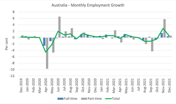
- Employment increased by 64,800 (0.5 per cent) – Full-time employment increased by 41,500 thousand and part-time employment increased by 23,300 thousand.
- Unemployment decreased by 62,200 to 574,400 persons.
- The official unemployment rate decreased 0.5 points to 4.2 per cent.
- The participation rate was unchanged at 66.1 per cent.
- The employment-population ratio increased by 0.3 points to 63.3 per cent.
- Aggregate monthly hours worked increased 18 million hours (1.0 per cent).
- Underemployment decreased by 0.8 points to 6.6 per cent (a fall of 117 thousand). Overall there are 916 thousand underemployed workers. The total labour underutilisation rate (unemployment plus underemployment) decreased by 1.3 points to 10.8 per cent. There were a total of 1,490.4 thousand workers either unemployed or underemployed.
In its – Media Release – the ABS note that:
The latest data shows further recovery in employment following the large 366,000 increase in November. This provides an indication of the state of the labour market in the first two weeks of December, before the large increase in COVID cases later in the month.
Recovery in New South Wales and Victoria continued to have a large influence on the national figures, with employment in these two states increasing by 32,000 and 25,000 people between November and December. Their employment was around where it had been in May having fallen 250,000 and 145,000 during the lockdowns.
The opening up certainly boosted employment but then the infection rate has gone through the roof after the survey was taken so we will see next month what effect that has had.
Employment increased by 64,800 in December 2021
1. Employment growth was slower this month at 0.5 per cent.
2. Full-time employment increased by 41,500 thousand and part-time employment increased by 23,300 thousand.
3. Employment in Australia is 246.7 thousand (net) jobs (1.9 per cent) above the pre-pandemic level in February 2020.
The following graph shows the month by month growth in full-time (blue columns), part-time (grey columns) and total employment (green line) for the 24 months to December 2021 using seasonally adjusted data.
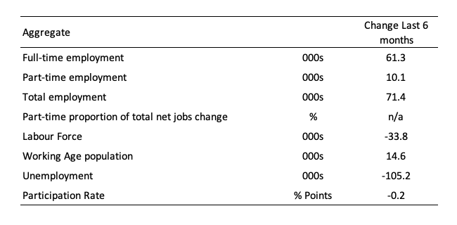
The following table provides an accounting summary of the labour market performance over the last six months to provide a longer perspective that cuts through the monthly variability and provides a better assessment of the trends.
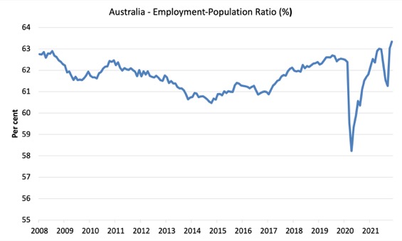
Given the variation in the labour force estimates, it is sometimes useful to examine the Employment-to-Population ratio (%) because the underlying population estimates (denominator) are less cyclical and subject to variation than the labour force estimates. This is an alternative measure of the robustness of activity to the unemployment rate, which is sensitive to those labour force swings.
The following graph shows the Employment-to-Population ratio, since February 2008 (the low-point unemployment rate of the last cycle).
It fell with the onset of the GFC, recovered under the boost provided by the fiscal stimulus packages but then went backwards again as the Federal government imposed fiscal austerity in a hare-brained attempt at achieving a fiscal surplus in 2012.
There are two forces working here – the denominator (population) is clearly providing favourable pressures due to the slower population growth as a result of the lack of immigration arising from the external border closures.
This is forcing employers to search harder for workers already in Australia rather than discriminate against the unemployed.
The numerator (employment) is clearly stronger as the restrictions ease.
The ratio rose by 0.3 points in December 2021.
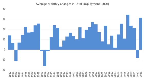
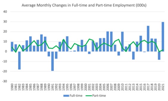
To put the current monthly performance into perspective, the following graph shows the average monthly employment change for the calendar years from 1980 to 2021 (to date).
1. The labour market weakened considerably over 2018 and that situation worsened in 2019.
2. The average employment change over 2020 was -8.4 thousand.
3. So far in 2021, the average monthly change is 29.7 thousand.
The following graph shows the average monthly changes in Full-time and Part-time employment (lower panel) in thousands since 1980.
The interesting result is that during recessions or slow-downs, it is full-time employment that takes the bulk of the adjustment. Even when full-time employment growth is negative, part-time employment usually continues to grow.
However, this crisis is different because much of the employment losses have been the result of lockdown and enforced business closures in sectors where part-time employment dominates.
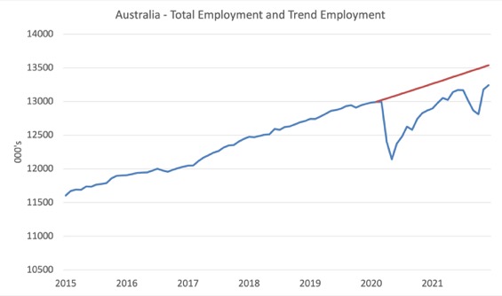
Actual and Trend Employment
The Australian labour market is now larger than it was in February 2020. But it is still a long way from where it would have been if it had have continued to expand at the previous trend.
The following graph shows total employment (blue line) and what employment would have been if it had continued to grow according to the average growth rate between 2015 and February 2020.
The gap as at December 2021 fell by 39.6 thousand to 295.7 thousand jobs.
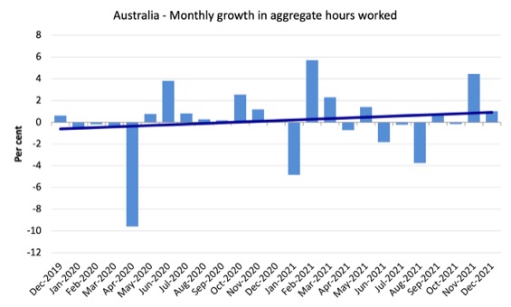
Hours worked increased 18.2 million hours (1 per cent) in December 2021
A slowdown from last month as the lockdown euphoria slowed.
The following graph shows the monthly growth (in per cent) over the last 24 months.
The dark linear line is a simple regression trend of the monthly change.
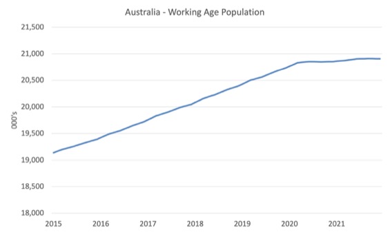
The Population Slowdown
The following graph shows Australia’s working age population (Over 15 year olds) from January 2015 to December 2021.
With the external border still largely closed, immigration has shrunk to virtually zero and the impact is very clear.
This flattening out has forced employers to work harder to get workers and is one of the reasons unemployment is falling quite quickly, given the circumstances.
The Federal government is now working against the workers by offering enticements for people to come on foreign visas to increase the labour supply under the guise of worker shortages.
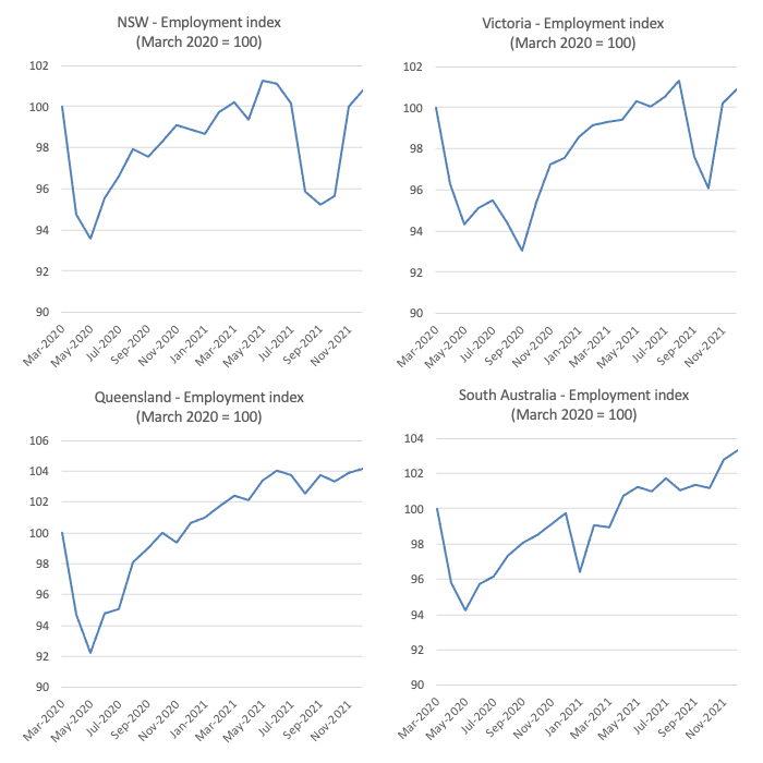
State and Territory Employment Trends
The lockdowns imposed in Sydney, Canberra and Melbourne are now over and while the ‘living with Covid’ politicians and their business pals thought that we would just go back to pre-Covid lifestyles, the situation is somewhat different.
This data, however, is before the reality of the Omicron wave hit us, and shows the recovery that accompanied the ending of the restrictions and the early pre-Xmas shopping period.
The following graphs show the employment evolution since March 2020 by state and territory.
NSW (100.8) and Victoria (100.9) are back to their March 2020 employment levels (index of 100).
Queensland (104.2), South Australia (103.3), Western Australia (104.8), Tasmania (101) are also above the pre-pandemic level.
But the territories are below: ACT (96.5) and NT (97.6).
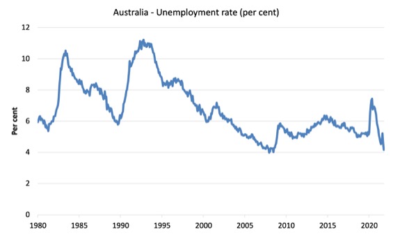
Unemployment decreased by 62,200 to 574,400 persons in December 2021
The official unemployment rate decreased 0.5 points to 4.2 per cent which was driven by strong employment growth and a constant participation rate.
The following graph shows the national unemployment rate from February 1980 to December 2021. The longer time-series helps frame some perspective to what is happening at present.
Broad labour underutilisation declined by 1.3 points to 10.8 per cent in December 2021
The results for December 2021 are (seasonally adjusted):
1. Underemployment decreased by 0.8 points to 6.6 per cent (a fall of 117 thousand).
2. Overall there are 916 thousand underemployed workers.
3. The total labour underutilisation rate (unemployment plus underemployment) decreased by 1.3 points to 10.8 per cent.
4. There were a total of 1,490.4 thousand workers either unemployed or underemployed.
The following graph plots the seasonally-adjusted underemployment rate in Australia from February 1980 to the December 2021 (blue line) and the broad underutilisation rate over the same period (green line).
The difference between the two lines is the unemployment rate.
The three cyclical peaks correspond to the 1982, 1991 recessions and the more recent downturn.
The other difference between now and the two earlier cycles is that the recovery triggered by the fiscal stimulus in 2008-09 did not persist and as soon as the ‘fiscal surplus’ fetish kicked in in 2012, things went backwards very quickly.
The two earlier peaks were sharp but steadily declined. The last peak fell away on the back of the stimulus but turned again when the stimulus was withdrawn.

Unemployment and broad labour underutilisation indexes – last four downturns
The following graph captures the evolution of the unemployment rates for the 1982, 1991, GFC and COVID-19 downturns.
For each episode, the graph begins at 100 – which is the index value of the unemployment rate at the low-point of each cycle (June 1981; December 1989; February 2008, and February 2020, respectively).
We then plot each episode out for 90 months.
For 1991, the peak unemployment which was achieved some 38 months after the downturn began and the resulting recovery was painfully slow. While the 1982 recession was severe the economy and the labour market was recovering by the 26th month. The pace of recovery for the 1982 once it began was faster than the recovery in the current period.
During the GFC crisis, the unemployment rate peaked after 16 months (thanks to a substantial fiscal stimulus) but then started rising again once the stimulus was prematurely withdrawn and a new peak occurred at the 80th month.
The COVID-19 downturn was obviously worse than any of the previous recessions shown but because of its unique nature – the job losses being largely driven by lockdowns etc.
The graph provides a graphical depiction of the speed at which each recession unfolded (which tells you something about each episode) and the length of time that the labour market deteriorated (expressed in terms of the unemployment rate).
After 22 months, the unemployment had risen (fallen) from 100 to:
1. 185.2 index points in 1982 and rising.
2. 171.6 index points in 1991 and rising.
3. 139.6 index points in the GFC and falling.
4. 81.8 index points currently and falling.
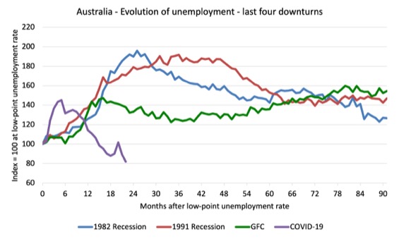
Note that these are index numbers and only tell us about the speed of decay rather than levels of unemployment.
The next graph performs the same operation for the broad labour underutilisation rate (sum of official unemployment and underemployment).

Teenage labour market continued to improve in December 2021
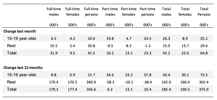
The following Table shows the distribution of net employment creation in the last month and the last 12 months by full-time/part-time status and age/gender category (15-19 year olds and the rest).
To put the teenage employment situation in a scale context (relative to their size in the population) the following graph shows the Employment-Population ratios for males, females and total 15-19 year olds since June 2008.
You can interpret this graph as depicting the loss of employment relative to the underlying population of each cohort. We would expect (at least) that this ratio should be constant if not rising somewhat (depending on school participation rates).
1. The male ratio has fallen by 5.1 percentage points since February 2008, and rose by 3.4 points over the month. It is now 3.8 points above its level in March 2020.
2. The female ratio is 0.6 percentage points above the February 2008 level, and rose by 1.2 points over the month. It is now 4.7 points above its level in March 2020.
3. The overall teenage employment-population ratio has fallen by 2.3 percentage points since February 2008, is now 4.3 points above its level in March 2020. It rose by 2.3 points over the month.

Conclusion
My standard monthly warning: we always have to be careful interpreting month to month movements given the way the Labour Force Survey is constructed and implemented.
My overall assessment is:
1. The cessation of most Covid restrictions has allowed the labour market to recover somewhat.
2. There are still 1.5 million Australian workers without work in one way or another (officially unemployed or underemployed) and several hundred thousand who have left the active labour force due to lack of employment opportunities.
3. We are seeing the impact of flat population growth coming up against growing demand for workers and that is the reason the unemployment rate has fallen so quickly. It is good for workers but that won’t last long because the government is already trying to lure foreign workers to fill so-called labour shortages.
4. Overall, the labour market is in better shape than it was during the lockdowns but more can be done to drive down the labour underutilisation rate.
That is enough for today!
(c) Copyright 2022 William Mitchell. All Rights Reserved.
https://www.bbc.co.uk/programmes/m0013hh7 In Our Time (Melvyn Bragg) today: ‘The Gold Standard’. Not related (directly) to today’s blog, but I thought this was heading to an ‘unveiling’ of MMT for ‘In Our Time’ listeners and still think it might have been; should Melvyn Bragg be approached to have the same experts with the addition of one more: an MMT expert?
Looking at all the graphs and readings kindly provided by Bill, I can see clearly that the labor situation is a direct effect of the health issue, the recession is the outcome.
The economy itself is not a problem (looking at the comparisons of the past economic events and downturns vs. the effects of Covid-19 within this pandemic period across demographics).
The economy (or the demand/supply) are there, as before, it is just not safe to go about it.
This suggests that no matter how good a fiscal stimulus a country provides, without a sound health and safety measures, it will be like a yo-yo effect.
We will be back to square one until the pandemic becomes weak, we become weak, or both, as we have seen.
Hence, it can be concluded that the countries that can provide a good pandemic handling strategy at all levels with equally good and corresponding fiscal support and budgeting will be able to survive this turbulent time best.
These are the two key issues IMO.
And thus, a double prong intervention strategy is required – health and adaptive national economic framework.
We must not look back to the world as we know, but live with the present and reality for the foreseeable future.
I note Bill you showed the Total employment gap is now 295.7 thousand jobs. I would be curious to see that gap adjusted for the 2 years of zero immigration, I suspect if we accounted for that using trend immigration numbers the gap would be very small now, if not reversed.
A cursory glance at your working age population graph suggests the loss in immigration has resulted in a gap of 550,000 working aged people since it flattened. Now I am not sure of what the participation rate is for migrants on average, but I assume due to skilled migrants it’s above the national average of 66.1%. Yet we would only need 53.7% of those missing 550,000 migrants to eliminate the employment gap, which suggests to me even if we conservatively assumed they had the same participation rate of 66.1%, the total employment gap is now reversed to a 67,850 more jobs. We are now above trend in terms of total employment once adjusting for immigration.
We always hear governments tout about how they plan to create so many hundreds of thousands of jobs over x years but then obscure how they intend to achieve that through immigration rather than reducing unemployment. But this time we are seeing the reverse happen where total employment numbers look bad (i.e. have a gap), but the reality is better due to the immigration effects.