The Australian Bureau of Statistics (ABS) released the latest labour force data today (June 25,…
US labour market recovery stalling
Last Friday (September 3, 2021), the US Bureau of Labor Statistics (BLS) released their latest labour market data – Employment Situation Summary – August 2021 – which reported a total payroll employment rise of only 235,000 jobs in August and a 0.2 points decline in the official unemployment rate to 5.2 per cent. The results suggest that the labour market recovery has slowed quite significantly. The US labour market is still 5,333 thousand jobs short from where it was at the end of February 2020, which helps to explain why there are no fundamental wage pressures emerging.
Overview for August 2021:
- Payroll employment increased by 235,000.
- Total labour force survey employment rose by 509 thousand net (0.33 per cent).
- The seasonally adjusted labour force rose by 190 thousand (0.12 per cent).
- The employment-population ratio rose 0.1 points to 58.5 per cent (down from February 2020 peak of 61.1 per cent).
- Official unemployment fell by 318 thousand to 8,384 thousand.
- The official unemployment rate fell by 0.2 points to 5.2 per cent.
- The participation rate was steady at 61.7 per cent.
- The broad labour underutilisation measure (U6) fell by 0.4 points to 8.8 per cent.
For those who are confused about the difference between the payroll (establishment) data and the household survey data you should read this blog post – US labour market is in a deplorable state – where I explain the differences in detail.
Payroll employment trends
The BLS noted that:
Total nonfarm payroll employment rose by 235,000 in August, following increases of 1.1 million in July and 962,000 in June. Nonfarm employment has risen by 17.0 million since April 2020 but is down by 5.3 million, or 3.5 percent, from its pre-pandemic level in February 2020 …
Employment in professional and business services increased by 74,000 in August … Since February 2020, employment in professional and business services is down by 468,000 …
Transportation and warehousing added 53,000 jobs in August, bringing employment in the industry slightly above (+22,000) its pre-pandemic level in February 2020 …
In August, employment increased by 40,000 in private education, declined by 21,000 in state government education, and changed little in local government education (-6,000) … Since February 2020, employment is down by 159,000 in private education, by 186,000 in state government education, and by 220,000 in local government education.
Manufacturing added 37,000 jobs in August … is down by 378,000 from its pre-pandemic level in February 2020.
The other services industry added 37,000 jobs in August, but employment is 189,000 lower than in February 2020.
Employment in information increased by 17,000 in August … is down by 150,000 since February 2020.
Employment in financial activities rose by 16,000 over the month … is down by 29,000 since February 2020.
Mining added 6,000 jobs in August, reflecting a gain in support activities for mining (+4,000) … is 96,000 below a peak in January 2019.
Employment in retail trade declined by 29,000 in August … is down by 285,000 since February 2020.
In August, employment in leisure and hospitality was unchanged … is down by 1.7 million, or 10.0 percent, since February 2020.
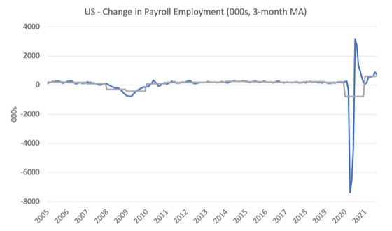
The first graph shows the monthly change in payroll employment (in thousands, expressed as a 3-month moving average to take out the monthly noise). The gray lines are the annual averages.
The data swings are still large and dwarf the past history.
The US labour market is still 5,333 thousand jobs short from where it was at the end of February 2020 and the commentary from the BLS above tells us how this shortfall is distributed across the sectors.
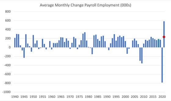
The next graph shows the same data in a different way – in this case the graph shows the average net monthly change in payroll employment (actual) for the calendar years from 2005 to 2021.
The red marker on the column is the current month’s result.
The final average for 2019 was 168 thousand.
The final average for 2020 was -785 thousand.
The average for 2021 (so far) is 586 thousand.
Labour Force Survey – employment rises but slowdown is evident
The data for August 2021 reveals:
1. Employment as measured by the household survey rose by 509 thousand net (0.33 per cent).
2. The labour force rose by rose by 190 thousand (0.12 per cent).
3. The participation rate was steady at 61.7 per cent.
4. As a result (in accounting terms), total measured unemployment fell by 318 thousand to 8,384 thousand and the unemployment rate fell by 0.2 points to 5.2 per cent.
The BLS note that both unemployment measures:
The unemployment rate declined by 0.2 percentage point to 5.2 percent in August. The number of unemployed persons edged down to 8.4 million, following a large decrease in July. Both measures are down considerably from their highs at the end of the February-April 2020 recession. However, they remain well above their levels prior to the coronavirus (COVID-19) pandemic (3.5 percent and 5.7 million, respectively, in February 2020). …
The number of long-term unemployed (those jobless for 27 weeks or more) decreased by 246,000 in August to 3.2 million but is 2.1 million higher than in February 2020. These long-term unemployed accounted for 37.4 percent of the total unemployed in August.
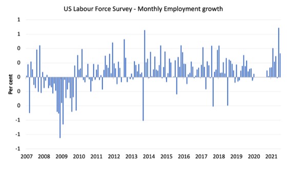
The following graph shows the monthly employment growth since January 2008 and excludes the extreme observations (outliers) between March 2020 and October 2020, which distort the current period relative to the pre-pandemic period.
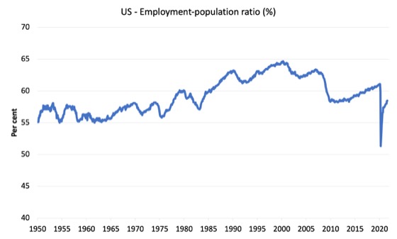
The Employment-Population ratio is a good measure of the strength of the labour market because the movements are relatively unambiguous because the denominator population is not particularly sensitive to the cycle (unlike the labour force).
The following graph shows the US Employment-Population from January 1950 to August 2021.
While the ratio fluctuates a little, the April 2020 ratio fell by 8.6 points to 51.3 per cent, which is the largest monthly fall since the sample began in January 1948.
In August 2021, the ratio rose by 0.1 points to 58.5 per cent.
It is still well down on the level in February 2020 (61.1 per cent).
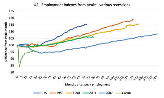
As a matter of history, the following graph shows employment indexes for the US (from US Bureau of Labor Statistics data) for the five NBER recessions since the mid-1970s and the current 2020-COVID crisis.
They are indexed at the employment peak in each case and we trace the data out for each episode until one month before the next peak.
So you get an idea of:
1. The amplitude (depth) of each cycle in employment terms.
2. The length of the cycle in months from peak-trough-peak.
The early 1980s recession was in two parts – a short downturn in 1981, which was followed by a second major downturn 12 months later in July 1982 which then endured.
Other facts:
1. Return to peak for the GFC was after 78 months.
2. The previous recessions have returned to the 100 index value after around 30 to 34 months.
3. Even at the end of the GFC cycle (146 months), total employment in the US had still only risen by 8.3 per cent (since December 2007), which is a very moderate growth path as is shown in the graph.
The COVID collapse was something else but the recent gains are evident, although the gains have been slowing relative to early in the recovery.
After 18 months, total employment is still 3.5 points below the February 2020 level.
Unemployment and underutilisation trends
The first graph shows the official unemployment rate since January 1994.
The official unemployment rate fell by 0.2 points to 5.2 per cent in August 2021.
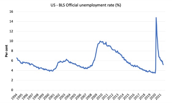
The official unemployment rate is a narrow measure of labour wastage, which means that a strict comparison with the 1960s, for example, in terms of how tight the labour market, has to take into account broader measures of labour underutilisation.
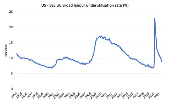
The next graph shows the BLS measure U6, which is defined as:
Total unemployed, plus all marginally attached workers plus total employed part time for economic reasons, as a percent of all civilian labor force plus all marginally attached workers.
It is thus the broadest quantitative measure of labour underutilisation that the BLS publish.
Pre-COVID, U6 was at 6.8 per cent (December 2019).
In August 2021 the U6 measure was 8.8 per cent, a decline of 0.4 points on the previous month.
Most of this fall was due to the decline in official unemployment and a modest decline in the workers in the part-time for economic reasons cohort (the US indicator of underemployment).
Ethnicity and Education
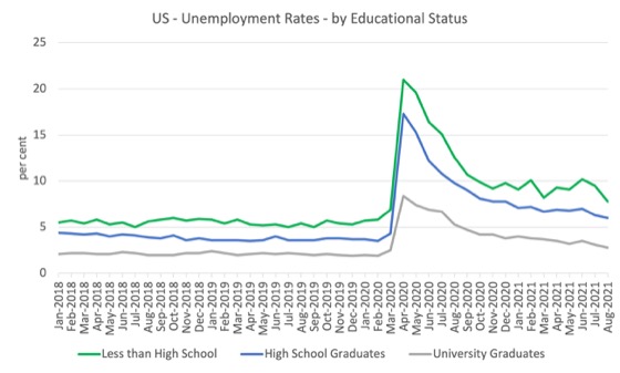
The next graph shows the evolution of unemployment rates for three cohorts based on educational attainment: (a) those with less than high school completion; (b) high school graduates; and (c) university graduates.
As usual, when there is a crisis, the least educated suffer disproportionately.
In the collapse in employment, the unemployment rates rose by:
- 14.1 points for those with less than high-school diploma.
- 13.0 points for high school, no college graduates.
- 5.9 points for those with university degrees.
The period since April 2020 has seen the unemployment rate fall by:
- 13.2 points for those with less than high-school diploma meaning the unemployment rate is now 0.9 points above the March level.
- 11.3 points for high school, no college graduates meaning the unemployment rate is now 1.7 points above the March level.
- 5.6 points for those with university degrees meaning the unemployment rate is now 0.3 points above the March level.
In the last month, the change in the unemployment rate has been:
- a fall of 1.7 points for those with less than high-school diploma.
- a fall of 0.3 points for high school, no college graduates.
- a fall of 0.3 points for those with university degrees.
In the US context, the trends in trends in unemployment by ethnicity are interesting.
Two questions arise:
1. How have the Black and African American and White unemployment rate fared in the post-GFC period?
2. How has the relationship between the Black and African American unemployment rate and the White unemployment rate changed since the GFC?
Summary:
1. All the series move together as economic activity cycles. The data also moves around a lot on a monthly basis.
2. The Black and African American unemployment rate was 6.8 per cent in March 2020, rose to 16.7 per cent in May and is at 8.8 per cent in August 2021. In the last month, it rose by 0.6 points.
3. The Hispanic or Latino unemployment rate was 6 per cent in March 2020, rose to 18.9 per cent in April and is at 6.4 per cent in August 2021. In the last month, it fell by 0.2 points.
4. The White unemployment rate was 3.9 per cent in March 2020, rose to 14.1 per cent in April and fell to 4.5 per cent in August 2021. In the last month, it fell by 0.3 points.
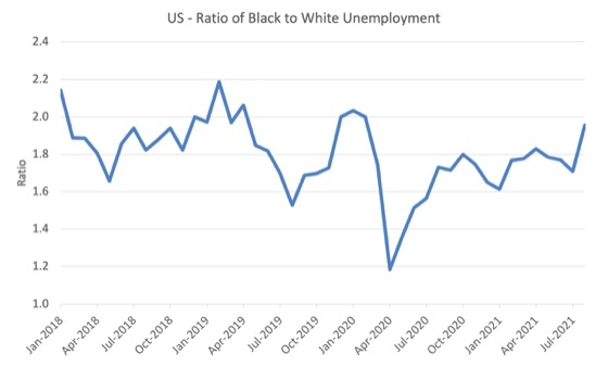
The next graph shows the Black and African American unemployment rate to White unemployment rate (ratio) from January 2018, when the White unemployment rate was at 3.5 per cent and the Black or African American rate was at 7.5 per cent.
This graph allows us to see whether the relative position of the two cohorts has changed since the crisis.
If it is rising, then the unemployment rate of the Black and African American cohort is either rising faster than the white unemployment rate or falling more slowly (or a combination of that relativity).
While there is month-to-month variability, the data shows that, in fact, through to mid-2019, the position of Black and African Americans had improved in relative terms (to Whites), although that just reflected the fact that the White unemployment was so low that employers were forced to take on other ‘less preferred’ workers if they wanted to maintain growth.
In April 2019, the ratio was 2.1 (meaning the Black and African American unemployment rate was more than 2 times the White rate).
By April 2020, the ratio had fallen to its lowest level of 1.2, reflecting the improved relative Black and African American position.
As the pandemic hit, the ratio rose and peaked at 1.8 in October 2020.
In August 2021, the ratio was 1.96 and rose by 0.24 points from the previous month, which indicates that the relative position of the Black and African American cohort is deteriorating.
The Occupational Impacts of Covid to date
As regular readers will know I have been tracking the sectoral and occupational employment changes in the US in relation to earnings for some time now.
The burning question is whether low-paid workers bear the brunt of downturns and how well the respective earnings groups fare in the recovery?
In the past, I have demonstrated that the proportion of jobs in the total employment in sectors that pay below-average pay has increased.
But at that level of aggregation, we are unable to say whether these jobs in question were high-pay or low-pay.
The next calculations help to expand on that understanding.
They show the net job losses (in the downturn) and net job gains (in the recovery to date) for the major occupations in the BLS classification.
I have sorted the occupations relative to median weekly earnings as at the June-quarter 2021 (most recent data).
Low-pay is 75 per cent of the median and in terms of the most recent earnings data includes the Service occupations, Farming, Fishing and Forestry occupations, and the Transportation and material moving occupations.
GFC downturn
1. In the downturn, 90.6 per cent of the jobs lost were in occupations that paid below median weekly earnings (12.3 per cent of those were in low-paid occupations). Very few jobs (relatively) were lost in the higher paying occupations.
2. Given 86.1 per cent of the total jobs lost in the downturn were in sectors paying above average pay, then we can infer that the jobs lost were predominantly the lower paying jobs in those sectors (although we cannot strictly compare mean and median in a wage distribution given the skewness).
GFC recovery to February 2020
1. In the upturn to February 2020, the net jobs added had not yet replaced those lost in the occupations with below median weekly earnings. 67 per cent of the net jobs added were in occupations with above median weekly earnings. That proportion rose in the last three months to February 2020.
2. In the recovery, a much larger number of low-paid jobs were added. Of the 33 per cent share of below median earning jobs added in the recovery, almost all of them were in low-pay occupations (31.3 per cent of the total jobs added).
3. This tells us that there is a polarisation going on in the occupational employment structure with a bias towards low-pay jobs in the below median weekly earnings occupations and towards jobs in the above median weekly earnings with a hollowing out in the middle of the distribution.
4. That is, over the GFC recovery period a hollowing out around the overall median pay levels was going on.
The Covid downturn and recovery – who lost and who gained jobs?
The current crisis has been very different to the GFC recession, given that a host of activities were forced to stop altogether as authorities enforced shutdowns and isolation and consumers, themselves, took some cautions.
The areas that are most affected include hospitality, sports, entertainment, restaurants and cafes, travel, and similar, which are major employers of low-paid, precarious workers.
The summary results are presented in the Table that follows:
| Occupational Group | Jobs change – Feb-Apr 2020 (000s) | Proportion change (%) | Jobs change – Apr 2020-Aug 2021 (000s) | Proportion change (%) | Jobs Gap (000s) |
| Above-median pay | -5,646 | 22.9 | 3,814 | 19.2 | -1,832 |
| Management, business, and financial operations occupations | 1,471 | 6.0 | 1,705 | 8.6 | 234 |
| Professional and related | -3,452 | 14.0 | 1,195 | 6.0 | -2,257 |
| Installation, maintenance, and repair | -723 | 2.9 | 914 | 4.63 | 191 |
| Below-median pay but not low pay | -19,045 | 77.1 | 16,090 | 80.86 | -2,955 |
| Sales and related | -2,846 | 11.5 | 2,054 | 10.3 | -792 |
| Office and administrative support | -1,937 | 7.8 | 1,106 | 5.6 | -831 |
| Construction and extraction | -1,605 | 6.5 | 1,781 | 8.9 | 176 |
| Production | -1,986 | 8.0 | 1,873 | 9.4 | -113 |
| Low pay | -10,671 | 43.2 | 9,276 | 46.6 | -1,395 |
| Service | -8,189 | 33.2 | 6,906 | 34.7 | -1,283 |
| Farming, fishing, and forestry | -64 | 0.3 | 66 | 0.3 | 2 |
| Transportation and material moving | -2,418 | 9.8 | 2,304 | 11.6 | -114 |
| Total | 24,691 | 100.0 | 19,904 | 100.0 | -4,787 |
The Covid slump – February 2020-April 2020
1. Low-paid work slumped by 29.9 per cent.
2. Below-median pay jobs slumped by 21.9 per cent.
3. Above-median pay jobs fell by 7.9 per cent.
4. In terms of total numbers of jobs lost:
(a) 22.9 per cent (5,646 thousand) were in above-median pay occupations.
(b) 77.1 per cent (19,045 thousand) in below-median pay occupations.
(c) 43.2 per cent of the total (10,671 thousand) have been in low-pay occupations.
The Covid recovery – from April 2020 to August 2021
1. Low-paid work has grown by 32.6 per cent and is still 1,395 thousand jobs short of the February 2020 level (a gap of 3.9 per cent).
2. Below-median pay jobs have grown by 27.5 per cent and are still 2,955 thousand jobs short of the February 2020 level (a gap of 3.4 per cent).
3. Above-median pay jobs have grown by 5.8 per cent and are still 1,832 thousand jobs short of the February 2020 level (a gap of 2.6 per cent).
4. In terms of total numbers of jobs gained:
(a) 19.2 per cent (3,814 thousand) were in above-median pay occupations.
(b) 80.8 per cent (16,090 thousand) in below-median pay occupations.
(c) 46.6 per cent of the total (9,276 thousand) have been in low-pay occupations.
The remaining Jobs Gaps by Occupation group (relative to February 2020)
The following table shows the Jobs Gaps in August 2021 compared to February 2020 by Occupational Category.
| Occupational Group | Jobs Gap (000s) | Per cent Gap |
| Above-median weekly wages | -1,832 | -2.6 |
| Management, business, and financial operations | 234 | 0.8 |
| Professional and related | -2,257 | -5.9 |
| Installation, maintenance, and repair | 191 | 3.9 |
| Below-median weekly wages | -2,955 | -3.4 |
| Sales and related | -792 | -5.3 |
| Office and administrative support | -831 | -5.1 |
| Construction and extraction | 176 | 2.2 |
| Production | -113 | -1.4 |
| Low-pay (< 75 median weekly wages) | -1,395 | -3.9 |
| Service | -1,283 | -4.9 |
| Farming, fishing, and forestry | 2 | 0.2 |
| Transportation and material moving | -114 | -1.0 |
| Total | -4,787 | -3.0 |
Conclusion
The August 2021 US BLS labour market data release suggests that the labour market recovery has slowed quite significantly.
The actual payroll figure is well down on expectations
The US labour market is still 5,333 thousand jobs short from where it was at the end of February 2020.
That is enough for today!
(c) Copyright 2021 William Mitchell. All Rights Reserved.
This Post Has 0 Comments