Economics and business correspondents regularly serve as apologists for poor policy. Their motivation is to…
Australian labour market – deteriorating but the worst is yet to come
Today (August 19, 2021), the Australian Bureau of Statistics put out the latest – Labour Force, Australia – for July 2021. The background is that the entire East Coast is in or has been in lockdown over the last few months and for the two largest labour markets (NSW and Victoria) that lockdown has been very tight, although not tight enough in NSW. The July 2021 data reveals that employment growth has come to a stop, although the negative impacts of the lockdowns are mainly showing up as reduced working hours and falling participation rates at present. But the job losses will get worse next month given the extended disaster that is now unfolding in NSW. The impact of the slower population growth is showing up in the continued drop in the unemployment rate, but the major fall in unemployment in July 2021, was due to the decline in the participation rate. So the official unemployed are becoming hidden unemployment, which means there is no improvement in the falling jobless numbers. Further, underemployment rose sharply again (0.4 points) to 8.3 per cent which is consistent with the drop in working hours. The labour market is still 255.7 thousand jobs of where it would have been if employment had continued to grow according to the average growth rate between 2015 and February 2020. This month is the calm before the storm. The extended lockdowns will show up in deteriorating data next month. What is preventing a worse outcome is the fact that the lower population growth due to the external border closures, means that employers are now having to absorb the unemployed more quickly to maintain their operations. There is now definite evidence that further fiscal support is required.
The summary ABS Labour Force (seasonally adjusted) estimates for July 2021 are:
- Employment increased by 2,200 (0.02 per cent) – Full-time employment decreased by 4,200 and part-time employment increased by 6,400.
- Unemployment decreased by 39,900 to 639,200 persons.
- The official unemployment rate decreased 0.3 points to 4.6 per cent.
- The participation rate fell 0.2 points to 66.0 per cent.
- Aggregate monthly hours worked decreased 3 million hours (-0.2 per cent).
- Underemployment increased by 0.4 points to 8.3 per cent (a rise of 53.2 thousand). Overall there are 1,147.2 thousand underemployed workers. The total labour underutilisation rate (unemployment plus underemployment) increased by 0.1 points to 12.9 per cent. There were a total of 1,786.4 thousand workers either unemployed or underemployed.
Employment increased by just 2,200 in July 2021
In other words, by ‘nothing’.
1. Employment growth was 0.02 per cent with just 2,200 (net) jobs being added.
2. Full-time employment decreased by 4,200 and part-time employment increased by 6,400.
3. Employment in Australia is now above the February 2020 level by 161.4 thousand (1.2 per cent). However, some sectors are still languishing.
The following graph shows the month by month growth in full-time (blue columns), part-time (grey columns) and total employment (green line) for the 24 months to July 2021 using seasonally adjusted data.

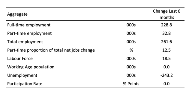
The following table provides an accounting summary of the labour market performance over the last six months to provide a longer perspective that cuts through the monthly variability and provides a better assessment of the trends.
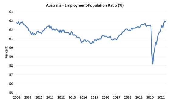
Given the variation in the labour force estimates, it is sometimes useful to examine the Employment-to-Population ratio (%) because the underlying population estimates (denominator) are less cyclical and subject to variation than the labour force estimates. This is an alternative measure of the robustness of activity to the unemployment rate, which is sensitive to those labour force swings.
The following graph shows the Employment-to-Population ratio, since February 2008 (the low-point unemployment rate of the last cycle).
It fell with the onset of the GFC, recovered under the boost provided by the fiscal stimulus packages but then went backwards again as the Federal government imposed fiscal austerity in a hare-brained attempt at achieving a fiscal surplus in 2012.
The ratio fell by 0.1 points in July 2021 to 62.9 per cent. The ratio is now equal to the pre-GFC peak in April 2008 of 62.9 per cent.
There are two forces working here – the denominator (population) is clearly providing favourable pressures due to the slower population growth as a result of the lack of immigration due to the on-going external border closures.
This is forcing employers to search harder for workers already in Australia rather than discriminate against the unemployed.
The numerator (employment) is clearly weaker as a result of the current lockdowns.
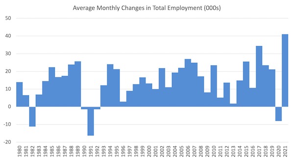
To put the current monthly performance into perspective, the following graph shows the average monthly employment change for the calendar years from 1980 to 2020 (to date).
1. The labour market weakened considerably over 2018 and that situation worsened in 2019.
2. The average employment change over 2020 was -8.0 thousand.
3. So far in 2021, the average monthly change is 47.5 thousand and you can see that from the graph that this is exceptional, although it has only been for 6 months so far as businesses return to more normal levels of operation.
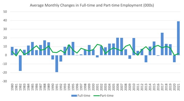
The following graph shows the average monthly changes in Full-time and Part-time employment (lower panel) in thousands since 1980.
The interesting result is that during recessions or slow-downs, it is full-time employment that takes the bulk of the adjustment. Even when full-time employment growth is negative, part-time employment usually continues to grow.
However, this crisis is different because much of the employment losses are the result of lockdown and enforced business closures in sectors where part-time employment dominates.
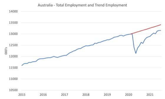
Actual and Trend Employment
While the current month’s employment figures are encouraging, the labour market is still some way from catching up on the jobs that were lost during the pandemic.
The following graph shows total employment (blue line) and what employment would have been if it had continued to grow according to the average growth rate between 2015 and February 2020.
The gap as at July 2021 rise by 22.7 thousand to 255.7 thousand jobs.
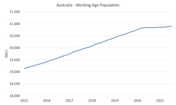
The Population Slowdown
The following graph shows Australia’s working age population (Over 15 year olds) from January 2015 to July 2021.
With the external border closed, immigration has shrunk to virtually zero and the impact is very clear.
This flattening out has forced employers to work harder to get workers and is one of the reasons unemployment is falling quite quickly, given the circumstances.
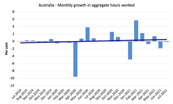
Hours worked decreased 3 million hours (-0.2 per cent) in July 2021
The decline in working hours this month is reflecting the closures to the lockdowns in NSW and Victoria. The situation will worsen as those restrictions deepen.
The following graph shows the monthly growth (in per cent) over the last 24 months.
The dark linear line is a simple regression trend of the monthly change – which depicts slightly positive trend.
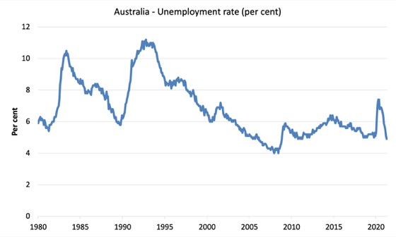
Unemployment decreased by 39,900 to 639,200 persons
The official unemployment rate fell 0.3 points to 4.6 per cent even though the employment growth was relatively weak.
While a fall in unemployment is usually a good sign, in this case, it reflects the shrinkage in the labour force by 37.8 thousand as the participation rate fell by 0.2 points.
So not only is the slowdown in the working age population due to the restrictions on the external border taking pressure of unemployment, but, this month, some of the unemployed in the previous month became hidden unemployed in July 2021 due to a slowdown in opportunities for work.
The following graph shows the national unemployment rate from February 1980 to July 2021. The longer time-series helps frame some perspective to what is happening at present.
Assessment:
1. Unemployment is now lower than the pre-pandemic February 2020 level – but we shouldn’t use that as the aspirational benchmark.
2. The usual cyclical asymmetry where unemployment rises quickly and falls very slowly is not being observed this cycle because of the population growth slowdown.
2. There is still considerable slack in the labour market that could be absorbed with further fiscal stimulus.
Broad labour underutilisation increased by 0.1 points to 12.9 per cent in July 2021
The results for July 2021 are (seasonally adjusted):
1. Underemployment increased by 53.2 thousand.
2. The underemployment rate rose by 0.4 points to 8.3 per cent.
2. Overall there are 1,147.2 thousand underemployed workers.
3. The total labour underutilisation rate (unemployment plus underemployment) increased by 0.1 points to 12.9 per cent.
4. There were a total of 1,786.4 thousand workers either unemployed or underemployed.
So the slack over the last few months is showing up as an increase in underemployment and an increase in hidden unemployment, rather than a rise in official unemployment
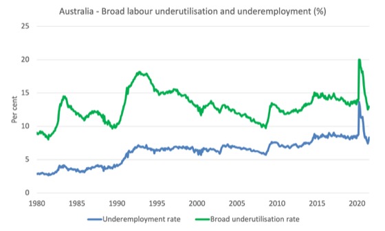
The following graph plots the seasonally-adjusted underemployment rate in Australia from February 1980 to the July 2021 (blue line) and the broad underutilisation rate over the same period (green line).
The difference between the two lines is the unemployment rate.
The three cyclical peaks correspond to the 1982, 1991 recessions and the more recent downturn.
The other difference between now and the two earlier cycles is that the recovery triggered by the fiscal stimulus in 2008-09 did not persist and as soon as the ‘fiscal surplus’ fetish kicked in in 2012, things went backwards very quickly.
The two earlier peaks were sharp but steadily declined. The last peak fell away on the back of the stimulus but turned again when the stimulus was withdrawn.
Aggregate participation rate decreased by 0.2 points to 66 per cent
As noted above, the decline in official unemployment was driven by the fall in participation – that is, unemployed workers seeking jobs.
This occurred because of the slowdown in employment opportunities.
The fall in the labour force participation rate means that the labour force fell by 37.8 thousand in July 2021, which means that even though employment growth was virtually zero, official unemployment fell by 39,800 thousand.
In other words, the official unemployed have become hidden unemployed – so not an improvement at all.
What would have been the case if the participation rate had not fallen?
We can make two calculations:
1. Just the monthly implication.
2. The implication of the participation rate being below its most recent peak of 66.2 per cent in August 2019. I don’t include that calculation here because the current participation rate marks a departure from that peak, which means the extra column of data would be redundant.
The labour force is a subset of the working-age population (those above 15 years old). The proportion of the working-age population that constitutes the labour force is called the labour force participation rate. Thus changes in the labour force can impact on the official unemployment rate, and, as a result, movements in the latter need to be interpreted carefully. A rising unemployment rate may not indicate a recessing economy.
The labour force can expand as a result of general population growth and/or increases in the labour force participation rates.
The following Table shows the breakdown in the changes to the main aggregates (Labour Force, Employment and Unemployment) and the impact of the rise in the participation rate.

The change in the labour force in July 2021 was the outcome of two separate factors:
- The underlying population growth added 4 thousand persons to the labour force. The population growth impact on the labour force aggregate is relatively steady from month to month but has slowed in recent months due to the border restrictions and the impact they have had on migration rates; and
- The fall in the participation rate meant that there were 41.8 thousand workers re-entering the labour force (relative to what would have occurred had the participation rate remained unchanged).
- The net result was that the labour force fell by 37.8 thousand.
Assessment:
1. If the participation rate had not have fallen in July 2021, total unemployment, given the current employment level, would have been 681 thousand rather than the official count of 639.2 thousand as recorded by the ABS – a difference of 41.8 thousand workers (the ‘participation effect’).
2. Without the fall in the participation rate in July 2021, the official unemployment rate would have been 4.9 per cent (rounded) rather than its current value of 4.6 per cent).
3. In other words, the underlying state of the labour market did not improve at all in July despite the fall in official unemployment. But it also means it did not deteriorate much.
Unemployment and broad labour underutilisation indexes – last four downturns
The following graph captures the evolution of the unemployment rates for the 1982, 1991, GFC and COVID-19 downturns.
For each episode, the graph begins at 100 – which is the index value of the unemployment rate at the low-point of each cycle (June 1981; December 1989; February 2008, and February 2020, respectively).
We then plot each episode out for 90 months.
For 1991, the peak unemployment which was achieved some 38 months after the downturn began and the resulting recovery was painfully slow. While the 1982 recession was severe the economy and the labour market was recovering by the 26th month. The pace of recovery for the 1982 once it began was faster than the recovery in the current period.
During the GFC crisis, the unemployment rate peaked after 16 months (thanks to a substantial fiscal stimulus) but then started rising again once the stimulus was prematurely withdrawn and a new peak occurred at the 80th month.
The COVID-19 downturn was obviously worse than any of the previous recessions shown but because of its unique nature – the job losses being largely driven by lockdowns etc.
The graph provides a graphical depiction of the speed at which each recession unfolded (which tells you something about each episode) and the length of time that the labour market deteriorated (expressed in terms of the unemployment rate).
After 16 months, the unemployment had risen from 100 to:
1. 154.3 index points in 1982 and rising.
2. 168.6 index points in 1991 and at the peak of the cycle.
3. 147.2 index points in the GFC and at the peak of the cycle.
4. 90.2 index points currently and falling (but note the following graph shows underemployment rising).
Note that these are index numbers and only tell us about the speed of decay rather than levels of unemployment.
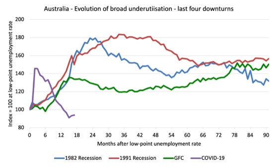
The next graph performs the same operation for the broad labour underutilisation rate (sum of official unemployment and underemployment).
Teenage labour market deteriorates in July 2021
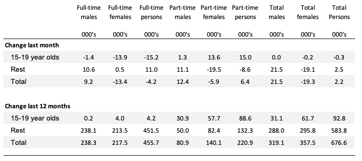
The following Table shows the distribution of net employment creation in the last month and the last 12 months by full-time/part-time status and age/gender category (15-19 year olds and the rest).
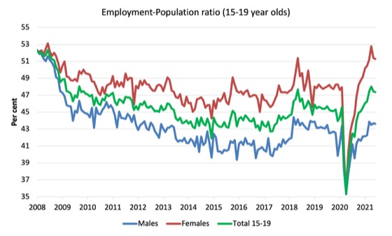
To put the teenage employment situation in a scale context (relative to their size in the population) the following graph shows the Employment-Population ratios for males, females and total 15-19 year olds since June 2008.
You can interpret this graph as depicting the loss of employment relative to the underlying population of each cohort. We would expect (at least) that this ratio should be constant if not rising somewhat (depending on school participation rates).
1. The male ratio has fallen by 8.7 percentage points since February 2008, but is now 0.2 points above its level in March 2020. It fell by 0.06 points over the month.
2. The female ratio has fallen by 0.9 percentage points since February 2008, is now 3.4 points above its level in March 2020. It fell by 0.1 points over the month.
3. The overall teenage employment-population ratio has fallen by 4.9 percentage points since February 2008, is now 1.7 points above its level in March 2020. It fell by 0.08 points over the month.
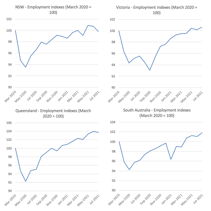
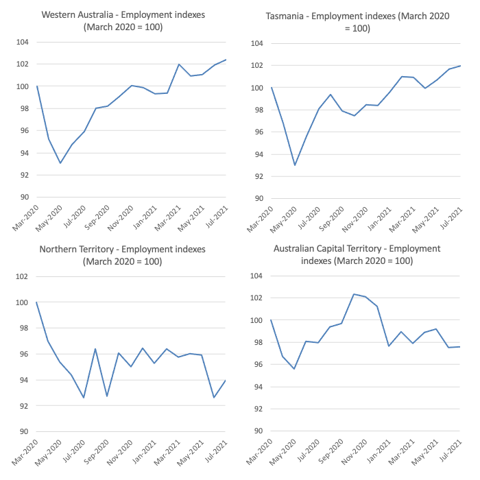
State by State Employment Trends
With renewed lockdowns imposed by Sydney and Melbourne (and to a lesser extent Brisbane and Canberra), the expectation was that employment would fall sharply given the extent of the restrictions.
The following graphs show the employment evolution since March 2020 by state and territory.
The impact of the, now 7-week lockdown in NSW are showing and employment is now below the March 2020 (pre-pandemic level) again.
The current lockdown in Victoria (now in 3rd week) is not yet showing in the data but it will next month.
Interestingly, even with lockdown 5.0 in Victoria (we are now in lockdown 6.0), which was just before the current lockdown, employment only declined slightly, which suggests that short, sharp closures are better than the staggered closures that the NSW government has imposed as they have progressively lost control of the outbreak (incompetence).
The states with the tightest border controls and the least COVID outbreaks (Tasmania and Western Australia) are clearly performing the best. A lesson is in that data.
Conclusion
My standard monthly warning: we always have to be careful interpreting month to month movements given the way the Labour Force Survey is constructed and implemented.
The July 2021 data reveals that employment growth has come to a stop as the various East Coast Covid outbreaks motivate hard lockdowns from the state and territory governments.
For this month, the lockdowns are mainly showing up as reduced working hours and falling participation rates.
But as they are enduring, job losses are occurring and that will get worse next month given the extended disaster that is now unfolding in NSW.
The impact of the slower population growth is showing up in the continued drop in the unemployment rate, but the major fall in unemployment in July 2021, was due to the decline in the participation rate.
So the official unemployed are becoming hidden unemployment, which means there is no improvement in the falling jobless numbers.
Further, underemployment rose sharply again (0.4 points) to 8.3 per cent which is consistent with the drop in working hours.
The labour market is still 255.7 thousand jobs of where it would have been if employment had continued to grow according to the average growth rate between 2015 and February 2020.
My overall assessment is:
1. The on-going impacts of the pandemic are once again killing job prospects and the lack of employment opportunities is pushing people out of the official labour force.
2. Without that participation response, unemployment would have been 0.3 points higher – which means no gains were made in July 2021.
3. This month is the calm before the storm. The extended lockdowns will show up in deteriorating data next month.
4. What is preventing a worse outcome is the fact that the lower population growth due to the external border closures, means that employers are now having to absorb the unemployed more quickly to maintain their operations.
3. There is now definite evidence that further fiscal support is required.
That is enough for today!
(c) Copyright 2021 William Mitchell. All Rights Reserved.
I’ve suggested this before, here or elsewhere.
One way to break up monopolies is to have a gradulated profits or revenue tax.
That is, have at least 2 rates. The normal rate for corps. that are in competive marlets, and a 4 times higher rate for corps. that are in a monopoly or concentrated market (less than 6 comp. in it).
I say ‘revenue’ because it is much harder to hide revenue than to hide profit in today’s mulit-national corporate structures. Frankly, I don’t care if taxing revenue is unfair to huge corps. Small corps. that opperate in 1 nation can’t hide profits overseas, while the huge corps can. So, tax profits of small corps, but revenue of huge corps. If we tax revenue we can just tax the revenue more liike double the rate we tax profits of small corps.
The intention is to make it impossible for huge corps. to opperate, so they break themselves up to avoid the tax.
Of course, all fixes of any kind that will do the job are impossible until the power of the huge corps. is broken by the people.
.