On May 19, 2026, Oxfam Australia's media release - Australian billionaires’ wealth grows by $50,000…
Australia – parlous wages growth signals loss of worker purchasing power
Today (August 18, 2021), the ABS released the latest – Wage Price Index, Australia – for the June-quarter 2021. The WPI data shows that nominal wages growth remains suppressed, and, as a result of the transitory spikes in inflation recently, workers in all sectors experienced sharp drops in their real wages (purchasing power). The behaviour of nominal wages in Australia gives us a clear signal that there is little prospect of sustained inflationary pressures emerging from the labour market any time soon. Wages in the public sector grew by only 1.3 per cent over the 12 months as a result of the ridiculous wage freezes and wage caps that the federal and state governments are imposing. This is not leadership at all.
The Wage Price Index:
… measures changes in the price of labour, unaffected by compositional shifts in the labour force, hours worked or employee characteristics
Thus, it is a cleaner measure of wage movements than say average weekly earnings which can be influenced by compositional shifts.
The summary results (seasonally adjusted) for the June-quarter 2021 were:
| Measure | Quarterly (per cent) | Annual (per cent) |
| Private hourly wages | 0.5 | 1.9 |
| Public hourly wages | 0.4 | 1.3 |
| Total hourly wages | 0.4 | 1.7 |
| Basic CPI measure | 0.9 | 3.8 |
| Weighted median inflation | 0.4 | 1.7 |
| Trimmed mean inflation | 0.4 | 1.6 |
On price inflation measures, please read my blog – Inflation benign in Australia with plenty of scope for fiscal expansion – for more discussion on the various measures of inflation that the RBA uses – CPI, weighted median and the trimmed mean The latter two aim to strip volatility out of the raw CPI series and give a better measure of underlying inflation.
The ABS Media Release – said that:
The … Wage Price Index (WPI) rose 0.4 per cent in June quarter 2021 with the annual growth rate at 1.7 per cent …
The June quarter saw the rate of growth in hourly earnings ease to 0.4 per cent, following two quarters of 0.6 per cent wage growth. The rate of growth over the quarter was one of the lowest rates recorded for the series.
… The public sector recorded its lowest annual rate of growth (1.3 per cent) since the series commenced in 1997.
Real wage trends in Australia
The summary data in the table above confirm that the plight of wage earners continues in Australia.
Real wages fell in the June-quarter (using the general CPI measure) in both the private sector but public sector after a period of low growth.
It is clear that the public sector wage caps (state and federal) have created an environment where private sector wage rises are being constrained, independently of the state of the private labour market.
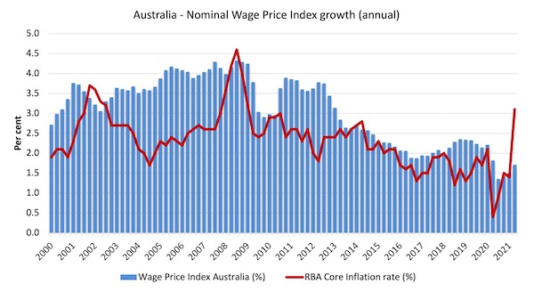
The first graph shows the overall annual growth in the Wage Price Index (public and private) since the December-quarter 2000 (the series was first published in the December-quarter 1997) and the RBA’s core annual inflation rate (red line).
The blue bar area above the red line indicate real wages growth and below the opposite.
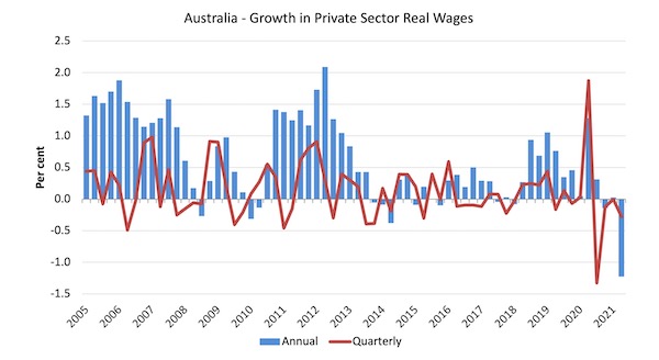
The next graph shows the growth in private sector real wages since the June-quarter 2005 to the June-quarter 2021. The Core inflation measure excluding volatile items is used.
The blue bars are the annual rate of change, while the red line is the quarterly rate of change.
The fluctuation between the June- and September-quarters 2020 is an outlier created by the temporary government decision to offer free child care for the June-quarter which was rescinded in the September-quarter.
Overall, the record since 2013 has been appalling.
Throughout 2017 and into 2018, real wages growth was negative. But then there were several quarters of modest real wages growth. The trend, however, is towards zero real wages growth.
The sharp spike downwards in the June-quarter 2021 is the result of very moderate nominal wages growth combined with a transitory surge in the CPI inflation rate.
The underlying position is more likely to be around zero on-going real wage changes.
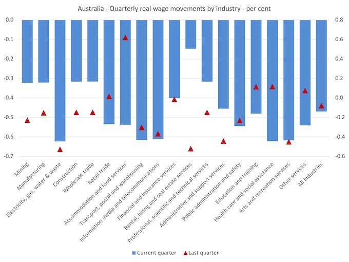
Sectoral Variability
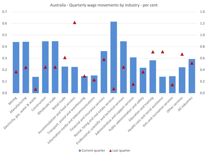
The aggregate data shown above hides quite a significant disparity in quarterly wage movements at the sectoral level, which are depicted in the next graph.
The blue bars are the current quarterly change, while the red triangles are the previous quarterly change.
The ABS also reported that:
– Electricity, gas, water and waste services, Transport, postal and warehousing, Health care and social assistance and the Arts and recreational services industries each recorded the lowest quarterly rise of 0.1%.
– Rental, hiring and real estate services recorded the highest quarterly rise of 0.6%.
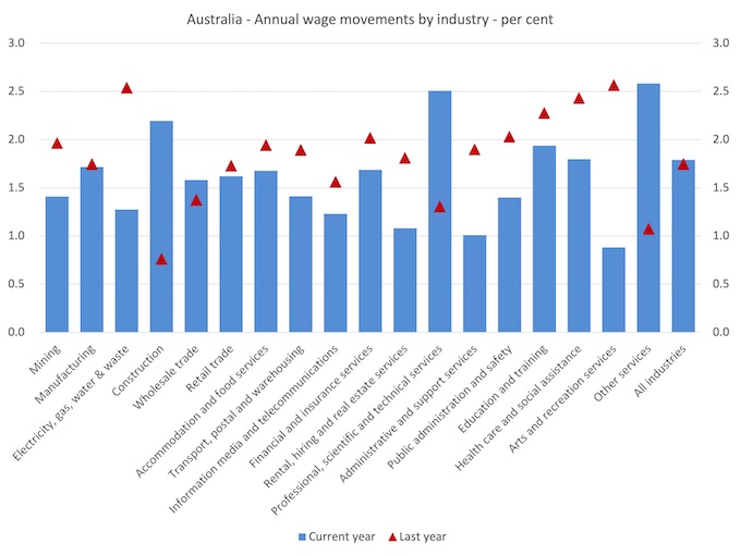
– Arts and recreation services recorded the lowest rise of 0.9% compared to this quarter last year.
– Other services industry recorded the highest through the year rise of 2.6% reflecting the unwinding of wage reductions in September and December quarters 2020..
If we consider the situation over the last year, then we can see from the following graph that growth in 15 of the 18 sectors has gone backwards.
Overall, growth is now around the same as it was a year ago.
While nominal wages growth was mostly positive, albeit modest, the next graph shows the movements in real wages and you can see that workers in all occupational groups lost purchasing power in the June-quarter.
But as noted above, the substantial decline in purchasing power is transitory and the more realistic assessment of the current situation is that workers will endure flat to small declines in real wages into the future unless nominal wages growth breaks out of the rut it has been in for some time now.
Workers not sharing in productivity growth
The Non-farm GDP per hour data (productivity) is derived from the quarterly National Accounts and available via the RBA Table H2 Labour Costs and Productivity.
The ABS Information Note: Gross Domestic Product Per Hour Worked – says that:
In Australian National Accounts: National Income, Expenditure and Product (cat. no. 5206.0) and Australian System of National Accounts (cat. no. 5204.0) the term ‘GDP per hour worked’ (and similar terminology for the industry statistics) is generally used in preference to ‘labour productivity’ because:
– the term is more self-explanatory; and
– the measure does not attribute change in GDP to specific factors of production.
While real wages growth means that the rate of growth in nominal wages is outstripping the inflation rate, another relationship that is important is the relative growth of real wages and productivity.
Historically (for periods which data is available), rising productivity growth was shared out to workers in the form of improvements in real living standards.
In effect, productivity growth provides the ‘space’ for nominal wages to growth without promoting cost-push inflationary pressures.
There is also an equity construct that is important – if real wages are keeping pace with productivity growth then the share of wages in national income remains constant.
Further, higher rates of spending driven by the real wages growth then spawned new activity and jobs, which absorbed the workers lost to the productivity growth elsewhere in the economy.
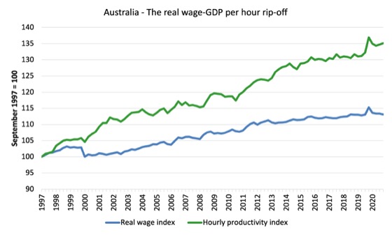
Taking a longer view, the following graph shows the total hourly rates of pay in the private sector in real terms (deflated with the CPI) (blue line) from the inception of the Wage Price Index (December-quarter 1997) and the real GDP per hour worked (from the national accounts) (green line) to the June-quarter 2021.
It doesn’t make much difference which deflator is used to adjust the nominal hourly WPI series. Nor does it matter much if we used the national accounts measure of wages.
But, over the time shown, the real hourly wage index has grown by 13.1 per cent, while the hourly productivity index has grown by 35.1 per cent.
So not has real wages growth been somewhat flat for some years, the gap between real wages growth and productivity growth continues to widen.
If I started the index in the early 1980s, when the gap between the two really started to open up, the gap would be much greater. Data discontinuities however prevent a concise graph of this type being provided at this stage.
For more analysis of why the gap represents a shift in national income shares and why it matters, please read the blog post – Australia – stagnant wages growth continues (August 17, 2016).
Where does the real income that the workers lose by being unable to gain real wages growth in line with productivity growth go?
Answer: Mostly to profits.
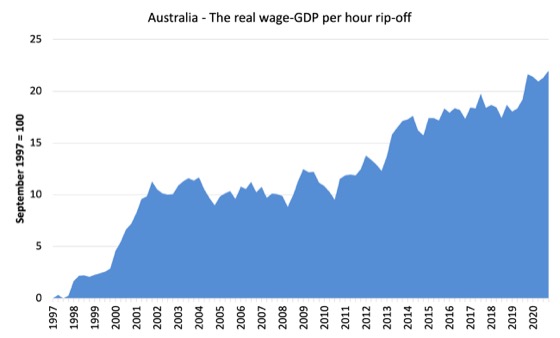
The next graph shows the gap between the real wage index and the labour productivity index in points.
It provides an estimate of the cumulative redistribution of income to profits.
Now, if you think the analysis is skewed because I used GDP per hour worked (a very clean measure from the national accounts), which is not exactly the same measure as labour productivity, then consider the next graph.
It shows the movements in the wage share in GDP (at factor cost) since the June-quarter 1960 to the March-quarter 2021.
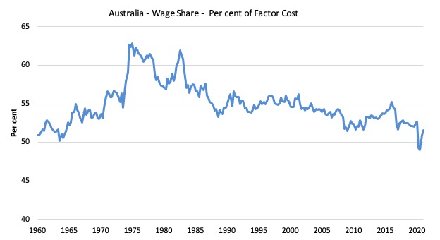
While the series moves around from quarter to quarter (and will fall in the June-quarter when the next National Accounts data release in September allows us to update the graph), the trend is obvious.
The only way that the wage share can fall like this, systematically, over time, is if there has been a redistribution of national income away from labour.
I considered these questions in a more detailed way in this blog post series:
1. Puzzle: Has real wages growth outstripped productivity growth or not? – Part 1 (November 20, 2019).
2. 1. Puzzle: Has real wages growth outstripped productivity growth or not? – Part 2 (November 21, 2019).
And the only way that can occur is if the growth in real wages is lower than the growth in labour productivity.
That has clearly been the case since the late 1980s. In the June-quarter 1991, the wage share was 56.6 per cent and the profit share was 22.2 per cent.
By the March-quarter 2021, the wage share had fallen to 51.6 per cent and the profit share risen to 29.5 per cent.
There has been a massive redistribution of income towards profits has occurred over the last 40 years.
The relationship between real wages and productivity growth also has bearing on the balance sheets of households.
One of the salient features of the neo-liberal era has been the on-going redistribution of national income to profits away from wages. This feature is present in many nations.
The suppression of real wages growth has been a deliberate strategy of business firms, exploiting the entrenched unemployment and rising underemployment over the last two or three decades.
The aspirations of capital have been aided and abetted by a sequence of ‘pro-business’ governments who have introduced harsh industrial relations legislation to reduce the trade unions’ ability to achieve wage gains for their members. The casualisation of the labour market has also contributed to the suppression.
The so-called ‘free trade’ agreements have also contributed to this trend.
I consider the implications of that dynamic in this blog post – The origins of the economic crisis (February 16, 2009).
As you will see, I argue that without fundamental change in the way governments approach wage determination, the world economies will remain prone to crises.
In summary, the substantial redistribution of national income towards capital over the last 30 years has undermined the capacity of households to maintain consumption growth without recourse to debt.
One of the reasons that household debt levels are now at record levels is that real wages have lagged behind productivity growth and households have resorted to increased credit to maintain their consumption levels, a trend exacerbated by the financial deregulation and lax oversight of the financial sector.
Real wages growth and employment
The standard mainstream argument is that unemployment is a result of excessive real wages and moderating real wages should drive stronger employment growth.
As Keynes and many others have shown – wages have two aspects:
First, they add to unit costs, although by how much is moot, given that there is strong evidence that higher wages motivate higher productivity, which offsets the impact of the wage rises on unit costs.
Second, they add to income and consumption expenditure is directly related to the income that workers receive.
So it is not obvious that higher real wages undermine total spending in the economy. Employment growth is a direct function of spending and cutting real wages will only increase employment if you can argue (and show) that it increases spending and reduces the desire to save.
There is no evidence to suggest that would be the case.
I usually publish a cross-plot that consistently shows no relationship between annual growth in real wages and the quarterly change in total employment over a long period.
The graph has issues at present due to Covid-19 outliers, although the conclusion doesn’t change.
There is also strong evidence that both employment growth and real wages growth respond positively to total spending growth and increasing economic activity. That evidence supports the positive relationship between real wages growth and employment growth.
Conclusion
In the June-quarter 2021, Australia’s wage growth continued to struggle at record low levels.
There can be no sustained recovery for the economy post Covid without a significant shift in the way we think about wages growth.
The business sector, as a whole, thinks it is clever to always oppose wages growth and the banks love that because they can foist more debt onto households to maintain their consumption expenditure.
But the wheels are falling off the whole show and the pre-Covid imbalances between wages and profits have not been addressed.
The problem is that the federal government supports wage suppression because that attracts funding for the conservatives from the corporate lobbies which help them stay in power.
It is a pretty bleak outlook for workers.
That is enough for today!
(c) Copyright 2021 William Mitchell. All Rights Reserved.
Reading this article reminds me of a discussion among a group of scholars few weeks ago that in term of GDP (PPP) or the gross domestic product based on purchasing power parity, published in April 2020 by the IMF and other agencies, showed that Australia PPP ranks behind China, India, Mexico, Indonesia, Brazil and among a dozen more countries.
I am not sure what to make of this except to share with bill’s conclusions that the future is not looking good.
Of course, I am aware that the quality of life is much lower in many aspects among some of those higher PPP countries compared to Australia, but the implication for the future is – how long?
And more importantly, what should be done?