Last week, the RBA increased interested rates claiming there was a growing capacity constraint (even…
Puzzle: Has real wages growth outstripped productivity growth or not? – Part 2
Inspector Commissionaire Bill is back on the case today for Part 2 and the solution of the puzzle we posed in – Puzzle: Has real wages growth outstripped productivity growth or not? – Part 1 (November 20, 2019). The puzzle was relatively easy to understand. The RBA (Australia’s central bank) published analysis in its most recent – Statement on Monetary Policy (November 2019), which showed that since the early 2000s, real earnings per hour have been above hourly labour productivity. Yet, National accounts data and earnings-productivity data trends that I regularly publish show the opposite. So the puzzle is: How can the RBA say that workers enjoyed real wage increases above labour productivity growth in the early 2000s up to around 2012, when we know the wage share has been falling more or less over the entire period? In Part 1, we laid out the conceptual framework to help us understand what I am writing about today. The resolution is that both sides of the puzzle are correct in their own way. The issue comes down to measurement and this two-part series demonstrates, very powerfully, how perceptions that are shaped by the presentation of data (graph, tables, etc) rarely come to grips with the underlying methods used to construct the presentations. We have all heard the phrase – There are three kinds of lies: lies, damned lies, and statistics. By becoming more educated about how to use statistics, we can all break that nexus and deploy data more reasonably to advance our cases. That is what this two-part blog series is about.
A tale of two graphs
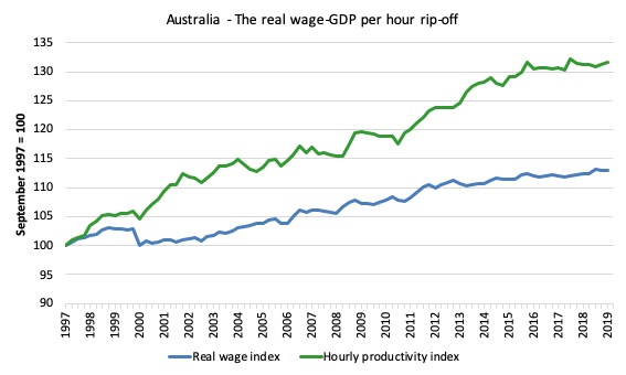
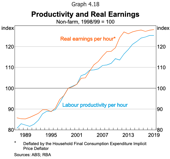
In Part 1, I presented two graphs, both of which purport to show the relationship (for Australia) between real wages and labour productivity. A third graph showing the wage share was included to reinforce the first graph.
Graph 1: Created by Bill
Graph 2: Created by the RBA
They can’t both be correct? Right?
Wrong?
They are both faithful depictions of the underlying data.
That is the puzzle. How can they both be correct and what does it mean?
A tale of four deflators
As noted in Part 1, a deflator is a variable that converts a nominal amount into a real amount.
As an example, say there is only good available for purchase (at a price of P = 1) and everyone gets the same nominal wage (W = $10). Each person can therefore purchase 10 units of the product, and so we say the real wage is equal to 10.
Thus, we deflate the nominal (W) by dividing it by the price level (P) to get the real wage. In this case, P is the deflator.
Now what happens if W rose to $20 but P rose to 2?
The nominal wage has clearly doubled, but the real wage is unchanged.
There are many ways to construct a deflator.
The consumer price index (CPI) is one method, where a fixed basket of goods and services is assembled, and an index of the price changes over time is computed based on survey evidence. The problem arises if the basket becomes unrepresentative of anything meaningful (for example, if consumer choices change over time).
There is also the issue of whether the basket is representative of any specific cohort’s expenditure patterns. To address that issue, the ABS computes – Selected Living Cost Indexes – by asking the question:
By how much would after tax money incomes need to change to allow households to purchase the same quantity of consumer goods and services that they purchased in the base period?
They define several different households representative of different expenditure patterns – Pensioners, Employee, Aged Pensioner, etc, to better refine the index.
Another type of deflator is called an Implicit price deflator and is derived in a totally different way to the CPI-type deflator. Again there are several different types.
The most general is the GDP (output) implicit price deflator (IPD), which is:
… derived by dividing current price values by the corresponding chain volume measures …
I won’t go into how chain volume time series are calculated but they effectively are intended to generate real output or real expenditure measures (that is, with the price change effects netted out).
In simple terms, the IPD is the nominal GDP divided by real GDP estimates, which gives a broad measure of prices.
Nominal GDP is P*Y.
Real GDP is Y.
So Nominal GDP/Real GDP = (P*Y)/Y = P.
This is usually multiplied by 100 to create an easy percentage index.
Say that last year, Nominal GDP was $1,000 and Real GDP was $1,000. The IPD would be 100 (calculated as 100 times $1,000/$1,000).
Now say in the current year, Nominal GDP is estimated to be $1,200 but real GDP is unchanged. Then the IPD would be 100 times (calculated as $1,200/$1,000) = 120.
Conclusion: the price level has risen by 20 per cent over the course of the year and accounts for all the measured ‘growth’ in nominal GDP. In real terms, the economy hasn’t grown at all.
The ABS publishes an IPD for overall GDP (output) and for other expenditure components, including Household final consumption expenditure.
In the latter case, the ABS estimates Household final consumption expenditure as one of the aggregate spending components and presents a nominal and chain volume (real) time series.
So the computation of an IPD for that component of expenditure is straightforward as before.
The main differences between the different price deflators are:
1. The GDP implicit price deflator is considered the most comprehensive indicator of price changes as it is based on all goods and services produced in the period.
2. The CPI type deflator measures price changes of a fixed basket of goods and if there are significant price changes outside the basket then the CPI will not pick them up. So changes in consumption patterns might not be reflected in the CPI.
3. However, the ABS notes that “movements in an implicit price deflator reflect both changes in price and changes in the composition of the aggregate for which the deflator is calculated”, which means it is not a pure measure.
4. The Household final consumption expenditure implicit price deflator is a less comprehensive measure of price changes as it only covers the goods and services that the statistician considers to be consumption items. It excludes, for example, “expenditures on the purchase of dwellings”.
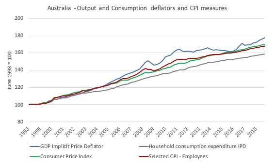
Now consider the following graph, which shows the four measures mentioned above from the June-quarter 1998 (the starting date of the SCL-employees index) to the March-quarter 2019.
The GDP IPD shows much stronger price escalation than the Household consumption expenditure IPD.
The two CPI-based measures are fairly closely related and lie between the two IPD measures.
What does this mean?
It means if we use a GDP IPD to convert, say nominal wages per hour into real wages per hour, then we will generate a lower real wage measure than if we were to use the Household consumption expenditure IPD.
The Information Article in the RBA Bulletin (March 2019) – The Labour and Capital Shares of Income in Australia – by Gianni La Cava notes that:
In Australia, the labour share of income – the share of total domestic income paid to workers in wages, salaries and other benefits (‘compensation of employees’) – rose over the 1960s and early 1970s but has gradually declined since then (Graph 1). Since the 1970s there has been a gradual increase in the capital share of income – the share of domestic income going to capital owners in profits (or ‘gross operating surplus’). The income accruing to unincorporated business owners (or ‘gross mixed income’) declined as a share of the economy over the 1960s and 1970s. Gross mixed income reflects a mix of labour and capital income and it is hard to say how much of the profits to business owners is the return to labour and how much is the return to capital. Regardless, it has not been an important driver of the trends in the factor shares since the 1980s …
The article also reiterates a point I have made often:
The labour share is typically thought of as the ratio of total wages and salaries to total income in the economy. But an alternative way of thinking about it is as the ratio of real wages to labour productivity. Both ratios capture earnings accrued by labour, divided by the value of the output produced by that labour. If the labour share is declining, this is because real wages growth is not keeping up with labour productivity growth.
The article tries to work out what the author calls a “puzzle” (another one, but related to my puzzle) where the wage share has “shown little net change since the global financial crisis” even though there has been “weak real wages growth and relatively strong productivity growth.”
The answer, according to the paper, lies in “the fact that real wages can be measured in different ways”, which is another way of saying that how we deflate the nominal wage measure matters.
He provides two specific measures:
1. “the ratio of nominal wages to consumer prices” – a purchasing power concept.
2. “the ratio of nominal wages to producer prices” – a cost of hiring perspective.
What has been the difference over time between these two real wage measures?
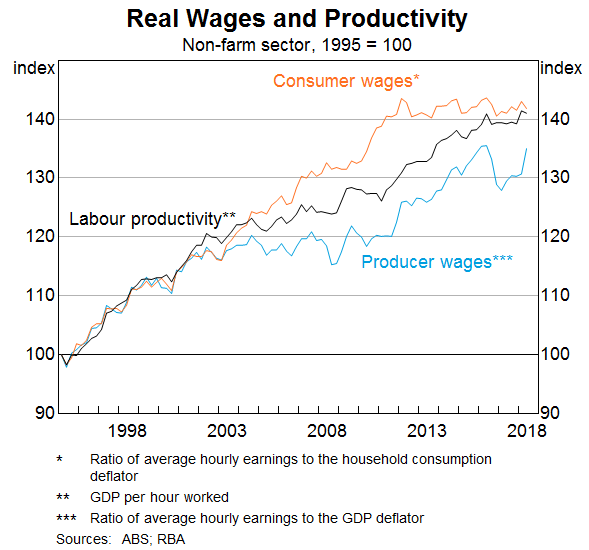
Gianni La Cava provides this graph, which shows the two real wage measures and GDP per hour worked from the national accounts (the same series that I use in the first graph above).
How should we interpret the differences – that is, why have the output and expenditure deflators parted company around the early 2000s?
Terms of trade effects
To make sure we understand what has been going on, we need to understand terms of trade effects on the measures.
The wage share measures use the GDP implicit price deflator (that is deflates via output or product prices) and so the corresponding real wage measure is the real cost (in output terms) for producers employing labour.
So if the growth in the real cost of employing labour is less than labour productivity, the wage share falls.
This can occur because of a slowdown in nominal wages and/or faster growth in the GDP IPD.
However, in an open economy, the relative export and import price movements (the so-called terms of trade) also impacts on the wage share.
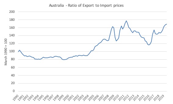
The following graph shows the ratio of export prices to import prices from the March-quarter 1990 to the September-quarter 2019. Australia enjoyed a massive boost to our terms of trade associated with the mining boom (world commodity prices boomed) from the end of 2003 until 2012, with a temporary lull during the early days of the GFC.
What impact does this have?
Here we have to distinguish between the share in total income and the real value of that share.
It is possible that the workers’ share could fall yet its real value of each dollar earned in that declining share rises.
So while workers are falling behind in proportional terms, they are better off in real terms than they were.
Here movements in the evolution of Australia’s terms of trade are directly implicated.
First, the rising terms of trade increased real incomes as export prices rose (even at constant export volumes).
Second, the lower import prices increased the real value of incomes in Australia.
So a gap between real GDP growth (which was slowing) and real income growth (which was accelerating) emerged in Australia in the early 2000s.
What the terms of trade movements did, in the words of Dean Parham (Source), was:
… drove a wedge between movements in product prices (prices of the goods and services that Australia produces) and consumer prices (prices of goods and services that Australians consume) … Higher export prices, especially for minerals, fuelled strong growth in product prices, with little effect on domestic consumer prices, while cheaper imports helped keep rises in domestic consumer prices in check.
This disparity in prices also drove a wedge between growth in real wages as a cost to producers (the real product wage) and growth in real wages as income to labour (the real consumption wage). The real consumption wage (RCW) deflates nominal wages by the consumer price index, rather than product prices. Consumer price inflation is relevant to those employed as it determines the real value or purchasing power of their incomes.
But the other point (not dealt with here) is that the terms of trade effect increased incomes overall. But, recognising that inequality and the incidence of precarious, low-paid work has risen over the same period then we would have to conduct a distributional analysis to work our which income cohorts had benefitted the most.
But we are not yet done
In a speech to an Australian industry peak body (AIG) – Productivity, Wages and Prosperity (June 13, 2018) – the RBA Governor talked about “some of the reasons why wages growth has been as lows as it has”.
He also discussed productivity growth.
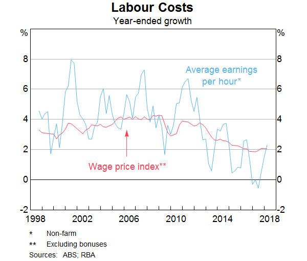
In his speech, he produced this graph, which shows the annual growth in Non-farm average earnings per hour taken from the National Accounts data and the Wage Price Index, which is a separate survey.
He noted that the national accounts measure is “the more volatile measure”, but the graph clearly shows the trajectory is more or less the same over the period shown (which is the span of the Wage Price Index (WPI) data).
My graph above uses the WPI to measure nominal earnings per hour, whereas the RBA’s graph uses Nominal hourly wages – constructed from the national accounts measure of non-Farm Compensation of Employees (COE) divided by total hours worked, where total hours worked is non-farm average hours per employee multiplied by total non-farm employees.
The following graph shows how using the different deflators on the WPI measure impacts on the relationship between real wages and productivity (measured as GDP per hour worked – from the national accounts).
The relativities between the real wage measures is expected, given the graph above showing the evolution of the four deflators.
But what we see is that, even though the terms of trade effects drive the Household consumption expenditure IPD version of real wages above the other three measures, GDP per hour is still consistently above all real wage measures.
In other words, how we measure the nominal wage also matters. It is not just a case of interpreting the puzzle in terms of the impact of different deflators.
The WPI is the most pure measure of wages growth because as the ABS tells us it:
… measures changes in the price of labour services resulting from market pressures, and is unaffected by changes in the quality or quantity of work performed. It is unaffected by changes in the composition of the labour force, hours worked, or changes in characteristics of employees (e.g. work performance).
The national accounts measures (used in the RBA graph and La Cava’s analysis) are affected by compositional change in the labour market so that if there is a shift to lower pay industries, the wages measure will be affected even if no changes in pay rates occur.
The national accounts measure is broader than the WPI measure.
I will discuss these differences further at a later date.
Finally, we might also think the productivity measure is influencing the comparison.
The ABS feature article – Labour Productivity – tells us:
Gross Domestic Product Per Hour Worked
In Australian National Accounts: National Income, Expenditure and Product (cat. no. 5206.0) and Australian System of National Accounts (cat. no. 5204.0) the term ‘GDP per hour worked’ (and similar terminology for the industry statistics) is generally used in preference to ‘labour productivity’ because:
– the term is more self-explanatory; and
– the measure does not attribute change in GDP to specific factors of production.
They go on to explain how they generate so-called “Estimates of Industry Multifactor Productivity”, which decomposes the productivity growth into its constituent inputs and provides a specific measure of labour productivity, which they define as:
… the amount of output produced for an hour of work … An increase in labour productivity means that more output is being produced per hour of work..
I accessed that data at – Estimates of Industry Multifactor Productivity, 2017-18 – and computed an index from 1989-90 (the data is presented in financial years).
This is more or less the time span of the previous graph.
1. Using 1989-90 as the base equal to 100, by 2017-18, the labour productivity index (as an aggregate of 12 of 16 Market Sector industries) has risen to 195.
2. If we use the Market Sector Industries (16 industries), then the labour productivity index rises to 146 from a base of 100 in 1995-96 (shorter data set due to data availability).
3. Even the most optimistic real earnings index (that supplied in the initial RBA graph) doesn’t come close to the growth of the labour productivity index measured in this way.
4. So it is difficult to see how real wages could have outstripped productivity growth, however, we measure nominal earnings.
Conclusion
There is no clear resolution to this problem.
Arguments can be made to support all sorts of positions on the relative movements of these series, and which series is best to use and more.
The point of the exercise is that it is always important to have some familiarity with how data is constructed when appraising a graph.
Things are not always as they seem.
My detective career is over for today!
That is enough for today!
(c) Copyright 2019 William Mitchell. All Rights Reserved.

So, is the bottom line this? —
That economists can easily confuse the issue by doing the graph showing wage growth and productivity growth over time with several different ways of calculating the correction to change ‘nominal’ to ‘real’; and the simply choose to display the one that conforms to what their boss wants them to say or what the economists wants to say.
If so then what is the point of looking at such graphs?
.* . Here ‘boss’ means the person or organization who pays their salary or the salary of their supervisor.
Dear Steve_American (at 2019/11/21 at 11:21 am)
No, that is not the bottom line.
The bottom line is that we should become better educated about how these analyses are created and what their limitations are.
They have meaning. One just has to interpret them correctly to extract that meaning and separate those with meaning from those that are problematic.
best wishes
bill
I am confused.
After all, are real wages lagging behind labour productivity or not?
Should we be mad or thankful towards Australian government?
This highlights one problem economics has – answering the question of “what should we measure and track over time?”
There is always a difficult problem of translating an abstract concept in economic theory into something that can be measured.
Price indexes seem to have this issue. Defining “inflation” in enough detail in the real world is very tricky. So many prices, and so many options that people/businesses have to choose how exposed/sensitive to changes in prices they are.
Additionally, the concepts are easily manipulated because they are often unobservable. Opportunity cost is a good example, because we need to create and value a set of hypothetical scenarios we know haven’t happened. Rife for manipulation of someone wanting to justify a choice they like, or berate a choice they don’t like.
Additionally, given that economic measures are seen as measures of success/competence/failure it is alway very tempting for people to mis use them.
Is this like having several systems of measurements without agreeing on a standard?
Or is it merely a conversion problem?
25C = 77F. Both units are useful, both say the same thing.
25C, dew point 25C, humidex 37C. All units/factors are useful, yet convey different information.
Humidex, however, is meant as a description, not a measurement.
In the US, the heat index is used. Conversion between the two is impossible.
Steve_American: Bill didn’t like your overall assessment from the standpoint of economics. From the standpoint of politics, however, I think you nailed it. I trust NO numbers being fed to me these days by the American government, affiliated NGOs, or the MSM. Bill, thankfully, has the expertise to parse these numbers, pull out the meaningful data that may lie within them, and share that data with us. But for us non-economists being fed numbers by our neoliberal overlords, the default position, I believe, should be skepticism at a minimum; at the maximum, the assumption that things are likely the opposite of how they’re presented to us.
Bill, do you have any comments about Randall Wray’s recent adventure in Washington D.C.? Would love to hear them if you do.
Personally, I was dismayed that so many of our representatives in the US Congress can’t seem to understand the difference between a household and the US Federal Government when it comes to budgeting and spending and debt. I think Randy Wray did a good job trying to explain the difference- but they seem to be unable to understand it.
In any event, it was great to see an MMT economist at the table with the others. I will try to post a link to the hearing in case anyone is interested. But I wouldn’t recommend listening to the whole thing unless you are trying unsuccessfully to fall asleep.
Here is a link. Randy Wray speaks for about 5 minutes starting at around 33 minutes. https://budget.house.gov/legislation/hearings/reexamining-economic-costs-debt
Here is a link to the text of Randy’s testimony to the congressional Budget Committee: http://www.levyinstitute.org/pubs/tst_11-20-19.pdf.
The poor are used to stifling any expression of their despair, because they must get on with life, with work, with the demands made of them day after day, hour after hour.
-Georges Simenon, Maigret and the Hundred Gibbets
To correct my previous comment- listening to that Congressional hearing might not make you sleepy. Lots of it will probably make you angry if you understand MMT.
Thank you Randall Wray for being there and enduring that. And telling them and trying to show them the truth.