The Australian Bureau of Statistics (ABS) released the latest labour force data today (March 19,…
US labour market continues to improve but ‘middle class’ jobs disappearing
Last week’s (February 1, 2019) release by the US Bureau of Labor Statistics (BLS) of their latest labour market data – Employment Situation Summary – January 2019 – showed that total non-farm payroll employment rose by 304,000 and the unemployment rate rose by 0.1 points to 4 per cent on the back of a 0.1 points rise in the participation rate. The labour force survey estimates were significantly impacted by changes in population benchmarks (an annual occurrence). However, all indications are that the labour market continues to improve. We will see in the next few months whether the strong January payroll employment growth was a one-off blip or a sustained trend. While the US labour market is looking fairly robust there is still a substantial jobs deficit remaining which tells us that it remains some distance from full employment. And, my latest analysis on which occupations are enjoying the employment growth shows that there has been a distinct hollowing out of median pay jobs (the so-called ‘middle class’ jobs), which helps to explain the sharp increases in income inequality.
Overview for January 2019
- Payroll employment rose by 304,000.
- Total labour force survey employment rose by 237 thousand in net terms after taking out changes due to variations in population benchmarks.
- The seasonally adjusted labour force rose by 495 thousand which pushed the unemployment rate up a bit.
- Official unemployment rose by 241,000 to 6.535 million.
- The official unemployment rate rose 0.1 points to 4 per cent.
- The participation rate rose by 0.1 points to 63.2 per cent but remains well below the peak in December 2006 (66.4 per cent). Adjusting for age effects, the rise in those who have given up looking for work for one reason or another since December 2006 is around 5,041 thousand workers. The corresponding unemployment rate would be 6.9 per cent, far higher than the current official rate.
- The broad labour underutilisation measure (U6) rose sharply from 7.6 per cent to 8.1 per cent due mainly to the enforced shutdown.
This month’s data was affected by new population benchmarks which are used to scale up the survey data to national level.
With the changes to the population benchmarks, the household and establishment survey data diverged significantly this month.
I analyse the differences below.
The BLS note that:
Establishment survey data have been revised as a result of the annual benchmarking process and the updating of seasonal adjustment factors. Also, household survey data for January 2019 reflect updated population estimates.
Further, for those who are confused about the difference between the payroll (establishment) data and the household survey data you should read this blog – US labour market is in a deplorable state – where I explain the differences in detail.
Payroll employment trends
The BLS noted that:
Total nonfarm payroll employment increased by 304,000 in January, compared with an average monthly gain of 223,000 in 2018. In January, employment grew in several industries, including leisure and hospitality, construction, health care, and transportation and warehousing. There were no discernible impacts of the partial federal government shutdown …
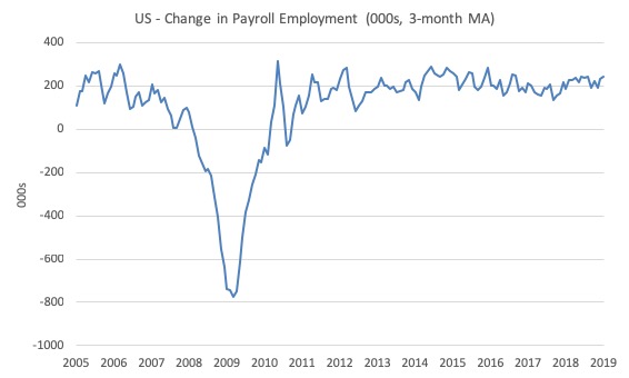
The first graph shows the monthly change in payroll employment (in thousands, expressed as a 3-month moving average to take out the monthly noise).
The monthly changes were stronger in 2014 and 2015, and then dipped in the first-half of 2016. By the end of 2016, job creation was stronger but then it tailed off again, somewhat.
This month was much more robust than the average over the last several years. We will wait to see if it lasts.
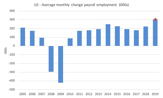
The next graph shows the same data in a different way – in this case the graph shows the average net monthly change in payroll employment (actual) for the calendar years from 2005 to 2019 (the 2019 average being the January observation at this stage).
The red diamond is the current month’s increase.
The slowdown that began in 2015 continued through 2017 and 2018 so far appears to have reversed that trend. The 2018 average was 223 thousand.
The average change in 2017 was 179 thousand, down from the 192 thousand average throughout 2016.
The average net change in 2014 was 251 thousand, in 2015 it was 227 thousand.
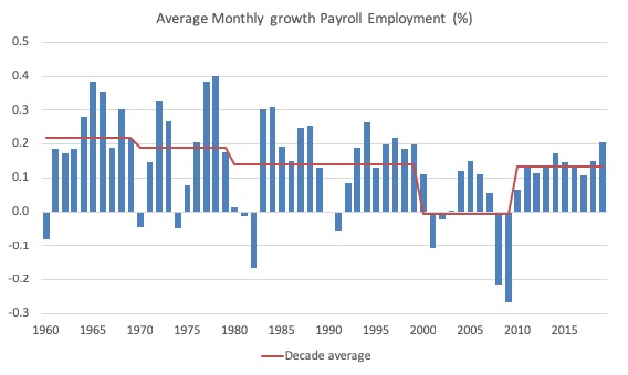
To put the current recovery into historical perspective the following graph shows the average annual growth in payroll employment since 1960 (blue columns) with the decade averages shown by the red line.
It reinforces the view that while payroll employment growth has been steady since the crisis ended, it is still well down on previous decades of growth.
Labour Force Survey – employment growth remains positive
The changes to the population benchmarks led to some significant shifts in the past estimates.
The BLS note that:
The adjustments decreased the estimated size of the civilian noninstitutional population in December by 800,000, the civilian labor force by 506,000, employment by 488,000, unemployment by 18,000 and the number of persons not in the labor force was by 294,000. The total unemployment rate, employment-population ratio, and labor force participation rate were unaffected.
Data users are cautioned that these annual population adjustments can affect the comparability of household data series over time.
So, readers, it is an inexact science!
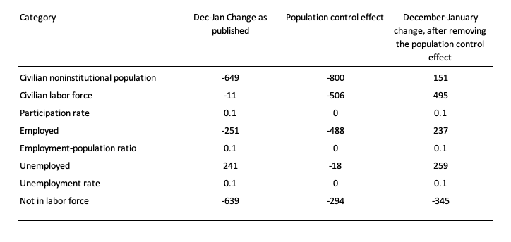
The following Table shows the impact on the December-January changes (in thousands).
So while total employment was estimated to have fallen by 251 thousand, the effect of the population benchmark changes was -488 thousand, which means that if we remove that impact the estimated change in employment would have been 237 thousand, more in line with the payroll survey findings.
When these changes to the benchmarks are made, we have to be very cautious in making broad statements.
The best guess is that the US labour market improved in total employment in January 2019.
Having that caveat in mind, in January 2018, employment as measured by the household survey fell by 251 thousand net (-0.16 per cent) while the labour force fell by 11 thousand (-0.01 per cent).
As a result, total unemployment rose by 241 thousand and the unemployment rate rose by 0.1 points to 4 per cent.
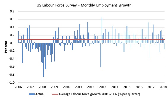
The next graph shows the monthly employment growth since the low-point unemployment rate month (December 2006). The red line is the average labour force growth over the period December 2001 to December 2006 (0.09 per cent per month).
Summary conclusion:
1. There is still no coherent positive and reinforcing trend in employment growth since the recovery began back in 2009. There are still many months where employment growth, while positive, remains relatively weak when compared to the average labour force growth prior to the crisis or is negative.
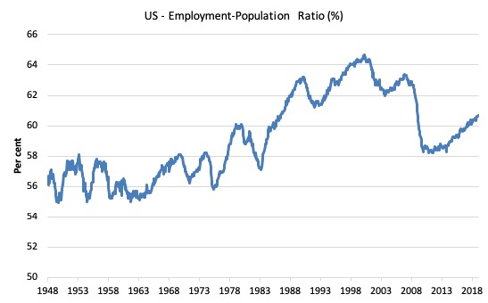
A good measure of the strength of the labour market is the Employment-Population ratio given that the movements are relatively unambiguous because the denominator population is not particularly sensitive to the cycle (unlike the labour force).
The following graph shows the US Employment-Population from January 1970 to January 2019. While the ratio fluctuates a little, the January 2019 ratio rose 0.1 points to 60.7 per cent.
So while the population benchmarks led to a lower estimate of overall employment, the changed estimates to the working age population fell by more leading to a rise in the EPOP ratio.
This time last year it was 60.2 per cent. So a larger proportion of the working age population are now in work.
Over the longer period though, we see that the ratio remains well down on pre-GFC levels (peak 63.4 per cent in December 2006), which is a further indication of how weak the recovery has been so far and the distance that the US labour market is from being at full capacity (assuming that the December 2006 level was closer to that state).
Unemployment and underutilisation trends
These estimates are also impacted by the changed population benchmarks as detailed in the Table above.
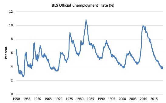
The first graph shows the official unemployment rate since January 1950.
It is clear that the US labour market is reaching unemployment rates not seen since the late 1960s.
The unemployment rate rose slightly in January 2019 largely because the participation rate rose by 0.1 points (adding to supply faster than employment added to demand).
The official unemployment rate is a narrow measure of labour wastage, which means that a strict comparison with the 1960s, for example, in terms of how tight the labour market, has to take into account broader measures of labour underutilisation.
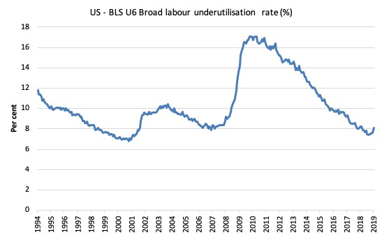
The next graph shows the BLS measure U6, which is defined as:
Total unemployed, plus all marginally attached workers plus total employed part time for economic reasons, as a percent of all civilian labor force plus all marginally attached workers.
It is thus the broadest measure of labour underutilisation that the BLS publish.
In December 2006, before the effects of the slowdown started to impact upon the labour market, the measure was estimated to be 7.9 per cent.
After a period of steady decline over the first part of 2018, it is now at 8.1 per cent having been at 7.6 per cent in December 2018.
However, the BLS tell us that:
The number of persons employed part time for economic reasons (sometimes referred to as involuntary part-time workers) increased by about one-half million to 5.1 million in January. Nearly all of this increase occurred in the private sector and may reflect the impact of the partial federal government shutdown. (Persons employed part time for economic reasons would have preferred full-time employment but were working part time because their hours had been reduced or they were unable to find full-time jobs.)
So the jump in U6 is likely to be the ‘Donald Trump Obstinacy on the Path to Humiliation Effect’ and we will see a reversal in that aggregate in February or March.
The U-6 measure is marginally below the pre-GFC level but remains above the trough of the early 2000s.
That provides a quite different perspective in the way we assess the US recovery and challenges the view that the US economy is close to full employment.
The US jobs deficit
The current participation rate of 63.2 per cent is a long way below the most recent peak in December 2006 of 66.4 per cent.
When times are bad, many workers opt to stop searching for work while there are not enough jobs to go around. As a result, national statistics offices classify these workers as not being in the labour force (they fail the activity test), which has the effect of attenuating the rise in official estimates of unemployment and unemployment rates.
These discouraged workers are considered to be in hidden unemployment and like the officially unemployed workers are available to work immediately and would take a job if one was offered.
In most advanced nations, the population is shifting towards older workers who have lower participation rates – so the US is not special in this regard.
Thus some of the decline in the total participation rate could simply being an averaging issue – more workers who have a lower participation rate as a proportion of the total workforce.
In this blog post (November 7, 2017) – Updating the impact of ageing labour force on US participation rates – I estimated that about 61 per cent of the decline in the participation rate since January 2008 has been due to non-cyclical shifts in the demographic weights (shifting age composition).
That still leaves a significant cyclical response.
Adjusting for the demographic effect would give an estimate of the participation rate in January 2019 of 65.2 per cent if there had been no cyclical effects (up from the current 63.2 per cent).
This would give an adjusted unemployment rate of 6.91 per cent rather than 4 per cent, if all the ‘hidden’ unemployed (since December 2006) were to be counted among the official unemployed.
To compute these job gaps we have to set a ‘full employment’ benchmark. I have set this at 3.7 per cent, which is where the US labour market reached in November 2018.
I explain in this blog post – US labour market – strengthened in February but still not at full employment (April 13, 2018) – is the best case scenario given that I actually think the cyclical losses are much worse than I provide here.
Using the estimated potential labour force (controlling for declining participation), we can compute a ‘necessary’ employment series which is defined as the level of employment that would ensure on 3.7 per cent of the simulated labour force remained unemployed.
This time series tells us by how much employment has to grow each month (in thousands) to match the underlying growth in the working age population with participation rates constant at their January 2008 peak – that is, to maintain the 3.7 per cent unemployment rate benchmark.
In the blog post cited above (US labour market – strengthened in February but still not at full employment), I provide more information and analysis on the method.
There are two separate effects:
- The actual loss of jobs between the employment peak in November 2007 and the trough (January 2010) was 8,582 thousand jobs. However, total employment is now above the January 2008 peak by 10,099 thousand jobs.
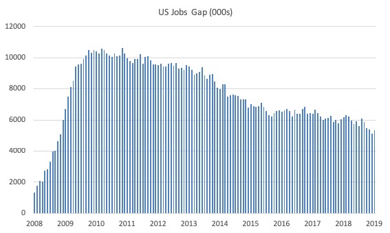
- The shortfall of jobs (the overall jobs gap) is the actual employment relative to the jobs that would have been generated had the demand-side of the labour market kept pace with the underlying population growth – that is, with the participation rate at its January 2008 value and the unemployment rate was constant at 3.7 per cent. This shortfall loss amounts to 5,350 thousand jobs.
The following graph shows the US Jobs Gap, which depicts the gap between current employment and the level of employment that would have generated a 3.7 per cent unemployment rate, given current population trends.
This reinforces the conclusion we reached above that the US labour market, while now enjoying a low official unemployment rate has not fully recovered from the GFC.
Occupational wage bias
I updated my research into the cyclical shifts in employment at the main occupational levels for the US today.
And the results are very interesting.
In the past, I have demonstrated that the proportion of jobs in the total employment in sectors that pay below-average pay has increased.
At that level we are unable to say whether these jobs in question were high-pay or low-pay.
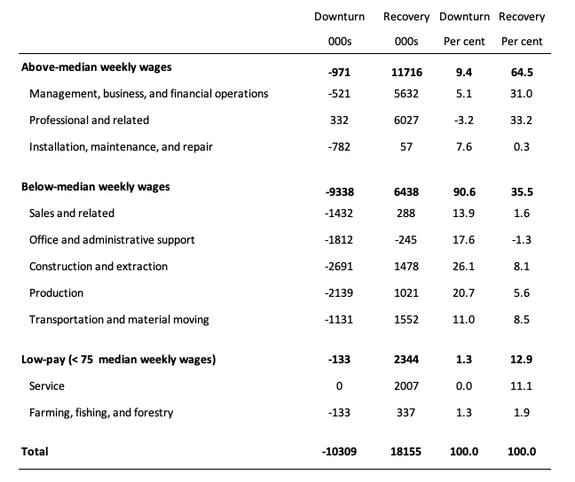
The next table helps to expand on that understanding.
It shows the net job losses (in the downturn) and net job gains (in the recovery to date) for the major occupations in the BLS classification.
I have sorted the occupations relative to median weekly earnings as at the fourth-quarter 2018.
Low-pay is 75 per cent of the median.
Results:
1. In the downturn 90.6 per cent of the jobs lost were in occupations that paid below median weekly earnings (1.3 per cent of those were in low-paid occupations). Very few jobs (relatively) were lost in the higher paying occupations.
2. Given 86.1 per cent of the total jobs lost in the downturn were in sectors paying above average pay. The inference is that the jobs lost were predominantly the lower paying jobs in those sectors (although we cannot strictly compare mean and median in a wage distribution given the skewness).
3. In the upturn to date, the net jobs added have not yet replaced those lost in the occupations with below median weekly earnings. 64.5 per cent of the net jobs added were in occupations with above median weekly earnings.
4. While only a small number and proportion of jobs were lost in the low-pay occupations, the recovery has seen a much larger number of those jobs being added. Of the 35.5 per cent share of below median earning jobs in the recovery the proportion that were in low-pay occupations was 12.9 per cent.
5. This tells us that there is a polarisation going on in the occupational employment structure with a bias towards low-pay jobs in the below median weekly earnings occupations and towards jobs in the above median weekly earnings.
6. That is there has been a hollowing out around the overall median pay levels. I am investigating that further.
Conclusion
The January 2019 BLS labour market data release for the US tells me that the US labour market remains fairly robust.
Caution should always be exercised given the volatility of the monthly data especially this month, given the changes made to the population benchmarks.
Total non-farm payroll employment rose by 304,000 and the unemployment rate rose by 0.1 points to 4 per cent on the back of a 0.1 point rise in the participation rate.
If the January result persists, then sustained reductions in unemployment will occur.
While the US labour market is looking fairly robust there is still a substantial jobs deficit remaining which tells us that it remains some distance from full employment.
And there has been a significant hollowing out of jobs in the median wage area (the so-called ‘middle-class’ jobs), which is reinforcing the polarisation in the income distribution and rising inequality.
That is enough for today!
(c) Copyright 2019 William Mitchell. All Rights Reserved.
We’re investing in everything except our citizens.
This is very helpful! Thank you.
How does the United States Bureau of Labor Statistics define the working age population?
Is it everyone aged 15 years and over?
Is it everyone aged 15 to 64 years?
Dear Nicholas,
Here is the link for the BLS Glossary of terms: https://www.bls.gov/bls/glossary.htm#C
Also, here is the definition of the civilian noninstitutional population:
“Included are persons 16 years of age and older residing in the 50 states and the District of Columbia who do not live in institutions (for example, correctional facilities, long-term care hospitals, and nursing homes) and who are not on active duty in the Armed Forces.”
I think this answers your question about what is the working age population.
Best,
Justin