The Australian Bureau of Statistics (ABS) released the latest labour force data today (June 25,…
Australian labour market stumbling along – no case to withdraw support yet
The latest data from the Australian Bureau of Statistics – Labour Force, Australia, January 2021 – released today (February 18, 2021), shows that the labour market is stumbling along and the pace of recovery has slowed considerably. Employment increased by 0.1 per cent (29,100) in the month, half the growth that was recorded in December 2020. Unemployment fell by 34,300 to 877,600 persons and the unemployment rate fell by 0.2 points although that was largely due to the decline in the participation rate. Underemployment also fell by 0.4 points and the broad labour underutilisation rate (sum of unemployment and underemployment) fell by 0.6 points, but some of that is due to the special monthly hour movements in January. The main uncertainty now is that the recovery is slowing and the current (extensive) government support is due to end in March 2021. Given the labour market is still quite a margin from where it was in March 2020, the idea that the government would withdraw its fiscal support is not a compelling option. Overall, the recovery is still too slow and more government support by way of large-scale job creation.
The summary ABS Labour Force (seasonally adjusted) estimates for January 2021 are:
- Employment increased 29,100 (0.2 per cent) – Full-time employment increased by 59,000 and part-time employment decreased 29,800.
- Unemployment decreased 34,300 to 877,600 persons.
- The official unemployment rate decreased 0.2 points to 6.4 per cent.
- The participation rate decreased by 0.1 points to 66.1 per cent.
- Aggregate monthly hours worked decreased 86 million hours (4.9 per cent).
- Underemployment decreased by 0.4 points to 8.1 per cent (decline of 112.7 thousand). Overall there are 1,125.7 thousand underemployed workers. The total labour underutilisation rate (unemployment plus underemployment) decreased by 0.6 points to 14.5 per cent. There were a total of 2,003.3 thousand workers either unemployed or underemployed.
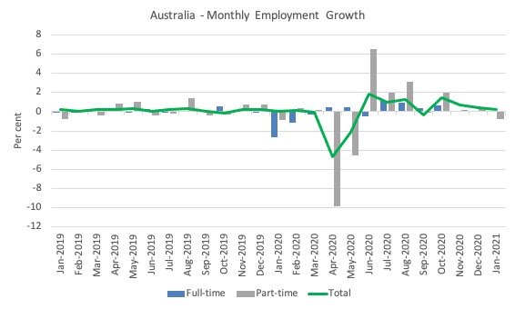
Employment increased at a slower rate in January 2021
1. Employment growth was 0.2 per cent and continuing to decline relative to the end of the 2020 rates.
It is now below the March level by 58.5 thousand (-0.5 per cent).
2. Full-time employment increased by 59,000 and part-time employment decreased 29,800.
The following graph shows the month by month growth in full-time (blue columns), part-time (grey columns) and total employment (green line) for the 24 months to January 2021 using seasonally adjusted data.
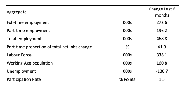
The following table provides an accounting summary of the labour market performance over the last six months to provide a longer perspective that cuts through the monthly variability and provides a better assessment of the trends.
Assessment:
1. Total employment has risen by 468.8 thousand and 41.9 per cent of that increase has been in part-time work.
2. Full-time employment is still below the March level by 53.3 thousand.
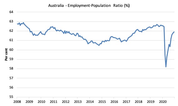
Given the variation in the labour force estimates, it is sometimes useful to examine the Employment-to-Population ratio (%) because the underlying population estimates (denominator) are less cyclical and subject to variation than the labour force estimates. This is an alternative measure of the robustness of activity to the unemployment rate, which is sensitive to those labour force swings.
The following graph shows the Employment-to-Population ratio, since June 2008 (the low-point unemployment rate of the last cycle).
It fell with the onset of the GFC, recovered under the boost provided by the fiscal stimulus packages but then went backwards again as the Federal government imposed fiscal austerity in a hare-brained attempt at achieving a fiscal surplus in 2012.
The ratio rose by 0.1 points in January 2021 to 61.9 per cent on the back of strong employment growth. The ratio is now 0.9 points below pre-GFC peak in April 2008 of 62.9 per cent.
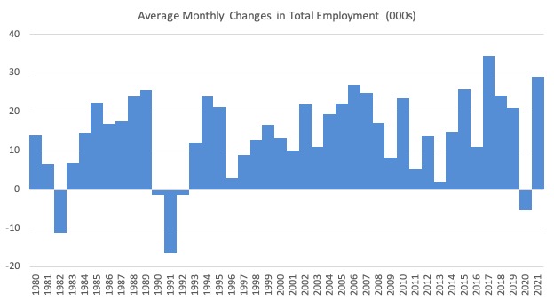
To put the current monthly performance into perspective, the following graph shows the average monthly employment change for the calendar years from 1980 to 2020 (to date).
1. The labour market weakened considerably over 2018 and that situation worsened in 2019.
2. The average employment change over 2020 was -5.3 thousand.
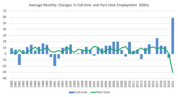
The following graph shows the average monthly changes in Full-time and Part-time employment (lower panel) in thousands since 1980.
The interesting result is that during recessions or slow-downs, it is full-time employment that takes the bulk of the adjustment. Even when full-time employment growth is negative, part-time employment usually continues to grow.
However, this crisis is different because much of the employment losses are the result of lockdowns and enforced business closures in sectors where part-time employment dominates.
But the slow recovery of full-time employment signals that the demand-side impacts from the lockdown have had wider effects.
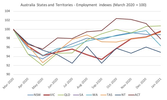
Impact of Stage 4 lockdown in Victoria
The following graph shows the impact on employment in Victoria as the State 4 restrictions took hold.
Victoria is now recovering strongly from its 100-day lockdown and the gap with other states has more than closed except in the case of Queensland.
With the long lockdown over (ignoring the most recent snap 5-day shutdown in Victoria), the January employment level is now almost where Victoria was at the start of the pandemic. Only Queensland has done better – and then only just.
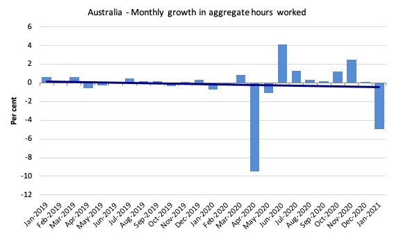
Hours worked decreased 86 million hours (4.9 per cent) in January 2021
The recovery in hours worked as the various state lockdowns eased, seems to have come to an abrupt end.
Given this exceptional result, the ABS published a special information release – Insights into hours worked, January 2021 (January 18, 2021).
We learn that:
This fall in hours worked should be viewed differently to the fall in April and May 2020, which resulted from the restrictions in the labour market and coincided with falls in employment …
There is a fall in hours worked every January as many people take annual leave, which the seasonal adjustment process makes allowance for. However, a larger than usual number of people took annual leave in January 2021. This led to the unusual combination of a rise in seasonally adjusted employment and a large fall in seasonally adjusted hours worked. Given the extent of disruption during 2020, including to people’s leave plans, it is not surprising that more than the usual amount of leave was taken in the Christmas-New Year holiday period.
So an unseasonally large, seasonal exit to the beach and camping sites.
The following graph shows the monthly growth (in per cent) over the last 24 months.
The dark linear line is a simple regression trend of the monthly change – which depicts a flat trend. Even before the coronavirus crisis struck, the trend was trending downwards (but will flatten a bit once the January exodus is reversed in subsequent months).
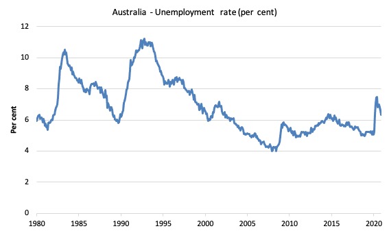
Unemployment decreased 34,300 to 877,600 persons or 6.4 per cent
The official unemployment rate fell 0.2 points to 6.4 per cent as the rise in employment (29.1 thousand) met a decline in the labour force (-34.3) as participation fell by 0.1 points.
The following graph shows the national unemployment rate from January 1980 to January 2021. The longer time-series helps frame some perspective to what is happening at present.
Assessment:
1. There is clearly still considerable slack in the labour market that could be absorbed with further fiscal stimulus.
Broad labour underutilisation decreased by 0.6 points to 14.5 per cent in January 2021
The results for January 2021 are (seasonally adjusted):
1. Underemployment fell by 55.5 thousand (due to post-Xmas drop in part-time work).
2. The underemployment rate fell by 0.4 points to 8.1 per cent.
2. Overall there are 1,125.7 thousand underemployed workers.
3. The total labour underutilisation rate (unemployment plus underemployment) decreased by 1.1 points to 15.1 per cent.
4. There were a total of 2,003.3 thousand workers either unemployed or underemployed.
The following graph plots the seasonally-adjusted underemployment rate in Australia from January 1980 to the January 2021 (blue line) and the broad underutilisation rate over the same period (green line).
The difference between the two lines is the unemployment rate.
The three cyclical peaks correspond to the 1982, 1991 recessions and the more recent downturn.
The other difference between now and the two earlier cycles is that the recovery triggered by the fiscal stimulus in 2008-09 did not persist and as soon as the ‘fiscal surplus’ fetish kicked in in 2012, things went backwards very quickly.
The two earlier peaks were sharp but steadily declined. The last peak fell away on the back of the stimulus but turned again when the stimulus was withdrawn.
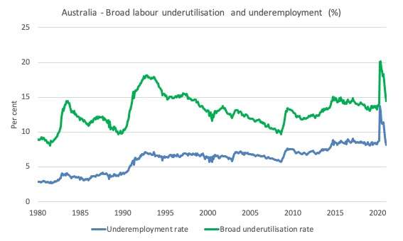
With the participation falling this month, hidden unemployment would have risen a little, which puts the fall in underemployment in a slightly different perspective. Please read my blog post – Australian labour underutilisation rate is at least 13.4 per cent – for more discussion on this point.
Unemployment and broad labour underutilisation indexes – last four downturns
The following graph captures the evolution of the unemployment rates for the 1982, 1991, GFC and COVID-19 downturns.
For each episode, the graph begins at 100 – which is the index value of the unemployment rate at the low-point of each cycle (June 1981; December 1989; February 2008, and January 2020, respectively).
We then plot each episode out for 90 months.
For 1991, the peak unemployment which was achieved some 38 months after the downturn began and the resulting recovery was painfully slow. While the 1982 recession was severe the economy and the labour market was recovering by the 26th month. The pace of recovery for the 1982 once it began was faster than the recovery in the current period.
During the GFC crisis, the unemployment rate peaked after 16 months (thanks to a substantial fiscal stimulus) but then started rising again once the stimulus was prematurely withdrawn and a new peak occurred at the 80th month.
The COVID-19 downturn was obviously worse than any of the previous recessions shown but because of its unique nature – the job losses being largely driven by lockdowns etc.
But the recovery is evident.
The graph provides a graphical depiction of the speed at which each recession unfolded (which tells you something about each episode) and the length of time that the labour market deteriorated (expressed in terms of the unemployment rate).
After 11 months, the unemployment had risen from 100 to:
1. 122.7 index points in 1982 and rising.
2. 135.9 index points in 1991 and rising.
3. 123.2 index points in the GFC and rising.
4. 125.1 index points currently and falling.
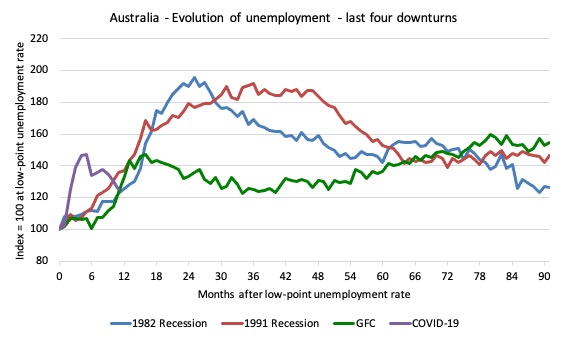
Note that these are index numbers and only tell us about the speed of decay rather than levels of unemployment.
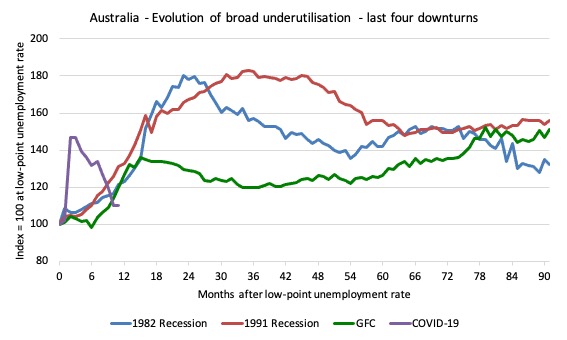
The next graph performs the same operation for the broad labour underutilisation rate (sum of official unemployment and underemployment).
Teenage labour market modest gains in January 2021
1. Total teenage net employment rose by 5.7 thousand in January 2021 (0.9 per cent).
2. Full-time teenage employment fell by 1 thousand (0.6 per cent) and part-time employment rose by 6.7 thousand (1.3 per cent).
3. The teenage unemployment rate rose by 0.4 points to 18.8 per cent and the participation rate rose by 0.8 points.
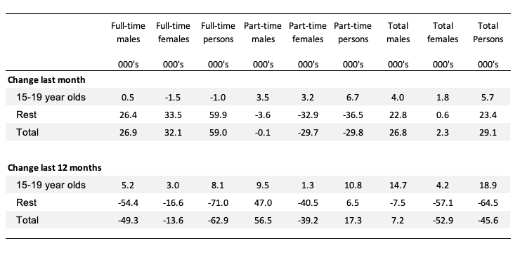
The following Table shows the distribution of net employment creation in the last month and the last 12 months by full-time/part-time status and age/gender category (15-19 year olds and the rest).
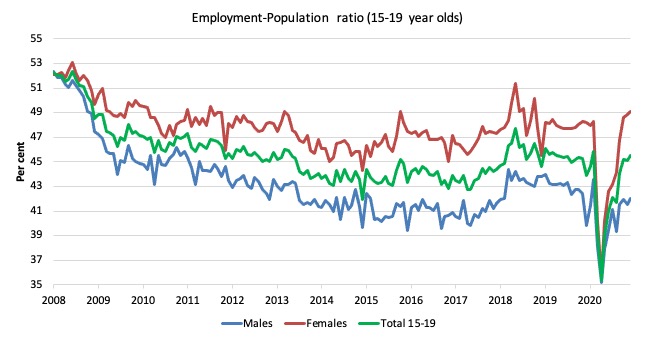
To put the teenage employment situation in a scale context (relative to their size in the population) the following graph shows the Employment-Population ratios for males, females and total 15-19 year olds since June 2008.
You can interpret this graph as depicting the loss of employment relative to the underlying population of each cohort. We would expect (at least) that this ratio should be constant if not rising somewhat (depending on school participation rates).
1. The male ratio has fallen by 10.3 percentage points since February 2008, and 1.5 points since March 2020, but rose 0.5 points over the month.
2. The female ratio has fallen by 3.0 percentage points, but has risen by 0.8 points since March 2020, and 0.3 points over the month.
3. The overall teenage employment-population ratio has fallen by 6.7 percentage points and 0.4 points since March 2020, but rose 0.4 points over the month.
Conclusion
My standard monthly warning: we always have to be careful interpreting month to month movements given the way the Labour Force Survey is constructed and implemented.
The January 2021 data reveals that the Australian labour market continues to recover albeit at a slower rate and a lack of employment growth has reduced participation (as well as the seasonal impact of the January holiday period).
My overall assessment is:
1. Victoria has bounced back strongly from its harsh Stage 4, 100-day lockdown. How much damage the most recent snap 5-day lockdown has caused we will see soon. Probably not much.
2. Employment increased by 0.2 per cent in the month, which half the growth that was recorded in December 2020.
3. Unemployment fell by 34,300 to 877,600 persons and the unemployment rate fell by 0.2 points although that was largely due to the decline in the participation rate.
4. Underemployment also fell by 0.4 points and the broad labour underutilisation rate (sum of unemployment and underemployment) fell by 0.6 points, but some of that is due to the special monthly hour movements in January.
6. The main uncertainty now is that the recovery is slowing and the current (extensive) government support is due to end in March 2021. Given the labour market is still quite a margin from where it was in March 2020, the idea that the government would withdraw its fiscal support is not a compelling option.
That is enough for today!
(c) Copyright 2020 William Mitchell. All Rights Reserved.
Never fear, our PM has the answer………..
“Earlier this week it was reported in the mainstream press that the Morrison Government was considering an unemployment insurance scheme in lieu of permanently lifting JobSeeker.
Under such a scheme, anyone made unemployed would be paid a fixed percentage of their income (e.g. 70%) for a set amount of time (e.g. three months) while they search and hopefully gain another job. However, the amount received would be capped, to prevent very high income earners from being paid too much.
After this set timeframe, the unemployment payment would revert back to its poverty level of $40 a day.”
Barstardising the unemployed – Australia’s national sport.