The income and wealth inequality that continues to grow in most advanced nations has led…
US labour market – things are getting worse again as the virus spreads
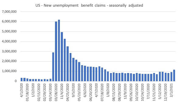
US Department of Labor’s latest unemployment claimant data is worrying with the claimants in the week to January 9, 2021 rising to 1,151,051 a shift of 231,335. This is the highest level since the week ending July 25, 2020 and confirms what we now know – that unless a nation deals with the health crisis and gets the virus infections under control (preferably to the point of zero community transmission), it cannot hope for a sustainable economic recovery. The data is the result of lockdowns leading to layoffs in the hospitality and recreation sectors which has pushed the US economy back into contraction. The rise in new claimants follows the payroll data that revealed that employment had fallen by 140,000 (net) – see this blog post for analysis of that data release – US labour market recovery has ended as health problem intensifies (January 11, 2021). And given the nature of the employment most impacted, you can be sure that socio-economic inequalities will have risen. I will write about that last issue another day.
Here is the latest update (as for the week ending October 17, 2020) from the US Department of Labor’s weekly data releases for the unemployment insurance claimants.
The Department of Labor provides an archive of the weekly unemployment insurance claims data back to January 7, 1967 – HERE.
The weekly data can be found in the – UI Weekly Claims Report.
New claimants rise sharply
The next graph shows the data for New claimants data from January 1, 2020 to January 10, 2021.
I had previously posted the full sample, which showed how insignificant the previous deep recessions of the early 1980s, 1990s and the GFC were by comparison with the current event.
But we get little information from seeing a huge vertical line dwarfing all previous observations. We know the scale.
This series provides the best information on the state of the labour market and reinforces the information we learned from the monthly payroll and labour force survey data – with the virus out of control – the economy will worsen.
The problem that the data on new (first-time) claimants for benefits demonstrates is that the weekly claims have not substantially declined since August, which tells me that employment growth has not been not fast enough to absorb the accumulated pool of jobless workers.
Continuing claims and covered unemployment rate
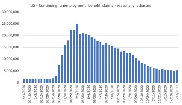
The other series, which is of interest is the continuing claims, which lags the new claims by a week.
The following graph shows that this series is dropping steadily until November 2020 but then levelled off as the health crisis deepened.
There are now 5,271,000.
On March 7, 2020, the stock of continuing claims was 1,702,000 persons. The figure for the week ending January 2, 2021 remains at 3.1 times that level.
It signals that the new US government will have to prioritise economic relief if they want to make any inroads into this disaster.
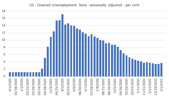
The next graph shows the evolution of the insured unemployment rate, which measures the proportion of the labour force that is collecting unemployment benefits.
This time last year, the rate was 1.2 per cent.
In the week to January 2, 2021, the rate rose from 3.5 per cent to 3.7 per cent (seasonally adjusted), which suggests a deteriorating situation.
Bringing together the archived data and the most recent release (January 10, 2021), the following table tells the story for those who like numbers.
| Week ending | Initial Claims (SA) | Weekly Change |
| March 7, 2020 | 211,000 | -6,000 |
| December 12, 2020 | 941,910 | -14,563 |
| December 19, 2020 | 872,941 | -68,969 |
| December 26, 2020 | 835,972 | -36,969 |
| January 2, 2021 | 919,680 | 83,708 |
| January 9, 2021 | 1,151,015 | +231,335 |
Past Recessions Comparison
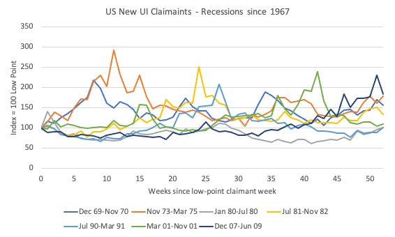
I wondered what the behaviour of this time series had been in past recessions. The data goes back to January 1967, which means it covers 8 official US recessions.
I started the indexes at 100 for each recession in the week where the lowest claimant count occurred before the recession began and then graphed the index out to 40 weeks, which is the duration of the current COVID recession.
The following graph covers the 7 official recessions up to and including the GFC.
I decided to graph the COVID episode separately because it completely obliterates any of the past dynamics in amplitude.
As you can see, the pattern is very similar for all these events (with some variational spikes).
Here is the graph for the COVID period. Stunning.
The current observation (January 10, 2021) is worse than any of the peaks in previous recessions (even the 1973 episode).
The spatial patterns
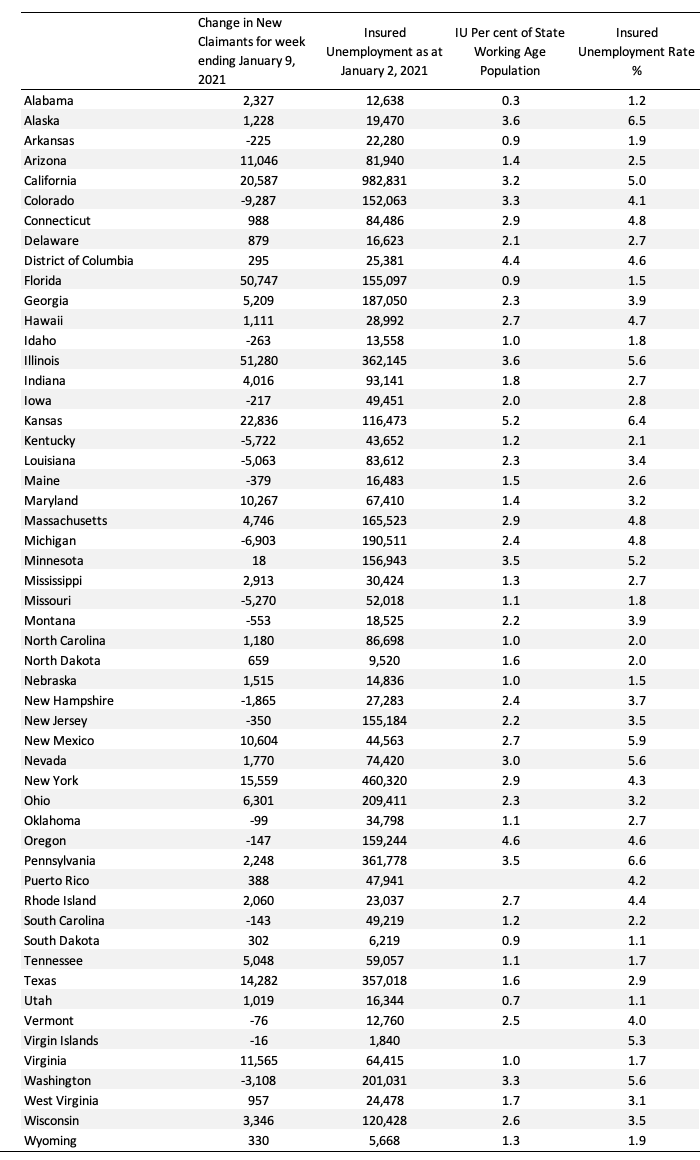
The following Table presents the most recent data to January 10, 2020 for the US states.
The columns are:
1. State
2. The Change in New Claimants for week ending January 9, 2021 – which gives you an idea of where the deterioration is occurring – huge shifts in Arizona, California, Florida, Illinois, Kansas, Maryland, New Mexico, New York, Texas, and Virginia.
3. Insured Unemployment as at January 2, 2021
4. Insured Unemployment as at January 2, 2021 as a percent of the each state’s working age population.
Conclusion
I am currently digging further into the regional data to record the socio-economic impact of the deteriorating situation.
I will write more about that tomorrow.
It is clear that the pandemic has also been a socio-economic disaster, which led one medical writer to coin the term ‘global syndemic’ to link the health disaster with the socio-economic considerations in the context of the worst health outcomes impacting on the poorest communities. A perfect neoliberal storm.
But it is also obvious that without further fiscal support, the situation in the US will become untenable from a social standpoint.
That is enough for today!
(c) Copyright 2021 William Mitchell. All Rights Reserved.
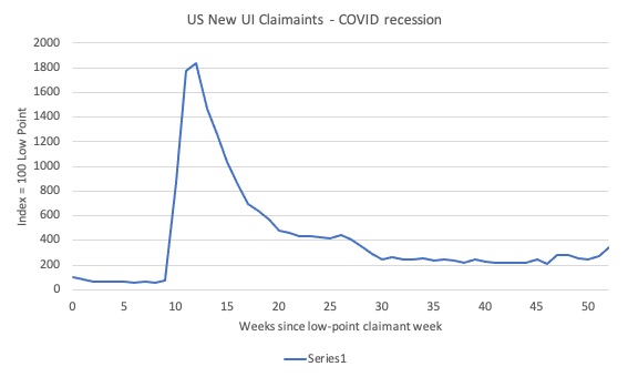
Comparing the 2 graphs of New UI Claimants for recessions since 1967, you can see that the highest spike on the covid recession graph is close to 1900 and the highest spike on any of the other 7 is just under 300.
That means this recession is over 6 times (6.4?? times) worse that any of the others in my adult life.
Also, a typo in the 1st paragraph, the last sentence has a double negative.
I do wonder how this ‘event’ will impact our habits, attitudes and practices in the long run, not only people’s… firms’, even governments. I, like many, work from home now. I like it. It’s less stressful. No more wasteful commute. Savings on gas alone is a nice addition to the budget, not to mention the environment. Fewer distractions too. Back in my office days I used to like sushi for lunch and occasional trips to Starbucks. Now I cook. Our office building has been essentially empty for many months now. Managers start to question the necessity of all this real estate. It turns out we didn’t actually need to be in the building to be productive. I am certain similar thoughts and attitudes can be observed throughout the world. What will happen to our landlords and other landlords like them. Starbucks franchise anyone? Less driving may lead to fewer cars and probably gas station workers. More home cooked meals likely leads to fewer restaurant meals. Alternatively online business is booming. Pros and cons, as ever.
Chris Richardson, a “leading economist”, says everything will be fine, don’t worry about un/under employment stuck above pre-covid levels until 2024, the outlook is not as bad as first feared…and besides, Chinese students and tourists will come rushing back to Australia ……
These guys should be forced to live on jobseeker until 2024….then maybe they would engage their brains.
The percentage of uninsured workers is shocking. What will follow is a wave of evictions.