The recent extreme weather in the northern hemisphere, the twin monster tropical storms in Japan,…
US labour market recovery has ended as health problem intensifies
It has been clear that with the virus infections in the US increasing rapidly and with the lack of fiscal support from government, that the labour market conditions would probably start to deteriorate after a brief period of recovery following the first blush with the virus. I have been predicting that since December 2020. The latest data reveals that assessment was accurate. On January 8, 2021, the US Bureau of Labor Statistics (BLS) released their latest labour market data – Employment Situation Summary – December 2020 – which reveals a deteriorating or static situation, depending on the weight one gives to the payroll data relative to the household survey. Payroll employment fell by 140 thousand. In terms of the household survey, with employment and the labour force hardly moving, unemployment and the unemployment rate was unchanged. While the signals are a little confused, the data is showing the recovery has ended as the health crisis intensifies. I consider that the US will have to stabilise the health situation before they will be able to sustain any economic recovery. The US appears to be going in the opposite direction to that.
Overview for December 2020:
- Payroll employment fell by 140,000.
- Total labour force survey employment rose by 21 thousand net (0.01 per cent).
- The seasonally adjusted labour force rose by 31 thousand (0.02 per cent).
- Official unemployment was unchanged at 10,736 thousand
- The official unemployment rate was unchanged at 6.7 per cent.
- The participation rate fell by 0.2 points to 61.5 per cent.
- The broad labour underutilisation measure (U6) fell by 0.3 points to 11.7 per cent, as the part-time for economic reasons cohort (the US indicator of underemployment) fell by 471 thousand (7.1 per cent).
For those who are confused about the difference between the payroll (establishment) data and the household survey data you should read this blog post – US labour market is in a deplorable state – where I explain the differences in detail.
BLS explanation
The BLS provided a special note to help us understand the results this month.
We learn:
1. “The collection rate for the establishment survey was 76 percent in December, about the same as the average for the 12 months ending in February 2020.”
2. “The household survey response rate was 77 percent in December, considerably higher than the low of 65 percent in June but below the average of 83 percent for the 12 months ending in February 2020.”
3. Both results reduce the accuracy of the surveys.
4. In the payroll survey:
… workers who are paid by their employer for all or any part of the pay period including the 12th of the month are counted as employed, even if they were not actually at their jobs. Workers who are temporarily or permanently absent from their jobs and are not being paid are not counted as employed, even if they continue to receive benefits.
5. In the Labour Force survey:
… individuals are classified as employed, unemployed, or not in the labor force based on their answers to a series of questions about their activities during the survey reference week (December 6th through December 12th). Workers who indicate they were not working during the entire survey reference week and expect to be recalled to their jobs should be classified as unemployed on temporary layoff. As in recent months, a large number of persons were classified as unemployed on temporary layoff in November.
The BLS wanted the latter group classified as unemployed for consistency but the survey staff didn’t always comply, which means that the employment estimates are probably overstated.
What impact might this have had?
The BLS say:
… the share of responses that may have been misclassified was highest in the early months of the pandemic and has been considerably lower in recent months.
For March through November, BLS published an estimate of what the unemployment rate would have been had misclassified workers been included among the unemployed. Repeating this same approach, the overall December unemployment rate would have been 0.6 percentage point higher than reported. However, this represents the upper bound of our estimate of misclassification and probably overstates the size of the misclassification error.
So we are still operating in an environment of uncertainty but the data accuracy has increased.
Payroll employment trends
The BLS noted that:
Total nonfarm payroll employment declined by 140,000 in December. Employment declines in leisure and hospitality, private education, and government were partially offset by gains in professional and business services, retail trade, construction, and transportation and warehousing. In December, nonfarm employment was below its February level by 9.8 million, or 6.5 percent.
It is clear that the US is in a dire situation. With the virus spiralling out of control, hospitals becoming overcrowded and the death rate rising to unimaginable levels, policy makers will have to reimpose lockdowns and the labour market will deteriorate as a consequence.
That is evident by where the losses in December have occurred:
In December, employment in leisure and hospitality declined by 498,000, with three-quarters of the decrease in food services and drinking places (-372,000). Employment also fell in the amusements, gambling, and recreation industry (-92,000) and in the accommodation industry (-24,000). Since February, employment in leisure and hospitality is down by 3.9 million, or 23.2 percent.
The other worry is that:
Government employment declined by 45,000 in December. Employment in the component of local government that excludes education declined by 32,000, and state government education lost 20,000 jobs. Federal government employment increased by 6,000. Since February, government employment overall is down by 1.3 million.
That signals a failure of the policy response.
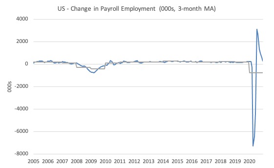
The first graph shows the monthly change in payroll employment (in thousands, expressed as a 3-month moving average to take out the monthly noise). The gray lines are the annual averages.
The data swings are still large and dwarf the past history.
Clearly, the 20.7 million job loss in April has not yet been reversed. Given the loss of payroll jobs in March and April, the US labour market is still 9.8 million jobs short from where it was at the end of February.
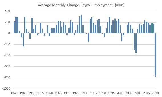
The next graph shows the same data in a different way – in this case the graph shows the average net monthly change in payroll employment (actual) for the calendar years from 1940 to 2020 (the 2020 average is for the months to date).
I usually only show this graph from 2005 but because history is being created at present I included the full sample available from 1940.
The final average for 2019 was 178 thousand.
The average so far for 2020 is -781 thousand.
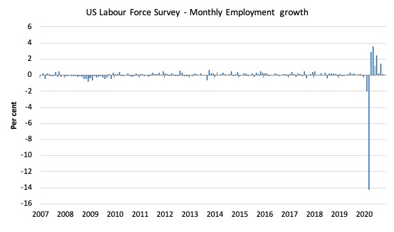
Labour Force Survey – employment growth nearly zero
The data for December reveals:
1. Employment as measured by the household survey rose by 21 thousand net (0.01 per cent).
2. The labour force rose by 31 thousand (0.02 per cent).
3. The participation rate was unchanged.
4. As a result (in accounting terms), total measured unemployment rose by 8 thousand and the unemployment rate was unchanged at 6.7 per cent.
The following graph shows the monthly employment growth since January 2008, which shows the massive disruption this sickness has caused.
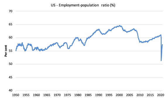
The Employment-Population ratio is a good measure of the strength of the labour market because the movements are relatively unambiguous because the denominator population is not particularly sensitive to the cycle (unlike the labour force).
The following graph shows the US Employment-Population from January 1950 to December 2020.
While the ratio fluctuates a little, the April 2020 ratio fell by 8.7 points to 51.3 per cent, which is the largest monthly fall since the sample began in January 1948.
In December 2020, the ratio was unchanged at 57.4 per cent.
It is still well down on the level in January 2020 (61.1 per cent).
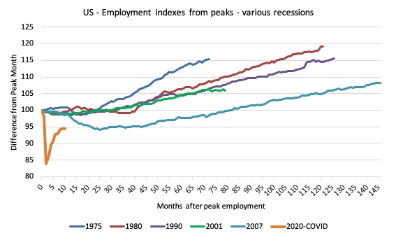
As a matter of history, the following graph shows employment indexes for the US (from US Bureau of Labor Statistics data) for the five NBER recessions since the mid-1970s and the current 2020-COVID crisis.
They are indexed at the employment peak in each case and we trace the data out for each episode until one month before the next peak.
So you get an idea of:
1. The amplitude (depth) of each cycle in employment terms.
2. The length of the cycle in months from peak-trough-peak.
The early 1980s recession was in two parts – a short downturn in 1981, which was followed by a second major downturn 12 months later in July 1982 which then endured.
Other facts:
1. Return to peak for the GFC was after 78 months.
2. The previous recessions have returned to the 100 index value after around 30 to 34 months.
3. Even at the end of the GFC cycle (146 months), total employment in the US had still only risen by 8.3 per cent (since December 2007), which is a very moderate growth path as is shown in the graph.
The current collapse is something else and progress has now now stalled.
Unemployment and underutilisation trends
The BLS report that:
In December, both the unemployment rate, at 6.7 percent, and the number of unemployed persons, at 10.7 million, were unchanged. Although both measures are much lower than their April highs, they are nearly twice their pre-pandemic levels in February (3.5 percent and 5.7 million, respectively)
The official unemployment rate was unchanged in December 2020 largely because the labour force and employment barely changed. Participation was constant.
The first graph shows the official unemployment rate since January 1994.
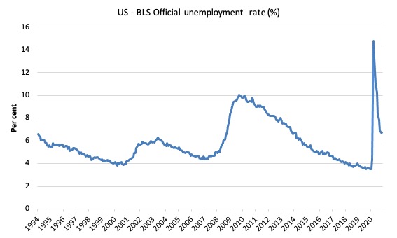
The official unemployment rate is a narrow measure of labour wastage, which means that a strict comparison with the 1960s, for example, in terms of how tight the labour market, has to take into account broader measures of labour underutilisation.
The next graph shows the BLS measure U6, which is defined as:
Total unemployed, plus all marginally attached workers plus total employed part time for economic reasons, as a percent of all civilian labor force plus all marginally attached workers.
It is thus the broadest quantitative measure of labour underutilisation that the BLS publish.
In December 2006, before the effects of the slowdown started to impact upon the labour market, the measure was estimated to be 7.9 per cent.
In December 2020 the U6 measure decreased by 0.3 points to 11.7 per cent.
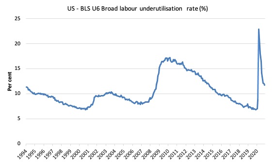
What drove this decline in U6?
The BLS say that:
The number of persons employed part time for economic reasons, at 6.2 million, decreased by 471,000 over the month. This measure is down from its April high of 10.9 million but is 1.8 million higher than the February level. These individuals, who would have preferred full-time employment, were working part time because their hours had been reduced or they were unable to find full-time jobs …
In December, the number of persons not in the labor force who currently want a job, at 7.3 million, was little changed over the month but is 2.3 million higher than in February. These individuals were not counted as unemployed because they were not actively looking for work during the last 4 weeks or were unavailable to take a job …
Among those not in the labor force who currently want a job, the number of persons marginally attached to the labor force, at 2.2 million, changed little in December but is up by 749,000 since February. These individuals wanted and were available for work and had looked for a job sometime in the prior 12 months but had not looked for work in the 4 weeks preceding the survey. The number of discouraged workers, a subset of the marginally attached who believed that no jobs were available for them, was essentially unchanged at 663,000 in December but is up by 262,000 since February.
Ethnicity and Education
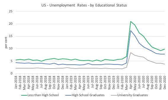
The next graph shows the evolution of unemployment rates for three cohorts based on educational attainment: (a) those with less than high school completion; (b) high school graduates; and (c) university graduates.
As usual, when there is a crisis, the least educated suffer disproportionately.
In the collapse in employment, the unemployment rates rose by:
- 14.4 points for those with less than high-school diploma.
- 12.9 points for high school, no college graduates.
- 5.9 points for those with university degrees.
The period since April 2020 has seen the unemployment rate fall by:
- 11.1 points for those with less than high-school diploma meaning the unemployment rate is now 3.8 points above the March level.
- 9.5 points for high school, no college graduates meaning the unemployment rate is now 4.6 points above the March level.
- 4.2 points for those with university degrees meaning the unemployment rate is now 2.3 points above the March level.
In the last month, the change in the unemployment rate has been:
- +0.6 points points for those with less than high-school diploma.
- No change for high school, no college graduates meaning the unemployment rate.
- -0.4 points for those with university degrees meaning the unemployment rate.
So a deterioration for those with less than high-school education
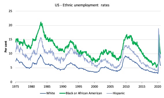
In the US context, especially in the current time, the trends in trends in unemployment by ethnicity are interesting.
Two questions arise:
1. How have the Black and African American and White unemployment rate fared in the post-GFC period?
2. How has the relationship between the Black and African American unemployment rate and the White unemployment rate changed since the GFC?
Summary:
1. All the series move together as economic activity cycles. The data also moves around a lot on a monthly basis.
2. The Black and African American unemployment rate was 6.7 per cent in March 2020, rose to 16.8 per cent in May and is now down to 9.9 per cent in December 2020.
3. The Hispanic or Latino unemployment rate was 6 per cent in March 2020, rose to 18.9 per cent in April and fell to 9.3 per cent in December 2020.
4. The White unemployment rate was 4 per cent in March 2020, rose to 14.2 per cent in April and fell to 6 per cent in December 2020.
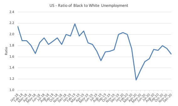
The next graph shows the Black and African American unemployment rate to White unemployment rate (ratio) from January 2018, when the White unemployment rate was at 3.5 per cent and the Black or African American rate was at 7.5 per cent.
This graph allows us to see whether the relative position of the two cohorts has changed since the crisis. If it is rising, then the unemployment rate of the Black and African American cohort is either rising faster than the white unemployment rate or falling more slowly (or a combination of that relativity).
While there is month-to-month variability, the data shows that, in fact, through to mid-2019, the position of Black and African Americans had improved in relative terms (to Whites), although that just reflected the fact that the White unemployment was so low that employers were forced to take on other ‘less preferred’ workers if they wanted to maintain growth.
In April 2019, the ratio was 2.1 (meaning the Black and African American unemployment rate was more than 2 times the White rate).
By April 2020, the ratio had fallen to its lowest level of 1.2, reflecting the improved relative Black and African American position.
As the pandemic hit, the ratio rose and peaked at 1.8 in August 2020, but fell to 1.7 in September, reflecting an improvement in the relative position of the Black and African American workers.
In December 2020, the ratio was 1.65 down from 1.75 in November.
Conclusion
The December 2020 US BLS labour market data release reveals that the recovery seen since the catastrophic labour market collapse in March and April has gone into reverse or at best stalled, depending on the weight one gives to the payroll data relative to the household survey.
Payroll employment fell by 140 thousand. In terms of the household survey, with employment and the labour force hardly moving, unemployment and the unemployment rate was unchanged.
While the signals are a little confused, the data is showing the recovery has ended as the health crisis intensifies.
The attrition in government employment continued which makes no sense at all.
And, I haven’t read anything from the incoming Administration to suggest they will take a dramatically different approach.
I consider that the US will have to stabilise the health situation before they will be able to sustain any economic recovery.
The US appears to be going in the opposite direction to that.
That is enough for today!
(c) Copyright 2021 William Mitchell. All Rights Reserved.
Yes the virus is out of control here in the US. Hundreds of thousands getting infected every day. Thousands dying every day. And unfortunately the deaths will continue up in the next few weeks.
But hopefully, the vaccines that are available will start to slow the infection rate fairly soon. On a positive note more than 8 million people here have received the first dose and we seem to be speeding up on administering the shots from our truly abysmal early efforts. I wish the idiots storming our Capitol had been complaining about the poor public health policies and efforts of our government. But of course they weren’t up in arms about that.
Oh well. I keep thinking two more months of this nightmare and it will get better. Hope isn’t a great policy but it is something. Thanks for the depressing analysis Professor.
I think vaccine distribution will take longer than a couple of months. For Canada something in the order of 9 or 10 months.
In Canada, we are approaching one and a quarter percent of the entire population having already had the virus. In the US that number is more like five percent.
Depending on the vaccine used 5, 10 or even 20 percent of those vaccinated won’t develop immunity to the virus and it looks like newly evolving mutations have an increasing rate of transmission.
The public health measures taken to try to prevent the spread appear to have only slowed it down a little and now it’s largely out of control as Jerry Brown points out. This is overwhelming health facilities.
Many surgeries and treatments for serious life threatening conditions haven’t happened because of the numbers infected with the virus, so the toll this pandemic is taking can’t be measured by looking at the statistics regarding the virus alone.
The problems with facilities weakened by decades of neoliberal cuts, privatizations and deregulation continue to result in levels of morbidity and mortality well beyond what fully funded public institutions would have experienced in the past.
Health workers are becoming exhausted and there are few reserves to draw on other than asking retirees to return to work.
Add this to the fact that it isn’t easy to get vaccines into hundreds of millions of people, and the fact that in many instances of infection there seems to be associated sequela months later, and it looks like there is still a long rough road to recovery.
J Christensen, in the US, confirmed cases are about 7% of the population. My hope is that there have been many, many more unconfirmed asymptomatic cases that provided people with some form of immunity going forward. But that is just a hope that cannot be substantiated. In any case- it is not looking good for people in my country for the next couple of months. But hopefully it will begin to get better. And now I’m getting depressed again.
But my brother the doctor got his first shot a week ago so I won’t need to worry so much about him at least. Stay well and stay away from here for quite a while.
Is Neil Wilson still around, still arguing that Covid is just a bit of a flu?
January 20 – Biden’s inauguration day – will mark 1 year since the first recorded case of Covid in the US – it’s looking like the death toll will be close to 400 000 by then, the third-leading cause of death from all causes in the US with only heart disease and cancer killing more people.
How many other infectious diseases have killed 400 000 Americans in the space of 12 months?
His insistence that Covid is “twice as bad as the flu – three times at absolute worst” has not been borne out by the actual numbers, which are at least ten times as bad as the worst flu fatality estimates.
To say nothing of the significant numbers of Covid survivors who appear to have been left with long-term health problems – which the flu typically does not cause.
You would think that Covid deniers would be an endangered species by now but they are still out there.
Lefty, it doesn’t really matter anymore. And the US had Donald Trump with a far greater megaphone spewing so much misinformation about this that it is practically a crime in its own right. No, it is a crime and maybe they will add that to the impeachment proceedings. It is an open question what the leading cause of death in the USA between April 1, 2020 and April 1 2021 will have been.
It seems that the initial assessment has been correct: health and economy is NOT a dichotomy.