The Australian Bureau of Statistics (ABS) released the latest labour force data today (June 25,…
Australian labour market – recovery plods on
The latest data from the Australian Bureau of Statistics – Labour Force, Australia, December 2020 – released today (January 17, 2021), shows that the labour market is still improving but the pace of recovery has slowed considerably.Employment increased by 0.4 per cent (50,000) in the month, which normally is a reasonable result but is nearly half the growth that was recorded in November 2020. Unemployment fell by 30,100 and the unemployment rate fell by 0.2 points even though the participation rate rose by 0.1 points. It is always a good sign when there is both employment and labour force growth with the former stronger than the latter. Underemployment also fell by 0.8 points and the broad labour underutilisation rate (sum of unemployment and underemployment) fell by 0.8 points. The main uncertainty now is that the recovery is slowing and the current (extensive) government support is due to end in the first-quarter of 2021. Given the labour market is still quite a margin from where it was in March 2020, the idea that the government would withdraw its fiscal support is not a compelling option. Overall, the recovery is still too slow and more government support by way of large-scale job creation.
The summary ABS Labour Force (seasonally adjusted) estimates for December 2020 are:
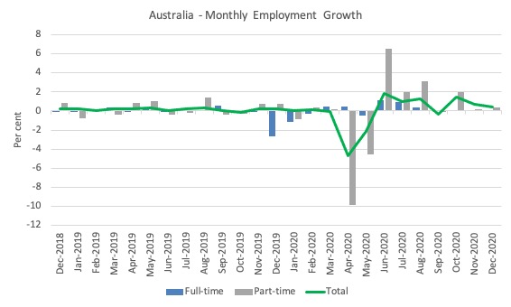
- Employment increased 50,000 (0.4 per cent) – Full-time employment increased by 35,700 and part-time employment increased 14,300.
- Unemployment decreased 30,100 to 912,000 persons.
- The official unemployment rate decreased 0.2 points to 6.6 per cent.
- The participation rate increased by 0.1 points to 66.2 per cent.
- Aggregate monthly hours worked increased 2 million hours (0.1 per cent).
- Underemployment decreased by 0.8 points to 8.5 per cent (decline of 112.7 thousand). Overall there are 1,181.1 thousand underemployed workers. The total labour underutilisation rate (unemployment plus underemployment) decreased by 1.1 points to 15.1 per cent. There were a total of 2,093.1 thousand workers either unemployed or underemployed.
Employment increased at a slower rate in December 2020
1. Employment growth was 0.4 per cent – slowing from the October and November rates.
It is now below the March level by 87.6 thousand (-0.7 per cent).
2. Full-time employment increased by 35,700 and part-time employment increased 14,300.
The following graph shows the month by month growth in full-time (blue columns), part-time (grey columns) and total employment (green line) for the 24 months to December 2020 using seasonally adjusted data.
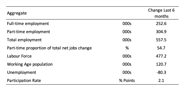
The following table provides an accounting summary of the labour market performance over the last six months to provide a longer perspective that cuts through the monthly variability and provides a better assessment of the trends.
Assessment:
1. Total employment has risen by 557.5 thousand but 54.7 per cent of that increase has been in part-time work. This is quite a significant result.
2. Full-time employment is still below the March level by 112.4 thousand although in the last 6 months there has been growth.
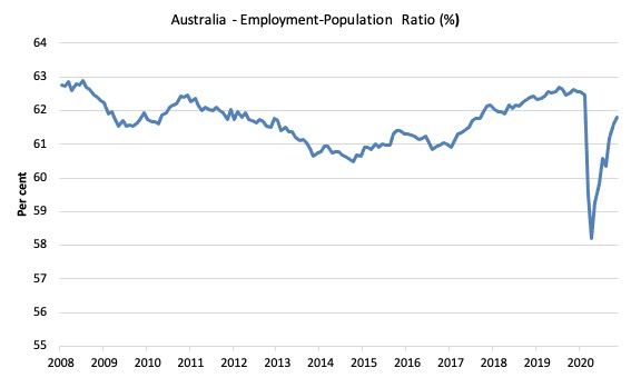
Given the variation in the labour force estimates, it is sometimes useful to examine the Employment-to-Population ratio (%) because the underlying population estimates (denominator) are less cyclical and subject to variation than the labour force estimates. This is an alternative measure of the robustness of activity to the unemployment rate, which is sensitive to those labour force swings.
The following graph shows the Employment-to-Population ratio, since June 2008 (the low-point unemployment rate of the last cycle).
It fell with the onset of the GFC, recovered under the boost provided by the fiscal stimulus packages but then went backwards again as the Federal government imposed fiscal austerity in a hare-brained attempt at achieving a fiscal surplus in 2012.
The ratio rose by 0.2 points in December 2020 to 61.8 per cent on the back of strong employment growth. The ratio is now 1.1 points below pre-GFC peak in April 2008 of 62.9 per cent.
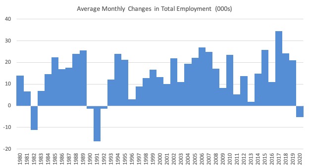
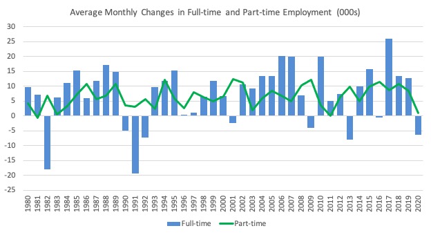
To put the current monthly performance into perspective, the following graph shows the average monthly employment change for the calendar years from 1980 to 2020 (to date).
1. The labour market weakened considerably over 2018 and that situation worsened in 2019.
2. The average employment change over 2020 was -5.3 thousand.
3. What I noticed when compiling the data today was how the scales are returning to the data. The early pandemic results made the past history look flat. But now some perspective is returning.
The following graph shows the average monthly changes in Full-time and Part-time employment (lower panel) in thousands since 1980.
The interesting result is that during recessions or slow-downs, it is full-time employment that takes the bulk of the adjustment. Even when full-time employment growth is negative, part-time employment usually continues to grow.
However, this crisis is different because much of the employment losses are the result of lockdowns and enforced business closures in sectors where part-time employment dominates.
But the slow recovery of full-time employment signals that the demand-side impacts from the lockdown have had wider effects.
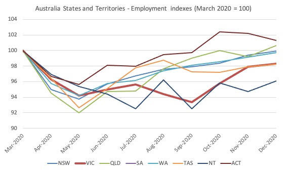
Impact of Stage 4 lockdown in Victoria
The following graph shows the impact on employment in Victoria as the State 4 restrictions took hold.
Victoria is now recovering strongly from its 100-day lockdown and the gap with othe
With the lockdown over, the November employment level is now above the level in April 2020 and 1.7 points below the March peak. So a very good recovery so far in that state.
Unemployment decreased 30,100 to 912,000 persons or 6.6 per cent
The official unemployment rate fell 0.2 points to 6.8 per cent as the rise in employment (50 thousand) outstripped the change in the labour force (20) even with participation rising by 0.1 points.
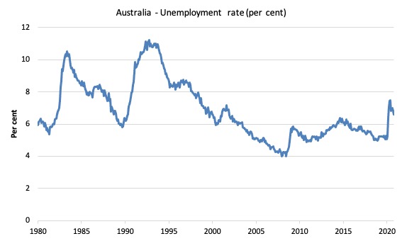
The following graph shows the national unemployment rate from January 1980 to December 2020. The longer time-series helps frame some perspective to what is happening at present.
Assessment:
1. There is clearly still considerable slack in the labour market that could be absorbed with further fiscal stimulus.
Broad labour underutilisation decreased by 1.2 points to 16.2 per cent in December 2020
The results for December 2020 are (seasonally adjusted):
1. Underemployment fell by 112.7 thousand.
2. The underemployment rate fell by 0.8 points to 8.5 per cent.
2. Overall there are 1,181.1 thousand underemployed workers.
3. The total labour underutilisation rate (unemployment plus underemployment) decreased by 1.1 points to 15.1 per cent.
4. There were a total of 2,093.1 thousand workers either unemployed or underemployed.
The following graph plots the seasonally-adjusted underemployment rate in Australia from January 1980 to the December 2020 (blue line) and the broad underutilisation rate over the same period (green line).
The difference between the two lines is the unemployment rate.
The three cyclical peaks correspond to the 1982, 1991 recessions and the more recent downturn.
The other difference between now and the two earlier cycles is that the recovery triggered by the fiscal stimulus in 2008-09 did not persist and as soon as the ‘fiscal surplus’ fetish kicked in in 2012, things went backwards very quickly.
The two earlier peaks were sharp but steadily declined. The last peak fell away on the back of the stimulus but turned again when the stimulus was withdrawn.
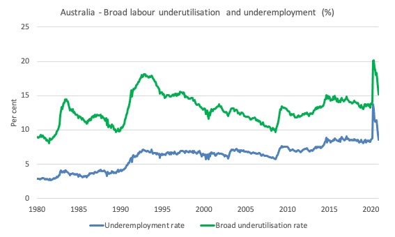
With the participation rising this month, hidden unemployment has fallen (as the participation rate is now closer to its past peak). Please read my blog post – Australian labour underutilisation rate is at least 13.4 per cent – for more discussion on this point.
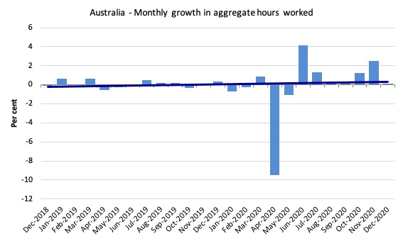
Hours worked increased 1.7 million hours (0.1 per cent) in December 2020
As the lockdown eases, hours worked are returning. But this month the rise has been close to zero, which tells us that the pace of recovery is starting to stall long before the damage has been ‘mopped up’.
The following graph shows the monthly growth (in per cent) over the last 24 months.
The dark linear line is a simple regression trend of the monthly change – which depicts a flat trend. Even before the coronavirus crisis struck, the trend was flat or mildly downwards.
Unemployment and broad labour underutilisation indexes – last four downturns
The following graph captures the evolution of the unemployment rates for the 1982, 1991, GFC and COVID-19 downturns.
For each episode, the graph begins at 100 – which is the index value of the unemployment rate at the low-point of each cycle (June 1981; December 1989; February 2008, and January 2020, respectively).
We then plot each episode out for 90 months.
For 1991, the peak unemployment which was achieved some 38 months after the downturn began and the resulting recovery was painfully slow. While the 1982 recession was severe the economy and the labour market was recovering by the 26th month. The pace of recovery for the 1982 once it began was faster than the recovery in the current period.
During the GFC crisis, the unemployment rate peaked after 16 months (thanks to a substantial fiscal stimulus) but then started rising again once the stimulus was prematurely withdrawn and a new peak occurred at the 80th month.
The COVID-19 downturn, while in its early months, was obviously worse than any of the previous recessions shown but because of its unique nature – the job losses being largely driven by lockdowns etc – the recovery is evident.
The graph provides a graphical depiction of the speed at which each recession unfolded (which tells you something about each episode) and the length of time that the labour market deteriorated (expressed in terms of the unemployment rate).
After ten months, the unemployment had risen from 100 to:
1. 117.9 index points in 1982 and rising.
2. 130.6 index points in 1991 and rising.
3. 114.6 index points in the GFC and rising.
4. 129.9 index points currently and falling.
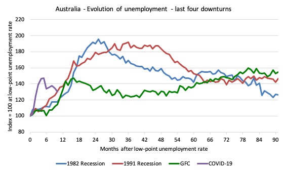
Note that these are index numbers and only tell us about the speed of decay rather than levels of unemployment.
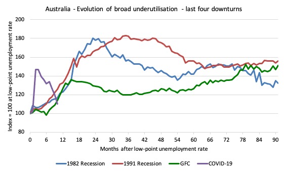
The next graph performs the same operation for the broad labour underutilisation rate (sum of official unemployment and underemployment).
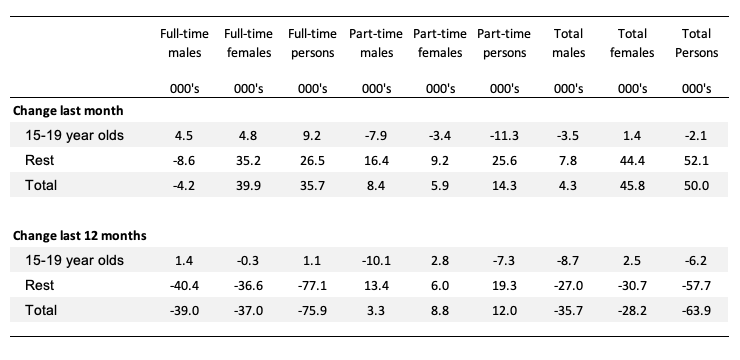
Teenage labour market deteriorates in December 2020
1. Total teenage net employment fell by 2.1 thousand in December 2020 (-0.3 per cent).
2. Full-time teenage employment rose by 9.2 thousand (6.4 per cent) and part-time employment fell by 11.3 thousand (-2.1 per cent). The strong full-time employment growth is a good sign but the decline in part-time employment is offsetting that optimism.
3. The teenage unemployment rate fell by 2.1 points to 18.4 per cent but only because the the participation rate fell by 1.6 points. These aggregates are volatile but the decline in participation is not a good sign.
The following Table shows the distribution of net employment creation in the last month and the last 12 months by full-time/part-time status and age/gender category (15-19 year olds and the rest).
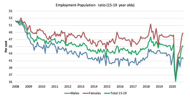
To put the teenage employment situation in a scale context (relative to their size in the population) the following graph shows the Employment-Population ratios for males, females and total 15-19 year olds since June 2008.
You can interpret this graph as depicting the loss of employment relative to the underlying population of each cohort. We would expect (at least) that this ratio should be constant if not rising somewhat (depending on school participation rates).
The absolute loss of jobs reported above has impacted more on females than males.
1. The male ratio has fallen by 10.8 percentage points since February 2008, 2.1 points since March 2020, and fell 0.4 points over the month.
2. The female ratio has fallen by 3.3 percentage points, but has risen by 0.6 points since March 2020, and 0.2 points over the month.
3. The overall teenage employment-population ratio has fallen by 7.2 percentage points, 0.9 points since March 2020, and 0.1 points over the month.
Conclusion
My standard monthly warning: we always have to be careful interpreting month to month movements given the way the Labour Force Survey is constructed and implemented.
The December 2020 data reveals that the Australian labour market is recovering but the pace of recovery has slowed and the indicators are mixed in that respect.
My overall assessment is:
1. Victoria has bounced back strongly from its harsh Stage 4, 100-day lockdown.
2. Employment increased by 0.4 per cent in the month, which normally is a reasonable result but is nearly half the growth that was recorded in November 2020.
3. Unemployment fell by 30,100 and the unemployment rate fell by 0.2 points even though the participation rate rose by 0.1 points.
4. It is always a good sign when there is both employment and labour force growth with the former stronger than the latter.
5. Underemployment also fell by 0.8 points and the broad labour underutilisation rate (sum of unemployment and underemployment) fell by 0.8 points.
6. The main uncertainty now is that the recovery is slowing and the current (extensive) government support is due to end in the first-quarter of 2021. Given the labour market is still quite a margin from where it was in March 2020, the idea that the government would withdraw its fiscal support is not a compelling option.
That is enough for today!
(c) Copyright 2020 William Mitchell. All Rights Reserved.
“The COVID-19 downturn, while in its early months, was obviously worse than any of the previous recessions shown but because of its unique nature – the job losses being largely driven by lockdowns etc – the recovery is evident” So it appears right now, at least in the location upon which Bill is focusing. But are we even slightly shying away here from facing full-on what may be our new and unprecedented reality, not only economically but existentially? Reading between the lines of Bill’s post, it would seem that he, like countless others of goodwill, is hoping against hope that the pandemic will tail off then die off, as proper precautions are maintained and amplified and effective vaccines and treatments become readily available. But what if this new virus does precisely what other viruses are wont to do: damp down only to return in waves, mutate into more contagious and dangerous forms, develop immunities and other resistances to new medicines, become essentially a permanent fixture in the world’s ecosystem, including, of course, our human societies? What if we’re inevitably playing whack-a-mole with Covid-19, knocking it down in one area for a limited time, only to have it surface again, perhaps with new virulence, as it continues its spread into additional areas and populations? What if the vaccines and treatments rushed to market with record speed turn out to pose substantial health risks of their own, as some experts are already suggesting? What if the periods of effectiveness of these vaccines and treatments are relatively short? What if the virus leads to long term health problems not addressed by any such vaccine or treatment? What if, in light of these potential problems with the vaccines and treatments, a sizeable number of people refuse to take them, as significant percentages of healthcare workers are reportedly doing? What if, in other words, our pre-pandemic global neoliberal economy which, like certain species of shark, has to swim constantly to breathe, is to be frozen again and again and again in its tracks–here, there, and everywhere–until it eventually floats belly-up to the surface? And finally, perhaps most importantly, what wisdom could MMT provide in designing and operating viable economies in such an inherently uncertain, unpredictable, and possibly permanent context? Obviously, a robust JG program, which could seamlessly pay people to work or to stay home as public health required, would be a start…but only that. I hope that Bill and other MMT economists will turn their attention to this worst-case scenario and be one step ahead in the game, to the immense benefit of humanity, if questions like these turn out to be more than hypothetical.
Dear Newton Finn,
What you say is what I also had in mind.
Partly because I wrote here sometimes ago that I noticed that the pandemic recovery takes the form of bell shape. Meaning that it takes as much time to go up to the peak as well as to go down.
At the moment the world infection cases are still going up. Thus, we are sure if we are close to half way point yet.
So, as far as each country is concerned, say, you are quite safe within your border, but it will have to be under constant alert due to the global situation is still peaking (this means the normal economic activities cannot return to the business as usual just yet).
For this, I share your imagined scenario to be more likely, than not.
And lastly, based on your writing, 2 assumptions come to mind:
1. The shape of the pandemic recovery that I observed is similar to bell shape, some with high, some low peak, depending on the responses. This goes for second, third and so on waves that I had observed as well. This implies that this pandemic phenomenon might become part of our life/environment from now on.
If that is that is the case then, your scenario is already here without us realizing.
2. What if the global pandemic takes on the same phenomenon (as in some individual countries), meaning, will have second, third, fourth wave and so on, each within a few months of each other, then your scenario is most likely as well.
I am not making this out of negative feeling or fear or anything like that, but from a neutral position having taught business research methods for the past 15 years.
In sum, if the 2 assumptions above are to be the case, then, we will be living in a different world than the one we know up until the beginning of 2019. And so, a new economic system has to be reinvented and implemented fast.
I hope I am wrong (on the pandemic issue).
Have a nice weekend!
Newton, I think it is important that there are a lot of ‘ifs’ in your worser case scenario. Yes, If that happened it would be very much worse for everyone and I’m not sure economists are who to turn to for solutions then. But there has been some good news in recent weeks that leads me at least to be more hopeful. We are making progress with production and distribution of vaccines for one thing. It will take a while but don’t despair at this point.
Thanks to vorapot and Jerry for responding to my comment. Please understand, Jerry, that my worst case scenario, which vorapot also believes MAY come to pass, is, at bottom, in the long run, much more full of hope than despair. It seemed to me and many others that the pre-pandemic global economy was hellbent on further oppression and ecocide. It appeared to be a dead end, LITERALLY, yet no one seemed to have a clue about how to change it into something better, something more beautiful, more sustainable. Then along came Covid and PERHAPS a forcing of the issue which we either didn’t want to address or didn’t know how to. If I’m right about the pre-pandemic neoliberal conditions and the daunting, possibly permanent problems the pandemic has brought, then humanity IMHO has a chance, an opening, A FORCED OPTION, to get about the business of building a better world, one in which human beings and all living things can ultimately flourish. Which is not to minimize for a minute the pain and suffering, necessary and unnecessary, that such a process will involve.
Great piece. Great comments.