I started my undergraduate studies in economics in the late 1970s after starting out as…
How do labour markets react to capacity utilisation changes?
As part of some research I am doing for a book that will come out next year on the dynamics of recessions I have been looking at asymmetries in the response of the labour market to changing economic activity. The analysis has produced some very interesting set of graphs that inform us, very starkly, how recessions damage the labour market. They also reveal why I am at present dubbing the current downturn the underemployment recession.
I have been working with capacity utilisation data with the aim of deriving a measure of labour hoarding. That work is unfinished but the creation of the dataset also informs the analysis noted above.
The capacity utilisation data is derived from the NAB series which comes from its Monthly Economic Survey. I have managed to put together a series from September 1989 to July 2009 which means I can cover the 1991 recession. The NAB define their capacity utilisation rate (hereafter CUT) as measuring the degree to which an industry is operating at or below its full capacity level. The full capacity rate is defined as the maximum desirable level of output given existing capital equipment. The NAB CUT is calculated as the average of respondents capacity utilisation for the quarter.
The data was assembled with some great help from regular commentator here – Sean Carmody who provided the series from 1997 to 2009. Pre-1997 data was derived from graphical output available from the RBA which was then used to extract the underlying data using fabulous program – Engauge, which is open-source “digitizing software for converting graphs and maps into numbers” (thanks to Sean for some help with this as well).
The CUT concept is not without controversy (yes economists disagreeing again). For example it is dependent on another concept of normal capacity and hence excess capacity. Before the 1982 recession, firms tended to carry more excess capacity than they now are prepared to do. Firms are much leaners now in terms of productive capital. So a high rate of capacity utilisation under the earlier circumstances would mean a much higher rate now. Fellow post keynesian and friend, Michael Perelman provides an excellent analysis of this point in his 1989 book Keynes, Investment Theory and the Economic Slowdown. Well worth a read!
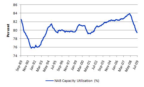
Anyway, to some extent the capital shakeouts occurred in the 1980s while our series starts in September 1989. The maximum for the series is 85.1 per cent (October 2007) and the mininum is 75.8 per cent (June 1991) with an average value of 80.3 per cent. This compares well with the average for the US Federal Reserve Board measure since 1967 has been around 81.6 per cent, and similar values are recorded for other countries.
It is still a bit puzzling though because if the data is to be believed and given the survey question asked then there is huge amounts of unused capacity that could be brought into production if there was sufficient aggregate spending. The high rates of excess capital capacity clearly are sympathetic with the high rates of labour underutilisation that have persisted over the same period. The other view is that if rates of CUT exceed 85 per cent then inflation pressures emerge due to the heterogeneity of capital across sectors.
Anyway, all of this brings into question the defining rhetoric of the last decade which has been developed to convince us that the economy was close to full employment. I have said for years that any construction of the situation to that effect was totally false. I think the CUT data helps support that view although I would not walk the plank on the veracity or meaningfulness of the NAB data.
But it is closely related to GDP growth changes and so variations in the rate of CUT probably do signal activity shifts in the economy which means the levels that you are dealing with are not as important. In other words we could scale it differently and just think about the shifts in the index.
The following graph shows the full series (in 6 month moving average form) from September 1999. You can see the 1991 recession stands out and the 2000 blip in growth also. The current period has been marked by a fall in the raw data from its recent peak (global and local) of 85.1 per cent in October 2007 to 80.4 per cent in July 2009 – quite a significant plunge.
Capacity utilisation and the unemployment rate
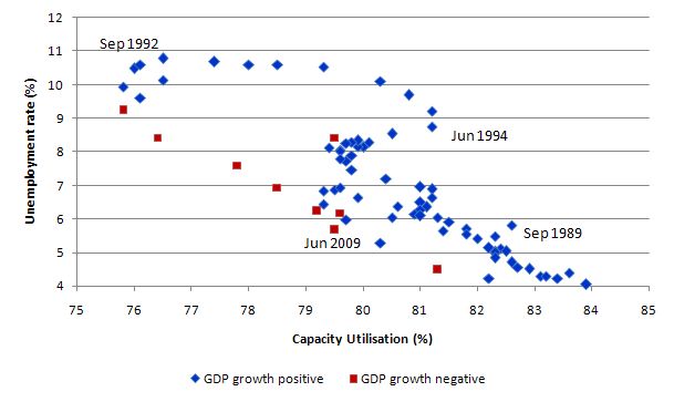
But the blog is not about CUT data although I use it to capture the shifts in economic activity. Labour markets respond asymmetrically to shifts in economic activity as I have indicated in previous blogs and many written articles published here and there. To see this consider the following scatter plot which has the quarterly CUT series on the horizontal axis plotted and the official ABS unemployment rate plotted on the vertical axis (both in percent). To make it clearer I arranged the data into periods where the quarterly GDP growth was positive (blue markers) and periods when quarterly GDP growth was negative (red markers). This allows you to see the tracking a bit better.
I think this is a very interesting graph. The September 1989 quarter was the penultimate quarter before the slowdown began which led to the 1991 recession. June 1990 was the first negative growth quarter and the last was June 1991. You see that the unemployment rate rose fairly sharply (after the points moved south-west from Sept 1989) upwards along the red dots (although not all of red dots apply to the 1991 downturn).
As GDP growth turned positive again (September 1991) and rates of CUT slowly started to increase, you can see that the unemployment kept rising and peaked in September 1992 – one year after the economy had resumed growth.
The other feature of the graph is the very slow decline in the unemployment between September 1992 and say June 1994 even though rates of CUT had risen some 6-7 percentage points over the 2-year period. This is the asymmetry I was talking about – rapid rise in unemployment followed by a drawn out decline.
The current downturn is once again starting out along the bottom arc of the graph (the red dots) although as yet the unemployment rate hasn’t scaled the heights that we saw in 1991. More about which later.
But the general point is that the economic and social costs of allowing this to happen are enormous and I have always argued that preventing this sort of pattern from starting out in the first place should be the highest priority of fiscal policy. You can see that I haven’t had much traction on the policy makers!
Capacity utilisation and underemployment
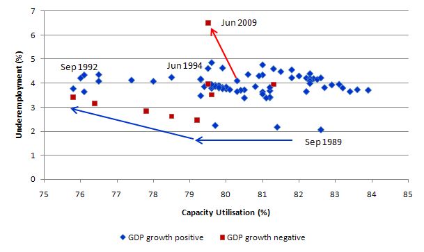
The next graph shows the rate of CUT on the horizontal axis and the underemployment rate (%) on vertical axis. Once again the blue markers are for pairs of observations when the quarterly GDP growth rate was positive and the red markers are for pairs of observations when the quarterly GDP growth rate was negative. I have added some directional arrows to bring the feature of the graph out.
The 1991 recession began with relatively low levels of underemployment (2.1 per cent in September 1989). Underemployment had edged up in the 1980s under the Hawke government which began the labour market deregulation allegedly to make it easier for married woman to combine work and family responsibilities. The dynamics that were set off in that era have come home to roost well and truly now – it was the beginnings of the part-time underemployed economy quite independent of what was happening to unemployment.
The blue arrows trace out the 1991 recession with underemployment reaching peaking in December 1992 at 4.4 per cent (one quarter after the unemployment peak). Once again labour utilisation rose as positive GDP growth returned this time in the form of underemployment. Total labour underutilisation (official unemployment, hidden unemployment and underemployment) peaked at 19.3 per cent in December 1992.
You can see the very slow reduction in underemployment as growth resumed into the 1990s. In fact it fell much more slowly than unemployment and the latter fell at snail’s pace. So for years after growth resumed the labour market was still in a very poor state.
The other very interesting aspect of plotting the data in this way is that you can see what is happening now. As the rate of CUT has fallen the underemployment rate has jumped very sharply – following the red arrow. This is why I am calling this the underemployment recession. While the deterioration in unemployment (see graph above) is following the same trajectory as the 1991, underemployment is scaling new heights very early in the recession.
Capacity utilisation and total labour underutilisation
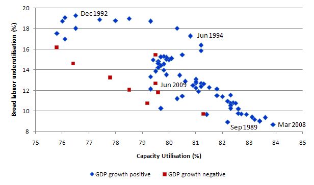
The final graph shows the CofFEE Broad Labour Underutilisation indicator (CU8) which is the sum of official unemployment, hidden unemployment and underemployment. The chart is assembled on the same basis as the previous scatter plots.
The pattern resembles the first scatter between the rate of CUT and the official unemployment rate. This is because movements in the CU8 series up until recently have been dominated by changes in the unemployment rate. However in recent years underemployment has become the dominant source of labour underutilisation and that explains some of the variations between the two scatter plots.
If GDP growth doesn’t rebound strongly in the second-half of this year, official unemployment will resume its position as the dominant malaise although underemployment will remain at record highs. A totally parlous situation is emerging.
Conclusion
The graphs are interesting to me because they provide a stark representation of how quickly the labour market deteriorates during an economic downturn and how slowly it improves on the other side as GDP growth returns.
I am also working with hours data to present similar findings which provide an alternative view of underemployment. That will emerge in the coming weeks.
Anyway, next week we get the June quarter GDP figures (the analysis above is based on the assumption that GDP growth will be slightly negative in the June quarter). I doubt that will be far off the mark.


Well the June figures are out and growth isn’t negative. It is 0.6%. How does this change things? (I’m guessing I have to wait for the new blog post to find out)