The recent extreme weather in the northern hemisphere, the twin monster tropical storms in Japan,…
US labour market weaker now
Last week, the US Bureau of Labor Statistics (BLS) released the latest – The Employment Situation – February 2016 – and the data shows that “Total nonfarm payroll employment rose by 242,000 in February, and the unemployment rate was unchanged at 4.9 percent”. The BLS noted that employment growth “occurred in health care and social assistance, retail trade, food services and drinking places, and private educational services” and “Construction employment continued to trend up”. Most other industries (mining excepted) showing “little change over the month”. However, other indicators were mixed. While the Employment-Population ratio and the Labour force participation rate “edged up” (“Both measures have increased by 0.5 percentage points since September”). The BLS estimates of hidden unemployment (discouraged workers) has fallen over the last year but underemployment “has shown little movement since November”. Broad measures of labour underutilisation indicate no significant improvement in the latter part of 2015 in the US labour market. Further average hourly earnings were static and of not risen as strongly as in previous recoveries. The participation rate was unchanged at 62.4 per cent and remains well below previous peaks. As I have shown before, despite the employment growth over the last year, there is a bias towards jobs at the lower end of the US pay distribution (see blog – US jobs recovery biased towards low-pay jobs. The US Federal Reserve Bank’s – Labor Market Conditions Index (LMCI) – changed by 0.4 index points (down from three consecutive months where the average change was 2.7). This signals a weakening situation. I also updated my gross flows database today. The transition probabilities that I derived to February 2016 suggest that that while there has been improvement in the US labour market in the last year, in recent months that improvement is slowing.
FRB LMCI
I discuss the FRB LMCI in more detail in this blog – US labour market weakening – and I won’t repeat the analysis here.
Suffice to say that the short-run (monthly) changes in the LMCI are “assumed to summarize overall labor market conditions”.
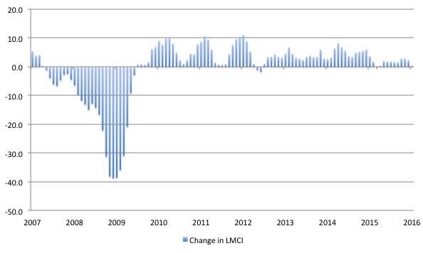
The following graph shows the FRB LMCI for the period January 2007 to January 2016 (the latest data available).
The conclusion is that the current labour market is relatively weak (compared to last year). To understand that we note that while unemployment is now lower than last year, the rate of hiring is also slower and the way these factors combine in the index leads to an overall assessment that the labour market is in decline.
The fall away in the last month is quite significant.
 >
>
Gross Flows and Transition Probabilities
Instead of just looking at the raw employment and unemployment data, I find that I get a lot more intelligence of the dynamics of the labour market by examining the gross flows data.
I updated that dataset for the US today (which takes us to February 2016) and computed updated Transition Probabilities, which are derived from the Gross Flows labour market data.
To fully understand the way gross flows are assembled and the transition probabilities calculated you might like to read these blogs – What can the gross flows tell us? and More calls for job creation – but then. For earlier US analysis see this blog – Jobs are needed in the US but that would require leadership
The data is available from the – US Bureau of Labor Statistics.
Gross flows analysis allows us to trace flows of workers between different labour market states (employment; unemployment; and non-participation) between months. So we can see the size of the flows in and out of the labour force more easily and into the respective labour force states (employment and unemployment).
Each period there are a large number of workers that flow between the labour market states – employment (E), unemployment (U) and not in the labour force (N). The stock measure of each state indicates the level at some point in time, while the flows measure the transitions between the states over two periods (for example, between two months).
The net changes each month – between the stock measures – are small relative to the absolute flows into and out of the labour market states.
National statisticians measure these flows in their monthly labour force surveys. The various stocks and flows are denoted as follows (single letters denote stocks, dual letters are flows between the stocks):
- E = employment stock, with subscript t = now, t+1 the next period.
- U = unemployment stock.
- N = not in the labour force stock.
- EE = flow from employment to employment (that is, the number of people who were employed last period who remain employment this period)
- UU = flow of unemployment to unemployment (that is, the number of people who were unemployed last period who remain unemployed this period)
- NN = flow of those not in the labour force last period who remain in that state this period
- EU = flow from employment to unemployment
- EN = flow from employment to not in the labour force
- UE = flow from unemployment to employment
- UN = flow from unemployment to not in the labour force
- NE = flow from not in the labour force to employment
- NU = flow from not in the labour force to unemployment
The following Matrix Table provides a schematic description of the flows that can occur between the three labour force framework states.
Labour Market Flows Matrix

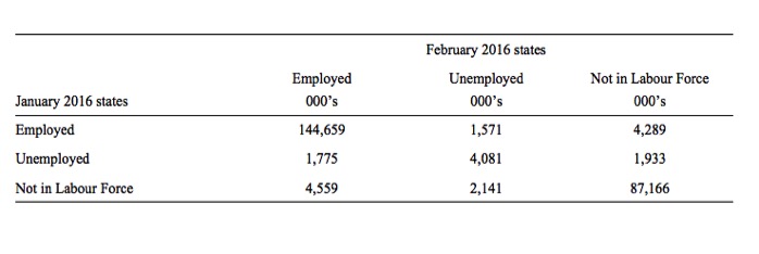
The latest US gross flows data is for transitions between January and February 2016.
To give you some idea of the magnitude of these flows between any given months, the next table summarises the flows for the US labour market for the period between January and February 2016.
By way of example, you read the Table in the following way. 1,775 thousand unemployed workers in January 2015 entered employment in February 2016 (the UE flow) while 1,571 thousand employed workers in January 2016 became unemployed in February 2016 (the EU flow).
The EE, UU, and NN (main diagonal elements) flows just tell us that, for example, 144,659 thousand workers who were employed in January 2016 remained employed in February 2016 (EE flow). The other main diagonal elements (UU, NN) are 4,081 thousand and 87,166 thousand, respectively. These are the unchanged state flows.
It doesn’t mean though that a worker who was employed in January 2016 and remained that way in February 2016, didn’t change jobs. Those type of flows are not captured in this data and can be substantial.
The data also allows us to understand the total change in each state. For example, why did unemployment fall in the US between January and February 2016? Where did the change in employment come from between these months?
This involves a calculation of the total inflows and outflows from the three labour force states between any two periods of interest.
The following Table shows the concepts total inflows and outflows and total change in state between periods.
The total inflow into employment is measured by the sum, UE + NE and for the period show equalled 6,344 thousand whereas the total outflow from employment, measured by the sum, EU + EN was 5,806 thousand. The net flow was thus positive (that is, employment rose) and equal to 474 thousand workers.
The total inflow into unemployment is measured by the sum, EU + NU and for the period show equalled 3,712 thousand whereas the total outflow from unemployment, measured by the sum, UE + UN was 3,708 thousand. The net flow was thus positive (meaning unemployment rose over the period) and equal to 4 thousand workers.
Finally, the total exits from the labour force is measured by the sum, EN + UN and for the period show equalled 6,700 thousand whereas the total new entrants into the labour force, measured by the sum, NE + NU was 6,222 thousand. The net flow was thus equal to -478 thousand workers extra workers entered the labour force.
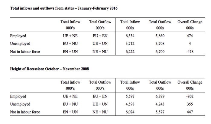
To put the flows for June and February 2016 into context, the lower panel shows what the data looked like at the height of the recession when employment was collapsing – October and November 2008.
You can see that the total change in employment was -802 thousand in the month and 355 thousand of those who lost jobs entered unemployment but 447 thousand left the labour force – early (forced) retirement or discouraged workers.
If the labour force had not contracted then the US unemployment rate would have been much higher than it was (and is). The cyclical shifts in participation mean that the full extent of the labour force underutlisation is disguised and some of it manifests outside of the labour force.
And that doesn’t even consider that of the 5,597 thousand that remained in employment between October and November 2008, many would have been reduced to part-time hours because of lack of sales. That is, this data doesn’t tell us about shifts in underemployment.
We can thus better understand the stock measures of the labour market states in each period by considering the net flows between two periods.
To learn more about this please read my blog – Labour market measurement – Part 2.
Transition Probabilities
The various inflows and outflows between the labour force categories are expressed in terms of numbers of persons which can then be converted into so-called transition probabilities – the probabilities that transitions (changes of state) occur.
We can then answer questions like: What is the probability that a person who is unemployed now will enter employment next period?
So if a transition probability for the shift between employment to unemployment is 0.05, we say that a worker who is currently employed has a 5 per cent chance of becoming unemployed in the next month. If this probability fell to 0.01 then we would say that the labour market is improving (only a 1 per cent chance of making this transition).
From the table above – sometimes called a Gross Flows Matrix – we can deduce the gross flows. For example, the element EE tells you how many people who were in employment in the previous month remain in employment in the current month.
Similarly the element EU tells you how many people who were in employment in the previous month are now unemployed in the current month. And so on. This allows you to trace all inflows and outflows from a given state during the month in question.
The transition probabilities are computed by dividing the flow element in the matrix by the initial state. For example, if you want the probability of a worker remaining unemployed between the two months you would divide the flow (UU) by the initial stock of unemployment. If you wanted to compute the probability that a worker would make the transition from employment to unemployment you would divide the flow (EU) by the initial stock of employment. And so on.
So the 3 Labour Force states in the Matrix Table above allow us to compute 9 transition probabilities reflecting the inflows and outflows from each of the combinations.
Analysing movements in these probabilities over time provides a different insight into how the labour market is performing by way of flows of workers.
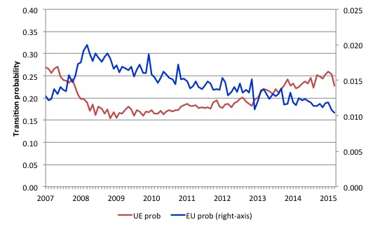
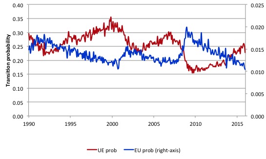
The next graph shows the transitions for EU and UE from December 2007 (when the crisis hit the US labour market) up to February 2016. The probability of an employed worker losing their job (denoted ‘EU prob’ and not to be confused with the Gross Flow from employment to unemployment ‘EU’) is plotted on the right-hand axis and to express the probabilities in percentage terms just multiply by 100.
The probability of an American (in general) losing their job if employed (blue line) rose throughout 2008 (peaking at 2 per cent in February 2009), slowly evened out and has been steadily falling since (1.0 per cent in February 2016). It is now lower than it was when the US entered the crisis.
In December 2007, the chance of an unemployed American worker gaining employment (‘UE prob’) was 26.9 per cent. This probability fell to a low of 15.4 per cent in October 2009, and scudded along at around 17 per cent through much of 2010-2011. It has been steadily rising since the end of 2013 and is now at 22.8 per cent, still well below the pre-crisis level.
Since August 2015, this probability has fallen from 25.1 per cent to 22.8 per cent, which is consistent with weaker conditions.
Workers in employment are slightly less likely to lose their jobs now than they were 6 months ago, but unemployed workers, now have less chance of getting a job than they did 6 months ago.
This is not a rapid recovery – rather one would now say the US has been experiencing a steady recovery, although the tension was lowered by workers giving up looking for work and exiting the labour market.
That is a big difference between this recession and previous recessions where the participation rates were more responsive (positively) to the upturn.
However, the latest data suggests the ‘steady’ recovery is waning somewhat.
The next graph compares the UE and EU transition probabilities since 1990 to put the recent period into some historical context.
The sharp rises in EU prob and sharp fall in UE prob in 2007-08 are notable and and EU prob is now moving back towards its historical level.
What is also evident is that the employment is becoming more secure (EU prob falling steadily) but the overall real GDP growth rate has not been sufficient to clear out the unemployment pool given the new entrants to the labour force and to attract those who have left the labour force for want of a job. The result is that the UE likelihood improved only slowly and remained well below its historical levels for an extended period.
You can see that in previous periods when the UE probability has dropped the resulting improvement has quickly taken it above the EU probability.
But in the tepid recovery that the US has undergone following the GFC it took a long period to reach the point where a worker has less chance of losing their job and entering unemployment (EU prob) than an unemployed person has of getting a job.
 >
>
The next graph (or 6 separate graphs) shows the the US transition probabilities from December 2007 (the low-point unemployment rate month of the last cycle) to February 2016 for the 6 transitions (EU, UE, EN, NE, NU, and UN). We exclude the same state probabilities (EE, UU, and NN). Note the vertical scales are different (they are optimised for the particular range of probabilities in each.
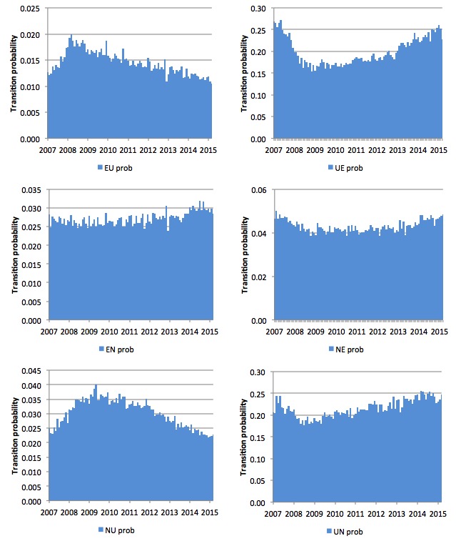
Several points by way of interpretation can be made (noting that care should be taken to recognise the vertical scales are quite different).
First, the EU probability (employment to unemployment) has fallen since the early days of the crisis but is now hovering around 10-11 per cent – that should be compared to the pre-crisis value of 13 per cent.
Second, the EN probability has rose during the crisis and again during the recovering, the latter shift, indicating that employed workers were increasingly likely to flow out of the labour force once they lose their jobs – that is, they become hidden unemployed or retire (in some form or another). That was a sign that the labour market is still not very strong. The effect appears to be moderating in recent months, and is consistent with the slight rise in the participation rate and the fall in discouraged workers.
Third, the likelihood of a new entrant getting a job (NE prob) has risen in recent months after being flat for some months. New entrants are much more likely to become employed (NE prob) than to enter the labour force as unemployed (NU).
Fourth, the probability of an unemployed worker leaving the labour force (UN prob) remains higher than the likelihood of them getting a job (UE prob) although the difference is narrowing.
The former probability has risen over the last 2 years, which is not a good sign (and is consistent with the weak participation rate).
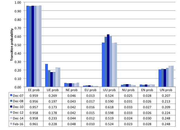
The second graph compares the US transition probabilities for selected months during the crisis up until February 2016 (see the accompanying Table for values). I have also jigged the vertical and horizontal scales to allow the changes in the columns to be seen more clearly. That is one of the reasons I also provided the raw data.
December 2007 was the peak of the last cycle and things deteriorated after that. The graph and table give you a sort of ‘year by year’ summary of how things have changed in the 8.5 years of recession and recovery.
What appears to be the case as at February 2016, is that an unemployed person is now less likely to get a job relative to a new entrant into the labour market because total employment growth is insufficient. Long-term unemployment is static in the US, suggesting that the unemployment pool is not being drained much at all and new entrants are leapfrogging the jobless to get the jobs that are being made available.
Conclusion
Overall, the Gross Flows data suggests that the US labour market has started to slow a little in the early months of 2016
There had been steady improvement but the signs of weakness are now evident.
That is enough for today!
(c) Copyright 2015 Bill Mitchell. All Rights Reserved.
Happy birthday! You are doing a great job.
How much people even want to work these days? Why has male labor force participation been dropping for decades, and now women too? Has society become so affluent that for many work is only a lifestyle choice now, subject to change in trends?
I would like to see a society where people get better work-life balance, not a polarized one where long hours and low wages are too off-putting for some, and others toil more than they even want to because management demands so.
Hepion, it’s not that low wages are unappealing, it’s that the job seekers have too much competition for even minimum wage positions. It’s also a trend that employers will choose an applicant who has spent the least time unemployed. ‘Want’ has very little to do with it when you get discouraged after applying for literally thousands of jobs.
Dear GLH (at 2016/03/07 at 22:38)
A belated thank you for your birthday wishes on Monday. I had a nice day.
best wishes
bill
Well, I was talking about this: https://research.stlouisfed.org/fred2/series/LRAC25MAUSA156N
Labour force participation for men aged 25-54 has been dropping for 50 years
Women reached peak in 1999 but participation has been dropping since: https://research.stlouisfed.org/fred2/series/LRAC25FEUSA156N
So overall for prime working age people has been going down for at least 17 years. There has to be a reason. Especially puzzling is 50 year trend in male participation, it has been long going on while increasing women participation has been sort of hiding it from the view.
While some lack work I think overall our lives are build too much around work as evidenced by opinion surveys where working people want better work-life balance. People recognize that in such affluent society material needs have been met so working too much doesn’t make any sense, and that could also be reason why people are dropping off labor force.
In addition to their own incomes many will get large inheritances from previous generations as people seem to, in average, accumulate more during their lifetimes than they will ever spend. Couple of houses from parents, own lifetime savings, how often is it enough to retire at least one member of household?
If people keep working even if they don’t have financial reason for it, it must be for intrinsic values working has. People may have been indoctrinated in our culture, by their parents most likely, that they must go to work like everybody else, and that is the only game in town. But if in a recession these same people who do not need to work for financial reasons are unable to find work, they might learn new values and find a new lifestyle for them and that might accelerate decline.