Regular readers will know that I hate the term NAIRU - or Non-Accelerating-Inflation-Rate-of-Unemployment - which…
The ECB could stand on its head and not have much impact
As the Bank of Japan began its hopeless quest to stimulate growth with negative interest rates (see my blog yesterday – The folly of negative interest rates on bank reserves), the latest data from the ECB came out on lending to households and non-financial institutions. It tells an interesting story. The story has to be framed within the knowledge that oil prices have now fallen by some 77 per cent. But the major factor that is not usually mentioned when commentators talk about ECB policy changes and the likely impacts is the on-going and manic fiscal austerity in the Eurozone, which puts the whole region in a recession-type straitjacket, where monetary policy changes, weak in impact at best, have little hope of achieving anything positive. The logic of the reliance on monetary policy for counter-stabilisation is also built on a failure to understand what drives the economic cycle. The belief that banks will suddenly lend just because the central bank imposes a tax on their reserve deposits (negative interest rates) or offers them cheap loans to on-lend to households and firms is misplaced. Banks do not loan out their reserves and firms will not borrow from banks no matter how cheap the money is if there are no profitable opportunities to pursue. It is time the authorities abandoned their neo-liberal myths and got real. The Eurozone needs a massive fiscal expansion and it needed it 7 or 8 years ago. The ECB is the only institution in the flawed system that can provide the financial resources to make that happen and it could, with Brussels approval, bypass the ‘no bailout’ clauses in the Treaty to make that happen. It won’t, and the Eurozone will muddle on with increased poverty rates and rising social instability. What folly!
According to the US Energy Information Administration data on – Oil Prices – are now per cent lower than they were at their previous peak in , 2014.
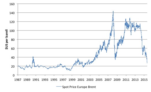
The following graph shows the spot price (US dollar per barrel) for Europe Brent Crude oil from May 20, 1987 to January 26, 2016. The current decline is now lower than the decline associated with the GFC, although the absolute decline
On July 3, 2008, the Brent Crude oil price was $US per barrel. It fell by 76.5 per cent until it reached a trough on December 26, 2008 ($US33.73 per barrel).
After recovering, then stalling over 2011 to mid-2014, the Brent Crude oil price fell from $US115.19 per barrel on June 19, 2014 to $US26.01 per barrel on January 20, 2016, a decline of 77.4 per cent.
It recovered marginally in the past few days (and was $US29.82 per barrel on January 25, 2016).
The reason for the decline is relatively clear – excessive supply against a weak demand. US production boomed over the last decade and displaced the imports from Saudi Arabia, Nigeria and Algeria, which in turn, tried to find demand in Asia.
Production in Canada, Iraq and Russia has also not let up.
Whether there are geopolitics behind the glut (which there undoubtedly is) is another issue. The price is dropping due to oversupply.
So why does the lower prices undermine aggregate spending. Clearly, many workers are now losing their jobs as oil rigs close down and firms cut back on exploration investment.
But there are not that many workers engaged in the industry to cause a global recession.
The impact of the lower investment in energy-related projects is likely to be a more significant negative effect.
On the other side, the lower prices increase household disposable income and that should, other things equal, be a stimulus to spending.
I will address this question in a later blog. For now, I note that the lower oil prices are deeply negative for the environment and for less-developed countries. The latest automobile data is that the big petrol-guzzling SUV monsters that should not be permitted on the road anyway are booming in sales in the US as a result of the lower petrol prices.
But that is not the topic of today’s blog.
The ECB launched its – Expanded Asset Purchase Program (APP) – in early 2015 and announced that:
The programme is designed to push inflation and inflation expectations back to levels closer to the ECB’s objective in the euro area as a whole.
When the question – Is the asset purchase programme monetary financing is asked – the ECB replies (Source):
The ECB strictly adheres to the prohibition on monetary financing by not buying in the primary market. The ECB will only buy bonds after a market price has formed. This ensures that the ECB does not distort the market pricing of risk.
Which, of course, is smoke and mirrors because the primary buyers of the government debt know with some certainty, given the size of the APP that the ECB will buy the debt they wish to off load.
The claim about not distorting “the market pricing of risk” is largely relevant to the fact that the ECB is keeping governments afloat in the Eurozone.
While the ECB says the APP is all about “maintaining price stability” it also says that the program will:
… also help businesses across Europe to enjoy better access to credit, boost investment, create jobs and thus support overall economic growth, which is a precondition for inflation to return to and stabilise at levels close to 2%. Subject to price stability, these are also important objectives to which the ECB contributes in line with the Treaty.
The ECB says that there will “Monthly purchases in public and private sector securities will amount to €60 billion” and they “are intended to be carried out until the end of March 2017”, on current estimates of the inflation trajectory towards their desired target of 2 per cent.
The initial program was ‘recalibrated’ by the ECB in December (hence the ‘expanded APP’ nomenclature) after the intital program didn’t seem to do too much and so-called “new downside risks” have “threatened the outlook for price stability” (see January 25, 2016 Speech by Mario Draghi – How domestic economic strength can prevail over global weakness).
Draghi said that:
With inflation already low for some time, we saw a danger that a continued period of low inflation – even if oil-driven – might destabilise inflation expectations and become persistent.
In addition, it introduced its so-called ‘credit easing package’on June 5, 2014, which they called the – Targeted longer-term refinancing operations” (TLTROs) – which is effectively just a cheap loan to the to the non-financial institutions (exclude household mortgages).
The ECB essentially is providing cheap money to banks as long as they on-lend to targetted businesses (small and medium-size).
The presumption was that banks are not lending enough because they do not have sufficient funds, which, of course, is a nonsense. The banks have not been lending because there are not huge swags of borrowers knocking on their doors to borrow given the disastrous shape the Eurozone has been in.
Accompanying the TLTRO scheme was the ECB introduction of negative interest rates on bank reserves deposited at the ECB. The ECB’s Deposit Facility Rate (DFR) was set at minus 0.10 per cent on that day, lowered to -0.2 per cent on September 4, 2015 and then to -0.3 per cent on December 9, 2015.
A senior ECB official joked before an audience in Frankfurt on September 9, 2014 that “The idea of negative rates, that is, lending 100 and getting back say 95, may seem absurd “but remember this: Early mathematicians thought the idea of a negative number was absurd”.
And anyone who laughed at that joke were clearly not aware of how bad the analogy was.
The operational significance of the policy shift is that the:
… banks that have more funds in their account with the ECB than what they need to fulfil their reserve requirement lose some money. Suppose, for instance, that a bank has €100 million of excess reserves continuously for one year, then at an interest rate of -0.20% it receives back € 99.8 million, so the cost of depositing funds with the ECB for a full year is € 200,000.
So if the cost of holding physical notes and coins exceeds the tax (negative interest rate), then banks will pay the tax. Otherwise, they will convert excess reserves into physical currency.
The logic expressed at the time was the same as the Bank of Japan used last week – to create an incentive for the banks to lend more instead of paying the tax (the negative interest rate).
It also was intended to reduce the deposit rates paid to individual bank customers which would apparently stimulate more spending.
You will find a sequence of speeches from ECB senior officials over the last several years with the same message of failure being repeated, although you will not read or hear them talk of failure.
For example, ECB Executive Board member Peter Praet told the Peterson Institute in Washington, D.C. on December 9, 2014, that:
The fact is that – despite our broad-based measures and the associated fall in private borrowing costs – inflation has not stopped trending down.
By September 9, 2015, he was telling a conference in Luxembourg that:
During the second quarter of 2015 credit standards continued to ease for firms, and even more so for households. Reflecting the endogenous relationship between credit supply and demand, credit demand also increased among both groups driven mostly by the low level of interest rates.
Well I studied the latest monetary data from the ECB yesterday and wondered whether all these unconventional monetary policy initatives have shown any fruit.
Certainly Mario Draghi and his officials are touting success – or were a few months ago. Draghi told a German audience last week (January 25, 2016) that “bank lending rates have fallen by 80 basis points for the euro area, and by between 100 and 140 basis points in the countries hit hardest by the crisis” and:
What this shows is that, even when rates are at zero, we can achieve the effect of a sizeable rate cut through unconventional measures. Overall, it’s clear that the impact of the APP on confidence, credit and the economy has been substantial.
Well what the data shows is something different.
The negative DFR (-0.3 per cent) and the monthly injection of €60 billion, big ‘guns’ by any stretch of imagination seem to be running out of impact if they ever had any.
I did some analysis.
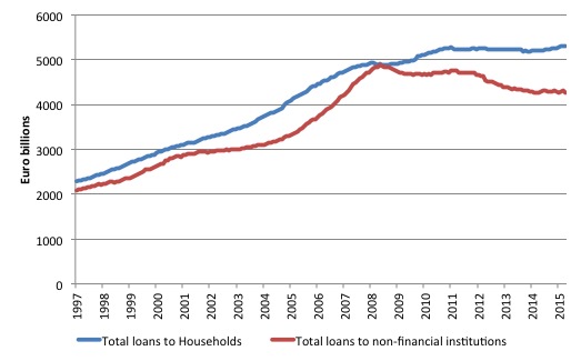
The first graph shows the total loans to households and non-financial institutions (that is, businesses that produce goods and services rather than shuffle money) in the Euro area from September 1998 to December 2015 (this is the entire sample provided by the ECB Statistics Warehouse.
The data is not “adjusted for sales and securitisation”, which the ECB define as “Adjustment for the derecognition of loans on the MFI balance sheet on account of their sale or securitisation.” In other words, the risk is sold off to some other speculator or another. They only started making that adjustment in January 2009.
The boom then the crash. While the household credit aggregate is now higher than before the crash, but only just; business borrowing remains well down and despite the ECB manoeuvres appears to be going nowhere up.
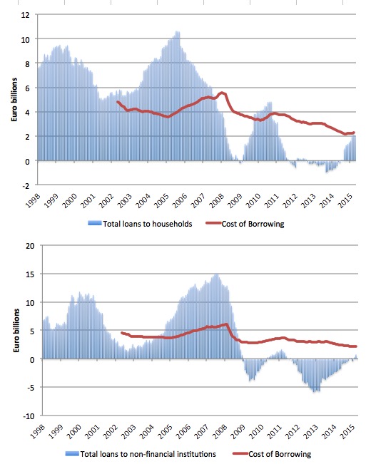
The next graph shows the annual percentage change in borrowing by households (upper panel) and non-financial institutions (lower panel) from January 2003 to December 2015. The red lines are the respective cost of borrowing for each sector (which is only available from January 2003).
There you see the credit binge in both sectors prior to the crisis and the subsequent collapse.
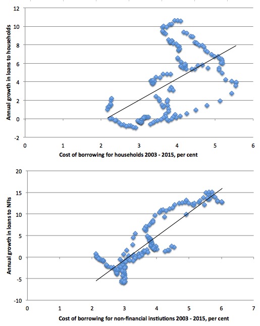
Just in case you were wondering what sort of relationship there was between the cost of borrowing and the annual percentage change in borrowing, the following graph provides some clue. It shows the cost of borrowing for households (upper panel) and non-financial institutions (lower panel) on the horizontal axes, and the annual growth in loans to each sector on the vertical axes of each panel.
The straight black line is a simple linear regression of the relationship between the two variables in each panel.
A literal interpretation of that line is that as the cost of borrowing rises the annual growth in loans also rises in each sector.
This is a case of spurious regression in all probability, especially for households where the observations are spread widely around the linear regression line.
This demonstrates that other factors are clearly significant and probably are correlated with both the cost of borrowing and the annual growth in loans. In other words, when considering why households or non-financial institutions borrow, the cost of borrowing is likely to be only one factor that we would consider to be, possibly, influential.
It is clear that the malaise in Europe has not yet lifted: firms are reluctant to invest (and hence borrow) because of slow sales, while households have also been subdued in their borrowing given the elevated and persistent levels of mass unemployment, the hangover of the credit binge (that is too much debt already), and the general policy uncertainty where Brussels appears not to have a clue as to which way to turn.
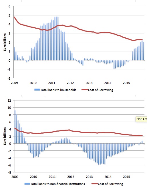
The final graph zooms in on the annual change in borrowing and the cost of borrowing for households (upper panel) and non-financial institutions (lower panel) from January 2009 to December 2015. It gives you a better idea of what is happening now, while the previous graph gave a good historical view of the credit binge and its aftermath once GFC hit.
In the last few months, loans to households have stalled even though the cost of borrowing continues to decline (note: the cost of borrowing series only goes to November 2015).
In the case of non-financial institutions, while the contraction in borrowing was abating, the most recent results suggest that any hoped for recovery do not appear to be forthcoming, despite very favourable cost of borrowing conditions and a manic central bank intent on capturing headlines with their acronym soup of non-conventional monetary policy manipulation.
The change in household borrowing was negative in December 2015 (-0.1 per cent) and -1.1 per cent for non-financial institutions. Over the last three months borrowing by non-financial institutions was also negative (-0.3 per cent).
Conclusion
Given the scale of the monetary policy interventions over the last year or two one would have expected a much stronger growth in loans, particularly for non-financial institutions if the logic of the central bank was sound.
The central bank can clearly use its currency-issuing capacity to prevent a massive financial meltdown. It can clearly stop governments in the Eurozone from going bankrupt as it did between 2010 and 2012 with the Securities Markets Program.
But what monetary policy in any of its forms cannot do is reverse a major recession where mass unemployment and income losses create deep pessimism among households and firms.
This is especially the case where the relevant fiscal authority (a questionable term in the case of the Eurozone) is intent on maintaining a straitjacket of austerity, which chokes off any green shoots in economic activity.
The big motor is fiscal policy and because of the flawed design in the Eurozone it is dysfunctional in the extreme. Central bank policy shifts can do little to counter the damage that fiscal austerity is doing in Europe.
That is enough for today!
(c) Copyright 2016 William Mitchell. All Rights Reserved.
Do we know where the negative interest rate charge is getting allocated? Clearly it isn’t driving loan volume so quantity expansion is out.
There are several options:
– shrink the margin. Essentially the shareholders get charged the tax. Shrinking margins in banks are likely to make them more cautious in lending – since the interest on other loans is what covers the cost of bad loans. The lower the margin the more other loans you need to cover a bad one.
– charge depositors. Either directly as interest rates, or via the usual set of sneaky charges.
– charge borrowers. Again either directly as interest rates, or via the front loading charges.
– squeeze suppliers and employees, and cutting corners.
Bill, the sentence just before the first graph is incomplete. It ends with “although the absolute decline”.
Bill, need numbers here? “According to the US Energy Information Administration data on – Oil Prices – are now per cent lower than they were at their previous peak in , 2014”.
Bill, in the graph showing the growth in loans vs. the cost of hh borrowing, the regression line is indeed linear, but the data blossom at the end like a flower unfolding. The line is unrepresentative here. There isn’t a better summary representation, but maybe a measure of the heteroscedasticity of the data might be good. That would provide some idea of the spread of the data, though not perhaps its asymmetry around the regression line. That is a problem; the data is asymmetrically heteroscedastic around the summary regression line. The regression line in the following graph is much more representative, and the data more equally scattered around the line, though not equally so. Having said that, in both graphs, the big picture of what is taking place is clear.
When I said that the regression line was linear, that wasn’t quite what I meant to say. I meant to say that it was as good a summary representation of the data as a nonlinear regression line would be.
What about the Eurozone household savings rates Bill.
http://ec.europa.eu/eurostat/tgm/table.do?tab=table&init=1&language=en&pcode=tsdec240&plugin=1
This must play a part as well. It will be interesting to see if Households actually spend more or save more faced with the drop in oil price.
I have a new thought overlay that helps me cope with how the world is run.
“The Smartest person on the planet is Dumb. The rest of us are just different shades of Dumber “.
So I don’t expect much from Dumb and Dumber.
Dear Michael Punch (at 2016/02/04 at 14:34)
On that logic you are a genius!
best wishes
bill