The Australian Bureau of Statistics (ABS) released the latest labour force data today (APRIL 16,…
Australian labour force data – policy failure now stark
Today’s release of the – Labour Force data – for July 2014 by the Australian Bureau of Statistics shows a deteriorating situation. The Australian labour market is weakening. While the participation rate rose by 0.1 points, which pushed extra workers into the labour force,the negative employment growth was well below the underlying population growth and so unemployment would have risen without the participation rate rise. In fact, unemployment rose sharply in July to 6.4 per cent. This is a terrible outcome. There are now 789 thousand officially counted as unemployed. Overall, the labour market is scudding along a very flat path and unemployment continues to eke its way up. The teenage labour market also weakened and in my view represents a national emergency. Overall, the policy failure at the federal level is now stark.
The summary ABS Labour Force (seasonally adjusted) estimates for July 2014 are:
- Employment decreased 300 (0.003 per cent) with full-time employment increasing by 14,500 and part-time employment falling by 14,800.
- Unemployment increased by 43,700 to 789,000.
- The official unemployment rate rose by 0.3 points to 6.4 per cent.
- The participation rate rose by 0.1 percentage points to 64.8. It is still well below its November 2010 peak (recent) of 65.9 per cent.
- Aggregate monthly hours worked decreased by 14.8 million hours (0.9 per cent).
- The quarterly ABS broad labour underutilisation estimates (the sum of unemployment and underemployment) were published in the May release and underemployment rose by 0.2 percentage points to 7.6 per cent and total labour underutilisation rate was 13.5 per cent. There were 936.59 thousand persons underemployed. The total workers unemployment or underemployed is now 1.653 million.
Employment growth – negative again
The data for July show that employment growth once again is on the negative side of the zero line, continuing the trend that has prevailed for the last 24 or so months of it zig-zagging back and forth between weak positive and negative growth.
Total employment fell by 300 (1 per cent) with full-time employment rising by 14,500 and part-time employment falling by 14,800.
Over the last 24 months or so we have seen the labour market data switching back and forth regularly between negative employment growth and positive growth spikes. This month’s figure, however, is the strongest overall performance in that time.
The following graph shows the month by month growth in full-time (blue columns), part-time (grey columns) and total employment (green line) for the 24 months to July 2014 using seasonally adjusted data. It gives you a good impression of just how flat employment growth has been.
While full-time and part-time employment growth are fluctuating around the zero line, total employment growth is still well below the growth that was boosted by the fiscal-stimulus in the middle of 2010.
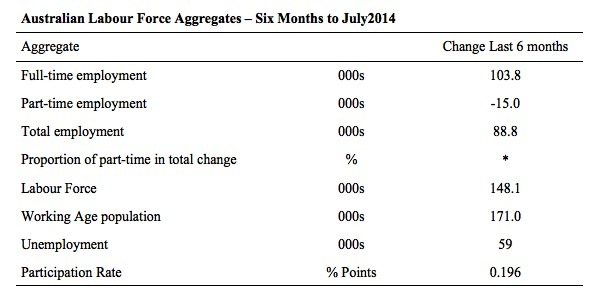
The following table provides an accounting summary of the labour market performance over the last six months. The monthly data is highly variable so this Table provides a longer view which allows for a better assessment of the trends. WAP is working age population (above 15 year olds).
The conclusion – overall there have 88.8 thousand jobs (net) added in Australia over the last six months. Full-time employment has risen by 103.8 thousand jobs (net) while part-time work has falen by 15.0 thousand jobs.
The Working Age Population has risen by 171 thousand in the same period while the labour force has risen by 148.1 thousand. The participation rate has risen by 0.196 percentage points over the last six months.
The weak employment growth has thus not been able to keep pace with the underlying population growth and unemployment has risen by 59 thousand as a result.
Today’s data is consistent with the very weak trends that have ruled for a long period now.
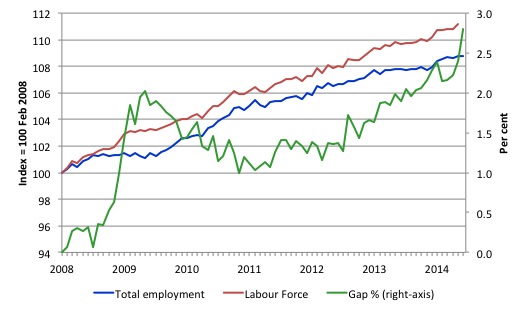
To put the recent data in perspective, the following graph shows the movement in the labour force and total employment since the low-point unemployment rate month in the last cycle (February 2008) to July 2014. The two series are indexed to 100 at that month. The green line (right-axis) is the gap (plotted against the right-axis) between the two aggregates and measures the change in the unemployment rate since the low-point of the last cycle (when it stood at 4 per cent).
You can see that the labour force index has largely levelled off yet the divergence between it and employment growth has risen sharply (in spurts) over the last several months.
The Gap series gives you a good impression of the asymmetry in unemployment rate responses even when the economy experiences a mild downturn (such as the case in Australia). The unemployment rate jumps quickly but declines slowly.
It also highlights the fact that the recovery has not strong enough to bring the unemployment rate back down to its pre-crisis low. You can see clearly that the unemployment rate fell in late 2009 and then has hovered at the same level for some months before rising again over the last several months.
Since the current government was elected in September 2013, the situation has deteriorated significantly.
The Gap shows that the labour market is now in worse shape than it was at the peak of the financial crisis in 2009. After the government prematurely terminated the fiscal stimulus the situation has progressively deteriorated.
In July 2014, the Gap of 2.8 percentage points is now well above the levels that appeared in May and June 2009 when the Australian economy was enduring the impact of the crisis. All the gains made since then have thus largely disappeared due to poorly crafted fiscal policy not responding appropriately to non-government spending changes.
There is now an upward bias in the unemployment rate.
Full-time and Part-time employment in recovery
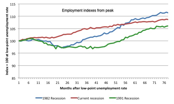
The following graph shows employment indexes for the last 3 recessions and allows us to see how the trajectory of total employment after each peak prior to the three major recessions in recent history: 1982, 1991 and 2009 (the latter to capture the current episode).
The peak is defined as the month of the low-point unemployment rate in the relevant cycle and total employment was indexed at 100 in each case and then indexed to that base for each of the months as the recession unfolded.
I have plotted the 3 episodes for 77 months after the low-point unemployment rate was reached in each cycle. The current episode is now in its 77th month.
The initial employment decline was similar for the 1982 and 1991 recessions but the 1991 recovery was delayed by many month and the return to growth much slower than the 1982 recession.
The current episode is distinguished by the lack of a major slump in total employment, which reflects the success of the large fiscal stimulus in 2008 and 2009.
However, the recovery spawned by the stimulus clearly dissipated once the fiscal position was reversed and the economy is now producing very subdued employment outcomes.
Moreover, the current episode is also different to the last two major recessions in the sense that the recovery is over and the economy is deteriorating again.
The next 3-panel graph decomposes the previous graph into full-time and part-time employment. The vertical scales are common to allow a comparison between the three episodes.
First, after the peak is reached, part-time employment continues to increase as firms convert full-time jobs into fractional jobs.
Second, recoveries are dominated by growth in part-time employment as firms are reluctant to commit to more permanent arrangements with workers while there is uncertainty of the future course in aggregate demand.
Third, the current recovery is clearly mediocre by comparison, with both very subdued growth in full-time and part-time work.
Teenage labour market – meltdown continues
All the net loss of jobs this month was in the teenage segment of the labour market.
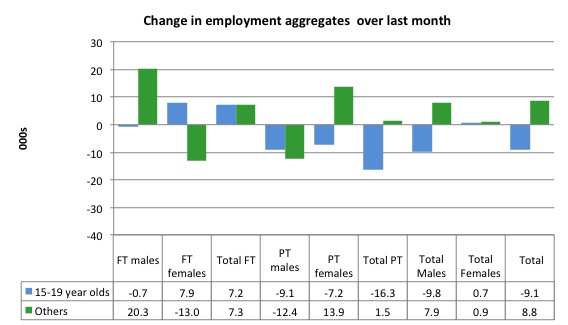
Full-time employment for teenagers rose by 7.2 thousand in July 2014, while part-time employment fell by 16.3 thousand. Overall, teenage employment fell by 9.1 thousand in July 2014.
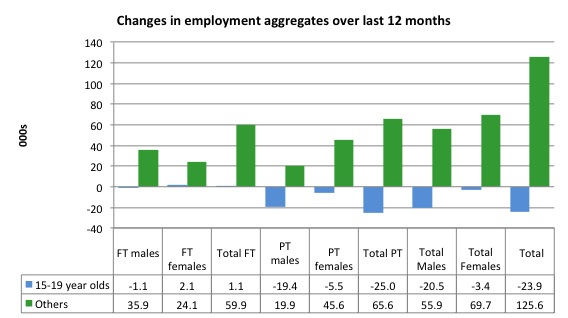
The following graph shows the distribution of net employment creation in the last month by full-time/part-time status and age/gender category (15-19 year olds and the rest)
If you take a longer view you see how poor the situation is.
Over the last 12 months, teenagers have lost 23.9 thousand jobs while the rest of the labour force have gained 125.6 thousand net jobs. Remember that the overall result represents a very poor annual growth in employment.
The teenage segment of the labour market is being particularly dragged down by the sluggish employment growth, which is hardly surprising given that the least experienced and/or most disadvantaged (those with disabilities etc) are rationed to the back of the queue by the employers.
The following graph shows the change in aggregates over the last 12 months.
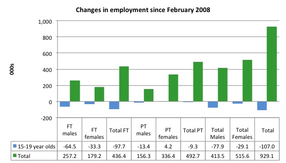
To further emphasise the plight of our teenagers, I compiled the following graph that extends the time period from the February 2008, which was the month when the unemployment rate was at its low point in the last cycle, to the present month (July 2014). So it includes the period of downturn and then the so-called “recovery” period. Note the change in vertical scale compared to the previous two graphs.
Since February 2008, there have been only 929.1 thousand (net) jobs added to the Australian economy but teenagers have lost a staggering 107 thousand over the same period. It is even more stark when you consider that 97.7 thousand full-time teenager jobs have been lost in net terms.
Even in the traditionally, concentrated teenage segment – part-time employment, the situation has worsened with 9.3 thousand jobs (net) being lost even though 492.7 thousand part-time jobs have been added overall.
Overall, the total employment increase is modest. Further, around 53 per cent of the total (net) jobs added since February 2008 have been part-time, which raises questions about the quality of work that is being generated overall.
To put the teenage employment situation in a scale context the following graph shows the Employment-Population ratios for males, females and total 15-19 year olds since March 2008 (the month which coincided with the low-point unemployment rate of the last cycle).
You can interpret this graph as depicting the loss of employment relative to the underlying population of each cohort. We would expect (at least) that this ratio should be constant if not rising somewhat (depending on school participation rates).
The facts are that the absolute loss of jobs reported above is depicting a disastrous situation for our teenagers. Males, in particular, have lost out severely as a result of the economy being deliberately stifled by austerity policy positions.
The male ratio has fallen by 11.6 percentage points since February 2008, the female by 5.3 percentage points and the overall teenage employment-population ratio has fallen by 8.5 percentage points.
The overall ratio fell again this month by some 0.6 percentage points.
Overall, the performance of the teenage labour market continues to be deeply disturbing. It doesn’t rate much priority in the policy debate, which is surprising given that this is our future workforce in an ageing population. Future productivity growth will determine whether the ageing population enjoys a higher standard of living than now or goes backwards.
The best the Government appears to be capable of is to dream up plans which deny income support to this group and impose impossible activity tests on them.
The longer-run consequences of this teenage “lock out” will be very damaging.
The problem is that in the modest growth period that the Australian labour market enjoyed as a result of the fiscal stimulus and mining investment, teenagers failed to participate in the gains – they went backwards.
It remains that the teenage cohort is not benefiting from the modest growth at present.
I continue to recommend that the Australian government immediately announce a major public sector job creation program aimed at employing all the unemployed 15-19 year olds, who are not in full-time education or a credible apprenticeship program.
The Government should abandon their ideological obsession with supply-side punishment regimes and realise that the unemployed cannot search for jobs that are not there.
It is clear that the Australian labour market continues to fail our 15-19 year olds. At a time when we keep emphasising the future challenges facing the nation in terms of an ageing population and rising dependency ratios the economy still fails to provide enough work (and on-the-job experience) for our teenagers who are our future workforce.
Unemployment – sharp rise
The unemployment rate rose by 0.3 percentage points to 6.4 per cent in July 2014. Official unemployment rose by 43,700 to 789,000. The rise was a combination of the negative employment growth and the 0.1 percentage point in participation.
Overall, the labour market still has significant excess capacity available in most areas and what growth there is is not making any major inroads into the idle pools of labour.
The following graph updates my 3-recessions graph which depicts how quickly the unemployment rose in Australia during each of the three major recessions in recent history: 1982, 1991 and 2009 (the latter to capture the 2008-2010 episode). The unemployment rate was indexed at 100 at its lowest rate before the recession in each case (January 1981; January 1989; May 2008, respectively) and then indexed to that base for each of the months as the recession unfolded.
I have plotted the 3 episodes for 78 months after the low-point unemployment rate was reached in each cycle. The current episode is now in its 77th month (0 being February 2008). For 1991, the peak unemployment which was achieved some 38 months after the downturn began and the resulting recovery was painfully slow. While the 1982 recession was severe the economy and the labour market was recovering by the 26th month. The pace of recovery for the 1982 once it began was faster than the recovery in the current period.
It is significant that the current situation while significantly less severe than the previous recessions is dragging on which is a reflection of the lack of private spending growth and declining public spending growth.
Moreover, the current episode is also different to the last two major recessions in the sense that the recovery is over and the economy is deteriorating again.
In relative terms, the current episode is now worse than the other two recessions (in terms of deviation from low-point unemployment rate).
The graph provides a graphical depiction of the speed at which the recession unfolded (which tells you something about each episode) and the length of time that the labour market deteriorated (expressed in terms of the unemployment rate).
From the start of the downturn to the 78-month point (to July 2014), the official unemployment rate has risen from a base index value of 100 to a value 160.5. After falling steadily as the fiscal stimulus pushed growth along (it reached 122.5 after 35 months – in January 2010), it has been slowly trending up for some months now. Unlike the other episodes, the current trend, at this stage of the cycle, is upwards and accelerating.
It is now above the peak that was reached just before the introduction of the fiscal stimulus. In other words, the gains that emerged in the recovery as a result of the fiscal stimulus in 2009-10 have now been lost.
At 78 months, 1982 index stood at 147.9 (and falling) while the 1991 index was at 144.1 (and falling). It is clear that at an equivalent point in the “recovery cycle” the current period is more sluggish than our recent two major downturns and trending upwards while the trend in the earlier episodes was moderately downwards.
It now appears that the recoveries have converging, which tells us that the current policy has failed to take advantage of the fact that the latest economic downturn was much more mild than the previous recessions. In other words, the policy failure is locking the economy into a higher unemployment rate than is desirable and otherwise attainable.
Note that these are index numbers and only tell us about the speed of decay rather than levels of unemployment. Clearly the 6 per cent at this stage of the downturn is lower that the unemployment rate was in the previous recessions at a comparable point in the cycle although we have to consider the broader measures of labour underutilisation (which include underemployment) before we draw any clear conclusions.
The notable aspect of the current situation is that the recovery is very slow.
Broad labour underutilisation
The ABS published its quarterly broad labour underutilisation measures in the May data release.
In the May-quarter, total underemployment rose by 0.2 percentage points to 7.6 per cent and the ABS broad labour underutilisation rate remained at 13.5 per cent (the sum of unemployment and underemployment).
| There were 936.5 thousand persons underemployed. Overall, there were 1.653 million workers either unemployed or underemployed. |
That situation is now worse and we will find out by how much in next month’s release.
The following graph plots the history of underemployment in Australia since February 1978.
If hidden unemployment is added to the broad ABS figure the best-case (conservative) scenario would see a underutilisation rate well above 15 per cent at present. Please read my blog – Australian labour underutilisation rate is at least 13.4 per cent – for more discussion on this point.
The next update will be in the August Labour Force data release.
Aggregate participation rate rose by 0.1 points
The July 2014 participation rate rose by 0.1 points to 64.8 per cent, the second consecutive rise of the same order. It remains substantially down on the most recent peak in November 2010 of 65.9 per cent when the labour market was still recovering courtesy of the fiscal stimulus.
In July 2014, negative employment growth (-300 net jobs) was below underlying population growth of 0.1 per cent. The Labour Force grew by 0.4 per cent with the boost in participation.
The labour force is a subset of the working-age population (those above 15 years old). The proportion of the working-age population that constitutes the labour force is called the labour force participation rate. Thus changes in the labour force can impact on the official unemployment rate, and, as a result, movements in the latter need to be interpreted carefully. A rising unemployment rate may not indicate a recessing economy.
The labour force can expand as a result of general population growth and/or increases in the labour force participation rates.
In the current month, the unemployment rate rose to 6.4 per cent (0.3 percentage points), which was partly because employment growth was inadequate relative to the underlying population growth but also because the labour force grew on the back of the participation increase.
What would have the unemployment rate been had the participation rate not risen by 0.1 points?
The following Table shows the breakdown in the changes to the main aggregates (Labour Force, Employment and Unemployment) and the impact of the fall in the participation rate.
In July 2014, the loss of 300 (net) jobs was accompanied by a labour force increase of 43.4 thousand. As a result, unemployment rose by 43.7 thousand.
The rising labour force in July 2014 was the outcome of two separate factors:
- The underlying population growth added 16.8 thousand persons to the labour force. The population growth impact on the labour force aggregate is relatively steady from month to month; and
- The rise in the participation rate meant that 26.6 thousand workers entered the labour force (relative to what would have occurred had the participation rate remained unchanged).
So while employment growth was below the underlying population growth, the rising participation made matters worse for unemployment adding those 26.6 thousand to the official unemployment count.
If the participation rate had not have risen, total unemployment, at the current employment level, would have been 762.4 thousand rather than the official count of 789 thousand as recorded by the ABS – a difference of 26.6 thousand workers (the ‘participation effect’).
Thus, without the fall in the participation rate, the unemployment rate would have been 6.2 per cent (rounded) rather than its current value of 6.4 per cent.
The conclusion is that hidden unemployment fell slightly in July 2014 while unemployment rose.
There is considerable monthly fluctuation in the participation rate but the current rate of 64.7 per cent is a long way below its most recent peak in November 2010 of 65.9 per cent.
What would the unemployment rate be if the participation rate was at that recent November 2010 peak level (65.9 per cent)?
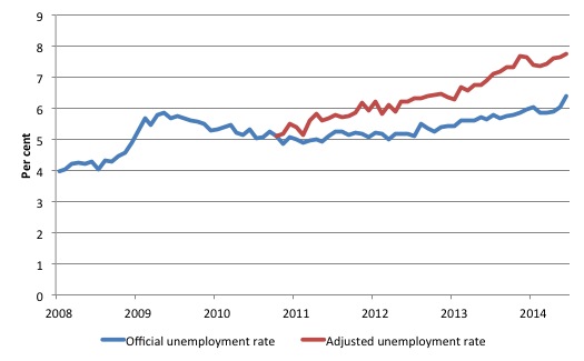
The following graph tells us what would have happened if the participation rate had been constant over the period November 2010 to July 2014. The blue line is the official unemployment since its most recent low-point of 4 per cent in March 2008.
The red line starts at November 2010 (the peak participation month). It is computed by adding the workers that left the labour force as employment growth faltered (and the participation rate fell) back into the labour force and assuming they would have been unemployed. At present, this cohort is likely to comprise a component of the hidden unemployed (or discouraged workers).
Total official unemployment in July 2014 was estimated to be 789 thousand. However, if participation had not have fallen since November 2010, there would be 974.1 thousand workers unemployed given growth in population and employment since November 2010.
| The unemployment rate would now be 7.8 per cent if the participation had not fallen below its November 2010 peak of 65.9 per cent. |
The difference between the two numbers mostly reflects the change in hidden unemployment (discouraged workers) since November 2010. These workers would take a job immediately if offered one but have given up looking because there are not enough jobs and as a consequence the ABS classifies them as being Not in the Labour Force.
Note, the gap between the blue and red lines doesn’t sum to total hidden unemployment unless November 2010 was a full employment peak, which it clearly was not. The interpretation of the gap is that it shows the extra hidden unemployed since that time.
Hours worked – fell in July 2014
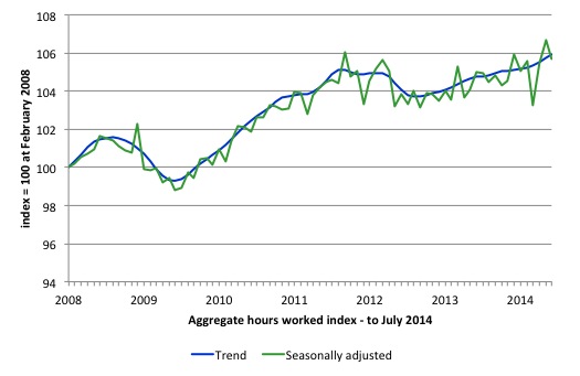
Aggregate monthly hours worked increased 14.8 million hours (0.9%) in July 2014 in seasonally adjusted terms.
The following graph shows the trend and seasonally adjusted aggregate hours worked indexed to 100 at the peak in February 2008 (which was the low-point unemployment rate in the previous cycle).
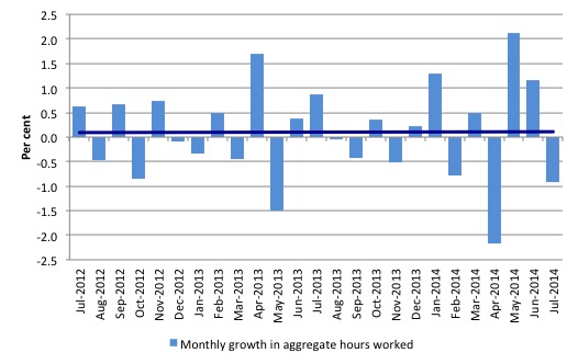
The next graph shows the monthly growth (in per cent) over the last 24 months. The dark linear line is a simple regression trend of the monthly change – which depicts a zero trend. You can see the pattern of the change in working hours is also portrayed in the employment graph – zig-zagging across the zero growth line.
Conclusion
In general, we always have to be careful interpreting month to month movements given the way the Labour Force Survey is constructed and implemented. But today’s data release is consistent with the message that has been generated for at least the last 2 years – the stagnant state of the labour market is on-going.
In July 2014, employment growth was negative (but only just) and below the underlying population growth and the result has been a further rise in unemployment. The only saving grace is that there was positive growth in full-time employment.
The rise in unemployment was worse because the participation rate also rose by 0.1 percentage points.
The teenage labour market, which is in a parlous state, deteriorated further in July 2014. This is an emergency being ignored by the Federal Government.
The neglect of our teenagers will have a very long memory indeed and the negative consequences will be stronger given the ageing population.
The data certainly shows that the government has to reverse the contractionary bias or else conditions will continue to slowly deteriorate.
It is time for the conservatives to implement some public sector job creation, which will arrest the current decline and stimulate private sector activity and employment!
That is enough for today!
(c) Copyright 2014 Bill Mitchell. All Rights Reserved.




Meanwhile,we have runaway immigration but I suppose it is politically incorrect to point that out.
Sorry,I never was much of a latte sipper. More of a long black,no sugar person.
Australia does need a population policy which recognises Limits to Growth both globally and nationally. In other words, we do need to state a target population. Credible estimates on Australia’s sustainable population long term vary from Jared Diamond’s pessimistic 8 million to about 30 million. Diamond clearly believes we are already in overshoot territory. To stop ourselves over-shooting a capacity of 30 million we would have to move to zero net immigration immediately.
Meanwhile,we have runaway immigration but I suppose it is politically incorrect to point that out.
I have no idea what the phrase “runaway immigration” means ?
Setting politics aside, what sort of numbers is Australia dealing with?
I used “runaway immigration” as a convenient shorthand term for the insane immigration policies of both the ALP and the LNP. Supported in the main by the Greens I might add.
The only people which this high level of immigration benefits are the immigrants (maybe) and certainly the rentier class with their political and media hacks. The rest of us put up with overcrowding, urban sprawl and environmental degradation plus higher levels of unemployment as detailed in the article.
As for numbers,I can’t do better in a short comment than Ikonoclast above.
Australia is a intregal part of the banking cartel – you must do your upmost to soak up economic refugees from elsewhere on this scarcity planet of theirs. (as always)
The Lost Boys of Ireland will not do you any favours.
They come from a society which was first broken on their wheel of misfortune 400 years ago.
Year, Settler Arrival Numbers, Net permanent migration.
2012-2013 152,414 60,653
Our net permanent migration has been running at about 50,000 to 75,000 per year since 1998-1999.
Given that as a country we are approaching the limits to growth, we should not have a net immigration policy. The world has overshot the limits to growth. It is a moral question whether we should take net immigration to relieve global overpopulation. My answer would be “no” on the basis of a version of the lifeboat dilemma. Imagine a sinking ship like the Titanic with an inadequate number of lifeboats. If a lifeboat is already full should it take more passengers thus assuring its sinking and the loss of all those passengers? Or should the “lifeboat full” ruling be made and those saved who can be saved? I suggest the latter.
Of course, matters will not be this neat. Once the desperation starts, provoked by Limits to Growth, and 100s of millions of displaced people start migrating (along with regional wars almost everywhere) then the chances of Australia maintaining sovereign integrity might be compromised. The future promises to be too chaotic and dangerous to be predictable.
Note, this does not mean I oppose proper treatment of bonma fide refugees currently. While the international scene remains manageable, we should take all bona fide refugee and asylum claimants into Australia and process them properly according to all UN treaty and humanitarian requirements. We could adjust voluntary migration to keep our net immigration at approximately zero. This would be the appropriate and humane policy for current conditions. I am simply saying above, “Don’t expect current relatively manageable conditions to last once the Limits to Growth become glaringly obvious and the world suffers serious energy, water and food shortages as it inevitably will.”
I am not an expert by any means in this field, but is their a real pop limit problem? I have seen analyses that contend that the problem isn’t numbers but distribution, that there is more than sufficient food and water but that it isn’t getting to where it is needed. Some of these analyses have acknowledged an urban sprawl issue but argue that this is a fixable problem.
Bill, do you know what might be useful to the 5% or so of your readers? A set of methodological essays on how you arrive at your data results, including the statistical procedures you employ and why you used the ones you did compared to the ones you didn’t. You needn’t go into excessive detail. I realize that this may seem to be a rather idiosyncratic request and possibly most of your readers might hate it, but I think it could aid in readers of your blog acquire a deeper appreciation of your analyses. Of course, a number of your readers may not need this kind of information. But just a thought.
Larry, there has to be a finite human population limit on earth as the earth itself is finite. The arguments and disagreements are about what that population limit might be. Those who are hopeful about this issue argue that this limit is not near yet and/or that population growth will naturally level off without harmful effects to humans or the environment. Often, they argue that technology will solve all our problems on our journey to a stable peak population at some undefined time in the future. Economists tend to be hopeful about such issues too as economists tend to believe that economics, like technology, can solve any problems we encounter.
Those who have done the numbers, like analysts of peak oil, peak energy, peak water and global footprints have concluded we have hit the peak about now, historically speaking. (They use physics and biological science and not the wishful thinking of economics.) Our growth momentum will carry us a bit further, maybe to 2025 or even 2035, but we are already in overshoot mode. Overshoot mode means we are using more resources per annum than the earth produces. The earth provides “natural capital” and “natural income”. “Natural capital” is a stock and “natural income” is a flow.
To take an example, a pristine forest is “natural capital”. You could log it for valuable timber. Even unlogged it provides valuable “biological services”; that is it takes CO2 out of the atmosphere and adds replenishing O2 as new trees grow. It tends to improve and augment rainfall patterns and cycles and to support biodiversity. If the forest is logged at a sustainable rate it will provide an income of timber each year and replace that in time with regrowth. If the forest is logged at an unsustainable rate, it will diminish in size each year. Thus, not only is the forest’s “income” being used but its “capital” is being used up. If continued, this process provides a once-only bonanza for a generation or a few generations of humans. Then with all the forest gone, there are no timbers and no biological services from forests.
This is exactly what we are doing with the earth. Wild forests, wild fisheries and other stores of natural capital are being drawn down until they are utterly spent. This is also a problem with water (depletion of aquifers and rivers) and soil (loss of topsoil), to name a couple more major issues. Then there is oil depletion (peak oil), peak mineral production and so on as the best natural reserves are used up. One key effect of then relying on lower grade ores, when good grades are used up, is the higher energy cost of recovery and refining. So this tends to exacerbate our energy shortage.
So in fact, even the current world population is probably unsustainable and set for collapse. There is some hope in renewable energy (solar, wind, hydro, tidal), some hope in sustainable farming and tree plantations etc. and some hope in moving from exhaustible resources (like copper) to ubiquitous resources like silicon and carbon (particularly if nano-engineering can confer new, useful electrical and electronic properties. But we will still have stabilise population and maybe even go for a managed decline to a lower, sustainable level.
Note: Copper (for example) is exhaustible not in the sense that it is destroyed by use but in the sense that economically viable copper deposits are limited and recycling is never 100% effective. There is always a small percentage of loss as copper is lost and scattered in tiny un-minable amounts throughout the environment. Oil on the other hand is exhaustible because deposits are again limited but it can’t be recycled (except for lubricating oils). Most oil is refined and combusted. This of course is a one-use process. This is very much a case of “use it and you lose it”.
Ikonoclast, our carrying capacity isn’t fixed and we’re multiple orders of magnitude below any absolute limit. To blame population misses the point: we’re living in a way that would be unsustainable even with half the population, yet with a few changes that won’t even have much effect on our lifestyle we could support a much higher population (particularly in Australia, but it’s also true globally to some extent).
To say there’s some hope in renewable energy is a gross understatement – it will revolutionize everything.
To say there’s some hope in sustainable farming is also an understatement. It’s already started to become mainstream in Australia, and it’s only a matter of time before theat becomes true globally. Some really big gains will become apparent as our understanding of soil microbiology improves.
There is no problem at all with copper exhaustibility – firstly becasue aluminium is already a widely used substitute for electrical purposes (and HDPE for water pipes), secondly because there is no shortage of high grade copper ore, and thirdly because improving technology is likely to counteract the higher energy requirements of utilizing low grade ore – but even if it doesnt, renewable energy will make it viable if the demand is there.
So telling refugees to FOAD is not and never will be justified.
Innovation and employment are hilhgy correlated. I think Henry Ford was a good example, even today. He supervised the invention of the assembly line so he could build cars cheap enough that his employees(well-paid) could afford them. The innovation of the assembly line, plus a bunch of other innovations, allowed Ford to offer many relatively high paying jobs.One of the structural problems that was not even mentioned is that various benefits and subsidies make it uneconomic for many people to find work. They simply are better off(although maybe not happy) living off benefits and subsidies because any job they could land would put them overall worse off. This has a profound negative effect on society and the economy. As an example, the type of skills needed to produce at i-Pad are not particularly high. But the barriers to hiring people in the US at the minimum wage to do it are so high Apple finds it more effective to manufacture in China and East Asia. In standard of living terms the wages at a company like FoxConn(the i-Pad builder) are not that far below the minimum US wage.