I grew up in a society where collective will was at the forefront and it…
US labour market improving but it is not all good
Last week (July 3, 2013), the – US Bureau of Labor Statistics – released their latest – Employment Situation -June 2014 – which showed that in seasonally adjusted terms, total payroll employment increased by 288,000 in June while the Household Labour Force Survey data showed that employment rose by 407 thousand. The essence to be extracted from the data is that total employment in the US is now outpacing the underlying population growth by a considerable margin and the official unemployment rate is dropping quickly (from 6.3 per cent in May to 6.1 per cent in June). Over the last year, the official unemployment rate dropped by 1.5 percentage points. There has been an acceleration in employment growth in the last 6 months. But the unemployment rate has benefited not only from stronger employment growth but also from a continued decline in the labour force participation rate. As a result the labour force shrunk has fallen by 128 thousand people over the last year. There is also evidence that a significant proportion of the jobs created are in low pay, precarious areas of the labour market.
For those who are confused about the difference between the payroll (establishment) data and the household survey data you should read this blog – US labour market is in a deplorable state – where I explain the differences in detail.
The “household survey has a broader employment definition than the payroll survey” and so the former is always higher than the latter. They move in a similar cyclical pattern though with very similar turning points (troughs and peaks).
Focusing on the Household Labour Force Survey data, the seasonally adjusted labour force rose by 81 thousand in June 2014, while employment rose by 407 thousand with the labour force participation rate constant at 62.8.
Unemployment thus fell by 326 thousand and the unemployment rate declined from 6.3 per cent to 6.1 per cent.
Employment growth has to absorb the increase in the labour force to ensure unemployment doesn’t rise. The task that economies typically face in a recovery from a deep recession is that the labour force growth, itself accelerates (due to the hidden or discouraged workers re-entering the labour force) and there is a huge residual pool of unemployed as to be absorbed.
Usually, employment growth is insufficient in the early stages of the recovery to absorb the unemployment quickly and so we observe the distinct cyclical asymmetry in the behaviour of unemployment over the economic cycle. It quickly rises but only falls slowly again.
In the case of the US labour market, the labour force pressure that typically slows the reduction in unemployment has not been visible in the recovery. In fact, as we will see below, the labour force participation rate continues to stagnate at below its pre-crisis peak, which takes pressure of the employment growth. But, of-course, that is not a good sign.
In June 2014, employment growth rose by 0.24 per cent, while the labour force rose by a very modest 0.05 per cent, all on the back of underlying population growth.
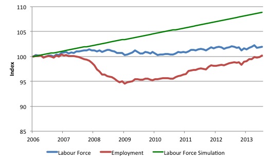
The following graph gives you an idea of what has been going on in the US since December 2006 (the low-point unemployment rate month of the last cycle). All series shown are indexed to 100 at December 2006. The graph shows the evolution of the labour force (blue), total employment (red) and what the labour force would have been (in index numbers) if it had have grown at its average rate over the period December 2001 to December 2006 (0.094 per cent per month).
The difference between the blue and red line is the growth in unemployment since December 2006, while the difference between the blue and green lines is due to the falling participation rate.
In this blog – Beware of structural explanations of cyclical events – I calculated that about 25 per cent of the rather substantial decline in the US employment-population ratio first-quarter 2008 and the first-quarter 2014 could be explained by demographic changes (more older workers in the population).
So the growth in discouraged workers (hidden unemployment) will be somewhat below the green line but well above the blue line. When I have done the decomposition of the participation rate I will be able to provide a more accurate statement (see the blog – Decomposing the decline in the US participation rate for ageing (July 22, 2014).
In terms of actual numbers, the gap between the green and blue lines is equivalent to 10.5 million workers as at June 2014.
So you get an idea of how massive this recession has been for the US labour market. The sluggish labour force growth (0.37 per cent over per annum since December 2006) compares with the average employment growth of 0.09 per cent per annum over the same period.
The unemployment devastation would have been massive if not for the sluggish labour force growth. I will come back to the falling participation rate later.
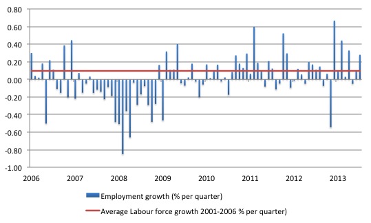
The following graph shows the monthly employment growth since the low-point unemployment rate month (December 2006). The red line is the average labour force growth over the period December 2001 to December 2006 (0.094 per cent per month). The unemployment rate rises if the employment growth is below the labour force growth rate.
What is apparent is that a strong positive and reinforcing trend in employment growth has not yet been established in the US labour market since the recovery began back in 2009. There are still many months where employment growth, while positive, remains relatively weak when compared to the average labour force growth prior to the crisis.
The situation will look decidedly weaker when (and if) the labour force participation rate reverts back to its past behaviour.
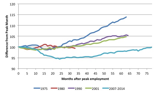
As a matter of history, the following graph shows employment indexes for the US (from US Bureau of Labor Statistics data) for the five NBER recessions since the mid-1970s.
They are indexed at the NBER peak (which doesn’t have to coincide with the employment peak). We trace them out to 64 months or so, except for the first-part of the 1980 downturn which lasted a short period.
It was followed by a second major downturn 12 months later in July 1982 which then endured. The current downturn has lasted 78 months and employment has just returned to an index value of 100 in June 2014, which was last achieved in December 2007.
The previous recessions have returned to the 100 index value after around 30 to 34 months.
Participation steadies
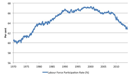
What really is striking about the last few years in the US is the falling participation rate. The following graph shows the labour force participation rate (the proportion of those above 16 years of age that are in the labour force – that is, employed or officially unemployed) since January 1970.
Clearly, there has been a trend decline in the labour force underpinning the sharp cyclical acceleration from late 2007. I will compute the demographic factor driving that trend in another blog. Note the reference to the Employment-Population ratio above.
Examining participation rates provides us with information about what is happening on the margin of civilian working age population and the labour force. If, for example, the participation rises, unemployment can rise even though employment growth is strong. That is a virtuous sign because it means that the economic situation is improving and discouraged workers are coming back into the labour force as the jobs market looks more hopeful.
We juxtapose that situation with one where the participation rate is falling – which suggests discouraged workers are giving up on job search because of the dearth of vacancies available and even though unemployment might actually fall, the signs are bleak. All that sort of economy is doing is trading official unemployment for hidden unemployment. The weakness just leaves the labour force.
The fall in participation since December 2006 has been stark – from 66.4 per cent to 62.8 per cent in June 2014, a decline of 3.7 percentage points. If we assume the ageing effect is about 25 per cent of that then the cyclical component would still be large at 2.7 percentage points.
In terms of the current working age population that amounts to some 6.6 million workers. Remember that the official unemployment is only 9.5 million workers. So even taking out the estimated demographic effect (the trend) we are still left with a massive cyclical response.
What does that mean for the underlying unemployment?
You can compute how much larger the labour force would be if the participation rate now was at its recent (December 2006) peak by working out the current working age population and multiplying it by the peak labour participation rate.
The difference between the actual labour force now and the “potential” labour force represents the number of workers that have given up looking for work as a result of the lack of job opportunities available, upon the assumption that there have been no sharp rise in retirements.
In June 2014, employment rose by 407 thousand while the labour force rose by 81 thousand. As a result, unemployment fell by only 326 thousand.
If the participation rate had have been at the December 2006 peak, then the current labour force would have been 162,388 million rather than the actual value of 155,694 million (taking into account that 75 per cent of the fall in participation is cyclical).
Thus, without the fall in the participation rate, the unemployment rate would have been 11.3 per cent rather than its current value of 6.1 per cent.
So there is a huge degree of slack not counted among the official unemployed in the US and tells us that the unemployment rate is likely to be a very misleading indicator of how the US economy is faring.
In other words, a lot of the continuing slack is being hidden in the not in the labour force category. If employment growth speeds up then we can expect to see unemployment rise as the participation rate rises due to improving opportunities for employment.
The conclusion is that hidden unemployment has risen substantially in the US since the downturn and it is only a matter of time before those workers respond to the higher employment growth and start to re-enter the labour force.
Then things won’t look so bright.
More low pay jobs?
Using payroll data for employment by industry and average weekly earnings (from the BLS), I computed that 42.4 per cent of the total change in employment over the last 12 months to June 2014 have been created in low-pay industries – defined here as those having average weekly earnings below $614 per week.
Average weekly earnings overall for the private sector are $822.42. 41.1 per cent of the jobs were created in industries paying more than the average and 58.9 per cent below the average weekly earnings.
I will do more analysis of the wage distribution in coming weeks as I get more data, but the stronger growth while it adds jobs may be condemning the US to a low-productivity future.
For information, the proportion of the total change in employment between June 2013 and June 2014 by industry were: Mining and logging 1.4 per cent; Construction 5.9 per cent; Manufacturing 4.1 per cent; Durable goods 4.0 per cent; Nondurable goods 0.2 per cent; Trade, transportation, and utilities 18.8 per cent; Wholesale trade 4.4 per cent; Retail trade 10.0 per cent; Transportation and warehousing 4.4 per cent; Utilities -0.1 per cent; Information -0.9 per cent; Financial activities 1.9 per cent; Professional and business services 20.5 per cent; Education and health services 12.0 per cent; Leisure and hospitality 12.4 per cent; Other services 1.2 per cent.
Conclusion
The US fiscal deficit has remained large enough to support some growth and allow some confidence to be regained in the private sector.
The results is that employment growth has gathered in pace although the underlying state of the labour market remains fragile.
If the employment growth remains stronger as it has been in the last few months, then the cyclical adjustment in the labour force participation rate will start to push unemployment back up.
The implied hidden unemployment is huge at present.
That is enough for today!
(c) Copyright 2014 Bill Mitchell. All Rights Reserved.


“not be no larger than this” ?
You’re usually impeccable grammar was not on display here, Bill. Some might misconstrue your meaning.
Dear Roger Erickson (at 2014/07/22 at 13:37)
It was shocking grammar – I have removed it. Thanks for the scalding.
best wishes
bill