The Australian Bureau of Statistics (ABS) released the latest labour force data today (APRIL 16,…
Australian labour market – things are getting worse
Today’s release of the – Labour Force data – for December 2013 by the Australian Bureau of Statistics shows that employment growth is now negative (again), unemployment is rising (slightly) and the participation rate fell sharply, which cushioned the rise in unemployment. The data confirms that there needs to be a major rethink in the macroeconomic policy settings in favour of stimulus. Employment growth has been around zero for nearly two years and there is an upward bias in unemployment. The situation will worsen unless the Government shows some leadership and increases its net spending and targets employment creation. The problem is that the Government is already demonstrating its lack of leadership credentials across a range of policy portfolios.
The summary ABS Labour Force (seasonally adjusted) estimates for December 2013 are:
- Employment decreased 22,600 (0.5 per cent) with full-time employment falling by 31,600 and part-time employment rising by 9,000.
- Unemployment increased by 8,000 (1.1 per cent) to 722,000.
- The official unemployment rate rose (due to rounding) to 5.8 per cent (from 5.7 per cent).
- The participation rate fell sharply to 64.6 per cent from 64.8 per cent and even further below its November 2010 peak (recent) of 65.9 per cent.
- Aggregate monthly hours worked increased by 0.6 million hours (0.04 per cent).
- The quarterly ABS broad labour underutilisation estimate (the sum of unemployment and underemployment) were published for the November-quarter in last month’s release and showed that underemployment fell by 0.2 percentage points to 7.6 per cent. The total labour underutilisation rate fell from 13.7 per cent in the August-quarter to 13.4 per cent in November. There were 941 thousand persons underemployed.
Employment growth – negative
The December 2013 data shows that employment decreased 22,600 (0.5 per cent) with full-time employment falling by 31,600 and part-time employment rising by 9,000..
Over the last 24 months or so we have seen the labour market data switching back and forth regularly between negative employment growth and positive growth spikes.
This pattern has consolidated and indicates the current policy settings are wrong and a stimulus is required.
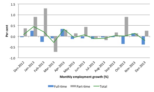
There have been considerable fluctuations in the full-time/part-time growth over the last year with regular crossings of the zero growth line.
The following graph shows the month by month growth in full-time (blue columns), part-time (grey columns) and total employment (green line) for the 12 months to December 2013 using seasonally adjusted data.
Today’s results just repeat the topsy-turvy nature of the data over the period shown.
While full-time and part-time employment growth are fluctuating around the zero line, total employment growth is still well below the growth that was boosted by the fiscal-stimulus in the middle of 2010.
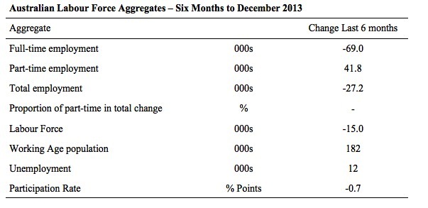
The following table provides an accounting summary of the labour market performance over the last six months. The monthly data is highly variable so this Table provides a longer view which allows for a better assessment of the trends. WAP is working age population (above 15 year olds).
The conclusion – overall there have 27.2 thousand jobs (net) lost in Australia over the last six month, which is appalling. Worse still is that fact that over the same period, full-time employment has fallen by 69 thousand jobs (net) while part-time work has risen by 41.8 thousand jobs.
The Working Age Population has risen by 182 thousand in the same period while the labour force has fallen by 15 thousand. The falling labour force growth reflects the fact that the participation rate has fallen substantially (0.7 percentage points) over the last six months.
This has had the effect of attenuating the rise in unemploymen (see later).
The weak employment growth has thus not been able to keep pace with the underlying population growth and unemployment has risen by 12 thousand as a result.
The rise in unemployment would have been much worse had the participation rate not dropped.
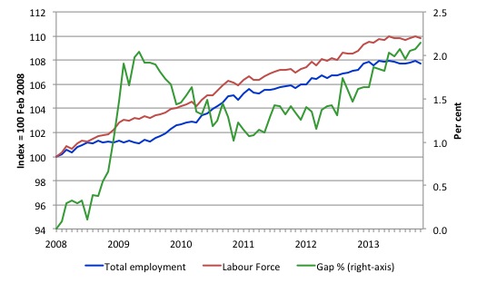
To put the recent data in perspective, the following graph shows the movement in the labour force and total employment since the low-point unemployment rate month in the last cycle (February 2008) to December 2013. The two series are indexed to 100 at that month. The green line (right-axis) is the gap (plotted against the right-axis) between the two aggregates and measures the change in the unemployment rate since the low-point of the last cycle (when it stood at 4 per cent).
You can see that the labour force index has largely levelled off and now falling and the divergence between it and employment growth has been relatively steady over the last several months with this month showing some improvement.
The Gap series gives you a good impression of the asymmetry in unemployment rate responses even when the economy experiences a mild downturn (such as the case in Australia). The unemployment rate jumps quickly but declines slowly.
It also highlights the fact that the recovery is still not strong enough to bring the unemployment rate back down to its pre-crisis low. You can see clearly that the unemployment rate fell in late 2009 and then has hovered at the same level for some months before rising again over the last several months.
The Gap shows that the labour market is still a long way from recovering from the financial crisis that hit in early 2008. There hasn’t been much progress since January 2010, when the fiscal stimulus started to run out.
In fact, in December 2013, the Gap (2.1 percentage points) exceeded the levels that appeared in May and June 2009 when the Australian economy was enduring the impact of the crisis. All the gains made since then have thus disappeared due to poorly crafted fiscal policy not responding appropriately to non-government spending changes.
Full-time and Part-time employment in recovery
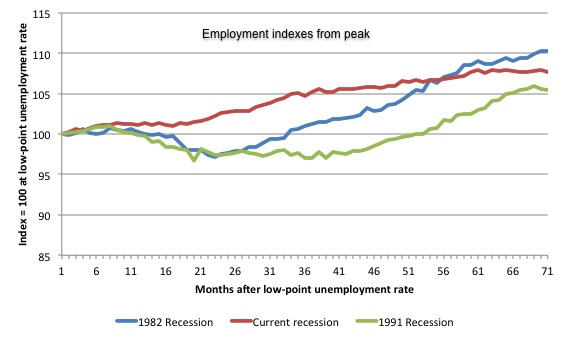
The following graph shows employment indexes for the last 3 recessions and allows us to see how the trajectory of total employment after each peak prior to the three major recessions in recent history: 1982, 1991 and 2009 (the latter to capture the current episode). The peak is defined as the month of the low-point unemployment rate in the relevant cycle and total employment was indexed at 100 in each case and then indexed to that base for each of the months as the recession unfolded.
I have plotted the 3 episodes for 70 months after the low-point unemployment rate was reached in each cycle. The current episode is now in its 70th month.
The initial employment decline was similar for the 1982 and 1991 recessions but the 1991 recovery was delayed by many month and the return to growth much slower than the 1982 recession.
The current episode is distinguished by the lack of a major slump in total employment, which reflects the success of the large fiscal stimulus in 2008 and 2009.
However, the recovery spawned by the stimulus clearly dissipated once the fiscal position was reversed and the economy is now producing very subdued employment outcomes.
Moreover, the current episode is also different to the last two major recessions in the sense that the recovery is over and the economy is deteriorating again.
The next 3-panel graph decomposes the previous graph into full-time and part-time employment. The vertical scales are common to allow a comparison between the three episodes.
First, after the peak is reached, part-time employment continues to increase as firms convert full-time jobs into fractional jobs.
Second, recoveries are dominated by growth in part-time employment as firms are reluctant to commit to more permanent arrangements with workers while there is uncertainty of the future course in aggregate demand.
Third, the current recovery is clearly mediocre by comparison, with both very subdued growth in full-time and part-time work.
Teenage labour market – continues to deteriorate
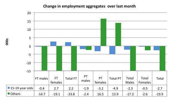
Full-time employment for teenagers rose by 2.2 thousand in December 2013 while part-time employment fell by 4.9 thousand. Overall, teenage employment fell by 2.7 thousand (net) jobs.
The following graph shows the distribution of net employment creation in the last month by full-time/part-time status and age/gender category (15-19 year olds and the rest)
If you take a longer view you see how poor the situation is.
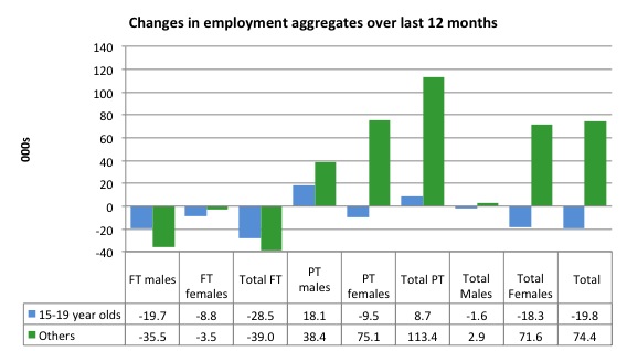
Over the last 12 months, teenagers have lost 19.8 thousand jobs while the rest of the labour force have gained 74.4 thousand net jobs. Remember that the overall result represents a very poor annual growth in employment.
Even more disturbing is the attrition of full-time jobs among teenagers – losing 28.5 thousand over the last year.
The teenage segment of the labour market is being particularly dragged down by the sluggish employment growth, which is hardly surprising given that the least experienced and/or most disadvantaged (those with disabilities etc) are rationed to the back of the queue by the employers.
The following graph shows the change in aggregates over the last 12 months.
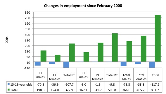
To further emphasise the plight of our teenagers, I compiled the following graph that extends the time period from the February 2008, which was the month when the unemployment rate was at its low point in the last cycle, to the present month (December 2013). So it includes the period of downturn and then the so-called “recovery” period. Note the change in vertical scale compared to the previous two graphs.
Since February 2008, there have been only 831.7 thousand (net) jobs added to the Australian economy but teenagers have lost a staggering 117.5 thousand over the same period. It is even more stark when you consider that 107.7 thousand full-time teenager jobs have been lost in net terms.
Even in the traditionally, concentrated teenage segment – part-time employment, 9.8 thousand jobs (net) have been lost even though some 499 thousand part-time jobs have been added overall.
Overall, the total employment increase is modest. Further, around 61 per cent of the total (net) jobs added since February 2008 have been part-time, which raises questions about the quality of work that is being generated overall.
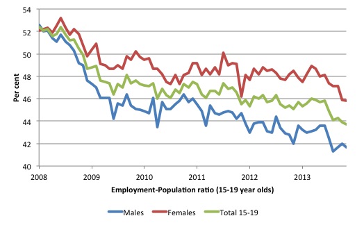
To put the teenage employment situation in a scale context the following graph shows the Employment-Population ratios for males, females and total 15-19 year olds since February 2008 (the month which coincided with the low-point unemployment rate of the last cycle).
You can interpret this graph as depicting the loss of employment relative to the underlying population of each cohort. We would expect (at least) that this ratio should be constant if not rising somewhat (depending on school participation rates).
The facts are that the absolute loss of jobs reported above is depicting a disastrous situation for our teenagers. Males, in particular, have lost out severely as a result of the economy being deliberately stifled by austerity policy positions.
The male ratio has fallen by 10.9 percentage points since February 2008, the female by 6.3 percentage points and the overall teenage employment-population ratio has fallen by 8.7 percentage points.
Overall, the performance of the teenage labour market is close to disastrous. It doesn’t rate much priority in the policy debate, which is surprising given that this is our future workforce in an ageing population. Future productivity growth will determine whether the ageing population enjoys a higher standard of living than now or goes backwards.
The longer-run consequences of this teenage “lock out” will be very damaging.
The problem is that in the modest growth period that the Australian labour market enjoyed as a result of the fiscal stimulus and mining investment, teenagers failed to participate in the gains – they went backwards.
Now, with the economy entering a new period of slowdown, these losses will be added too given that teenagers are among the first in line to be shown the door by employers seeking to reduce staff levels in the face of declining aggregate sales.
The previous Government’s response was to push this cohort into endless training initiatives (supply-side approach) without significant benefits. The research shows overwhelmingly that job-specific skills development should be done within a paid-work environment.
I would recommend that the new Australian government immediately announce a major public sector job creation program aimed at employing all the unemployed 15-19 year olds, who are not in full-time education or a credible apprenticeship program.
It is clear that the Australian labour market continues to fail our 15-19 year olds. At a time when we keep emphasising the future challenges facing the nation in terms of an ageing population and rising dependency ratios the economy still fails to provide enough work (and on-the-job experience) for our teenagers who are our future workforce.
Unemployment
The unemployment rate increased to 5.8 per cent in December 2013, up from 5.7 per cent in November (due to rounding). Official unemployment increased by 8,000 (1.1 per cent) to 722,000.
Overall, the labour market still has significant excess capacity available in most areas and what growth there is is not making any major inroads into the idle pools of labour.
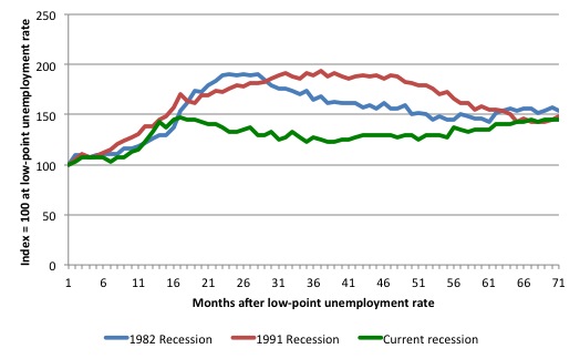
The following graph updates my 3-recessions graph which depicts how quickly the unemployment rose in Australia during each of the three major recessions in recent history: 1982, 1991 and 2009 (the latter to capture the 2008-2010 episode). The unemployment rate was indexed at 100 at its lowest rate before the recession in each case (January 1981; January 1989; April 2008, respectively) and then indexed to that base for each of the months as the recession unfolded.
I have plotted the 3 episodes for 70 months after the low-point unemployment rate was reached in each cycle. The current episode is now in its 70th month (0 being February 2008). For 1991, the peak unemployment which was achieved some 38 months after the downturn began and the resulting recovery was painfully slow. While the 1982 recession was severe the economy and the labour market was recovering by the 26th month. The pace of recovery for the 1982 once it began was faster than the recovery in the current period.
It is significant that the current situation while significantly less severe than the previous recessions is dragging on which is a reflection of the lack of private spending growth and declining public spending growth.
Moreover, the current episode is also different to the last two major recessions in the sense that the recovery is over and the economy is deteriorating again.
The graph provides a graphical depiction of the speed at which the recession unfolded (which tells you something about each episode) and the length of time that the labour market deteriorated (expressed in terms of the unemployment rate).
From the start of the downturn to the 70-month point (to December 2013), the official unemployment rate has risen from a base index value of 100 to a value 145 – peaking at 147.5 after 17 months. After falling steadily as the fiscal stimulus pushed growth along (it reached 122.8 after 35 months – in January 2010), it has been slowly trending up for some months now. Unlike the other episodes, the current trend, at this stage of the cycle, is upwards.
It will soon be above the peak that was reached just before the introduction of the fiscal stimulus. In other words, the gains that emerged in the recovery as a result of the fiscal stimulus in 2009-10 have now been lost.
At 70 months, 1982 index stood at 153.7 while the 1991 index was at 148.3. It is clear that at an equivalent point in the “recovery cycle” the current period is more sluggish than our recent two major downturns and trending upwards while the trend in the earlier episodes was moderately downwards.
It now appears that the recoveries are converging, which tells us that the current policy has failed to take advantage of the fact that the latest economic downturn was much more mild than the previous recessions. In other words, the policy failure is locking the economy into a higher unemployment rate than is desirable and otherwise attainable.
Note that these are index numbers and only tell us about the speed of decay rather than levels of unemployment. Clearly the 5.8 per cent at this stage of the downturn is lower that the unemployment rate was in the previous recessions at a comparable point in the cycle although we have to consider the broader measures of labour underutilisation (which include underemployment) before we draw any clear conclusions.
The notable aspect of the current situation is that the recovery is very slow.
Broader labour underutilisation
The ABS published its quarterly broad labour underutilisation measures in the November release.
In the November-quarterly release, total underemployment fell by 0.2 percentage points to 7.6 per cent and the ABS broad labour underutilisation rate fell by 0.3 points to 13.4 per cent (the sum of unemployment and underemployment).
| There were 941 thousand persons underemployed. Overall, there are 1.7 million workers either unemployed or underemployed. |
The next update will be in the February Labour Force data release.
Aggregate participation rate falls sharply
The December 2013 participation rate was down to 64.6 per cent (from 64.8 per cent).
The falling participation meant that the rise in unemployment was lower than otherwise given the contraction in employment.
The fall in participation meant that unemployment would have been 38.2 thousand persons higher than the official level had the labour participation rate remained static and given the actual employment growth.
We can assume that hidden unemployment has risen by something close to 38 thousand persons in December 2013 as the employment prospects for workers continue to diminish. The participation rate is also still substantially down on the most recent peak in November 2010 of 65.9 per cent when the labour market was still recovering courtesy of the fiscal stimulus.
The labour force is a subset of the working-age population (those above 15 years old). The proportion of the working-age population that constitutes the labour force is called the labour force participation rate. Thus changes in the labour force can impact on the official unemployment rate, and, as a result, movements in the latter need to be interpreted carefully. A rising unemployment rate may not indicate a recessing economy.
The labour force can expand as a result of general population growth and/or increases in the labour force participation rates.
In the current month, the unemployment rate rose to 5.8 per cent. What would have the unemployment rate been had the participation rate not fallen by 0.2 points.
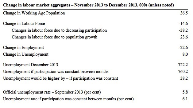
The following Table shows the breakdown in the changes to the main aggregates (Labour Force, Employment and Unemployment) and the impact of the rise in the participation rate.
In December 2013, employment fell by 22.6 thousand while the labour force contracted by 14.6 thousand persons. As a result, unemployment rose by 8 thousand.
The labour force fall in August was the outcome of two separate factors:
- The underlying population growth added 23.6 thousand persons to the labour force. The population growth impact on the labour force aggregate is relatively steady from month to month; and
- The fall in the participation rate meant that 38.2 thousand workers left the labour force (relative to what would have occurred had the participation rate remained unchanged).
So while employment growth failed to keep pace with the underlying population growth, the falling participation took the pressure off somewhat as workers exited the labour force and were taken out of the official unemployment count.
If the participation rate had not have fallen, total unemployment, at the current employment level, would have been 760.2 thousand rather than the official count of 722.2 thousand as recorded by the ABS – a difference of 38.2 thousand workers.
Thus, without the fall in the participation rate, the unemployment rate would have actually risen to 6.1 per cent rather than its current value of 5.8 per cent.
The conclusion is that hidden unemployment rose and this attenuated the rise in the official unemployment rise. In functional terms this signals a much worse deterioration in the conditions than signalled by the current official unemployment rate.
There is considerable monthly fluctuation in the participation rate but the current rate of 64.6 per cent is a long way below its most recent peak in November 2010 of 65.9 per cent.
What would the unemployment rate be if the participation rate was at that recent peak level (65.9 per cent)?
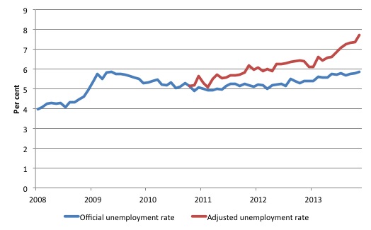
The following graph tells us what would have happened if the participation rate had been constant over the period November 2010 to December 2013. The blue line is the official unemployment since its most recent low-point of 4 per cent in February 2008.
The red line starts at November 2010 (the peak participation month). It is computed by adding the workers that left the labour force as employment growth faltered (and the participation rate fell) back into the labour force and assuming they would have been unemployed. At present, this cohort is likely to comprise a component of the hidden unemployed (or discouraged workers).
Total official unemployment in December 2013 was estimated to be 722 thousand. However, if participation had not have fallen there would be 970.6 thousand workers unemployed given growth in population and employment since November 2010.
| The unemployment rate would now be 7.7 per cent if the participation had not fallen below its November 2010 peak of 65.9 per cent. |
The difference between the two numbers mostly reflects the change in hidden unemployment (discouraged workers) since November 2010. These workers would take a job immediately if offered one but have given up looking because there are not enough jobs and as a consequence the ABS classifies them as being Not in the Labour Force.
Note, the gap between the blue and red lines doesn’t sum to total hidden unemployment unless November 2010 was a full employment peak, which it clearly was not. The interpretation of the gap is that it shows the extra hidden unemployed since that time.
As the participation rate dropped over the period, the gap rose.
This is quite a different picture to that portrayed by the official summary statistics.
Hours worked – flat in December 2013
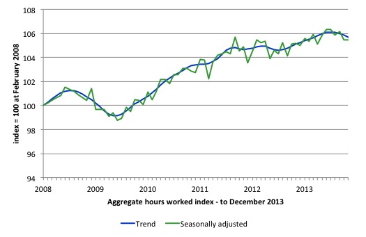
Aggregate monthly hours worked rose by 0.6 million hours (0.04 per cent) in seasonally adjusted terms. The rise in hours worked this month continues the trends over several months of growth being interspersed with contraction with the trend switching back and forth between positive and negative.
The following graph shows the trend and seasonally adjusted aggregate hours worked indexed to 100 at the peak in February 2008 (which was the low-point unemployment rate in the previous cycle). The rising trend which marked the early recovery courtesy of the fiscal stimulus is now clearly gone.
The months of hours contraction are larger than the positive months now and the trend is negative.
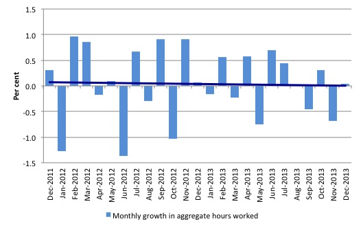
The next graph shows the monthly growth (in per cent) over the last 24 months. The dark linear line is a simple regression trend – which depicts a declining trend. You can see the pattern in working hours that is also portrayed in the employment graph – zig-zagging across the zero growth line.
The data supports the conclusion that the Australian labour market is performing badly and the current policy setting are not supporting growth. There needs to be a change in policy towards stimulus. Two years with no discernible upward trend is evidence of policy failure.
Conclusion
In general, we always have to be careful interpreting month to month movements given the way the Labour Force Survey is constructed and implemented.
Overall, today’s data shows that the Australian labour market remains stuck in a stagnant state with employment growth continuing to lag behind population growth. The trend is biased downwards now.
Despite the monthly variations we need to be cautious about, we have now had more than two years of weak-to-zero employment growth and deteriorating or suppressed participation. It is clear that the consistently weak employment growth relative to the underlying population growth is slowly but surely pushing the unemployment rate upwards.
The of labour wastage is now at least 13.4 per cent. Add to this the impacts of the falling participation rate over the last two years and the figure is well above 15 per cent.
The most striking aspect of a sad picture remains the appalling performance of the teenage labour market. Employment has collapsed for that cohort since 2008. I consider it a matter of policy urgency for the Government to introduce an employment guarantee to ensure we do not continue undermining our potential workforce.
The data certainly shows that the new government has to reverse the contractionary bias and that means only one thing – more fiscal stimulus is definitely needed.
It is time for the conservatives to abandon their free market/anti-government biases and do some public sector job creation, which will arrest the current decline and stimulate private sector activity and employment!
However, at least one politician will claim in the next week or so that we are near full employment and the government deficit needs to be cut. That is the appalling state that we find ourselves in.
That is enough for today!
(c) Copyright 2013 Bill Mitchell. All Rights Reserved.

There’s a lot I like in this post. Especially I don’t dispute the big picture that growth in employment has been very disappointing since 2008, nor that this outcome was foreseeable (and foreseen!). I’d probably put a little more blame on the RBA (what on earth did they think they were doing raising rates in 2010 – they should have been printing money and dropping it from helicopters at that stage!) and a little less on Treasury than you would, but that’s quibbling.
But in some of those charts – especially the “Employment Indexes from Peak” after recessions – there is no recognition of demography, which is more powerful and operates on slightly shorter timeframes than many think. After the 1983 and 1992 recessions the labour force grew quickly for purely demographic reasons. In this decade we should expect significant falls in the PR because, as I’ve commented before, this decade has the fastest rate of workforce aging Australia has, or probably will, ever experience. And the cohorts entering the labour force are a relative trickle now compared to, say, 1983.
Bill,
I would very much like it if you would include updates of the table you have at https://billmitchell.org/blog/?p=25654&cpage=1#comment-31626 in your Labour Force data updates. Please consider it. Thank you.
DD, I asked Matt Cowgill to explain this in more depth to me since his position seems to be that the falling participation rate is 100% the result of demographic factors – an ageing population. When I questioned his position in light of the fact that most of the fall in participation has been in the younger cohorts, he accused me of misrepresenting him. I think his argument is that the oldest cohorts are now making up a larger percentage of the working age population and this is affecting the participation rate more so than discouraged workers.
Here is a letter (along with original footnotes) that was published in some Canadian newspapers:
Re: Canada hit by unexpected rise in jobless rate, Dana Flavelle, Jan 10 2014
http://www.thestar.com/business/economy/2014/01/10/canada_hit_by_unexpected_rise_in_jobless_rate.html
If the Harper Conservatives were serious about job creation, they would not rely entirely on the whims of private sector hiring. In 1944, Canada’s unemployment rate dropped below 1 per cent because one out of every three adult males was engaged in military service and many private sector workers were fulfilling government contracts. As the British politician Tony Benn put it, “If you can have full employment by killing Germans, why can’t we have it by building hospitals, schools, recruiting nurses and teachers? If you can find money to kill people, you can find money to help people.”
In the 1970s the Liberal government experimented with direct job creation delivered through local organizations and citizen groups. The Local Initiatives Program successfully hired in areas such as arts and culture, recreation, tourism, research and protecting the environment. The federal government needs to renew these initiatives. With double-digit unemployment currently among youth, do we really want a generation of young people living without incomes, without job experience, and without an opportunity to contribute to society?
Larry Kazdan
Footnotes:
1. The Social Enterprise Sector Model for a Job Guarantee
http://neweconomicperspectives.org/2014/01/social-enterprise-sector-model-job-guarantee-u-s.html?utm_source=feedburner&utm_medium=feed&utm_campaign=Feed%3A+neweconomicperspectives%2FyMfv+%28New+Economic+Perspectives%29
By Pavlina R. Tcherneva
“It’s time to change the conversation from creating jobs for the jobless now, to creating jobs for the jobless always. The Job Guarantee provides the solution. I have explained elsewhere why neither the private sector nor the flawed bastard Keynesian pump-priming policies can get us there ……
2. Interview with Tony Benn
http://www.script-o-rama.com/movie_scripts/a1/sicko-script-transcript-michael-moore.html
Here is part of a post of Matt Cowgill’s from a couple of weeks ago……
“The participation rate reached an all-time peak in late 2010, well after the financial crisis, when unemployment was falling towards 5%. Since then participation has fallen and unemployment has risen. On the face of it, you might think that this suggests the labour market is weaker than the unemployment rate indicates. But you have to remember that much of the fall in participation here has been due to the effect of the ageing population, most notably the rapidly rising share of the adult population that is aged 65+.
When I calculate the participation rate holding the demographic shape of the population constant since late 2010, I find that all of the fall in participation up to mid-2013 was due to ageing, not due to a fall in participation within individual age groups. Over the past six months or so, the story has changed – most of the recent fall in participation has not been driven by ageing. The labour market has clearly hit a patch of cyclical weakness. I think this was largely caused (as I suggested earlier) by tight fiscal policy (at all levels of government) and an overvalued Aussie dollar.”
Dear derrida derider,
The RBA, like all central banks, cannot print money and dop it from helicopters. The Fed has not been doing this despite the popular belief it has. To print money and drop it from helicopters is the equivalent of central-government spending (the spending would ultimately be done by those lucky enough to catch the money falling from helicopters). Central banks do not conduct spending. At the central government level, only central governments have the power to spend money on real goods and services. Central banks can create money and buy government bonds, which is what the Fed has been doing, but that’s not spending on real goods and services, and is therefore not spending in the sense of ‘G’ in the identity: GDP = C + I + G + X – M.
By buying bonds, the Fed has engaged in financial asset swaps – swapping money for bonds. Holders of US Govt bonds have been swapping bonds for money. This has been commonly referred to by ignoramuses as a ‘stimulus’ to the US economy. It’s nothing of the sort, since the increase in money has not altered the quantity of net financial assets denominated in US dollars and has not made it any easier for US banks to lend and for the private sector to net save. In any case, banks will only lend more if they believe there are more credit-worthy customers, which is only likely if the US Govt spends US$85 billion per month on real goods and services (especially idle labour) instead of the Fed wasting its time spending US$85 billion per month on bonds.
Phil Lawn,
It’s true that central banks don’t spend money, on the other hand if government borrows and spends $X, and the CB then prints money and buys the relevant government bonds, then that comes the same thing as the government / central bank machine simply printing money and spending it, and/or cutting taxes.
Re the fact that QE does not affect the total of private sector net financial assets, that’s true. But it does make those assets a bit more liquid. I.e. cash is more liquid that government bonds. So there has to be a finite stimulatory effect I’d guess.