The Australian Bureau of Statistics (ABS) released the latest labour force data today (March 19,…
Australia – vacancy data undermines the deregulation lobby
Yesterday, the Australian Bureau of Statistics released the latest – International Trade in Goods and Services – data for November 2013 which told us that the national economy is slowing. We learned that while exports were aout steady, imports (particularly consumption goods) fell for the fourth consecutive month and capital and intermediate goods imports rose, which suggests that explanations relating to the switching of the commodities (mining) boom from the investment to export stage are not accurate. The data tells us that household incomes are being squeezed by rising unemployment which generally means that import spending will drop. The irony is that the trade deficit fell, which means that the drain on growth from the trade sector is now lower (that is, this is a stimulatory move) despite it being driven by sluggish growth. Today, the ABS released its – Job Vacancies – data for the November-quarter 2013 and it confirmed that the labour market continues to slide backwards in the face of subdued private spending and the national government’s penury. This is all in the context of conservatives coming out and slamming gay marriages, single mothers, women who seek abortions and the meagre number of labour market protections that remain in place. It is all about priorities I suppose. The current government is suggesting their priorities are to further the well-being of the well-to-do and chip away at what assistance is available for the disadvantaged Australians.
The continuing obsession among policy makers around the world is a combination of fiscal austerity and deregulation (particularly of labour markets), which they claim is the path to prosperity. I know these are just catch cries that aim to obfuscate the underlying intent which is to redistribute real income away from workers. The structural reform argument goes that growth can be engendered by deregulating the labour market to remove inefficiencies that create bottlenecks for growth even when fiscal austerity is slashing aggregate demand and killing growth. The 1994 OECD Jobs Study the provides the framework for this policy approach. The only problem is that it failed even before the crisis emerged. But with policymakers intent on slashing aggregate demand, which they know will kill growth, they have to offer something that they can pretend will generate growth. The structural reform agenda has zero credibility in the same way that fiscal austerity has zero credibility. The latest vacancy data from Australia continues to provide an evidential basis for rejecting both conservative agendas.
The highlights of today’s November-quarter 2013 (seasonally adjusted) data are:
- Over the year to the November-quarter 2013, job vacancies have fallen by 26.2 thousand or 15.2 per cent.
- Over the last quarter, job vacancies have fallen by 2.5 thousand or 1.7 per cent.
- The fall from the most recent peak (November-quarter 2010) has been 52.6 thousand or 27.2 per cent. Interestingly, the most recent peak in labour force participation was also the November-quarter 2010 and participation has declined steadily since then as job opportunities have vanished).
- In the last year, vacancies in the private sector fell by 23.8 thousand or 15.4 per cent, while vacancies in the Public sector fell by 2.4 thousand a decline of 19.4 per cent.
- The unemployment-vacancy ratio (a measure of the strength of the labour market) was 3.6 in May 2011 and has risen to 5.1 in the November-quarter 2013, a sign of a deteriorating labour market overall. This is higher now than at any time during the crisis.
I last wrote about this topic in the blog – Latest Australian vacancy data – its all down to deficient demand.
Other related blogs include – Serial liars who stand for nothing that is worth supporting and Labour market deregulation will not reduce unemployment and The OECD is at it again and Extending unemployment benefits … an omen and Nobel prize – hardly noble.
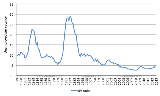
The Unemployment-Vacancies ratio in Australia looks like this – for the period May 1979 to November 2013. You can see the impacts of the two major recessions in this period (1982 and 1991).
The UV ratio is now of 5.1 – that is, around 5.1 unemployed persons per unfilled job – and it has been rising steadily since the Australian government went into austerity mode in its obsessive (failed) pursuit of a fiscal surplus. While that pursuit was in vain it undermined aggregate demand and the labour market has weakened considerably ever since.
The current UV ratio is low relative to the peak of May 1992 when the ratio was 29, but it remains the case that there are many more people unemployed competing for scarce jobs than there were before the crisis started to impact.
Further, underemployment is now much higher than in 1982 (when it was largely non-existent) and 1991 (when it started to rise to current levels) and so the unemployed now have to compete for jobs with new entrants, other unemployed and the near 941 thousand underemployed (7.5 per cent of the labour force).
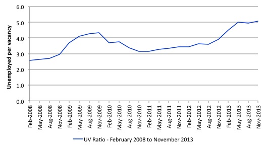
The next graph zooms in on the most recent period – February 2008 (which was the low-point unemployment rate in the last cycle) to May 2013 (the latest data).
The recovery that was evident in late 2009 as the fiscal stimulus started to impact has now been lost. Both sides of the hump that peak in the August-2009 quarter tell you are story about the effectiveness of fiscal interventions.
Before the stimulus package was introduced, the Australian labour market was heading into crisis as the UV rose and the economy headed into recession.
After the 2009 peak, the fiscal stimulus started to support the economic recovery and the UV ratio fell..
Since then, with no structural changes obvious in this period, it is hard to argue that the rising ratio is the result of anything other than a declining aggregate demand situation – that is, a lack of job creation.
Unemployment dancing to labour demand
You will increasingly hear in the coming months policy makers and business lobbyists calling for more structural reform in the labour market. The extreme versions will claim that growth is being constrained by the labour market – thus diverting attention from the fact that firms only employ if they can sell the production that is created.
That narrative is already starting as a result of the election of the conservatives in September 2013. There now appears to be carte blanche for the crazies to come out and advocate privatisation of the last few things in public hands (for example, Australia Post) and other public assets.
Accompanying that call is the usual call to allow “bosses and employees choice” (that is the way they put it), which just means scrape away the protections that workers still enjoy – the declining number that is – and give the bosses an open field to extract more work effort, pay less, offer less secure work and give the workers no alternatives.
This diversionary tactic, however, attempts to argue that mass unemployment is a personal state (individual indolence, poor job search activity etc).
Despite all the evidence to the contrary, the neo-liberals continue to wheel out the worn-out notion that unemployment is a result of supply-side constraints that have to be eliminated through deregulation and harsher work tests including denial of benefits to people – to wit the current debate in the US Congress over the elimination of federal income support for long-term unemployed.
The reality is that unemployment is typically an aggregate demand phenomenon – that is, it reflects a systemic failure to create enough jobs as a result of deficient aggregate demand.
The Australian Government’s position is standard supply-side, which has been exposed over several decades to be a false depiction of how unemployment occurs.
It is difficult to mount a search-based explanation for mass unemployment when there are not enough jobs being generated relative to labour supply.
It is impossible to mount a structural explanation (for example, excessive unemployment benefits) when there has been no change in structure over the time unemployment has risen.
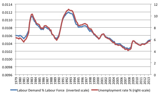
In the following graph, we show the unemployment rate is plotted on the right-hand scale against the sum of employment and vacancies (as a percentage of the labour force) as a measure of labour demand on the left-hand scale (inverted to show the correspondence between the two series). The data is from the May-quarter 1979 (the longest coherent vacancies series that is available) to the November-quarter 2013 (that is, the data incorporates the latest vacancy information released today).
The correspondence between the two series is striking and the variation in the unemployment rate (turning points etc) is closely associated with the evolution of demand.
If unemployment rates were the result of supply-changes (such as preferences for work, or welfare benefits etc) then this close correspondence would not occur. The fact is that unemployment is the driven by insufficient demand for labour, which, in turn, is driven by aggregate demand deficiencies.
You can see that labour demand is now falling again – after the effects of the fiscal stimulus through 2010-11 have started to wane upon its withdrawal.
The late Franco Modigliani presented similar graphs for France, Germany, and the United Kingdom, which shows that as job availability declines the unemployment rate rises, with the concomitant outcomes that the search process lengthens as does the average duration of unemployment. Modigliani (2000: 5) concluded:
Everywhere unemployment has risen because of a large shrinkage in the number of positions needed to satisfy existing demand.
Reference: Modigliani, Franco (2000) ‘Europe’s Economic Problems’, Carpe Oeconomiam Papers in Economics, 3rd Monetary and Finance Lecture, Freiburg, April 6.
Where data is available, you could draw similar graphs for most nations.
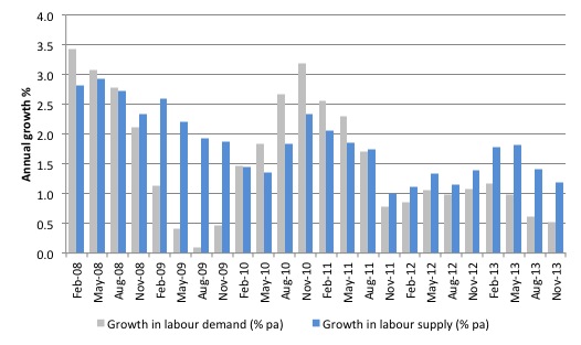
The next graph shows the growth in labour demand and labour supply (measured as the growth in the labour force) from February 2008 to May 2013 (the current cycle). The impact of the fiscal stimulus in 2010 and into 2011 is clear as is the withdrawal of the same and the slowdown in investment in mining in more recent quarters.
The supply-side depicted underestimates the actual available labour because it ignores the fact that participation has declined sharply in recent years.
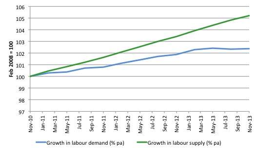
The next graph shows the evolution of labour demand (as defined above) and labour supply (standardised at the November 2010 peak labour force participation rate). In November 2010, the labour force participation rate was 65.8 per cent and it is now 64.8 per cent. That amounts to some 192 thousand workers who have left the labour force over the time, most of them due to the lack of job opportunities.
The calculation for the supply index is simple – take the actual working age population in each period after November 2010 and find out what the labour force would have been had the participation rate remained at its November 2010 peak. Then express that potential labour force in index terms (the green line).
Its linear nature reflects only the growth in the working age population with the cyclical shifts in participation eliminated.
The increase in the gap between labour demand and labour supply relative to the gap in November 2010 is 762 thousand as at November 2013. The actual gap that existed in November 2010 was approximately 415 thousand.
Also note the demand side measures persons employed and unfilled vacancies. If we expressed employment in Full-Time Equivalent terms the picture would be far worse given the rise in underemployment. Remember, to be counted as employed one only has to work one hour or more a week.
Phase diagrams
To examine the demand versus supply issue further, we can examine some phase diagrams.
I first started using phase analysis in this 2001 paper – Exploring labour market shocks in Australia, Japan and the USA, which has since been published but you can get the free working paper version at the link provided. You will find reference in that paper to other relevant material if you are interested.
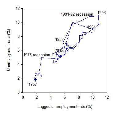
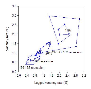
The following two phase diagrams show the current values of the respective time series plotted on the y-axis against the lagged value of the same series on the x-axis. The annual data is from 1966 to 2013 (so the graphs are for 1967 to 2012 given the lagged values).
These scatter plots are helpful in four distinct ways:
First, the charts provide information on whether cycles are present in the data.
Second, the presence of “attractor points” can be determined. The points might loosely be construed as the middle of each of the traced-out ellipses.
Third, the magnitude of the cycles can be inferred by the size of the cyclical ellipses around the attractor points.
Fourth, the persistence (strength) of the attractor point can be determined by examining the extent to which it disciplines the cyclical observations following a shock. Weak attractors will not dominate a shock and the relationship will shift until a new attractor point exerts itself.
The first graph shows the phase diagram for the Australian unemployment rate while the second graph shows the phase diagram for the vacancy rate.
Australia shifted its attractor in the 1974-76 period and the two subsequent recessions have oscillated around this higher point with varying cyclical magnitude. The explanation for Australia’s persistently high unemployment rate revolves around the factors that generated the shift.
It is also clear that the economy takes several years to recover from a large negative shock even if the attractor remains constant. Japan, also shifted its attractor in the period following the first oil shock. The extent of the shift compared to Australia was small. There was also a relatively speedier resolution to the 1980s downturn compared to Australia.
If you look carefully you can see that the 2012-2013 movement is outwards.
The next graph shows phase diagram for the vacancy rate. Once again, the 1974-75 disturbances in the unemployment rate attractor in Australia also promoted a shift in the vacancy rate attractor, although in this case the movement was downwards.
If you look carefully you can see that the 2012-2013 movement is inwards (towards the origin).
The neo-liberal supply-side analysis interprets the unemployment shift as indicative of a decline in labour market efficiency. The cure – structural adjustment aka labour market deregulation.
But using the same logic, we would interpret the inward shift in the vacancy relationship as a sign of increasing efficiency in the process that matches labour supply and labour demand (less unfilled vacancies are present at any time).
Clearly, both states cannot hold. The unemployment behaviour cannot be indicating a deteriorating structural efficiency while the vacancy relationship is depicting the opposite.
A consistent interpretation for both movements can be found in the view that the Australian economy has been demand constrained as a result of a regime shift in government policy in the mid-1970s. That is, the increasing dominance of neo-liberal and fiscal austerity. The same findings can be found for other nations with the same explanation.
The rapid rise in unemployment in 1974 was so large that subsequent (lower) growth with on-going labour force and productivity growth could not reverse the stockpile of unemployed.
Whatever endogenous supply effects that may have occurred in skill atrophy and work attitudes were not causal but reactive.
The phase diagram analysis suggests that to restore full employment, the economy needs a major positive shock of a sufficient magnitude to shift the current attractor point downwards.
It is almost definite from the earlier analysis and related empirical work reported in my 2008 book with Joan Muysken – Full Employment abandoned – that this shock has to be aggregate and focused on the demand side.
That is, large-scale job creation is required.
Conclusion
The latest vacancy data from the ABS is consistent with the view that the Australian labour market is deteriorating as a result of a slowdown in aggregate demand translating into a decline in labour demand.
The same analytical framework could be applied to most advanced nations right now with similar conclusions.
The data is damaging for those who consider the mass unemployment to be a problem that can only be addressed via structural reform – cutting job protection, wages etc.
That sort of agenda will clearly further undermine the living standards and job security of workers already damaged by persistently high labour underutilisation (unemployment, underemployment and hidden unemployment).
The deregulation attempts will reinforce the damage that fiscal austerity is doing in the countries with high unemployment.
The problem for the structural reform lobby is that like the arguments used to justify fiscal austerity, there is no credible evidence available to support claims that labour market deregulation increases employment, real wages, and productivity.
While there have been a number of research articles published in self-serving mainstream journals, supposedly proving that unemployment support reduces employment by undermining the incentives of the jobless to search for work, the reality is that the evidence is deeply flawed and inconsequential.
The literature is replete with such datasets, spurious techniques and other niceties that the mainstream researchers use to cheat on their findings or mislead the reader as to what is actually being demonstrated.
The most sustainable argument that can be maintained is that unemployment is the result of a failure of aggregate demand to generate enough economic activity and employment growth.
Tomorrow we are back on the Europe case!
That is enough for today!
(c) Copyright 2014 Bill Mitchell. All Rights Reserved.
Bill, I recreated your graph of unemployment vs labor demand for the U.S. using FRED data and saw a funny divergence that seems to start at just about the same time that the last recession was officially over. Here’s my graph. Any idea what might account for this? Is this some artifact of the data or something real? This would seem to indicate that there are job openings that are not being filled for some reason.
I always found that people who lose a game of musical chairs are best assisted by having them train to run much faster. Although, no matter how fast they can run, a ratio of 5:1 people:chairs means that only the most vicious runners will make the cut. I can’t seem to figure out why they don’t all just run faster!!!
Dear Paul Kreuger
Your graph is very interesting. How did you compute the labour demand side? (that is, which series?).
The divergence could be to do with hoarding rather than job openings that are not being filled. The JOLTS data from the BLS certainly doesn’t suggest any major change that would be required to produce that result.
best wishes
bill
Is the problem that repressed consumption in China together with an abundance of underpaid employment in China (or our external sector as a whole) is the offsetting factor to our unemployment causing reduced demand through savings/refusal to gear up to consume and the paradox of thrift?
The area where I have difficulty is in whether in a relatively open economy like Australia’s in an era of globalisation and multinationals, the mercantilist policies of other countries must impact on our employment. I feel that they must. If we provide additional income to the households with most propensity to consume, it leaks offshore as that is where the production of most durables take place. If we use deficits to fund additional demand, eventually we sell the assets off unless the external sector is prepared to buy more of or pay more for our goods. But how do we attract the investment to produce more of what the world wants, other than merely being the world’s quarry.
It seems to me that ultimately, the world doesn’t want to invest in/lend to a country like Greece that let’s itself get too out of kilter with the norms of the mercantilist countries that already have large manufacturing sectors and repressed consumption.
If Abbott follows the demands from business for labour market reform then any slowdown will be met with interst rate cuts from RBA because government won’t stimulate as maintaining employment allows the labour market to hold its ground. Unemployment on the other hand increases the power of the employers and leads to destruction of unions. This would be the path to ZIRP, QE and stock market rises. place your bets!
Bill, the labor demand was calculated as (Labor Force / (Job Vacancies + Employment Level)) where:
Labor Force = Civilian Labor Force (CLF16OV), Monthly, Seasonally Adjusted, 1948-01-01 to 2013-11-01
Job Vacancies = Total Unfilled Job Vacancies for the United States (LMJVTTUVUSM647S), Monthly, Seasonally Adjusted, 2000-12-01 to 2013-09-01
Employment Level: Employment Level (LNU02000000), Monthly, Not Seasonally Adjusted, 1948-01-01 to 2013-11-01
I realized that the employment level was not seasonally adjusted as the other series were, but I couldn’t find a comparable seasonally adjusted series over the same time frame. I din’t think that would result in this sort of discrepancy over a multi-year period.
I read somewhere about job vacancies that have been posted but left intentionally unfilled, but I don’t understand what the motivation for that might be. Is that what you meant by job hoarding?
Bill, I just had another thought about what might have caused the divergence I saw in my graph. I am a former corp VP (retired for 5+ years). At the time I left, there was a growing movement to have a continuous turnover in employees; replacing approximately the bottom 20% each year after a force ranking of all employees by the value of their contributions. To do that you need to post for “openings” that you don’t really have. The idea is to find better new employees to replace those you expect to let go (or effectively force to leave by not giving them any incentive to stay). During the recession, most companies were concentrating on improving productivity and doing more of this sort of “trading up” might have become more commonplace, resulting in a surplus of posted openings above and beyond the actual demand. It’s a nice story, but I’m not sure where you would find data to support it.