The recent extreme weather in the northern hemisphere, the twin monster tropical storms in Japan,…
A successful degrowth strategy will require a massive redistribution of income and wealth towards the poorest
It is true that all big cities have areas of poverty that is visible from the streets. But I am always a bit shocked when I travel to London, where I am currently working, because the inequality is very obvious. As I work more on the degrowth, decolonisation project that I am currently involved in, one thing becomes paramount. An overwhelming proportion of the total fossil fuel energy usage is due to the consumption of the wealthiest households. And to dramatically reduce our ecological footprint will require dramatically reducing the capacity of the top end of the income and wealth distributions to consume energy. However, all the trends are moving against that requirement. Here are some notes on that topic.
The March 2023 edition of the academic journal Ecological Economics (Vol 208) published an article – Social outcomes of energy use in the United Kingdom: Household energy footprints and their links to well-being – written by several academic researchers (mostly affiliated with Leeds University).
The motivation was obvious – “Current energy consumption is too high to maintain global warming within 1.5 degrees without resorting to massive negative emissions”.
The culprit was “overconsumption”, particularly in the ‘Global North’, which according to Wikipedia article – Global North and Global South – “broadly comprises Northern America and Europe, Israel, Japan, South Korea, Australia, and New Zealand” – meaning the North-South divide is not based on latitude.
The Global North is code for wealthier nations that have access to best-practice technology.
The study starts with the observation that:
We know that energy use and carbon emissions associated with it are highly unequally distributed, with the top 10% of income earners (mostly in the Global North) responsible for 49% of all carbon dioxide emissions …
There is a mass of credible research evidence that supports that contention.
We have known that for a long time.
On December 2, 2025, Oxfam published a Media Briefing – Extreme Carbon Inequality – which found that:
Climate change is inextricably linked to economic inequality: it is a crisis that is driven by the greenhouse gas emissions of the ‘haves’ that hits the ‘have-nots’ the hardest …
… the scale of this inequality suggest that the poorest half of the global population – around 3.5 billion people – are responsible for only around 10% of total global emissions attributed to individual consumption …
The average footprint of the richest 1% of people globally could be 175 times that of the poorest 10% …
So as stark as those estimates are, they also tell us how challenging a degrowth strategy will be to implement given that it requires significantly reduced energy usage, which, in turn, means that policy action must be targetted towards the high ends of the wealth and income distributions in the wealthier nations.
The Ecological Economics article cited above sought to investigate the distributional characteristics of energy usage within the UK.
I won’t discuss the technical aspects of the study which are interesting and there are innovative ways presented to overcome data limitations.
Their research linked energy use to “needs satisfaction and well-being”, which provides another dimension to the inequality discussion.
They found:
1. “There is a nine-fold difference in energy use between the lowest and top EF decile” (EF is the energy footprint).
2. Much of the energy usage differences by income cohort arise from differential rates of private transportation usage. The lower deciles consume most of their energy in their homes, while the higher deciles consume a lot of international travel in addition to having larger homes.
3. “The bottom 10% of energy users contribute only 2% to the total energy use, and only 5% of the top 10% users’ usage. The bottom half of energy users are responsible for just one-fifth of total energy use. This is less than the share of the top 10% of energy users, which is over a one third of total energy use.”
4. In terms of well-being and energy use, the poorest quickly become better off as they consume more energy but the gains taper off as energy usage increases.
5. “some households use so little energy that they cannot achieve high well-being, while others use over ten times more” – and the wealthier families well-being could be achieved at much lower levels of energy consumption.
6. “high well-being is possible to achieve … [with energy consumption that] … is less than the national average energy footprint (EF)” = meaning that excess energy usage is not essential to having high levels of well-being despite perceptions.
The practical policy problem is to get governments to start dealing with the inequality as an essential step in a degrowth trajectory.
Of course, my confidence level on achieving that requirement is very low.
The neoliberal period ended the several decades of inequality reduction that had been achieved through social democratic government policy aimed at increasing transfers, providing cheap and high quality public services, expanding public education and health, and ensuring wages growth was able to reflect productivity growth (meaning real wages grew considerably).
The neoliberal takeover of governments sought to reverse or retrench these initiatives to allow the share that capital gets out of national income to rise again.
There are several dimensions to this concerted campaign to end social democratic inequality reduction.
I have been examining the UK data while I am here in London (as background to various meetings etc) and it is clear that government policy has prioritised capital over labour.
The British Office of National Statistics (ONS) data – Labour share of income: Whole economy SA: percentage: UK (published February 17, 2026) – shows that in the third-quarter 1973, the labour share in income for the UK was 71.9 per cent.
It now stands at 59.7 per cent and had fallen to as low as 53.3 per cent (December-quarter, 1996).
The profit share has risen commensurately.
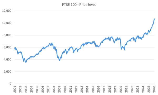
Consider the movements in the Financial Times Stock Exchange Index (FTSE 100) – which is a market index of the 100 largest companies traded on the London Stock Exchange.
When it was launched on January 3, 1984, it had a value of 1000.
The following graph tracks the monthly index levels since February 2000.
Aside from the major cyclical events shown (GFC, Pandemic), the FTSE 100 has been on an ever increasing journey upwards.
What is the average return on the FTSE 100?
The data shows (Source):
The total shareholder return is arguably the superior metric, as it counts all returns from investing in the FTSE 100. In the 20 years from 2003 to 2023, FTSE 100 total shareholder returns came in at 241%, generating an average return of 6.3% on an annualised basis, including dividends.
Across the Atlantic, the S&P 500, which is an index tracking the largest 500 corporations in the US, delivered an “average of 10.26% per year since its modern inception in 1957 through to the end of 2023.”
What about real returns (after accounting for inflation)?
The data shows that:
If you consider the annualised 6.3% return over the past 20 years, and then subtract the average inflation rate of 2.8% over the same time frame, then you get an average real annualised return of 3.5%.
Now compare that to real wages growth over the same period in the UK?
The ONS dataset – EARN01: Average weekly earnings – provides a table of real average weekly earnings.
The annual average growth rate in regular pay between January 2023 and December 2025 is 0.64 per cent per annum.
In other words, hardly anything at all.
If you go back and look at the FTSE 100 graph, you will observe a dramatic increase since about October 2020.
The average annual increase in nominal terms of the FTSE 100 between October 2021 and January 2026 was 7.94 per cent, compared to an average annual inflation rate of 5.5 per cent over the same period.
Thus a real return of 2.5 per cent.
Over the same period, real average weekly earnings rose by 0.27 per cent per annum.
And while the share market continues to boom, the UK Guardian article (February 17, 2026) – UK unemployment rate hits five-year high of 5.2% as wage growth cools – tells a different story for workers.
And the latest data on job vacancies in the UK shows that “The number of job vacancies in the UK has tumbled to the lowest level in five years” and “Graduate jobs fell below 10,000 for the first time since Adzuna began tracking this in 2016” (Source).
The latest ONS – Labour market overview, UK: February 2026 (published February 17, 2026) – also shows that the British labour market is providing declining opportunities that satisfy the preferences of workers.
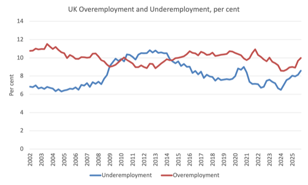
The following graph shows the rates of underemployment and overemployment in the UK since the March-quarter 2002 to the December-quarter 2025.
Underemployment captures workers who want to work more hours but the labour market is too weak to offer them.
Overemployment captures workers who are working too many hours per week, and this is often due to punitive working conditions being imposed.
The underemployment rate was 8.6 per cent in the December-quarter 2025 and the overemployment rate was 10 per cent.
So 18.6 per cent of those employed were not happy with the hours they were currently being forced by the ‘market conditions’ to work.
In the March-quarter 2024, that proportion was 15.1 per cent.
If we combine the underemployment with the recent official unemployment rate of 5.2 per cent, we get a broad underutilisation rate of 13.8 per cent, which is the slack that is available to work more.
And put that in the context of the most recent ONS data (published February 20, 2026) – Public sector finances, UK: January 2026 – which revealed that:
Initial estimates show that the public sector recorded a £30.4 billion surplus in January 2026, £15.9 billion higher than, or double that of January 2025, and £6.3 billion above the Office for Budget Responsibility’s November 2025 forecast; the highest surplus in any month since records began in 1993 …
The government is still in deficit for the 12 months but it is contracting quickly.
So increasing labour market slack, flat real wages growth (heading south), booming share market and corporate profits – and that means income and wealth inequality is rising.
And the implications for reducing energy usage are clear.
Also clear is what is required for a degrowth strategy to work.
Conclusion
It is obvious that a successful degrowth strategy will require a massive redistribution of income and wealth.
That means dismantling the neoliberal institutions that have overseen a massive shift towards higher income and wealth inequality.
How that can happen is a topic for further posts.
But it is unlikely to be achieved within a capitalist system, which makes the task but tougher indeed.
London event this week – Wednesday, February 25, 2026
I am speaking at the launch of the new Modern Monetary Theory (MMT) focused group in the UK – MMTUK Policy Research Group – on February 25, 2026 in London. I hope to see as many of the MMT crowd as possible at the launch.
The event is open to the public but the capacity of the venue is very limited.

Please follow this – LINK for tickets (which are free).
Given the capacity size of the venue, please do not register for a ticket if you are at all uncertain of your intention to intend
The event details are:
MMTUK Launch Event: A Job Guarantee for Britain
Start: Wednesday, February 25, 2026 19:00
End: Wednesday, February 25, 2026 to 21:00
Location: Friends Meeting House, 173-177 Euston Road, London, NW1 2BJ GB
Host Contact Info: contact@mmtuk.org
The venue is right opposite Euston Station, on Euston Road.
I hope to catch up with all our MMT friends in London during this visit.
The MMTUK Policy Research Group is a very promising development and I hope they garner widespread support.
That is enough for today!
(c) Copyright 2026 William Mitchell. All Rights Reserved.
Bill your view on raising child benefit to living wage? End child poverty. JG unless exempt for age and infirmity includes children too.
The poverty in London has long appalled Australians who visit there.
Historian Clare Wright (in You Daughters of Freedom) writes how it appalled Australian feminists who went there over 100 years ago to help British women win the vote.
Kev Carmody wrote about it in his song ‘Images of London.’
https://www.kevcarmody.com.au/images-illusions
Is the UK event being livestreamed, Bill?
We only need to walk though any large shopping centre / mall to see just how unnecessary and detrimental to the planet most businesses have become.
As a species I don’t believe we are even capable anymore of living in a way that isn’t detrimental to the future of the environment/planet.
Most of us have succumbed to the convenience of modern technologies and the notion of ever giving them up would not enter many minds.
Can Enlightenment-style rationalism overcome sociobiological determinants of behavior?
Dear Adam (at 2026/02/24 at 10:15 pm)
Sorry, I don’t think they are livestreaming it. I will find out in an hour or so and if I am wrong I will notify readers here.
best wishes
bill