The Australian Bureau of Statistics (ABS) released the latest labour force data today (APRIL 16,…
Australian labour market continues to weaken
Today’s release by the Australian Bureau of Statistics (ABS) of the – Labour Force data – for July 2013 continues to signals a weakening labour market. Employment growth was negative with both full-time employment and part-time employment contracting. Full-time employment has contracted for the last three months. Over the last six months, there have been only 29.9 thousand (net) jobs created in the Australian economy comprising an overall loss of 18 thousand full-time jobs and 47.9 thousand part-time jobs. Unemployment fell by 5,700 but only because the labour force contracted with a 0.2 points fall in the participation rate. In other words, hidden unemployment rose as more people gave up looking for work in an environment where job opportunities are shrinking rapidly. This data signals an urgent need for fiscal stimulus to reverse the negative trend. Unfortunately, with both sides of politics locked into an austerity mindset the situation is likely to deteriorate further.
The summary ABS Labour Force (seasonally adjusted) estimates for July 2013 are:
- Employment decreased 10,200 (0.1 per cent) with full-time employment falling by 6,700 and part-time employment falling by 3,500.
- Unemployment decreased by 5,700 (0.8 per cent) to 705,400 but only because the labour force shrank on the back of a declining participation rate
- The official unemployment rate was steady at 5.7 per cent.
- The participation rate fell by 0.2 points to 65.1 per cent still well below its November 2010 peak (recent) of 65.9 per cent.
- Aggregate monthly hours worked increased by 7.9 million hours (0.48 per cent).
- The quarterly ABS broad labour underutilisation estimate (the sum of unemployment and underemployment) in the May-quarter was 12.9 per cent. This will now be well over 13 per cent as a result of today’s data. In the May-quarter, underemployment was estimated to be 7.4 per cent or 908.6 thousand persons.
Employment growth – negative
The July 2013 data shows that employment contracted. Employment decreased 10,200 (0.1 per cent) with full-time employment falling by 6,700 and part-time employment falling by 3,500.
Today’s data reasserts the message that the labour market data is switching back and forth regularly between negative employment growth and positive growth spikes. This monthly behaviour is producing a weak positive trend, although not too much should be read into one month’s results.
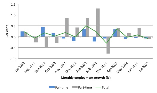
There have been considerable fluctuations in the full-time/part-time growth over the last year with regular crossings of the zero growth line.
The following graph shows the month by month growth in full-time (blue columns), part-time (grey columns) and total employment (green line) for the 12 months to July 2013 using seasonally adjusted data.
Today’s results just repeat the topsy-turvy nature of the data over the period shown.
While full-time and part-time employment growth are fluctuating around the zero line, total employment growth is still well below the growth that was boosted by the fiscal-stimulus in the middle of 2010.
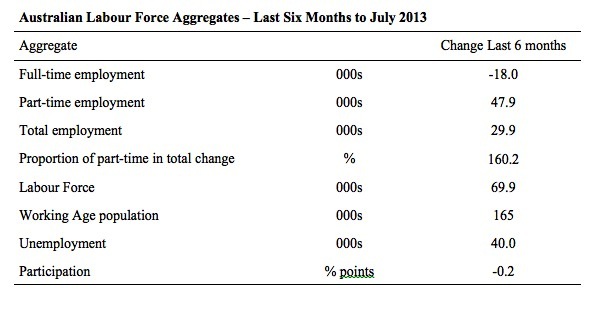
The following table provides an accounting summary of the labour market performance over the last six months. The monthly data is highly variable so this Table provides a longer view which allows for a better assessment of the trends. WAP is working age population (above 15 year olds).
The conclusion – overall a miserable 29.9 thousand jobs (net) have been created in Australia over the last six months (heavily influenced by the February and April 2013 results). There has been no net employment growth over the last two months.
Over the last six months, full-time employment has fallen by 18 thousand jobs (net) while part-time work has grown by 47.9 thousand jobs.
Over the last 6 months, a staggering 160.2 per cent of the net employment opportunities created have been part-time, which explains the sharp rise in underemployment (see below).
The Working Age Population has risen by 165 thousand in the same period while the labour force rose by 69.9 thousand. The weak employment growth has thus not been able to keep pace with the underlying population growth and unemployment has risen as a result (by 40 thousand).
The rise in unemployment would have been much worse had the participation rate not dropped by -0.2 points (see below for accounting of that impact).
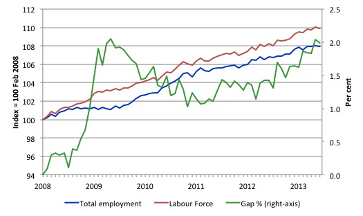
To put the recent data in perspective, the following graph shows the movement in the labour force and total employment since the low-point unemployment rate month in the last cycle (February 2008) to July 2013. The two series are indexed to 100 at that month. The green line (right-axis) is the gap (plotted against the right-axis) between the two aggregates and measures the change in the unemployment rate since the low-point of the last cycle (when it stood at 4 per cent).
You can see that the labour force index has largely levelled off and now falling and the divergence between it and employment growth has been relatively steady over the last several months with this month showing some improvement.
The Gap series gives you a good impression of the asymmetry in unemployment rate responses even when the economy experiences a mild downturn (such as the case in Australia). The unemployment rate jumps quickly but declines slowly.
It also highlights the fact that the recovery is still not strong enough to bring the unemployment rate back down to its pre-crisis low. You can see clearly that the unemployment rate fell in late 2009 and then has hovered at the same level for some months before rising again over the last several months.
The Gap shows that the labour market is still a long way from recovering from the financial crisis that hit in early 2008. There hasn’t been much progress since January 2010, when the fiscal stimulus started to run out.
In fact, in July 2013, the Gap reached the levels that appeared in May and June 2009 when the Australian economy was enduring the impact of the crisis. All the gains made since then have gone.
Teenage labour market – remains in a parlous state
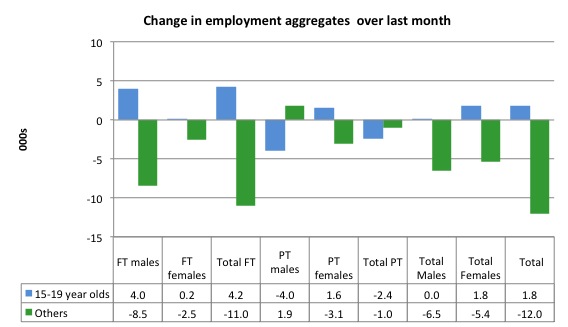
Full-time employment for teenagers rose by 4.2 thousand in July 2013 while part-time employment fell by 2.4 thousand. Overall, teenage employment rose by 1.8 thousand (net) jobs, which defied the overall deterioration but just means that over the last 12 months there has been no net teenage employment generation.
The following graph shows the distribution of net employment creation in the last month by full-time/part-time status and age/gender category (15-19 year olds and the rest)
If you take a longer view you see how poor the situation is.
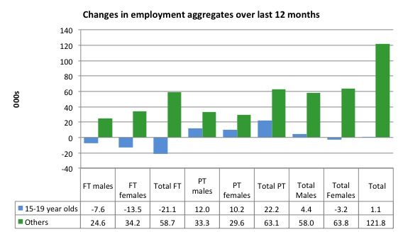
Over the last 12 months, teenagers have gained only 1,100 jobs while the rest of the labour force have gained 121.8 thousand net jobs. Remember that the overall result represents a very poor annual growth in employment.
Even more disturbing is the attrition of full-time jobs among teenagers – losing 21.1 thousand over the last year.
The teenage segment of the labour market is being particularly dragged down by the sluggish employment growth, which is hardly surprising given that the least experienced and/or most disadvantaged (those with disabilities etc) are rationed to the back of the queue by the employers.
The following graph shows the change in aggregates over the last 12 months.
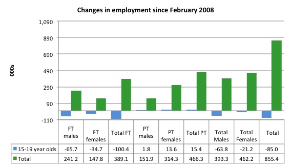
To further emphasise the plight of our teenagers I compiled the following graph that extends the time period from the February 2008, which was the month when the unemployment rate was at its low point in the last cycle, to the present month (July 2013). So it includes the period of downturn and then the “recovery” period. Note the change in vertical scale compared to the previous two graphs.
Since February 2008, there have been 855.4 thousand (net) jobs added to the Australian economy but teenagers have lost a staggering 85 thousand over the same period. It is even more stark when you consider that 100.4 thousand full-time teenager jobs have been lost in net terms.
Even in the traditionally, concentrated teenage segment – part-time employment – there have been only 15.4 thousand jobs (net) gained even though overall some 466.3 thousand part-time jobs have been added.
Overall, the total employment increase is modest. Further, around 54 per cent of the total (net) jobs added since February 2008 have been part-time, which raises questions about the quality of work that is being generated overall.
Overall, the performance of the teenage labour market remains poor. It doesn’t rate much priority in the policy debate, which is surprising given that this is our future workforce in an ageing population. Future productivity growth will determine whether the ageing population enjoys a higher standard of living than now or goes backwards.
The longer-run consequences of this teenage “lock out” will be very damaging.
The problem is that in the modest growth period that the Australian labour market enjoyed as a result of the fiscal stimulus and mining investment, teenagers failed to participate in the gains – they went backwards.
Now, with the economy entering a new period of slowdown, these losses will be added too given that teenagers are among the first in line to be shown the door by employers seeking to reduce staff levels in the face of declining aggregate sales.
The Government’s response is to push this cohort into endless training initiatives (supply-side approach) without significant benefits. The research shows overwhelmingly that job-specific skills development should be done within a paid-work environment.
I would recommend that the Australian government announce a major public sector job creation program aimed at employing, in the first instance, all the unemployed 15-19 year olds.
It is clear that the Australian labour market continues to fail our 15-19 year olds. At a time when we keep emphasising the future challenges facing the nation in terms of an ageing population and rising dependency ratios the economy still fails to provide enough work (and on-the-job experience) for our teenagers who are our future workforce.
Unemployment
The unemployment rate was steady on 5.7 per cent in July 2013 with official unemployment falling by 5,700 to 705,400. The slight drop in official unemployment in the face of contracting employment was due to the sharp drop in the participation rate (see analysis below).
Overall, the labour market still has significant excess capacity available in most areas and what growth there is is not making any major inroads into the idle pools of labour.
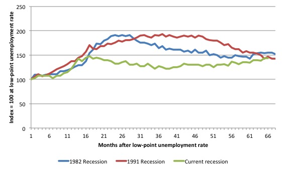
The following graph updates my 3-recessions graph which depicts how quickly the unemployment rose in Australia during each of the three major recessions in recent history: 1982, 1991 and 2009 (the latter to capture the 2008-2010 episode). The unemployment rate was indexed at 100 at its lowest rate before the recession in each case (January 1981; January 1989; April 2008, respectively) and then indexed to that base for each of the months as the recession unfolded.
I have plotted the 3 episodes for 68 months after the low-point unemployment rate was reached in each cycle. The current episode is now in its 66th month. For 1991, the peak unemployment which was achieved some 38 months after the downturn began and the resulting recovery was painfully slow. While the 1982 recession was severe the economy and the labour market was recovering by the 26th month. The pace of recovery for the 1982 once it began was faster than the recovery in the current period.
It is significant that the current situation while significantly less severe than the previous recessions is dragging on which is a reflection of the lack of private spending growth and declining public spending growth.
Moreover, the current episode is also different to the last two major recessions in the sense that the recovery is over and the economy is deteriorating again.
The graph provides a graphical depiction of the speed at which the recession unfolded (which tells you something about each episode) and the length of time that the labour market deteriorated (expressed in terms of the unemployment rate).
From the start of the downturn to the 66-month point (to July 2013), the official unemployment rate has risen from a base index value of 100 to a value 144.4 – peaking at 148 after 17 months. After falling steadily as the fiscal stimulus pushed growth along (it reached 122.8 after 35 months – in January 2010), it has been slowly trending up for some months now. Unlike the other episodes, the current trend, at this stage of the cycle, is upwards.
The gains that emerged in the recovery as a result of the fiscal stimulus in 2009-10 have now been lost.
At 66 months, 1982 index stood at 155.6 and was falling while the 1991 index was at 146.6 and was also falling. It is clear that at an equivalent point in the “recovery cycle” the current period is more sluggish than our recent two major downturns.
It now appears that the recoveries are converging, which tells us that the current policy has failed to take advantage of the fact that the latest economic downturn was much more mild than the previous recessions. In other words, the policy failure is locking the economy into a higher unemployment rate than is desirable and otherwise attainable.
Note that these are index numbers and only tell us about the speed of decay rather than levels of unemployment. Clearly the 5.7 per cent at this stage of the downturn is lower that the unemployment rate was in the previous recessions at a comparable point in the cycle although we have to consider the broader measures of labour underutilisation (which include underemployment) before we draw any clear conclusions.
The notable aspect of the current situation is that the recovery is very slow.
Broader labour underutilisation
The ABS published its quarterly broad labour underutilisation measures in the May data release. The next update will be in the August release.
In the May release, total underemployment rose to 7.3 per cent (from 7.1 per cent) in the May-quarter and the ABS broad labour underutilisation rate rose sharply by 0.3 points to 12.9 per cent (the sum of unemployment and underemployment). There are now 908.6 thousand workers underemployed in Australia.
The sum of underemployment and unemployment will now be above 13 per cent as a result of the further deterioration in July 2013.
If hidden unemployment is added to this figure the best-case (conservative) scenario would see a 14.5 per cent underutilisation rate. Please read my blog – Australian labour underutilisation rate is at least 13.4 per cent – for more discussion on this point.
Taken together, there are area least 1.8 million workers who desire work but cannot find it.
Aggregate participation rate fell by 0.2 points
The participation rate fell by 0.2 percentage points in July 2013 continuing the rise and fall pattern that we have seen for the last 6 months – over a downward trend.
It is now at 65.1 per cent. The falling participation added to the rise in unemployment given the fact that employment growth lagged behind the additions to the labour force coming from underlying growth in the working age population.
The fall in participation meant that unemployment would have been 38 thousand persons higher than the official level had the labour force remained static and given the actual employment growth.
We can assume that hidden unemployment has risen by something close to 38 thousand persons in July 2013 as the employment prospects for workers continue to diminish. The participation rate is also still substantially down on the most recent peak in November 2010 of 65.9 per cent when the labour market was still recovering courtesy of the fiscal stimulus.
The labour force is a subset of the working-age population (those above 15 years old). The proportion of the working-age population that constitutes the labour force is called the labour force participation rate. Thus changes in the labour force can impact on the official unemployment rate, and, as a result, movements in the latter need to be interpreted carefully. A rising unemployment rate may not indicate a recessing economy.
The labour force can expand as a result of general population growth and/or increases in the labour force participation rates.
In the current month, the unemployment rate remained steady at 5.7 per cent. What would have the unemployment rate been had the participation rate not fallen by 0.2 points.
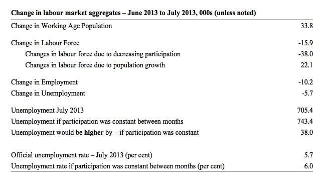
The following Table shows the breakdown in the changes to the main aggregates (Labour Force, Employment and Unemployment) and the impact of the rise in the participation rate.
In July 2013, employment fell by 10.2 thousand while the labour force contracted by 15.9 thousand persons. As a result, unemployment fell by 5.7 thousand.
The labour force fall in July was the outcome of two separate factors:
- The underlying population growth added 22.1 thousand persons to the labour force. The population growth impact on the labour force aggregate is relatively steady from month to month; and
- The fall in the participation rate meant that 38 thousand workers left the labour force (relative to what would have occurred had the participation rate remained unchanged).
So while employment growth failed to keep pace with the underlying population growth, the falling participation took the pressure off somewhat as workers exited the labour force (38 thousand) and were taken out of the official unemployment count.
If the participation rate had not have fallen, total unemployment, at the current employment level, would have been 743.4 thousand rather than the official count of 705.4 thousand as recorded by the ABS – a difference of 38 thousand workers.
Thus, without the fall in the participation rate, the unemployment rate would have actually risen to 6 per cent rather than its current value of 5.7 per cent.
The conclusion is that hidden unemployment rose and this attenuated the rise in the official unemployment rise. In functional terms this signals a much worse deterioration in the conditions than signalled by the current official unemployment rate.
There is considerable monthly fluctuation in the participation rate but the current rate of 65.1 per cent is a long way below its most recent peak in November 2010 of 65.9 per cent.
What would the unemployment rate be if the participation rate was at that recent peak level (65.9 per cent)?
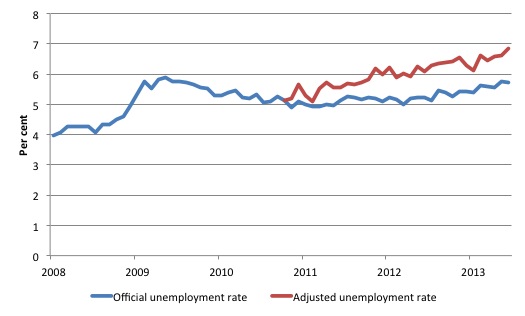
The following graph tells us what would have happened if the participation rate had been constant over the period November 2010 to July 2013. The blue line is the official unemployment since its most recent low-point of 4 per cent in February 2008. It is currently at 5.7 per cent.
The red line starts at November 2010 (the peak participation month). It is computed by adding the workers that left the labour force as employment growth faltered (and the participation rate fell) back into the labour force and assuming they would have been unemployed. At present, this cohort is likely to comprise a component of the hidden unemployed (or discouraged workers).
Total unemployment in July 2013 was estimated to be 709.3 thousand. However, if participation had not have fallen there would be 857.3 thousand workers unemployed given growth in population and employment since November 2010.
This translates into an unemployment rate of 6.9 per cent.
The difference between the two numbers reflects the change in hidden unemployment since November 2010. These workers would take a job immediately if offered one but have given up looking because there are not enough jobs and as a consequence the ABS classifies them as being Not in the Labour Force.
Note, the gap between the blue and red lines doesn’t sum to total hidden unemployment unless November 2010 was a full employment peak, which it clearly was not. The interpretation of the gap is that it shows the extra hidden unemployed since that time.
As the participation rate dropped over the period, the gap rose.
This is quite a different picture to that portrayed by the official summary statistics.
Hours worked – modest rise in July 2013
Aggregate monthly hours worked increased by 7.9 million hours (0.48 per cent) in seasonally adjusted terms. The rise in hours worked this month continues the trends over several months of growth being interspersed with contraction with the trend switching back and forth between positive and negative.
With full-time employment contracting for the last three months, and part-time contracting in July, the rise in working hours overall is the result of compositional shifts in working hours among the employed.
The small swings up and down in monthly hours worked each month since the beginning of 2011 is being largely driven by similar fluctuations in full-time employment.
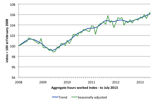
The following graph shows the trend and seasonally adjusted aggregate hours worked indexed to 100 at the peak in February 2008 (which was the low-point unemployment rate in the previous cycle). The rising trend which marked the early recovery courtesy of the fiscal stimulus is now clearly gone.
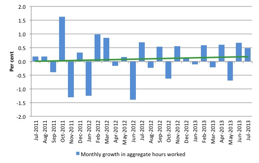
The next graph shows the monthly growth (in per cent) over the last 24 months. The green linear line is a simple regression trend – which depicts a slightly upward trend. You can see the pattern in working hours that is also portrayed in the employment graph – zig-zagging across the zero growth line.
The data doesn’t support the notion of a fully employed labour market that is bursting against the inflation barrier.
Conclusion
Overall, today’s data shows that the Australian labour market continues to weaken with full-time employment growth falling for the third consecutive month and no net growth in employment overall over the last two months.
In general, we always have to be careful interpreting month to month movements given the way the Labour Force Survey is constructed and implemented.
But the trend evidence supports a view that the labour market is very weak and employment growth is consistently so low relative to population growth that the unemployment rate is trending upwards – slowly.
The lack of job opportunities is leading workers to give up looking for jobs (that are not there) and the shrinking labour force is keeping the rise in unemployment down. But the 5.7 per cent unemployment rate is flattering given the accompanying rise in underemployment and hidden unemployment.
The official unemployment rate is trending upwards and it will eke its way up towards 6 per cent over the next 6 months.
The most striking aspect of a sad picture remains the appalling performance of the teenage labour market. Employment has collapsed for that cohort since 2008. I consider it a matter of policy urgency for the Government to introduce an employment guarantee to ensure we do not continue undermining our potential workforce.
The data certainly doesn’t support the Federal Government’s current macroeconomic settings, which are biased towards contraction. More fiscal stimulus is definitely needed but will not be forthcoming given the government’s neo-liberal biases.
If you listen to the ABC national current affairs program – PM – tonight you will catch my assessment of today’s data.
That is enough for today!
(c) Copyright 2013 Bill Mitchell. All Rights Reserved.
Hopefully, this will be of some interest:
Do wage shares have to fall with globalisation? Chandrasekhar and Ghosh
http://www.thehindubusinessline.com/opinion/columns/c-p-chandrasekhar/do-wage-shares-have-to-fall-with-globalisation/article4941681.ece
‘Twas on the 7:30 Report too – but they miscaptioned it – they seem to think you still work at Newcastle.
How would the fiscal stimulus you propose manifest itself? Higher spending in what areas, or where to lower taxes?