The Australian Bureau of Statistics (ABS) released the latest labour force data today (APRIL 16,…
Australian labour market – weak and deteriorating
Today’s release by the Australian Bureau of Statistics (ABS) of the – Labour Force data – for May 2013 signals a deteriorating situation. Employment growth was about zero. The fall in the unemployment rate was due to a decline in the participation rate. Monthly hours worked fell as full-time employment contracted. The broad labour underutilisation rate rose sharply by 0.4 pts to 12.9 per cent with more than 908 thousand workers underemployed. This data signals an urgent need for fiscal stimulus to reverse the negative trend. Unfortunately, with both sides of politics locked into an austerity mindset the situation is likely to deteriorate further.
The summary ABS Labour Force (seasonally adjusted) estimates for May 2013 are:
- Employment increased 1,100 (0.4 per cent) with full-time employment falling by 5,300 and part-time employment rising by 6,400.
- Unemployment decreased by 3,600 (0.5 per cent) to 682,900 as a result of the decreasing participation.
- The official unemployment rate remained steady at 5.5 cent
- The participation rate fell by 0.1 points to 65.2 per cent.
- Aggregate monthly hours worked decreased by 11.5 million hours (-0.7 per cent).
- The quarterly ABS broad labour underutilisation estimates (the sum of unemployment and underemployment) rose by 0.4 points to 12.9 per cent. Underemployment was estimated to be 7.4 per cent or 908.6 thousand persons.
The ABC news headline was – Employment figures surprise with tiny jobs gain – and readers were informed that:
Official figures show unemployment eased slightly to 5.5 per cent, but with almost no new jobs created … The fall in unemployment was driven more by a 0.1 percentage point fall in the participation rate than it was by an increase in jobs.
Which is highly misleading given that the virtually zero gain in employment was well below the underlying population growth.
The data today shows that the labour market is stuck with the trend in employment being weak and insufficient to absorb the underlying population growth.
Further, the weak employment growth is dominated by part-time employment.
The trend in unemployment is up and the broad labour underutilisation rate is rising.
The weak participation rates also mean that people are dropping out of the labour force, which is keeping the official unemployment rate estimate lower than otherwise.
Overall, a very weak situation – not one of collapse as yet but trending towards a worsening situation.
Employment growth – virtually zero
The May data shows that employment growth was virtually zero. Total employment rose by 1,100 (0.1 per cent) to 11,663,300. Full-time employment fell by 5,300 while part-time employment rose by 6,400.
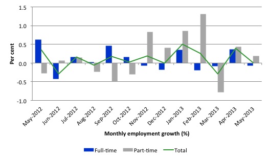
Today’s data reasserts the message that the labour market data is switching back and forth regularly between negative employment growth and positive growth spikes. This monthly behaviour is producing a weak positive trend, although not too much should be read into one month’s results.
There have been considerable fluctuations in the full-time/part-time growth over the last year with regular crossings of the zero growth line.
The following graph shows the month by month growth in full-time (blue columns), part-time (grey columns) and total employment (green line) for the 12 months to May 2013 using seasonally adjusted data.
Today’s results just repeat the topsy-turvy nature of the data over the period shown.
While full-time and part-time employment growth are fluctuating around the zero line, total employment growth is still well below the growth that was boosted by the fiscal-stimulus in the middle of 2010.
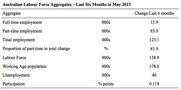
The following table provides an accounting summary of the labour market performance over the last six months. The monthly data is highly variable so this Table provides a longer view which allows for a better assessment of the trends. WAP is working age population (above 15 year olds). The first three columns show the number of jobs gained or lost (net) in the last six months.
The conclusion – overall 98.9 thousand jobs (net) have been created in Australia over the last six months (heavily influenced by the February and April 2013 results). Over the last six months, full-time employment has risen by only 15.9 thousand jobs (net) while part-time work has grown by 83 thousand jobs.
Over the last 6 months, a staggering 83.9 per cent of the net employment opportunities created have been part-time, which explains the sharp rise in underemployment (see below)
The Working Age Population has risen by 178 thousand in the same period while the labour force rose by 138.6 thousand. The weak employment growth has thus not been able to keep pace with the underlying population growth and unemployment has risen as a result (by 40 thousand).
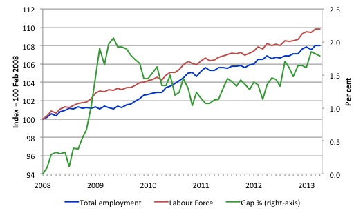
To put the recent data in perspective, the following graph shows the movement in the labour force and total employment since the low-point unemployment rate month in the last cycle (February 2008) to May 2013. The two series are indexed to 100 at that month. The green line (right-axis) is the gap (plotted against the right-axis) between the two aggregates and measures the change in the unemployment rate since the low-point of the last cycle (when it stood at 4 per cent).
You can see that the labour force index has largely levelled off and now falling and the divergence between it and employment growth has been relatively steady over the last several months with this month showing some improvement.
The Gap series gives you a good impression of the asymmetry in unemployment rate responses even when the economy experiences a mild downturn (such as the case in Australia). The unemployment rate jumps quickly but declines slowly.
It also highlights the fact that the recovery is still not strong enough to bring the unemployment rate back down to its pre-crisis low. You can see clearly that the unemployment rate fell in late 2009 and then has hovered at the same level for some months before rising again over the last several months.
The gap shows that the labour market is still a long way from recovering from the financial crisis that hit in early 2008. There hasn’t been much progress since January 2010, when the fiscal stimulus started to run out.
Teenage labour market – remains in a parlous state
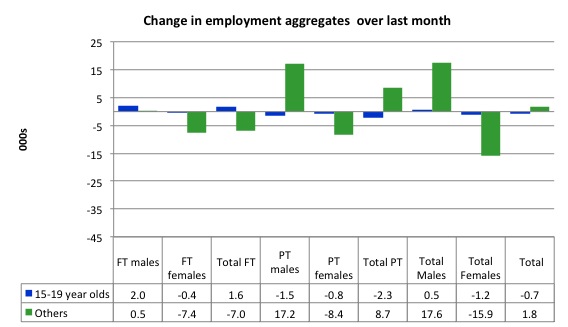
Full-time employment for teenagers rose by 1.6 thousand in May 2013 and part-time employment fell by 2.3 thousand. Overall, teenage employment fell by 700 (net) jobs.
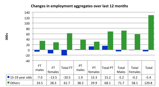
The following graph shows the distribution of net employment creation in the last month by full-time/part-time status and age/gender category (15-19 year olds and the rest)
If you take a longer view you see how poor the situation is.
Over the last 12 months, teenagers have lost 5.4 thousand jobs while the rest of the labour force have gained 129.8 thousand net jobs. Remember that the overall result represents a very poor annual growth in employment.
Even more disturbing is the attrition of full-time jobs among teenagers – losing 20.5 thousand over the last year.
The teenage segment of the labour market is being particularly dragged down by the sluggish employment growth, which is hardly surprising given that the least experienced and/or most disadvantaged (those with disabilities etc) are rationed to the back of the queue by the employers.
The following graph shows the change in aggregates over the last 12 months. Australian teenagers are going backwards which is a trend common around the world at present.
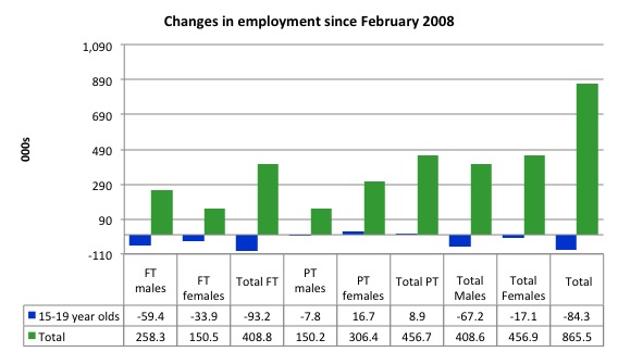
To further emphasise the plight of our teenagers I compiled the following graph that extends the time period from the February 2008, which was the month when the unemployment rate was at its low point in the last cycle, to the present month (May 2013). So it includes the period of downturn and then the “recovery” period. Note the change in vertical scale compared to the previous two graphs.
Since February 2008, there have been 865.5 thousand (net) jobs added to the Australian economy but teenagers have lost a staggering 84.3 thousand over the same period. It is even more stark when you consider that 93.2 thousand full-time teenager jobs have been lost in net terms. Even in the traditionally, concentrated teenage segment – part-time employment – there have been only 8,900 jobs (net) gained even though overall some 456.7 thousand part-time jobs have been added.
Overall, the total employment increase is modest. Further, around 53 per cent of the total (net) jobs added since February 2008 have been part-time, which raises questions about the quality of work that is being generated overall.
Overall, the performance of the teenage labour market remains poor. It doesn’t rate much priority in the policy debate, which is surprising given that this is our future workforce in an ageing population. Future productivity growth will determine whether the ageing population enjoys a higher standard of living than now or goes backwards.
The longer-run consequences of this teenage “lock out” will be very damaging.
The Government’s response is to push this cohort into endless training initiatives (supply-side approach) without significant benefits. The research shows overwhelmingly that job-specific skills development should be done within a paid-work environment.
I would recommend that the Australian government announce a major public sector job creation program aimed at employing, in the first instance, all the unemployed 15-19 year olds.
It is clear that the Australian labour market continues to fail our 15-19 year olds. At a time when we keep emphasising the future challenges facing the nation in terms of an ageing population and rising dependency ratios the economy still fails to provide enough work (and on-the-job experience) for our teenagers who are our future workforce.
Unemployment
The unemployment rate fell from 5.56 per cent to 5.53 per cent but when rounded there was no change for May 2013. Official unemployment fell by 3,600 but that was due to the fall in the participation rate.
Overall, the labour market still has significant excess capacity available in most areas and what growth there is is not making any major inroads into the idle pools of labour.
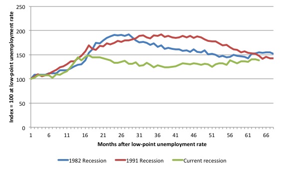
The following graph updates my 3-recessions graph which depicts how quickly the unemployment rose in Australia during each of the three major recessions in recent history: 1982, 1991 and 2009 (the latter to capture the 2008-2010 episode). The unemployment rate was indexed at 100 at its lowest rate before the recession in each case (January 1981; January 1989; April 2008, respectively) and then indexed to that base for each of the months as the recession unfolded.
I have plotted the 3 episodes for 68 months after the low-point unemployment rate was reached with the current episode now in its 64th month. For 1991, the end-point shown is the peak unemployment which was achieved some 38 months after the downturn began although the recovery was painfully slow. While the 1982 recession was severe the economy and the labour market was recovering by the 26th month. The pace of recovery for the 1982 once it began was faster than the recovery in the current period.
It is significant that the current situation while significantly less severe than the previous recessions is dragging on which is a reflection of the lack of private spending growth and declining public spending growth.
The graph provides a graphical depiction of the speed at which the recession unfolded (which tells you something about each episode) and the length of time that the labour market deteriorated (expressed in terms of the unemployment rate).
From the start of the downturn to the 64-month point (to May 2013), the official unemployment rate has risen from a base index value of 100 to a value 138.7 – peaking at 148 after 17 months. After falling steadily as the fiscal stimulus pushed growth along (it reached 122.8 after 35 months – in January 2010), it has been slowly trending up for some months now. Unlike the other episodes, the current trend, at this stage of the cycle, is upwards.
The gains that emerged in the recovery as a result of the fiscal stimulus in 2009-10 have now been lost.
At 64 months, 1982 index stood at 154.9 and was wavering while the 1991 index was at 148.2 and was also falling. It is clear that at an equivalent point in the “recovery cycle” the current period is more sluggish than our recent two major downturns.
It now appears that the recoveries are converging, which tells us that the current policy has failed to take advantage of the fact that the latest economic downturn was much more mild than the previous recessions. In other words, the policy failure is locking the economy into a higher unemployment rate than is desirable and otherwise attainable.
Note that these are index numbers and only tell us about the speed of decay rather than levels of unemployment. Clearly the 5.4 per cent at this stage of the downturn is lower that the unemployment rate was in the previous recessions at a comparable point in the cycle although we have to consider the broader measures of labour underutilisation (which include underemployment) before we draw any clear conclusions.
The notable aspect of the current situation is that the recovery is very slow.
Broader labour underutilisation
The ABS published its quarterly broad labour underutilisation measures in this data release.
Total underemployment rose to 7.3 per cent (from 7.1 per cent) in the May-quarter and the ABS broad labour underutilisation rate rose sharply by 0.3 points to 12.9 per cent (the sum of unemployment and underemployment). There are now 908.6 thousand workers underemployed in Australia.
If hidden unemployment is added to this figure the best-case (conservative) scenario would see a 14.1 per cent underutilisation rate. Please read my blog – Australian labour underutilisation rate is at least 13.4 per cent – for more discussion on this point.
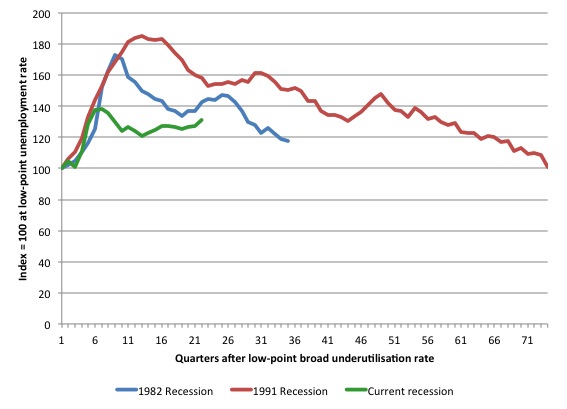
The following graph shows the same type of indexes as the previous graph except it uses the ABS broad labour underutilisation rate (unemployment plus underemployment). It also is in terms of quarters rather than months.
We also show the full evolution of the the 1982 and 1991 episodes from the low-point (= 100) through the peak and back to the next low-point. In the case of the 1982 recession the index had risen to a peak of 172.8 in May 1983 (a broad underutilisation rate of 14.4 per cent) and then fell back to 9.8 per cent by November 1989 (index value 117.4).
At that point, the cycle turned down again signalling the beginning of the 1991 recession. That cycle reached a peak of 185 (or 18.1 per cent in November 1992) and it took until February 2008 for it to reach the low-point of 9.9 percent (an index value of 100.9). That point marked the beginning of the next cycle.
That should tell you how severe the 1991 recession was and how asymmetric the labour market response is on either side of the cycle. From its start in November 1989 it took 74 quarters (18.5 years) to return to more or less that level.
In terms of the three recession comparison, at the same period in the recovery (using quarterly data), the broad labour underutilisation rate (unemployment plus underemployment) had an index value of 142.5 in the 1982 recession (absolute value of 11.9 per cent); an index value of 158.1 in the 1991 recession (absolute value of 15.5 per cent); and an index value of 130.9 in the current period (absolute value of 12.9 per cent).
So while the level of unemployment is much lower now than in the 1982 recession (at a comparable stage), underemployment is now much higher and so the total labour underutilisation rates is higher. Further, the 1982 recovery in broad underutilisation terms was more robust than the current stagnating situation.
Commentators who think of the 1982 recession as severe, rarely see it in these terms. Joblessness is probably worse than underemployment but both mean that labour is wasted and income earning opportunities are being foregone. For a worker with extensive nominal commitments, the loss of income when hours are rationed may be no less severe than the loss of hours involved in unemployment, if the threshold of solvency is breached.
Aggregate participation rate fell – held down the implied rise in unemployment
The participation rate fell by 0.1 percentage points in May continuing the decline which was punctuated by improvements in February and April. It is now at 65.2 per cent. The fall in participation meant that unemployment would have been 16.6 thousand persons higher than the official level had the labour force remained static and given the actual employment growth.
We can assume that hidden unemployment has risen by something close to 34.7 thousand persons in March 2013 as the employment prospects for workers continue to diminish. The participation rate is still substantially down on the most recent peak in November 2010 of 65.9 per cent when the labour market was still recovering courtesy of the fiscal stimulus.
In the current month, the unemployment rate fell to 5.53 per cent from 5.56 per cent. What would have the unemployment rate been had the participation rate not fallen?
The labour force is a subset of the working-age population (those above 15 years old). The proportion of the working-age population that constitutes the labour force is called the labour force participation rate. So changes in the labour force can impact on the official unemployment rate and so movements in the latter need to be interpreted carefully. A rising unemployment rate may not indicate a recessing economy.
The labour force can expand as a result of general population growth and/or increases in the labour force participation rates.
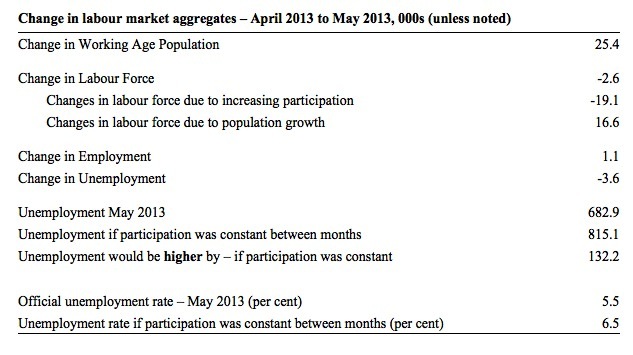
The following Table shows the breakdown in the changes to the main aggregates (Labour Force, Employment and Unemployment) and the impact of the rise in the participation rate.
In May 2013, employment fell by 1.1 thousand while the labour force contracted by 2.6 thousand persons. As a result, unemployment fell by 3.6 thousand.
The labour force fall in May was the outcome of two separate factors:
- The underlying population growth added 16.6 thousand persons to the labour force. The population growth impact on the labour force aggregate is relatively steady from month to month; and
- The fall in the participation rate meant that 19.1 thousand workers left the labour force (relative to what would have occurred had the participation rate remained unchanged).
So while employment growth failed to keep pace with the underlying population growth, the falling participation took the pressure off somewhat (by 19.1 thousand) as workers exited the labour force and were taken out of the official unemployment count.
If the participation rate had not have fa;;em, total unemployment, at the current employment level, would have been 798.3 thousand rather than 682.0 thousand as recorded by the ABS – a difference of 115.5 thousand workers.
Thus, without the rise in the participation rate, the unemployment rate would have actually risen to 6.5 per cent rather than its current value of 5.5 per cent.
The conclusion is that hidden unemployment rose and this attenuated the rise in the official unemployment rise. In functional terms this signals a much worse deterioration in the conditions than signalled by the current official unemployment rate.
There is considerable monthly fluctuation in the participation rate but the current rate of 65.2 per cent is a long way below its most recent peak in November 2010 of 65.9 per cent.
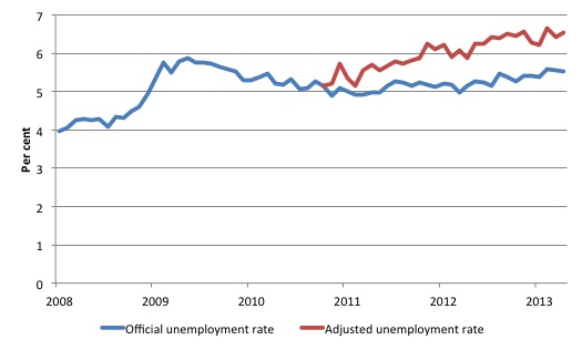
The following graph tells us what that means in terms of the unemployment rate. The blue line is the official unemployment since its most recent low-point of 4 per cent in February 2008. It is currently at 5.5 per cent.
The red line starts at November 2010 (the peak participation month). It is computed by adding the workers that left the labour force as employment growth faltered (and the participation rate fell) back into the labour force and assuming they would have been unemployed. At present, this cohort is likely to comprise a component of the hidden unemployed (or discouraged workers).
These workers would take a job immediately if offered one but have given up looking because there are not enough jobs and as a consequence the ABS classifies them as being Not in the Labour Force.
Note, the gap between the blue and red lines doesn’t sum to total hidden unemployment unless November 2010 was a full employment peak, which it clearly was not. The interpretation of the gap is that it shows the extra hidden unemployed since that time.
As the participation rate dropped over the period, the gap rose. The adjusted unemployment rate would now be 6.5 per cent instead of the official rate of 5.5 per cent.
Hours worked plunge in May 2013
Aggregate monthly hours worked decreased by 11.5 million hours (-0.7 per cent) in seasonally adjusted terms. The fall in hours worked this month continues the trends over several months of growth being interspersed with contraction with the trend switching back and forth between positive and negative.
The sharp rise in underemployment in the second-quarter 2013 is indicative of a trend away from full-time employment.
The small swings up and down in monthly hours worked each month since the beginning of 2011 is being driven by similar fluctuations in full-time employment.
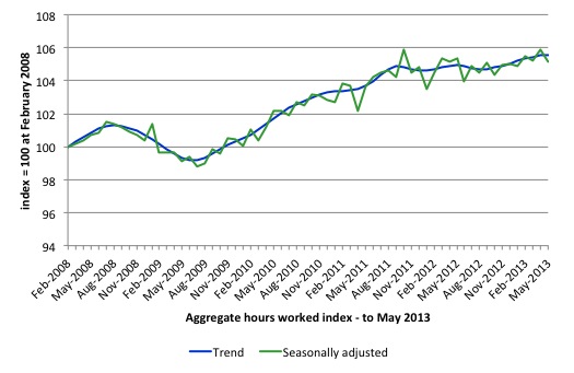
The following graph shows the trend and seasonally adjusted aggregate hours worked indexed to 100 at the peak in February 2008 (which was the low-point unemployment rate in the previous cycle). The rising trend which marked the early recovery courtesy of the fiscal stimulus is now clearly gone.
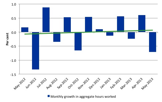
The next graph shows the monthly growth (in per cent) over the last 12 months. The green linear line is a simple regression trend – slightly positive after this month’s gains. You can see the pattern in working hours that is also portrayed in the employment graph – zig-zagging across the zero growth line. The economy is now starting to slow down as private spending growth is slowing and being exacerbated by the fiscal contraction.
Once again the data doesn’t support the notion of a fully employed labour market that is bursting against the inflation barrier.
Conclusion
Overall, today’s data was a terrible result after last month’s more positive signs. In general, we always have to be careful interpreting month to month movements given the way the Labour Force Survey is constructed and implemented.
The labour market is very weak and deteriorating.
It has not yet started to collapse (with unemployment rising sharply) in the face of significant terms of trade adjustments (down) and the fiscal contraction that is continuing but it is weakening.
The most striking aspect of a sad picture remains the appalling performance of the teenage labour market. Employment has collapsed for that cohort since 2008. I consider it a matter of policy urgency for the Government to introduce an employment guarantee to ensure we do not continue undermining our potential workforce.
The data certainly doesn’t support the Federal Government’s current macroeconomic settings, which are biased towards contraction. More fiscal stimulus is definitely needed but will not be forthcoming given the government’s neo-liberal biases.
That is enough for today!
(c) Copyright 2013 Bill Mitchell. All Rights Reserved.
President Obama’s Council of Economic Advisers:
FULL EMPLOYMENT IS A PRO-MARKET CONCEPT-II
People buy things when they are employed….
And unemployment has all kinds of bad consequences….bad “social” consequences-i.e., the ancient proverb “Idle hands are the devil’s workshop”….
Like riots in Turkey, and “Occupy”, and “Arab Spring”, and an epidemic of gun violence in America….
In fact, there is not a single positive that can be attached to unemployment….there is an antiquated economic theory that Full Employment leads to mild inflation…but even if it’s merits were not in dispute-in a cost-effective trade-off Full Employment wins hands down….
But the most pronounced puzzlement is the failure to identify unemployment as a “social” problem-i.e., it is not a problem the “Market” can, or should be asked solve-but rather, we-the larger society have the responsibility to solve….it is a complex point…
Particularly in the face of a giddy, almost religious belief that the Market can produce all the jobs we need-which we cling to like a ticket on the Titanic….particularly when the Market has been unable to produce the jobs necessary to its viability, since the mid-1970’s …..
Indeed, we celebrate automation, globalization, etc., but then get “a deer in the headlights” regarding the displaced [and soon to become invisible] employee…..
The truth is we have a blended economy-and our economy would fall apart if we didn’t…
For example, were it not for Social Security Insurance moneys percolating up through our economy during the meltdown of 2008-we would not be talking about having narrowly averted another Great Depression-we would be buried in one!
And the truth is, Social Insurance is a vital ingredient in building a vibrant and decent society-And, invent a better widget, sell the company for a million bucks, and retire in South Florida [capitalism]-is as well a vital ingredient in building a vibrant and decent society.
So why do we have this war of words pitting the two against each other-rather than educating the American people regarding the indispensable and symbiotic relationship they have to each other?
The bottom line is: We have the legal authority, as I write, to limit our unemployment to 3% [15 USC § 3101]-[and a majority of Americans in agreement] but Washington runs from it like a scared rabbit-to the detriment of America-and at the expense of a decent society.
See also: HR 870 and, A POOL OF SLAVES, on Amazon/Kindle
Jim Green, Democrat opponent to Lamar Smith for Congress, 2000
Bill, nice blog. Stumbled on it while trying to educate myself on money supply and the hash being made fixing UK economy.
I think we can learn a lot from the Australian economic model and you should not assume it needs fixing when it’s not actually broken.
I was in Oz February, this year. Their problems are the strong Oz dollar, drought and China (probably in that order). Yea, there are too many flies in the outback but employing a million public workers swatting them won’t fix much!