I read a new Report this morning - Waste Not - that was published by…
British labour market is very active but stuck
The British economy has entered a double-dip recession as a result of aggregate spending slowdowns driven by a pessimistic private domestic sector, a poor net exports outlook and the increasing impacts of the fiscal austerity. The result has been that unemployment is stuck at its elevated levels and will likely rise in the coming year if the government doesn’t change its tack. However, the official data released last week by the UK Office of National Statistics (see link below) shows us that if you are employed in Britain at present the chances of losing one’s job are slim. It is rising but still very small. What the gross flows data allows us to appreciate is that the much-focused on unemployment rate does not tell us about the chances that are worker will remain in that state, become employed or leave the labour force. Even those the risk of an employed person becoming unemployed is low, it still remains that the chances of an unemployed person remaining so is higher and significantly higher than before the recession. This is because the net flows into employment are too low relative to the labour force growth. This blog is the first of a few which attempts to encourage people to look deeper into the statistics and gain a wider appreciation of what is happening in the labour market. I will write more on it in further blogs when I have more time.
Gross flows analysis provides a different perspective on the labour market than is afforded by examining the net figures each month – that is, total employment, unemployment and not in the labour force.
For example, the British data for the September-quarter 2012 shows that the flow into employment was equal to 1,028,225 persons, while the outflow from employment was equal to 870,552 persons for a net change of 157,674.
That gives you an impression of how dynamic labour markets are even those which are mired in recession. The flows become smaller in recession but there are still lots of job changes going on and changes of labour market state.
How much easier it is for an unemployed worker in the UK to gain employment now compared to what they had to confront at the height of the recession in 2008. Are new entrants into the labour market more likely to gain employment now than in 2008? What is the chance of a worker losing their job relative to 2008? Are there any signs of significant improvement in the last months? Etc?
These are the sorts of questions that can be answered by examining the Gross labour flows. The following analysis is based on the – ONS Labour Market Flows November 2012 – (which apply to the September-quarter 2012).
To fully understand the way gross flows are assembled and the transition probabilities calculated you might like to read these blogs – What can the gross flows tell us? and More calls for job creation – but then. For earlier US analysis see this blog – Jobs are needed in the US but that would require leadership.
You might also like to read this ONS publication – Labour market gross flows data from the Labour Force Survey – from February 2010, which provides an excellent discussion of how the ONS generates the experimental series.
My most recent gross flows analysis for the US was provided in this blog – The US labour market has improved but more stimulus is required.
The stocks and flows are denoted as follows (single letters denote stocks, dual letters are all flows):
- E = employment, with subscript t = now, t+1 the next period
- U = unemployment
- N = not in the labour force
- EE = flow from employment to employment (that is, the number of people who were employed last period who remain employment this period)
- UU = flow of unemployment to unemployment (that is, the number of people who were unemployed last period who remain unemployed this period)
- NN = flow of those not in the labour force last period who remain in that state this period
- EU = flow from employment to unemployment
- EN = flow from employment to not in the labour force
- UE = flow from unemployment to employment
- UN = flow from unemployment to not in the labour force
- NE = flow from not in the labour force to employment
- NU = flow from not in the labour force to unemployment
By way of summary, gross flows analysis allows us to trace flows of workers between different labour market states (employment; unemployment; and non-participation) between months. So we can see the size of the flows in and out of the labour force more easily and into the respective labour force states (employment and unemployment).
The various inflows and outflows between the labour force categories are expressed in terms of numbers of persons. But a useful alternative presentation is to compute transition probabilities, which are the probabilities that transitions (changes of state) occur. For example, what is the probability that a person who is unemployed now will enter employment next period.
So if a transition probability for the shift between employment to unemployment is 0.05, we say that a worker who is currently employed has a 5 per cent chance of becoming unemployed in the next month. If this probability fell to 0.01 then we would say that the labour market is improving (only a 1 per cent chance of making this transition).
The following table shows the schematic way in which gross flows data is arranged each month – sometimes called a Gross Flows Matrix. The elements allows you to trace all inflows and outflows from a given state during the month in question.
The transition probabilities are computed by dividing the flow element in the matrix by the initial state. For example, if you want the probability of a worker remaining unemployed between the two months you would divide the flow (U to U) by the initial stock of unemployment. If you wanted to compute the probability that a worker would make the transition from employment to unemployment you would divide the flow (EU) by the initial stock of employment. And so on.
For the 3 Labour Force states we can compute 9 transition probabilities reflecting the inflows and outflows from each of the combinations.
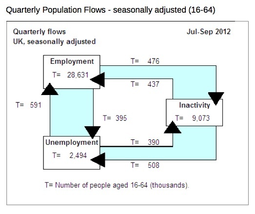
The following diagram is taken from the – September-quarter 2012 publication – and summarises the stock and flow relationships for British persons aged 16-64 years (that is, the working age population).
So total employment (E) was 28,631 thousand, total unemployment (U) was 2,494 thousand, and total not in the labour force (N) was 9,073 thousand.
In the September-quarter 2012, 591 thousand flowed from unemployment to employment (UE) but 395 thousand flowed from employment to unemployment (EU). Similarly, 390 thousand flowed from unemployment to not in the labour force (UN) whereas 508 thousand flowed from the not in the labour force to unemployment (NU).
While 437 thousand flowed from not in the labour force to employment (NE), more employment workers flowed to not in the labour force (EN) – a total of 476 thousand.
Finally, 508 thousand workers entered the labour force into unemployment (NU) and 390 thousand went the other way (UN).
The transition probabilities can also be termed hazard rates, which according to the 2010 ONS discussion paper (linked above):
… measure of the probability that an individual will change status over the quarter. This is calculated by taking the gross flow from the second quarter as a percentage of the total stock from the previous status in the first quarter.
And so on, for all quarter-by-quarter (or month-by-month in the case of Australia and the USA) or year-to-year etc.
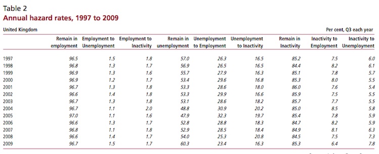
The following Table is taken from that 2010 ONS paper and shows the annual transitions in per cent terms. I know the print is small (having to squeeze a wide table into the column).
The ONS paper says, for example, to help you interpret what the numbers mean that “between 2000 and 2007, on average, 30 per cent of those who were in unemployment in the first quarter had moved into employment by the next quarter. By 2009 it was 23.4 per cent.”
So as the UK economy went into its first stage of the recession the EU probabilities rose sharply (1.1 per cent in 2007 to 1.5 per cent in 2009) and the UE probabilities fell sharply (from 28.5 per cent in 2007 to 23.4 per cent in 2009). Note also that new entrants were less likely to gain employment and the unemployed were much more likely to exit the labour force (hidden unemployment effect).
You can also learn about the asymmetries in labour market adjustment from this data. Not that the EU probability rose towards sharply at the crisis deepened but the UE probability peaked in 2005 and fell continuously after that. So firms were not laying off workers as the slowdown occurred which meant the unemployed started to find it difficult to get work. So employers initially stop hiring and then they start to layoff workers as the recession deepens.
What about the more recent period? The ONS data is quarterly from the December-quarter 2001 to the September-quarter 2012. So it gives a good impression of the dynamics over the recession (first part), then the recovery, then the descent back into the double-dip.
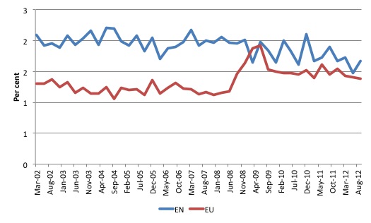
The following graph shows the hazard rates (probabilities) out of employment since the March-quarter 2002.
Previously it was much more likely that an employed worker would exit the labour force (retire) than become unemployed.
The recession saw that position reversed and then the labour market has subsequently become stuck.
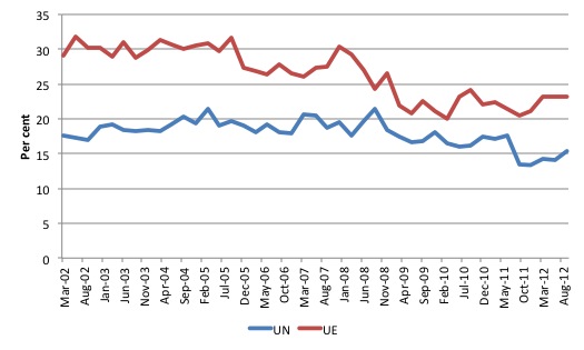
The following graph shows the hazard rates (probabilities) out of unemployment since the March-quarter 2002.
It is clear that the recession significantly reduced the likelihood of unemployed workers gaining employment and that situation has barely improved since the first trough was encountered.
Further, the chances of an unemployed worker leaving the active labour force (UN) has fallen since the crisis.
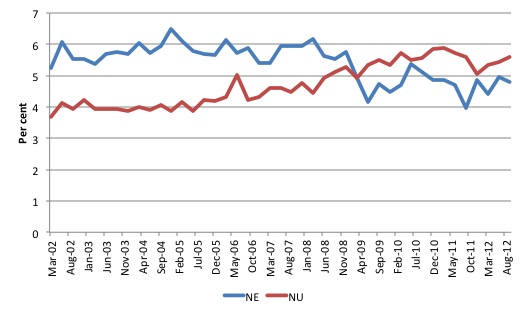
The following graph compares the hazard rates for NU and NE since the March-quarter 2002.
The probability for those not in the labour force of gaining employment fell sharply during the recession and improved as the stimulus created better conditions through the latter part of 2009. Once the new government took over the probability has fallen again and is now stuck at the lower level.
Alternatively, the chances of new entrants entering the (active) labour force via unemployment rose steadily from 2006 as the economy started to slow and employers stopped hiring. It remains well above the 4 per cent level that was experienced in the pre-crisis growth period.
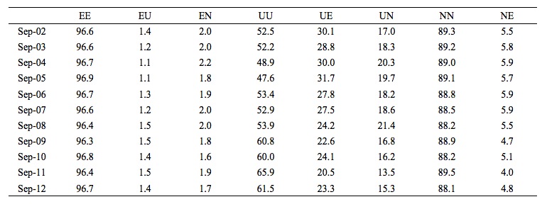
The following Table shows the 9 hazard rates from September-quarter 2002 to the September-quarter 2012. You will readily understand that even with the recession, the chance of losing one’s job was only marginally affected. However, the probability of remaining unemployed once that state was reached by a person increased substantially over the recession period and remains at elevated levels.
This is because employment is not growing fast enough to absorb all the new entrants and make serious in-roads into the pool of unemployed. As a result, we see the typical recession phenomenon of persistently high unemployment (which is manifested as rising long-term unemployed given the biases in the composition of the flows in and out – that is, some workers don’t flow at all!).
Note that total employment in any period (t) is given by the following formula (linking stocks and flows): E(t+1) = E(t) + UE(t) + NE(t) – EU(t) – EN(t).
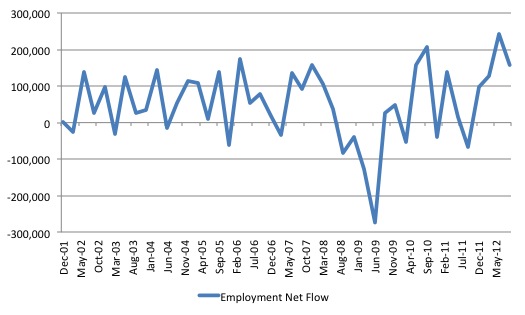
The net employment flows are given by UE(t) + NE(t) – EU(t) – EN(t). If positive, total employment rises and vice-versa.
The following graph shows the net flows into employment since the December-quarter 2001. You can see the sharp effect of the recession and the rebound then stalling pattern, where the net additions oscillate around the zero line (with a slightly positive bias).
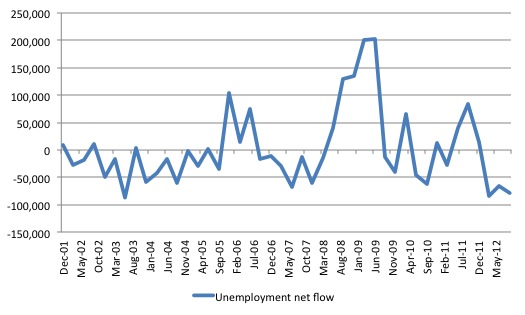
The next graph shows the unemployment net flows from the December-quarter 2001 to the September-quarter 2012. The net movements are a mirror-image of the previous graph. Although
Conclusion
After the crisis began the UK economy was saved from a major depression by the initial fiscal stimulus. There is no doubt about that. However, because the stimulus was not of a sufficient magnitude nor swift enough (in its targetting of employment growth), the economy only slowly ground its way towards growth and the labour market was stuck in a very persistent recessed state with only slight improvements occurring.
Only a short blog today as I have a long flight to make this afternoon.
That is enough for today!
(c) Copyright 2012 Bill Mitchell. All Rights Reserved.

1. This analysis does not seem to include anything explicitly about the flows into and out of the potential work force, both in what is written here and what is in the ONS report. Since the total population in the working age group is around 40 million, and the age range is around 40 years, we would expect something like 1 million to enter the group each year and 1 million to leave, depending on the age distribution. That is around 250,000 per quarter, which is of the same order of magnitude as the flows listed. I have not got my head around this issue and how it would affect the analysis.
2. The notation is a little confusing in the matrix of transition probabilities. The transition probabilities are different to the flows and both are denoted by EE, EU, etc. If we use the transition probabilities (let’s call them ee, eu, en, etc) then the matrix becomes the transpose of a Markov matrix. Let’s call it M. In a Markov matrix, each column adds up to one. The elements of the transition matrix can be taken from Table 2, the table of hazard rates. For 2009, ee = 96.7, eu = 1.5, en = 1.7 (which add up to one except for a rounding error), etc.
The change in employment over a period t is then given by
E(t+1) = ee(t) E(t) + ue(t) U(t) + ne(t) N(t) = EE(t) + UE(t) + NE(t).
But ee = 1 – eu – en, and therefore
E(t+1) = E(t) +ue(t) U(t) + ne(t) N(t) – eu(t) E(t) – en(t) E(t) = E(t) + UE + NE – EU -EN,
which was the original equation quoted.
I doubt if anything I have said here contradicts the general conclusions however. I’m sorry if this is too wonkish and inconsequential.