The Australian Bureau of Statistics (ABS) released the latest labour force data today (APRIL 16,…
Australian labour market goes into reverse
Labour Force data today for April 2011 which shows that employment and participation contracted sharply over the last month. The data confirms recent trends (March being the outlier) that the labour market is not very robust at present. Total working hours also contracted sharply. With full-time employment sharply negative, and modest part-time employment growth – I also suspect that underemployment rose again this month. I do not consider this data supports the popular view being promoted by politicians and bank economists that we are close to full employment and interest rates will have to rise. My view is that there is a lot of slack left in the economy. A stunning aspect of this observation is that teenagers continue to suffer employment losses having lost 73 thousand jobs overall since the crisis then recovery began. The other reality is that trend employment growth is barely keeping pace with population growth so unemployment is hovering at high levels. If the “once-in-a-hundred-year” mining boom was really delivering a bounty then we should be eating into unemployment and underemployment. The reality is that the Australian economy is, at best, growing modestly with most regions close to contraction. The summary ABS Labour Force (seasonally adjusted) estimates for April 2011 are:
- Employment decreased by 22,100 (-0.2 per cent) with the net losses in full-time employment of 49,100 partially offset by a rise in part-time employment of 26,900.
- Unemployment decreased 9,800 to 583,000.
- The official unemployment rate remained unchanged at 4.9 per cent.
- The participation rate increased by 0.2 percentage points to 65.6 per cent which meant that the unemployment rate was not impacted by the fall in employment but hidden unemployment will have risen.
- Aggregate monthly hours worked decreased 14.7 million hours (-0.9 per cent).
- The quarterly labour underutilisation estimates will next be published in May. The loss of full-time work and the rise in part-time work in April will almost certainly mean that underemployment will have risen. Total labour underutilisation (computed by the ABS as the sum of underemployment and unemployment) was estimated to be 11.9 per cent in February. I expect it to be slightly higher now.
The jobless rate is the key because the employment numbers can be very noisy, and we’re still looking at an unemployment rate below 5 per cent, so that’s still a pretty solid signal there.”The jobless rate is a very poor signal. It is a ratio after all – of unemployment and the labour force – with both being cyclical sensitive. What happened this month is that the labour force shrunk more than employment fell (a twin evil) and so unemployment edged down a little. That is not a “pretty solid signal”. As I show below the unemployment rate would have risen sharply had the participation rate not plunged. The Sydney Morning Herald headline was – Full-time jobs drop most in 26 months. They quoted another “bank” economist (from Moody’s) as saying:
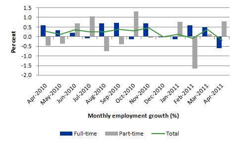
An unexpected fall in jobs, but the unemployment rate held steady because of a decline in the participation rate … That’s worrying for inflation because it will intensify labour shortages and keep upward pressure on wages.Moody’s should stick to providing irrelevant credit ratings to sovereign governments. But how can a cyclical decline in the participation rate intensify labour shortages? The very nature of hidden unemployment (which is mostly what a cyclical decline in the participation rate) tells us that the workers will take a job if one is offered. They have just become tired of looking for jobs that are not there. Today’s job figures tell me that there will be no upward pressure on wages. The data is also consistent with many other recent indicators that suggest the Australian economy is not growing as robustly as the politicians would have us believe. What needs to be understood is that the Mining industry is expert at self-promotion and making a contribution to real GDP of around 5 per cent look 10 times that. The data clearly tells us that the Australian economy is nowhere near full employment nor about to run against the inflation barrier. In fact, I wouldn’t be surprised if the East Coast economy (Melbourne, Sydney, Brisbane) is in decline. Employment growth negative – trending down The April data shows that employment growth (-0.2 per cent) has contracted again and despite the March rebound has been trending around the zero line for several months. The trend rate of employment growth dropped sharply around November 2010 as the fiscal stimulus was withdrawn. Despite all the claims that the labour market is overheating and running out of skills, full-time employment growth contracted sharply and only a weak positive part-time employment response saved overall employment from dropping even further than it did. With both employment and participation falling, the unemployment rate was constant. The combination of falling employment and participation signals a very poor labour market. More on the participation effect later. The following graph shows the month by month growth in full-time (blue columns), part-time (grey columns) and total employment (green line) for the 12 months to April 2011 using seasonally adjusted data. It is clear that the picture has been mixed over the last 12 months with employment growth averaging 0.2 points per month (full-time 0.3 points; part-time 0.1 points). While full-time and part-time employment growth are fluctuating around the zero line, total employment growth is still well below the fiscal-stimulus boosted growth we saw in the middle of 2010.
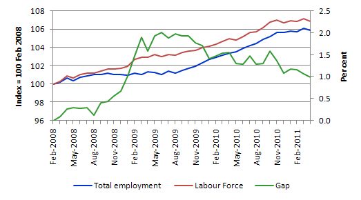
 To put the recent data in perspective, the following graph shows the movement in the labour force and total employment since the low-point unemployment rate month in the last cycle (February 2008) to April 2011. The two series are indexed to 100 at that month. The green line (right-axis) is the gap (plotted against the right-axis) between the two aggregates and measures the change in the unemployment rate since the low-point of the last cycle (when it stood at 4 per cent).
The Gap series gives you a good impression of the asymmetry in unemployment rate responses even when the economy experiences a mild downturn (such as the case in Australia). The unemployment rate jumps quickly but declines slowly.
It also highlights the fact that the recovery is still not strong enough to bring the unemployment rate back down to its pre-crisis low. You can see clearly that the unemployment rate fell in late 2009 and very little improvement has been made in the course of this year.
The Australian labour market continues to be stuck in a period of sluggish growth and fluctuating participation rates. The declining Gap in April is driven by the labour force shrinking faster than the contraction in employment.
 Negative employment growth for teenagers continues
The teenage labour market remains in an appalling state.
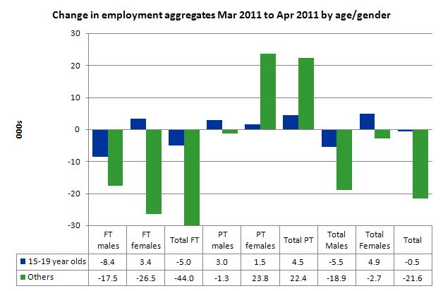
The evidence continues to show that the Australian labour market continues to fail our teenagers (15-19 year olds) and exclude them from employment growth. Teenage employment growth in the last month remained negative losing 500 jobs (net) – loss of 5,000 full-time jobs and gain of 4,500 part-time jobs. The overall decline in teenage employment has been a continuing trend over the last few years.
At a time when we keep emphasising the future challenges facing the nation in terms of an ageing population and rising dependency ratios the economy still fails to provide enough work (and on-the-job experience) for our teenagers who are our future workforce.
The following graph shows the distribution of net employment creation in the last month by full-time/part-time status and age/gender category (15-19 year olds and the rest).
 To put this month’s figures in perspective though, the following graph shows the change in aggregates over the last 12 months. Teenagers have gone backwards in this so-called period of recovery – the jobs market has been shrinking for them – with nearly 23,000 jobs overall lost since April 2010.
 To further emphasise the plight of our teenagers I compiled the following graph that extends the time period from the February 2008, which was the month when the unemployment rate was at its low point in the last cycle, to the present month (April 2011). So it includes the period of downturn and then the “recovery” period. Note the change in vertical scale compared to the previous two graphs. That tells you something!
The results are stunning really. Teenagers have lost 72 thousand full-time jobs, 1.2 thousand part-time jobs and 73 thousand jobs overall in that time. The comparison with the rest of the employed labour force is staggering.
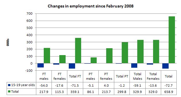 There is nothing good that you can say about any of that. It makes a mockery of those (like the bank economists and our politicians) who claim we are close to full employment. An economy that excludes its active teenagers from any employment growth at all is not one that is using its existing capacity to its potential. An economy that sheds 73 thousand jobs that were formerly held by teenagers (including 72 full-time jobs) is no-where near full employment.
The longer-run consequences of this teenage “lock out” will be very damaging.
In the February quarter broad labour underutilisation data released by the ABS, the underemployment rate for 15-24 year olds was 12.8 per cent (a slight decrease from the November quarter). Total labour underutilisation for 15-24 year olds was 24.6 per cent.
So that should be a headline in the news today and tomorrow – 24.6 per cent of our 15-24 year olds (who are seeking work) but are idle at present (sum of unemployment and underemployment). That is an indictment of government policy and represents a lot of excess capacity that can be tapped via the creation of appropriate job/training slots.
Why is this occurring? I was just talking to a journalist friend about this and we tossed around different ideas. My conclusion overall is that “once-in-a-hundred-year” mining boom is not delivering very much growth at all to the Eastern states (the non-mining regions) which just happen to be where the vast majority of the population live.
Last week, the ABS published data which showed that retail sales is contracting. I suspect the East coast economy is close to contracting overall. I think there is a heavy labour demand ration being placed on the non-mining labour market and teenagers are at the end of the queue (but still ahead of indigenous and disabled workers).
It is also clear that the types of jobs being created in the mining areas are not going to employ teenagers in any significant numbers.
So my summary is that the very weak recovery that is occurring in the Australian economy is not providing any significant opportunities for our youngest workers. These workers are our future. We talk of the intergenerational demands on public spending and rising dependency ratios. But then we allow 25 odd percent of our active youth to remain idle and outside the skill development process. This waste ensures our future productivity growth will be lower than it otherwise could be.
How can we be happy about an economy that shuts out our youth from the recovery?
Unemployment
The unemployment rate remained unchanged in April at 4.9 per cent. As I will demonstrate below, this mispresents the deterioration that occurred in the labour market over the last month. The decline in participation helped keep the unemployment rate from rising sharply given the fall in employment. In other words, hidden unemployment has risen and replaced some official unemployment.
So before we start believing the Treasurer’s Budget speech spin that we are now close to “full employment” remember that in February 2008, at the low-point of the last cycle the unemployment rate was 3.9 per cent and falling. Further, there was no wage-induced inflation evident. The idea that full employment is equated with a 5 per cent unemployment rate is just an ad hoc myth propagated by mainstream economists using flawed econometric models.
Overall, the labour market still has significant excess capacity available in most areas.
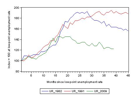
The following graph updates my 3-recessions graph which depicts how quickly the unemployment rose in Australia during each of the three major recessions in recent history: 1982, 1991 and 2009 (the latter to capture the 2008-2010 episode). The unemployment rate was indexed at 100 at its lowest rate before the recession in each case (June 1981; November 1989; February 2008, respectively) and then indexed to that base for each of the months as the recession unfolded.
I have plotted the 3 episodes for 45 months after the low-point unemployment rate was reached (although the current episode has only endured for 39 months). For 1991, the end-point shown is the peak unemployment which was achieved some 38 months after the downturn began although the recovery was painfully slow. While the 1982 recession was severe the economy and the labour market was recovering by the 26th month. The pace of recovery for the 1982 once it began was faster than the recovery in the current period.
It is significant that the current situation while significantly less severe than the previous recessions is dragging on which is a reflection of the lack of private spending growth and declining public spending growth.
The graph provides a graphical depiction of the speed at which the recession unfolded (which tells you something about each episode) and the length of time that the labour market deteriorated (expressed in terms of the unemployment rate).
From the start of the downturn to the 39-month point (to April 2011), the official unemployment rate has risen from a base index value of 100 to a value 122.5 – peaking at 145 after 21 months. At the same stage in 1991 the rise was 189 (and starting to decline) and in 1982 – 162 (and falling in spurts).
The trend in unemployment at present is stuck at its current level as employment growth barely keeps pace with population growth.
 Aggregate participation rate falls
The participation rate fell sharply (by 0.2 percentage points) in April 2011 taking us back to the September 2010 level. This month the workers exiting the labour force helped keep the unemployment rate constant in the face of negative employment growth.
What would the unemployment rate been had participation remained constant?
The labour force is a subset of the working-age population (those above 15 years old). The proportion of the working-age population that constitutes the labour force is called the labour force participation rate. So changes in the labour force can impact on the official unemployment rate and so movements in the latter need to be interpreted carefully. A rising unemployment rate may not indicate a recessing economy.
The labour force can expand as a result of general population growth and/or increases in the labour force participation rates.
The following Table shows the breakdown in the changes to the main aggregates (Labour Force, Employment and Unemployment) and the impact of the fall in the participation rate.
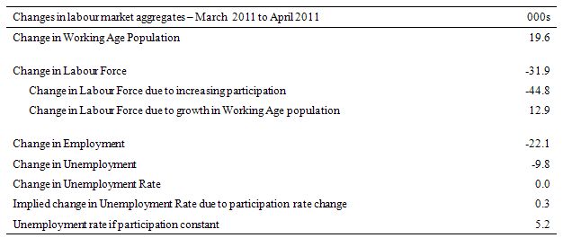 In April 2011, employment fell by 22.1 thousand and the labour force fell by 31.9 thousand which meant that unemployment also fell by 9.8 thousand (for all the wrong reasons).
The fall in the participation rate meant that a staggering 44.8 thousand workers left the labour force – most into hidden unemployment – as a result of the failure of the economy to generate enough jobs growth. Growth in the working age population added an extra 12.9 thousand to the labour force – this impact is steady from month to month.
The net result was that the unemployment rate stayed constant. Has the participation rate not fallen the unemployment rate would have risen sharply to 5.2 per cent.
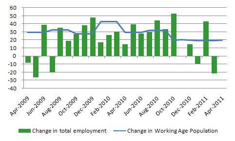
Another way of thinking about the strength of employment growth is to compare the change in employment each month with the change in the working age population (WAP). The change in the WAP is the underlying number of workers that enter the labour force month to month. The labour force fluctuates also due to participation rate changes but they tend to be volatile and cyclical.
So is the Australian economy adding jobs faster than the growth of its population? The answer is a resounding no.
The following graph plots the two series from April 2009. Over that period, the WAP has expanded on average by 25 thousand per month while employment has only increased on average by 23 thousand over the same period. That is why unemployment is persistently hovering at 5 per cent. The fluctuations in unemployment are on average largely due to participation rate volatility over this period.
 I think that is an important observation that is largely overlooked in the public debate.
Hours worked fall sharply in April
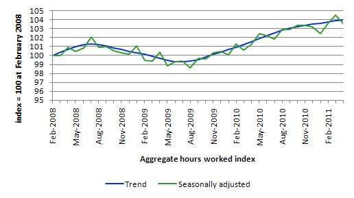
Total monthly hours worked fell in April by 14.1 million hours or -0.9 per cent).
The following graph shows the trend and seasonally adjusted aggregate hours worked indexed to 100 at the peak in February 2008 (which was the low-point unemployment rate in the previous cycle). Working hours are not trending strongly upwards.
 The next graph shows the monthly growth (in per cent) over the last 12 months. The green linear line is a simple regression trend and it is suggesting monthly growth rates have been in decline all year.
Once again the data doesn’t support the notion of a fully employed labour market that is bursting against the inflation barrier.
 Conclusion
The April Labour Force data shows that the Australian economic recovery remains tepid at best and is faltering. Employment growth is now barely able to keep up with population growth and it is only the rise in hidden unemployment that has kept the official unemployment rate stable at 4.9 per cent.
We are now seeing the trends that are free of the natural disasters which tainted the labour force data earlier in the year. The trend is not good. But with monthly data you always have to be careful to look at the trends over several months. They are positive but very weak.
There is still a lot of slack left to be mopped up and the teenage employment problem is manifest and should be a policy priority. The Budget last Tuesday did little to address the lack of job creation for teenagers. The proposed wage subsidies will fail as they always do.
More than 70 thousand teenage jobs have disappeared – that is, they were already working and have now been squeezed out. The idea that berating them with new “participation incentives” will create work (that they had) is far fetched and reflects pure ideology. It would be better for the Government to admit this approach has failed over the last 15 years and that jobs need to be created before people can take them.
That is enough for today!]]>
Not a good outlook,especially regarding teenage unemployment as these kids are part of our future.
However,if we have a sick economy (and society) now just wait till the Chinese bubble bursts.This is inevitable and that is when the tide goes out and reveals who has been swimming naked.
Podargus.
That would be the ‘lame’ stream political theoconomist ’emperors’ who’ve got no clothes then?! 😉
@Podargus
Why will the Chinese bubble burst? Sure, politically they are in a nasty (albeit stable) state, but economically they seem to be doing well – they are just beginning to tap the potential of their billion workers. They will only get stronger as they move from low-wage menial jobs into more science and engineering jobs, and their government seems very focused on that.
Us western nations are the ones that have capitulated to the tyranny of low expectations. The Chinese government realizes what power it has over the economy and isn’t afraid to use it to make themselves economically powerful.
Why the hell should the mining boom translate wealth to the average Australian. It only takes 2 men driving a monster truck and a giant digger to move a gabazillion tons of dirt per day. Some more, the Chinese are renting the mining rights from a bunch of turds who got their stakes in first. Probably plotting to ship in Bangladeshi and Vietnamese workers to fill the skills gap.
The hyperbolic crappola I hear in the media is beyond belief. Didn’t you know mining boom “mark II” is “Showering” cash on the economy.
Why the hell should the mining boom translate wealth to the average Australian. It only takes 2 men driving a monster truck and a giant digger to move a gabazillion tons of dirt per day. Some more, the Chinese are renting the mining rights from a bunch of turds who got their stakes in first. Probably plotting to ship in Bangladeshi and Vietnamese workers to fill the skills gap.
The hyperbolic crappola I hear in the media is beyond belief. Didn’t you know mining boom “mark II” is “Showering” cash on the economy?
With regards to the UK Government’s response to ever increasing youth unemployment, see this doc published today:
http://www.number10.gov.uk/wp-content/uploads/support-youth-employment.pdf
Reading this you would think youth unemployment is purely a supply side problem – note the references to making work pay, and barely any mention of how actual, real jobs are going to be created.
Hello fellow MMT’ers! I am trying to educate others on this and would appreciate if the experts tell me if I am spreading the correct message. I wrote a little piece here that I would like for you guys to read:
http://uspoutland.yuku.com/topic/918/What-is-the-real-purpose-of-taxation
@JP Hochbaum
Nicely said, the only problem was where you said:
“Deficits only measure the 225 year history of how much money the government created vs. how much money they removed”
Deficits are a yearly difference between spending and taxation – a flow. Debt is a stock, and is what you are referring to in that sentence. Otherwise well put!