The Australian Bureau of Statistics (ABS) released the latest labour force data today (APRIL 16,…
Australian labour market continues to weaken
The Australian Bureau of Statistics (ABS) released the Labour Force data today for May 2011 which shows that the labour market is in a very weak state. Full-time employment collapsed further (having falling sharply last month) and part-time employment growth was very weak. Employment growth is failing to keep pace with population growth which means that no dent is being made in the very high labour underutilisation rates. Total working hours barely moved and total labour underutilisation (the sum of unemployment and underemployment) rose from 11.9 to 12.2 per cent. The teenage labour market remained in an appalling state. Even the usually optimistic bank economists (who predicted that employment growth would have been much stronger than it was) are starting to sound circumspect in media interviews today – “weakness”, “softness”, “poor result” – were descriptors that were heard today. The Australian economy is nowhere near full employment and the slack increased in May 2011.
The summary ABS Labour Force (seasonally adjusted) estimates for May 2011 are:
- Employment increased by 7,800 (0.1 per cent) with full-time employment continuing to fall (22,000) and part-time rising by 29,800.
- Unemployment increased 8,900 (1.5 per cent) to 592,000.
- The official unemployment rate remained unchanged at 4.9 per cent.
- The participation rate was unchanged at 65.6 per cent.
- Aggregate monthly hours worked increased 6.4 million hours (0.4 per cent) – that is, barely positive.
- The quarterly labour underutilisation estimates showed that labour wastage rose by 0.2 pts to 12.2 per cent. This is because there has been a loss over the last two months in full-time work with the net jobs growth being concentrated in part-time work. Underemployment is now at 7.1 per cent (up from 7 per cent in February) and unemployment is at 4.9 per cent (just down from 5.0 per cent in February) giving a total labour underutilisation rate (computed by the ABS as the sum of underemployment and unemployment) at 12.2 per cent (up from 11.9 in February). This is sign of a weakening labour market.
The ABC news report today (June 9, 2011 carried the headline – Full-time jobs fall in ‘weak’ employment data – which was accurate. The ABC said:
It is the second month in a row that full-time employment has slipped, with April’s fall being revised to 57,200, after initially being estimated at 49,100 …
So the poor figures from last month (April) were even worse than we thought. The data is consistent with other information we are getting that the Australian economy overall is weak and getting weaker.
It seems that the message hasn’t really got through to the “bank economists”. The ABC reports that “The average economist forecast was for a 25,000-strong rise in employment in May, according to a survey of 25 market analysts by Bloomberg”.
Not only were they way off the mark (which is normal) but the loss of full-time work reveals the extent of the weakness notwithstanding that employment growth was just positive.
The “markets” had also “priced in” an interest rate rise in July (after the RBA had held its target rate constant in its June meeting but the ABC reported that this was now considered to be highly unlikely. With last week’s National Accounts reporting a large contraction in the Australian economy and the labour market still as weak as it is there is no case for a tightening of monetary policy.
The market economists are so obsessed with the proposition that the default option is that the RBA will increase rates each month that it takes a poor data release to bring them back to reality. Which is – the Australian economy is contracting!
Only those who have bought into the “once-in-a-hundred-year” mining boom rhetoric that the mining industry and politicians are promoting would be surprised by the weakening labour market.
If you appreciate that private demand is flat, the external sector is still not contributing positively to demand and the fiscal stimulus is slowly being withdrawn then it is no surprise that business confidence is low, that consumers are not spending and the labour market is fluctuating around the zero growth line.
The Sydney Morning Herald headline was – Full-time jobs sink again and acknowledged that the data was “pointing to a weakening labour market”.
They quoted another “bank” economist as saying:
That suggests the economy is quite a bit weaker than most people had thought this year … It’s not restricted to one state – it’s fairly broadly based. And it’s not just restricted to one or two months now,
This has been the problem – the narrative being pushed by a few who dominate the media – the so-called “most” people. As noted above the data is no surprise. Once you understand Modern Monetary Theory (MMT) this was predictable as soon as the fiscal stimulus started to wane and the RBA started to hike interest rates.
It was clear that private spending remained flat and was not going to fill the gap left by the declining net public spending. It was also clear that the external sector was draining demand despite our mining boom.
The other point about today’s data that is finally being spoken about but which is obvious from the last several months observations is that the stable unemployment rate is a poor indicator of what is going on.
The only reason unemployment rate is holding steady at present is because labour participation is weak and people are remaining as hidden unemployed. If the economy was in this so-called “once-in-a-hundred-year” boom then participation would be stronger and the growth in the labour force would thus be stronger. That would really expose this insipid employment growth.
The data clearly tells us that the Australian economy is nowhere near full employment nor about to run against the inflation barrier.
The Federal Treasurer was interviewed by the ABC and frankly made a fool of himself. I just heard him speaking on the radio saying that the Labour Force numbers were good and that any unemployment rate with a 4 in front of it is something we should be happy about.
Given that there are 600,000 Australians unemployed and more than 700,000 underemployed I don’t think that is something that an advanced nation should aspire to as a benchmark of “good” outcomes.
The following table shows the number of jobs gained or lost (net) in the last six months. The conclusion – the so-called booming Australian economy is only able to produce a modest number of part-time jobs while it sheds full-time work.
I don’t think an economy that has failed to produce in net terms any full-time jobs over the last six months is performing well.
| Full-time (000s) | Part-time (000s) | Total (000s) | |
| November 2010 to May 2011 | -3.9 | 33.8 | 29.9 |
Employment growth insipid – trending down
The May data shows that employment growth (0.1 per cent) has contracted again and despite the March rebound has been trending around the zero line for several months. The trend rate of employment growth dropped sharply around November 2010 as the fiscal stimulus was withdrawn.
As the previous table shows, the labour market has shed nearly 4000 full-time jobs over that period.
Despite all the claims that the labour market is overheating and running out of skills, full-time employment growth continues to contract and only a weak positive part-time employment response saved overall employment from contracting for the second month in a row.
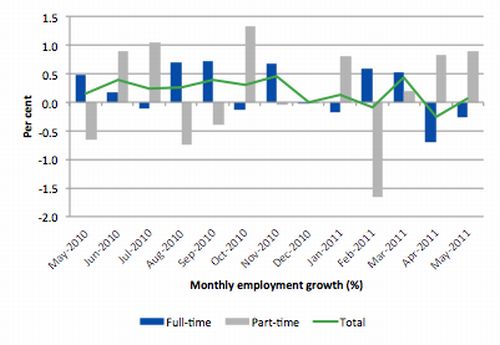
The following graph shows the month by month growth in full-time (blue columns), part-time (grey columns) and total employment (green line) for the 12 months to May 2011 using seasonally adjusted data. It is clear that the picture has been mixed over the last 12 months with employment growth averaging 0.2 points per month (full-time 0.2 points; part-time 0.2 points).
While full-time and part-time employment growth are fluctuating around the zero line, total employment growth is still well below the growth that was boosted by the fiscal-stimulus in the middle of 2010.
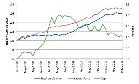
To put the recent data in perspective, the following graph shows the movement in the labour force and total employment since the low-point unemployment rate month in the last cycle (February 2008) to May 2011. The two series are indexed to 100 at that month. The green line (right-axis) is the gap (plotted against the right-axis) between the two aggregates and measures the change in the unemployment rate since the low-point of the last cycle (when it stood at 4 per cent).
The Gap series gives you a good impression of the asymmetry in unemployment rate responses even when the economy experiences a mild downturn (such as the case in Australia). The unemployment rate jumps quickly but declines slowly.
It also highlights the fact that the recovery is still not strong enough to bring the unemployment rate back down to its pre-crisis low. You can see clearly that the unemployment rate fell in late 2009 and very little improvement has been made in the course of this year.
The Australian labour market continues to be stuck in a period of sluggish growth and fluctuating participation rates. The declining Gap in May is driven by the labour force shrinking faster than the contraction in employment.
Teenage labour market – slight improvement but from a low base
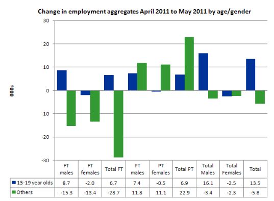
The teenage labour market remains in an appalling state although in May both full-time and part-time employment grew for males. Full- and part-time employment for female teenagers continued to contract.
While employment for all persons rose by 7,800 the only gains were teenage males with the non-teenage labour force experiencing a contraction in overall employment.
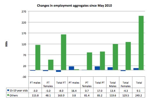
But the Australian labour market continues to fail our teenagers (15-19 year olds) and over the last 12 months only 9,000 jobs have been secured (net) by them.
At a time when we keep emphasising the future challenges facing the nation in terms of an ageing population and rising dependency ratios the economy still fails to provide enough work (and on-the-job experience) for our teenagers who are our future workforce.
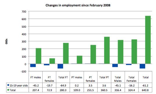
The following graph shows the distribution of net employment creation in the last month by full-time/part-time status and age/gender category (15-19 year olds and the rest).
To put this month’s figures in perspective though, the following graph shows the change in aggregates over the last 12 months. In this so-called period of recovery, the current month is the first sign of any employment growth for teenagers
To further emphasise the plight of our teenagers I compiled the following graph that extends the time period from the February 2008, which was the month when the unemployment rate was at its low point in the last cycle, to the present month (May 2011). So it includes the period of downturn and then the “recovery” period. Note the change in vertical scale compared to the previous two graphs. That tells you something!
The results are stunning really. Teenagers have lost 65 thousand full-time jobs and 61 thousand jobs overall in that time. The comparison with the rest of the employed labour force is staggering.
There is nothing good that you can say about any of that. It makes a mockery of those (like the bank economists and our politicians) who claim we are close to full employment. An economy that excludes its active teenagers from any employment growth at all is not one that is using its existing capacity to its potential.
The longer-run consequences of this teenage “lock out” will be very damaging.
In the May 2011 quarter broad labour underutilisation data released today by the ABS, the underemployment rate for 15-24 year olds was 13.1 per cent (up from 12.9 per cent in the February quarter). Total labour underutilisation for 15-24 year olds was 24.2 per cent (only marginally below the 24.6 per cent in February).
This is an economy that the Treasurer says is booming and in need of fiscal austerity but in which – 24.2 per cent of our 15-24 year olds (who are seeking work) are idle (sum of unemployment and underemployment).
Unemployment
The unemployment rate remained unchanged in May at 4.9 per cent although unemployment edged up by 8,900 which tells you that the employment growth barely kept pace with the underlying population growth.
Overall, the labour market still has significant excess capacity available in most areas.
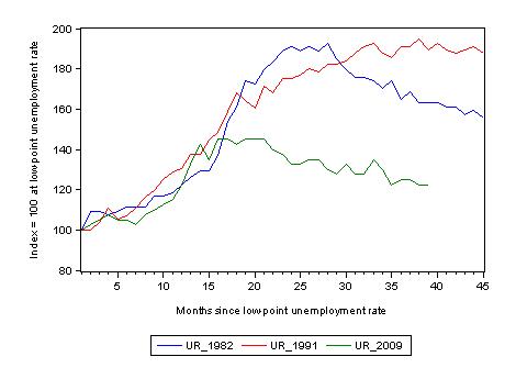
The following graph updates my 3-recessions graph which depicts how quickly the unemployment rose in Australia during each of the three major recessions in recent history: 1982, 1991 and 2009 (the latter to capture the 2008-2010 episode). The unemployment rate was indexed at 100 at its lowest rate before the recession in each case (June 1981; November 1989; February 2008, respectively) and then indexed to that base for each of the months as the recession unfolded.
I have plotted the 3 episodes for 45 months after the low-point unemployment rate was reached (although the current episode has only endured for 40 months). For 1991, the end-point shown is the peak unemployment which was achieved some 38 months after the downturn began although the recovery was painfully slow. While the 1982 recession was severe the economy and the labour market was recovering by the 26th month. The pace of recovery for the 1982 once it began was faster than the recovery in the current period.
It is significant that the current situation while significantly less severe than the previous recessions is dragging on which is a reflection of the lack of private spending growth and declining public spending growth.
The graph provides a graphical depiction of the speed at which the recession unfolded (which tells you something about each episode) and the length of time that the labour market deteriorated (expressed in terms of the unemployment rate).
From the start of the downturn to the 39-month point (to May 2011), the official unemployment rate has risen from a base index value of 100 to a value 122.5 – peaking at 145 after 21 months. At the same stage in 1991 the rise was 192 (the peak) and in 1982 – 162 (and falling in spurts).
The trend in unemployment at present is stuck at its current level as employment growth barely keeps pace with population growth.
Note that these are index numbers and only tell us about the speed of decay rather than levels of unemployment. Clearly the 4.9 per cent at this stage of the downturn is lower that the unemployment rate was in the previous recessions at a comparable point in the cycle although we have to consider the broader measures of labour underutilisation (which include underemployment) before we draw any clear conclusions.
Each quarter the ABS publish their broader measures of labour underutilisation. Today, we received the data for the May 2011 quarter.
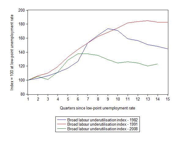
The following graph replicates the previous graph except it uses the ABS broad labour underutilisation rate (unemployment plus underemployment) as a better means of comparing the three recessions.
At the same period in the recovery (using quarterly data), the broad labour underutilisation rate (unemployment plus underemployment) had an index value of 148 in the 1982 recession (absolute value of 12.2 per cent and falling); an index value of 182 in the 1991 recession (absolute value of 17.6 per cent and falling); and an index value of 123 in the current period (absolute value of 22.2 per cent and rising).
So while the level of unemployment is much lower now than in the 1982 recession (at a comparable stage), underemployment is now much higher and so the total labour underutilisation rates are similar.
Commentators who think of the 1982 recession as severe, rarely see it in these terms. Joblessness is probably worse than underemployment but both mean that labour is wasted and income earning opportunities are being foregone. For a worker with extensive nominal commitments, the loss of income when hours are rationed may be no less severe than the loss of hours involved in unemployment, if the threshold of solvency is breached.
Aggregate participation rate falls
The participation rate was constant in May after falling fell sharply (by 0.2 percentage points) in April 2011.
The labour force is a subset of the working-age population (those above 15 years old). The proportion of the working-age population that constitutes the labour force is called the labour force participation rate. So changes in the labour force can impact on the official unemployment rate and so movements in the latter need to be interpreted carefully. A rising unemployment rate may not indicate a recessing economy.
The labour force can expand as a result of general population growth and/or increases in the labour force participation rates.
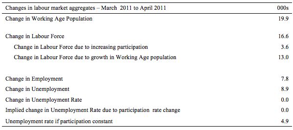
The following Table shows the breakdown in the changes to the main aggregates (Labour Force, Employment and Unemployment) and the impact of the fall in the participation rate.
In May 2011, employment rose by only 7.8 thousand while the labour force rose by 16.6 thousand which meant that unemployment also rose (by 8.9 thousand).
So employment growth failed to keep pace with the underlying population growth.
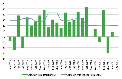
To explore this further we can compare the change in employment each month with the change in the working age population (WAP). The change in the WAP is the underlying number of workers that enter the labour force month to month. The labour force fluctuates also due to participation rate changes but they tend to be volatile and cyclical.
So is the Australian economy adding jobs faster than the growth of its population? The answer is a resounding no.
The following graph plots the two series from May 2009. Over that period, the WAP has expanded on average by 24 thousand per month while employment has only increased on average by 22 thousand over the same period. That is why unemployment is persistently stuck around 4.9 to 5 per cent. The fluctuations in unemployment are on average largely due to participation rate volatility over this period.
Hours worked basically static in May
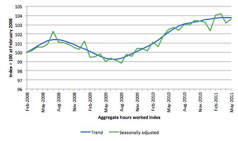
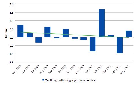
Total monthly hours worked rose in May by 6.4 million hours or 0.4 per cent – that is, barely positive.
The following graph shows the trend and seasonally adjusted aggregate hours worked indexed to 100 at the peak in February 2008 (which was the low-point unemployment rate in the previous cycle). Working hours are not trending strongly upwards.
The next graph shows the monthly growth (in per cent) over the last 12 months. The green linear line is a simple regression trend and it is suggesting monthly growth rates have been in decline all year.
Once again the data doesn’t support the notion of a fully employed labour market that is bursting against the inflation barrier.
Conclusion
The May Labour Force data shows that the Australian economic recovery remains tepid at best and is faltering. Employment growth is now failing to keep up with population growth and it is only a sluggish participation rate that has kept the official unemployment rate stable at 4.9 per cent.
We are now seeing the trends that are free of the natural disasters which tainted the labour force data earlier in the year. The trend is not good. But with monthly data you always have to be careful to look at the trends over several months. They are positive but very weak.
There is still a lot of slack left to be mopped up and the teenage employment problem is manifest and should be a policy priority.
The fact that the Treasurer has expressed satisfaction with the performance outlined in today’s data indicates he does not deserve that position.
It would be better for the Government to admit that they need to maintain a strong fiscal stiumulus and abandon their budget surplus ambitions which are totally at odds with the direction of the economy at present.
That is enough for today!
I’m glad my teenagers are set on pursuing a higher education. I would hate for them to be leaving school in this environment. I regret they won’t have the same educational opportunity as myself (I had my tuition fees paid in a saner era). Student loans are yet another personal debt burden the ideologues and financiers have hung around our necks. I want to condition them not to expect too much as a graduate in this increasingly unfair world, but I don’t want to kill their spirit and optimism.
If the current god awful state of political dialogue persists……all sides braying for surplus and austerity. I’m starting to doubt if the mining boom will stave off a double dip recession. Today there was more news on prices falls in China housing. I’m imagining steel rebar piling up in factories all over China. The miners always over forecast their capital investment anyhow. It’s almost certain they will ratchet down the 2012 numbers, with 2011 actual spending coming in well below forecast.
are you saying that government spending is not creating long term jobs and barely any short term jobs?
Off topic: William Dudley, president of the New York Fed, uses sectoral balances in his argument. Would he have got this from MMTers, or was the sector balance idea well established in the literature before the arrival of MMT?
See para starting “To illustrate this second point..” at:
http://www.newyorkfed.org/newsevents/speeches/2011/dud110607.html
Government spending is winding down Sam.
Private sector credit growth – one of the main economic engines IMO – has not returned to it’s pre-GFC levels and is languishing far below it. With government support being steadily withdrawn, the results are telling.
Hi Bill
I am a regular reader of your blog. I have taken the following excerpt from your blog titled “Twin deficits – another mainstream myth”:
“So at the macroeconomic level, the final expenditure components of aggregate demand are consumption (C), investment (I), government spending (G), and net exports (exports minus imports) (NX).
The basic aggregate demand equation in terms of the sources of spending is:
GDP = C + I + G + (X – M)
which says that total national income (GDP) is the sum of total final consumption spending (C), total private investment (I), total government spending (G) and net exports (X – M).
In terms of the uses that national income (GDP) can be put too, we say:
GDP = C + S + T
which says that GDP (income) ultimately comes back to households who consume, save (S) or pay taxes (T) with it once all the distributions are made.
So if we equate these two ideas sources of GDP and uses of GDP, we get:
C + S + T = C + I + G + (X – M)
Which we then can simplify by cancelling out the C from both sides and re-arranging (shifting things around but still satisfying the rules of algebra) into what we call the sectoral balances view of the national accounts.
There are three sectoral balances derived – the Budget Deficit (G – T), the Current Account balance (X – M) and the private domestic balance (S – I).”
Can you please explain why (X-M) is considered to be Net Exports in terms the uses that national income and the Current Account balance in the sectoral balance?
This has been a matter of confusion for me.
Thanks
Kennedy