Go back to the headlines in 2010 - – “Countries with debt over 90 percent…
Australian inflation rate falls sharply as supply pressures ease
Today’s post is a complement to my post on earlier this week – So-called ‘Team Transitory’ declared victors (January 8, 2024). Yesterday (January 10, 2024), the Australian Bureau of Statistics published the latest – Monthly Consumer Price Index Indicator – for November 2023, which showed another sharp drop in inflation. The data are the closest we have to what is actually going on at the moment and it is clear that the falling inflation that began in September 2022 is continuing at a fairly brisk pace. The annual rate is now down to 4.3 per cent from 4.9 per cent in October 2023. The main driver of inflation over the last few years has been fuel prices and automotive fuel inflation has fallen from 19.7 per cent in September 2023 to 2.3 per cent in November 2023, due to global factors quite independent of domestic monetary policy. In fact, as the time passes we get a much clear reinforcement of the transitory narrative driven by supply factors rather than demand factors. This narrative has also been given weight by a recent research paper from the ECB – What drives core inflation? The role of supply shocks (published November 13, 2023). Overall, the data is now exposing the folly of the New Keynesian macroeconomic policy approach which prioritises monetary policy as the counter stabilising tool and has considered the inflationary episode to be due to excessive government spending.
Inflation continues to decline sharply in Australia
The ABS Media Release (January 10, 2024) – Monthly CPI indicator rose 4.3% annually to November 2023 – noted that:
This month’s annual increase of 4.3 per cent is down from the 4.9 per cent rise in October and is the smallest annual increase since January 2022 …
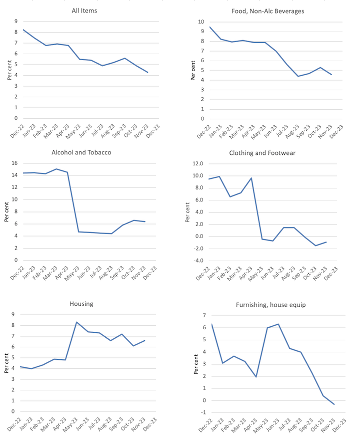
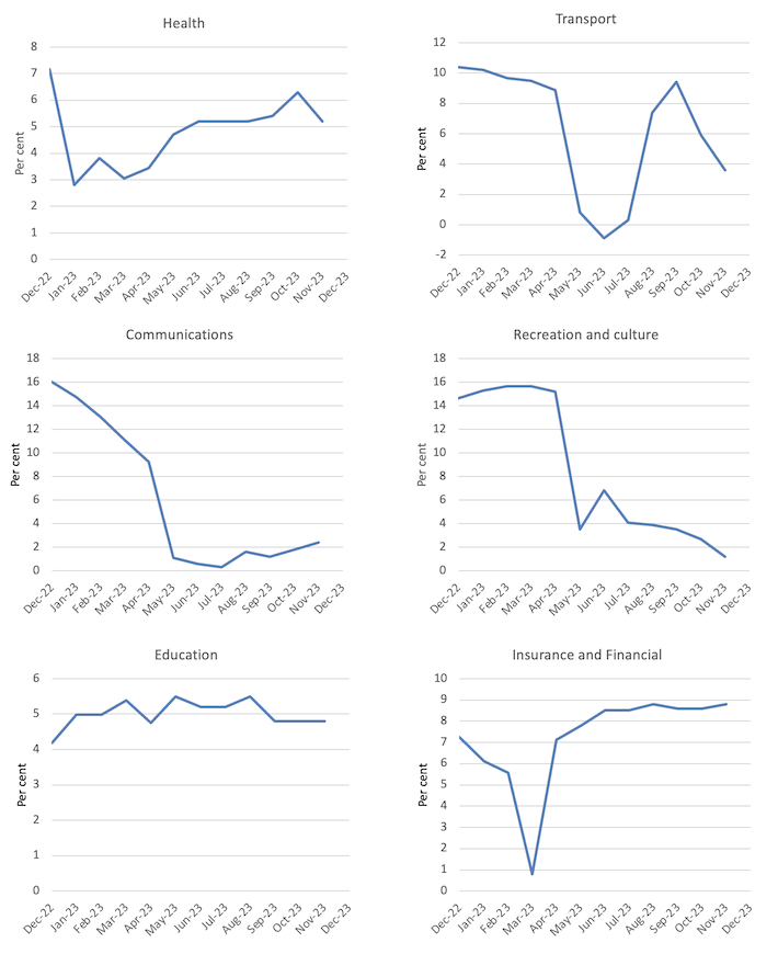
The most significant contributors to the November annual increase were Housing (+6.6 per cent), Food and non-alcoholic beverages (+4.6 per cent), Insurance and financial services (+8.8 per cent) and Alcohol and tobacco (+6.4 per cent) …
Annual inflation for Automotive fuel has fallen from 19.7 per cent in September 2023 to 2.3 per cent in November. This has been a significant contributor to the lower annual rise in the monthly CPI indicator over the past two months.
A few observations:
1. The huge drop in petrol prices has nothing to do with the RBA interest rate increases and has been a ‘significant’ reason the inflation rate is dropping so quickly – a supply side factor.
2. The rent inflation is partly due to the RBA’s own rate hikes as landlords in a tight housing market just pass on the higher borrowing costs – so the so-called inflation-fighting rate hikes are actually driving inflation.
3. Rent increases have been partly offset by increases in Commonwealth Rent Assistance, which shows that more generous fiscal policy at this stage could further significantly reduce the inflation rate.
4. The electricity price rises are due to administrative decisions to allow the poorly regulated privatised power companies to push up prices in excess of cost rises.
5. Higher insurance costs have arisen as a result of a series of climate-change instigated natural disasters – floods, fires – and are not sensitive to higher interest rates.
6. None of the other major drivers are sensitive to interest-rate increases, and are changing for reasons unrelated to the monetary policy changes.
The general conclusion is that the global factors that were responsible for the inflation pressures are abating fairly quickly as the world adapts to Covid, Ukraine and OPEC profit gouging.
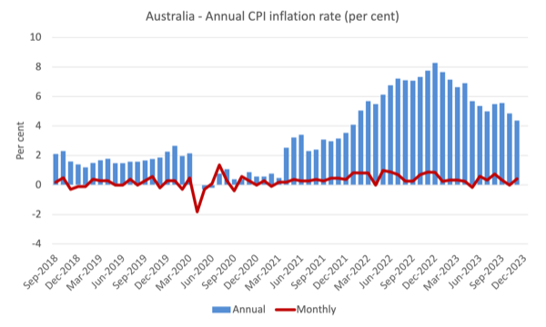
The next graph shows, the annual rate of inflation is heading in one direction – down and quickly.
The blue columns show the annual rate while the red line shows the month-to-month movements in the All Items CPI.
The next graphs show the movements between December 2022 and November 2023 for the main components of the All Items CPI.
In general, most components are seeing dramatic reductions in price rises as noted above and the exceptions do not provide the RBA with any justification for further interest rate rises.
Overall, the inflation rate is declining as the supply factors ease.
The RBA’s fictional NAIRU
One of the problems with the New Keynesian approach is its glued-down insistence that the so-called Non-Accelerating-Inflation-Rate-of-Unemployment (NAIRU) should guide monetary policy.
The mainstream textbook garbage which says that if the unemployment rate is below the NAIRU then inflation accelerates, and, if the unemployment rate is above the NAIRU, then inflation will decline.
The NAIRU, according to the logic defines the state where inflation is stable.
I reject the logic, but let’s run with it to test its internal consistency.
The RBA currently claims justification for hiking interest rates even though inflation is declining rapidly because they claim that the NAIRU, which is unobservable but estimated through econometric methods, is around 4.25 per cent.
With the current unemployment rate at 3.9 per cent, the NAIRU logic should see inflation continuing to accelerate.
On that basis, with inflation in decline, even if we accept there is a definable NAIRU that can be measured somehow, the RBA’s narrative is plainly wrong.
I wrote about that issue in more detail in this blog post (among others) – Mainstream logic should conclude the Australian unemployment rate is above the NAIRU not below it as the RBA claims (July 24, 2023).
The point is, according to the NAIRU logic, if the unemployment rate is below the NAIRU then inflation should be accelerating and if the unemployment rate is above the NAIRU, then inflation should be decelerating.
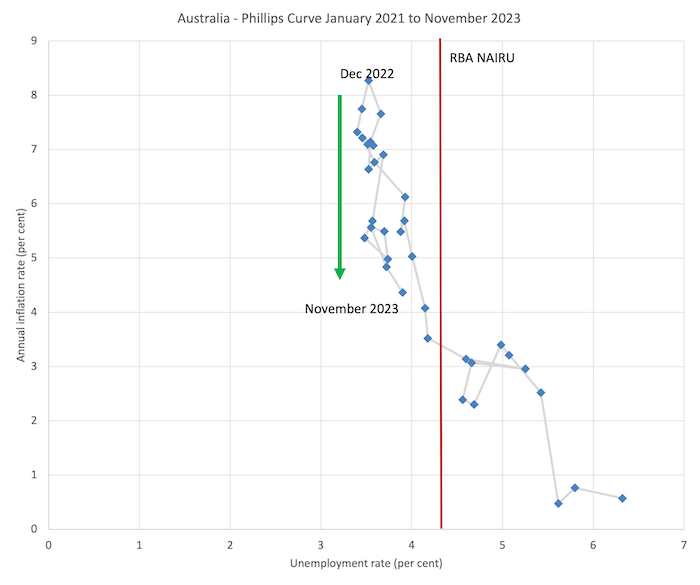
The facts are shown in the graph below which is a Phillips curve graph from January 2021 (just before the inflation rate accelerated) to November 2023.
A Phillips curve graphs the relationship between the unemployment rate (horizontal axis) and the inflation measure on the vertical axis.
In Australia’s case over the last 2 years, the situation is pretty clear.
The unemployment rate has been very stable over the last year or so, fluctuating within a narrow band, but the inflation rate has been falling since last September (green arrow).
Which means that logically, the NAIRU could not be above the current unemployment rate and must be below it.
Which means that the RBA’s insistence on putting 140,000 extra workers onto the unemployment scrap heap has no foundation even in the theoretical structure they believe in.
The vertical red line is the RBA’s NAIRU, which coincides with an inflation rate of just over 3 per cent.
But at that inflation rate there is a wide range of unemployment rates shown – from 4.1 per cent to 5.3 per cent (about) and if I was to do the econometric modelling to estimate the NAIRU formally, I would get a wide confidence interval within which I could not statistically discriminate – in other words the NAIRU estimates are useless for policy.
The NAIRU estimates are just tools used by ideologues who want higher unemployment and more bargaining power to the corporations.
The most recent inflation peak was in December 2022 and it has been declining steadily since with a blip in April 2023.
But look at the range of the unemployment rate within which that decline has been taking place?
Very narrow.
So the NAIRU cannot be at 4.25 per cent and it must, in a logical sense, be lower than 3.7 per cent.
ECB research shows demand effects miniscule
One of the themes of the last few years among economic commentators has been that the inflationary pressures demonstrated that Modern Monetary Theory (MMT) was a failed doctrine.
The inference was that MMT economists had claimed that higher fiscal deficits and lower interest rates, which accompanied the pandemic policy response, could not be inflationary.
The corollary was that MMT economists were wrong to assume that fiscal deficits ‘didn’t matter’ and that the demand expansion had, as the mainstream predicted, caused inflation.
Of course, the inference and corollary was relating to a ‘straw person’ version of MMT, which bore no relation to the body of work that I have been part of developing.
All spending carries an inflation risk.
Fiscal deficits have to be calibrated to fill spending gaps left by non-government saving decisions.
Fiscal deficits can be too large and that assessment depends on the context – Does the nation run an external deficit? What is the saving-investment balance in the private domestic sector?
Further, to assume that MMT is a policy regime is to display the most elemental level of ignorance about what MMT actually is…
More importantly, in this context, when the pandemic emerged and distorted the pattern of supply and demand for goods, it was clear that some inflationary pressures would emerge.
The supply of goods and services became highly contrained.
Access to services was restricted by health policies.
Incomes were maintained by government support spending.
People were confined to their homes and had a lot of time for DIY projects and the Internet still operated for orders to be placed.
The goods supply could not adapt quickly enough to meet the higher demand for goods as people shifted spending from going to cafes and theatres to buying home renovating tools!
Overall demand (spending) did not go far above trend though.
In this context, it was clear that the inflation was not a problem of excessive spending, but was, rather, a supply problem exacerbated by Ukraine and OPEC+.
The solution then was not to cut back spending – which is what the central banks think they are doing when they hike interest rates.
The solution – à la Bank of Japan – was to wait out the supply constraints and hold interest rates constant, with the government providing some fiscal support to lower income households to ease the temporary cost-of-living pressures.
The Japanese policy response has been overwhelmingly demonstrated to be the appropriate one and the opposite to the approach recommended by mainstream macroeconomics.
The ECB recently published some research that reinforces that conclusion.
In the paper cited in the Introduction, the researchers “propose a framework to identify a rich set of structural drivers of inflation in order to understand the role of the multiple and concomitant sources of the post-pandemic inflation surge”.
In other words, they develop a statistical way of separating out the supply and demand factors that are implicated in the emergence of the inflationary pressures.
Their conclusion:
Overall, supply shocks can explain the bulk of the post-pandemic inflation surge, also for core inflation … Shocks related to global supply chains, gas price, and the oil market have all pushed in the same direction supporting a “bad-luck” narrative to the high inflation episode.
Read that a few times.
They also find that ‘labour shocks’ (wage pressures) made a minimal contribution, which again bears badly on the narratives that unemployment had to rise to discipline wage pressures as a solution to the inflation.
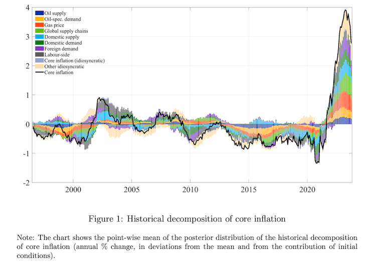
This graph (ECBs Figure 1) summarises the various factors that form the decomposition of the total inflation effect.
Conclusion
The mainstream macroeconomics profession has a incredible capacity to deny evidence.
The way the central banks have justified significant rate hikes despite it being obvious, even in 2021, that the inflationary pressures were not due to excessive demand, has been quite breathtaking.
But I have been in the profession a long time now and I am used to the chicanery and blindness that Groupthink generates.
If there are people looking down from other planets who are more committed to truth then they will be thinking how stupid humans are for believing these mainstream economists, when it is obvious they are just self-serving and reinforcing the dominant position of the elites.
That is enough for today!
(c) Copyright 2024 William Mitchell. All Rights Reserved.
Neoliberalism’s strange non-death.
“The mainstream macroeconomics profession has a incredible capacity to deny evidence.”
Nailed it, right there Bill, thank you!
Great post Bill. Thank you for explaining it once again.
For a while there, I had been afraid I would need to apologize to Larry Summers for my harsh (relatively, by my standards) criticism of his analysis of the causes of inflation and his prescriptions of how to deal with it. But you were right all along about this and I should not have worried. And he deserves no apology for recommending that millions of people should lose their jobs in order to limit inflation.
I also note that Paul Krugman, who may have come up with the term ‘team transitory’, also agreed with you at first. But then he backtracked while you remained firm. I guess he is back on ‘team transitory’ now, but that doesn’t say much for his analysis when it was needed.
I do have a question about the last graph in this post. The legend has a color for “Labour-side” components of inflation, but I can’t see any of it in the chart. Is it there at all, or am I confusing the purple-ish colors with the foreign demand component? I also just love the explanatory note under it- “Note: The chart shows the point-wise mean of the posterior distribution of the historical decomposition of core inflation (annual % change, in deviations from the mean and from the contribution of initial conditions).” Is that intended to be unintelligible to most people, or why do they write like that?
Thanks again for the great post and for the many, many great posts over the years. You are the best economist out there.
Jerry,
It’s kind of a cheesy graphic. I imported it into the GNU Image Manipulation Program to zoom in and compare colors. The Labor component is meant to be dark grey. It seems to provide a small component at the left end of the graph near the black line, a small component below the black line just after 2000, and a largish component above the axis (above and below the black line) leading up to 2005. Also in the lowest dips before and after 2020.
Innocent that I am, I would take that to mean the Labor income, or lack of, was driving core inflation down at most times except the period 2003-2005.
Or maybe that’s too teleological. Maybe they just correlate, and whatever core inflation was doing, the Labor component was doing also.
Another great post, thanks Bill.
I have one question though; the assertion that increases in Commonwealth Rent Assistance could significantly reduce inflation, even just in the housing sector, seems suspect to me.
I would be interested to understand how?
While rent assistance undeniably provides immediate financial relief to tenants, it does not inherently lower rents. By increasing tenants’ ability to pay, it could inadvertently fuel demand-pull inflation in a market with limited housing supply (the underlying problem here, as I understand it).
Surely this could lead to an increase, rather than a decrease, in rents, and by extension contribute to inflation rather than mitigate it?
What am I missing?