On May 19, 2026, Oxfam Australia's media release - Australian billionaires’ wealth grows by $50,000…
Australia – wages growth flat and purchasing power of workers is plummeting to new depths
All eyes have been waiting for today’s release (August 17, 2022) of the – Wage Price Index, Australia – by the Australian Bureau of Statistics for the June-quarter, given that the Reserve Bank of Australia has been claiming wage pressures are becoming threatening and using that as a cover for unnecessarily pushing up interest rates. Prior to pushing up interest rates over the last several months, the RBA had been signalling that they would not move on interest rates until there was a concerted increase in wages growth, which has been at record low levels for some years now. On the back of that information, many new entrants to the housing market ran up massive mortgage debts and now feel dudded by the central bank. Whatever, information on wages the RBA is privy too is not gelling at all with the official data, which continues to show that wages growth remains flat (hasn’t moved in three months) and at record low levels. The is no acceleration. Wages growth is not driving the inflation trajectory. Workers are enduring massive real wage cuts and the RBA has made that worse by pushing up mortgage rates for those exposed. The business sector, as a whole, thinks it is clever to always oppose wages growth and the banks love that because they can foist more debt onto households to maintain their consumption expenditure. But the reality is clear – there can be no sustained recovery for the economy post Covid without significant increases in the current rate of wages growth.
The Wage Price Index:
… measures changes in the price of labour, unaffected by compositional shifts in the labour force, hours worked or employee characteristics
Thus, it is a cleaner measure of wage movements than say average weekly earnings which can be influenced by compositional shifts.
The summary results (seasonally adjusted) for the June-quarter 2022 were:
| Measure | Quarterly (per cent) | Annual (per cent) |
| Private hourly wages | 0.7 | 2.7 |
| Public hourly wages | 0.6 | 2.4 |
| Total hourly wages | 0.7 | 2.6 |
| Basic CPI measure | 1.78 | 6.1 |
| Weighted median inflation | 1.1 | 4.2 |
| Trimmed mean inflation | 1.2 | 4.9 |
On price inflation measures, please read my blog post – Inflation benign in Australia with plenty of scope for fiscal expansion (April 22, 2015) – for more discussion on the various measures of inflation that the RBA uses – CPI, weighted median and the trimmed mean The latter two aim to strip volatility out of the raw CPI series and give a better measure of underlying inflation.
Real wage trends in Australia
The summary data in the table above confirm that the plight of wage earners continues in Australia.
Real wages fell again in the June-quarter in both the private and public sectors.
It is clear that the public sector wage caps (state and federal) have created an environment where private sector wage rises are being constrained, independently of the state of the private labour market.
The first graph shows the overall annual growth in the Wage Price Index (public and private) since the June-quarter 2000 (the series was first published in the June-quarter 1997) and the RBA’s core annual inflation rate (red line).
Any blue bar area above the red line indicate real wages growth and below the opposite.
Workers have endured increasing real wage cuts over the last five quarters.

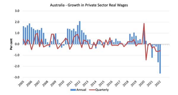
The next graph shows the growth in private sector real wages since the June-quarter 2005 to the June-quarter 2021. The core inflation rate is used to deflate the nominal wages growth.
The blue bars are the annual rate of change, while the red line is the quarterly rate of change.
The fluctuation in mid-2020 is an outlier created by the temporary government decision to offer free child care for the June-quarter which was rescinded in the June-quarter of that year.
Overall, the record since 2013 has been appalling.
Throughout most of the period since 2015, real wages growth has been negative with the exception of some partial catchup in 2018 and 2019.
The real wage cuts are now intensifying.
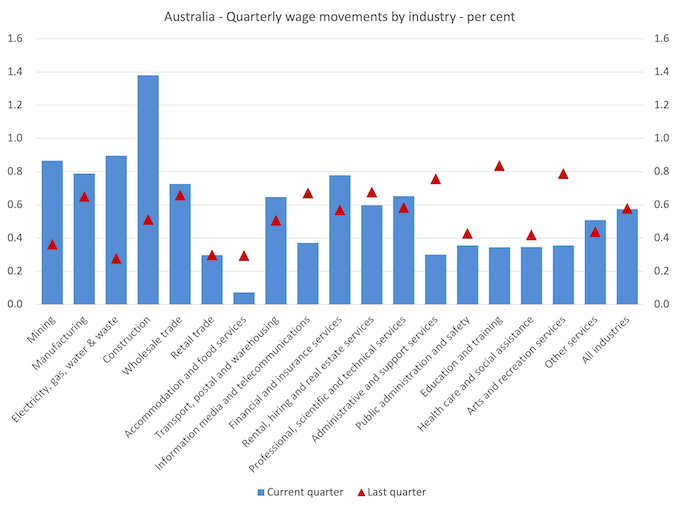
Industry Variability
The aggregate data shown above hides quite a significant disparity in quarterly wage movements at the sectoral level, which are depicted in the next graph.
The blue bars are the current quarterly change, while the red triangles are the previous quarterly change.
Some sectors have experienced rising nominal wages growth in the last quarter but many other sectors are static or going backwards.
It is no surprise that the construction sector is leading the way given the shortage of workers due to Covid.

The ABS also reported that:
- Construction recorded the highest quarterly (1.4%) and annual rise (3.4%) in wages. This was the highest quarterly rate for the industry since June quarter 2008 and the highest annual rate of growth since December quarter 2012.
- Accommodation and food services recorded the lowest quarterly rate of growth (0.1%).
- Mining and Electricity, gas, water and waste services recorded the lowest through the year wage growth (2.2%).
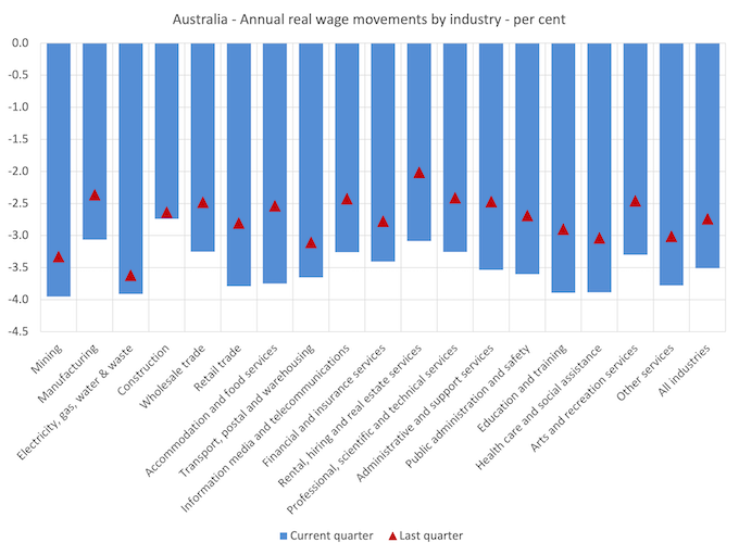
If we consider the situation over the last year, then we can see from the following graph that wages growth has picked up a bit but this is not demonstrative of any major wages breakout occurring.
While nominal wages growth was positive, albeit modest, the next graph shows the movements in real wages and you can see that real wages fell in all sectors.
This is now a chronic situation.
This on-going cut in the purchasing power of workers is almost unprecedented in our wages history and marks a massive redistribution of income towards profits.
Further, one can hardly say that wages push is causing the inflation spike.
The great productivity rip-off continues at a pace
The Non-farm GDP per hour data (productivity) is derived from the quarterly National Accounts and available via the RBA Table H2 Labour Costs and Productivity.
The ABS Information Note: Gross Domestic Product Per Hour Worked – says that:
In Australian National Accounts: National Income, Expenditure and Product (cat. no. 5206.0) and Australian System of National Accounts (cat. no. 5204.0) the term ‘GDP per hour worked’ (and similar terminology for the industry statistics) is generally used in preference to ‘labour productivity’ because:
– the term is more self-explanatory; and
– the measure does not attribute change in GDP to specific factors of production.
While the decline in real wages means that the rate of growth in nominal wages being outstripped by the inflation rate, another relationship that is important is the relationship between movements in real wages and productivity.
Historically (up until the 1980s), rising productivity growth was shared out to workers in the form of improvements in real living standards.
In effect, productivity growth provides the ‘space’ for nominal wages to growth without promoting cost-push inflationary pressures.
There is also an equity construct that is important – if real wages are keeping pace with productivity growth then the share of wages in national income remains constant.
Further, higher rates of spending driven by the real wages growth can underpin new activity and jobs, which absorbs the workers lost to the productivity growth elsewhere in the economy.
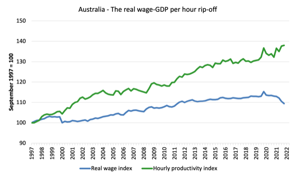
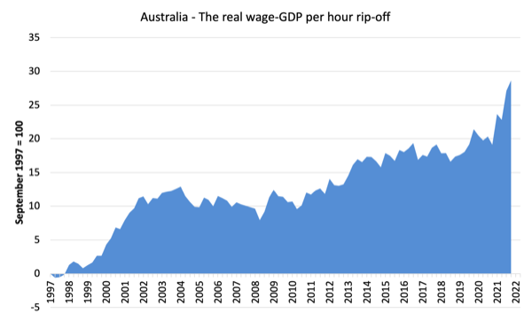
Taking a longer view, the following graph shows the total hourly rates of pay in the private sector in real terms (deflated with the CPI) (blue line) from the inception of the Wage Price Index (June-quarter 1997) and the real GDP per hour worked (from the national accounts) (green line) to the June-quarter 2021.
It doesn’t make much difference which deflator is used to adjust the nominal hourly WPI series. Nor does it matter much if we used the national accounts measure of wages.
But, over the time shown, the real hourly wage index has grown by only 9.4 per cent (and falling), while the hourly productivity index has grown by 38 per cent (and rising).
So not only has real wages growth turned negative over the last year or so, but the gap between real wages growth and productivity growth continues to widen.
If I started the index in the early 1980s, when the gap between the two really started to open up, the gap would be much greater. Data discontinuities however prevent a concise graph of this type being provided at this stage.
For more analysis of why the gap represents a shift in national income shares and why it matters, please read the blog post – Australia – stagnant wages growth continues (August 17, 2016).
Where does the real income that the workers lose by being unable to gain real wages growth in line with productivity growth go?
Answer: Mostly to profits.
The next graph shows the gap between the real wage index and the labour productivity index in points.
It provides an estimate of the cumulative redistribution of income to profits as a result of real wage suppression.
Now, if you think the analysis is skewed because I used GDP per hour worked (a very clean measure from the national accounts), which is not exactly the same measure as labour productivity, then consider the next graph.
It shows the movements in the wage share in GDP (at factor cost) and profit share since the June-quarter 1960 to the March-quarter 2022 (latest data).
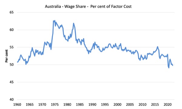
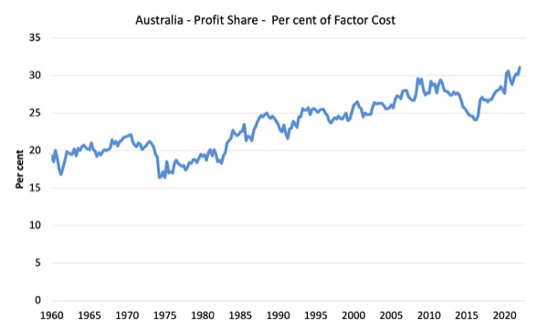
While the series move around from quarter to quarter, the trend is obvious.
The only way that the wage share can fall like this, systematically, over time, is if there has been a redistribution of national income away from labour.
I considered these questions in a more detailed way in this blog post series:
1. Puzzle: Has real wages growth outstripped productivity growth or not? – Part 1 (November 20, 2019).
2. 1. Puzzle: Has real wages growth outstripped productivity growth or not? – Part 2 (November 21, 2019).
And the only way that can occur is if the growth in real wages is lower than the growth in labour productivity.
That has clearly been the case since the late 1980s. In the June-quarter 1991, the wage share was 56.6 per cent and the profit share was 22.2 per cent.
By the June-quarter 2022, the wage share had fallen to 49.8 per cent and the profit share risen to 31.3 per cent.
There has been a massive redistribution of income towards profits has occurred over the last 40 years.
The relationship between real wages and productivity growth also has bearing on the balance sheets of households.
One of the salient features of the neo-liberal era has been the on-going redistribution of national income to profits away from wages. This feature is present in many nations.
The suppression of real wages growth has been a deliberate strategy of business firms, exploiting the entrenched unemployment and rising underemployment over the last two or three decades.
The aspirations of capital have been aided and abetted by a sequence of ‘pro-business’ governments who have introduced harsh industrial relations legislation to reduce the trade unions’ ability to achieve wage gains for their members. The casualisation of the labour market has also contributed to the suppression.
The so-called ‘free trade’ agreements have also contributed to this trend.
I consider the implications of that dynamic in this blog post – The origins of the economic crisis (February 16, 2009).
As you will see, I argue that without fundamental change in the way governments approach wage determination, the world economies will remain prone to crises.
In summary, the substantial redistribution of national income towards capital over the last 30 years has undermined the capacity of households to maintain consumption growth without recourse to debt.
One of the reasons that household debt levels are now at record levels is that real wages have lagged behind productivity growth and households have resorted to increased credit to maintain their consumption levels, a trend exacerbated by the financial deregulation and lax oversight of the financial sector.
Real wages growth and employment
The standard mainstream argument is that unemployment is a result of excessive real wages and moderating real wages should drive stronger employment growth.
As Keynes and many others have shown – wages have two aspects:
First, they add to unit costs, although by how much is moot, given that there is strong evidence that higher wages motivate higher productivity, which offsets the impact of the wage rises on unit costs.
Second, they add to income and consumption expenditure is directly related to the income that workers receive.
So it is not obvious that higher real wages undermine total spending in the economy. Employment growth is a direct function of spending and cutting real wages will only increase employment if you can argue (and show) that it increases spending and reduces the desire to save.
There is no evidence to suggest that would be the case.
I usually publish a cross-plot that consistently shows no relationship between annual growth in real wages and the quarterly change in total employment over a long period.
The graph has issues at present due to Covid-19 outliers, although the conclusion doesn’t change.
There is also strong evidence that both employment growth and real wages growth respond positively to total spending growth and increasing economic activity. That evidence supports the positive relationship between real wages growth and employment growth.
Conclusion
In the June-quarter 2022, Australia’s wage growth remained modest to say the least.
There can be no sustained recovery for the economy post Covid without a significant shift in the way we think about wages growth.
The data shows that the significant cuts to workers’ purchasing power continue, and, in my view, constitute a national emergency.
There can be no sustained acceleration in the inflation rate while wages growth is at these levels.
Further productivity growth continues apace, which means with declining real wages, that the redistribution of national income away from wages to profits also continues.
Another emergency that no policy maker seems to want to address.
The business sector, as a whole, thinks it is clever to always oppose wages growth and the banks love that because they can foist more debt onto households to maintain their consumption expenditure.
None of this offers workers a better future.
Misleading statements from the Great Barrington crew
An Icelandic study was published a few weeks ago (August 3, 2022) – Rate of SARS-CoV-2 Reinfection During an Omicron Wave in Iceland – which produced some interesting results.
The Great Barrington crew waded in on Twitter inferring that it vindicated their flawed position on the pandemic.
They wrote:
– 11.5% reinfected during the Omicron
– Reinfection odds were higher among persons who had received 2 or more doses vs. 1 dose or fewer of the vax (odds ratio, 1.42; 95% CI, 1.13-1.78).
The Twitter cheer squad Tweeted “Wow!” as if the information was startling. I guess the cheer squad hadn’t read the study in detail.
The inference they wanted uninformed readers of their Tweets to take out was that the vaccines were an inferior option to not having any vaccine.
While the lay audience can be excused (to some extent) for not studying the scientific paper in detail and understanding the methods and qualifications of the authors, the professionals who put the Tweets out cannot be so excused.
I consider their input to be misinformation.
First, the authors of the Icelandic study note:
This finding should be interpreted with caution because of limitations of our study, which include the inability to adjust for the complex relationships among prior infection, vaccine eligibility, and underlying conditions.
In other words, there were no strict controls which means that there is no causal inference possible.
What other protective measures were the respondents taking, for example?
You could get this result, for example, if the non-vaccinated had become hermits and the vaccinated had resumed a vibrant social life. Without the controls a researcher cannot infer anything.
But second, the authors wrote:
Importantly, by December 1, 2021, all persons aged 12 years and older were eligible for 2 or more vaccine doses free of charge, and 71.1% of the Icelandic population had been vaccinated,5 compared with only 25.5% of our cohort of previously infected persons.
Which is the significant point.
When they gathered their sample of those reinfected, that sample was significantly more vaccinated than respondents who were previously infected.
So it is no surprise that there will be an association with vaccine coverage and reinfection.
We are thus dealing with a volume rather than causal effect.
We all know that the vaccines do not prevent infection. They help to reduce the rate of infection and also attenuate the severity of the disease.
So as the vaccination coverage rises during a pandemic of this type, one would expect more infections in number among the vaccinated as opposed to the non-vaccinated.
It tells you nothing of interest really.
That is enough for today!
(c) Copyright 2022 William Mitchell. All Rights Reserved.
Bloomberg is reporting that the UK is about to receive Australian gas for the first time
The UK will then regas the shipment and pipe it to Europe – because the UK has no storage facilities of its own.
This will be how the prices paid in Europe are transmitted down under. The drop in demand in China is being hoovered up by Europe.
“We all know that the vaccines do not prevent infection. They help to reduce the rate of infection and also attenuate the severity of the disease.”
I’m not seeing a lot of evidence that the first generation Covid vaccines reduced the rate of infection very much, if at all. The effects seem to be limited to reducing the severity of the disease amongst older people, with side effects in some people that are more severe than the equivalent flu vaccine.
All to be expected from a vaccine that was put together in record time. It’s still better than nothing!
All sides in this debate seem to be relying upon obvious statistical flaws to push their narrative. Either the quality of peer review has declined, or they’ve all been taking lessons from mainstream economists in how to lie by waving your credentials.
Science is becoming a branch of brand marketing.
“Science is becoming a branch of brand marketing.’ Well said, albeit a bad sign. The number of scientific/medical papers being recalled is astonishing. Junk publishing with disingenuous motives. It’s getting to a point where you ought to disbelieve anything published until proven otherwise.
Australia – wages growth flat and purchasing power of workers is plummeting to new depths
And while ever we embrace neoliberalism and their neocon sycophants we will continue down! Russia and China are on the rise the collective west are in sh##ts ville!!!
I just read a tweet from Warren Mosler, citing a certain Michael Woodford (economist at Columbia University, as it seems), that “higher interest rates make savings more lucrative, in comparison to current spending”. He goes on to conclude that “if the GOVERNMENT sees it’s shoveling out too much money in interest, it could cut other spending or raise taxes(…).”
First, the priority is to satisfy the rich, even if that means cutting social spending or raising taxes for the middle class (the only ones that pay taxes, for the poor don’t have it and the rich don’t pay anything, as Trump as shown to everyone, not so long ago).
Remarkable how the ideologues of central bank independency, now talk about “the government”, meaning that it’s all about political options e nothing about technical issues.
Well, we knew it all along, right?
“…real wages growth respond positively to total spending growth …”
This is a little difficult to understand given that profits push is always in operation and it doesn’t gel with the notion that the wages share has declined significantly.
If profits push was not a significant factor, I think it would be reasonable to argue Bill’s point.
The other way of having Bill’s point be viable is to say that real wages growth may respond to total spending growth but is not as strong as total spending growth. That is, profits push holds back real wage growth but there can be real wages growth none the less. It’s all in the dynamics.
“As Keynes and many others have shown – wages have two aspects:”
Mainstream economists claiming that the GT was about the effect of sticky wages on output, is clear evidence they have not read the GT.