In the 1990s, a new industry was created in Australia. It produced nothing. But it…
US employment continues to grow but still 1.6 million jobs short of pre-pandemic levels
Last Friday (April 1, 2022), the US Bureau of Labor Statistics (BLS) released their latest labour market data – Employment Situation Summary – March 2022 – which reported a total payroll employment rise of only 431,000 jobs. Fortunately, employment growth was strong enough to drive the unemployment rate down by 0.2 points to 3.6 per cent. But there is still room for the unemployment rate to fall even further. The US labour market is still 1,579 thousand jobs short from where it was at the end of March 2020, which helps to explain why there are no wage pressures emerging. Real wages continued to decline. Any analyst who is claiming the US economy is close to full employment hasn’t looked at the data.
Overview for March 2022:
- Payroll employment increased by 431,000.
- Total labour force survey employment rose by 736 thousand net (0.47 per cent).
- The seasonally adjusted labour force 418 thousand net (0.25 per cent).
- The employment-population ratio rose 0.2 points to 60.1 per cent (it is still lower than the March 2020 peak of 61.2).
- Official unemployment fell by 318 thousand to 5,952 thousand.
- The official unemployment rate fell by 0.2 points to 3.6 per cent.
- The participation rate rose a little to 62.4 per cent.
- The broad labour underutilisation measure (U6) fell by 0.3 points to 6.9 per cent as the underemployment increase was offset by the unemployment decline.
For those who are confused about the difference between the payroll (establishment) data and the household survey data you should read this blog post – US labour market is in a deplorable state – where I explain the differences in detail.
Some months the difference is small, while other months, the difference is larger.
Payroll employment trends
The BLS noted that:
Total nonfarm payroll employment rose by 431,000 in March … Overall, job growth averaged 562,000 per month in the first quarter of 2022, the same as the average monthly gain for 2021. However, employment is down by 1.6
million, or 1.0 percent, from its pre-pandemic level in February 2020 …Employment in leisure and hospitality continued to increase, with a gain of 112,000 in March … is down by 1.5 million, or
8.7 percent, since February 2020.Job growth continued in professional and business services, which added 102,000 jobs in March … is 723,000 higher than in February 2020.
Employment in retail trade increased by 49,000 in March … is 278,000 above its level in February 2020.
Manufacturing added 38,000 jobs in March … is down by 128,000, or 1.0 percent.
Employment in social assistance increased by 25,000 in March … is down by 126,000, or 2.9 percent, from its level in February 2020.
Employment in construction continued to trend up in March … and has returned to its February 2020 level.
In March, employment in financial activities rose by 16,000 … is 41,000 above its level in February 2020.
Health care employment changed little in March … is down by 298,000, or 1.8 percent, since February 2020.
Employment in transportation and warehousing was essentially unchanged in March … is 608,000 higher than in February 2020.
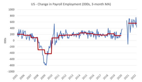
The first graph shows the monthly change in payroll employment (in thousands, expressed as a 3-month moving average to take out the monthly noise). The red lines are the annual averages. I left out the observations between January 2020 and September 2020, which were so extreme that they make it harder to compare the current period with the pre-pandemic history.
The US labour market is still 1,579 thousand jobs short from where it was at the end of March 2020 and the commentary from the BLS above tells us how this shortfall is distributed across the sectors.
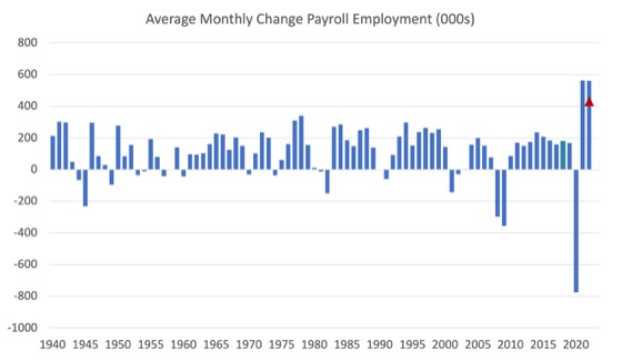
The next graph shows the same data in a different way – in this case the graph shows the average net monthly change in payroll employment (actual) for the calendar years from 2005 to 2021.
The red marker on the column is the current month’s result.
The final average for 2019 was 164 thousand.
The final average for 2020 was -774 thousand.
The final average for 2021 was 562 thousand.
The average so far in 2022 is 562 thousand.
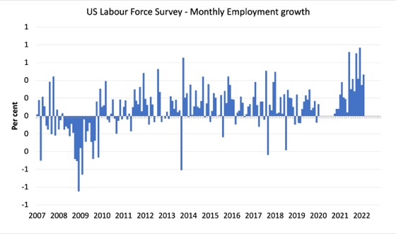
Labour Force Survey – employment growth moderates
The data for March 2022 reveals:
1. Total labour force survey employment rose by 736 thousand net (0.47 per cent).
2. The seasonally adjusted labour force 418 thousand net (0.25 per cent).
3. The participation rate rose by 0.1 points to 62.4 per cent.
4. As a result (in accounting terms), total measured unemployment fell by 318 thousand to 5,952 thousand and the unemployment rate fell by 0.2 points to 3.6 per cent.
The following graph shows the monthly employment growth since January 2008 and excludes the extreme observations (outliers) between March 2020 and October 2020, which distort the current period relative to the pre-pandemic period.
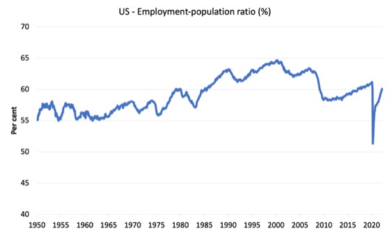
The Employment-Population ratio is a good measure of the strength of the labour market because the movements are relatively unambiguous because the denominator population is not particularly sensitive to the cycle (unlike the labour force).
The following graph shows the US Employment-Population from January 1950 to March 2022.
While the ratio fluctuates a little, the April 2020 ratio fell by 8.6 points to 51.3 per cent, which is the largest monthly fall since the sample began in January 1948.
In March 2022, the ratio rose by 0.2 points to 60.1 per cent.
It is still down on the level in March 2020 (61.1 per cent).
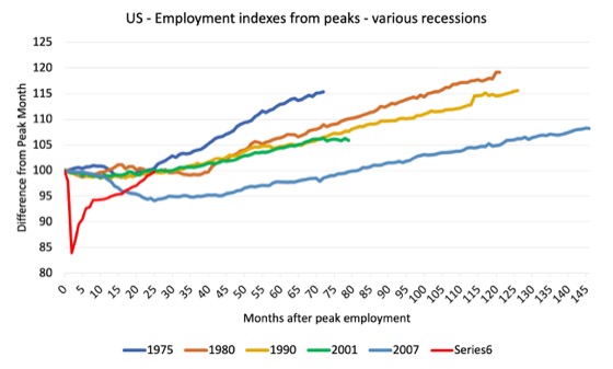
As a matter of history, the following graph shows employment indexes for the US (from US Bureau of Labor Statistics data) for the five NBER recessions since the mid-1970s and the current 2020-COVID crisis.
They are indexed at the employment peak in each case and we trace the data out for each episode until one month before the next peak.
So you get an idea of:
1. The amplitude (depth) of each cycle in employment terms.
2. The length of the cycle in months from peak-trough-peak.
The early 1980s recession was in two parts – a short downturn in 1981, which was followed by a second major downturn 12 months later in July 1982 which then endured.
Other facts:
1. Return to peak for the GFC was after 78 months.
2. The previous recessions have returned to the 100 index value after around 30 to 34 months.
3. Even at the end of the GFC cycle (146 months), total employment in the US had still only risen by 8.3 per cent (since December 2007), which is a very moderate growth path as is shown in the graph.
The COVID collapse was something else but the recent gains are evident.
After 24 months, total employment is still 0.3 points below the March 2020 level.
Unemployment and underutilisation trends
The BLS note that:
The unemployment rate declined by 0.2 percentage point to 3.6 percent in March, and the number of unemployed persons decreased by 318,000 to 6.0 million. These measures are little different from their values in February 2020 (3.5 percent and 5.7 million,
respectively), prior to the coronavirus (COVID-19) pandemic. …the number of long-term unemployed (those jobless for 27 weeks or more) decreased by 274,000 to 1.4 million. This measure is 307,000 higher than in February 2020. The long-term unemployed accounted for 23.9 percent of all unemployed persons in
March. …The number of persons employed part time for economic reasons was about unchanged at 4.2 million in March and is little different from its February 2020 level. These individuals, who would have preferred full-time employment, were working part time because their hours had been reduced or they were unable to find full-time jobs. …
In March, employment growth was strong enough to outpace the growth in the labour force driven by a slight rise in the participation rate and so unemployment fell.
It is clear that the unemployment rate can go lower yet before wage pressures emerge (see below).
The first graph shows the official unemployment rate since January 1994.
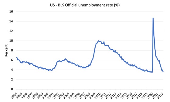
The official unemployment rate is a narrow measure of labour wastage, which means that a strict comparison with the 1960s, for example, in terms of how tight the labour market, has to take into account broader measures of labour underutilisation.
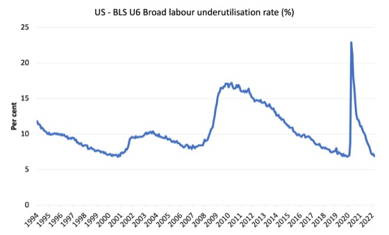
The next graph shows the BLS measure U6, which is defined as:
Total unemployed, plus all marginally attached workers plus total employed part time for economic reasons, as a percent of all civilian labor force plus all marginally attached workers.
It is thus the broadest quantitative measure of labour underutilisation that the BLS publish.
Pre-COVID, U6 was at 6.8 per cent (December 2019).
In March 2022 the U6 measure was 6.9 per cent, a rise of 0.3 points on the previous month.
This is mainly due to the decline in official unemployment.
Ethnicity and Education
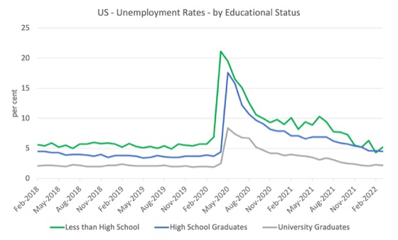
The next graph shows the evolution of unemployment rates for three cohorts based on educational attainment: (a) those with less than high school completion; (b) high school graduates; and (c) university graduates.
The unemployment rate for a person with a university degree is 2 per cent, while the other groups are much higher.
In the collapse in employment in the early months of the pandemic, the unemployment rates rose by:
- 14.2 points for those with less than high-school diploma.
- 13.2 points for high school, no college graduates.
- 5.9 points for those with university degrees.
The period since April 2020 has seen the unemployment rate fall by:
- 15.9 points for those with less than high-school diploma meaning the unemployment rate is now 1.7 points below the March 2020 level.
- 13.6 points for high school, no college graduates meaning the unemployment rate is now 0.4 points above the March 2020 level.
- 6.4 points for those with university degrees meaning the unemployment rate is now 0.5 points below the March 2020 level.
In the last month, the change in the unemployment rate has been:
- a fall of 0.9 points for those with less than high-school diploma.
- a fall of 0.5 points for high school, no college graduates.
- a fall of 0.2 points for those with university degrees.
In the US context, the trends in trends in unemployment by ethnicity are interesting.
Two questions arise:
1. How have the Black and African American and White unemployment rate fared in the post-GFC period?
2. How has the relationship between the Black and African American unemployment rate and the White unemployment rate changed since the GFC?
Summary:
1. All the series move together as economic activity cycles. The data also moves around a lot on a monthly basis.
2. The Black and African American unemployment rate was 6.8 per cent in March 2020, rose to 16.6 per cent in May 2020 and is at 6.2 per cent in March 2022. In the last month, it was fell by 0.4 points, the third consecutive month of decline.
3. The Hispanic or Latino unemployment rate was 6 per cent in March 2020, rose to 18.9 per cent in April and is at 4.2 per cent in March 2022. In the last month, it fell by 0.2 points.
4. The White unemployment rate was 3.9 per cent in March 2020, rose to 14.1 per cent in April and fell to 3.2 per cent in March 2022, a decline of 0.1 point.
5. As the labour market tightens, the more disadvantaged groups get sucked back into employment as employers are forced to abandon prejudices.
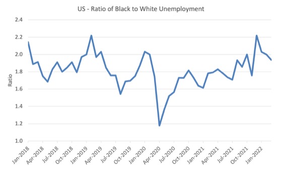
The next graph shows the Black and African American unemployment rate to White unemployment rate (ratio) from January 2018, when the White unemployment rate was at 3.5 per cent and the Black or African American rate was at 7.5 per cent.
This graph allows us to see whether the relative position of the two cohorts has changed since the crisis.
If it is rising, then the unemployment rate of the Black and African American cohort is either rising faster than the white unemployment rate or falling more slowly (or a combination of that relativity).
While there is month-to-month variability, the data shows that, in fact, through to mid-2019, the position of Black and African Americans had improved in relative terms (to Whites), although that just reflected the fact that the White unemployment was so low that employers were forced to take on other ‘less preferred’ workers if they wanted to maintain growth.
In April 2019, the ratio was 2.1 (meaning the Black and African American unemployment rate was more than 2 times the White rate).
By April 2020, the ratio had fallen to its lowest level of 1.2, reflecting the improved relative Black and African American position.
As the pandemic hit, the ratio rose and peaked at 1.8 in October 2020.
In March 2022, the ratio was 1.94, a decline of 0.06 points, which indicates that the relative position of the Black and African American cohort has improved a little further.
Special analysis this month – What are wages doing in the US?
Unemployment continues to fall in the US challenging any previous notions of full employment.
But inflation is also rising and so the NAIRU-gang naturally (no pun intended) claim the inflation is being driven by an overheated economy.
The US Federal Reserve has bowed to the pressure from financial markets and started hiking interest rates.
However, if this story was correct then wages growth should be strong and pushing the price level along.
So with the unemployment rate continuing to fall, has this promoted an acceleration in wages growth?
The BLS reported that:
Average hourly earnings for all employees on private nonfarm payrolls rose by 13 cents to $31.73 in March. Over the past 12 months, average hourly earnings have increased by 5.6 percent. In March, average hourly earnings of private sector production and nonsupervisory employees rose by 11 cents to $27.06.
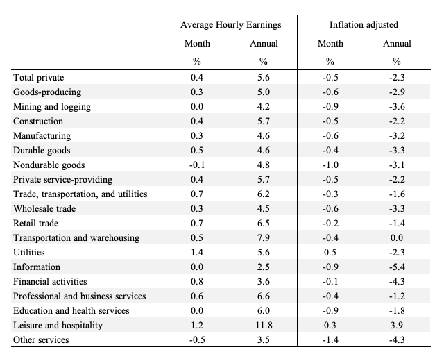
The following table shows the movements in nominal Average Hourly Earnings (AHE) by sector and the inflation-adjusted AHE by sector for February 2022 (latest data).
Real wages are falling in all sectors other than Leisure and hospitality.
If wages were pushing the inflation rate we would not be seeing persistent real wages cuts.
The following graph shows the annual hourly earnings growth for all private employees since March 2007.
There is no accelerating trend.
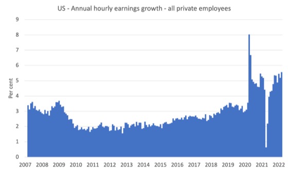
Note that the above graph is in nominal terms.
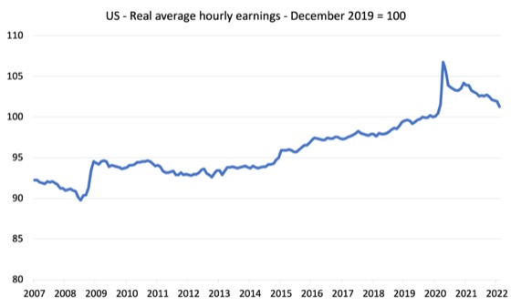
The latest – BLS Real Earnings Summary (published March 10, 2022) – tells us that:
Real average hourly earnings for all employees decreased 0.8 percent from January to February, seasonally adjusted … This result stems from essentially no change in average hourly earnings combined with an increase of 0.8 percent in the
Consumer Price Index for All Urban Consumers (CPI-U). …Real average weekly earnings decreased 0.5 percent over the month due to the change in real average hourly earnings combined with an increase of 0.3 percent in the average workweek.
Real average hourly earnings decreased 2.6 percent, seasonally adjusted, from February 2021 to February 2022.
So, over the year to February 2022, real earnings are significantly lower.
Workers are not catching up with the price level rises and can hardly be said to be pressuring inflation.
The following graph shows movements in real average hourly earnings (indexed at 100 the pre-GFC peak – November 2006) up to January 2022 tells the story.
The spike in the early period of the pandemic was the result of hours adjustments rather than earnings growth.
And, from the latest – Productivity and Costs, Fourth Quarter and Annual Averages 2021, Revised (published March 3, 2022) – report, we find that:
Nonfarm business sector labor productivity increased 6.6 percent in the fourth quarter of 2021 … as output increased 9.1 percent and hours worked increased 2.4 percent … From the fourth quarter of 2020 to the fourth quarter of 2021, nonfarm business sector labor productivity increased 1.9 percent … Annual average productivity increased 1.9 percent from 2020 to 2021.
So real hourly earnings growth is still lagging behind the annual productivity growth, which is another sign of labour market slack and weak bargaining power.
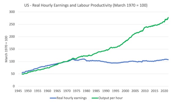
The following graph tells the story.
It shows real hourly earnings and labour productivity (output per hour) indexed at 100 in the March-quarter 1970 (around the time the two series started to diverge).
Workers have enjoyed hardly any real wages growth since 1970 (rising by just 7.6 per cent) whereas productivity growth has risen by 177 per cent.
There has been a massive redistribution of national income away from workers towards profits over this long period.
This depicts the failure of Capitalism to serve the best interests of the people.
Conclusion
The US labour market was stronger in March 2022 with good employment growth and further falls in the unemployment rate.
The US labour market is still 1,579 thousand jobs short from where it was at the end of March 2020.
The employment-population ratio is still down on the March 2020 peak.
There are no fundamental wage pressures emerging at present despite the spikes in inflation arising from supply chain constraints.
The US labour market is still some way from being at full employment.
That is enough for today!
(c) Copyright 2022 William Mitchell. All Rights Reserved.
Unrelated to today’s post, but I just had to express my delight at seeing a graph, with the reference “Source: Bill Mitchell bilbo.economicoutlook.net” in a piece on the ABC (Australian Broadcasting Corporation) website by their business editor Ian Verender. I don’t recall ever seeing a reference to Bill’s work in any other ABC story.
The piece is called “Beware of politicians promising higher wages as Australia decides in next month’s federal election” if you want to frame it and hang it on your wall.
Shouldn’t there be some attention paid to the high level of job openings? The government’s Covid spending surge encouraged people to not work–sort of like bidding workers away from the private sector, a factor that could be adding to inflationary pressures. Also, is it possible that measurements of wages are being distorted by the rising level of retirements where people who could have been getting higher pay are no longer in the work force?