The Australian Bureau of Statistics (ABS) released the latest labour force data today (June 25,…
Australian labour market – as Covid spreads, workers get sick and hours or work falls dramatically
The Australian Bureau of Statistics released the latest labour force data today (February 17, 2022) – Labour Force, Australia – for January 2022. The situation is this: most states have now abandoned Covid restrictions and the virus has spread quickly and is now impacting significantly on the availability of workers. One standout in today’s data is the dramatic fall in monthly hours worked (-8.8 per cent). This puts paid to the notion spread by economists that there is a trade-off between the economy and the health of workers. Employment growth was modest to say the least and full-time jobs growth was negative. The unemployment rate was unchanged. The flat population growth as external borders remain largely closed (or there is a slow take-up of international travel opportunities from foreign tourists) has helped keep the unemployment rate low as employment growth slows dramatically. The falling fiscal support is not helping however.
The summary ABS Labour Force (seasonally adjusted) estimates for January 2022 are:
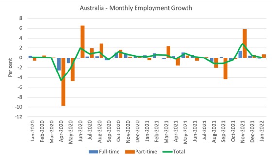
- Employment increased by 12,900 (0.1 per cent) – Full-time employment decreased by 17,000 and part-time employment increased by 30,000.
- Unemployment rose by 5,600 to 580,000 persons.
- The official unemployment rate was unchanged at 4.2 per cent.
- The participation rate increased by 0.1 points to 66.2 per cent.
- The employment-population ratio increased by 0.1 points to 63.4 per cent.
- Aggregate monthly hours worked fell by 159.4 million hours (-8.8 per cent).
- Underemployment increased by 0.1 points to 6.7 per cent (a rise of 9 thousand). Overall there are 924.9 thousand underemployed workers. The total labour underutilisation rate (unemployment plus underemployment) increased by 0.1 points to 10.9 per cent. There were a total of 1,505.0 thousand workers either unemployed or underemployed.
In its – Media Release – the ABS note that:
Seasonally adjusted hours worked fell by 8.8 per cent between December 2021 and January 2022 …
The changes in hours worked were more pronounced than for other key indicators, with employment increasing by around 13,000 people, unemployment by 6,000 people and the unemployment rate remaining at 4.2 per cent …
said the large fall in hours worked in January 2022 reflected more people than usual taking annual leave and sick leave in the first two weeks of January. This was a period with high numbers of COVID cases associated with the Omicron variant, and considerable disruption across the labour market …
Nationally, and in New South Wales and Victoria, the number of people who worked reduced hours because they were sick was around three times the pre-pandemic average for January. In other states and territories, it was twice as many people.
The opening up certainly boosted employment but then the infection rate has gone through the roof and as I predicted last month, the incidence of sickness has caused a reduction in labour supply, which has impacted on production etc.
The idea that there was a trade-off between the economy and health, was just a myth propagated by economists, who are now turning their attention to privatising the moon of all things to distract us from their on-going predictive failures (I will write about that next week).
Employment increased by only 12,900 in January 2022
1. Employment growth slowed further this month to 0.1 per cent.
2. Full-time employment decreased by 17,000 and part-time employment increased by 30,000.
3. Employment in Australia is 259.6 thousand (net) jobs (2 per cent) above the pre-pandemic level in February 2020.
The following graph shows the month by month growth in full-time (blue columns), part-time (grey columns) and total employment (green line) for the 24 months to January 2022 using seasonally adjusted data.
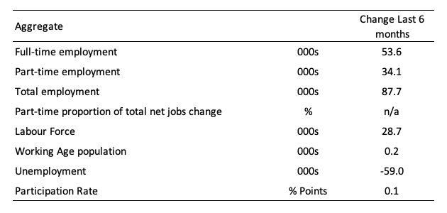
The following table provides an accounting summary of the labour market performance over the last six months to provide a longer perspective that cuts through the monthly variability and provides a better assessment of the trends.
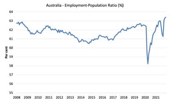
Given the variation in the labour force estimates, it is sometimes useful to examine the Employment-to-Population ratio (%) because the underlying population estimates (denominator) are less cyclical and subject to variation than the labour force estimates. This is an alternative measure of the robustness of activity to the unemployment rate, which is sensitive to those labour force swings.
The following graph shows the Employment-to-Population ratio, since February 2008 (the low-point unemployment rate of the last cycle).
It fell with the onset of the GFC, recovered under the boost provided by the fiscal stimulus packages but then went backwards again as the Federal government imposed fiscal austerity in a hare-brained attempt at achieving a fiscal surplus in 2012.
There are two forces working here – the denominator (population) is clearly providing favourable pressures due to the slower population growth as a result of the lack of immigration arising from the external border closures.
This is forcing employers to search harder for workers already in Australia rather than discriminate against the unemployed.
The numerator (employment) is clearly stronger as the restrictions ease.
The ratio rose by 0.1 points in January 2022.
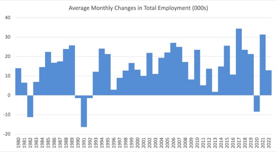
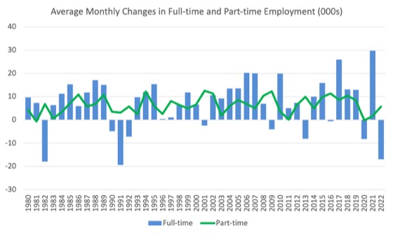
To put the current monthly performance into perspective, the following graph shows the average monthly employment change for the calendar years from 1980 to 2022 (to date).
1. The labour market weakened considerably over 2018 and that situation worsened in 2019.
2. The average employment change over 2020 was -8.4 thousand which rose to 31.3 thousand in 2021 as the lockdowns eased.
3. So far in 2022, the average monthly change is 12.9 thousand.
The following graph shows the average monthly changes in Full-time and Part-time employment (lower panel) in thousands since 1980.
The interesting result is that during recessions or slow-downs, it is full-time employment that takes the bulk of the adjustment. Even when full-time employment growth is negative, part-time employment usually continues to grow.
However, this crisis is different because much of the employment losses have been the result of lockdown and enforced business closures in sectors where part-time employment dominates.
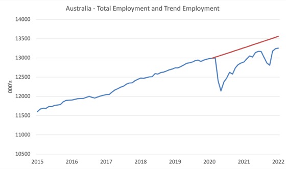
Actual and Trend Employment
The Australian labour market is now larger than it was in February 2020. But it is still a long way from where it would have been if it had have continued to expand at the previous trend.
The following graph shows total employment (blue line) and what employment would have been if it had continued to grow according to the average growth rate between 2015 and February 2020.
The gap as at January 2022 rose by 12.3 thousand to 308 thousand jobs.
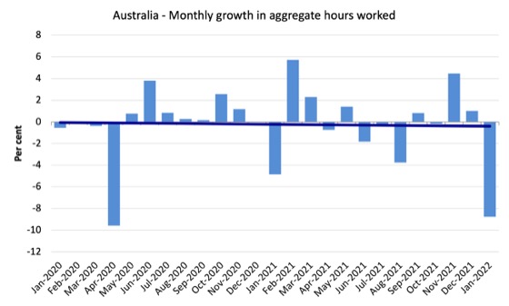
Hours worked fell by 159.4 million hours (-8.8 per cent) in January 2022
A slowdown from last month as the lockdown euphoria slowed and the absentee rate rose dramatically as more workers became sick with Covid.
The following graph shows the monthly growth (in per cent) over the last 24 months.
The dark linear line is a simple regression trend of the monthly change.
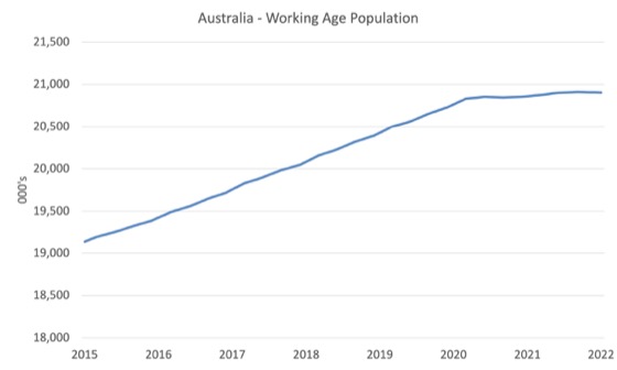
The Population Slowdown
The following graph shows Australia’s working age population (Over 15 year olds) from January 2015 to January 2022.
With the external border still largely closed, immigration has shrunk to virtually zero and the impact is very clear.
This flattening out has forced employers to work harder to get workers and is one of the reasons unemployment is falling quite quickly, given the circumstances.
The Federal government is now working against the workers by offering enticements for people to come on foreign visas to increase the labour supply under the guise of worker shortages.
Next week, I will provide detailed analysis of these trends to refute the claim that many economists are now making that the border closures have not helped reduce the unemployment rate. I am still calibrating some simulations and they will be ready Monday I hope.
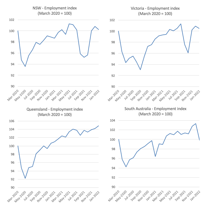
State and Territory Employment Trends
The lockdowns imposed in Sydney, Canberra and Melbourne are now over and while the ‘living with Covid’ politicians and their business pals thought that we would just go back to pre-Covid lifestyles, the situation is somewhat different.
As more and more workers become ill and cannot work, the employment situation has deteriorated.
The following graphs show the employment evolution since March 2020 by state and territory.
NSW (100.2) and Victoria (100.5) are back to their March 2020 employment levels (index of 100).
Queensland (104.9), Western Australia (105.4), Tasmania (100.4) are also above the pre-pandemic level.
But South Australia (99.8) and the territories – ACT (95.7) and NT (96.4) – are below.
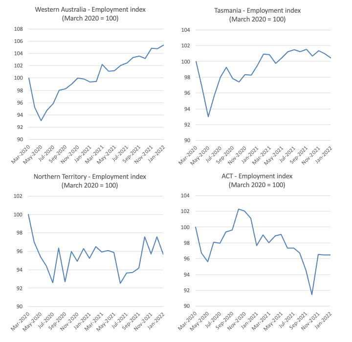
Unemployment rose by 5,600 to 580,000 persons in January 2022
The official unemployment rate was unchanged at 4.2 per cent (after rounding – slightly higher at 2 decimal places).
The following graph shows the national unemployment rate from February 1980 to January 2022. The longer time-series helps frame some perspective to what is happening at present.
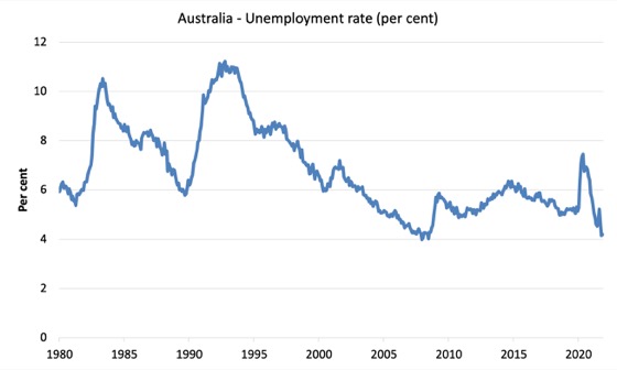
Broad labour underutilisation rose by 0.1 points to 10.9 per cent in January 2022
The results for January 2022 are (seasonally adjusted):
1. Underemployment increased by 0.1 points to 6.7 per cent (a rise of 9 thousand).
2. Overall there are 924.9 thousand underemployed workers.
3. The total labour underutilisation rate (unemployment plus underemployment) increased by 0.1 points to 10.9 per cent.
4. There were a total of 1,505.0 thousand workers either unemployed or underemployed.
The following graph plots the seasonally-adjusted underemployment rate in Australia from February 1980 to the January 2022 (blue line) and the broad underutilisation rate over the same period (green line).
The difference between the two lines is the unemployment rate.
The three cyclical peaks correspond to the 1982, 1991 recessions and the more recent downturn.
The other difference between now and the two earlier cycles is that the recovery triggered by the fiscal stimulus in 2008-09 did not persist and as soon as the ‘fiscal surplus’ fetish kicked in in 2012, things went backwards very quickly.
The two earlier peaks were sharp but steadily declined. The last peak fell away on the back of the stimulus but turned again when the stimulus was withdrawn.
Unemployment and broad labour underutilisation indexes – last four downturns
The following graph captures the evolution of the unemployment rates for the 1982, 1991, GFC and COVID-19 downturns.
For each episode, the graph begins at 100 – which is the index value of the unemployment rate at the low-point of each cycle (June 1981; December 1989; February 2008, and February 2020, respectively).
We then plot each episode out for 90 months.
For 1991, the peak unemployment which was achieved some 38 months after the downturn began and the resulting recovery was painfully slow. While the 1982 recession was severe the economy and the labour market was recovering by the 26th month. The pace of recovery for the 1982 once it began was faster than the recovery in the current period.
During the GFC crisis, the unemployment rate peaked after 16 months (thanks to a substantial fiscal stimulus) but then started rising again once the stimulus was prematurely withdrawn and a new peak occurred at the 80th month.
The COVID-19 downturn was obviously worse than any of the previous recessions shown but because of its unique nature – the job losses being largely driven by lockdowns etc.
The graph provides a graphical depiction of the speed at which each recession unfolded (which tells you something about each episode) and the length of time that the labour market deteriorated (expressed in terms of the unemployment rate).
After 23 months, the unemployment had risen (fallen) from 100 to:
1. 192.1 index points in 1982 and rising.
2. 174.4 index points in 1991 and rising.
3. 132.3 index points in the GFC and falling.
4. 81.8 index points currently and static.
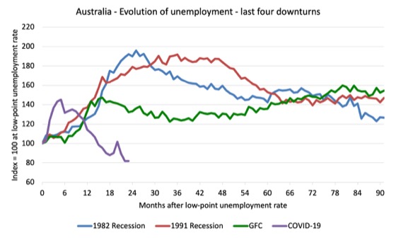
Note that these are index numbers and only tell us about the speed of decay rather than levels of unemployment.
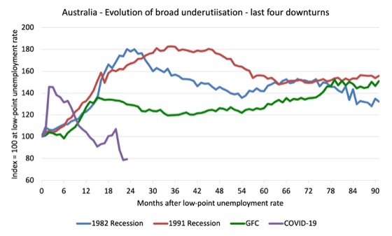
The next graph performs the same operation for the broad labour underutilisation rate (sum of official unemployment and underemployment).
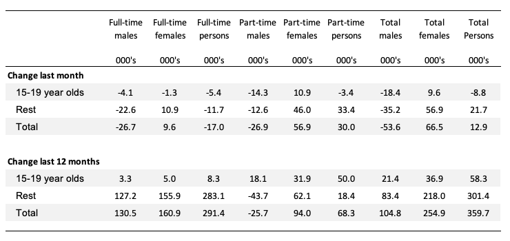
Teenage labour market deteriorated in January 2022
The following Table shows the distribution of net employment creation in the last month and the last 12 months by full-time/part-time status and age/gender category (15-19 year olds and the rest).
All the job losses in January were in the 15-19 segment.
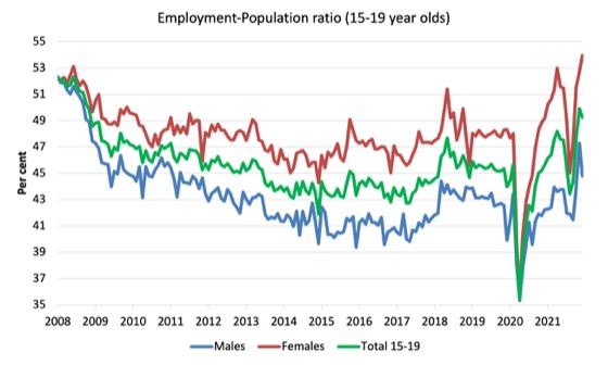
To put the teenage employment situation in a scale context (relative to their size in the population) the following graph shows the Employment-Population ratios for males, females and total 15-19 year olds since June 2008.
You can interpret this graph as depicting the loss of employment relative to the underlying population of each cohort. We would expect (at least) that this ratio should be constant if not rising somewhat (depending on school participation rates).
1. The male ratio has fallen by 7.5 percentage points since February 2008. It fell 2.5 points over the month. It is now 1.3 points above its level in March 2020.
2. The female ratio is 1.8 percentage points above the February 2008 level. It rose by 1.2 points over the month. It is now 6 points above its level in March 2020.
3. The overall teenage employment-population ratio has fallen by 3 percentage points since February 200. It is now 3.6 points above its level in March 2020. It fell by 0.7 points over the month.
Conclusion
My standard monthly warning: we always have to be careful interpreting month to month movements given the way the Labour Force Survey is constructed and implemented.
My overall assessment is:
1. The cessation of most Covid restrictions initially allowed the labour market to recover somewhat but as the infection rate rose, so did the absentee rate as workers were too sick to work from Covid.
This puts paid to the notion spread by economists that there is a trade-off between the economy and the health of workers. There is not.
One standout in today’s data is the dramatic fall in monthly hours worked.
2. There are still 1.5 million Australian workers without work in one way or another (officially unemployed or underemployed) and several hundred thousand who have left the active labour force due to lack of employment opportunities.
3. We are seeing the impact of flat population growth coming up against growing demand for workers and that is the reason the unemployment rate fell so quickly.
4. The other standout is that employment fell for teenagers.
5. Overall, the labour market is faltering and will continue to do so while the infection rates are high.
That is enough for today!
(c) Copyright 2022 William Mitchell. All Rights Reserved.
The “problem” is that current strains of Covid do not cause serious illness in most cases, especially among the vaccinated, and this has become general knowledge. Thus political traction is missing for more lockdowns and other more extreme measures. Juxtapose this with a minority, yet a substantial minority, still terrified of the pandemic, and you’ve got a snapshot of the quandary facing policymakers and all of us. In the meantime, both sides, and those subtler souls without a side, must learn to appreciate each other’s position.
The UK stats’ are showing Q4 2021 Actual Weekly Hours Worked at 1.1 billion. Q4 2019 was 1.046 billion. The low was 0.844 billion around Q2 2020; the high was 1.058 billion around Q3 2021.
How productive those hours worked were, considering the mental condition/health of the workforce, is yet to be determined.
@Newton E. Finn, very well stated picture.
For me, I also see that the situation is one of social, economical, political, heath, other related issues. All intertwined!
How can we respond, address, or navigate out of this “situation” and still be able to maintain our normalcy or even better, civilization?
From the MMT lens/perspective, and from management point of view, the answer is very clear.
Use the fiscal capacity to adapt and change in every way that is necessary going forward.
This will help us rebuild, revitalize, rejuvenate our ways of productive capacities, for all sectors too.
We should not go back to the past and rebuild that. It is not a sensical goal nor strategy. We must adapt and change with the time and situation.
A discussion among my fellows few days ago, and looking at one among many recent data, we surprisingly discovered that despite multiple lock downs, the demand for office space has decreased by only 2% (for Thailand).
This tells us a lot of things. For instance, there is a hidden, perhaps demands for bigger work space, better design of the working hour/shift/day to accommodate employees, better design of the communal work space for onsite, team work, meetings (on and off site with all stakeholders), are a must for all so they can still feel belong, to be creative, and feel safe and remain in good health while being employed/in investment.
All these will lead to higher performance and job/life satisfaction “in a new normal” that all companies should aim for.
This is one of the insights gained among other things like Bill mentioned, the trade off is a myth.
We feel there is no such thing, not at this point, while we still can do so much for the macro economy via fiscal capacity.
For example, there is a real need to recompose the economic structure when say, it relies too much on tourism.
A another case in point is that a learned that a big global company sanctioned a study on how the change during the pandemic, recognizing that doing things the same way is not really possible.
The outcome was interesting to say the least!
In short, I believe the key is to adapt and change; and use all our fiscal spaces on the productive capacities in our hands to address the situation that we find ourselves in for a better future, be they currency users or issuers.
I found this little Gem from 2010
https://billmitchell.org/blog/?p=5240
Answers a lot of the questions many were asking a few weeks back. Glad to see even 12 years ago MMT’rs recognised asset price inflation is not a low rate phenomenon. A study of the history of asset price bubbles you will find overwhelming evidence that the level of interest rates were not the operative factor. Indeed, the common denominator is speculative behaviour.