In the 1990s, a new industry was created in Australia. It produced nothing. But it…
Australian labour market – slow employment growth but unemployment continues to fall as population growth remains weak
Today (July 15, 2021), the Australian Bureau of Statistics put out the latest – Labour Force, Australia – for June 2021. The data shows that the trend where even relatively weak employment growth is driving the unemployment rate down because the growth in labour supply, is continuing. Employment increased by 29,100 or 0.2 per cent (which is weak), monthly hours worked decreased by 1.8 per cent, the participation rate was stable, yet unemployment fell by 22,000 (which is excellent), and the unemployment rate fell 0.2 points to 4.9 per cent. But underemployment rose sharply (0.5 points) to 7.9 per cent. So it is a good outcome for unemployment to be falling but the quantity and quality of employment growth is not desirable. The drop in working hours is due to the two-week lockdown in Victoria recently. Next month, the current extended lockdown in Sydney will show up as a negative in the July result. The labour market is still 232.9 thousand jobs of where it would have been if employment had continued to grow according to the average growth rate between 2015 and February 2020.
The summary ABS Labour Force (seasonally adjusted) estimates for June 2021 are:
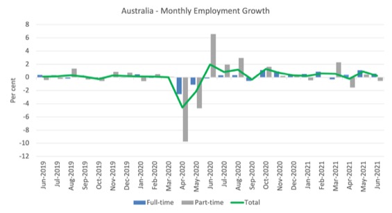
- Employment increased by 29,100 (0.2 per cent) – Full-time employment increased by 51,600 and part-time employment decreased by 22,500.
- Unemployment decreased by 22,000 to 679,100 persons.
- The official unemployment rate decreased 0.2 points to 4.9 per cent.
- The participation rate was stable at 66.2 per cent.
- Aggregate monthly hours worked decreased 33 million hours (-1.8 per cent).
- Underemployment increased by 0.5 points to 7.9 per cent (a rise of 66 thousand). Overall there are 1,094 thousand underemployed workers. The total labour underutilisation rate (unemployment plus underemployment) increased by 0.3 points to 12.8 per cent. There were a total of 1,773.1 thousand workers either unemployed or underemployed.
Promotion – ABC program – ‘The Economists’
This afternoon (17:30) with later repeats, I am a guest on the ABC radio program – The Economists – talking about how low the unemployment rate can go and the advantages of introducing a Job Guarantee.
More people are becoming interested in these ideas.
Employment increased by just 29,100 in June 2021
1. Employment growth was 0.2 per cent with 29,100 (net) jobs being added.
2. Full-time employment increased by 51,600 and part-time employment decreased by 22,500.
3. Employment in Australia is now above the February 2020 level by 159.2 thousand (1.2 per cent). However, some sectors are still languishing while others are rebounding strongly.
The following graph shows the month by month growth in full-time (blue columns), part-time (grey columns) and total employment (green line) for the 24 months to June 2021 using seasonally adjusted data.
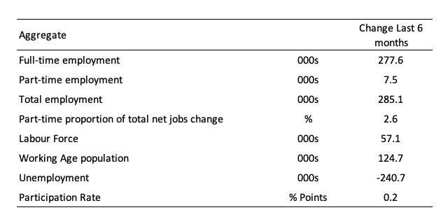
The following table provides an accounting summary of the labour market performance over the last six months to provide a longer perspective that cuts through the monthly variability and provides a better assessment of the trends.
Assessment:
1. Total employment has risen by 285.1 thousand and only 2.6 per cent of that increase has been in part-time work.
2. Full-time employment has dominated.
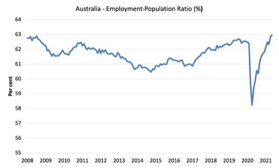
Given the variation in the labour force estimates, it is sometimes useful to examine the Employment-to-Population ratio (%) because the underlying population estimates (denominator) are less cyclical and subject to variation than the labour force estimates. This is an alternative measure of the robustness of activity to the unemployment rate, which is sensitive to those labour force swings.
The following graph shows the Employment-to-Population ratio, since February 2008 (the low-point unemployment rate of the last cycle).
It fell with the onset of the GFC, recovered under the boost provided by the fiscal stimulus packages but then went backwards again as the Federal government imposed fiscal austerity in a hare-brained attempt at achieving a fiscal surplus in 2012.
The ratio rose by 0.2 points in June 2021 to 63 per cent. The ratio is now above the pre-GFC peak in April 2008 of 62.9 per cent.
This is partly due to the slower population growth as a result of the lack of immigration due to the on-going external border closures.
This is forcing employers to search harder for workers already in Australia rather than discriminate against the unemployed.
To put the current monthly performance into perspective, the following graph shows the average monthly employment change for the calendar years from 1980 to 2020 (to date).
1. The labour market weakened considerably over 2018 and that situation worsened in 2019.
2. The average employment change over 2020 was -8.0 thousand.
3. So far in 2021, the average monthly change is 47.5 thousand and you can see that from the graph that this is exceptional, although it has only been for 6 months so far as businesses return to more normal levels of operation.

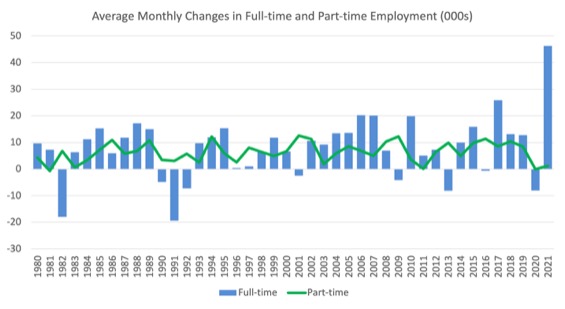
The following graph shows the average monthly changes in Full-time and Part-time employment (lower panel) in thousands since 1980.
The interesting result is that during recessions or slow-downs, it is full-time employment that takes the bulk of the adjustment. Even when full-time employment growth is negative, part-time employment usually continues to grow.
However, this crisis is different because much of the employment losses are the result of lockdown and enforced business closures in sectors where part-time employment dominates.
Actual and Trend Employment
While the current month’s employment figures are encouraging, the labour market is still some way from catching up on the jobs that were lost during the pandemic.
The following graph shows total employment (blue line) and what employment would have been if it had continued to grow according to the average growth rate between 2015 and February 2020.
The gap as at June 2021 is 232.9 thousand jobs.

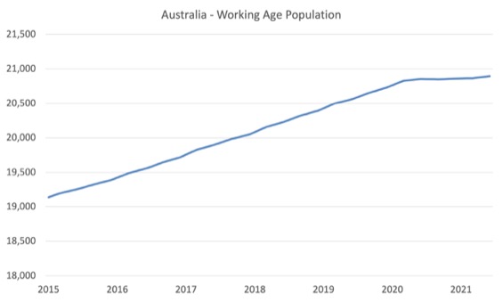
The Population Slowdown
The following graph shows Australia’s working age population (Over 15 year olds) from January 2015 to June 2021.
With the external border closed, immigration has shrunk to virtually zero and the impact is very clear.
This flattening out has forced employers to work harder to get workers and is one of the reasons unemployment is falling quite quickly, given the circumstances.
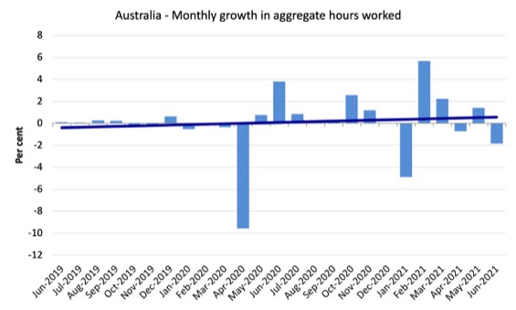
Hours worked decreased 33 million hours (-1.8 per cent) in June 2021
The decline in working hours this month was due to the two-week lockdown in Victoria recently. Next month, the current extended lockdown in Sydney will show up as a negative in the July result.
The following graph shows the monthly growth (in per cent) over the last 24 months.
The dark linear line is a simple regression trend of the monthly change – which depicts slightly positive trend.
Unemployment decreased by 22,000 to 679,100 persons
The official unemployment rate fell 0.2 points to 4.9 per cent even though the employment growth was relatively weak.
The labour force grew by just 7 thousand with participation stable. This is the result of the slowdown in the working age population due to the restrictions on the external border.
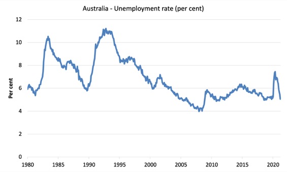
The following graph shows the national unemployment rate from February 1980 to June 2021. The longer time-series helps frame some perspective to what is happening at present.
Assessment:
1. Unemployment is now lower than the pre-pandemic February 2020 level – but we shouldn’t use that as the aspirational benchmark.
2. The usual cyclical asymmetry where unemployment rises quickly and falls very slowly is not being observed this cycle because of the population growth slowdown.
2. There is still considerable slack in the labour market that could be absorbed with further fiscal stimulus.
Broad labour underutilisation increased by 0.3 points to 12.8 per cent in June 2021
The results for June 2021 are (seasonally adjusted):
1. Underemployment increased by 6 thousand.
2. The underemployment rate rose by 0.5 points to 7.9 per cent.
2. Overall there are 1,094 thousand underemployed workers.
3. The total labour underutilisation rate (unemployment plus underemployment) increased by 0.3 points to 12.8 per cent.
4. There were a total of 1,773.1 thousand workers either unemployed or underemployed.
The following graph plots the seasonally-adjusted underemployment rate in Australia from February 1980 to the June 2021 (blue line) and the broad underutilisation rate over the same period (green line).
The difference between the two lines is the unemployment rate.
The three cyclical peaks correspond to the 1982, 1991 recessions and the more recent downturn.
The other difference between now and the two earlier cycles is that the recovery triggered by the fiscal stimulus in 2008-09 did not persist and as soon as the ‘fiscal surplus’ fetish kicked in in 2012, things went backwards very quickly.
The two earlier peaks were sharp but steadily declined. The last peak fell away on the back of the stimulus but turned again when the stimulus was withdrawn.

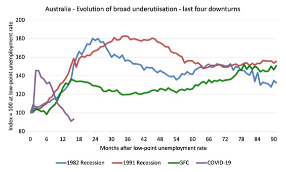
Unemployment and broad labour underutilisation indexes – last four downturns
The following graph captures the evolution of the unemployment rates for the 1982, 1991, GFC and COVID-19 downturns.
For each episode, the graph begins at 100 – which is the index value of the unemployment rate at the low-point of each cycle (June 1981; December 1989; February 2008, and February 2020, respectively).
We then plot each episode out for 90 months.
For 1991, the peak unemployment which was achieved some 38 months after the downturn began and the resulting recovery was painfully slow. While the 1982 recession was severe the economy and the labour market was recovering by the 26th month. The pace of recovery for the 1982 once it began was faster than the recovery in the current period.
During the GFC crisis, the unemployment rate peaked after 16 months (thanks to a substantial fiscal stimulus) but then started rising again once the stimulus was prematurely withdrawn and a new peak occurred at the 80th month.
The COVID-19 downturn was obviously worse than any of the previous recessions shown but because of its unique nature – the job losses being largely driven by lockdowns etc.
And the recovery is evident.
The graph provides a graphical depiction of the speed at which each recession unfolded (which tells you something about each episode) and the length of time that the labour market deteriorated (expressed in terms of the unemployment rate).
After 16 months, the unemployment had risen from 100 to:
1. 154.3 index points in 1982 and rising.
2. 168.6 index points in 1991 and at the peak of the cycle.
3. 147.2 index points in the GFC and at the peak of the cycle.
4. 95.6 index points currently and falling.
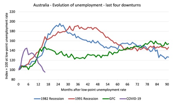
Note that these are index numbers and only tell us about the speed of decay rather than levels of unemployment.
The next graph performs the same operation for the broad labour underutilisation rate (sum of official unemployment and underemployment).
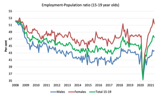
Teenage labour market deteriorates in June 2021
The following Table shows the distribution of net employment creation in the last month and the last 12 months by full-time/part-time status and age/gender category (15-19 year olds and the rest).

To put the teenage employment situation in a scale context (relative to their size in the population) the following graph shows the Employment-Population ratios for males, females and total 15-19 year olds since June 2008.
You can interpret this graph as depicting the loss of employment relative to the underlying population of each cohort. We would expect (at least) that this ratio should be constant if not rising somewhat (depending on school participation rates).
1. The male ratio has fallen by 8.6 percentage points since February 2008, but is now 0.2 points above its level in March 2020. It rose by 0.3 points over the month.
2. The female ratio has fallen by 0.8 percentage points since February 2008, is now 3.5 points above its level in March 2020. It fell by 1.4 points over the month.
3. The overall teenage employment-population ratio has fallen by 4.8 percentage points since February 2008, is now 1.8 points above its level in March 2020. It fell by 0.6 points over the month.
Conclusion
My standard monthly warning: we always have to be careful interpreting month to month movements given the way the Labour Force Survey is constructed and implemented.
The June 2021 data reveals that employment continues to growth, albeit modestly even with the recent two-week lockdown in Victoria.
That lockdown shows up in the reduced working hours for June.
The drop in working hours is due to the two-week lockdown in Victoria recently. Next month, the current extended lockdown in Sydney will show up as a negative in the July result.
The impact of the slower population growth is showing up in the continued drop in the unemployment rate, despite the relatively modest employment growth.
Underemployment rose sharply (0.5 points) to 7.9 per cent which is consistent with the drop in working hours.
It is a good outcome for unemployment to be falling but the quantity and quality of employment growth is not desirable.
The labour market is still 232.9 thousand jobs of where it would have been if employment had continued to grow according to the average growth rate between 2015 and February 2020.
My overall assessment is:
1. Total employment is now above where it was in February 2020 but there are major sectoral differences – some sectors are still in deep recession while others are booming.
2. The results suggest that with lower population growth due to the external border closures, employers are now having to absorb the unemployed more quickly to mainstain their operations.
3. There is still plenty of scope for further fiscal support without triggering any inflationary pressures.
That is enough for today!
(c) Copyright 2021 William Mitchell. All Rights Reserved.
This Post Has 0 Comments