Economics and business correspondents regularly serve as apologists for poor policy. Their motivation is to…
US labour market slower but unemployment reaches lows not seen since the late 1960s
In last week’s blog post – Leading indicators are suggesting recession (October 3, 2019) – we saw some conflicting signals about the state of the US economy. The PMI data was looking quite awful whereas another composite index was telling a different story. On Friday (October 4, 2019), the US Bureau of Labor Statistics (BLS) released their latest labour market data – Employment Situation Summary – September 2019 – which reveals a slowing labour market, but, one that is still adding jobs. The commentators claim it is operating below expectation but the current trend is fairly predictable given the slowdown in overall economic growth. The US labour market is still adding jobs, albeit at a slower pace than last year. The Broad labour underutilisation ratio (U-6) remains high (but fell in September by 0.3 points) even though the official unemployment is now hovering around levels not seen since the late 1960s. The worry is that the jobs being added represent a significant hollowing out of jobs in the median wage area (the so-called ‘middle-class’ jobs), which is reinforcing the polarisation in the income distribution and rising inequality. There is no hint, yet in the data, that a recession is coming any time soon.
Overview for September 2019
- Payroll employment rose by 136,000 – below the 2019 monthly average.
- Total labour force survey employment rose by 391 thousand net (0.25 per cent).
- The seasonally adjusted labour force rose by 117 thousand (0.07 per cent).
- Official unemployment fell by 275 thousand to 5,769 thousand.
- The official unemployment rate fell significantly to 3.52 per cent (-0.2 points).
- The participation rate was unchanged on 63.2 per cent but remains well below the peak in December 2006 (66.4 per cent). Adjusting for age effects, the rise in those who have given up looking for work for one reason or another since December 2006 is around 2,184.4 thousand workers. The corresponding unemployment rate would be 4.8 per cent, far higher than the current official rate.
- The broad labour underutilisation measure (U6) fell by 0.3 points to 6.9 per cent largely because of a decline in the number in the part-time for economic reasons cohort (the US indicator of underemployment).
Further, for those who are confused about the difference between the payroll (establishment) data and the household survey data you should read this blog – US labour market is in a deplorable state – where I explain the differences in detail.
Payroll employment trends
The BLS noted that:
Total nonfarm payroll employment increased by 136,000 in September. Job growth has averaged 161,000 per month thus far in 2019, compared with an average monthly gain of 223,000 in 2018. In September, employment continued to trend up in health care and in professional and business services.
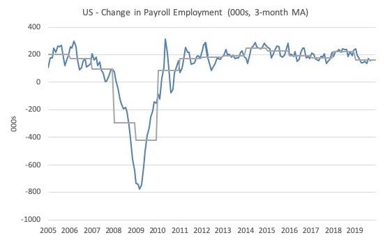
The first graph shows the monthly change in payroll employment (in thousands, expressed as a 3-month moving average to take out the monthly noise). The gray lines are the annual averages.
This month saw the change in payroll employment fall below the average monthly change for the year and well down on 2018 levels.
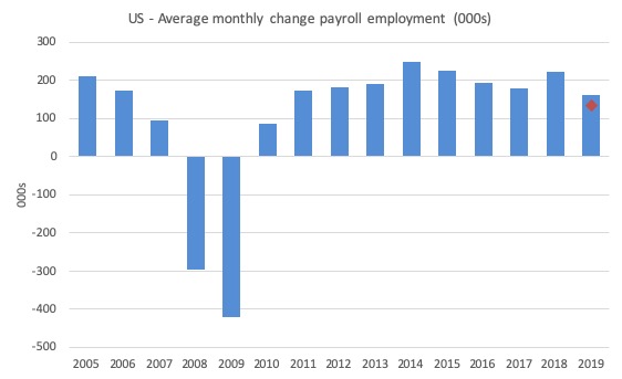
The next graph shows the same data in a different way – in this case the graph shows the average net monthly change in payroll employment (actual) for the calendar years from 2005 to 2019 (the 2019 average being for the first six months at this stage).
The red diamond is the current month’s increase.
The slowdown that began in 2015 continued through 2017 was reversed last year. The 2018 average was 223 thousand compared to 179 thousand in 2017.
So far the average for 2019 is 161 thousand. But within that lower first seven month average is considerable volatility on a month to month basis.
There is a slowing trend evident at present.
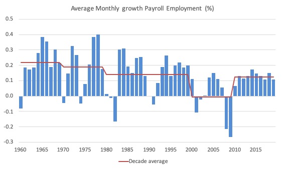
To put the current recovery into historical perspective the following graph shows the average annual growth in payroll employment since 1960 (blue columns) with the decade averages shown by the red line.
It reinforces the view that while payroll employment growth has been steady since the crisis ended, it is still well down on previous decades of growth.
Labour Force Survey – employment growth remains positive
Employment as measured by the household survey rose by 391 thousand net (0.25 per cent) while the labour force rose by only 117 thousand (0.07 per cent).
As a result (in accounting terms), total unemployment fell by 275 thousand and the unemployment rate fell to 3.52 per cent (-0.2 points). The last time the unemployment rate was this low was in August 1969.
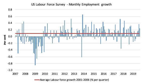
The next graph shows the monthly employment growth since January 2008. The red line is the average labour force growth over the period December 2001 to December 2006 (0.09 per cent per month).
Summary conclusion:
There is still no coherent positive and reinforcing trend in employment growth since the recovery began back in 2009. There are still many months where employment growth, while positive, remains relatively weak when compared to the average labour force growth prior to the crisis or is negative.
There are also months where employment growth is negative.
The last four months have seen increasing growth – which is a positive outlook and appears to be be presenting a slightly different view than that presented by the payroll data.
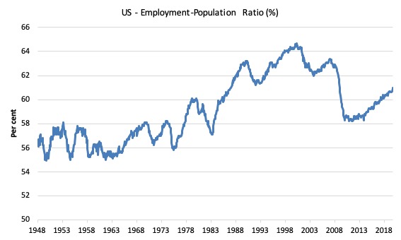
A good measure of the strength of the labour market is the Employment-Population ratio given that the movements are relatively unambiguous because the denominator population is not particularly sensitive to the cycle (unlike the labour force).
The following graph shows the US Employment-Population from January 1948 to September 2019. While the ratio fluctuates a little, the September 2019 ratio rose by 0.1 points to 61 per cent. In the last twelve months, the ratio has risen by 0.5 points.
Over the longer period though, we see that the ratio remains well down on pre-GFC levels (peak 63.4 per cent in December 2006), which is a further indication of how weak the recovery has been so far and the distance that the US labour market is from being at full capacity (assuming that the December 2006 level was closer to that state).
It is usually a positive sign though when total employment outstrips the underlying growth in the working age population.
Unemployment and underutilisation trends
The first graph shows the official unemployment rate since January 1950 which is currently at 3.69 per cent, slightly lower than the previous month.
It is clear that the US labour market is reaching unemployment rates not seen since the late 1960s.
With inflation stable, the continued low unemployment rates make a mockery of official NAIRU estimates of full employment coinciding with an unemployment rate of 4.6 per cent.
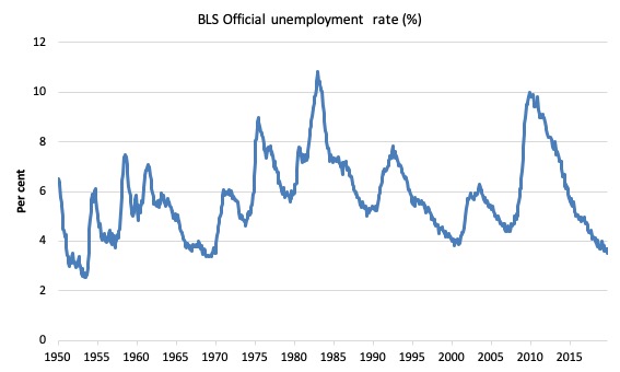
The official unemployment rate is a narrow measure of labour wastage, which means that a strict comparison with the 1960s, for example, in terms of how tight the labour market, has to take into account broader measures of labour underutilisation.
The next graph shows the BLS measure U6, which is defined as:
Total unemployed, plus all marginally attached workers plus total employed part time for economic reasons, as a percent of all civilian labor force plus all marginally attached workers.
It is thus the broadest measure of labour underutilisation that the BLS publish.
In December 2006, before the effects of the slowdown started to impact upon the labour market, the measure was estimated to be 7.9 per cent.
In September 2019 the U6 measure fell by 0.3 points to 6.9 per cent. This was the result of the category ‘Part-time for economic reasons’ falling by 31 thousand or 1 per cent.
U-6 was 8.1 per cent at the beginning of 2019.
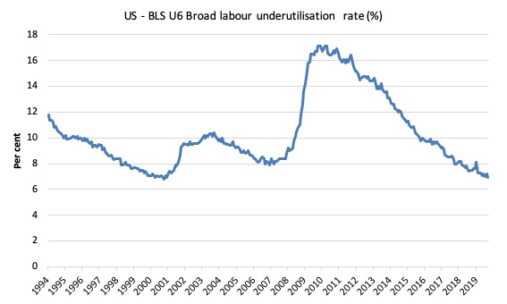
The U-6 measure is marginally below the pre-GFC level but remains above the trough of the early 2000s when it was 6.8 per cent.
While it is signalling improvement, there is still some scope to go before full capacity is reached.
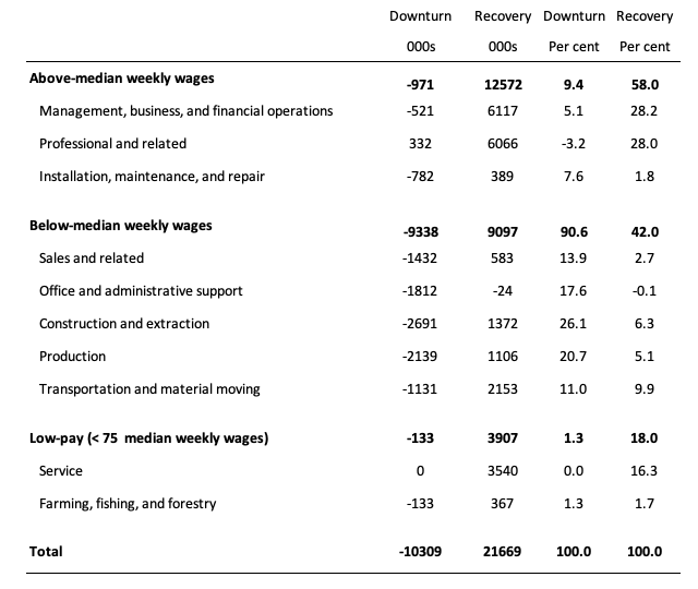
Feature this month: Occupational wage bias intensifies through 2019
I updated my research into the cyclical shifts in employment at the main occupational levels for the US today.
And the results are very interesting.
In the past, I have demonstrated that the proportion of jobs in the total employment in sectors that pay below-average pay has increased.
But at that level of aggregation, we are unable to say whether these jobs in question were high-pay or low-pay.
The next table helps to expand on that understanding.
It shows the net job losses (in the downturn) and net job gains (in the recovery to date) for the major occupations in the BLS classification.
I have sorted the occupations relative to median weekly earnings as at the second-quarter 2019.
Low-pay is 75 per cent of the median.
Summary results:
1. In the downturn 90.6 per cent of the jobs lost were in occupations that paid below median weekly earnings (1.3 per cent of those were in low-paid occupations). Very few jobs (relatively) were lost in the higher paying occupations.
2. Given 86.1 per cent of the total jobs lost in the downturn were in sectors paying above average pay. The inference is that the jobs lost were predominantly the lower paying jobs in those sectors (although we cannot strictly compare mean and median in a wage distribution given the skewness).
3. In the upturn to date, the net jobs added have not yet replaced those lost in the occupations with below median weekly earnings. 58 per cent of the net jobs added have been in occupations with above median weekly earnings.
4. While only a small number and proportion of jobs were lost in the low-pay occupations, the recovery has seen a much larger number of those jobs being added. Of the 42 per cent share of below median earning jobs added in the recovery, the proportion that are in low-pay occupations is currently 18 per cent.
5. This tells us that there is a polarisation going on in the occupational employment structure with a bias towards low-pay jobs in the below median weekly earnings occupations and towards jobs in the above median weekly earnings.
6. That is there has been a hollowing out around the overall median pay levels.
Conclusion
The September 2019 BLS labour market data release for the US tells me that the US labour market remains below the performance achieved in 2018 although there has been considerable month-to-month volatility.
The US labour market is still adding jobs, albeit at a slower pace than last year.
The Broad labour underutilisation ratio (U-6) remains high (but fell) and the official unemployment is now hovering around levels not seen since the late 1960s
The worry is that the jobs being added represent a significant hollowing out of jobs in the median wage area (the so-called ‘middle-class’ jobs), which is reinforcing the polarisation in the income distribution and rising inequality.
That is enough for today!
(c) Copyright 2019 William Mitchell. All Rights Reserved.
American Factory on Netflix shows with insight how thousands of high-paying jobs at a GM plant were replaced -after the plant closed- with jobs paying around half compared to GM. Most of the GM workers remained working in the same plant at half-pay for some Chinese manufacturer that transformed the facility now supplying glass windows for cars. These people were really grateful to still have a job, but have much more difficulty making ends meet. Pretty remarkable that we allow a society to function in this way.
I would just like to point out the huge difference between the late 60s and now.
In the late 60s about 500,000 Americans were in Vietnam and more in the US Navy in the waters off that nation.
Now, we do have 2 wars, but there are far fewer Americans who are not in America either working or unemployed.
My seat of my pants estimate is the the number now in the services because of the wars is about equal to the number in the Navy supporting the war in Vietnam. So, this means that about 500,000 more American {mostly men} need to be added to the unemployment totals to compare the 2 time periods. Meaning that just comparing the 2 percentages of ‘unemployment’ is quite misleading. [Has there also been a change in the definition of ‘unemployed’ in the intervening time?]
@Steve American:
“In the late 60s about 500,000 Americans were in Vietnam and more in the US Navy in the waters off that nation.”
Didn’t the y figured as “employed” by teh DoD, though? I remember reading not long ago how the DoD is and has been for a while the biggest employer of the world (almost 3 Million last time I checked). That is without even counting all of the DoD work that is outsorced to private companies.
Despite the great level of commitment to detail and accuracy, Bill’s jobs numbers always leave me thinking the even if the numbers a OK, it’s the bad kind of jobs in the wrong fields. This time though, his mention of the hollowing out of the jobs in the median wage area make a lot of sense to me.
Cheers!
Maybe it’s time to begin looking at the quality of employment rather than the quantity. You never mention real wage growth or hours worked as two measures that could add a more favorable interpretation of the data. Also, thousands of high-paid workers are retiring each year and taking their highly paid compensation out of the data. Maybe that is why the middle class compensation is being hollowed out.
Even after 10 years, employment-population ratio is still below the peak in 2008.
The book Why Minsky matters by Wray completed the circle for me. I only got round to reading it last week during the last few days of my holiday. An excellent book, fantastic.
The book completed what I have learned studying MMT. In the same way many Michael Hudson’s books have.
What I enjoyed about it was the description between the 2 prominent mainstream theories. Keynes and Friedman and what both means when it comes to job creation and highlight where they both fail. Tied in with this piece by Bill beautifully.
Why Minsky matters should be taught in every secondary school. Then their is hope for all of us. Chapter 5 should be copied and pasted into Labour manifesto. Of course the SNP manifesto if Scotland ever gets independence.
Unfortunately, neither would be able to implement chapter 5 as both want to be tied to the growth and stability pact, excessive debt procedure and the corrective arm. Finally they would both realise they are on the wrong side of the arguement.
The Brexiverse, when the right act like the left and the left act like liberals.
@ HermannTheGerman,
Yes, I know that soldiers were counted as employed.
That is my point. The private economy was not providing them with jobs.
They were being paid, but for the most part they were not adding to demand in the US, their wives were, but most were single. This distorts the data IMO. But, I’m no expert.
When they arrived home and were discharged, they added to demand because they had saved up their pay. In the early 70s this would have created inflationary pressure. If they didn’t get a job right away that added to the supply of stuff, etc., then this would have created inflation, right?
Dr. Blyth claims that the investor chose not the invest and hire because the inflation was going to eat into their profits to such an extent the there would be no increase in profits. Is this an example of a self-fulfilling prophecy?
@Steve American
I got you now. I thought you meant the job numbers, but you were talking about the “missing demand” at home. It is also my understanding that the addition of all those consumers without an accompanying jobs programm that actually boosts the supply of goods would have led to a a higher inflation.
Cheers!
@ HermannTheGerman,
Actually I was originally saying thet we need to be careful comparing the numbers [unemployment percentages] for those 2 times. because times were different.
If [as in the late 60s] the Gov. takes 500,000 young men out of the work force, pays them to do whatever, and doesn’t let them spend their pay; that this will distort the economy so much that the unemployment numbers are tainted.
In my reply to you I elaborated on that by adding that inflation would be the result when they were all brought home and dumped into the economy with their pockets full of back pay.