The income and wealth inequality that continues to grow in most advanced nations has led…
US Labour Market still adding jobs but scope for further expansion
Last week’s (July 5, 2019) release by the US Bureau of Labor Statistics (BLS) of their latest labour market data – Employment Situation Summary – June 2019 – reveals a steady labour market with month-to-month volatility. The US labour market is still adding jobs, albeit at a slower pace than last year. The unemployment rate remains low (at 3.67 per cent) and the participation rate has moved up a tick, which is a good sign. It is also clear that there is still a substantial jobs deficit remaining and considerable scope for increased participation.
Overview for June 2019
- Payroll employment rose by 224,000.
- Total labour force survey employment rose by 247 thousand net (0.16 per cent).
- The seasonally adjusted labour force rose by 335 thousand (0.21 per cent).
- Official unemployment rose by 87 thousand to 5.975 million.
- The official unemployment rate was essentially unchanged at 3.67 per cent (+0.05 points).
- The participation rate rose by 0.1 point to 62.9 per cent but remains well below the peak in December 2006 (66.4 per cent). Adjusting for age effects, the rise in those who have given up looking for work for one reason or another since December 2006 is around 2,247 thousand workers. The corresponding unemployment rate would be 5.2 per cent, far higher than the current official rate.
- The broad labour underutilisation measure (U6) rose 0.1 point to 7.2 per cent.
Further, for those who are confused about the difference between the payroll (establishment) data and the household survey data you should read this blog – US labour market is in a deplorable state – where I explain the differences in detail.
Payroll employment trends
The BLS noted that:
Total nonfarm payroll employment increased by 224,000 in June. Employment growth has averaged 172,000 per month thus far this year, compared with an average monthly gain of 223,000 in 2018. In June, notable job gains occurred in professional and business services, in health care, and in transportation and warehousing.
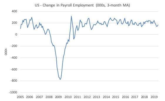
The first graph shows the monthly change in payroll employment (in thousands, expressed as a 3-month moving average to take out the monthly noise).
This month was more robust than the last two but still under the average of the last several years.
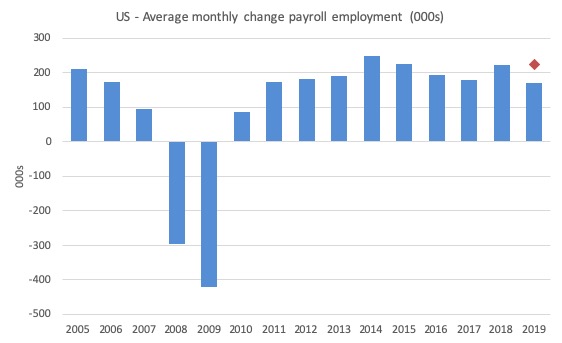
The next graph shows the same data in a different way – in this case the graph shows the average net monthly change in payroll employment (actual) for the calendar years from 2005 to 2019 (the 2019 average being for the first six months at this stage).
The red diamond is the current month’s increase.
The slowdown that began in 2015 continued through 2017 was reversed last year. The 2018 average was 223 thousand compared to 179 thousand in 2017.
So far the average for 2019 is 172 thousand. But within that lower first six month average is considerable volatility on a month to month basis (in part due to statistical factors such as new bench-marking).
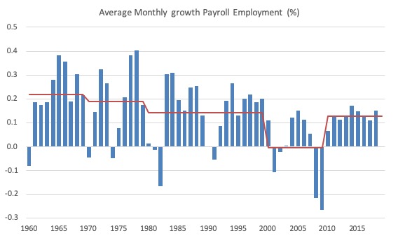
To put the current recovery into historical perspective the following graph shows the average annual growth in payroll employment since 1960 (blue columns) with the decade averages shown by the red line.
It reinforces the view that while payroll employment growth has been steady since the crisis ended, it is still well down on previous decades of growth.
Labour Force Survey – employment growth remains positive
Employment as measured by the household survey rose by 247 thousand net (0.16 per cent) while the labour force rose by 335 thousand (0.21 per cent).
As a result (in accounting terms), total unemployment rose by 87 thousand but the unemployment rate was largely unchanged at 3.67 per cent (up 0.05 points).
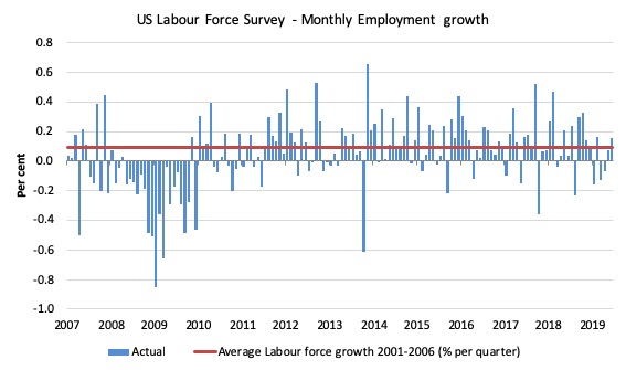
The next graph shows the monthly employment growth since January 2008. The red line is the average labour force growth over the period December 2001 to December 2006 (0.09 per cent per month).
Summary conclusion:
There is still no coherent positive and reinforcing trend in employment growth since the recovery began back in 2009. There are still many months where employment growth, while positive, remains relatively weak when compared to the average labour force growth prior to the crisis or is negative.
There are also months where employment growth is negative.
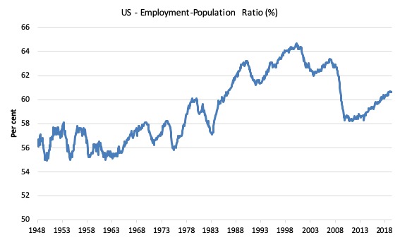
A good measure of the strength of the labour market is the Employment-Population ratio given that the movements are relatively unambiguous because the denominator population is not particularly sensitive to the cycle (unlike the labour force).
The following graph shows the US Employment-Population from January 1970 to June 2019. While the ratio fluctuates a little, the June 2019 ratio was steady on 60.6 per cent. It has held this value since March 2019.
This indicates a very steady situation – employment growing in proportion with the underlying population.
This time last year it was 60.4 per cent. So a larger proportion of the working age population are now in work of some kind.
Over the longer period though, we see that the ratio remains well down on pre-GFC levels (peak 63.4 per cent in December 2006), which is a further indication of how weak the recovery has been so far and the distance that the US labour market is from being at full capacity (assuming that the December 2006 level was closer to that state).
Unemployment and underutilisation trends
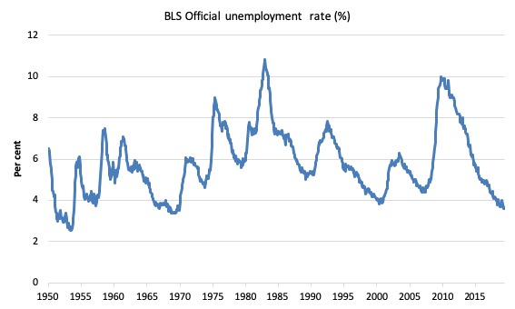
The first graph shows the official unemployment rate since January 1950 which is currently at 3.67 per cent.
It is clear that the US labour market is reaching unemployment rates not seen since the late 1960s (it is slightly lower than the most recent low-point in April 2000).
With inflation stable, the continued low unemployment rates make a mockery of official NAIRU estimates of full employment coinciding with an unemployment rate of 4.5 per cent.
The official unemployment rate is a narrow measure of labour wastage, which means that a strict comparison with the 1960s, for example, in terms of how tight the labour market, has to take into account broader measures of labour underutilisation.
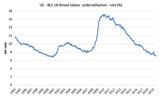
The next graph shows the BLS measure U6, which is defined as:
Total unemployed, plus all marginally attached workers plus total employed part time for economic reasons, as a percent of all civilian labor force plus all marginally attached workers.
It is thus the broadest measure of labour underutilisation that the BLS publish.
In December 2006, before the effects of the slowdown started to impact upon the labour market, the measure was estimated to be 7.9 per cent.
In June 2019 the U6 measure rose 0.1 point to 7.2 per cent.
It is 0.6 points lower than this time last year.
The U-6 measure is marginally below the pre-GFC level but remains above the trough of the early 2000s when it was 6.8 per cent.
While it is signalling improvement, there is still some scope to go before full capacity is reached.
Impact of ageing labour force on US participation rates
It is clear that during the recession, many workers opt to stop searching for work because there was a dearth of jobs available.
As a result, national statistics offices consider these workers to have stopped ‘participating’ and classify them as being ‘not in the labour force’, which had had the effect of attenuating the official estimates of unemployment and unemployment rates.
These discouraged workers are considered to be in hidden unemployment.
But the participation rates are also influenced by compositional shifts (changing shares) of the different demographic age groups in the working age population.
In most nations, the population is shifting towards older workers who have lower participation rates.
Thus, some of the decline in the total participation rate could simply be an averaging issue.
I considered this issue in these blog posts (among others):
1. Decomposing the decline in the US participation rate for ageing (July 22, 2014).
2. Democrats in glass houses – you know the rest! (February 22, 2016).
3. Updating the impact of ageing labour force on US participation rates (November 7, 2017).
Refer back to these blog posts for the detailed methodology that I develop to estimate these impacts.
It is time to update my estimates.
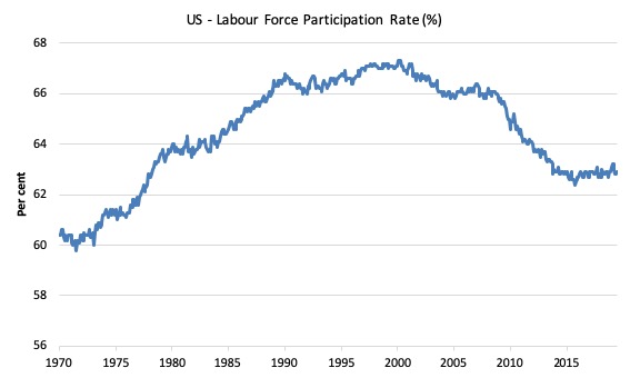
The following graph shows the aggregate participation rate from January 1950 to June 2019.
The US aggregate participation rate peaked at 67.3 per cent in April 2000 (seasonally adjusted). Thereafter it has declined on trend with some reversions in between.
In June 2019, it was stood at 62.9 per cent, a considerable fall since 2000.
The question is how much of the decline is due to ageing and how much is due to lack of opportunity for jobs (a residue of the GFC downturn).
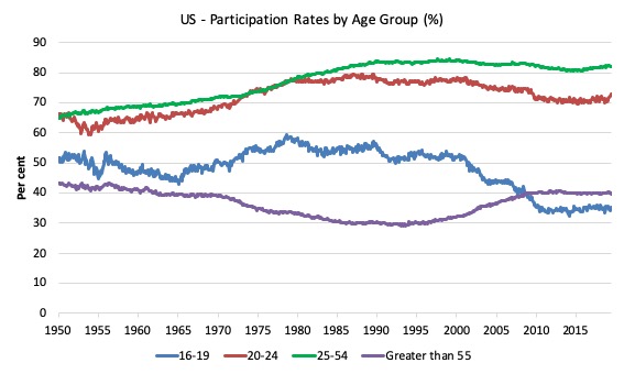
The next graph breaks the aggregate participation rate down into four age groups. The prime age (25-54) and the 20-24 groups have seen a tapering of their participation rates since the late 1980s.
There have been sharp declines in the participation rates for teenagers (16-24) since the late 1980s and a steady rise in participation rates for the over 55s.
The aggregate participation rate is a weighted-average of the participation rates of the different demographic groups. It is thus influenced by the shifting weights of its component parts (in this case, the age-weights) in the working age population.
These shifts in demographic shares of the working age population tend to be slow moving (trends) rather then cyclical.
But they certainly mean that movements in the aggregate participation rate is influenced by the compositional shifts (changing shares) of the different demographic age groups in the working age population.
In most nations, the population is shifting towards older workers who have lower participation rates even if these older worker participation rates are rising.
Thus, some of the decline in the total participation rate could simply being an averaging issue – more workers in the working age population who on average who have a lower participation rate.
That is, the participation rate could change without any underlying change in the behaviour of the different demographic groups.
To calculate the ageing effect, we will use three broad groups – young workers 16-24 years old; prime-age workers 25-54 years old; and older workers 55 years and over.
The behaviour of the individual age cohorts within the prime-age category (25-34, 35-44, 45-54) is very similar and researchers often reduce the complexity of the problem by aggregating them together with little loss of information.
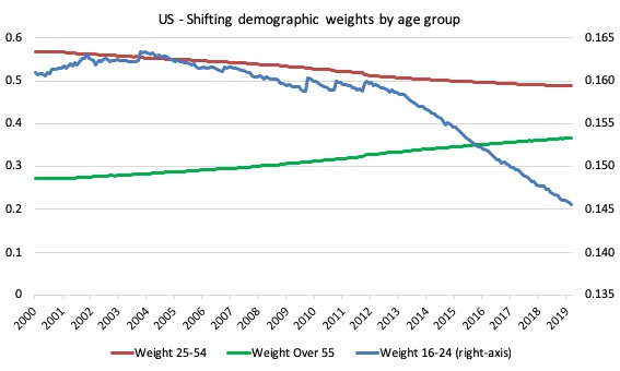
The next graph shows the changing weights of the three groups in the total Working Age Population (WAP) for the US from April 2000 (the peak participation rate month) to June 2019.
We note:
1. The Prime-age demographic (25-54 year olds) steadily declines as a share of the total WAP over the period shown.
2. The share of older workers (GT55) in the total WAP started to rise steadily as the Prime-age persons moved into that category.
3. The US Youth participation rates (16-24), shown on the right-hand axis has declined over the same period.
The change in weights since April 2000 (to June 2019) are:
- 16-24: -1.5 percentage points
- 25-54: -8.0 percentage points
- Over 55: +9.5 percentage points
Since the GFC (from January 2008) the change in in weights has been:
- 16-24: -1.5 percentage points
- 25-54: -5.2 percentage points
- Over 55: +6.7 percentage points
So all the decline in the youth weight has come since the GFC whereas the trends for the other cohorts were already well established prior to the GFC.
As an aside, this information allows you to see how scaling on a vertical axis can provide a very misleading impression. The youth decline is very small relative to the changes in the weights of the other two age groups.
The decline in the Prime-age weight has been less than the rise in the Older workers share because the Prime-age category is experiencing flows at both thresholds – the youth flow in and the older Prime-age workers flow out.
Now we are in a position to answer our question: How much of that falling LFPR is due to the cyclical shifts and how much of it is due to the ageing of the population?
To answer this question we have to establish a benchmark period in history and then analyse the shifts in relation to that benchmark.
Once that benchmark period is established, we can use the following formula to decompose the changes in the participation rate into cyclical (effects of recession and boom) and trend components (ageing etc).
January 2008 is our benchmark, which was the period when the last cycle finished. We can calculate the weighted average in the following way.
Instead of using the current weights to calculate the actual participation rate:
Actual LFPR(t) = (w16-24 x LFPR16-24) + (w25-54 x LFPR25-54) + (wGT55 x LFPRGT55)
We would use so-called fixed weights, where the relevant weights (proportions in the population) are fixed at their January 2008 values.
In other words, we are then considering the LFPR behaviour for each group weighted by the share of the WAP as at January 2008. T
The formula would be (in this case):
Fixed-weight LFPR(t) = (w16-24_January_2008 x LFPR16-24) + (w25-54_January_2008 x LFPR25-54) + (wGT55_January_2008 x LFPRGT55)
where the term (for example) w16-24_January_2008 is the share of 16-24 years olds in the WAP as at January 2008 and so on.
Then the difference between the two calculations – Actual LFPR(t) and Fixed-weight LFPR(t) – tells us the change in the participation rate that is due to changes in the age distribution of the Working Age Population since January 2008.
We can then isolate what the participation rate would be without any changes in the age distribution and thus see the impact of the cyclical changes.
Here are some numbers:
1. The actual participation rate in January 2008 was 66.2 per cent. In June 2019, it had fallen to 62.9 per cent.
2. The following weights applied in January 2008: 16-24 16.1 per cent of WAP; 25-54 53.9 per cent; and over 55s 30.3 per cent.
3. By June 2019, these weights were: 16-24 14.6 per cent of WAP; 25-54 48.7 per cent; and over 55s 36.7 per cent. So, quite a shift.
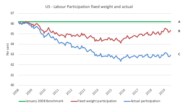
The following graph plots the two times series – the Actual LFPR(t) (using current weights) and Fixed-weight LFPR(t) (using January 2008 weights and thus denoting what the LFPR would be had the weights not changed).
The green line is just the participation rate at January 2008. The differences between the three lines provides the decomposition between ageing factors (shifting weights in the working age population) and other factors (which we presume to be cyclical given what has happened in this period).
The differences between the three lines are interpreted as follows:
1. A to C – is simply the total change in the actual participation rate since January 2008.
2. A to B – is the difference between the actual participation rate at January 2008 and what the participation rate would have been had there been no changes in the demographic weights – it is thus the cyclical effect.
2. B to C – is the difference between the actual participation rate and what the participation rate would have been had there been no changes in the demographic weights – it is thus the ageing effect.
What does this mean?
1. The difference A to C is equal to 3.3 percentage points – which, given the Working Age Population in June 2019, represents an absolute loss of 8,550 thousand workers from the labour force due to the participation rate decline since January 2008.
2. If the population weights had not changed (that is, were still at the January 2008 benchmark) then the June 2019 participation rate would be 65.3 per cent rather than the actual rate of 62.9 per cent. This is the distance B to C and is thus 2.4 percentage points. This means that some 6,303 thousand workers have left the labour force due to ageing (shifting weights).
3. That means that 0.9 percentage points drop in the participation rate is due to the cycle – some 2,247 thousand workers leaving the labour force due to a lack of employment opportunities.
These workers could be reasonably classified as additions to ‘hidden unemployed’, which suggests that they would return to the employed workforce if there was sufficient employment growth forthcoming. They would almost certainly work if a Job Guarantee was introduced.
4. The ageing effect thus accounts for 73.7 per cent of the decline in the participation rate, and the other (cyclical) effect accounts for 26.3 per cent of the decline in the participation rate since January 2008.
5. If we add the cyclical effect back into the labour force, and call these workers unemployed, then the adjusted ‘unemployment rate’ would be 5.2 per cent in June 2019 compared to the actual rate reported by the BLS of 3.67 per cent.
Which reinforces our view that there is still excess capacity in the US labour market (irrespective of the U6 measure, which also suggests excess capacity).
The US jobs deficit
The update to the participation shifts due to ageing also allows us to update our estimates of the US jobs deficit.
The current participation rate of 62.9 per cent is a long way below the most recent peak in December 2006 of 66.4 per cent.
Adjusting for the demographic effect would give an estimate of the participation rate in June 2019 of 65.3 per cent if there had been no cyclical effects.
This would give an adjusted unemployment rate of 5.2 per cent rather than 3.67 per cent, if all the new ‘hidden’ unemployed (since December 2006) were to be counted among the official unemployed.
To compute the job gaps, a ‘full employment’ benchmark of 3.7 per cent is used – which is the current rate.
I explain in this blog post – US labour market – strengthened in February but still not at full employment (April 13, 2018) – is the best case scenario given that I actually think the cyclical losses are much worse than I provide here.
Using the estimated potential labour force (controlling for declining participation), we can compute a ‘necessary’ employment series which is defined as the level of employment that would ensure on 3.7 per cent of the simulated labour force remained unemployed.
This time series tells us by how much employment has to grow each month (in thousands) to match the underlying growth in the working age population with participation rates constant at their January 2008 peak – that is, to maintain the 3.7 per cent unemployment rate benchmark.
In the blog post cited above (US labour market – strengthened in February but still not at full employment), I provide more information and analysis on the method.
There are two separate effects:
- The actual loss of jobs between the employment peak in November 2007 and the trough (January 2010) was 8,582 thousand jobs. However, total employment is now above the January 2008 peak by 10,410 thousand jobs.
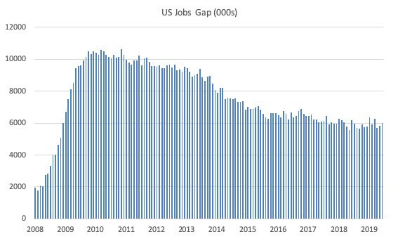
- The shortfall of jobs (the overall jobs gap) is the actual employment relative to the jobs that would have been generated had the demand-side of the labour market kept pace with the underlying population growth – that is, with the participation rate at its January 2008 value and the unemployment rate was constant at 3.7 per cent. This shortfall loss amounts to 6,016 thousand jobs.
The following graph shows the US Jobs Gap, which depicts the gap between current employment and the level of employment that would have generated a 3.7 per cent unemployment rate, given current population trends.
The shortfall has been rising for the last three months.
This reinforces the conclusion we reached above that the US labour market, while now enjoying a low official unemployment rate has not fully recovered from the GFC.
Conclusion
The June 2019 BLS labour market data release for the US tells me that the US labour market has been relatively steady over the last few months despite some month-to-month volatility.
It is weaker than where it was at the end of 2018.
It is clear that there is still a substantial jobs deficit remaining and considerable scope for increased participation.
That is enough for today!
(c) Copyright 2019 William Mitchell. All Rights Reserved.
Bill, you wrote,
”This means that some 6,303 workers have left the labour force due to ageing (shifting weights).”
You meant, ”This means that some 6,303,000 workers have left the labour force due to ageing (shifting weights).”