The Australian Bureau of Statistics (ABS) released the latest labour force data today (June 25,…
US labour market – muddling along and real wages growth goes negative
On July 6, 2018, the US Bureau of Labor Statistics (BLS) released their latest labour market data – Employment Situation Summary – June 2018 – which showed that total non-farm employment from the payroll survey rose by 213,000 and the unemployment rate rose by 0.2 per cent to 4 per cent in June 2018. The employment-population ratio was unchanged in June at 60.4 percent and has been largely stable since February 2018. The Labour Force Survey data, however, showed that employment only rose just 102 thousand in June 2018 and was accompanied by a substantial rise in the labour force (601 thousand) on the back of a surge in participation (up 0.2 points), which meant that total unemployment rise by 499 thousand. The broad labour underutilisation measure (U-6) also signalled weakness, rising by 0.2 points. There is still no evidence of a wages breakout going on although wages growth for blue-collar occupations has surpassed the white-collar occupations over the last 8 quarters. However, the data shows that real wages fell in June 2018 by 0.4 points. Taken together, the US labour market is showing no definite trend up or down at present and it is still some distance from being at full employment.
Overview – Total employment rose by 102 thousand in June 2018
For those who are confused about the difference between the payroll (establishment) data and the household survey data you should read this blog – US labour market is in a deplorable state – where I explain the differences in detail.
See also the – Employment Situation FAQ – provided by the BLS, itself.
The BLS say that:
The establishment survey employment series has a smaller margin of error on the measurement of month-to-month change than the household survey because of its much larger sample size. … However, the household survey has a more expansive scope than the establishment survey because it includes self-employed workers whose businesses are unincorporated, unpaid family workers, agricultural workers, and private household workers …
Focusing on the Household Labour Force Survey data, the seasonally adjusted labour force rose by 601 thousand in June 2018 with the participation rate rising by 0.2 points to 62.9 per cent.
Total employment rose by 102 thousand in net terms, which means that official unemployment rose by 499 thousand.
The official unemployment rate rose by 0.2 points to 4.05 per cent.
These large supply swings will most likely be revised downwards next month.
Despite the monthly volatility, in assessing the overall state of the labour market, we have to bear in mind that the June 2018 participation rate is still far below the peak in December 2006 (66.4 per cent).
Adjusting for the ageing effect (see below), the rise in those who have given up looking for work for one reason or another since December 2006 is around 3.5 million workers.
If we added them back into the labour force and considered them to be unemployed (which is not an unreasonable assumption given that the difference between being classified as officially unemployed against not in the labour force is solely due to whether the person had actively searched for work in the previous month) – we would find that the current US unemployment rate would be around 6.1 per cent rather than the official estimate of 4.05 per cent.
To put that into further perspective, the following graph shows the BLS measure U6, which is defined as:
Total unemployed, plus all marginally attached workers plus total employed part time for economic reasons, as a percent of all civilian labor force plus all marginally attached workers.
It is thus the broadest measure of labour underutilisation that the BLS publish.
In December 2006, before the affects of the slowdown started to impact upon the labour market, the measure was estimated to be 7.9 per cent.
It is now at 7.8 per cent and after declining in the early part of 2018 rose by 0.2 points in June 2018.
The U-6 measure remains above the trough of the early 2000s, and is only marginally below the pre-GFC level.
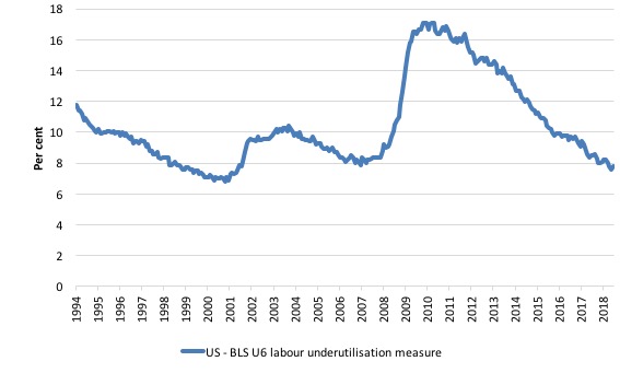
That provides a quite different perspective in the way we assess the US recovery. It challenges the view that the US economy is close to full employment.
Conclusion: on that basis, the US labour market is still some way from where it was at the end of 2007, even though the U-6 Broad indicator has now returned to its pre-GFC level (see below).
Payroll employment trends
The BLS noted this month that:
The change in total nonfarm payroll employment for April was revised up from +159,000 to +175,000, and the change for May was revised up from +223,000 to +244,000. With these revisions, employment gains in April and May combined were 37,000 more than previously reported.
This arises when the statistician gets extra information.
What it means is that labour market did not slow down as much as the original April and May data had suggested.
Which is a good outcome.
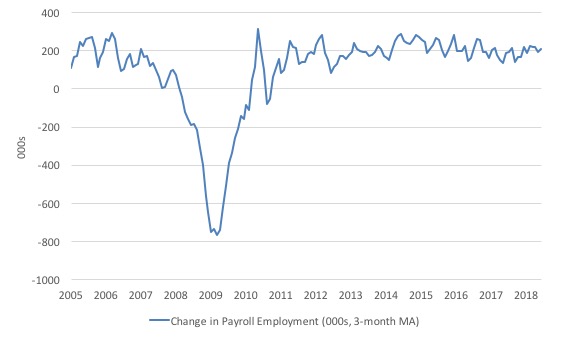
The first graph shows the monthly change in payroll employment (in thousands, expressed as a 3-month moving average to take out the monthly noise).
The monthly changes were stronger in 2014 and 2015, and then dipped in the first-half of 2016. By the end of 2016, job creation was stronger but then it tailed off again, somewhat.
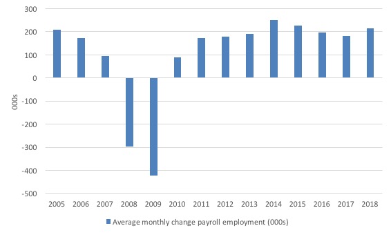
The next graph shows the same data in a different way – in this case the graph shows the average net monthly change in payroll employment (actual) for the calendar years from 2005 to 2017.
The slowdown that began in 2015 is continued through 2017 and 2018 so far appears to have reversed that trend, with the current average for 2018 (2015 thousand) higher than the 2017 average.
The average change in 2017 was 182 thousand, down from the 195 thousand average throughout 2016.
The average net change in 2014 was 250 thousand, in 2015 it was 226 thousand.
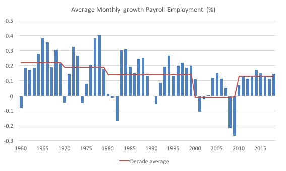
To put the current recovery into historical perspective the following graph shows the average annual growth in payroll employment since 1960 (blue columns) with the decade averages shown by the red line.
It reinforces the view that while payroll employment growth has been steady since the crisis ended, it is still well down on previous decades of growth.
Labour Force Survey – employment growth virtually flat this month
In June 2018, employment as measured by the household survey rose by only 102 thousand net (0.07 per cent) while the labour force rose by 601 thousand (0.37 per cent) and the participation rate rose by 0.2 points to 62.9 per cent.
As a result, total unemployment rose by 499 thousand.
Given that the monthly data has fluctuated considerably lately it is hard to be definitive. There are mixed messages – employment growth is docile but participation is up.
Both mean that unemployment has risen.
We will have to wait to see: (a) what the revisions are next month; and (b) whether any definitive trends emerge.
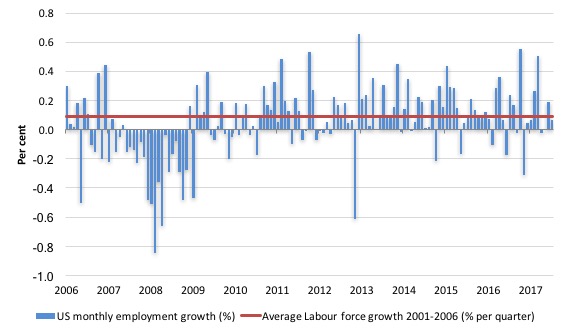
The next graph shows the monthly employment growth since the low-point unemployment rate month (December 2006). The red line is the average labour force growth over the period December 2001 to December 2006 (0.09 per cent per month).
The last three months have been very disappointing using this measure of employment.
What is apparent is that there is still no coherent positive and reinforcing trend in employment growth in the US labour market since the recovery began back in 2009. There are still many months where employment growth, while positive, remains relatively weak when compared to the average labour force growth prior to the crisis or is negative.
The sharp positive spike in September 2017 is clearly an outlier as is (to a certain extent) the negative spike in October 2017.
But when we consider the payroll data and the poor labour force survey result, the general conclusion is that things are fairly subdued.
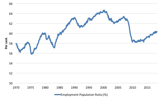
A good measure of the strength of the labour market is the Employment-Population ratio given that the movements are relatively unambiguous because the denominator population is not particularly sensitive to the cycle (unlike the labour force).
The following graph shows the US Employment-Population from January 1970 to June 2018. While the ratio fluctuates a little, the June 2018 outcome was stable at 60.4 per cent and has been at that level since February 2018.
Over the longer period though, we see that the ratio remains well down on pre-GFC levels (peak 63.4 per cent in December 2006), which is a further indication of how weak the recovery has been so far and the distance that the US labour market is from being at full capacity (assuming that the December 2006 level was closer to that state).
Unemployment trends
The trends in unemployment by ethnicity are interesting in the US.
Two questions arise:
1. Is the Black and African American unemployment rate higher than it was before the GFC, given that the White unemployment rate is now around its lower levels?
2. Has the relationship between the Black and African American unemployment rate and the White unemployment rate deteriorated since the GFC?
The answer to both questions is No!.
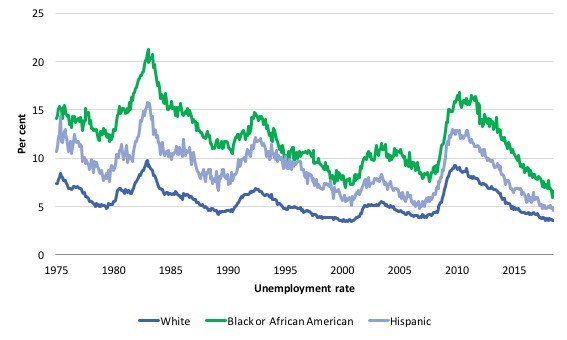
The first graph shows the history of BLS unemployment rates for Black and African Americans, Hispanics and Whites.
You can see that they all cycle together as economic activity cycles. You can also see that the Black and African American unemployment rate is currently at 6.5 per cent, which is well below the pre-GFC minimum achieved of 7.6 per cent (August 2007).
Note: this data moves around a lot on a monthly basis.
The Black and African American unemployment rate rose from 6.8 per cent in December 2017 to 7.7 in January 2018 only to drop back to 6.9 per cent in March and then fall further to 5.9 per cent in May 2018.
In June 2018, it rose to 6.5 per cent.
The White unemployment rate was steady in June 2018 at 3.5 per cent and the Hispanic rate fell from 4.9 per cent to 4.6 per cent.
In other words, the national unemployment rate is due to the Black and African American unemployment rate increasing.
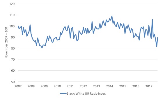
The second graph shows the Black and African American unemployment rate to White unemployment rate (ratio) from October 2007 (index = 100), when the White unemployment rate was at its previous lowest level.
This graph allows us to see whether the relative position of the two cohorts has changed since the crisis.
The data shows that, in fact, Black and African Americans are slightly worse off in relative terms (to Whites) now (June 2018) than they were a decade ago.
The ratio index stands at 89.6 points, meaning that that the Black and African American to White unemployment rate ratio has fallen by 10.4 percentage points since November 2007, which is a relative improvement for Black and African Americans.
It rose sharply in the last month however on the back of the rise in the Black and African American unemployment rate.
Overall, since the end of the GFC, the US labour force growth is absorbing proportionately more disadvantaged workers.
There is no wages breakout for workers
The latest data continues to support my assessment that despite the commentariat claiming a wages breakout is nigh, the evidence for that claim is non-existent.
Production and Non-supervisory workers have barely seen movement in their hourly wage outcomes over the last several years (note the BLS revised the January growth figure down in the latest release).
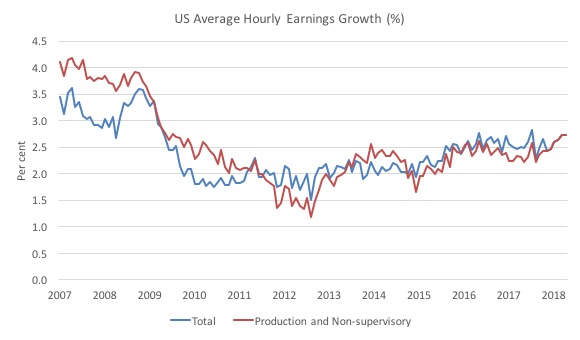
The first graph shows the annual movement in average hourly earnings in total and for Production and Non-supervisory workers. The BLS time series for the latter category began in April 2006.
Total nominal average hourly earnings rose by 2.7 per cent in the 12 months to June 2018.
This is the same growth experienced in the 12 months to December 2017.
However, the annual growth in inflation outstripped wages growth in June and as a result real wages fell overall (-0.4 points) and for Production and Non-supervisory workers (-0.4 points).
Production and non-supervisory employees were 82.3 per cent of private US non-farm employment. The growth in average hourly earnings for this dominant cohort has been relatively stable since December 2017.
The graph shows that for these workers – the predominant majority in the US labour market – wages growth has been largely flat since 2013 with a dip in 2015.
The annual rate of growth has been sitting on around 2.3 to 2.4 per cent since 2009 (with monthly fluctuations around that attractor).
The conclusion is that for the vast majority of workers there is no acceleration in wages in the US
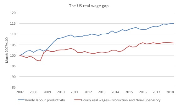
The next graph shows the movements in hourly labour productivity for Production and non-supervisory employees and their real wages – indexed to 100 in the April-quarter 2007. The data is quarterly so it includes updated productivity estimates.
As I have explained before, if productivity outstrips real wages growth, then these workers are losing wage share and shifting the difference to profits (or other workers – the top-end of the distribution)
The US real wage gap (labour productivity growth minus real wages growth) is pronounced. Labour productivity (output per hour) has grown by 15 per cent since the April-quarter 2007, whereas real hourly wages have only grown by 5.9 per cent over the same time period.
In the last few years, real hourly wages growth has been virtually non-existent (as the graph shows).
In June 2018, real wages actually fell by 0.1 points.
And, of course, these indexes understate the redistribution. If I had have started the base year in the 1990s, for example, the gap now would be much wider.
Interesting Employment Cost Index (ECI) movements
My special topic this month’s US labour market report relates to occupational wage movements in the US.
The BLS publish their Employment Cost Index (ECI), which is constructed in such a way that shifts in the occupational and industrial distribution of the labour force are purged, thus giving a fairly clean indicator of underlying growth in wages and
benefits paid to workers.
I have been looking at the occupation trends in wages in the US as part of my study of where the jobs are being created (occupation and industry) and who might be benefiting from the job creation.
We can thus use the data to trace where the overall wages growth is coming from at the occupational level.
The BLS allow us to easily distinguish between the professional, white-collar occupations and the blue-collar occupation in this regard.
The following graph shows the annual growth in total compensation (the sum of wages and salaries and benefits) for All civilian workers (blue) and Private industry workers (green) from the March-quarter 2002 (start of the series) to the March-quarter 2018.
The slowdown associated with the GFC was significant and the recovery has been slow. But since the beginning of 2016, the pace has increased substantially, although it is still below the pre-GFC levels.
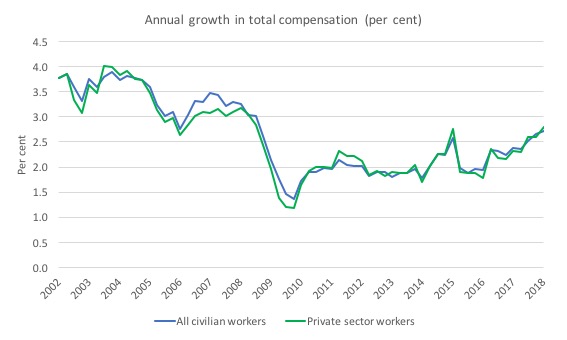
USA_Annual_Growth_ECI_All_Private_March_2018.jpg
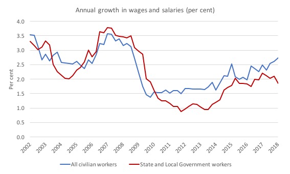
The next graph shows the annual growth in wages and salaries (so total compensation less benefits) for All civilian workers (blue) and State and Local Government workers (red) over the same period.
It is clear that the austerity imposed by State and Local governments in the US impacts harshly on wages growth for their workforces and the recent recovery for other workers is not being shared by the government workforce.
The next question examines the growth in wages and salaries for white-collar and blue-collar workers.
The BLS terminated its white-collar/blue-collar ECI series in 2007 when it updated the 1990 Occupational Classification System with the 2000 Standard Occupational Classification System (SOC).
The BLS noted that “the white collar and blue collar series are no longer useful” largely due to the “disparate wage and compensation rates” within the categories under the SOC.
The following table shows the occupational division from the BLS for white-collar and blue-collar occupational categories. There is no easy way to aggregate those occupational categories into meaningful totals.
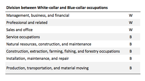
To overcome this issue I have just graphed the broad occupational groups and assigned colours (according to the BLS designations) for the two different occupational categories (blue for blue-collar naturally, and green for the white-collar because white will not show up!).
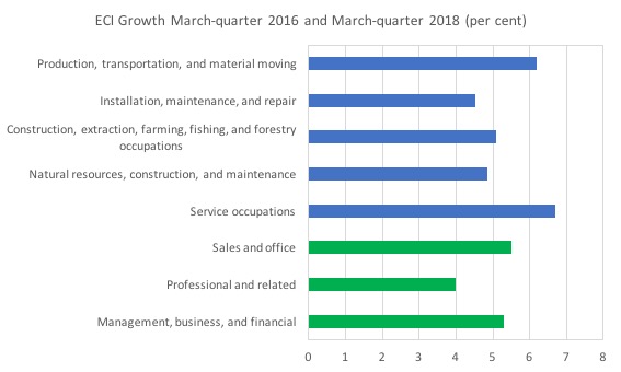
The graph shows the percentage growth in Total compensation between the March-quarter 2015 and the March-quarter 2018, which corresponds with the period of more rapid growth shown in the first graph in this section (above).
The strongest growth is clearly in the ‘blue-collar’ occupational groups and the slowest growth is in the professional occupations.
Remember this is a separate issue to who gains access to the total growth in national income over the same period. What this data is telling us is that the traditional blue-collar workers (typically with lower levels of formal education) have been driving the growth in wages and salaries in the US since the March-quarter 2016.
The word of caution is that this also doesn’t mean that unit labour costs are rising generally or specifically. I would need to analyse occupational productivity trends for that and that is for another day (when I can get meaningful data together).
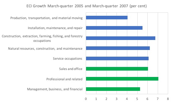
The situation was somewhat different in the lead up to the financial crisis. The next graph shows the growth in Total compensation between the March-quarter 2005 and the March-quarter 2007.
The professional occupations led the way in that growth period.
Conclusion
The June BLS labour market data release for the US tells me that the US labour market is muddling along with significant slack still remaining.
Caution should always be exercised given the volatility of the monthly data.
The broader measure of labour underutilisation (U-6) and the unemployment rate both rose by 0.2 points.
The relatively weak employment growth and the rising participation ensured that unemployment would rise rather sharply in June 2018. It is too early to consider that a trend.
I still do not think the US labour market is near to full employment. This assessment is reinforced by the fact that the participation rate is still well below where it was even after we adjust for the ageing effects (retirements), a bias towards low wage jobs continues, and the JOLTS dynamics suggest some slack.
Finally, despite the recent claims in the media that wages for US workers are in the process of ‘breaking out’, a closer look at the data shows that for 84 per cent of the private workforce (production and nonsupervisory) wages growth is steady and real wages growth was negative in June 2018.
That is enough for today!
(c) Copyright 2018 William Mitchell. All Rights Reserved.
Thanks for the report.
Its hard for people like me to know what to pick up from government report on labor without exhausting the brain power that has to be used at work.