The Australian Bureau of Statistics (ABS) released the latest labour force data today (APRIL 16,…
New Labour Account framework in Australia provides new insights
The Australian Bureau of Statistics released a new labour market framework on Tuesday (July 10, 2018) – Labour Account Australia, Quarterly Experimental Estimates – which will improve statistical analysis and allow new conjectures to be examined against the evidence. This blog post is really an exploration on my behalf of this new dataset and I know it is rather dry. But that is part of my work and it has to be done to build an evidential basis for the claims I make about this and that. I am still exploring the framework and will obviously use it to advantage (hopefully) in the future but for now here are some of the compelling insights that emerge from it. The first obvious new insight we can gain is to divide total filled jobs (employment) into Main and Secondary jobs. This allows us to assess the quality of the change in overall employment. Up until now we have considered employment in terms of persons employed. But now we can work out how many persons are employed in more than one job and where those jobs are. It provides an excellent check on statements made by politicians etc about the number of jobs being created and their quality.
What is it?
Labour market statistics, particularly headline figures such as the unemployment rate, are among the most closely watched and widely reported of all economic information available.
They are input on a regular basis to the political process and drive policy debates.
The problem, however, is that the current methods of collecting labour market information (via household and establishment surveys) etc are not without significant limitations in the depiction they provide of the state of the labour market and what it means for the overall economy (and society).
It is obvious that a focus on the unemployment rate (a narrow measure of labour underutilisation) may lead to flawed assessments when, for example, underemployment is rising and casualisation of employment is rife.
Statisticians have long identified the limitations in this respect and have increasingly published broader measures of labour wastage to give a better diagnostic of what is happening.
But the development of the Labour Account framework seeks to go beyond those more easily solved issues.
The ILO publication – Labour Accounts: A Step Forward to a Coherent and Timely Description of the Labour Market – sets out the ILO thinking on how to proceed with the development of this integrated framework and what it hopes to achieve.
They say that the limitations of the current approach to collecting labour market data are:
1. “Occurrence of contradictory results between data sources” – arising because “different labour market statistics not only use different reference populations, measurement units, reference periods and definitions but they all contain sampling and non-sampling errors too”.
2. “Each available data source on labour describes part of the labour market and related aspects”, so overlaps and gaps exist.
3. “Difficulties and limitations in describing labour market dynamics” – regular labour market data is usually published at a point in time and describes net changes. Gross flows data tries to remedy that situation, recognising that a labour market where 1 million people leave jobs in a month and 1.1 million gain jobs (net 100k) is quite different from a labour market where no-one leaves their jobs and 100k new entrants get work.
And while gross flows data is available it is limited and not strictly comparable with the broader static labour force data.
I once spent several weeks with a co-author some years ago devising statistical algorithms to bring the labour force data more closely in line with the gross flows data. We had some success but still were dissatisfied.
For a working paper on that sort of exercise see – Construction of Australian labour market flow data, 1980:I to 2002:III.
4. “The links between labour market data and other statistical systems are often missing” – there are many data sets that are connected in concept but not linked – for example, labour force, national accounts, demographic, education, R&D and so on.
Regular readers will recall that in my national accounts analysis I relate the national accounts measure of total working hours to productivity. However, the national accounts measure of employment (working hours) does not necessarily correspond to an estimate from the Labour Force survey.
The Labour Account framework resolves some of those issues by “combining various statistical data sources” in a consistent manner.
In the accounting tradition, the “aggregates have to satisfy a set of identity relations” which are stock-flow consistent.
It means that the changes within a quarter (flows) will consistently reflect the shifts in the stocks at the end of the quarter.
It means that the “labour input aggregates (persons, jobs, hours etc.), which describe supply and demand on the labour market as well as labour payments (as income and as costs)” will all tell a consistent story about the labour market and its relationship to the other parts of the economy (for example, the expenditure, production and income system recorded by the national accounts).
The ABS state that:
The Australian Labour Account provides a framework through which existing labour market data from different sources can be confronted and integrated, with the aim of producing a coherent and consistent set of aggregate labour market statistics.
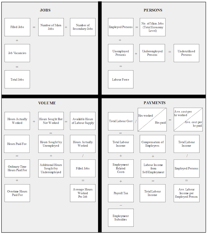
The Australian Labour Account consists of four central quadrants of Jobs, Persons, Labour Volume and Labour Payments. Data in each table are available quarterly, and for the industry divisions defined in the Australian and New Zealand Standard Industry Classification (ANZSIC).
The framework is not only consistent with the “accounting conventions of the United Nations System of National Accounts (2008 SNA)”, which drives the production of “the Australian System of National Accounts (ASNA)” – for example, production boundaries are consistent now (at industry level), but is also consistent with the specifications set out by the International Labour Organisation (ILO).
The framework will allow consistent international comparisons to be made. Already, Denmark, the Netherlands and Switzerland have introduced the Labour Accounts framework to improve the utility of existing labour statistics.
The following diagram is taken from the explanatory publication – Australian Labour Account: Concepts, Sources and Methods (released June 26, 2018).
The four quadrants are shown and you can appreciate how the data series corresponding to the conceptual boxes relate in an integrated additive way to derive labour market aggregates.
Each of the quadrants describes the identities that have to be satisfied.
For example, in the upper-left quadrant (Jobs) the framework tells us that:
Total Jobs = Filled Jobs + Job Vacancies.
Filled Jobs = Number of Main Jobs + Number of Secondary Jobs.
This allows us to estimate the extent to which people work more than one job – a major new development.
In the upper-right quadrant (Persons) we see that:
Employed Persons = No of Main Jobs (Total Economy Level)
So we see by relating the two quadrants, that if there are X Total Jobs and only Y (< X) Employed Persons, then the number of people who are working multiple jobs is consistently estimated.
Uses of the Labour Account framework
The Labour Account framework allows us to assess more meaningfully statements by politicians such as:
This government has created a record number of jobs. We have created X jobs since we were elected.
Which is a common claim made by politicians.
This sort of claim has always been fraught for obvious reasons. A record number of jobs when the population is rising does not necessarily mean that the performance is sound.
For example, if the employment rises to record levels as the population rises but the employment-population ratio falls (meaning more people who want jobs may be unemployed) then that doesn’t equate to a sound track record.
It also is fraught because typically the statement is only relating to net outcomes. A highly dynamic labour market with lots of flux can create the same net outcomes as a totally stagnant labour market where there is little opportunity for upward mobility.
But the Labour Account framework allows us to add other insights.
The Labour Force framework, which is used to publish the monthly estimates we are familiar with, constructs employment estimates in terms of persons employed rather than directly estimating the number of jobs there are in the economy.
This can be quite misleading because we know that people sometimes work in more than one job – which the Jobs Quadrant in the diagram above recognises as the distinction between the Main job and the Secondary job, the two summing to total filled jobs.
For example, if the X Main jobs that have been created in the economy in net terms in a period are of such a quality that the people working in them have to work in secondary jobs to make ends meet, then that is quite a different outcome to one where the change in net filled jobs is predominately due to a net change in main jobs.
As of Tuesday, Australian researchers can now see the breakdown between main jobs and secondary jobs on a quarterly basis.
For example, using the data for All Industries allows us to understand that the relatively strong growth in employment in Australia in 2017, which was lauded as evidence for sound economic management by the conservative government, was largely because workers were being forced into working a second job to make ends meet.
That sounds like a bad story when the aggregate result – relatively strong growth in employment – was made out to be a good story.
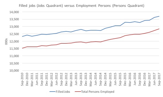
The first graph shows the total number of Filled Jobs (from the Jobs Quadrant) and the total number of Persons Employment (from the Persons Quadrant). The dataset published by the ABS so far runs from the September-quarter 2010 to the September-quarter 2017. Hopefully, as time passes they will backdate the series.
The gap between the two series is the total number of secondary jobs worked (by a person who also has a main job).
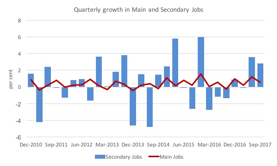
To see more clearly what has been going on since the September-quarter 2010, the next graph shows the quarterly growth in Main and Secondary jobs, using the Jobs Quadrant data identities.
By and large, the growth of total filled jobs is driven by the growth in Main Jobs (given that the latter accounts for around 93 per cent of the former).
But what the graph shows the growth of secondary jobs is highly variable, which makes sense in the context that most people will not choose to take on a second job if their main job is providing for their needs.
Overall, the data shows us that:
1. The growth in Total Filled jobs was 11.3 per cent between the September-quarter 2010 and the September-quarter 2017.
2. Growth in Main jobs was 11.1 per cent over the same period.
3. Growth in Secondary jobs was 14.5 per cent over the same period.
4. In the period covered by the September-quarter 2016 to the September-quarter 2017, the growth in Total Filled jobs was 3.2 per cent. The growth in Main jobs was 2.9 per cent and the growth in Secondary jobs was 7.3 per cent.
5. In the June- and September-quarters of 2017, the growth in Secondary jobs was dominant (3.5, and 2.8 per cent, respectively) against growth in Main jobs of 1.2 and 0.5 per cent, respectively. Of course, in total terms the number of Main jobs created in net terms was larger given the relative scales of the two categories.
6. The number of people in a secondary job has risen from a low of 6.5 per cent in the June-quarter 2014 to 6.9 per cent in the September-quarter 2017.
7. Over the last few years of the dataset, the rising proportion of persons working secondary jobs is clearly associated with the flat wages growth (and falling real wages in some quarters) and the rising underemployment.
The next graphs and tables show some of the industry-level insights that this new dataset can provide in terms of the quality of jobs being created.
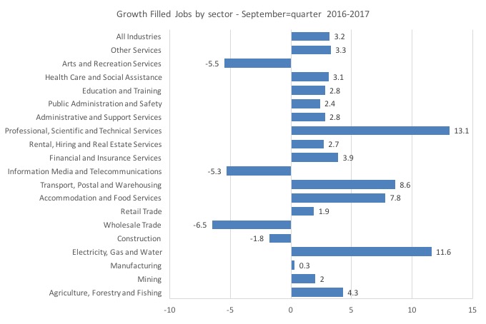
The first graph shows the growth in total filled jobs between the September-quarter 2016 and the September-quarter 2017 by sector (per cent).
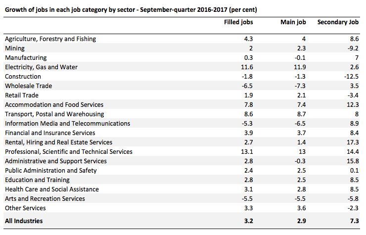
We see that filled jobs in the Professional, Scientific and Technical Services sector grew by a staggering 13.1 per cent in that period while overall net filled jobs great by 3.2 per cent.
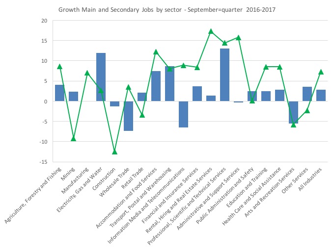
The next graph breaks down the growth into Main and Secondary Jobs.
Of note is the negative growth in Main jobs and the strong growth in Secondary jobs in Rental, Hiring and Real Estate Services, Information Media and Telecommunications and and Administrative and Support Services.
The same trend, but to a lesser extent is evident in Manufacturing and Wholesale Trade.
These sectors are cutting Main jobs, which are the better-paid jobs with more secure and higher quality working conditions in favour of, generally, more precarious and low-paid Secondary jobs.
The following table provides all the data to support the previous two graphs.
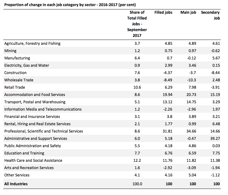
The next table shows the proportion of the change in total jobs in each category (Filled, Main and Secondary) that each industrial sector contributed to between the September-quarter 2016 and the September-quarter 2017.
The significant result is that the Professional, Scientific and Technical Services sector, which in the September-quarter 2017 accounted for 8.6 per cent of total filled jobs, contributed 31.8 per cent of the net change in total Filled jobs, 34.7 per cent of the net change in Main jobs, and 14.7 per cent of the net change in total Secondary Jobs.
The other sector to perform disproportionately well in terms of both categories was Accommodation and Food Services.
Sectors like Manufacturing, Construction, Wholesale Trade, Retail Trade, Arts and Recreation performed disproportionately badly over the same period.
It is also interesting that Administrative and Support Services contributed a high proportion of the net change in Secondary jobs.
Conclusion
There is a lot more we can glean from this new Labour Account framework and I am only just getting acquainted with the possibilities.
Unfortunately, the time series are still too short to do any serious econometric modelling but that will be overcome as the years pass (maybe not quickly enough for me!).
But already we can deduce that the employment growth last year was not as flash as the Government has been making out.
It was dominated by a growth in Secondary jobs which is a sure sign that people are being squeezed by flat income growth, excessive debt (particularly credit card and housing) and are scraping around for every hour of work they can get, even if it means going to work in a second job after their main job is finished for the day or week.
That is enough for today!
(c) Copyright 2018 William Mitchell. All Rights Reserved.
Wow!
I hung on to every word and have gone to see the data for myself!
I’m just an amateur but I can already see uses for this data within the union movement.