Economics and business correspondents regularly serve as apologists for poor policy. Their motivation is to…
US labour market – improves again in July
Shonk is an Australian/NZ slang word to describe someone engaged in shonky behaviour, which the Oxford Dictionary describes as being behaviour that is “Dishonest, unreliable, or illegal, especially in a devious way”. So a shonk means a “dishonest person; swindler or con artist” and while intent is implied it doesn’t have to be conscious action (note the inclusion of the descriptor “unreliable”). It could just mean stupidity or ignorance that leads to shonky performance. I will come back to that topic soon. On August 4, 2017, the US Bureau of Labor Statistics (BLS) released their latest labour market data – Employment Situation Summary – July 2017 – which showed that total non-farm employment from the payroll survey rose by a relatively healthy 209,000 in July. The weak result for May now seems to have been a blip in the data. The Labour Force Survey data showed that employment rose by 345 thousand in July but was still not large enough an increase to offset the rise in the labour force (349 thousand), and as a consequence, official unemployment rose by 4 thousand. The official unemployment rate was stable though at 4.4 per cent. There are still 6.98 million unemployed persons in the US. There is still a large jobs deficit remaining and other indicators suggest the labour market is still below where it was prior to the crisis. Further, the bias towards low-pay and below-average pay jobs continues.
Overview
For those who are confused about the difference between the payroll (establishment) data and the household survey data you should read this blog – US labour market is in a deplorable state – where I explain the differences in detail.
See also the – Employment Situation FAQ – provided by the BLS, itself.
The BLS say that:
The establishment survey employment series has a smaller margin of error on the measurement of month-to-month change than the household survey because of its much larger sample size. … However, the household survey has a more expansive scope than the establishment survey because it includes self-employed workers whose businesses are unincorporated, unpaid family workers, agricultural workers, and private household workers …
Focusing on the Household Labour Force Survey data, the seasonally adjusted labour force rose by 349 thousand in July 2017 and the participation rate rose by 0.1 points to 62.9 per cent.
Total employment rise by 345 thousand in net terms, and as a consequence, official unemployment rose by 4 thousand.
The changes were too small to budge the official unemployment rate which remained stable at 4.35 per cent.
Further, the July 2017 participation rate of 62.9 per cent is still far below the peak in December 2006 (66.4 per cent).
Adjusting for the ageing effect (see US labour market – some improvement but still soft for an explanation of this effect), the rise in those who have given up looking for work for one reason or another since December 2006 is around 3.6 million.
If we added them back into the labour force and considered them to be unemployed (which is not an unreasonable assumption given that the difference between being classified as officially unemployed against not in the labour force is solely due to whether the person had actively searched for work in the previous month) – we would find that the current US unemployment rate would be around 6.4 per cent rather than the official estimate of 4.35 per cent.
That provides a quite different perspective in the way we assess the US recovery.
Note also previous discussions – All net jobs in US since 2005 have been non-standard and the fact that there has been a bias towards low-wage job creation in the recovery.
Conclusion: the US labour market is still a long way from where it was at the end of 2007.
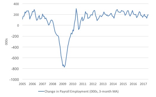
Payroll employment trends
The first graph shows the monthly change in payroll employment (in thousands, expressed as a 3-month moving average to take out the monthly noise).
The monthly changes were stronger in 2014 and 2015, and then dipped in the first-half of 2016. By the end of 2016, job creation was stronger but then it tailed off again, somewhat.
In the first two months of 2017 (January and February), there was a strengthening of the net payroll employment change, followed by a lull in March and May.
The months of June and July have been strong.
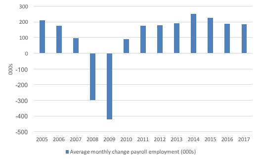
The next graph shows the same data in a different way – in this case the graph shows the average net monthly change in payroll employment (actual) for the calendar years from 2005 to 2017. Clearly, the average for 2017 is for January to July only.
The slowdown that began in 2015 is continuing.
The average change so far in 2017 (184 thousand) is down from the 187 thousand average throughout 2016.
The average net change in 2014 was 250 thousand, in 2015 it was 226 thousand.
Labour Force Survey – employment growth stronger this month
In July 2017, employment increased by 0.23 per cent (345 thousand) while the labour force rose by 0.22 per cent (349 thousand) as the participation rate rose by 0.1 percentage points.
As a result, while employment growth was stronger than in the previous few months, unemployment still rose by by 4 thousand.
We should note that the monthly data has been all over the place lately so it is a little hard to be definitive.
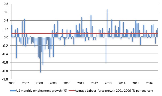
The next graph shows the monthly employment growth since the low-point unemployment rate month (December 2006). The red line is the average labour force growth over the period December 2001 to December 2006 (0.09 per cent per month).
What is apparent is that no coherent positive and reinforcing trend in employment growth has been established in the US labour market since the recovery began back in 2009. There are still many months where employment growth, while positive, remains relatively weak when compared to the average labour force growth prior to the crisis or is negative.
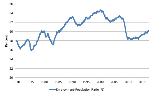
A good measure of the strength of the labour market is the Employment-Population ratio given that the movements are relatively unambiguous because the denominator population is not particularly sensitive to the cycle (unlike the labour force).
The following graph shows the US Employment-Population from January 1970 to July 2017. While the ratio fluctuates a little, the July 2017 outcome (60.2 per cent) was 0.1 points up from the previous month, which continues the rise that began earlier in 2017.
But the ratio remains well down on pre-GFC levels (peak 63.4 per cent in December 2006), which is a further indication of how weak the recovery has been so far.
The US jobs deficit
As noted in the Overview, the current participation rate of 62.9 per cent is a long way below the most recent peak in December 2006 of 66.4 per cent.
When times are bad, many workers opt to stop searching for work while there are not enough jobs to go around. As a result, national statistics offices classify these workers as not being in the labour force (they fail the activity test), which has the effect of attenuating the rise in official estimates of unemployment and unemployment rates.
These discouraged workers are considered to be in hidden unemployment and like the officially unemployed workers are available to work immediately and would take a job if one was offered.
But the participation rates are also influenced by compositional shifts (changing shares) of the different demographic age groups in the working age population. In most nations, the population is shifting towards older workers who have lower participation rates.
Thus some of the decline in the total participation rate could simply being an averaging issue – more workers who have a lower participation rate as a proportion of the total workforce.
I analysed this declining trend in this blog – Decomposing the decline in the US participation rate for ageing.
I updated that analysis to December 2015 and computed that the decline in the participation rate due to the shift in the age composition of the working age population towards older workers with lower participation rates accounted for about 58 per cent of the actual decline.
Thus, even if we take out the estimated demographic effect (the trend), we are still left with a massive cyclical response.
What does that mean for the underlying unemployment?
The labour force changes as the underlying working age population grows and with changes in the participation rate.
If we adjust for the ageing component of the declining participation rate and calculate what the labour force would have been given the underlying growth in the working age population if participation rates had not declined since December 2006 then we can estimate the change in hidden unemployment since that time due to the sluggish state of the US labour market.
Adjusting for the demographic effect would give an estimate of the participation rate in July 2017 of 64.5 if there had been no cyclical effects (1.6 percentage points up from the current 62.9 per cent).
So the 1.6 percentage point decline in the participation rate due to the downturn (net of ageing effect) amounts to 4,009 thousand workers who have left the labour force as a result of the cyclical sensitivity of the labour force.
It is hard to claim that these withdrawals reflect structural changes (for example, a change in preference with respect to retirement age, a sudden increase in the desire to engage in full-time education). I will talk about structural factors next.
To compute these job gaps we have to set a ‘full employment’ benchmark. In this exercise I have set it at 4.4 per cent, which is where the US labour market was in March 2007 prior to the crisis.
We can have a separate debate about whether 4.4 per cent constitutes full employment in the US.
My bet is that if the government offered an unconditional Job Guarantee at an acceptable minimum wage there would be a sudden reduction in the national unemployment rate which would take it to well below 4.4 per cent without any significant inflationary impacts (via aggregate demand effects).
So I doubt 4.4 per cent is the true irreducible minimum unemployment rate that can be sustained in the US. In July 2017, the unemployment rate had fallen to 4.35 per cent and there is plenty of scope for further reductions.
But we will use 4.4 per cent as a benchmark so as not to get sidetracked into definitions of full employment. In that sense, my estimates should be considered the best-case scenario given that I actually think the cyclical losses are much worse than I provide here.
4.4 per cent just compares the present with where the US was in March 2007 (after adjusting for the demographic shifts since then).
Using the estimated potential labour force (controlling for declining participation), we can compute a ‘necessary’ employment series which is defined as the level of employment that would ensure on 4.4 per cent of the simulated labour force remained unemployed.
This time series tells us by how much employment has to grow each month (in thousands) to match the underlying growth in the working age population with participation rates constant at their January 2007 peak – that is, to maintain the 4.4 per cent unemployment rate benchmark.
I computed the ‘necessary’ employment series based on the age-adjusted potential labour force (dark green line in the following graph).
The light blue line is the actual employment as measured by the BLS and the dotted red line is the level of employment that prevailed in November 2007 (the peak before the crisis).
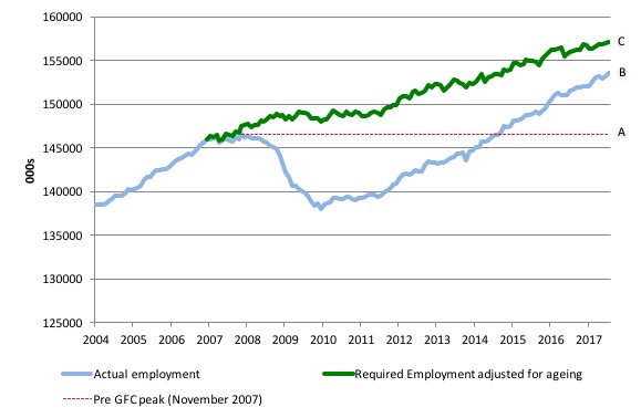
This allows us to calculate how far below the age-adjusted 4.4 per cent unemployment rate (constant participation rate) the US employment level currently is.
There are two effects:
- The actual loss of jobs between the employment peak in November 2007 and the trough (January 2010) was 8,582 thousand jobs. However, total employment is now above the January 2008 peak by 6,918 thousand jobs. This gain in jobs is measured by the AB gap in the graph which shows the gap in employment relative to the November 2007 peak (the dotted red line is an extrapolation of the peak employment level). You can see that it wasn’t until July 2014 that the US labour market reached the November 2007 peak employment level again.
- The shortfall of jobs (the overall jobs gap) is the actual employment relative to the jobs that would have been generated had the demand-side of the labour market kept pace with the underlying population growth (Required Employment Adjusted for Ageing) – that is, with the participation rate at its December 2006 peak and the unemployment rate constant at 4.4 per cent. This shortfall (BC) loss amounts to 3,578 thousand jobs. This is the segment BC measured as at July 2017.
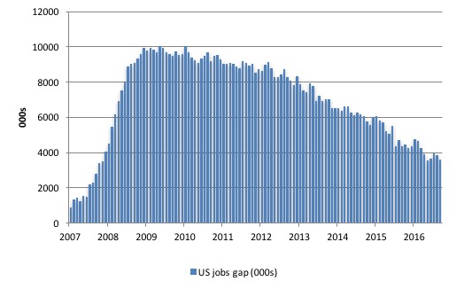
The next graph shows the difference between the blue and green lines in the above graph. The US Jobs Gap is thus the departure of current employment from the level of employment that would have generated a 4.4 per cent unemployment rate, given current population trends.
While the jobs gap has declined, it is still substantial and subject to monthly variation in either direction.
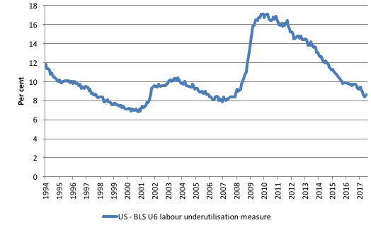
To put that into further perspective, the following graph shows the BLS measure U6, which is defined as:
Total unemployed, plus all marginally attached workers plus total employed part time for economic reasons, as a percent of all civilian labor force plus all marginally attached workers.
It is thus the broadest measure of labour underutilisation that the BLS publish.
In December 2006, before the affects of the slowdown started to impact upon the labour market, the measure was estimated to be 7.9 per cent. It now stands at 8.6 per cent (July 2017) an increase of 0.2 points since May. But it has fallen by 0.6 points since the end of 2016.
The U-6 measure remains well above previous troughs, which suggests (along with the other signals presented above) that the labour market is still some way from being considered ‘recovered’.
Back to Shonky – the US NAIRU
My feature on the US labour market this month focuses on the NAIRU estimates that the Congressional Budget Office puts out and which it uses as a guide to policy advice.
The US Federal Reserve also uses NAIRU estimates in determining monetary policy directions.
I have written about the poverty of the NAIRU concept previously, including:
1. No coherent evidence of a rising US NAIRU.
2. Why we have to learn about the NAIRU (and reject it).
3. NAIRU mantra prevents good macroeconomic policy.
4. The dreaded NAIRU is still about!.
5. US labour market – poor results – not close to full employment.
In the last cited blog (5) written in June 2017 to coincide with the release of the BLS Employment Situation in that month, I examined the US Phillips curve – the relationship between unemployment and inflation – and considered that relationship in the context of the NAIRU concept.
Proponents of the NAIRU – the Non-Accelerating Inflation Rate of Unemployment – claim that there is only one unemployment rate consistent with stable inflation.
If the hypothesis was true then it would mean that there is no discretionary role for aggregate demand management (fiscal and monetary policy to manipulate total spending) to reduce the unemployment rate.
If government tried to drive the unemployment rate down to low levels (below the NAIRU) then all that would happen is that the inflation rate would accelerate.
The theory claims that only microeconomic changes (structural policies) can reduce the natural rate of unemployment (NAIRU).
Accordingly, after this idea (concept) entered the policy arena in the early and mid-1970s, the policy debate became increasingly concentrated on deregulation, privatisation, and reductions in the provisions of the Welfare State with tight monetary and fiscal regimes instituted.
These policies were considered structural and would change the structure of the labour market – for example, by cutting income support for the unemployed, there would be a behavioural change in their approach to job search – they would (so the theory went), search more effectively and harder.
At the time, I coined the expression – the unemployed cannot search for jobs that are not there! Duh! But reality was never the strength of the NAIRU proponents.
Remember Shonky!
The NAIRU concept has dominated macroeconomic policy making in most OECD countries since the late 1970s and the “fight-inflation-first” strategies have exacted a harsh toll in the form of persistently high unemployment and broader labour underutilisation.
Under the sway of the NAIRU, policy makers around the World abandoned the pursuit of full employment as initially conceived.
Of-course they couldn’t admit that so they started redefining what full employment meant.
So if you read this literature you will quickly realise that the neo-liberals define full employment as being the NAIRU which is divorced from any notion that there has to be enough jobs available to meet the desires of the available labour force.
How useful is the NAIRU as a guide to policy? While the topic is vast, in this blog I will just have a brief look at the NAIRU.
In my 2008 book with Joan Muysken – Full Employment Abandoned – we analyse this topic in depth.
So if you are looking for references or authorities for the statements I make here the book would be a good place to start.
Our conclusion: the NAIRU is basically useless for policy analysis.
Roberto Chang, concluded in his 1997 article – Is Low Unemployment Inflationary? – that:
In practice, the concept of a nonaccelerating inflation rate of unemployment is not useful for policy purposes. First, the NAIRU moves around. Second, uncertainty about where the NAIRU is at any point of time is considerable. Third, even if we knew where the NAIRU were, it would be sub optimal to predict inflation solely on the basis of the comparison of unemployment against the NAIRU. A policy of raising the fed funds rate when unemployment falls below the NAIRU may be ineffective…even if the NAIRU were constant, its location were known and all shocks to the economy were to come from the demand side. Implementing such policy would likely induce changes in the expectations and behavior of the private sector an important additional reason to be skeptical about using the NAIRU for policy.
While I don’t think Paul Krugman has much to say that is useful either, his recent blog comment (August 4, 2017) –
Structural Unemployment: Yes, It Was Humbug – is sound.
He notes that:
… five years ago there was a remarkable Beltway consensus that high unemployment was structural, the result of a mismatch between the skills workers had and the skills the economy needed …
Meanwhile, lots of other evidence – like the fact that unemployment was falling fastest in the same places and occupations where it rose most – pointed to a cyclical story, that is, that the economy was simply suffering from inadequate demand …
Yet so strong was the groupthink that news analyses often presented the structural story as if it were the known truth …
… with unemployment now below pre-crisis levels, with prime-age employment not too far below where it was, and still no wage pressure.
What does that mean for the NAIRU?
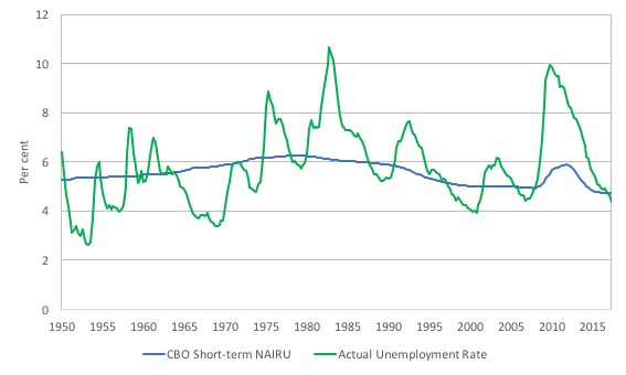
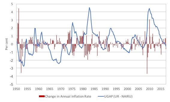
Have a look at this graph, which shows the evolution of the actual unemployment rate since the March-quarter 1950 to the June-quarter 2017 (green) and the Congressional Budget Office’s estimate of their Short-term NAIRU over the same period (blue).
So according to the theory inflation should be accelerating whenever the official unemployment rate is below the estimate of the NAIRU and vice-versa.
As I showed in the previous discussion of the NAIRU cited above (June Employment Situation commentary), no such relationships exist, which puts the operational significance of the NAIRU (not to mention its theoretical validity) into question.
The CBO say that:
The natural rate of unemployment (NAIRU) is the rate of unemployment arising from all sources except fluctuations in aggregate demand … The short-term natural rate incorporates structural factors that are temporarily boosting the natural rate beginning in 2008. The short-term natural rate is used to gauge the amount of current and projected slack in labor markets, which is a key input into CBO’s projections of inflation.
Note, that they claim, that structural factors pushed up the NAIRU estimate during the GFC independent of cyclical factors (the fluctuations in economic activity).
But the actual structural changes which create the shifting estimates are hazy and appear to move with the cycle, a point I have made in the previous commentaries.
Here are some more graphs. The first, shows the change in the UGAP (actual unemployment rate minus the NAIRU) and the annual change in the inflation rate (red bars).
As you can see, it is hard to see any definitive relationship where the positive UGAP (UR > NAIRU) is associated with rising inflation and vice versa.
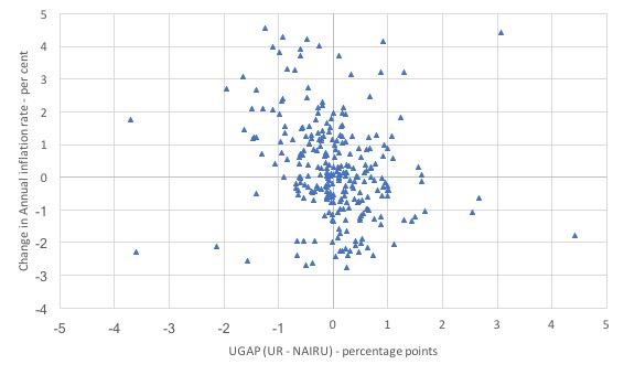
Here is another view in scatter plot terms. Again no strong relationship one way or another.
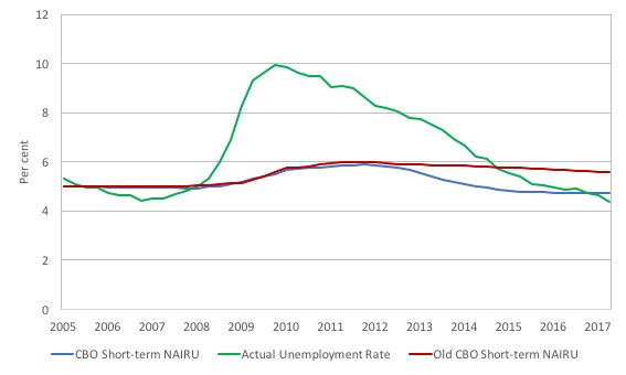
Finally, this graph zeros in on the period March-quarter 2005 to the June-quarter 2017 and then you see some strange things. The green line is the official unemployment rate. The red-line is the CBO Short-term NAIRU estimates derived from its January 2012 report The Budget and Economic Outlook: Fiscal Years 2012-2022.
The blue-line shows the latest CBO estimates.
So what structural factors have changed in the short period to justify the revision from red to blue? None.
As Paul Krugman wrote:
So here we are, with no obvious up-skilling of the work force, but with unemployment now below pre-crisis levels, with prime-age employment not too far below where it was, and still no wage pressure.
The more reasonable explanation is that bodies like the CBO have been caught out – again – with the actual unemployment rate falling below the estimates of the NAIRU and with no accelerating inflation in sight they did what mainstream economists usually do – make up stuff and alter the data to suit.
It is obvious that whenever the mainstream theories are found out they resort to ad hoc manipulation. I guess it is an improvement on the practice espoused by one of my past professors who told me (during a class when I asked a question relating to the problems the NAIRU had with the data in the 1980s) that if the data conflicts with the theory then the data is wrong.
He wasn’t joking!
I am reminded of the work of Staiger, Stock and Watson who wrote in their 1997 paper – The NAIRU, Unemployment and Monetary Policy – which was published in the Journal of Economic Perspectives (Vol 11, Number 1, pages 33-49) that:
We find that there is statistical evidence that the NAIRU has fallen by approximately one percentage point from its peak in the early 1980s to a current estimate that ranges from 5.5 per cent to 5.9 per cent, depending on the details of the specification. However, the most striking feature of these estimates is their lack of precision. For example, the 95 percent confidence interval for the current value of the NAIRU … is 4.3 per cent to 7.3 per cent. In fact, our 95 percent confidence intervals for the NAIRU are commonly so wide that the unemployment rate has only been below them for a few brief periods over the last 20 years.
They produced this table which shows the NAIRU estimates and the confidence intervals for different measures of inflation (the NAIRU is derived from an econometric specfication relating unemployment to inflation).
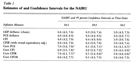
The range is huge.
Totally unreliable and useless.
Shonky!
Conclusion
The July labour market data release confirms that there is no clear improving trend emerging in the US labour market.
Caution always has to be exercised given the volatility of the monthly data.
Employment growth was stronger in July but still failed to keep pace with the underlying population growth and so unemployment rose by thousand.
But that should be seen in the context of a rising participation rate.
Further the broader measure of labour underutilisation (U-6) remains above the pre-GFC levels and brings into question the claims that the US labour market is at full employment.
This assessment is reinforced by the fact that the participation rate is still well below where it was even after we adjust for the ageing effects (retirements).
Finally, the low official unemployment rate confounds those who believe in the NAIRU as a guide for monetary policy.
Crowdfunding Request – Economics for a progressive agenda
I received a request to promote this Crowdfunding effort. I note that I will receive a portion of the funds raised in the form of reimbursement of some travel expenses. I have waived my usual speaking fees and some other expenses to help this group out.
The Crowdfunding Site is for an – Economics for a progressive agenda.
As the site notes:
Professor Bill Mitchell, a leading proponent of Modern Monetary Theory, has agreed to be our speaker at a fringe meeting to be held during Labour Conference Week in Brighton in September 2017.
The meeting is being organised independently by a small group of Labour members whose goal is to start a conversation about reframing our understanding of economics to match a progressive political agenda. Our funds are limited and so we are seeking to raise money to cover the travel and other costs associated with the event. Your donations and support would be really appreciated.
For those interested in joining us the meeting will be held on Monday 25th September between 2 and 5pm and the venue is The Brighthelm Centre, North Road, Brighton, BN1 1YD. All are welcome and you don’t have to be a member of the Labour party to attend.
It will be great to see as many people in Brighton as possible.
Please give generously to ensure the organisers are not out of pocket.
That is enough for today!
(c) Copyright 2017 William Mitchell. All Rights Reserved.
The other major part missing in the mainstream employment picture is the quality of jobs. Initially after the recession, I remember it being very difficult to find any jobs at all. Now, it is much easier to find A job, however that job is likely to be very low pay. So yes, many people have returned to work, but for what are effectively starvation wages.
Food, hospitality, service, retail jobs abound. If you want to actually survive and not be homeless though thats a different question. The jobless, and income-less recovery.