I grew up in a society where collective will was at the forefront and it…
No coherent evidence of a rising US NAIRU
There was an interesting article in the January 2012 edition of the Monthly Labor Review, published by the US Bureau of Labor Statistics – Labor force projections to 2020: a more slowly growing workforce. I was reading this the other day in conjunction with a new report from the US Federal Reserve Bank of Philadelphia – On the Causes of Declines in the Labor Force Participation Rate, which was released on November 19, 2013. The latter paper is controversial because it suggests that the US labour market is much tighter than the actual unemployment rate would suggest. I would suggest otherwise and here is some preliminary analysis to back that view.
The FRBP paper is controversial because, in relation to the declining labour force participation rate in the US, it concludes that:
1. “Roughly 65 percent of the decline is accounted for by retirement and disability” – the former “occurred only after 2010”.
2. The rising number of discouraged workers (that is, workers who are give up looking for work due to a lack of job opportunities), “explains roughly one-quarter of the total decline”.
3. “the decline in the unemployment rate since 2012 is not due to more discouraged workers dropping out of the labor force”.
4. “The likelihood of those who left the labor force due to retirement or disability rejoining the labor force is small … suggesting that the decision to leave the labor force for those two reasons is more or less permanent”.
Why is that controversial?
It implies that the full employment unemployment rate has risen to close to the current actual unemployment rate. That is, the paper implies that the labour market is much tighter than the actual unemployment rate would suggest.
The author suggests that if all the discouraged workers started actively looking for work as the economy improved then it would increase the unemployment rate by 0.7 percentage points.
Here is some background analysis using US Bureau of Labor Statistics data. There is a lot of digging to be done to consider the proposition raised in the FRBP paper and today’s blog is just a start.
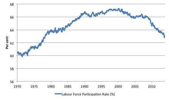
The first graph shows the US labour force participation rate from January 1970 to November 2013. The sample provides an insight into the trend and cyclical behaviour of the time series.
The BLS say:
The overall labor force participation rate peaked at 67.1 percent from 1997 to 2000 and then declined during the recession of 2001. Unlike its behavior in previous downturns, in which it would soon return to the prerecession level, the labor force participation rate continued to decline after the 2001 recession and then held steady at 66.0 percent from 2004 to 2008, with a small uptick to 66.2 percent in 2006. In the 2007-2009 recession, the overall labor force participation rate experienced a sharp drop, to 65.4 percent in 2009. In 2010, it came in at 64.7 percent, a further decrease of 0.7 percentage point.
The BLS identify several factors which help to explain the declining labour force participation rates in the US.
Demographic and structural changes
The BLS say that “(t)he aging of the U.S population is a prime example of a demographic change that will affect the labor force participation rate and, hence, the labor force itself”.
So the labour force participation rate declines not because of a change in behaviour in the different age cohorts but because there are more older workers in the population than before and they have lower participation rates.
That is, the composition of the labour force is shifting.
To compute that impact, we can use the data set that accompanied the MLR article. The accompanying data set – Civilian labor force participation rates by age, sex, race, and ethnicity – provides a rich source of information about labour force trends in the US.
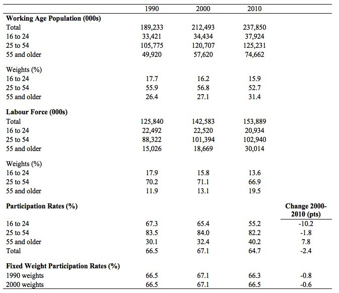
The following Table shows you the calculations I performed. The relevant rows are the last one showing the Actual Labour Force Participation Rates (%) and the change between 2000 and 2010 (in percentage points), and the Fixed Weight Labour Force Participation Rate (using 1990 and 2000 weights).
The 1990 weighted series takes the actual age-specific participation rates and weights them by the proportion of each age group in the working age population in 1990. The same logic applies for the 2000 fixed-weight series.
We not that between 1990 and 2010 the proportion of 16-24 year olds in the working age population in the US fell from 17.7 per cent to 15.9 per cent, while the proportions for prime-age persons (25-54) fell from 55.9 per cent to 52.7 per cent. The proportion of older workers (above 55 years) rose from 26.4 per cent to 31.4 per cent.
You will also note that the older workers have lower participation rates than the prime age workers. So the shift in proportions of the total working age population towards the older workers will reduce the weighted-average participation rate overall.
If we ask what the total participation rate would be if the proportions in the working age population by age group had not changed from their 2000 proportions (that is, using 2000 weights), then the participation rate in 2010 would have been 66.5 per cent rather than the actual result of 64.7 per cent.
So the compositional effect of the shifting weights between 2000 and 2010 results in a decline in the participation rate of 0.6 points, compared to the actual decline of 2.4 percentage points.
The BLS summarise the compositional effect:
In other words, the U.S. labor market is currently experiencing a negative demographic effect in which a large segment of the population is moving from an age group with higher participation rates to an older age group with lower participation rates, resulting in a slowdown in the growth of the labor force. In addition, the baby bust is reinforcing this slowdown because fewer people are entering the labor force from that age cohort.
Cyclical changes
The BLS say that:
Cyclical factors such as economic expansions and recessions cause short-term changes in labor force participation rates, which usually increase in expansions and decline during economic downturns. During the 2007-2009 recession, weak demand for workers strengthened the aforementioned demographic and structural factors, pushing participation rates to considerably lower levels.
They note that the cyclical sensitivity of the participation rate is most pronounced among the 16-24 years workers because they are “usually the first to be fired and the last to be hired”.
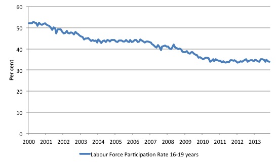
You can see from the Table above that the participation rate for US youth plunged between 2000 and 2010. The following graph shows the full period since January 2000 (to November 2013).
In June 2006, the 16-19 participation rate was 44.4 per cent which was the most recent peak. It had been relatively steady around that mark for some years after the recession in the early 2000s.
In November 2013, the rate was 34 per cent, a 10.4 per cent decline since the recession set in.
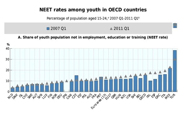
The OECD provide data for NEETs who are young persons who are “Not in Education, Employment, or Training”.
In Chapter 3 of the 2012 Employment Outlook, the OECD provide a graph (reproduced below) for the NEET rates among youth in OECD countries: Percentage of population aged 15-24, 2007 Q1-2011 Q1.
The graph shows that the NEET rate in the US has risen over the course of the crisis by several percentage points.
In 2011, there were 6 per cent of American 15-29 year olds unemployed and 8 per cent inactive, taking the NEET rate to 14 per cent (OECD Source).
.
The BLS also note that contrary to the youth effect, there have been “at least two factors have been responsible for strengthening the rates”.
1. “The labor force participation rate of the 55-years- and-older age group has increased considerably since 1996”.
2. “… increasing racial and ethnic diversity of both the population and the labor force” – Hispanic and Asian men have higher participation rates and are becoming an increasing proportion of the working age population.
In terms of the first effect, the rising participation rates of older workers has been the result of “continually increasing life expectancy of the population”, “the elimination of mandatory retirement and the enactment of age discrimination laws” and the “continuing economic uncertainty and the impact of the financial crisis on many individuals’ retirement savings and investment accounts”.
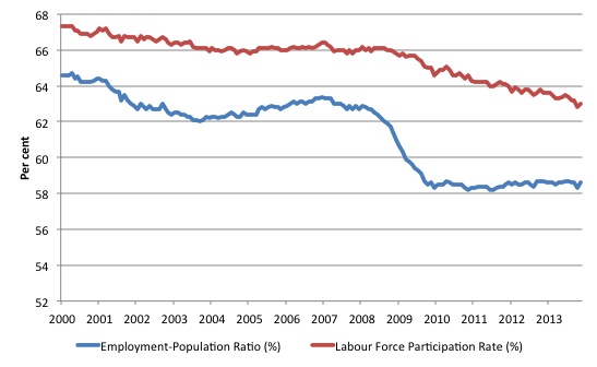
The following graph shows the depth of the crash in the post 2007 period using the employment-population ratio, which excludes the cyclicality in the participation rate. It also overlays the actual labour force participation rate.
The cyclical collapse in employment in 2008 and 2009 was extreme relative to US history.
In December 2006, just before the crisis took hold in the US, the national unemployment rate was 4.4 per cent.
The average annual labour force growth since December 2006 (to November 2013) has been 0.4 per cent, considerably slower than in previous periods. This incorporates the declining participation rate due to whatever reason.
The average annual growth in employment over the same period has been -0.2 per cent.
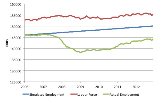
If from December 2006, total employment had have kept pace with the (declining) labour force growth rate (of 0.4 per cent) then total employment in November 2013 would have been 150,070 thousand rather than the actual (stagnating) value of 144,386 thousand a difference of 5,684 thousand.
The following graph shows the evolution of the labour force (red line), the actual employment level (green line) and the simulated employment (blue line), where the simulation shows what employment would have been if it had increased steadily at the annual average labour force growth rate for the period shown (December 2006 to November 2013).
One might consider that the blue line eliminates the cyclical effect of the plunge in employment during the crisis but still is consistent with the slowing labour force (due to retirements etc).
The gap between the blue and green lines is, using this logic, an indication of cyclical decline in employment in the US.
If we then compute what the unemployment rate would been, had total employment not declined as shown but had have instead increased steadily at the average labour force growth rate for the period, then we would estimate it to be 3.4 per cent in November 2013 rather than the actual rate of 7.02 per cent. The difference between the actual December 2006 rate of 4.4 per cent and the simulated rate is because the labour force growth rate has slowed.
Conclusion
This is an on-going investigation.
While there is some evidence to suggest that retirements (in absolute numbers) are increasing as the population ages, this is a separate issue to the strength of employment growth.
Can the US increase its employment growth rate from the miserable -0.2 per cent per annum since the onset of the crisis in the face of the labour force changes in composition?
Obviously, yes with stronger aggregate demand.
Would it be able to match the now slower labour force growth rate? Why not? There is no reason why the US economy should not generate jobs growth consistent with the underlying growth of the labour force, even if, the latter has shifted (downwards) in the face of working age population growth.
There is no evidence to suggest the underlying full employment unemployment rate has shifted significantly from what it might have been in December 2006 when things went awry.
That is enough for today!
(c) Copyright 2013 Bill Mitchell. All Rights Reserved.
Bill says, “Can the US increase its employment growth rate . . . . Obviously, yes with stronger aggregate demand.”
Problem there is that leading members of the economics profession are so HOPELESSLY INCOMPETENT that they don’t know how to raise demand at the zero bound. For example, there’s Lawrence Summers ridiculous “secular stagnation” theory according to which we’re in for an extended period of deficient demand. And even Paul Krugman doesn’t seem to know how to raise demand at the zero bound. See respectively:
http://www.fulcrumasset.com/files/summersstagnation.pdf
http://www.nytimes.com/2013/11/18/opinion/krugman-a-permanent-slump.html?_r=0
For MMTers, raising demand at the zero bound is a doddle, of course.
I’ve just been alerted by someone on Frances Coppola’s site to an article published by Krugman yesterday. See:
http://krugman.blogs.nytimes.com/2013/12/09/helicopters-dont-help-wonkish/
I’m now even more baffled as to what’s going on in his brain. Can anyone tell me what he’s trying to say in the latter article?
I have no idea either Ralph.
Same old Krugman. He’s bringing gold standard analogies to a modern money economy.
“Printing Money”
“Financing deficits via bond issues”
Overall, he’s a former acadmic who is now primarily a journalist trying to sell newspapers.
Bill, are you going to write a piece about Holden shutting down its factories? The use by a sovereign government of subsidies too keep some citizens employed in a particular industry can promote full employment, but I recall you making some previous comments about governments propping up failing industries.
Prof, I did table of the US jobless rate, S&P 500, and budget balance from 1948 to date. Sharp increases in US unemployment, and the subsequent recessions, have always happened during a budget surplus or tiny deficit.
Thanks for the explication of a nettlesome topic for a
layman. NAiRU, it seems, is like a raindance. If it doesn’t rain
you can’t say the raindance doesn’t work, only that you
misunderstood, and did it wrong. Redefine again! As for Krugman,
excellent commentary at NEP:
http://neweconomicperspectives.org/2013/12/krugman-helicopters-consolidation.html#more-7092.
Why do the leaders of MMT want to so badly for a mercenary such as Krugman to agree with them.
Krugman 15/8/2011
“But the MMT people are just wrong in believing that the only question you need to ask about the budget deficit is whether it supplies the right amount of aggregate demand; financeability matters too, even with fiat money.” [http://krugman.blogs.nytimes.com/2011/08/15/mmt-again/?_r=0]
And now MMT advocates think he’s come full circle. You must be joking.
Dear Alan
You can exclude yours truly from the list who long for Paul Krugman’s acceptance.
best wishes
bill