In the 1990s, a new industry was created in Australia. It produced nothing. But it…
US employment falls in October signalling increased weakness
After last month’s US Bureau of Labor Statistics employment data (for September) I assessed that – The US labour market is nowhere near full employment. This was in the context of overtly political (ideological) and ridiculous statements made by the President of the Federal Reserve Bank of San Francisco, who had claimed that the US economy had already returned to full employment. The current BLS data release – Employment Situation Summary – October 2016 – has not altered my view. It showed that total non-farm employment from the payroll survey rose by 161,000 and the unemployment rate remained “little changed” at 4.9 per cent. But from the perspective of the labour force survey (Current Population Survey), total employment fell by 43 thousand. See below for an explanation of that paradox. The point is that employment still remains well below the pre-GFC peak and the jobs that have been created in the recovery are biased towards low pay. In general, the problem is less job creation as quality of the work being created and the capacity of US workers to enjoy wage increases. There are also wide disparities among state unemployment rates.
Overview
For those who are confused about the difference between the payroll (establishment) data and the household survey data you should read this blog – US labour market is in a deplorable state – where I explain the differences in detail.
See also the – Employment Situation FAQ – provided by the BLS, itself.
The BLS say that:
The establishment survey employment series has a smaller margin of error on the measurement of month-to-month change than the household survey because of its much larger sample size. … However, the household survey has a more expansive scope than the establishment survey because it includes self-employed workers whose businesses are unincorporated, unpaid family workers, agricultural workers, and private household workers …
Focusing on the Household Labour Force Survey data, the seasonally adjusted labour force fell by 195 thousand in October 2016 as the participation rate fell by 0.1 points.
Total employment fell by 43 thousand in net terms, and as a consequence of the even weaker labour force growth, official unemployment fell by 152 thousand.
The unemployment rate eased from 4.96 per cent to 4.88 per cent.
The October participation rate of 62.8 per cent was 0.1 points down on the September outcome figure and 0.2 points below the most recent peak of 63 per cent in March 2016.
Adjusting for the ageing effect (see US labour market – some improvement but still soft for an explanation of this effect), the rise in those who have given up looking for work (discouraged) in the last seven months is around 295 thousand workers.
If we added them back into the labour force and considered them to be unemployed (which is not an unreasonable assumption given that the difference between being classified as officially unemployed against not in the labour force is solely due to whether the person had actively searched for work in the previous month) – then the unemployment rate would be 5.1 per cent rather than 4.9 per cent.
However, if we assessed the impact of the loss of participation since the peak (December 2006 – 66.4 per cent) and adjusted for the ageing effect on participation, we would find that 3,931 thousand workers had exited due to lack of employment opportunities, which would make the current US unemployment rate would be 8.3 per cent if they were added back in to the jobless.
That provides a quite different perspective in the way we assess the US recovery.
The US labour market is still a long way from where it was at the end of 2007.
Employment growth faltering
In January 2016, employment rose by 0.41 per cent, while the labour force rose by 0.32 per cent. Despite the positive employment growth spikes in July and September, employment growth has faltered throughout much of 2016 – with negative growth in April and again in October 2016.
Employment growth in October was -0.12 per cent down from a modest 0.28 per cent in September 2016.
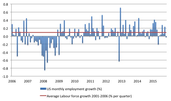
The following graph shows the monthly employment growth since the low-point unemployment rate month (December 2006). The red line is the average labour force growth over the period December 2001 to December 2006 (0.0910 per cent per month).
What is apparent is that a strong positive and reinforcing trend in employment growth has not yet been established in the US labour market since the recovery began back in 2009. There are still many months where employment growth, while positive, remains relatively weak when compared to the average labour force growth prior to the crisis.
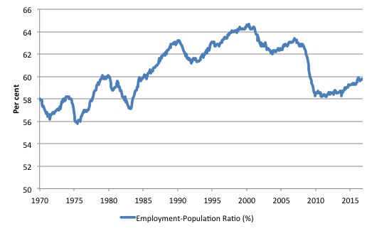
A good measure of the strength of the labour market is the Employment-Population ratio given that the movements are relatively unambiguous because the denominator population is not particularly sensitive to the cycle (unlike the labour force).
The following graph shows the US Employment-Population from January 1970 to October 2016. While the ratio fluctuates a little, the October outcome (59.7 per cent) down by 0.1 points on September.
But it remains well down on pre-GFC levels (peak 63.4 per cent in December 2006), which is a further indication of how weak the recovery has been so far.
Regional unemployment in the US
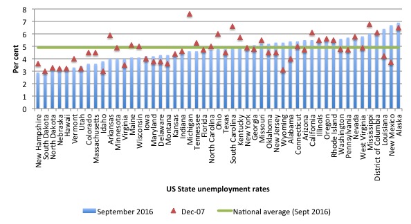
The following graph shows the US state unemployment rates as at December 2007 (red triangles) and September 2016 (blue bars). The green line is the September 2016 national average.
Points to note:
1. Considerable dispersion – the coefficient of variation in percentage terms is 20.9 per cent in September (a little lower than the pre-GFC value of 22.8 per cent).
2. The better performing states tended to have higher unemployment rates in December 2007 than now, whereas the poorer performing states in September 2016 have deteriorated since the crisis.
3. Within each state are regional areas with much higher unemployment rates than are reflected in the state averages. For example, El Centro (CA), which is due east of San Diego had an unemployment rate of 22.7 per cent, while the neighbouring town of Yuma (AZ) had an unemployment rate of 20.9 per cent.
Federal Reserve Bank Labor Market Conditions Index (LMCI)
The Federal Reserve Bank of America has been publishing a new indicator – Labor Market Conditions Index (LMCI) – which is derived from a statistical analysis of 19 individual labour market measures since October 2014.
It is now being watched by those who want to be the first to predict a rise in US official interest rates. Suffice to say that the short-run (monthly) changes in the LMCI are “assumed to summarize overall labor market conditions”.
A rising value (positive change) is a sign of an improving labour market, whereas a declining value (negative change) indicates the opposite.
You can get the full dataset HERE.
I discussed the derivation and interpretation of the LMCI in this blog – US labour market weakening.
At the time of writing, the Federal Reserve Bank had not updated the data for October.
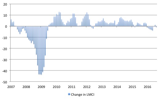
In September 2016, the LMCI dropped by 2.2 index points, the second consecutive negative decline (-1.3 points in August). While the index recorded a positive increase in July, it had fallen for six consecutive months prior to that.
Overall, the trend is definitely down and signals a weakening situation.
The following graph shows the FRB LMCI for the period January 2007 to October 2016.
We note that while unemployment is now lower than last year and the rate of hiring has stabilised after declining earlier in the year. The way these factors combine in the index leads to an overall assessment that the labour market has been in decline.
The fall away over the last nine months has been quite significant notwithstanding the July 2016 upturn.
Is there a bias towards low-pays jobs in the recovery in the US?
That question cannot be immediately answered from the summary report provided by the BLS and needs further analysis (and lots of data manipulation).
But while updating all my datasets for the US labour market today, I did the calculations necessary to answer the question: Is there a bias towards low-pays jobs in the recovery in the US?
Answer: clearly!
Previously, I have calculated what happened in the downturn with respect to the jobs lost in net terms and their pay characteristics (at a sectoral level).
Please read my blog – US jobs recovery biased towards low-pay jobs – for more discussion on this point.
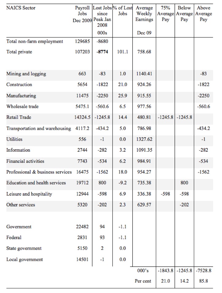
Peak US non-farm employment occurred in January 2008 (138,432 thousand) and the trough occurred in December 2009 (129,774 thousand).
Using the top-level North American Industry Classification System (2012 NAICS), we can calculate what has happened in the recovery period:
1. Since the trough (December 2009), total non-farm employment has grown by 15,178 thousand.
2. Total private employment has grown by 15,425 thousand.
3. Government employment has fallen 742,000 after growing by 94,000 during the peak-trough period (January 2008 to December 2009).
4. Of those net employment additions in the private sector, 27.8 per cent have been what might be considered low-pay, where that is defined as less than 75 per cent of average weekly earnings.
The following table summarises what happened in the Peak-trough period.
The first column shows the NAICS sector with the first two rows summarising relevant totals. Total non-farm employment is the sum of total private employment plus Government employment.
The second column shows the total employment in each sector as at December 2009, which was the trough of the downturn following the peak in January 2008.
The third column shows the lost jobs (in thousands) between the Peak and the Trough (these are net losses). So overall 8.7 million jobs were lost – with 8.8 million lost in the private sector and they were only partially offset by the 94,000 net jobs added in the government sector.
The next column shows the percentage of those lost jobs per sector, which allows you to see where the downturn impacted mostly. The next column shows average weekly earnings as at December 2009 in US dollars.
The final three columns then distribute the jobs lost according to whether the sector pays 75 per cent or less than average pay, below average pay (the first being a subset of the second), or above average pay as at December 2009.
The totals are below the last three columns and the percent indicates the percent of total jobs lost in each of the pay categories.
So in the downturn, from January 2008 to December 2009, 21 per cent of the jobs lost (net) were in sectors that paid on average below 75 per cent of the overall private sector average pay.
The last two columns divide the total job losses in net terms between above and below average pay and you can see that 85.8 per cent of the total jobs lost in the downturn were in sectors were paying above average pay.
The next table summarises what happened in the period from the trough to the most recent monthly data observation (October 2016).
The columns now have a slightly different interpretation, given that we are discussing a growth period rather than a period of contraction.
The second column shows the latest BLS payroll employment data as at September 2016. The next column shows the number of net jobs (in thousands) that have been added by each sector since the trough in December 2009.
The next column shows the percentage of those total jobs added by sector. You can see that with the Government sector in contraction the total jobs added in the Private sector are 101.6 per cent of the total net jobs added.
The fourth column shows the Average Weekly Earnings for each sector as at September 2016.
The final three columns split these job additions into their pay characteristics using the sectoral average weekly earnings and the same criteria as in the previous example.
The summary statistics for each ‘pay category’ (75% of Average Pay, Below Average Pay, Above Average Pay) are at the bottom of each column.
We find that:
1. Government employment has contracted in the expansion, particularly at the Local Government level as fiscal austerity has been imposed. Employment losses in the education sector should be of great concern to American citizens.
2. 27.8 per cent of the total private jobs added could be considered low-pay, that is, in sectors that pay on average weekly wage 75 per cent below the total private sector average weekly earnings.
3. 50.2 per cent of the jobs created (net) since the recovery began pay below average weekly earnings. That proportion has increased over the last 6 months.
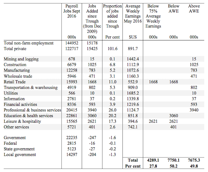
The data shows that the low-paid jobs that were lost in the downturn have been more than added back (in net terms) in the upturn so far.
However the above average pay jobs that were lost in the downturn have barely recovered.
This analysis shows a bias in the recovery towards low-paid in the US, which would have to be considered a disturbing trend given the implications for long-term productivity growth and material prosperity.
Data conspiracies theories abound
One of the characteristics of the Right-wing (mostly) is a deep paranoia about the state and its information releases. This is often focused on the national statistical agency or agencies.
There was an article in the New York Times a few days ago (November 3, 2016) – How Economic Data Is Kept Politics-Free – that reminded me of how ill-informed people are who use the labour force data that comes out (usually) each month.
The article reflects on a:
Twitter warning of a government conspiracy to swing the presidential election in the Democrats’ favor popped up just moments after the Labor Department reported the biggest monthly decline in the unemployment rate in nine years.
That warning came in 2012 rather than last week.
At the time, there was a torrent of social media claims that the President was rigging the labour force numbers to rig the election because they had been out-debated by the Republican (or whatever he is) candidate.
To call what has been going on in this election campaign in the US a ‘debate’ is to render the term meaningless. I hardly call any of it a debate.
But for the Republican interests to invoke conspiratorial claims about the jobs data is just a reflection of their sheer ignorance rather than being a source of concern.
I should add the same sort of nonsense gets wheeled out in all countries.
On the US though, I repeat previous comments that I have no truck with Hillary Clinton or her retinue of so-called progressives. To me they represent the corrupted Democratic vision where power is all and funds from almost anywhere is solicited to maintain that power. They rarely do anything in policy that I would call progressive.
But one thing I don’t think the Democrats get up to is rig the labour force data.
What Mr Trump says when he quotes ‘facts’ should be mostly disregarded because there doesn’t appear to be any basis in fact for his empirical observations.
The NYT articles notes “that nearly half of Mr. Trump’s supporters “completely distrust the economic data reported by the federal government”.
The familiar play out of confirmation bias is at work here. Even without knowing the basis of things people will tend to accept propositions that support their ideological position and reject information that challenges that position.
The New York Times article is useful because it provides a very understandable discussion of how labour force surveys are conducted (including the payroll survey that supplements the labour force data).
While it highlights are strengths and weaknesses of the data collected it should leave no doubt that within the ambit of the statistical techniques and concepts used (which are part of an international agrement among national statistical agencies), there is no room for political manipulation on a monthly basis.
Clearly, ideology conditions the underlying concept. Why, for example, do national statistical agencies not collect data on surplus production (a Marxian concept)?
It is obvious that the unemployment rate derived in the US from the Current Population Survey of 60,000 persons (on a rotational basis) is a narrow indicator.
I covered that topic in last month’s US labour market commentary – The US labour market is nowhere near full employment.
As the New York Times notes (and I have noted more times than I care to count):
It does not take into account people who are working only part time because they cannot find a full-time job. Or the former steelworker who, after years of fruitless searching, has given up looking but would take a job if he could find one.
But, to the credit of the BLS, they pioneered alternative measures of labour underutilisation, which other national statistical agencies have since adopted (their U-1 to U-6 measures).
There are many things the labour force data does not recount, which are relevant in assessing the state of health of the labour market.
For example, the New York Times notes:
… nearly half of the seven million men between 25 and 54 not in the labor force were on daily painkillers or disabled …
But deficiencies aside, there is no political bias in the data.
Conclusion
The evidence is fairly consistent across a range of measures – the mass unemployment in the US was the result of a systemic failure in that economy to produce enough jobs, which emerged as aggregate spending collapsed in early 2008.
Since then, as the economy has slowly starting growing again, the demand-side of the labour market has improved steadily and the unemployment rate has fallen.
The pace of improvement appears to be slowing and this month’s household data shows that total employment actually contracted.
The labour market has considerable slack as indicated by the broader BLS measures of labour underutilisation and the jobs gap and the jobs that are being created are biased towards low pay.
It is not a great outlook.
That is enough for today!
(c) Copyright 2016 William Mitchell. All Rights Reserved.
Hi Bill…..Two-cents from this side of the pond….your query that our method for counting the unemployed doesn’t make sense-it is because the powers that be over here….don’t want to know the truth-[re the ridiculous SF FED comment that we have “full employment”-particularly when full employment is a mandated objective of the FED]-I’m sure you know this but when a person in America stops actively looking for work, they are dropped from the statistics-so our true unemployment rate is “God only knows”? Projections are as high as 20 million, rather than the “official” 7.8 million reported in the October 2016 BLS report you noted. I have a theory on this-but no one is listening-until unemployment is recognized as a “bottom line” issue-the danger unemployment poses in building a good and decent society-what Cicero observed “The people’s good is the highest law”-this issue will fall on deaf ears. To change the dialogue I devised a “law” based on common sense, the “D/UE LAW” [“D”iminished income to the market due to “UE”-unemployment]-and while I may be wrong on the “3%”[I’m open to serious research]-I’m not wrong on the theory-people do not buy what we manufacture, when they are jobless-but then, a primary objective is to get real solutions to UE on the table. Since this brief blurb is already way over the top, including a recent letter to expand on the D/UE lAW [also fully aware that calling for a new way to look at anything, is a ticket to being called delusional]….
Please Forward To: Elon Musk….I noted in the November, 2016 issue of National Geographic-your interest in going to Mars.
My nephew has a Tesla, so very aware of your many accomplishments-and it struck me how remarkable it would be if you focused your energies here on Earth…on fixing the most pernicious social/economic problem facing America [as well as the rest of the OECD], today, and going forward in the 21st Century, to wit:
Unemployment [hereafter UE].
Our failure to evolve on UE since WW II is the reason over 70% of Americans believe “We are moving in the wrong direction!”….
And least understood is the adverse impact UE has on the bottom line, on the Market…. unemployment is a No One Wins-the jobless lose, civility loses [Ferguson, etc.,], and the Market loses, to wit:
OUR SLUGGISH ECONOMY RESULTNG FROM THE LAW OF DIMINISHED INCOME TO THE MARKET FROM UNEMPLOYMENT [hereafter D/UE LAW]
Short Definition:
3% is the zero-sum threshold above which unemployment starts substantially undermining the Market–and the loss in income to the Market is compounded exponentially with each percentage point of increase in unemployment, above 3%..
The bottom line is, since WW II Americans have been stuck with the false and pernicious belief driving our Job Creation, that “the market can provide anybody wanting a job, with a job”-and yet, this fraud has not resulted in a UE rate below 3% since 1953! Leaving millions jobless in its wake, creating our inner-cities with 60% minority UE, drug economies, and an epidemic of gun violence!
We have several deficit-neutral/Pro-Market paths to Full Employment-for one, HR 1000 [in Committee]-proposed, here, is: THE NEIGHBOR-TO-NEIGHBOR JOB CREATION ACT [hereafter NTN] Amazon-a federally mandated, Social Insurance, owned by our employed to provide a fund to hire/train our unemployed. Jobs beget jobs, and for a modest 4% of salary policy cost we will create more “private-sector jobs” in 6 months, than the HIRE Act, HR 2847, in 6 years!
Operating from the mind-set that “We have far more work that needs to be done in America, than persons to fill these jobs” –local jurisdictions would apply for a Grant-In-Aid from the Labor Department-with this insurance fund/Act triggered by the “legal authorization” in Federal Law 15 USC § 3101, anytime our UE rate rises above 3%.
Jim Green, Democrat candidate for Congress, 2000