I started my undergraduate studies in economics in the late 1970s after starting out as…
R we or R we not …
Today the ABS released the March quarter National Accounts data which showed that the Australian economy is actually resisting the global slowdown although barely. The results allowed all and sundry to pronounce that Australia had escaped recession, despite there being no acceptable definition of what actually constitutes a recession. For now then we do not have a recession based on the national accounts benchmark – two consecutive quarters of negative GDP growth. But I hardly think this is the end of it. And if we take a labour market definition of recession which researchers such as me think is a better approach because unemployment is a personal experience that allow us to feel the movements in the cycle – then we are already in recession. That is what this blog is about – R we or R we not!
One should be very careful in taking one quarter’s GDP results and assuming too much from them.
In June 1974, GDP growth collapsed by -2.9 per cent, then recovered in the September quarter (1.7 per cent), then fell again by 0.1 per cent in the December quarter only to record two successive quarters of growth (0.3 per cent in the March 1975 quarter and 3.2 per cent in the June 1975 quarter. What followed was a recession – minus 0.8 per cent growth in September 1975 and minus 1.3 per cent growth in December 1975.
Similarly, in December 1981, the Australian economy recorded zero GDP growth, dropping to -1.1 per cent in the March 1982 quarter then recovering a bit (0.7 per cent) in the June quarter only to record four successive negative growth quarters from September 1982 to June 1983.
The 1991 downturn also unfolded in stages. The first negative GDP growth quarter was June 1990 (-0.2 per cent) then -0.5 per cent in September, with a modest recovery (zero growth in the December 1990 quarter), followed by two quarters of negative growth into the first half of 1991.
I was asked in an ABC Radio interview today about the “good news balance of payments data” which was released yesterday and led to overnight revisions of the market forecasts for today’s GDP figures. Previously economists were expecting today to reveal another quarter of negative growth but overnight they altered this.
I told the interviewer that while it looks like net exports are telling a good news story in fact they portend the opposite. Exports are modestly up – which is good. But commodity prices are now falling (iron ore and coal) which will reduce the contribution from exports in the year ahead.
But more significantly, in the March quarter, the modest growth in exports has been overwhelmed by the decline in imports which adds to domestic growth because the expenditure leakage is now smaller. But the sharp fall in imports is a sign of a weak economy and indicates that investment plans have stalled badly (we import most of our capital equipment).
This is clearly brought out in today’s National Accounts data. It shows that business investment has collapsed for the time being. This is a significant reason why the contribution of (falling) imports has been so strong. The declining investment however spells very bad news for employment growth and even if GDP “muddles through”, skating along the the zero line – unemployment will continue to rise over the coming 12 months.
The modest positive growth in household consumption probably reflects the support coming from fiscal (stimulus packages) and monetary policy (low interest rates). Those impacts will exhaust though although the infrastructure spending associated with the fiscal packages is now starting to come on tap and will provide a positive boost in the next 12 months for sure.
The politics of today’s data are clear – the Government is claiming that the Growth justifies stimulus cash whereas the Opposition in the same ABC news bulletin claims the growth has nothing to do with the stimulus and has been driven by export growth.
The prime minister told ABC news that “Australia is the fastest growing advanced economy and the only major advanced economy that is not in recession” which depends on what you consider to be a major advanced economy (China?).
The Temporary Opposition leader claimed on ABC radio today that:
Yesterday’s balance of payments figures showed a boost in exports that was predicted to add 2.2 per cent to economic growth.
Well, nice if it was true but it isn’t.
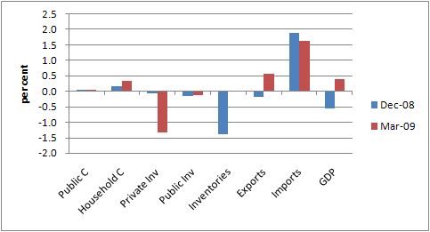
The following graph is derived from the ABS data and shows the contributions to GDP growth (in percentage points) for the December and March quarters for the major expenditure components. The table below it reports the data used in the chart. Note that when imports (a leakage from the expenditure system) falls we say it has a positive contribution to domestic GDP growth.
Despite what the Temporary Opposition leader says, exports only contributed 0.56 percentage points to the growth figure in the March 2009 quarter. The most significant contributor to growth shown in the Table was the decline in imports which was three times more significant than the rise in exports.
Further, export growth will not continue at that pace either as noted above.
Private and public investment both subtracted from growth for the second consecutive quarter. Public spending on consumption was weak and household consumption was not much better.
So while the stimulus package has perhaps taken the edge of the downturn, the evidence, for it being a significant contributor to the GDP growth performance in the March quarter is not overwhelming. I would expect a stronger contribution from “stimulus package” components (that is, domestic final demand) in the June quarter national accounts data which will be out in 3 months time.
The following table shows the underlying data I computed. You calculate the percentage contribution for each aggregate using 100 times (A(t) – A(t-1))/GDP(t-1), where A is some expenditure aggregate, t is now and t-1 is last quarter and GDP is Gross Domestic Product. I provided the table to make it easier to read the bar graph.
Recession a la the labour market
There is considerable scepticism about the GDP-based definition of a recession. Tim Colebatch has a very interesting article on this topic in The Melbourne Age yesterday.
Concepts like GDP are remote from our daily existence whereas the labour market is a much more tangible contact that we have with the production system. This has led some to argue that if the unemployment rate rises by 1.5 per cent over a 12 month period then that constitutes an economic calamity that deserves to be called a recession.
I have sympathy for this view. However, given that the official unemployment rate is a narrow indicator of labour underutilisation and fails to capture hidden unemployment and underemployment, I would prefer we think of this rule more broadly. So I posit that when broad labour underutilisation rises by more than 1.5 per cent over a 12 month period then that is when the economy has gone into a recession.
To see how we might apply this rule I used data taken from the CofFEE Labour Market Indicators – CLMI – which we produce every quarter at the Centre.
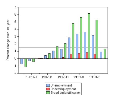
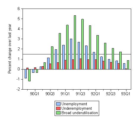
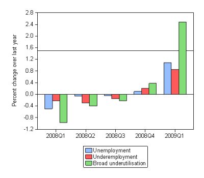
This sequence of graphs shows the quarterly percentage point changes in the official unemployment rate, the CLMI measure of underemployment and the CLMI broad labour underutilisation measure which adds hidden unemployment and underemployment to unemployment.
The graphs start in the quarter where the official unemployment reached its lowest point in the relevant cycle – February 1981; November 1989; and February 2008. The periods graphed then last until the annual change in the broad labour underutilisation rate falls below 1.5 per cent (November 1983; February 1993). For the current period I have just graphed up to the last available observation (February 2009). The May 2009 quarter CLMI is due soon.
The horizontal line is drawn at the 1.5 per cent point. So look for green bars that are above that threshold.
The first graph is for the 1982 recession. it took five quarters of labour market deterioration before broad underutilisation increased by more than 1.5 per cent over the last 12 months. At that point (May 1982) the economy entered recession although the GDP definition told us that recession came in September 1982. By then the labour market had been heading south for some months. The 1982 recession lasted 6 quarters by the labour market approach and at its peak broad labour underutilisation grew by nearly 6 per cent over the relevant year.
This graph is for the 1991 recession. Once again the build-up to the recession took 4 quarters beginning in August 1990, and once it took hold it lasted another 10 quarters finally abating in February 1993. By the GDP definition, the economy was in recession from June 1990 but by December was out of it only to slump back into recession in June 1991. But by this time, the labour market had experienced around 12 months of recession.
Finally, the next graph is for the current recession. Why do I call it a recession? Well, because in the February 2009 quarter, the broad labour underutilisation rate grew by more than 1.5 per cent over the previous 12 months. It actually sky-rocketed by 2.48 per cent. So even though the GDP figures are allowing the commentators to declare we avoided recession the labour market data is telling us otherwise.
An interesting aspect of the three graphs is the increasing importance of underemployment. In the 1980s, underemployment was hardly an issue. It exploded in the 1991 recession but the changes in broad labour underutilisation were still dominated by the movements in official unemployment. In the current recession, the movements in broad underutilisation are nearly being driven by underemployment more than previously. That dynamic remains to be explored and I will have more to say on it as the downturn unfolds. But it is a very interesting phenomenon.
Digression: Households savings ratio
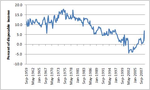
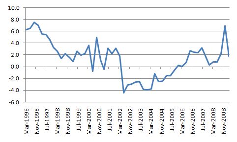
The following two graphs show the household saving ratio (as a %) from disposable income. The first is for the period September 1959 to March 2009 and the second from March 1996 to March 2009. They both show that the decline in household saving as a proportion (to the point that during the budget surplus years the ratio was negative.
The more focused (temporarily) chart shows more clearly the recent dynamics. Households are now saving again in aggregate as the federal budget deficit increases to provide the finance to permit this to occur.

Thanx so much for the info I needed some stats and stuff for an assignment it gave my some great ideas don’t stress i didn’t plagiarise