I grew up in a society where collective will was at the forefront and it…
Age of firm rather than size matters for job creation in the US
Today, among other things, I have been analysing the fantastic dataset produced by the US Census bureau – Business Dynamics Statistics – which allows us to understand in much more detail, the underlying drivers of employment growth in the US by age and size of firm across sectors. I have done a lot of work on this topic in the past and this sort of dataset is a gold mine. It allows us, for example, to examine the veracity of the oft-repeated claims by conservative politicians and lobbyists that small business is the employment engine of the modern economies and all sorts of concessions and deregulation (mostly directed at underlying job security, wages and conditions for workers) are required to allow small business to do its work. The simple conclusion of today’s data analysis is that the age of the firm is more important in understanding net job creation in the US than the size of the firm. Here are some tentative results that may or may not be of interest.
Several studies reveal that labour markets in advanced countries are in a constant state of flux which means that specific jobs are continually created and destroyed as firms expand, adjust to changing labour force characteristics, restructure, contract or close.
This process of job creation and destruction (JC&D) is mirrored by movements of workers between labour force states. When we consider employment dynamics using macroeconomic data we typically focus on measures of net employment changes over time.
For example, say total employment in April is 8000 thousand and in May it is 8020 thousand. Then we would conclude that total employment rose by 20 thousand jobs in the month of May. You will constantly hear commentators saying that 20 thousand jobs were created in May. That is likely to be a false statement because in all likelihood many multiples of that were created at the same time as thousands were also destroyed leaving a net change of 20 thousand.
In other words, a net focus at the aggregate focus prevents an understanding of flows noted above (numbers of jobs created and destroyed and movements of workers across labour force categories).
A net figure showing an increase in employment of 20 thousand can be describe totally different underlying dynamics. For example, imagine that 100 thousand jobs were created and 80 thousand were destroyed in the month – which would suggest a highly fluid labour market. Compare that to just 20 thousand jobs being created and none destroyed – a much less vibrant situation.
Research in this area thus analyses the flows of workers between states usually at a disaggregated industry level to gauge the extent to which the labour market is in flux.
There are several technical issues involved in calculating the job creation and job destruction rates and the derivative time series but I will ignore them here. I have several academic papers out on this topic if anyone is interested in pursuing the matter more formally.
As an example of some freely available work I have done in this area – see the 2005 Working Paper – The dynamics of job creation and destruction in Australia.
There are several of my papers papers like this in both Working Paper and final published form on various aspects of gross job flows both in Australia and elsewhere if you want to search for more of my writing on the topic.
To ground some concepts we initially define the rate of employment growth in sector i (that is, a sub-sector of some industry) at some time (t) as the percentage change in employment between two periods in relation to the average size of sector i over the period in question.
We then define the job creation rate for a sector as a sub-sector-weighted average of these growth rates when growth is positive. We also define the job destruction rate as a sub-sector-weighted average of these growth rates (in absolute value) when growth is negative.
Aggregate gross job flow measures are then computed by summing over all sectors in an industry (or over industries).
We also compute the total churn (or job reallocation rate) as the sum of the job creation and job destruction rates. Net employment growth is simply the difference between job creation and job destruction rates.
For the technically-minded the following formulas are used:
The US BDS data used here is for firms rather than establishments – Business Dynamics Statistics (BDS) Data Tables: Firm Characteristics. You can read the related material on the BDS site for the differences in their datasets if you are interested.
The dataset is available for the years 1977 to 2011, so gives us some indication of what has happened since the crisis began.
Note that the different nations adopt different definitions of “small business”. There is also variation across industry sector. For example, the Australian Bureau of Statistics defines a small business as having fewer than 25 employees, whereas the European Union considers a small business to be one with less than 50 employees.
The – US Small Business Administration – defines a small business in this way:
500 employees for most manufacturing and mining industries, and
$7 million in average annual receipts for most non-manufacturing industries.
But the SBA notes there are “many exceptions” to these “primary size standards for most industries”.
In the data available I will just use a rough figure of 500 employees as a guide to small business here.
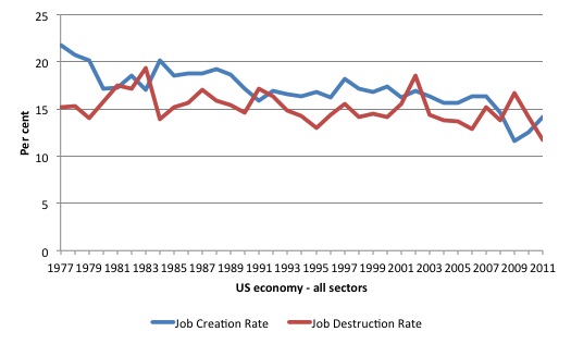
The first graph shows the aggregate job creation and job destruction rates from 1977 to 2011. of interest, is the steadily declining job creation rate in the US over this period and the sudden plunge in 2008 and 2009 associated with the global financial crisis.
The job destruction rate has been relatively steady over the period shown with cyclical spikes associated with the recessions. The most recent spike was not as severe as the increase in the destruction rate earlier in the decade.
You can also see that the gap between the job destruction and job creation rates in the period since 2007 endured for much longer than the previous cyclical downturns. It is only in 2011 that the job creation rate exceeded the job destruction rate once again.
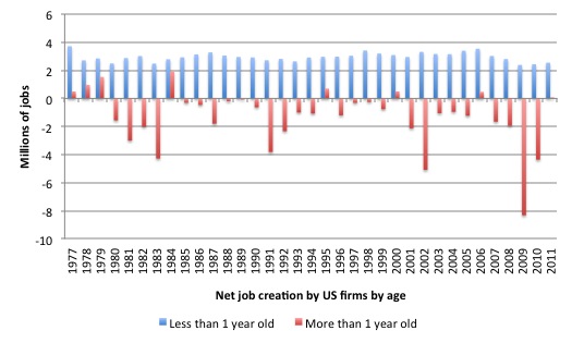
The next graph shows the net job creation (so the difference between job creation and job destruction) by age of the firm in millions of jobs.
What we see something rather extraordinary. Apart from 8 of the 34 years, firms that are less than one-year-old (that is, new entrants or so-called start-ups) have been the sole source of net job creation in the US.
In the 8 years that established firms did contribute in net terms to job overall jobs growth, the new entrants still dominated the overall net job creation.
There was no net contribution from established firms between 2007 and 2010 and only a minute contribution in 2011.
Does the size of the firm help us understand these results any further?
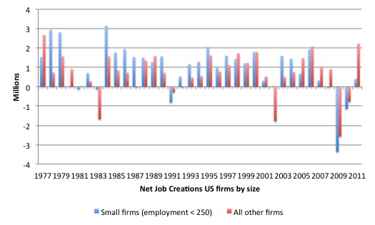
While further work is needed to really understand this data, the “small businesses” were able to withstand previous recessions better than all other sized-firms, but in the recent recession, small business firms were much more significantly affected (negatively) and recovered more slowly (up to 2011 at least).
The average annual net job creation (in millions) between 1977 and 2011 was 0.97 for businesses with less than 250 employees and 0.70 for all other businesses. Between, 1977 and 2007, the average net rate was 1.23 for small business and 0.8 for all other businesses.
However in the period 2008-2011, the net job creation rate for small business has been -1.04 against -0.05 for all other businesses.
Further, the highest net contributor among “small businesses” for the period 1977-2011, were firms with 100-249 employees. Also, the largest job losses were concentrated at the very small scale (less than 50 employees).
So there is some truth in the claims that small businesses have higher net job creation than larger businesses but they also have been largely responsible for the jobs rout in the global financial crisis.
The overall point though is that size is much less important in explaining the job dynamics in the US labour market than is the age of the firm.
Finally, we look at the dynamics from a sectoral (industry) perspective.
The “Broad industry categories” used by the BDS are:
AGR – agricultural services, forestry, fishing
MIN – mining
CON – construction
MAN – manufacturing
TCU – transportation and public utilities
WHO – wholesale trade
RET – retail trade
FIRE – finance, insurance, real estate
SRV – services
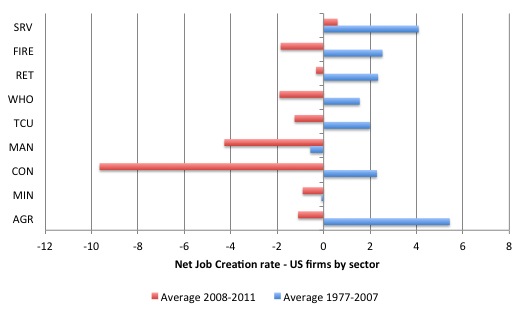
The following graph shows the net job creation rates (in percentages) for the broad industry sectors in the US split into two periods: the average for 1977 to 2007 and the average for the period 2008 and 2011.
Only the service sector has had a positive net job creation rate between 2008 and 2011, and it is considerably lower than its previous performance, which apart from agriculture, was the highest net job creator.
The largest job losses implied by these net job creation rates have been endured by workers in construction and manufacturing and to some extent the retail and FIRE sectors. Only manufacturing has experienced negative job creation rates on average over the entire period.
Conclusion
That is just a glimpse of the data that the US Census Bureau has produced with its BDS surveys. There are many conjectures to be examined in due course. I will report back another day when I know more.
That is enough for today!
(c) Copyright 2013 Bill Mitchell. All Rights Reserved.

Wildcat investment seeks to jump on to the next new thing early, whereas large firms tend to be late adopters of new ideas, generally playing a wait and see game.
Is the graph US_Net_JC_by_age_1977_2011 telling us something profound or something trivial? My first conjectures are that it could be a bit of both.
It is axiomatic that new firms under one year old will return a result of a positive contribution to jobs creation. After all , the definition of a new firm is a new start up that hires workers. What is not axiomatic I guess is that new firms will start up at all. They might not if the economy is really quite moribund.
So, I guess the “Less than one year old” bars are always going to be positive. The chance of a zero bar seems vanishingly small. So, in this case only the height of the bars and their relative size compared to total jobs and the “More than one year old bars” matters.
Sorry, I am thinking aloud here. I have never considered a graph like this before and intitially it seemed a little nonsensical to me. On reflection, I can see some possible meanings coming out of it. What surprises me are the relatively few years from 1977 to 2011 where firms more than one year old actually contributed to job creation. That suggests to me nearly 40 years of a strange kind of stagnancy in the US where firms over year old rarely grow. And how does the growth of large corporations e.g. Microsoft, get drowned out in this data? Are the numbers they employ really not significant compared to total numbers?
The numbers also suggest a kind of “optimism churning” where people are constantly starting new businesses many of which presumably fail in the second year or soon after that. I can’t see this as really effective or efficient. It seems a wasteful process to me. Or am I looking at this graph all wrong?
I’m also a little curious about what the data are telling us. It seems logical that start ups will contribute to job creation, and failures within x years would logically contribute to destruction, but successful firms will stabilise their workforce and mainly shed staff during cyclical downturns.
If the US_Net_JC_by_age_1977_2011 graph adjusted the “age” differentiation to 18 months, 2 years, or even 3, we would expect to see a gradual shift towards equilibrium between job creation/destruction until new firms contributed more to losses as the old firms increasingly represented both very old firms and newer firms that had passed through their early years without failure.
I think I’m coming to the same conclusion as Ikonoclast – it’s strange to see such consistently low figures in +1 year old firms over such a long period of time. I suspect we’re just seeing a lot of 1-3 year old start ups failing.
It begs the question:-
“Is less-than-1-year-old / more-than-1-year-old really a meaningful way to slice the data?”