Go back to the headlines in 2010 - – “Countries with debt over 90 percent…
New UK cost of living dataset improves on standard CPI release – somewhat
The UK Office of National Statistics released a new dataset last week (January 28, 2022) – CPI-consistent inflation rate estimates for UK household groups (plutocratic weighting) – which resumes its analysis of the differential impacts of price rises on different cohorts in the population. Other national statistical agencies have also been doing for some years now. For example, the Australian Bureau of Statistics regularly publishes its – Selected Living Cost Indexes, Australia (last edition September-quarter 2021, published November 3, 2021). This type of data fills the breach left by the standard CPI releases
These data sets are intended to address the variable impact of cost pressures on different household types.
There are many ways to construct a deflator to capture the impact of rising costs in the economy.
The consumer price index (CPI) is one method, where a fixed basket of goods and services is assembled, and an index of the price changes over time is computed based on survey evidence.
The problem arises if, over time, the basket becomes unrepresentative of the goods and services that consumer purchase (for example, if consumer choices change over time).
This problem leads the statistician to regularly update the basket and the weights within the basket to reflect current spending patterns.
There is also the issue of whether the basket is representative of any specific cohort’s expenditure patterns. Different income groups have different spending patterns.
Low-income families spent a higher proportion of their income on basic necessities and less on international travel to ski resorts.
To address that issue, the ABS computes its – Selected Living Cost Indexes – by asking the question:
By how much would after tax money incomes need to change to allow households to purchase the same quantity of consumer goods and services that they purchased in the base period?
They define several different households representative of different expenditure patterns – Pensioners (non-age related government transfer recipients), Employee, Aged Pensioner, and Self-funded retiree households – to better refine the index.
This type of index differs from the CPI because it seeks to measure the “changes in purchasing power of the after-tax income of households” relative to their specific spending patterns.
The CPI “is designed to measure price inflation for the household sector as a whole”, and, as such, “is not the conceptually ideal measure for assessing the changes in the purchasing power of the disposable incomes of households.”
The new ONS series follows this distinction and seeks to provide information on how changes in the prices of goods and services impact on different income groups, and particularly, on low-income households.
In the ONS blog (January 26, 2022) – Measuring the changing prices and costs faced by households – the head of ONS inflation statistics explained that:
… the headline inflation rate is, of course, only an average figure and doesn’t necessarily reflect the price changes experienced by different people … the average annual rate of inflation can conceal a lot. When you are regularly collecting 180,000 prices, you will observe a lot of variety …
The headline CPIH measure captures the average but everyone has their own personal inflation rate. Some people may spend a larger proportion of their income on gas and electricity, or petrol if you commute via car daily …
Before I go any further, you might be wondering what ‘plutocratic weighting’ means.
A price index is just a weighted-average if individual prices.
There are two broad ways the weights are calculated. The first, is called the democratic method where the share of each good in the household’s total expenditure are averaged across all households to form the aggregate weight in the index.
The second, is the plutocratic method where the share of each good in the household total expenditure are weighted by the share of consumption expenditure of each individual household across total consumption expenditure.
In the UK, the aggregate (headline) inflation rate for December was 5.4 per cent.
The question is whether that is a reasonable summary of the impact on purchasing power for British citizens.
If one’s expenditure was matched to the goods and services in the CPI basket and the proportions were according to the weights used by the ONS, then the answer is that the headline figure would be an accurate summary.
But, in general, the answer is probably not.
Which is why the ONS has resumed publishing its cohort-specific measures after a break due to difficulties presented by Covid in data collection.
With the latest release, we learn that:
1. “High-income and low-income households have experienced similar annual inflation rates since 2014.”
2. “High-income households’ experience of inflation is being driven by rising transport costs, on which they spend a larger proportion of their expenditure when compared with low-income households, while for low-income households housing-related costs are more of a factor.”
3. “Retired and non-retired households have experienced similar levels of inflation rates since April 2021.”
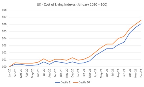
The following graph compares the indexes for the lowest decile with the highest decile of income recipients indexed to 100 at January 2020.
The patterns are very similar with the highest income recipients experiencing a cost of living rise of 6.6 per cent over the two-year period, while the lowest income recipients endured 6.1 per cent rise in their cost of living.
There is hardly any difference between the income deciles, which either means the different expenditure patterns across the income distribution net themselves out – as in point 2 above, or that the expenditure patterns are not all that much different.
The headline CPIH rate actually closely reflects the experience of all the deciles.
There is also not much difference when the series are computed for retirees and non-retirees, the latter experience a cost of living increase of 6.1 per cent since January 2020 (to December 2021), while the former endured a 6.4 per cent rise.
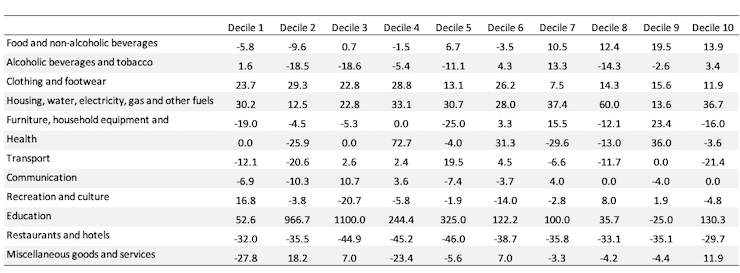
The ONS data also breaks down data by the 12 expenditure categories and the equivalised disposable income deciles:
- 1. Food and non-alcoholic beverages
- 2. Alcoholic beverages and tobacco
- 3. Clothing and footwear
- 4. Housing, water, electricity, gas and other fuels
- 5. Furniture, household equipment and maintenance
- 6. Health
- 7. Transport
- 8. Communication
- 9. Recreation and culture
- 10. Education
- 11. Restaurants and hotels
- 12. Miscellaneous goods and services
I have seen headlines in the UK Guardian recently saying that Britain “pricing the poor out of the food”.
The ONS will release more data in May 2022, which will allow us to say more on that question.
What the existing dataset allows us to trace is the shift in expenditure shares in the COICOP (a UN classification framework – Classification of Individual Consumption According to Purpose) from 2005 through to December 2021.
I created a Table to summarise the percentage shifts in the shares.
It is too complex to provide a running commentary on each interesting finding.
But the lowest two deciles are now spending a smaller proportion of their disposable income on food, wherea the top four deciles are devoting more of their income to food.
All deciles are devoting a much larger proportion of their expenditure for housing and (mostly) education.
There is a lower share for Restaurants and Hotels across the board, which is clearly the pandemic effect.
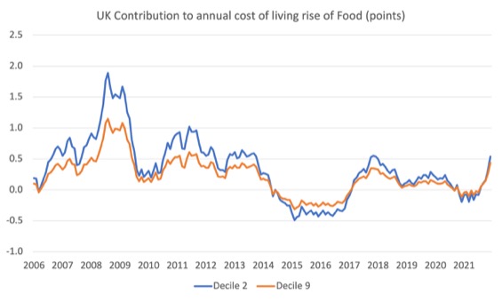
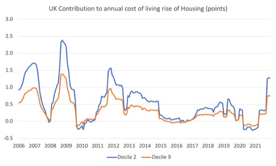
The ONS data also allows us to see the contribution of price rises in each expenditure category on the annual rise in cost of living for the second and ninth decile household from January 2006 to December 2021.
The next graph shows the contribution of the Food and non-alcoholic beverages category, while the second graph shows the contribution of the Housing, water, electricity, gas and other fuels category.
Food was a major contributor for the low-income families during the GFC and less so for the higher income households.
During the pandemic, they have both experienced the impact of food price rises – more or less equally.
The housing cost rises have impacted more harshly on the low-income households.
Finally, transport contributions are higher at present for the high-income households.
![]()
Australian experience
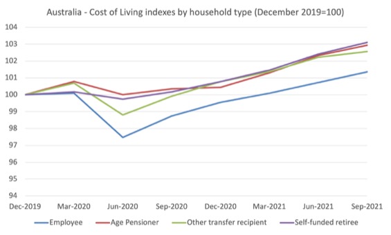
The Selected Cost of Living indexes are not strictly comparable to the ONS UK data because, for a start, the household types are different, although the ABS data does differentiate between “Aged pensioner households” and “Employee households”, which isn’t quite the same as retired and non-retired as in the UK data.
The ABS also have a “self-funded retiree household” category to differentiate those on government aged pensions.
The following graph sets the index at 100 for the December-quarter, just before the pandemic and traces the evolution of cost of living indexes on the four household types.
It is clear that during the first year of the pandemic, employee households and unemployment benefit recipients experienced a reduction in their cost of living (partly due to government policy decisions – free child care, for example in March-quarter 2020).
In 2021, as the supply constraints intensified, transport (petrol) and housing costs (falling affordability) drove the cost of living indexes up at a similar rate for all groups.
Over the course of the pandemic (to the September-quarter 2021), we have the following cost of living increases:
1. Employee households – 1.4 per cent higher.
2. Aged pensioner households – 2.9 per cent higher.
3. Other government transfer recipient households – 2.6 per cent higher.
4. Self-funded retiree households – 3.1 per cent higher.
If we used the average CPI measure then over the same we would have concluded the cost of living has risen on average by 4.4 per cent, which tells you why the selected measures are a better guide to purchasing power erosion.
Conclusion
This blog post was really about me becoming acquainted with this new dataset that the ONS is releasing.
It will get richer as they release more data (cross-tabs, etc).
It already tells an interesting story about what is happening across the income distribution.
My Helsinki Lectures series 2022
I am currently presenting my annual set of lectures on Modern Monetary Theory (MMT) and the global economy at the University of Helsinki.
We are already up to Lecture 3 in the 6 part series.
The teaching program will be:
- Tuesday January 25, 2022 – Streamed public lecture (YouTube) starting 10:15 Helsinki time.
- Wednesday, January 26 – first Zoom lecture with class – 08:15-09:45 Helsinki time.
- Thursday, January 27 – second Zoom lecture – 10:15-11:45 Helsinki time.
- Tuesday, February 1 – third Zoom lecture – 10:15-11:45 Helsinki time.
- Wednesday, February 2 – fourth Zoom lecture – 08:15-09:45 Helsinki time.
- Thursday, February 3 – final Zoom lecture – 10:15-11:45 Helsinki time.
The Zoom link for the lectures is:
https://helsinki.zoom.us/j/5354174274?pwd=OHdTdWJzSHNndHpyVkV2Y0lJUExRZz09
Meeting ID: 535 417 4274
Passcode: ETZhk9
This is an MMTed initiative.
MMTed MOOC – Modern Monetary Theory: Economics for the 21st Century
MMTed – invites you to enrol for the edX MOOC – Modern Monetary Theory: Economics for the 21st Century.
It’s free and the 4-week course starts on February 9, 2022 (note edX adjusts the starting date for time zones, so for some the starting date will be listed as February 8, 2022).
The course is offered through the University of Newcastle edX program.
The course is self-paced so you can learn and participate as you choose. There is new material released at the start of each of the four weeks.
Learn about MMT properly with lots of videos, discussion, and more.
For – Further Details.

That is enough for today!
(c) Copyright 2022 William Mitchell. All Rights Reserved.
The Guardian reference comes from Jack Monroe, who is a campaigner. She is autistic and has a personal experience of poverty. Her autism allows her to remember long lists of prices and when they change.
What she noticed was a difference in price rises between budget/staple goods and higher value items. It was much higher for the budget/staple items. There has also been a large reduction in so called basic ranges of goods, which many people on low incomes rely.
Jack Monroe is something of an expert on how to minimise your shopping bill while still providing adequate nutrition. I think the concern is that increasing numbers of low income households will find that it is impossible to afford adequate nutrition no matter how carefully they shop.
I think this is probably somewhat different than the ONS stance on measuring inflation for different income groups.
In the UK there is no attempt to correlate state benefits with a minimum standard of living. The money that you receive is not intended to allow you to achieve a particular standard of living, it is merely the sum of money allotted to you if you meet certain criteria.