In the 1990s, a new industry was created in Australia. It produced nothing. But it…
US labour market improves but still a long way to go before full employment is reached
Last Friday (November 5, 2021), the US Bureau of Labor Statistics (BLS) released their latest labour market data – Employment Situation Summary – October 2021 – which reported a total payroll employment rise of only 531,000 jobs in August and a 0.2 points decline in the official unemployment rate to 4.6 per cent. With participation unchanged, this was a stronger result than the previous month and the employment-population ratio rose by 0.1 points. It is still well down on the February 2020 peak though. The US labour market is still 4,204 thousand jobs short from where it was at the end of February 2020, which helps to explain why there are no fundamental wage pressures emerging. An occupational analysis shows that the lower paid occupations have not participated proportionally in the jobs growth and many groups have endured real Median weekly earning cuts over the course of the pandemic. Any analyst who is claiming the US economy is close to full employment hasn’t looked at the data.
Overview for October 2021:
- Payroll employment increased by 531,000.
- Total labour force survey employment rose by 359 thousand net (0.23 per cent).
- The seasonally adjusted labour force 104 thousand net (0.06 per cent).
- The employment-population ratio rose 0.1 points to 58.8 per cent (down from February 2020 peak of 61.1 per cent).
- Official unemployment fell by 255 thousand to 7,419 thousand.
- The official unemployment rate fell by 0.2 points to 4.6 per cent.
- The participation rate was unchanged at 61.6 per cent.
- The broad labour underutilisation measure (U6) fell by 0.2 points to 8.3 per cent.
For those who are confused about the difference between the payroll (establishment) data and the household survey data you should read this blog post – US labour market is in a deplorable state – where I explain the differences in detail.
Payroll employment trends
The BLS noted that:
Total nonfarm payroll employment rose by 531,000 in October. Thus far this year, monthly job growth has averaged 582,000. Nonfarm employment has increased by 18.2 million since a recent trough in April 2020 but is down by 4.2 million, or 2.8 percent, from its pre-pandemic level in February 2020. Job growth was widespread in October, with notable job gains occurring in leisure and hospitality, in professional and business services, in manufacturing, and in transportation and warehousing. Employment in public education declined over the month …
Employment in leisure and hospitality increased by 164,000 in October and has risen by 2.4 million thus far in 2021 … is down by 1.4 million, or 8.2 percent, since February 2020.
Professional and business services added 100,000 jobs in October … is 215,000 below its level in February 2020.
Employment in manufacturing increased by 60,000 in October … is down by 270,000 since February 2020.
Employment in transportation and warehousing increased by 54,000 in October and is 149,000 above its February 2020 level.
Construction employment rose by 44,000 in October … is 150,000 below its February 2020 level.
Health care added 37,000 jobs in October … is down by 460,000 since February 2020.
In October, employment in retail trade rose by 35,000 … is 140,000 lower than its level in February 2020.
Employment in the other services industry increased by 33,000 in October … is 169,000 below its February 2020 level.
Employment in financial activities rose by 21,000 in October and has returned to its February 2020 level.
Employment in wholesale trade increased by 14,000 in October … is 158,000 lower than in February 2020.
Mining employment continued to trend up in October (+5,000) but is down by 87,000 from a peak in January 2019.
In October, employment decreased in local government education and state government education (-43,000 and -22,000, respectively) … Since February 2020, employment is down by 370,000 in local government education, by 205,000 in state government education, and by 148,000 in private education.
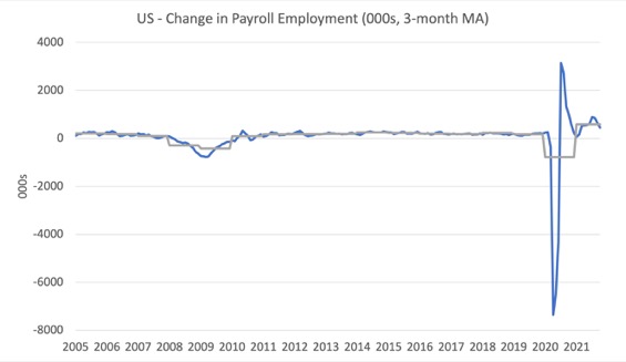
The first graph shows the monthly change in payroll employment (in thousands, expressed as a 3-month moving average to take out the monthly noise). The gray lines are the annual averages.
The data swings are still large and dwarf the past history.
The US labour market is still 4,204 thousand jobs short from where it was at the end of February 2020 and the commentary from the BLS above tells us how this shortfall is distributed across the sectors.
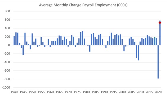
The next graph shows the same data in a different way – in this case the graph shows the average net monthly change in payroll employment (actual) for the calendar years from 2005 to 2021.
The red marker on the column is the current month’s result.
The final average for 2019 was 168 thousand.
The final average for 2020 was -785 thousand.
The average for 2021 (so far) is 582 thousand.
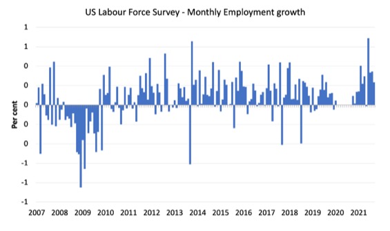
Labour Force Survey – employment growth steady
The data for October 2021 reveals:
1. Employment as measured by the household survey rose by 3596 thousand net (0.23 per cent).
2. The labour force fell by 104 thousand net (0.06 per cent).
3. The participation rate was unchanged at 61.6 per cent.
4. As a result (in accounting terms), total measured unemployment fell by 255 thousand to 7,419 thousand and the unemployment rate fell by 0.2 points to 4.6 per cent.
The following graph shows the monthly employment growth since January 2008 and excludes the extreme observations (outliers) between March 2020 and October 2020, which distort the current period relative to the pre-pandemic period.
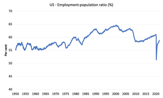
The Employment-Population ratio is a good measure of the strength of the labour market because the movements are relatively unambiguous because the denominator population is not particularly sensitive to the cycle (unlike the labour force).
The following graph shows the US Employment-Population from January 1950 to October 2021.
While the ratio fluctuates a little, the April 2020 ratio fell by 8.6 points to 51.3 per cent, which is the largest monthly fall since the sample began in January 1948.
In October 2021, the ratio rose by 0.1 points to 58.8 per cent.
It is still well down on the level in February 2020 (61.1 per cent).
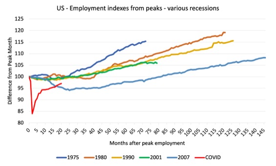
As a matter of history, the following graph shows employment indexes for the US (from US Bureau of Labor Statistics data) for the five NBER recessions since the mid-1970s and the current 2020-COVID crisis.
They are indexed at the employment peak in each case and we trace the data out for each episode until one month before the next peak.
So you get an idea of:
1. The amplitude (depth) of each cycle in employment terms.
2. The length of the cycle in months from peak-trough-peak.
The early 1980s recession was in two parts – a short downturn in 1981, which was followed by a second major downturn 12 months later in July 1982 which then endured.
Other facts:
1. Return to peak for the GFC was after 78 months.
2. The previous recessions have returned to the 100 index value after around 30 to 34 months.
3. Even at the end of the GFC cycle (146 months), total employment in the US had still only risen by 8.3 per cent (since December 2007), which is a very moderate growth path as is shown in the graph.
The COVID collapse was something else but the recent gains are evident, although the gains have been slowing relative to early in the recovery.
After 18 months, total employment is still 3 points below the February 2020 level.
Unemployment and underutilisation trends
The BLS note that:
The unemployment rate edged down to 4.6 percent in October. The number of unemployed persons, at 7.4 million, continued to trend down. Both measures are down considerably from their highs at the end of the February-April 2020 recession. However, they remain above their levels prior to the coronavirus (COVID-19) pandemic (3.5 percent and 5.7 million, respectively, in February 2020). …
In October, the number of long-term unemployed (those jobless for 27 weeks or more) decreased by 357,000 to 2.3 million but is 1.2 million higher than in February 2020. The long-term unemployed accounted for 31.6 percent of the total unemployed in October.
The first graph shows the official unemployment rate since January 1994.
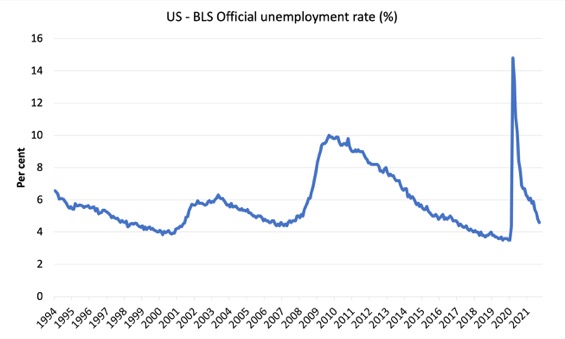
The official unemployment rate is a narrow measure of labour wastage, which means that a strict comparison with the 1960s, for example, in terms of how tight the labour market, has to take into account broader measures of labour underutilisation.
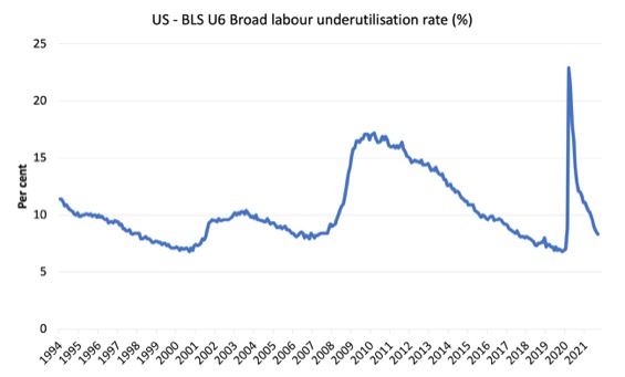
The next graph shows the BLS measure U6, which is defined as:
Total unemployed, plus all marginally attached workers plus total employed part time for economic reasons, as a percent of all civilian labor force plus all marginally attached workers.
It is thus the broadest quantitative measure of labour underutilisation that the BLS publish.
Pre-COVID, U6 was at 6.8 per cent (December 2019).
In October 2021 the U6 measure was 8.3 per cent, a decline of 0.2 points on the previous month.
Some of this fall was due to the decline in official unemployment and a modest decline in the workers in the part-time for economic reasons cohort (the US indicator of underemployment).
But it was also significantly due to the decline in the participation rate, which saw a 174 thousand increase (11.2 per cent) in the category “NLF searched and available Marginally Attached to Labor Force”.
Ethnicity and Education
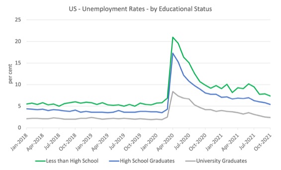
The next graph shows the evolution of unemployment rates for three cohorts based on educational attainment: (a) those with less than high school completion; (b) high school graduates; and (c) university graduates.
As usual, when there is a crisis, the least educated suffer disproportionately.
In the collapse in employment, the unemployment rates rose by:
- 14.1 points for those with less than high-school diploma.
- 13.0 points for high school, no college graduates.
- 5.9 points for those with university degrees.
The period since April 2020 has seen the unemployment rate fall by:
- 14.1 points for those with less than high-school diploma meaning the unemployment rate is now 1 points above the March 2020 level.
- 13 points for high school, no college graduates meaning the unemployment rate is now 1.5 points above the March 2020 level.
- 5.9 points for those with university degrees meaning the unemployment rate is now at the March 2020 level.
In the last month, the change in the unemployment rate has been:
- a fall of 0.5 points for those with less than high-school diploma.
- a fall of 0.6 points for high school, no college graduates.
- a fall of 0.1 points for those with university degrees.
In the US context, the trends in trends in unemployment by ethnicity are interesting.
Two questions arise:
1. How have the Black and African American and White unemployment rate fared in the post-GFC period?
2. How has the relationship between the Black and African American unemployment rate and the White unemployment rate changed since the GFC?
Summary:
1. All the series move together as economic activity cycles. The data also moves around a lot on a monthly basis.
2. The Black and African American unemployment rate was 6.8 per cent in March 2020, rose to 16.7 per cent in May and is at 7.9 per cent in October 2021. In the last month, it was unchanged.
3. The Hispanic or Latino unemployment rate was 6 per cent in March 2020, rose to 18.9 per cent in April and is at 5.9 per cent in October 2021. In the last month, it fell by 0.4 points.
4. The White unemployment rate was 3.9 per cent in March 2020, rose to 14.1 per cent in April and fell to 4 per cent in October 2021. In the last month, it fell by 0.2 points.
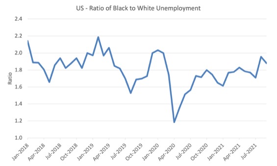
The next graph shows the Black and African American unemployment rate to White unemployment rate (ratio) from January 2018, when the White unemployment rate was at 3.5 per cent and the Black or African American rate was at 7.5 per cent.
This graph allows us to see whether the relative position of the two cohorts has changed since the crisis.
If it is rising, then the unemployment rate of the Black and African American cohort is either rising faster than the white unemployment rate or falling more slowly (or a combination of that relativity).
While there is month-to-month variability, the data shows that, in fact, through to mid-2019, the position of Black and African Americans had improved in relative terms (to Whites), although that just reflected the fact that the White unemployment was so low that employers were forced to take on other ‘less preferred’ workers if they wanted to maintain growth.
In April 2019, the ratio was 2.1 (meaning the Black and African American unemployment rate was more than 2 times the White rate).
By April 2020, the ratio had fallen to its lowest level of 1.2, reflecting the improved relative Black and African American position.
As the pandemic hit, the ratio rose and peaked at 1.8 in October 2020.
In October 2021, the ratio was 1.98, a rise of 0.1 points from the previous month, which indicates that the relative position of the Black and African American cohort has deteriorated.
The White workers enjoyed a lower unemployment rate, while the Black and African rate was unchanged.
Occupational employment and earnings growth – December 2019 to September 2021
I wondered how the pandemic had affected employment and earnings at the occupational level.
Was there any evidence that wages growth was breaking out or not, which might propagate an inflationary spiral on the back of the supply-side pressures at the moment?
Note that some of these categories are sub-aggregates of other categories.
For example:
1. Management, professional and related occupations encompasesses Management, business, and financial operations occupations and Professional and related occupations.
2. Sales and office occupations encompasses Sales and related occupations and Office and administrative support occupations.
3. Natural resources, construction, and maintenance occupations encompasses Farming, fishing, and forestry occupations and Construction and extraction occupations and Installation, maintenance, and repair occupations
4. Production, transportation, and material moving occupations encompasses Production occupations and Transportation and material moving occupations.
Within each of these aggregates there is occupational diversity in terms of median weekly earnings.
For example, within aggregate (3), the Farming, fishing, and forestry occupations are classified as low-pay, while the Installation, maintenance, and repair occupations are above-average.
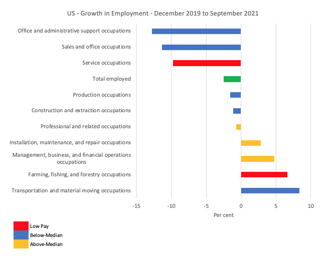
The first graph shows the growth in employment between December 2019 and September 2021 by the sub-occupational categories.
The colour codes denote above-median (gold), below-median (blue) and within the latter category, low-pay (red), which is below 75 per cent of the Median weekly earnings. The green bar is the Economy-wide median weekly earnings.
Overall, as at September 2021, the labour market is still 2,954 thousand jobs short of where it was in December 2019, a 2.5 per cent drop.
Clearly, some occupations have fared well over this period in terms of employment growth (for example, Transporation and material moving occupations have grown by 8.3 per cent), while others have endured devastating employment losses.
Overall the employment losses have been concentrated at the low-pay end of the labour market.
1. Above-Median earnings – gained 905 thousand (net) jobs.
2. Below-Median earnings – lost 2,326 thousand (net) jobs.
3. Low-pay – lost 1,532 thousand (net) jobs (65.8 per cent of the Below-Median job losses).
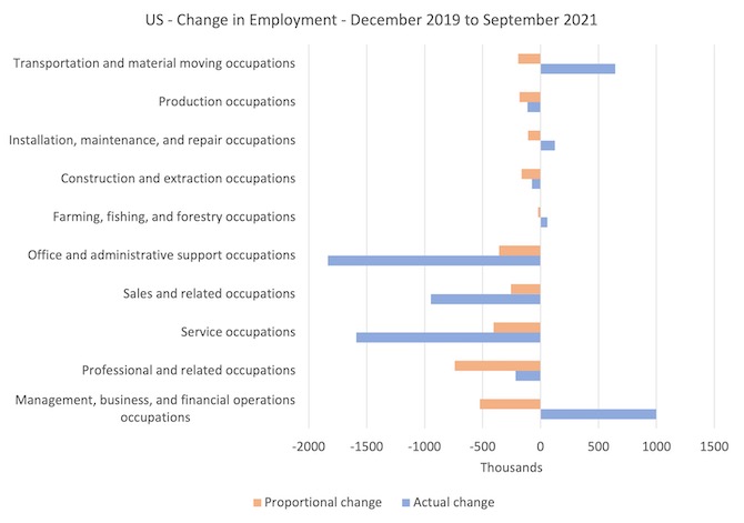
The next graph captures how the occupational composition of the labour market has shifted during the pandemic to date.
It helps us to understand relative scales (importance of each occupational category in total jobs)
The blue bars show the actual employment change for each occupational category between December 2019 and September 2021, while the orange bars show what the employment change would have been if the categories had have shared in the total employment loss over this period according to their December 2019 shares in total employment.
The difference between the bars tells you the extent to which their has been a shift in the composition.
The real issue relates to the relative damage done to the low-pay service workers and the gains made by the high-paid workers in management, business and financial occupations.
The other lower occupational groups at the lower-end of the Below-Median group also lost more jobs that their 2019 shares would have indicated.
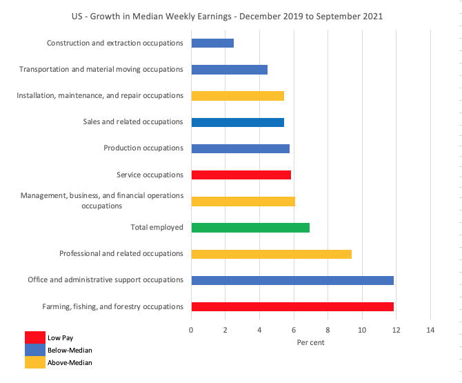
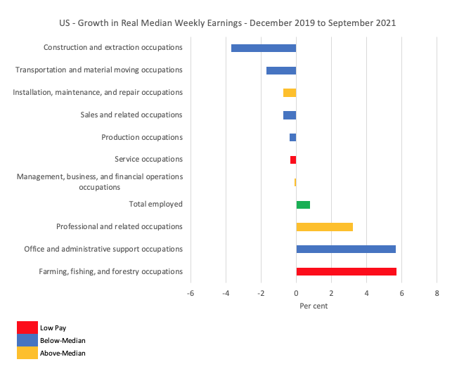
The next graph shows the growth in nominal Median weekly earnings between December 2019 and September 2021 for the occupational categories.
Overall, there was a 6.9 per cent growth in Median weekly earnings over this period although there has been considerable diversity across the occupational distribution with no clear pattern.
The next graph shows this data in real terms.
The CPI grew by 6.2 per cent over this period (which is hardly a sign of accelerating inflation), and, given the modest nominal growth for most occupational groups, this translates into a real cut in Median weekly earnings from all but three categories.
I will write more about trends in the Transportation and material moving occupations later in the week as there are very interesting trends across the unionised and non-unionised firms that dominate this sector.
Another lesson emerges from that – but that will be later in the week, once I have some more data.
But it is clear that while the pandemic has provided jobs growth for these occupations (on-line deliveries etc), the workers have been unable to secure real wage increases and have, rather, endured a 1.7 per cent real wage cut.
These sorts of outcomes tell us why the inflation surge at the moment has no propagating mechanisms to turn the supply shocks into a persistent wage-price spiral (like what happened in the 1970s).
Conclusion
The October 2021 US BLS labour market data release suggests that the labour market is improving but still not close to full employment.
The actual payroll figure is well down on expectations
The US labour market is still 4,204 thousand jobs short from where it was at the end of February 2020.
The employment-population ratio is still well down on the February 2020 peak.
An occupational analysis shows that the lower paid occupations have not participated proportionally in the jobs growth and many groups have endured real Median weekly earning cuts over the course of the pandemic.
Taken together, there are no fundamental wage pressures emerging at present despite the spikes in inflation arising from supply chain constraints.
That is enough for today!
(c) Copyright 2021 William Mitchell. All Rights Reserved.
I know I’m a broken record, but whenever Bill presents his instructive data and acute analyses of employment in the U.S. (or elsewhere), I feel compelled to interject that the QUALITY of that employment (wages, benefits, job security, working conditions, etc.) has slipped SO FAR that it’s almost like comparing apples to oranges when more recent employment levels are contrasted with those of several decades ago. I also know that my broken record is being heard by the choir.
Hi Bill have you ever had much contact with Richard Wolff?I would be curious to know on which points you are not agreed on.
Thanks for all your work.
Meanwhile, Newton, I’m apparently battling censorship:
I replied to an article in Crikey by Christopher Warren (onetime president of the journalist union in Oz), which was about Albo and his current ‘laying low’ strategy; my comment was put “on hold, awaiting moderation”.
Later my comment disappeared altogether, now it has reappeared (after I contacted Warren), but still with the ‘awaiting moderation’ notice…..meaning it is without a reply function, so no-one else can reply to it (if they can even read it).
I was explaining Gittins use of the term “printing money” in his pro-MMT article entitled; ‘Funding the budget by printing money is closer than you think’.
Perhaps Warren is concerned about a reference to Philip Lowe in the latter part of my post:
…………….
“As economist James Galbraith wrote:
“As anyone who has ever been responsible for legislative oversight of central bankers knows, they do not like to have their authority challenged. Most of all, they will defend their mystique, that magical aura that hovers over their words, shrouding a slushy mix of banality and baloney in a mist of power and jargon.”
Is Philip Lowe in the same category of central bankers, as suggested in the Gittins article.
“…..Lowe insisted that “the RBA does not, and will not, directly finance governments. The bonds we own will have to be repaid in the same way as if they were owned by others.”
(continuing with my own remarks) why must the (federal) government buy bonds in the first place, when it has access to its own treasury and central bank, and can spend money into existence so long as the resources (inc. unemployed labour) on which the money is to be spent are available for purchase (to avoid inflation)?”” (end) …………
Worthy of moderation? Because I’m equating P. Lowe’s words with ” a slushy mix of banality and baloney in a mist of power and jargon”? Hmmm.
Meanwhile Albo, speaking on radio today, still can’t come up with a costed plan for maximum emissions reduction by 2030, wanting to see Morrison’s plan first.
As you would expect from a politician who believes he has to balance the federal budget….